Chapter 2 Summaries of Data
> # Store all variables up to this line.  Later generated variables will be
> # deleted after the end of each chapter
> freeze <- ls()
The following text is not a complete excerpt or summary of chapter 2. On the one hand, I will only write down those things that are new for me and not covered in other introductory statistics textbooks. On the other side, I am exploring the presented concepts, and on this occasion, I will using and practicing R.
2.1 Measures of Locations
2.1.1 Definition and examples
The standard description of a “measure of location” as a number intended to reflect the typical individual or thing under study is misleading. A more accurate definition is that a measure of location has to satisfy three properties (p.25):
- It always lies between the largest and smallest value inclusive.
- If values are multiplied by a constant, the measures of location are multiplied with this figure as well.
- If you add a constant to every data, then the measures of location is increased by this amount too.
Measures of locations are:
2.1.1.1 The sample mean
With R, you calculate the sample mean with the built-in function mean(x). This measure is susceptible to outliers.
One way of quantifying the sensitivity of the sample mean to outliers is with the so-called finite sample breakdown point … [which] is the smallest proportion of observations that can make it arbitrary large or small. Said another way, the finite sample breakdown point of the sample mean is the smallest proportion of n observations that can render it meaningless. A single observation can make the sample mean arbitrarily large or small, regardless of what the other values might be, so its finite sample breakdown point is 1/n. (p.19)
The name breakdown point refers to the maximal amount of variation the measure can withstand before it breaks down, i.e., before it can take arbitrary values2.
2.1.1.2 The sample median
In R, you calculate the sample median with the built-in function median(x). The median is the most extreme example of a trimmed mean, e.g., a mean where a specified portion of the smallest and largest values are cut and not included in the computation of the average. The finite sample breakdown point for the median is approximately 0.5, the highest possible value.
2.1.2 Critical discussion
Based on the single criterion of having a high breakdown point, the median beats the mean. But it is not being suggested that the mean is always inappropriate when extreme values occur (p.21).
Take, for example, a researcher reporting that the median amount of earnings over ten years is $100,000.This statement sounds good, but consider the following income situation:
100,000, 100,000, 100,000, 100,000, 100,000, 100,000, 100,000, 100,000, 100,000, -1.000,000. At the end of the ten years, the person has earned nothing but in fact, lost 100,000. Here the long term amount of earning, as expressed in the mean, is important.
> x <- c(100000, 100000, 100000, 100000, 100000, 100000, 100000, 100000, 100000,
+     -1000000)
> mean(x)
> median(x)
## [1] -10000
## [1] 100000Or take the daily rainfall in Boston, Massachusetts, as another example for the appropriateness of the mean. The median is zero because no rain is typical for Boston. But, of course, it does rain in Boston sometimes.
2.1.3 Trimmed mean
The sample median represents the most extreme amount of trimming and might trim too many values. Therefore many times, a trimmed mean performs better. Often a good choice for the routine use of a trimmed mean is 20%. In that case, 20% of the lowest and highest data are cut, i.e., are not included in the calculation of the mean.
For the R standard function mean() the default trim parameter is 0, which corresponds to the sample mean, e.g., no trimming is carried out. To get the desired 20% in the built-in function, you have to specify mean(x, trim=0.2), where the finite sample breakdown point is approximately 0.2.3
Wilcox provides tmean() especially written for the book, which has as its default trim parameter value 0.2. (tmean(x, tr=.2))
2.1.4 Winsorized mean
Later in chapter 4, the so-called winsorized mean4 is needed. Instead of trimming a certain percentage of the lowest and highest data, the winsorized mean set this percentage of data equal to the lowest, respectively, to the highest value, which would not have been trimmed by the trim function. Again the finite sample breakdown point equals approximately the proportion of points winsorized.
The following demonstrations show that the non-adapted mean is quite different from the median. It is almost three times bigger! You will get considerably better results with the trimmed mean and the winsorized mean.
But keep in mind that there are situations where the mean is still a very relevant measure (see Example 2.1).
> x_data <- c(12, 45, 23, 79, 19, 92, 30, 58, 132, 1000)
> x_data_mean <- format(mean(x_data), nsmall = 2)
> x_data_median <- format(median(x_data), nsmall = 2)
> x_data_trim_mean <- format(mean(x_data, 0.2), nsmall = 2)
> x_data_win_mean <- with(allfun, {
+     format(winmean(x_data, 0.2), nsmall = 2)
+ })
>
> x_data_tmean <- with(allfun, {
+     format(tmean(x_data), nsmall = 2)
+ })| Measure | Value | Notes |
|---|---|---|
| Mean | 149.00 | “12, 19, 23, 30, 45, 58, 79, 92, 132, 1000” |
| Median | 51.50 | “12, 19, 23, 30, 45, 58, 79, 92, 132, 1000” |
| 20% trimmed mean | 54.50 | “[12, 19], 23, 30, 45, 58, 79, 92, [132, 1000]” |
| 20% winsorized mean | 55.70 | “23, 23, 23, 30, 45, 58, 79, 92, 92, 92” |
2.2 Measures of Variance
Not all people are alike. Even objects of the same category have more or less slightly different features. In real life, there is always variation. And it is precisely this inevitable variation, which is the motivation for sophisticated statistical techniques. We need, therefore, appropriate measures of variation, which are also called measures of scale.
2.2.1 Sample Variance and Standard Deviation
- The sample variance \(s^{2}\): Subtract the sample mean from each observation and square them. Add all differences and divide by the number of observations minus one. The build-in R function is \(var(x)\).
- The sample standard deviation \(s\): It is the positive square root of the sample variance. The build-in R function is \(sd(x)\).
The sample variance is not resistant to outliers: A single unusual value can inflate the sample variance and give a misleading figure.
2.2.2 The Interquartile Range
2.2.2.1 How to construct the IQR?
Another measure of dispersion, which is mainly used when the goal is to detect outliers, is called the interquartile range (IQR). The IQR reflects the range of values among the middle 50% of the data.
The usual way to compute it is by removing the smallest and largest 25% of the data. Then we take the difference between the largest (q1) and the smallest (q2) values remaining. \(q2\) and \(q1\) are called lower and upper quartiles, respectively.
There are many alternative proposals for the computation of the IQR, slightly altering the calculation of the sample quantiles. The help page in R for sample quantiles records nine different types.
2.2.2.2 Calculation of the ideal fourth
A more complicated calculation uses the so-called lower and upper ideal fourth.
Definition 2.1 (Ideal fourth) \[q_{1} = (1 -h)X_{j} + hX_{j+1}\]
where \(j\) is the integer portion of \((n/4) + (5/12)\), meaning that \(J\) is \((n/4) + (5/12)\) rounded down to the nearest integer, and
\[h = \frac{n}{4} + \frac{5}{12} - j\]
The upper ideal fourth is:
\[q_{2} = (1 -h)X_{k} + hX_{k-1}\]
where \(k = n - j + 1\) in which case the interquartile range is:
\[IQR = q_{2} - q_{1}\]R code snippet 2.2 (Calculation of the ideal fourth)
Wilcox shows the process of the computation with the following 12 values: \(-29.6, -20.9, -19.7, -15.4, -8.0, -4.3, 0.8, 2.0, 6.2, 11.2, 25.0\)
\[\frac{n}{4} + \frac{5}{12} = \] \[\frac{12}{4} + \frac{5}{12} = \] \[\frac{36}{12} + \frac{5}{12} = \] \[\frac{41}{12} = 3.41667\]
Rounding 3.41667 to the nearest integer = r round(3.41667), so h = 3.41667 - 3 = 0.41667. Because \(X_{3} = -19.7\) and \(X_{4} = -15.4\) we get
\[q_{1} = (1-0.41667)(-19.7) + 0.41667(-15.4) = -17.9\] and
\[q_{2} = (1-0.41667)(-6.2) + 0.41667(2.0) = 4.45\] So the interquartile range, based on the ideal fourth is
\[IQR = 4.45 - (-17.9) = 22.35\]
2.2.2.3 Comparison of different IQR computations
With idealf(x) respectively idealfIQR using the ideal fourths, the tenth function for the IQR computation was specially written for the Wilcox book.
| Function | Quantiles: 25%, 75% | IQR |
|---|---|---|
| IQR, Type 1 | -19.70, 2.00 | 21.70 |
| IQR, Type 2 | -17.55, 4.10 | 21.65 |
| IQR, Type 3 | -19.70, 2.00 | 21.70 |
| IQR, Type 4 | -19.70, 2.00 | 21.70 |
| IQR, Type 5 | -17.55, 4.10 | 21.65 |
| IQR, Type 6 | -18.625, 5.150 | 23.775 |
| IQR, Type 7 | -16.475, 3.050 | 19.525 |
| IQR, Type 8 | -17.90833, 4.45000 | 22.35833 |
| IQR, Type 9 | -17.81875, 4.36250 | 22.18125 |
| idealf / idealfIQR | -17.90833, 4.45 | 22.35833 |
The table compares the different computation for the IQR. R uses as standard type = 7. Note that type = 8 corresponds exactly to the ideal fourth calculation.
2.2.3 Winsorized Variance
When working with the trimmed mean, the winsorized variance plays an important role. The winsorized variance is just the sample variance of the winsorized values. Its finite sample breakdown point is equal to the amount winsorized.
The R function winvar is especially written for the book and takes of its default 0.2. winvar(x, tr = 0.2, na.rm = FALSE, STAND = NULL)5
> x_data <- c(12, 45, 23, 79, 19, 92, 30, 58, 132)
> var_win_0.2 <- with(allfun, {
+     format(winvar(x_data), nsmall = 2)
+ })
> var_win_0.0 <- with(allfun, {
+     format(winvar(x_data, tr = 0), nsmall = 2)
+ })
> var_std <- format(var(x_data), nsmall = 2)
The default 20% winsorized variance calculated with winvar(x) = 937.9444. The standard sample variance s2 is var(x) = 1596.778 and this is exactly the value one gets calculated with winvar(x, tr = 0) = 1596.778. Typically the winsorized variance is smaller than the sample variance s2 calculated with var(x), because winsorizing pulls in extreme values.
2.2.4 Median Absolute Deviation (MAD)
The median absolute deviation (MAD) is another measure of dispersions and plays an important role when trying to detect outliers.
Definition 2.2 (Median Absolute Deviation (MAD)) There are three steps for its calculation. I will demonstrate these three steps with the figures from the example above,. eg., with the values \(12, 45, 23, 79, 19, 92, 30, 58, 132\):
- Compute the sample Median M. (After sorting the values \(12, 19, 23, 30, 45, 58, 79, 92, 132\) you get M = 45.
- Substract this value (\(45\)) from every observed value and take the aboslute value. (For instance: \(X_1 - M = |12 - 45| = 33\) and \(|X_2 - M| = 0\). All values are: \(33, 0, 22, 34, 26, 47, 15, 13, 87\).)
- MAD is the median of this new list of values: \(26\).
For reasons related to the normal distribution, MAD is typically corrected by a specific factor, namely multiplied by \(0.6745\) or divided by \(1.4826\). The result is sometimes called MADN to differentiate this value form the uncorrected MAD.
R has a built-in function mad() which calculates MADN.
mad)
> x_data <- c(12, 45, 23, 79, 19, 92, 30, 58, 132)
> x_mad <- mad(x_data)
> x_madn1 <- mad(x_data) * 0.6745
> x_madn2 <- mad(x_data)/1.4826
The calculated MAD = 38.5476 but to get MADN this value is divided by the factor 1.4826, resulting in 26.00 exactly — or as mentioned in the Wilcox book — multiplied by 0.6745 with the same value of 26.00036.
2.2.5 Other robust measures of variation
There are many (~ 150) other measures of dispersion. Two well-performing measures are the biweight midvariance and the percentage bend midvariance. More recently, there are some new measures in the discussion, such as the translated biweight S (TBS) estimator6 and the tau measure of scale.
In contrast to the other measures already described, these new measures follow a different approach: Basically, MAD or winsorized variance considers only the middle portion of the data, whereas the four measures mentioned in this section try to detect outliers and then to discard them from the calculation.
The R-functions for these measures are:
- Percentage Bend Midvariance:
pbvar() - Biweight Midvariance:
bivar() - Tau measure of scale:
tauvar() - Translated Biweight S:
(tbs())$var
##
## Attaching package: 'magrittr'
## The following object is masked from 'package:purrr':
##
## set_names## The following object is masked from 'package:tidyr':
##
## extract## The following object is masked from 'package:raster':
##
## extract> vecs <- list(c("Vector W", "Vector X", "Vector Y", "Vector Z"))
> measures <- list(c("pbvar", "bivar", "tauvar", "tbs"))
> vars <- list(c("V1", "V2", "V3", "V4", "V5", "V6", "V7", "V8", "V9"))
>
> m1 <- matrix(c(12, 45, 23, 79, 19, 92, 30, 58, 132, 12, 45, 23, 79, 19, 92,
+ 30, 58, 1000, 12, 45, 23, 79, 19, 1000, 30, 58, 1000, 12, 45, 23, 1000,
+ 19, 1000, 30, 58, 1000), nrow = 4, ncol = 9, byrow = TRUE, dimnames = c(vecs,
+ vars))
>
> m2 <- matrix(data = NA, nrow = 4, ncol = 4, byrow = FALSE, dimnames = c(vecs,
+ measures))
>
> for (i in c("pbvar", "bivar", "tauvar")) {
+ for (j in 1:4) {
+ m2[, i] <- apply(m1, 1, i)
+ }
+ }
>
> # special treatment of tbs as it does not return a single value, but a list
> # the same program lines gives different results! Why?
>
> # browser()
> for (j in 1:4) {
+ m2[j, 4] <- tbs(m1[j, ])$var
+ }
> m <- cbind(m1, m2)
> m %>% kable(caption = "Comparison of other robust measures of variation", label = "other-disp-measure") %>%
+ kable_styling(bootstrap_options = c("striped", "hover", "condensed", "responsive"),
+ font_size = 14, full_width = TRUE) %>% column_spec(11:14, bold = T,
+ color = "white", background = "gray")| V1 | V2 | V3 | V4 | V5 | V6 | V7 | V8 | V9 | pbvar | bivar | tauvar | tbs | |
|---|---|---|---|---|---|---|---|---|---|---|---|---|---|
| Vector W | 12 | 45 | 23 | 79 | 19 | 92 | 30 | 58 | 132 | 1527.75 | 1489.4442 | 1344.308 | 1740.284 |
| Vector X | 12 | 45 | 23 | 79 | 19 | 92 | 30 | 58 | 1000 | 1527.75 | 904.7307 | 1345.374 | 1044.183 |
| Vector Y | 12 | 45 | 23 | 79 | 19 | 1000 | 30 | 58 | 1000 | 1527.75 | 738.9717 | 1735.996 | 1001.164 |
| Vector Z | 12 | 45 | 23 | 1000 | 19 | 1000 | 30 | 58 | 1000 | 684679.50 | 690.1830 | 2194.432 | 1299.108 |
For the following interpretation, we are not interested in the magnitude of these dispersion measures, because we only want to compare their performance them with the different size and number of outliers in the four vectors W, X, Y, Z.
The table demonstrates:
- The
pbvar()ignores the default parameter of the bending constant of 0.2, the two largest and smallest values. Therefore it is entirely robust with two outliers and does not change its value. But with more than two outliers on one side (small or large), its performance cause havoc: The value of pbvar in theVector Z-column is strikingly different from the other values. In that case, the bending constant has to be enlarged. For instance: Changing the constant from .2 to .3 results inpbvar()values of \(2128\) for all four vectors. - The
bivar()value is for theVector Wsimilar to the percentage bend midvariancepbvar(). But increasing the largest value \(132\) and adding more outliers it decreases! The reason is thatbivar()has \(132\) not detected as an outlier in contrast to \(1000\), which values are subsequently ignored. - The
tauvaris robust with one to two outliers of one side of the spectrum (small or large). With more than two small or large outliers, it increases but in moderate paces. - The
(tbs())$varresults only in slightly changes with different sizes and numbers of outliers. One thing I do not understand: Whenever I run the program, the values for thetbsdiffer somewhat.
2.2.6 Some comments on measures of variation
The preceding sections describe several measures of dispersion. But how to choose the most appropriate? The answer depends in part of the type of problem and will be addressed in the subsequent chapters.
2.3 Detecting outliers
Detecting unusually large or small values can be very important. The standard methods based on the sample mean and variance are sometimes highly unsatisfactory.
2.3.1 Mean and variance-based method
Declare as outliers all values that are more than two standard deviations away from the mean. The reason for factor \(2\) will be covered in the next chapter.
\[\frac{|X - \bar{X}|}{s} > 2.\]
This formula works fine in some cases, notably, if there are not many outliers inflating the sample mean and especially the sample standard deviation. The following three examples will demonstrate one problem of outlier detection, called masking.
> x.out <- c(2, 2, 2, 2, 2, 3, 3, 3, 3, 3, 4, 4, 4, 4, 4, 1000)
> y.out <- c(x.out, 10000)
> z.out <- c(2, 2, 3, 3, 3, 4, 4, 4, 100000, 100000)
To demonstrate masking, Wilcox has prepared three different sets of data.
- x.out has one outlier: “2, 2, 2, 2, 2, 3, 3, 3, 3, 3, 4, 4, 4, 4, 4, 1000”
- y.out has one “normal” and one extrem outlier: “2, 2, 2, 2, 2, 3, 3, 3, 3, 3, 4, 4, 4, 4, 4, 1000, 10000”
- z.out has two extrem outliers: “2, 2, 2, 2, 2, 3, 3, 3, 3, 3, 4, 4, 4, 4, 4, 100000, 100000”
| # | Vector | Outlier | \(\bar{X}\) | \(s\) | \(> 2 sd?\) |
|---|---|---|---|---|---|
| 1 | \(x.out\) | 103 | 65.3125 | 249.2513373 | 3.7499799 |
| 2 | \(y.out1\) | 103 | 649.7058824 | 2421.5715911 | 0.1446557 |
| 3 | \(y.out2\) | 104 | 649.7058824 | 2421.5715911 | 3.8612503 |
| 4 | \(z.out\) | 105 | 20002.5 | 42162.3845263 | 1.8973666 |
- Line 1: The value is > 2 sample standard deviation = correct detection of outlier.
- Line 2, 3: The smaller outlier is masked by another more extreme outlier = no detection of the smaller outlier.
- Line 4: Both extreme outliers are not detected!
2.3.2 The MAD-Median rule
The MAD-Median rule declares X as an outlier if
\[\frac{|X - M|}{MADN} > 2.24\]
If we now substitute the formula above with the values of line 4, we get 134893.43046, which is much bigger than 2.24. So, in this case, both outliers are detected correctly.
2.3.3 R function out(x)
Wilcox suggests in his book the new programmed function out(x) for detecting outliers without the masking problem.
out(x))
## $n
## [1] 10
##
## $n.out
## [1] 2
##
## $out.val
## [1] 100000 100000
##
## $out.id
## [1]  9 10
##
## $keep
## [1] 1 2 3 4 5 6 7 8
##
## $dis
##  [1]      2.0234723      2.0234723      0.6744908      0.6744908
##  [5]      0.6744908      0.6744908      0.6744908      0.6744908
##  [9] 134893.4304600 134893.4304600
##
## $crit
## [1] 2.241403
out(x) returns a list, where I do not understand all parameter as explained in the comment inside the function. But $out.val returns the value all outliers and out.id the positions of the outliers within the vector. Trying with the above example of z.out:
- Number of detected outliers: 2
- The detected outliers are: 100000, 100000
- Position of detected outliers: 9, 10.
The function out(x) detects both outliers and avoids masking.
2.3.4 Boxplot rule
Another method to detect outliers is a graphical summary provided by a boxplot.
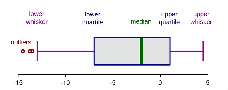
Figure 2.1: Detecting outliers with boxplot graphics (Ruediger85/CC-BY-SA-3.0/Wikimedia Commons)
The end of the whiskers are the smallest and largest values, not declared outliers, and are called adjacent values. Because the IQR has a finite sample breakdown point of 0.25, more than 25% of the data must be outliers before the problem of masking occurs.
The boxplot declares outliers if their positions are more than 1.5 IQRs from the lower, respectively, from the upper quartile.
\[X < q1 - 1.5(IQR)\]
or
\[X < q1 + 1.5(IQR)\]
For a better understanding of the boxplot measures a comparison with the probability density function of a normal distribution may be helpful:
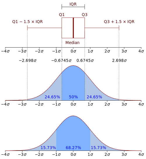
Figure 2.2: Boxplots in relation to the Probability Density Function (PDF). By Jhguch at en.wikipedia, CC BY-SA 2.5, https://commons.wikimedia.org/w/index.php?curid=14524285
For more on boxplots, especially about the problem that the data distribution is hidden behind each box, read Boxplot and The Boxplot and its pitfalls.
There is a built-in R function boxplot(x). For a demonstration, I will use the rivers data again.
boxplot(x))
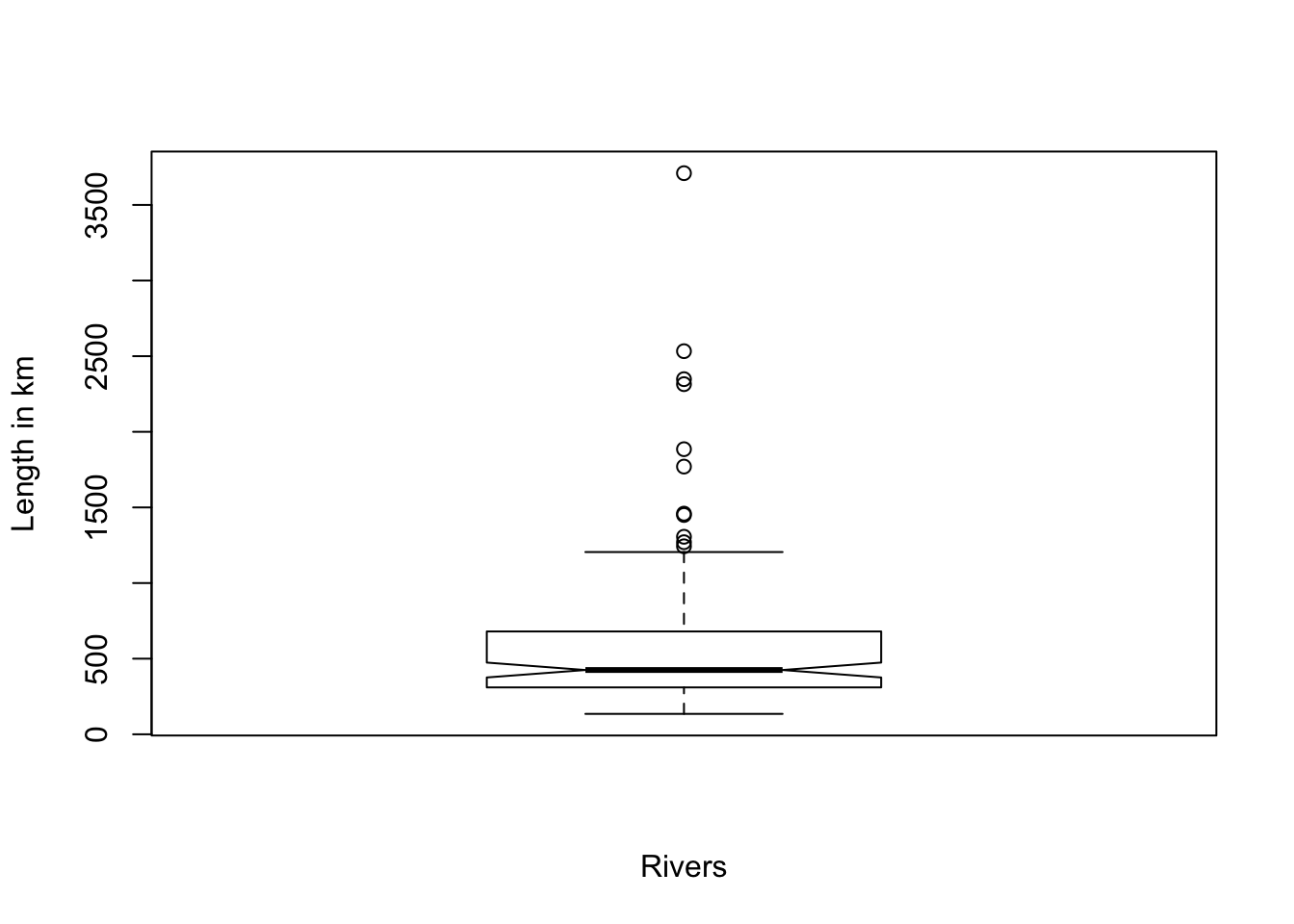
Figure 2.3: Demonstration of the build-in R function boxplot(x) with the rivers data = length of rivers
You see several points outside the upper whisker (outside 1.5 IQR). These are the detected outliers. To get the numerical values of the boxplot Wilcox mentions boxplot(x, plot = FALSE) but I would recommend to use boxplot.stats(x).
boxplot and boxplot.stats)
## [1] 1243 1270 1306 1450 1459 1770 1885 2315 2348 2533 3710## $stats
## [1] 135 310 425 680 1205
##
## $n
## [1] 141
##
## $conf
## [1] 375.7678 474.2322
##
## $out
## [1] 1459 1450 1243 2348 3710 2315 2533 1306 1270 1885 1770## [1] 1243 1270 1306 1450 1459 1770 1885 2315 2348 2533 3710Explanation of the result values of boxplot.stats:
- stats: a vector of length 5, containing the extreme of the lower whisker, the lower ‘hinge’, the median, the upper ‘hinge’, and the extreme of the upper whisker.
- n: the number of non-NA observations in the sample.
- conf: the lower and upper extremes of the ‘notch’. These values are vital if you want to compare the medians of different sample vectors. If they do not overlap, then you can be 95% confident that the medians of the vectors differ.
- out: the values of any data points which lie beyond the extremes of the whiskers.
To get just a sorted list of outliers, you can write sort(boxplot.stats(rivers)$out) which results in: 1243, 1270, 1306, 1450, 1459, 1770, 1885, 2315, 2348, 2533, 3710.
2.3.5 Boxplot rule modified
The proportion of detected outliers with the boxplot depends on the sample size. It is higher where the sample size is small. A modified boxplot rule solves this problem:
\[X > M + kIQR\]
or
\[X > M - kIQR\] where
\[k = \frac{17.63n - 23.64}{7.74n - 3.71}\]
2.3.6 R function outbox(x)
Wilcox has developed a function outbox(x) using the two different methods for detecting outliers with the boxplot method (standard and modified version).
Changing the parameter of mbox results in the two different methods for detecting outliers:
- Parameter mbox = FALSE: The function uses the standard boxplot rule.
- Parameter mbox = TRUE: The function uses the modified boxplot rule.
outbox function)
## $out.val
##  [1] 1459 1450 2348 3710 2315 2533 1306 1270 1885 1770
##
## $out.id
##  [1]   7  23  66  68  69  70  83  98 101 141
##
## $keep
##   [1]   1   2   3   4   5   6   8   9  10  11  12  13  14  15  16  17  18
##  [18]  19  20  21  22  24  25  26  27  28  29  30  31  32  33  34  35  36
##  [35]  37  38  39  40  41  42  43  44  45  46  47  48  49  50  51  52  53
##  [52]  54  55  56  57  58  59  60  61  62  63  64  65  67  71  72  73  74
##  [69]  75  76  77  78  79  80  81  82  84  85  86  87  88  89  90  91  92
##  [86]  93  94  95  96  97  99 100 102 103 104 105 106 107 108 109 110 111
## [103] 112 113 114 115 116 117 118 119 120 121 122 123 124 125 126 127 128
## [120] 129 130 131 132 133 134 135 136 137 138 139 140
##
## $n
## [1] 141
##
## $n.out
## [1] 10
##
## $cl
## [1] -253
##
## $cu
## [1] 1248.333
The meaning of the different returned list values:
- out.val: I contain those values which are declared as outliers.
- out.id: Location of the outliers within the vector.
- keep: All the values not declared as outliers. This is useful if you want to store the vector without outliers in a new variable (e.g.,
x_no_out = x_with_out[outbox(x_with_out)$keep]) - cl: Lower starting point for values to be declared as an outlier.
- cu: Upper starting point for values to be declared as an outlier.
> out.1 <- sort(boxplot.stats(rivers)$out)
> out.2 <- sort(with(allfun, {
+     outbox(rivers, mbox = FALSE)$out.val
+ }))
> out.3 <- sort(with(allfun, {
+     outbox(rivers, mbox = TRUE)$out.val
+ }))| Rule | List of outliers |
|---|---|
| boxplot.stats | 1243, 1270, 1306, 1450, 1459, 1770, 1885, 2315, 2348, 2533, 3710 |
| outbox, mbox = FALSE | 1270, 1306, 1450, 1459, 1770, 1885, 2315, 2348, 2533, 3710 |
| outbox. mbox = TRUE | 1306, 1450, 1459, 1770, 1885, 2315, 2348, 2533, 3710 |
There are slight differences in all three variants. For me, this is surprising, particularly in the case of boxplot.stats and outbox, mbox = FALSE as these two methods should result in the same list of outliers.
2.3.7 Eliminate outliers
There exist two strategies for dealing with outliers:
- Trim a specified portion of smallest and largest values. eg., median (section 2.1.1.2), trimmed mean (section 2.1.3), winsorized mean (section 2.1.4)
- Identify and then eliminate the outliers
2.3.7.1 Modified one-step M-estimator (MOM)
It checks for any outliers using the MAD-median rule (section 2.3.2), eliminates any outliers, and averages the remaining values.
2.3.7.2 One-step M-estimator
It uses a slight variation of the MAD-median rule:
Instead of
\[\frac{|X - M|}{MADN} > 2.24\]
it uses
\[\frac{|X - M|}{MADN} > 1.28\]
If the number of small outliers (\(l\)) is not equal to the number of large outliers (\(u\)), then there is another difference where the measure is adjusted by adding:
\[\frac{1.26(MADN)(u-l)}{n-u-l}\]
2.3.7.3 Functions onestep(x) and mom
Wilcox illustrates both measures with the following data set:
\[77, 87, 88, 114, 151, 210, 219, 246, 253, 262, 296, 299, 306, 376, 428, 515, 666, 1310, 2611\]
onestep and mom)
> x.m <- c(77, 87, 88, 114, 151, 210, 219, 246, 253, 262, 296, 299, 306, 376,
+     428, 515, 666, 1310, 2611)
> mean(x.m)
## [1] 448.1053## [1] 262## [1] "285.1576"## [1] "245.4375"2.3.8 Summary
Generally, outliers harm the calculation. But keep in mind when omitting outliers that they are valuable and informative as they can hide some underlying structure. Do not ignore them, but explore them and try to understand respectively to explain why they exist.
2.4 Histograms
Histograms are classical graphical tools for summarizing data. They group the data into categories and plots the corresponding frequencies. A common variation is to plot the relative frequencies instead. Histograms tell us something about the overall shape of the distribution. Sometimes they are also used to check for outliers. But generally, they are not suitable for outlier detection. There is no precise rule to tell us when a value should be considered as an outlier. Fazit: It is better to stick with the boxplot or MAD-median method, which has precise rules for outlier detection.
The following two graphics compares the standard R graphics with the newer specialized ggplot2 package. The many program lines for the ggplot2 graphics are necessary to get a similar result as with the simple hist() command. This greater complexity is an advantage as it allows for much more precise control of the graphics’ appearance.
hist and ggplot.)
> library(ggplot2)
> T5 <- c(0, 0.12, 0.16, 0.19, 0.33, 0.36, 0.38, 0.46, 0.47, 0.6, 0.61, 0.61,
+     0.66, 0.67, 0.68, 0.69, 0.75, 0.77, 0.81, 0.81, 0.82, 0.87, 0.87, 0.87,
+     0.91, 0.96, 0.97, 0.98, 0.98, 1.02, 1.06, 1.08, 1.08, 1.11, 1.12, 1.12,
+     1.13, 1.2, 1.2, 1.32, 1.33, 1.35, 1.38, 1.38, 1.41, 1.44, 1.46, 1.51, 1.58,
+     1.62, 1.66, 1.68, 1.68, 1.7, 1.78, 1.82, 1.89, 1.93, 1.94, 2.05, 2.09, 2.16,
+     2.25, 2.76, 3.05)
> hist(T5)
>
>
> ## Warning: Calling `as_tibble()` on a vector is discouraged, because the
> ## behavior is likely to change in the future.  Use `tibble::enframe(name =
> ## NULL)` instead.
> df <- tibble::enframe(T5, name = NULL)
> ggplot(df, aes(x = value)) + stat_bin(binwidth = 0.5, boundary = 0.5, fill = "white",
+     colour = "black") + scale_x_continuous(breaks = c(0, 0.5, 1, 1.5, 2, 2.5,
+     3, 3.5)) + theme_bw() + theme(plot.title = element_text(hjust = 0.5, size = 14,
+     face = "bold"), panel.grid = element_blank(), axis.title = element_text(size = 12),
+     axis.text.y = element_text(angle = 90, size = 12), axis.text.x = element_text(size = 12)) +
+     labs(title = "Histogram of T5", x = "T5", y = "Frequency")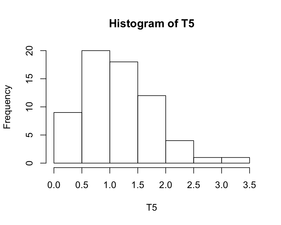
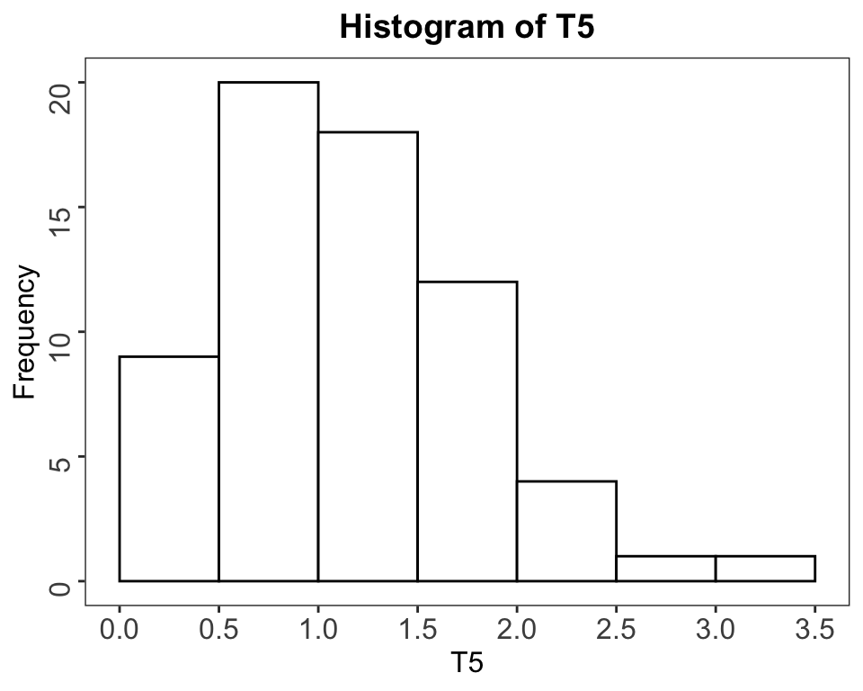
Figure 2.4: Left: Historgram with hist. Right: Same Histogram recreated with ggplot
When the number of observed values is relatively small, it might be sometimes better instead to present the absolute values to use the height of a spike indicating the relative values. For this graphic representation, you can use the Wilcox function splot().
hist function with splot)
##
## Attaching package: 'scales'
## The following object is masked from 'package:purrr':
##
## discard## The following object is masked from 'package:readr':
##
## col_factor## The following objects are masked from 'package:psych':
##
## alpha, rescale> f <- c(rep.int(1, 12), rep.int(2, 22), rep.int(3, 32), rep.int(4, 19), rep.int(5,
+ 8))
> with(allfun, {
+ splot(f, xlab = "X", ylab = "Rel. Freq.")
+ })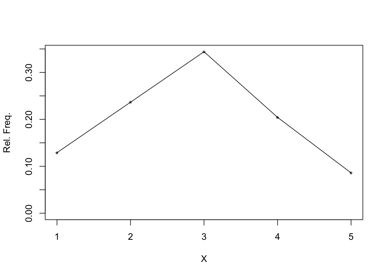
## $n
## [1] 93
##
## $frequencies
## [1] 12 22 32 19  8
##
## $rel.freq
## [1] 0.12903226 0.23655914 0.34408602 0.20430108 0.08602151
To compare, I have also calculated and displayed the spike demonstration with the package ggplot2.
hist function with ggplot2)
## Warning: `as.tibble()` is deprecated, use `as_tibble()` (but mind the new semantics).
## This warning is displayed once per session.
> ggplot(F, aes(x = as.integer(value), y = z)) + geom_line() + scale_y_continuous(labels = percent) +
+ labs(x = "X", y = "Rel. Freq.")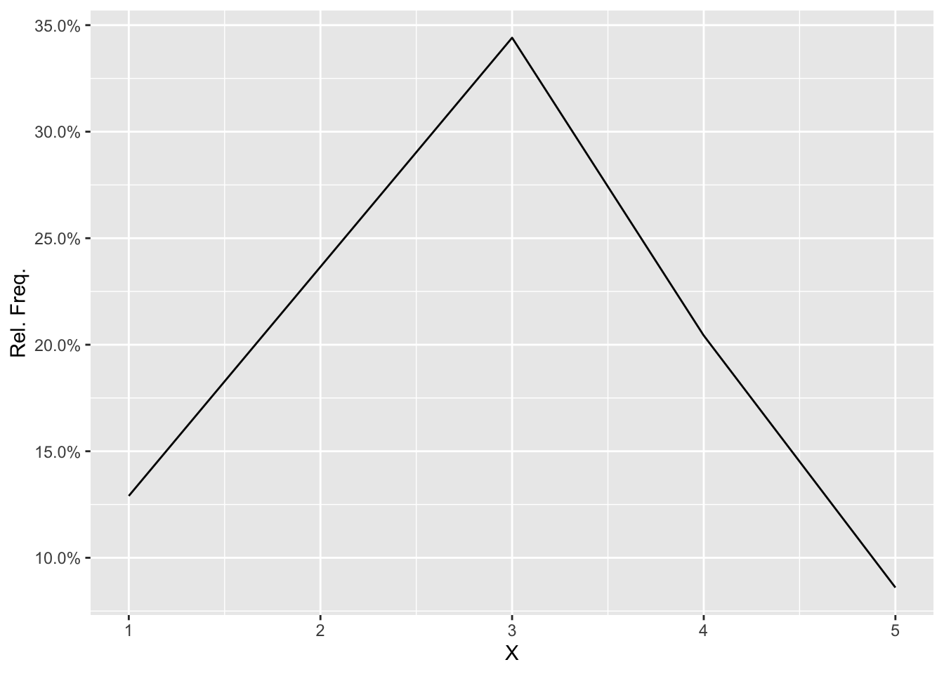
Another problem with histograms is that they are sensible about the number of outliers. In symmetric or bell-shaped distributions, a histogram of a sample of 100 observations is satisfactory, but when outliers are relatively common, you would need a much bigger sample size.
2.5 Kernel Density Estimators
Kernel density estimators are a large class of methods to improve histograms, e.g., to get a better sense of the overall shape of the data. Kernel density estimators empirically determine which observed values are close to the value of interest. They are based on some measure of variation, such as the interquartile range or the sample variance. Then the proportion of such points is computed.
This explanation is only a very rough approximation; the details go beyond the scope of the book.
Wilcox provides the functions kdplot and akerd.
2.6 Stem-and-leaf Displays
Stem-and-leaf Displays are another method to gain some overall sense of what data are like. The following example demonstrates the technique. The data are drawn from a study aimed at understanding how children acquire reading skills.
Word Identification Scores:
58,58,58,58,58,64,64,68,72,72,72,75,75,77,77,79,80,82,82, 82,82,82,84,84,85,85,90,91,91,92,93,93,93,95,95,95,95,95, 95,95,95,98,98,99,101,101,101,102,102,102,102,102,103,104,104,104,104, 104,105,105,105,105,105,107,108108,110,111,112,114,119,122,122,125,125,125, 127,129,129,132,134
The construction of the stem-and-leaf display begins by separating each value into two components. The first is the leaf, which, in this example, is the number in the one’s position (the single digit just to the left of the decimal place). For example:
the leaf corresponding to the value 58 is 8, the leaf corresponding to the value 64 is 4, the leaf corresponding to the value 125 is 5.
The digits to the left of the leaf are called stem. Continuing with the above example:
the stem corresponding to the value 58 is 5, the stem corresponding to the value 64 is 6, the stem corresponding to the value 125 is 12.
To display the graph, one can use the built-in function stem.
> sx <- c(58, 58, 58, 58, 58, 64, 64, 68, 72, 72, 72, 75, 75, 77, 77, 79, 80,
+     82, 82, 82, 82, 82, 84, 84, 85, 85, 90, 91, 91, 92, 93, 93, 93, 95, 95,
+     95, 95, 95, 95, 95, 95, 98, 98, 99, 101, 101, 101, 102, 102, 102, 102, 102,
+     103, 104, 104, 104, 104, 104, 105, 105, 105, 105, 105, 107, 108, 108, 110,
+     111, 112, 114, 119, 122, 122, 125, 125, 125, 127, 129, 129, 132, 134)
> stem(sx)
##
## The decimal point is 1 digit(s) to the right of the |
##
## 5 | 88888
## 6 | 448
## 7 | 22255779
## 8 | 0222224455
## 9 | 011233355555555889
## 10 | 1112222234444455555788
## 11 | 01249
## 12 | 22555799
## 13 | 24There are five children with a score of \(58\), so there are five scores with a leaf of \(8\). The five 8s reflect this data structure on the right side of the sign “|”, which represents the level where the leaves connect with the stem.
2.7 Skewness
When applying classic inferential techniques, it is crucial to have symmetric data. If the data are skewed (for instance, to the right, e.g., the longer tail corresponds to the right side), serious concerns arise that require more complex modern inferential techniques. Sometimes transforming data (e.g., to take logarithms) can help.
The above paragraph is just a warning. More about techniques to work with skewed distribution will follow in the later chapters of the book.
2.8 Choosing a measure of location
To answer the question “how to decide which measure of location to use” in detail is not possible at this stage of knowledge. What follows are just general rules of thumb:
- The optimal measure of location depends in part of the nature of the histogram for the entire population of individuals.
- When the population histogram is reasonable symmetric and light-tailed, roughly meaning outliers are relatively rare, the sample mean performs well.
- When working with a small sample size (less than 100), then extreme care should be taken as the mean of the population could be very different from the sample.
- When dealing with situations where outliers are relatively common, one should use the median or the 20% trimmed mean, even when the population is sysmmetric.
- When the population histogram is skewed, there are advantages to use the median or the 20% trimmed mean.
To sum up with two conclusions:
- Always check for skewness and outliers with the methods mentioned in this chapter.
- The 20% trimmed mean is for most practical purposes an excellent choice.
2.9 Exercises
2.9.1 Exercise 01
For the observations “21, 36, 42, 24, 25, 36, 35, 49, 32” verify that the sample mean, 20% trimmed mean, and the median are \(\bar{X} = 33.33\), \(\bar{X}_{t} = 32.9\), and \(M = 35\).
> ex1 <- c(21, 36, 42, 24, 25, 36, 35, 49, 32)
> X1 <- format(round(mean(ex1), 2), nsmall = 2)
> Xt1 <- format(round(mean(ex1, trim = 0.2), 2), nsmall = 2)
> M1 <- format(round(median(ex1), 2), nsmall = 2)
Verify the following measures:
| Dispersion measure | Reference value | My actual value |
|---|---|---|
| Sample mean | 33.33 | \(\bar{X}\) = 33.33 |
| 20% trimmed mean | 32.90 | \(\bar{X}_{t}\) = 32.86 |
| Median | 35.00 | \(M\) = 35.00 |
2.9.2 Exercise 02
Replace the highest value from vector ex1 (= 49) with 200 and calculate the same values as in ex1. Verify that the sample mean is now \(\bar{X} = 50.1\), but the trimmed mean and median are not changed and still \(\bar{X}_{t} = 32.9\), resp. \(M = 35\). What does this illustrate about the resistance of the sample mean?
> ex2 <- c(21, 36, 42, 24, 25, 36, 35, 200, 32)
> X2 <- format(round(mean(ex2), 2), nsmall = 2)
> Xt2 <- format(round(mean(ex2, trim = 0.2), 2), nsmall = 2)
> M2 <- format(round(median(ex2), 2), nsmall = 2)
Verify the following measures:
| Dispersion measure | Reference value | My actual value |
|---|---|---|
| Sample mean | 50.10 | \(\bar{X}\) = 50.11 |
| 20% trimmed mean | 32.90 | \(\bar{X}_{t}\) = 32.86 |
| Median | 35.00 | \(M\) = 35.00 |
Despite one much bigger value, the trimmed mean and the median are resilient and have not changed, whereas the sample mean is not robust and has therefore changed a lot.
2.9.3 Exercise 03
For the data in ex1, what is the minimum number of observations that must be altered so that the 20% trimmed mean is greater than 1000?
The vector ex1 has length(ex1) (= 9), 20% from every side = more than 1 but less than 2. So two values must be altered.
> ex3a <- c(21, 36, 42, 24, 25, 36, 35, 10000, 32)
> ex3b <- c(21, 36, 10000, 24, 25, 36, 35, 10000, 32)
> Xt3a <- format(round(mean(ex3a, trim = 0.2), 2), nsmall = 2)
> Xt3b <- format(round(mean(ex3b, trim = 0.2), 2), nsmall = 2)
The 20% trimmed mean of ex3a (just one value altered) = 32.86. In contrast with ex3b (where two values are altered): 1455.43.
2.9.4 Exercise 04
Repeat the previous problem but use the median instead. What does this illustrate about the resistance of the mean, median, and trimmed mean?
The sorted data of ex1 is “21, 24, 25, 32, 35, 36, 36, 42, 49” and their median is 35.
The median in ex2 is still 35, and the median of ex3b is also 35, again precisely the same value.
You have to rise to the amount of \(10.000\) more than half of the values of the data from example #1 to overcome the resistance of the median: \(n = 9\), so \(9 \times 0.5 = 4.5\). This result means that a substantial change in the median requires altering at least five observations.
In contrast: The mean is changing with only one outlier, and the trimmed values change with the percentage of their trimming. The resistance of the measure is expressed in the finite sample breakdown point.
| Measure | Finite sample breakdown point |
|---|---|
| Mean | 1/n |
| Median | 0.50 |
| 20% trimmed mean | 0.20 |
| 20% winsorized mean | 0.20 |
| sample variance + sd | 1/n |
| IQR | 0.25 |
| Winsorized variance | 0.20 |
| MAD | 0.50 |
| MAD-Median rule | 0.50 |
| Boxplot | 0.25 |
| One step M | 0.50 |
2.9.5 Exercise 05
For the observations “6, 3, 2, 7, 6, 5, 8, 9, 8, 11” verify that the sample mean, 20% trimmed meand, and median are \(\bar{X} = 6.5\), \(\bar{X}_{t} = 6.7\), and \(M = 6.5\).
> ex5 <- c(6, 3, 2, 7, 6, 5, 8, 9, 8, 11)
> X5 <- format(round(mean(ex5), 2), nsmall = 2)
> Xt5 <- format(round(mean(ex5, trim = 0.2), 2), nsmall = 2)
> M5 <- format(round(median(ex5), 2), nsmall = 2)
Verification:
| Dispersion measure | Reference value | My actual value |
|---|---|---|
| Sample mean | 6.5 | \(\bar{X}\) = 6.50 |
| 20% trimmed mean | 6.7 | \(\bar{X}_{t}\) = 6.67 |
| Median | 6.5 | \(M\) = 6.50 |
2.9.6 Exercise 06
A class of fourth graders was asked to bring a pumpkin to school. Each of the 29 students counted the number of seeds in their pumpkin and the results were:
250, 220, 281, 247, 230, 209, 240, 160, 370, 274, 210, 204, 243, 251, 190, 200, 130, 150, 177, 475, 221, 350, 224, 163, 272, 236, 200, 171, 98.
(The data were supplied by Mrs. Capps at the La Cañada elementary school.) Verify that the sample mean, 20% trimmed meand, and the median are \(\bar{X} = 229.2\), \(\bar{X}_{t} = 220.8\), and \(M = 221\).
> ex6 <- c(250, 220, 281, 247, 230, 209, 240, 160, 370, 274, 210, 204, 243, 251,
+     190, 200, 130, 150, 177, 475, 221, 350, 224, 163, 272, 236, 200, 171, 98)
> X6 <- format(round(mean(ex6), 2), nsmall = 2)
> Xt6 <- format(round(mean(ex6, trim = 0.2), 2), nsmall = 2)
> M6 <- format(round(median(ex6), 2), nsmall = 2)
Verification:
| Dispersion measure | Reference value | My actual value |
|---|---|---|
| Sample mean | 229.2 | \(\bar{X}\) = 229.17 |
| 20% trimmed mean | 220.8 | \(\bar{X}_{t}\) = 220.79 |
| Median | 221.0 | \(M\) = 221.00 |
2.9.7 Exercise 07
Suppose health inspectors rate sanitation conditions at restaurants on a five-point scale where a 1 indicates poor conditions and a 5 is excellent. Based on a sample of restaurants in a large city, the frequencies are found to be \(f_{1} = 5\), \(f_{2} = 8\), \(f_{3} = 20\), \(f_{4} = 32\), and \(f_{5} = 23\). What is the sample size, \(n\)? Verify that the sample mean is \(\bar{X} = 3.7\).
> ex7 <- c(rep.int(1, 5), rep.int(2, 8), rep.int(3, 20), rep.int(4, 32), rep.int(5,
+     23))
> n7 <- length(ex7)
> X7 <- format(round(mean(ex7), 2), nsmall = 2)
The sample size \(n\) = 88 and the mean \(\bar{X}\) = 3.68.
2.9.8 Exercise 08
For the frequencies \(f_{1} = 12\), \(f_{2} = 18\), \(f_{3} = 15\), \(f_{4} = 10\), \(f_{5} = 8\), and \(f_{6} = 5\), verify that the sample mean is 3. (Here I am using another calculation provided by the Wilcox solution paper.)
> ex8 <- c(12, 18, 15, 10, 8, 5)
> n8 <- sum(ex8)
> x8 <- c(1:6)
> X8 <- sum(x8 * ex8)/n8  # The sample mean
The sample size \(n\) = 68 and the mean \(\bar{X}\) = 2.9852941.
2.9.9 Exercise 09
For the observations 21,36,42,24,25,36,35,49,32 verify that the sample variance and the sample Winsorized variance are \(s^2 = 81\), \(s^2_{w} = 51.4\).
> ex9 <- c(21, 36, 42, 24, 25, 36, 35, 49, 32)
> X9var <- var(ex9)
> X9winvar <- with(allfun, {
+     format(winvar(ex9), nsmall = 2)
+ })
The sample variance in my calculation is \(s^2\) = X9var = 81 and the sample Winsorized variance \(s^2_{w}\) = X9winvar = 51.36111.
2.9.10 Exercise 10
Inthe previous example, what is the Winsorized variance if the value 49 is increased to 102, e.g., the new data vector is: 21,36,42,24,25,36,35,102,32.
> ex10 <- c(21, 36, 42, 24, 25, 36, 35, 102, 32)
> X10winvar <- with(allfun, {
+     format(winvar(ex10), nsmall = 2)
+ })
The Winsorized variance remained the same = X10winvar = 51.36111.
2.9.11 Exercise 11
In general, will the Winsorized sample variance, \(s^2_{w}\), be less than the sample variance, \(s^2\)?
Yes, because we shift the extreme values closer to the mean. This change reduces the dispersion in the data. The mean squared distances from the mean decreases accordingly.
2.9.12 Exercise 12
Among a sample of 25 participants, what is the minimum number of participants that must be altered to make the sample variance arbitrarily large?
Just a single observation as the sample breakpoint point is \(1/n\).
2.9.13 Exercise 13
Repeat the previous problem but for \(s^2_{w}\) instead. Assume 20% Winsorization.
The sample breakdown point of the 20% Winsorized variance is 0.2. In the case of \(n=25\), this would be \(25 \times 0.2 = 5\). So, we need to change at least six observations to render the Winsorized variance arbitrarily large.
2.9.14 Exercise 14
For the observations 6,3,2,7,6,5,8,9,8,11 verify that the sample variance and Winsorized variance are 7.4 and 1.8, respectively.
> ex14 <- c(6, 3, 2, 7, 6, 5, 8, 9, 8, 11)
> X14var <- var(ex14)
> X14winvar <- with(allfun, {
+     format(winvar(ex14), nsmall = 2)
+ })
Verification: Sample variance = 7.3888889 and Winsorized variance = 1.822222.
2.9.15 Exercise 15
For the data in Exercise 2.6 verify that the sample variance is 5584.9 and the winsorized sample variance is 1375.6
Verification: Sample variance = 5584.9334975 and Winsorized variance = 1375.6059113.
2.9.16 Exercise 16
For the data in Excercise 2.11, determine the ideal fourths and the corresponding interquartile range.
The lower quartile q16$ql = 4.8333333.
The upper quartile q16$qu = 8.0833333.
The IQR is the difference = 3 or ìqr16` = 3.25.
Note: With the Wilcox-Solution, the figures are not integers but:
The lower quartile = 4.833333. The upper quartile = 8.083333. The IQR is the difference = \(8.083-4.833=3.25\).
I do not know what the reason is for the difference as I am using the same functions.
2.9.17 Exercise 17
For the data used in Excercise 2.6, which values would be declared outliers using the rule-based on MAD?
> ex6 <- c(250, 220, 281, 247, 230, 209, 240, 160, 370, 274, 210, 204, 243, 251,
+     190, 200, 130, 150, 177, 475, 221, 350, 224, 163, 272, 236, 200, 171, 98)
> X17 <- with(allfun, {
+     out(sort(ex6))
+ })
> X17.n <- X17$n.out
> X17.val <- X17$out.val
For the data used in Exercise 2.6 there are 4 outliers: 98, 350, 370, 475.
2.9.18 Exercise 18
Devise a method for computing the sample variance based on the frequencies, \(f_x\).
2.9.18.1 Formula for the sample variance
\[s^2 = \frac{1}{n-1} \sum (X_{i} - \bar{X})^2\]
2.9.18.2 Formula for the sample variance based on frequencies
\[s^2 = \frac{n}{n-1} \sum (x_{i} - \bar{X})^2\frac{f_{x}}{n}\]
2.9.19 Exercise 19
One million couples are asked how many children they have. Suppose the relative frequencies are \[f_{0}/n = 0.10,\, f_{1}/n = 0.20,\, f_{2}/n = 0.25,\, f_{3}/n = 0.29,\, f_{4}/n = 0.12,\, f_{5}/n = 0.04\] Compute the sample variance.
> x19 <- c(0:5)
> ex19 <- c(0.1, 0.2, 0.25, 0.29, 0.12, 0.04)  # relative frequencies
> x19bar <- sum(x19 * ex19)
> X19 <- sum((x19 - x19bar)^2 * ex19)  # The sample variance
The sample variance = 1.6675.
2.9.20 Exercise 20
For a sample of participants, the relative frequencies are \[f_{0}/n = 0.20,\, f_{1}/n = 0.4,\, f_{2}/n = 0.2,\, f_{3}/n = 0.15,\, f_{4}/n = 0.05\] The sample mean is 1.45. Using the answer in Exercise 2.9.18, verify that the sample variance is 1.25
> x20 <- c(0:4)
> ex20 <- c(0.2, 0.4, 0.2, 0.15, 0.05)  # relative frequencies
> x20bar <- sum(x20 * ex20)  # calculated, but figure is already given with 1.45
> X20 <- sum((x20 - x20bar)^2 * ex20)  # The sample variance
Verification: The sample mean is already given with 1.45. But my calculation results precisely to the same value of 1.45. The sample variance is 1.2475.
2.9.21 Exercise 21
Snedecor and Cochran (1967) report results from an experiment on weight gain in rats as a function of the source of protein and levels of protein. One of the groups was fed beef with a low amount of protein. The weight gains were \[90,\, 76,\ 90,\ 64,\ 86,\ 51,\ 72,\ 90,\ 95,\ 78\] Verify that there are no outliers among these values when using a boxplot, but there is an outlier using the MAD-median rule.
> ex21 <- c(90, 76, 90, 64, 86, 51, 72, 90, 95, 78)
> boxplot(ex21, notch = FALSE, ylab = "Weight gains in gram", xlab = "Rats")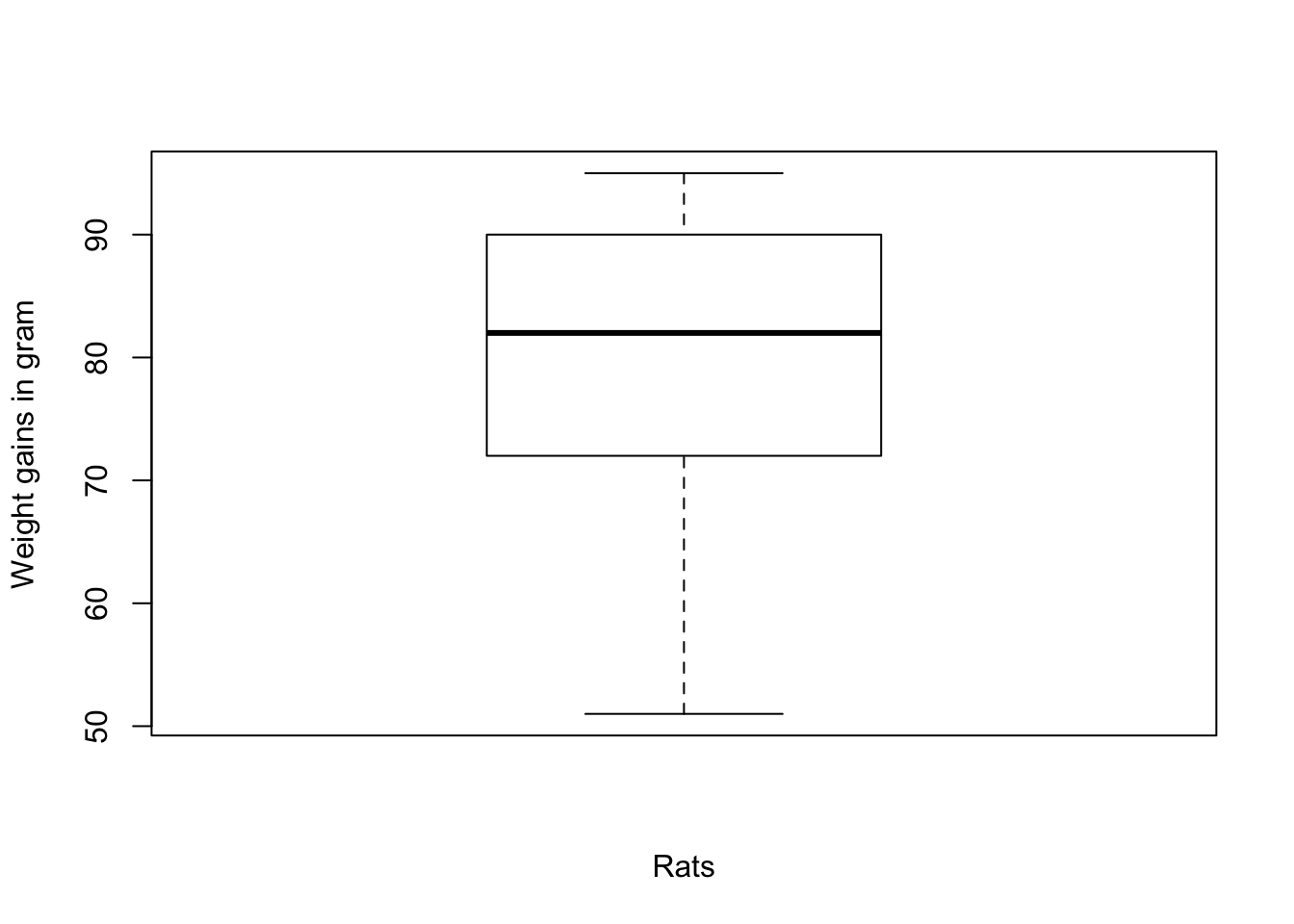
Figure 2.5: Graphical boxplot representation of the boxplot data.
The boxplot graphics shows that there are no outliers. Calculating the figures of the graph with boxplot.stats(ex21)$stats we get the vector 51, 72, 82, 90, 95 where the figures is sequence are:
- the extreme of the lower whisker (51),
- the lower ‘hinge’ (72),
- the median (82),
- the upper ‘hinge’ (90), and
- the extreme of the upper whisker (95).
As there are in the data now values outside of the extremes of lower and upper whisker, there are no outliers dectected by the boxplot rule. We get the same empty list of values with the standard and modified boxplot rules via the outbox() function. But with the MAD-median rule we observe one outlier:
> out21.1 <- boxplot.stats(ex21)$out
> out21.2 <- with(allfun, {
+     outbox(ex21, mbox = FALSE)$out.val
+ })
> out21.3 <- with(allfun, {
+     outbox(ex21, mbox = TRUE)$out.val
+ })
> out21.4 <- with(allfun, {
+     out(ex21)$out.val
+ })| Rule | List of outliers |
|---|---|
| boxplot.stats | |
| outbox, mbox = FALSE | |
| outbox. mbox = TRUE | |
| out | 51 |
2.9.22 Exercise 22
There are no outliers for the values: \[1,2,3,4,5,6,7,8,9,10\] If you increase 10 to 10, then 20 would be declared an outlier by a boxplot.
- If the value \(9\) is also increased to \(20\), would the boxplot find two outliers?
- If the value \(8\) is also increased to \(20\), would the boxplot find all three outliers?
> ex22.1 <- c(1, 2, 3, 4, 5, 6, 7, 8, 9, 10)
> ex22.2 <- c(1, 2, 3, 4, 5, 6, 7, 8, 9, 20)
> ex22.3 <- c(1, 2, 3, 4, 5, 6, 7, 8, 20, 20)
> ex22.4 <- c(1, 2, 3, 4, 5, 6, 7, 20, 20, 20)
The following table summarizes the result with the R code boxplot.stats(ex22.?)$out where ? is substituted by the variant number.
| Data | List of outliers |
|---|---|
| \(1,2,3,4,5,6,7,8,9,10\) | |
| \(1,2,3,4,5,6,7,8,9,20\) | 20 |
| \(1,2,3,4,5,6,7,8,20,20\) | 20, 20 |
| \(1,2,3,4,5,6,7,20,20,20\) |
Verification:
- Two outliers are found.
- No outliers are found because now the number of outliers inflates the upper quartile, which in turn in boosts the interquartile range.
2.9.23 Exercise 23
Use the result of the last exercise to come up with a general rule about how many outliers a boxplot can detect.
Because the IQR has a finite sample breakdown point of 0.25 (see table 2.6 inside exercise 2.9.4), more than 25% of the data must be outliers before the problem of masking occurs. For example, when we had three outliers with \(n=10\), all outliers disappeared in exercise 2.9.22.
2.9.24 Exercise 24
For the data of vector T5 in example 2.13 verify that the value \(3.05\) is an outlier based on the boxplot rule.
With the formula boxplot.stats(T5)$out we get correctly the value 3.05.
2.9.25 Exercise 25
Looking at what approximately is the interquartile range? How large or small must a value be, to be declared an outlier?
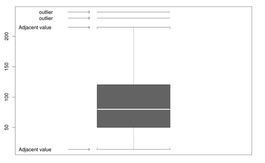
Figure 2.6: Estimate outliers with this boxplot graphics. Copied from the Wilcox book, p.35.
The upper and lower quartiles in are approximately 125 and 50, respectively, so x is declared an outlier when \[x > 125 + 1.5 \times (125 - 50)\] \[x < 50 - 1.5 \times (125 - 50)\]
2.9.26 Exercise 26
In a study conducted by M. Earleywine, one goal was to measure hagover symptoms after consuming a specific amount of alcohol in a laboratory setting. The resulting measures, written in ascending order, were: \[0,0,0,0,0,0,0,0,0,0,0,0,0,0,0,0,0,0,0,0,0,0,1,2,2,2,3,3,3,6,8,9,11,11,11,12,18,32,32,41\]
Construct a histogram. Then use the functions outbox() and out() to determine which values are outliers. Additionally, comment on using the histogram as an outlier detection method.
> ex26 <- c(0, 0, 0, 0, 0, 0, 0, 0, 0, 0, 0, 0, 0, 0, 0, 0, 0, 0, 0, 0, 0, 0,
+     1, 2, 2, 2, 3, 3, 3, 6, 8, 9, 11, 11, 11, 12, 18, 32, 32, 41)
> hist(ex26, main = "Histogram of hangover symptoms after consuming alcohol",
+     xlab = "Amount of alcohol orally administered in laboratory setting")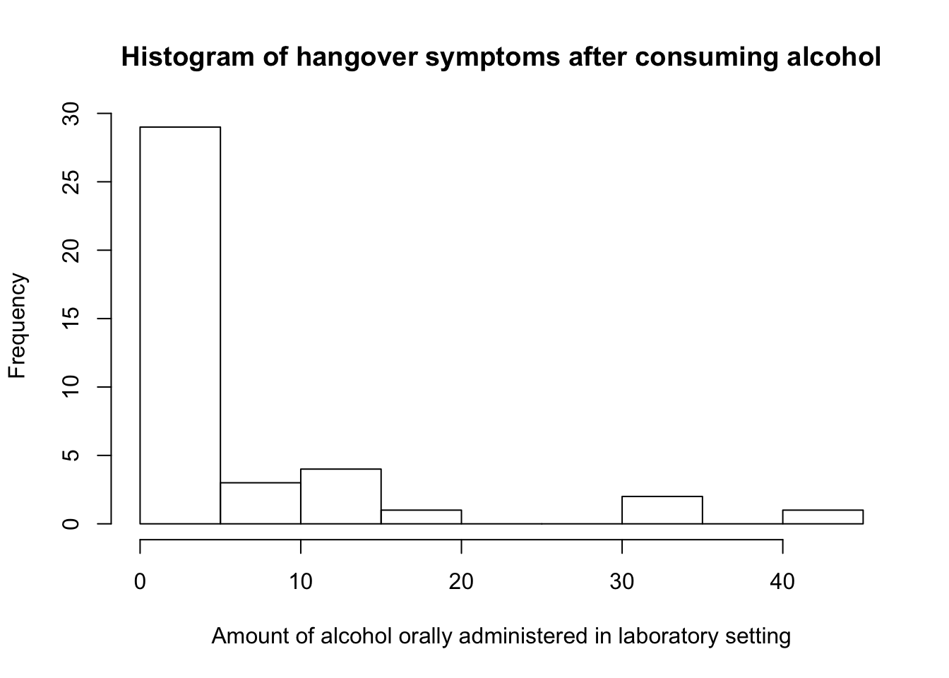
- With the
outbox()function the detected outliers are: 18, 32, 32, 41. - Whereas with the
out()function, all values not equal to zero are flagged as outliers: 1, 2, 2, 2, 3, 3, 3, 6, 8, 9, 11, 11, 11, 12, 18, 32, 32, 41.
Histograms are sensible about the number of outliers. In symmetric or bell-shaped distributions, a histogram of a sample of \(100\) observations is satisfactory, but when outliers are relatively common, you would need a much bigger sample size.
References
Snedecor, G. W., and W. Cochran. 1967. Statistical Methods. 6th ed. The Iowa State University Press.