url <- "https://raw.githubusercontent.com/emtechinstitute/MachineLearning/main/shoesize.csv"
tib <- readr::read_csv(url, col_types = "ifdd")

## data cleaning:
## only two values of the Height column are doubles.
## Index 178 and 208 (row 179 & 209)
## See details in "/my_notes/changing-cell-values.qmd"

tib <- tib |>
    dplyr::mutate(Height = round(Height, 0)) |>
    dplyr::mutate(Height = vctrs::vec_cast(Height, integer()))

saveRDS(tib, "data/shoesize.rds")Appendix A — 2D continuous probability example
Note
In this section I try to reproduce Figure 3.7. (Lambert, Ben. A Student’s Guide to Bayesian Statistics (S.44). SAGE Publications. Kindle-Version.)
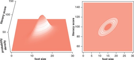
To reproduce Figure 3.7 I would need a data set. As I couldn’t find the data Lambert is referring to (“Foot length and literacy”) I am going to use another data set about the relation between shoe size and height (McLaren 2012).
Wach out!
The links to the additional material in the article are not valid anymore. The correct URLs are:
- data set: https://jse.amstat.org/v20n3/mclaren/shoesize.xls. There are also other places where you can inspect and download the data set, e.g. at the Emerging Technology Institute.
- data documentation: https://jse.amstat.org/v20n3/mclaren/documentation.doc
- instructor manual: https://jse.amstat.org/v20n3/mclaren/manual.doc
A.1 Figure 3.7: Left panel
To generate the left panel I have to look into packages for 3D graphic. I am at the moment not interested in the 3D display but I have googled some interesting packages for later to learn and to apply:
- graphics::persp(): This Base R function draws perspective plots of a surface over the x–y plane.
- rgl::plot3d(): Draws a 3D interactive scatterplot but also other 3D visualizations by using OpenGL, the industry standard for high performance graphics. (I think “rgl” stands for “R Graphic Library”). RGL is a 3D real-time rendering system for R.
-
plotly::plot_ly(): With the argument
type=surface{plotly} generates an interactive surface plot. But {plotly} has many more option for plotting 3D graphs. - scatterplot3d::scatterplot3d(): Plots a three dimensional (3D) point cloud.
-
plot3D::scatter3D(): It containing many functions for 2D and 3D plotting:
scatter3D(),points3D(),lines3D(),text3D(),ribbon3D(),hist3D(), etc. (I could neither find the vignettes nor the github repo.) -
car::scatter3d(): The function
scatter3d()uses the {rgl} package to draw and animate 3D scatter plots.
A.2 Figure 3.7: Right panel
The contour plot of the right panel I could draw with ggplot2::geom_contour(). But I have still to learn how to calculate the probability distribution.
A.3 Download data
The next code chunk has to run only once.
A.4 Scatterplot
Now that I have the data I can inspect the data and plot the relation of shoe size and height. I am going to use the position = "jitter" argument to prevent overplotting and to show all data.
#> Classes 'tbl_df', 'tbl' and 'data.frame':    408 obs. of  4 variables:
#>  $ Index : int  1 2 3 4 5 6 7 8 9 10 ...
#>  $ Gender: Factor w/ 2 levels "F","M": 1 1 1 1 1 1 1 1 1 1 ...
#>  $ Size  : num  5.5 6 7 8 8 9 7.5 6.5 5 6 ...
#>  $ Height: int  60 60 60 60 60 60 60 60 60 61 ...
tib |>
ggplot2::ggplot(ggplot2::aes(Size, Height)) +
ggplot2::geom_point(position = "jitter")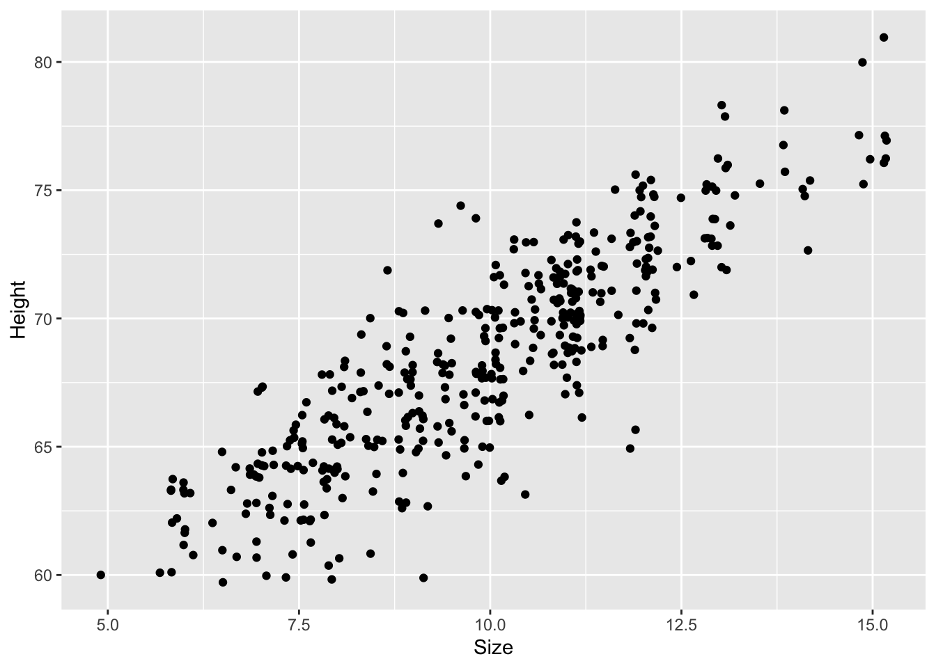
As I do not have experience with inches here are two websites for converting the values:
Wach out!
The same numbers for women and men shoes result in different length values!
A.5 Height distribution
Listing A.1: Plot the distribution of the heights, overlaid by an ideal Gaussian distribution
tib |>
    ggplot2::ggplot(ggplot2::aes(Height)) +
    ggplot2::geom_density() +

    ggplot2::stat_function(
        fun = dnorm,
        args = with(tib, c(mean = mean(Height), sd = sd(Height)))
    ) +
    ggplot2::scale_x_continuous("Height in inches") +
    ggplot2::scale_y_continuous("Density")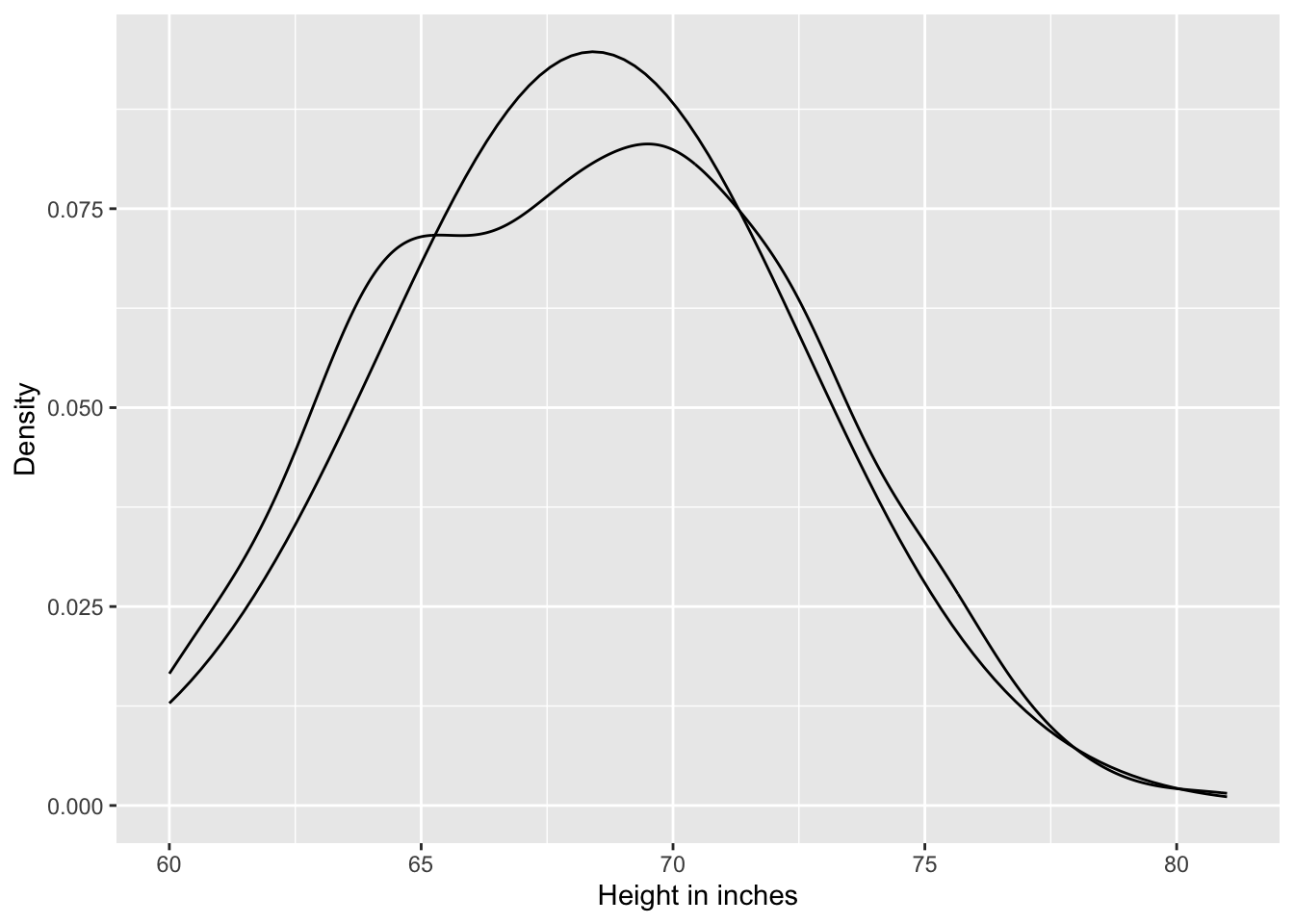
A.6 Defining priors for Gaussian heights model
A.6.1 Formula
Definition A.1 (Define priors for \(\mu\) and \(\sigma\) for the Gaussian height model) \[ \begin{align*} h_{i} \sim \operatorname{Normal}(μ_{i}, σ) \\ \mu \sim \operatorname{Normal}(70, 8) \\ \sigma \sim \operatorname{Uniform}(0, 20) \end{align*} \tag{A.1}\]
A.6.2 Plot \(\mu\)
The prior for \(\mu\) is a broad Gaussian prior, centered on 70 in (177.8 cm), with 95% of probability between 70 ± 16 in. The range from 54 in to 86 in (137.16 to 218,44cm) encompasses a huge range of plausible mean heights for human populations.
It is always important to plot the priors, so you get a sense of the assumption they build into the model.
Listing A.2: Plot the chosen mean prior
p1 <-
  tibble::tibble(x = seq(from = 40, to = 100, by = .1)) |>

  ggplot2::ggplot(ggplot2::aes(x = x, y = dnorm(x, mean = 70, sd = 8))) +
  ggplot2::geom_line() +
  ggplot2::scale_x_continuous(breaks = seq(from = 40, to = 100, by = 10)) +
  ggplot2::labs(title = "mu ~ dnorm(70, 8)",
        x = "height in inches",
       y = "density")

p1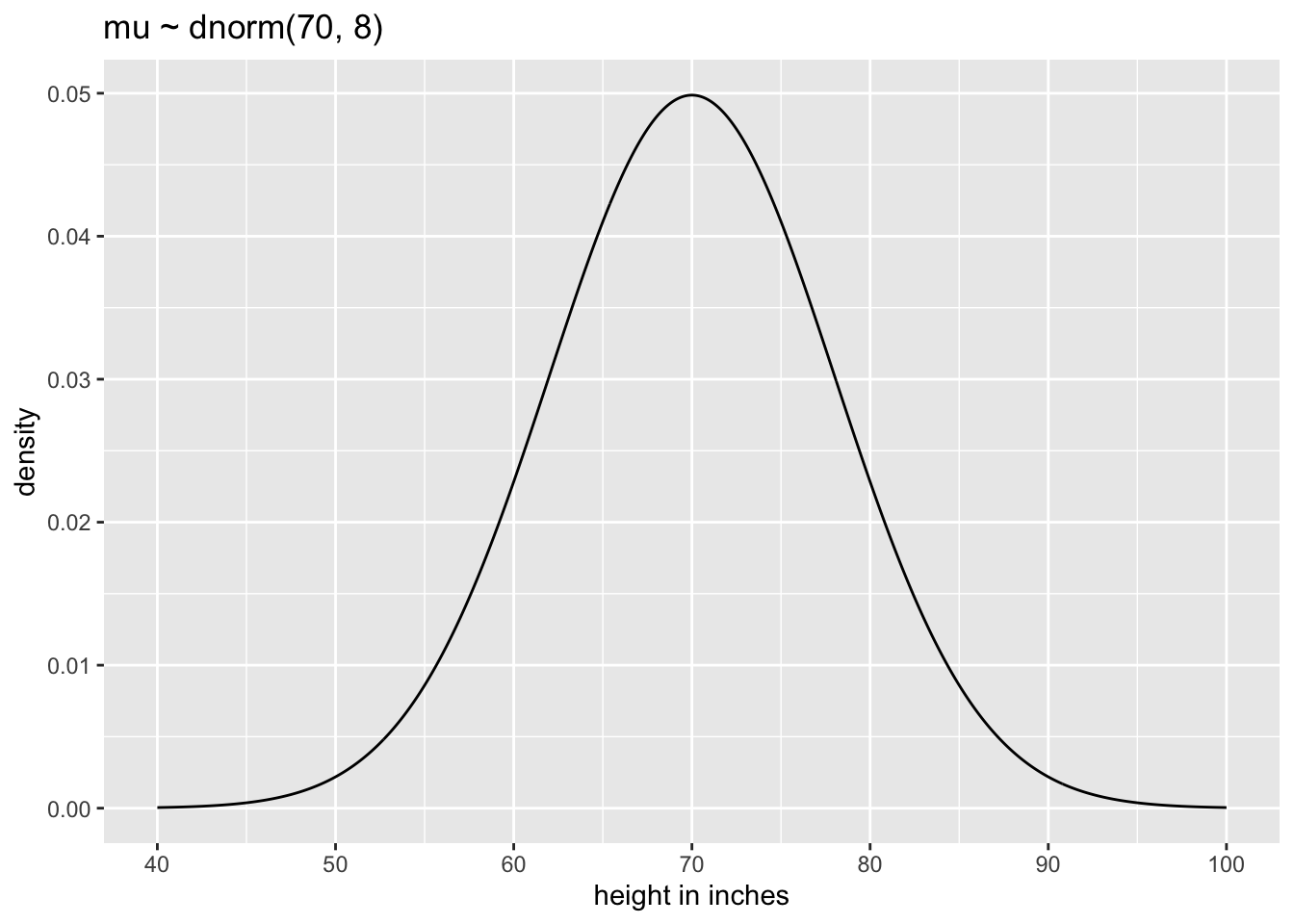
The chosen prior is assuming that the average height (not each individual height) is almost certainly between 43 and 97 in (=109,22 and 246,38 cm). So this prior carries a little information, but not a lot.
A.6.3 Plot \(\sigma\)
The \(\sigma\) prior is a truly flat prior, a uniform one, that functions just to constrain σ to have positive probability between zero and 20 in (= 50.8 cm).
Listing A.3: Plot the chosen sigma prior
p2 <-
  tibble::tibble(x = seq(from = -10, to = 30, by = .1)) |>

  ggplot2::ggplot(ggplot2::aes(x = x, y = dunif(x, min = 0, max = 20))) +
  ggplot2::geom_line() +
  ggplot2::scale_x_continuous(breaks = seq(from = -10, to = 30, by = 10)) +
  ggplot2::scale_y_continuous(NULL, breaks = NULL) +
  ggplot2::ggtitle("sigma ~ dunif(0, 20)")

p2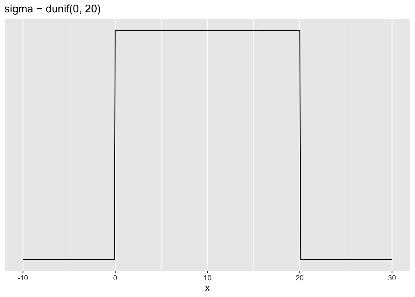
A standard deviation like \(\sigma\) must be positive, so bounding it at zero makes sense. How should we pick the upper bound? In this case, a standard deviation of 20 in (50.8 cm) would imply that 95% of individual heights lie within 40 in (101.6 cm) of the average height. That’s a very large range.
A.6.4 Prior predictive simulation
Thinking about the mean height value is one thing, but it is almost more important to see what these priors imply about the distribution of individual heights. This so-called prior predictive simulation is an essential part of modeling. Once we’ve chosen priors for \(h\), \(\mu\), and \(\sigma\), these imply a joint prior distribution of individual heights. By simulating from this distribution, we can see what our choices imply about observable height. This helps us diagnose bad choices. Lots of conventional choices are indeed bad ones, and we’ll be able to see this through prior predictive simulations.
Okay, so how to do this? You can quickly simulate heights by sampling from the prior. Remember, every posterior is also potentially a prior for a subsequent analysis, so you can process priors just like posteriors. We can simulate from both priors at once to get a prior probability distribution of Height.
Listing A.4: Simulate heights by sampling from the priors:
n <- 1e4
set.seed(4)

sim <-
  tibble::tibble(sample_mu    = rnorm(n, mean = 70, sd  = 8),
         sample_sigma = runif(n, min = 0, max = 20)) |>
  dplyr::mutate(height = rnorm(n, mean = sample_mu, sd = sample_sigma))

p3 <- sim |>
  ggplot2::ggplot(ggplot2::aes(x = height)) +
  ggplot2::geom_density() +
  ggplot2::scale_x_continuous(breaks = seq(from = 0, to = 140, by = 20)) +
  ggplot2::scale_y_continuous(NULL, breaks = NULL) +
  ggplot2::ggtitle("height ~ dnorm(mu, sigma)") +
  ggplot2::theme(panel.grid = ggplot2::element_blank())

p3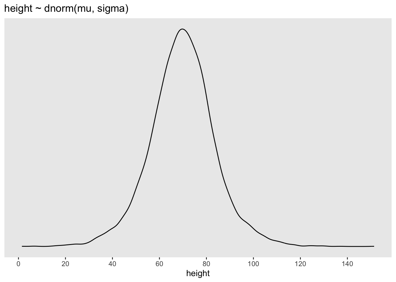
A.7 Linear model
The strategy is to make the parameter for the mean of a Gaussian distribution, μ, into a linear function of the predictor variable and other, new parameters that we invent. This strategy is often simply called the linear model. The linear model strategy instructs the golem to assume that the predictor variable has a constant and additive relationship to the mean of the outcome. The golem then computes the posterior distribution of this constant relationship.
How do we get shoe size into the Gaussian model of height as specified in Equation A.1? Let \(x\) be the name for the column of shoe size measurements, tib$Size. Let the average of the \(x\) values be \(\overline{x}\), “ex bar”. Now we have a predictor variable \(x\), which is a list of measures of the same length as \(h\). To get Size into the model, we define the mean \(\mu\) as a function of the values in \(x\). This is what it looks like, with explanation to follow:
Definition A.2 (Linear model Height against Size) \[
\begin{align*}
h_{i} \sim \operatorname{Normal}(μ_{i}, σ) \space \space (1) \\
μ_{i} = \alpha + \beta(x_{i}-\overline{x}) \space \space (2) \\
\alpha \sim \operatorname{Normal}(70, 8) \space \space (3) \\
\beta \sim \operatorname{Log-Normal}(0,1) \space \space (4) \\
\sigma \sim \operatorname{Uniform}(0, 20) \space \space (5)
\end{align*}
\tag{A.2}\]
Likelihood (Probability of the data): The first line is nearly identical to before, except now there is a little index \(i\) on the \(μ\) as well as the \(h\). You can read \(h_{i}\) as “each height” and \(\mu_{i}\) as “each \(μ\)” The mean \(μ\) now depends upon unique values on each row \(i\). So the little \(i\) on \(\mu_{i}\) indicates that the mean depends upon the row.
Linear model: The mean \(μ\) is no longer a parameter to be estimated. Rather, as seen in the second line of the model, \(\mu{i}\) is constructed from other parameters, \(\alpha\) and \(\beta\), and the observed variable \(x\). This line is not a stochastic relationship – there is no
~in it, but rather an=in it – because the definition of \(\mu{i}\) is deterministic. That is to say that, once we know \(\alpha\) and \(\beta\) and \(x_{i}\), we know \(\mu{i}\) with certainty. – At first we tried a prior with \(\beta \sim \operatorname{Normal}(0,10)\) but it turned out that this prior results in unrealistic data with negative heights. The Log-Normal ensures only positive values. See Image A.6.includes (3),(4) and(5) with \(\alpha, \beta, \sigma\) priors: The remaining lines in the model define distributions for the unobserved variables. These variables are commonly known as parameters, and their distributions as priors. There are three parameters: \(\alpha, \beta, \sigma\). You’ve seen priors for \(\alpha\) and \(\sigma\) before, although \(\sigma\) was called \(\mu\) back then.
A.7.1 Prior precitive simulation
Listing A.5: Calcukate prior with Normal and Normal-Log
## start condition
set.seed(2971)
# how many lines to draw?
n_lines <- 100

## normal model
lines <-
  tibble::tibble(n = 1:n_lines,
         a = rnorm(n_lines, mean = 70, sd = 8),
         b = rnorm(n_lines, mean = 0, sd = 10)) |>
  tidyr::expand_grid(size = range(tib$Size)) |>
  dplyr::mutate(height = a + b * (size - mean(tib$Size)))

p4 <-
  lines |>
  ggplot2::ggplot(ggplot2::aes(x = size, y = height, group = n)) +
  ggplot2::geom_line(alpha = 1/10) +
  ggplot2::ggtitle("b ~ dnorm(0, 10)") +
  ggplot2::theme_classic()

## log-normal model
# make a tibble to annotate the plot

p5 <-
    tibble::tibble(n = 1:n_lines,
           a = rnorm(n_lines, mean = 70, sd = 8),
           b = rlnorm(n_lines, mean = 0, sd = 1)) |>
      tidyr::expand_grid(size = range(tib$Size)) |>
      dplyr::mutate(height = a + b * (size - mean(tib$Size)))  |>

  # plot
  ggplot2::ggplot(ggplot2::aes(x = size, y = height, group = n)) +
  ggplot2::geom_line(alpha = 1/10) +
  ggplot2::ggtitle("log(b) ~ dnorm(0, 1)") +
  ggplot2::theme_classic()

## display plots
library(patchwork)
p4 + p5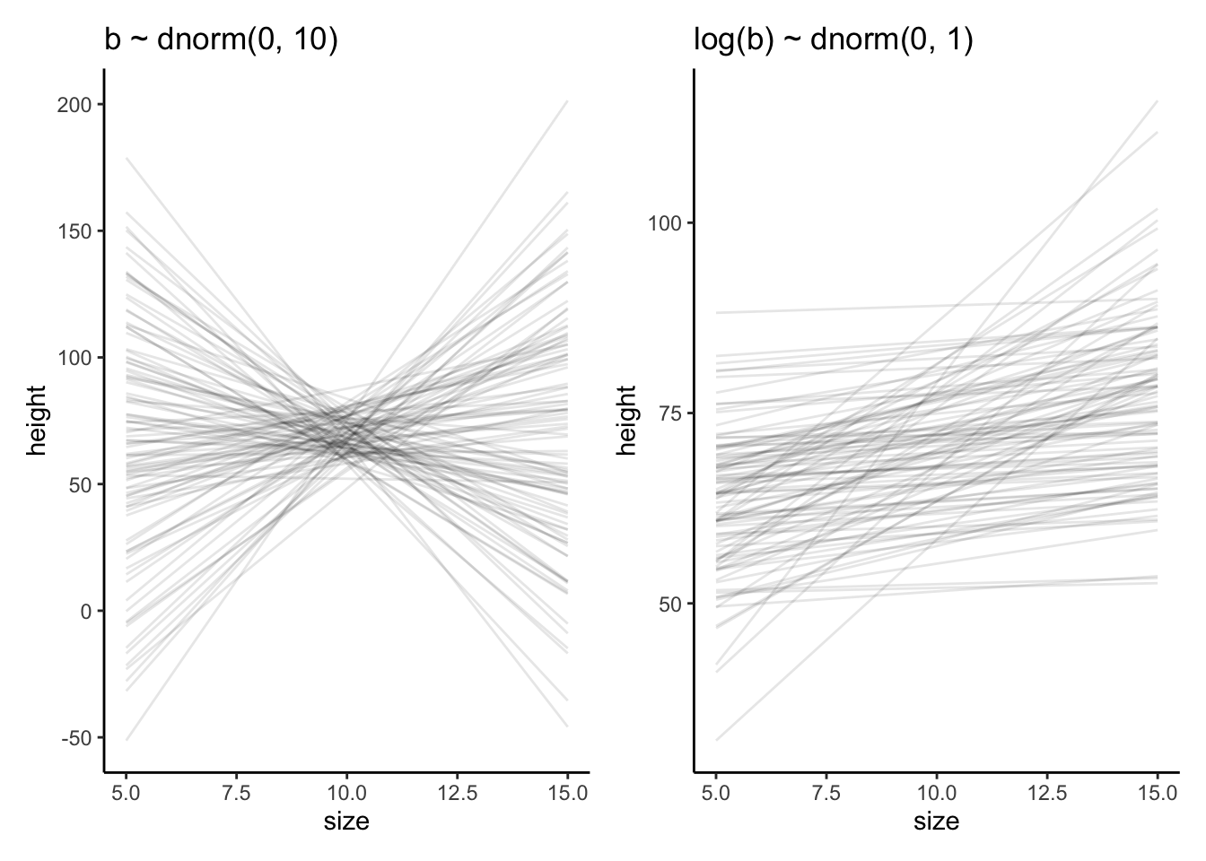
A.7.2 Posterior distribution
A.7.2.1 Fit model with rehtinking priors
Listing A.6: Fit model with priors from the rethinking book, display summary, trace plots and linear correlation
## create new variable for difference Size to mean(Size)
tib <-
  tib |>
  dplyr::mutate(Size_c = Size - mean(Size))

## fit model
lambert.A1.1 <-
  brms::brm(data = tib,
      family = gaussian(),
      Height ~ 1 + Size_c,
      prior = c(brms::prior(normal(70, 8), class = Intercept),
                brms::prior(lognormal(0, 1), class = b, lb = 0),
                brms::prior(uniform(0, 20), class = sigma, ub = 20)),
      iter = 2000, warmup = 1000, chains = 4, cores = 4,
      seed = 42,
      file = "fits/lambert.A1.1")

## display summary
brms:::summary.brmsfit(lambert.A1.1)
#> Family: gaussian
#> Links: mu = identity; sigma = identity
#> Formula: Height ~ 1 + Size_c
#> Data: tib (Number of observations: 408)
#> Draws: 4 chains, each with iter = 2000; warmup = 1000; thin = 1;
#> total post-warmup draws = 4000
#>
#> Population-Level Effects:
#> Estimate Est.Error l-95% CI u-95% CI Rhat Bulk_ESS Tail_ESS
#> Intercept 68.42 0.10 68.22 68.62 1.00 4314 2960
#> Size_c 1.77 0.05 1.67 1.88 1.00 3420 2604
#>
#> Family Specific Parameters:
#> Estimate Est.Error l-95% CI u-95% CI Rhat Bulk_ESS Tail_ESS
#> sigma 2.07 0.07 1.93 2.22 1.00 3870 2970
#>
#> Draws were sampled using sampling(NUTS). For each parameter, Bulk_ESS
#> and Tail_ESS are effective sample size measures, and Rhat is the potential
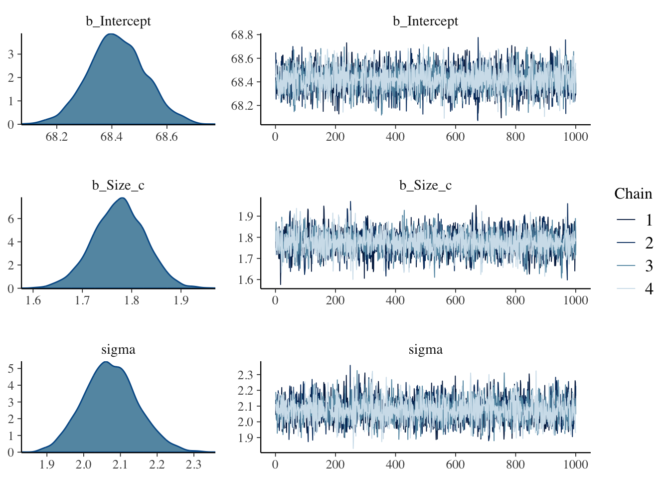
#> scale reduction factor on split chains (at convergence, Rhat = 1).Listing A.7: Fit model with priors from the rethinking book, display summary, trace plots and linear correlation
A.7.2.2 Fit model with priors from brms::get_prior() function
Listing A.8: Fit model with priors from the get_prior function, display summary, trace plots and linear correlation
my_priors <- brms::get_prior(Height ~ 1 + Size_c, data = tib, family = gaussian())

## create new variable for difference Size to mean(Size)
tib <-
  tib |>
  dplyr::mutate(Size_c = Size - mean(Size))

## fit model
lambert.A1.2 <-
  brms::brm(data = tib,
      family = gaussian(),
      Height ~ 1 + Size_c,
      prior = c(brms::prior(student_t(3, 68, 4.4), class = Intercept),
                brms::prior(lognormal(0, 1), class = b, lb = 1),
                brms::prior(student_t(3, 0, 4.4), class = sigma, lb = 0)),
      iter = 2000, warmup = 1000, chains = 4, cores = 4,
      seed = 42,
      file = "fits/lambert.A1.2")

## display summary
brms:::summary.brmsfit(lambert.A1.2)
#> Family: gaussian
#> Links: mu = identity; sigma = identity
#> Formula: Height ~ 1 + Size_c
#> Data: tib (Number of observations: 408)
#> Draws: 4 chains, each with iter = 2000; warmup = 1000; thin = 1;
#> total post-warmup draws = 4000
#>
#> Population-Level Effects:
#> Estimate Est.Error l-95% CI u-95% CI Rhat Bulk_ESS Tail_ESS
#> Intercept 68.42 0.10 68.21 68.63 1.00 3532 2798
#> Size_c 1.78 0.05 1.68 1.87 1.00 4219 2943
#>
#> Family Specific Parameters:
#> Estimate Est.Error l-95% CI u-95% CI Rhat Bulk_ESS Tail_ESS
#> sigma 2.08 0.07 1.93 2.23 1.00 4238 2883
#>
#> Draws were sampled using sampling(NUTS). For each parameter, Bulk_ESS
#> and Tail_ESS are effective sample size measures, and Rhat is the potential
#> scale reduction factor on split chains (at convergence, Rhat = 1).Listing A.9: Fit model with priors from the get_prior function, display summary, trace plots and linear correlation
## show trace plots
plot(lambert.A1.2, widths = c(1, 2))
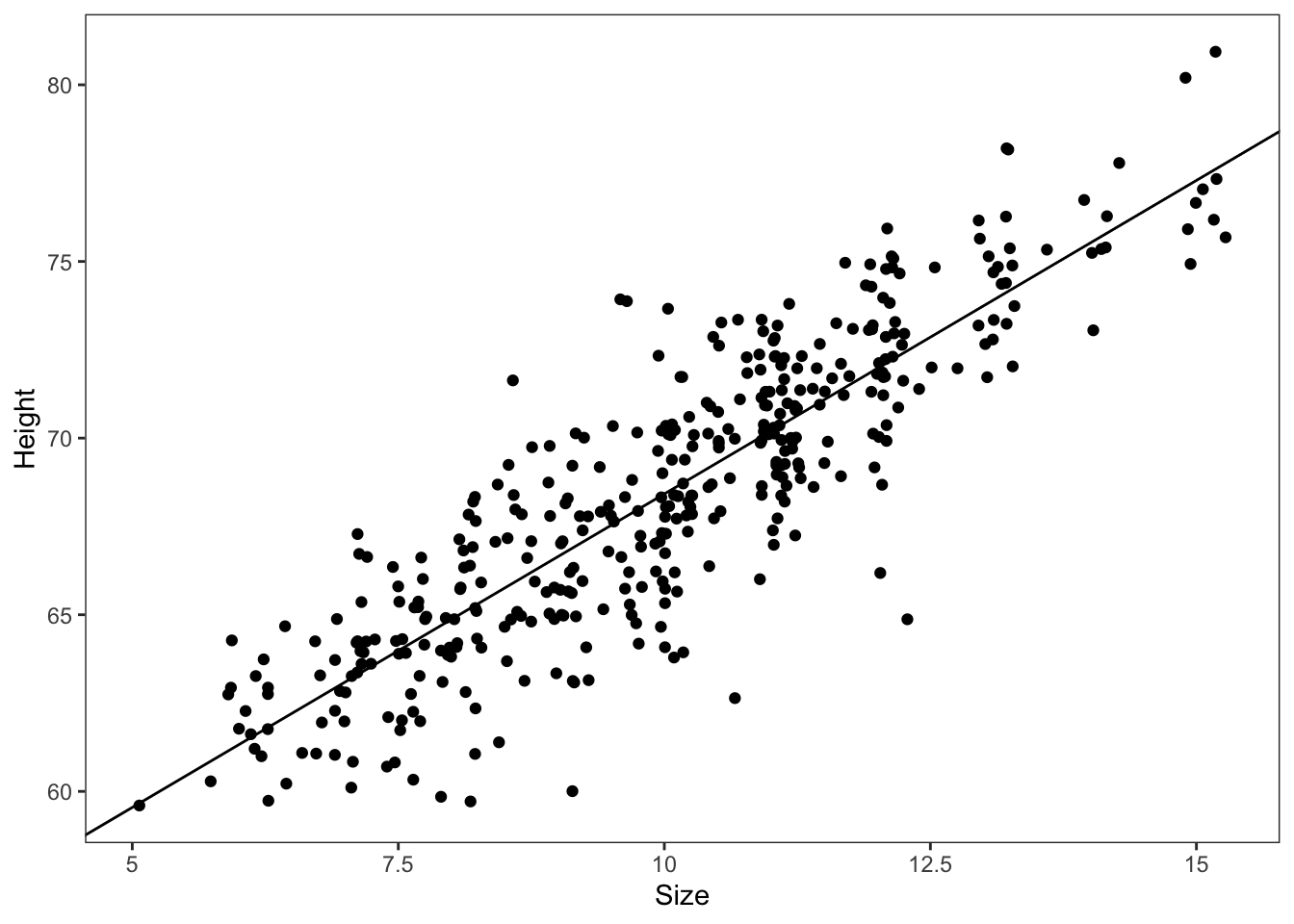
## plot linear correlation
labels <-
c(-5, -2.5, 0, 2.5, 5) + mean(tib$Size) |>
round(digits = 0)
tib |>
ggplot2::ggplot(ggplot2::aes(x = Size_c, y = Height)) +
ggplot2::geom_abline(intercept = brms:::fixef.brmsfit(lambert.A1.2)[[1]],
slope = brms:::fixef.brmsfit(lambert.A1.2)[[2]]) +
ggplot2::geom_point(position = "jitter") +
ggplot2::scale_x_continuous("Size",
breaks = c(-5, -2.5, 0, 2.5, 5),
labels = labels) +
ggplot2::theme_bw() +
ggplot2::theme(panel.grid = ggplot2::element_blank())
my_priors#> prior class coef group resp dpar nlpar lb ub
#> (flat) b
#> (flat) b Size_c
#> student_t(3, 68, 4.4) Intercept
#> student_t(3, 0, 4.4) sigma 0
#> source
#> default
#> (vectorized)
#> default
#> default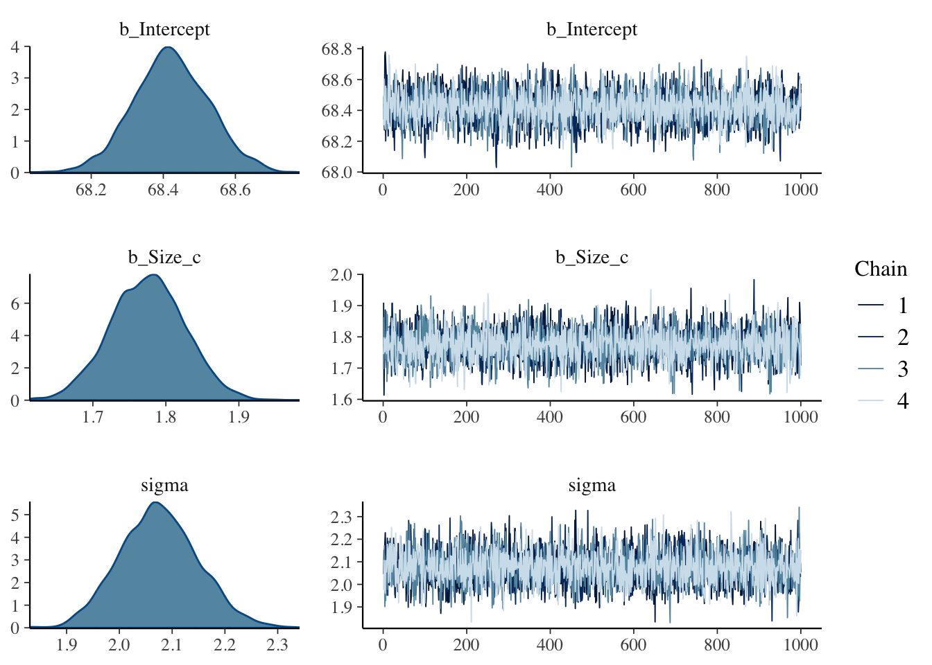
# extract posterior samples of population-level effects
samples1 <- brms::as_draws_df(lambert.A1.1)
head(samples1)
#> # A draws_df: 6 iterations, 1 chains, and 5 variables
#> b_Intercept b_Size_c sigma lprior lp__
#> 1 68 1.7 2.0 -7.6 -881
#> 2 68 1.8 2.1 -7.7 -881
#> 3 69 1.8 2.0 -7.7 -882
#> 4 68 1.7 2.1 -7.6 -882
#> 5 69 1.8 2.0 -7.7 -882
#> 6 69 1.8 2.1 -7.7 -881
#> # ... hidden reserved variables {'.chain', '.iteration', '.draw'}A.8 Glossary
| term | definition |
|---|---|
| Contour Plot | Contour plots are a way to show a three-dimensional surface on a two-dimensional plane. A contour plot is appropriate if you want to see how some value Z changes as a function of two inputs, X and Y: `z = f(x, y)`. Contour lines indicate levels that are the same. ([Statistics How To](https://www.statisticshowto.com/contour-plots/)) |
| Linear Model | A linear model specifies a linear relationship between a dependent variable and $n$ independent variables. It conforms to a mathematical model represented by a linear equation of the form $Y = b_{1}X_{1} + b_{2}X_{2} + … + b_{n}X_{n}$. ([Oxford Reference](https://www.oxfordreference.com/display/10.1093/oi/authority.20110803100107198)) |
| Prior Predictive Simulation | It is an essential part of modeling. Once you’ve chosen priors for all variables these priors imply a joint prior distribution. By simulating from this distribution, you can see what your choices imply about the observable variable. This helps to diagnose bad choices. Prior predictive simulation is therefore very useful for assigning sensible priors. (Chap.4) |
| Probability Distribution | The two defining features are: (1) All values of the distribution must be real and non-negative. (2) The sum (for discrete random variables) or integral (for continuous random variables) across all possible values of the random variable must be 1. (Bayesian Statistics, Chap.3) |