3 ggplot2
ggplot2 excels at visualizing all kinds of data and is the “go to package” for most applications, so it should come as no surprise that you can also visualize spatial data with it. For this chapter we will use several extensions to `ggplot2’ to create our plots.
# for loading our data
library(jsonlite)
library(rgdal)
library(sf)
# for plotting
library(extrafont)
library(ggplot2)
library(ggspatial)
library(patchwork)
library(scico)
library(vapoRwave)
# for data wrangling
library(dplyr)
3.1 Data used
We won’t be using a lot of data in this chapter.
# load honey shapefile
honey_sf <- read_sf("honey.shp")
# get the data for 2008
honey2008 <- honey_sf[honey_sf$year == 2008, ]
# create a MULTILINESTRING object
honey2008_multiline <- st_cast(honey2008, "MULTILINESTRING")
# load state capitals of the US
state_capitals <- fromJSON(
  "https://raw.githubusercontent.com/vega/vega/master/docs/data/us-state-capitals.json"
  )
# turn it into an sf object
state_capitals_sf <- st_as_sf(state_capitals, coords = c("lon", "lat"), crs = 4326)
# remove alaska and hawaii
state_capitals_sf <- state_capitals_sf[
  !state_capitals_sf$state %in% c("Alaska", "Hawaii"),
  ]
3.2 Using ggplot2 to create maps
The easiest way to create spatial plots with ggplot is to use the geom_sf() function. By default there is no aesthetic mapping, but we can use arguments like fill to easily create choropleth maps.
usa_1 <- ggplot(data = honey2008) +
  geom_sf()
usa_2 <- ggplot(data = honey2008) +
  geom_sf(aes(fill = Price_per_lb)) +
  ggtitle(label = "The Honey crisis of 2008", subtitle = "Price per lb")
usa_1 / usa_2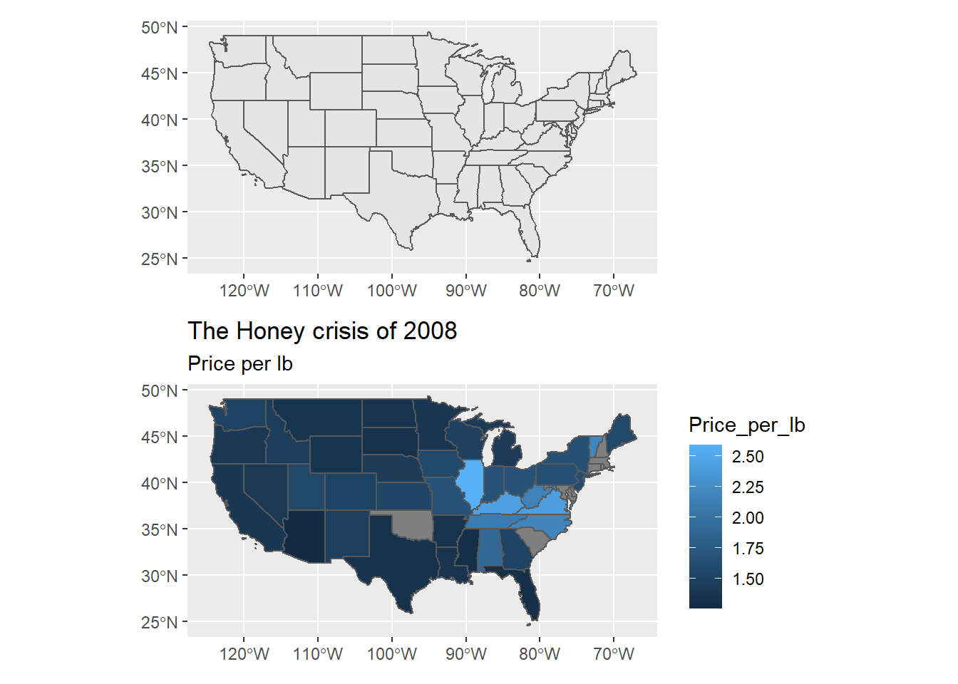
Figure 3.1: Basic use of ggplot2 for spatial data
Using the annotation_*() functions of ggspatial we can customize our maps by adding a base map or other elements to our map.
ggplot(data = honey2008) +
  annotation_map_tile("stamenwatercolor") +
  geom_sf(aes(fill = Price_per_lb), alpha = 0.8) +
  annotation_scale() +
  scale_fill_viridis_c() +
  ggtitle(label = "The Honey crisis of 2008", subtitle = "Price per lb")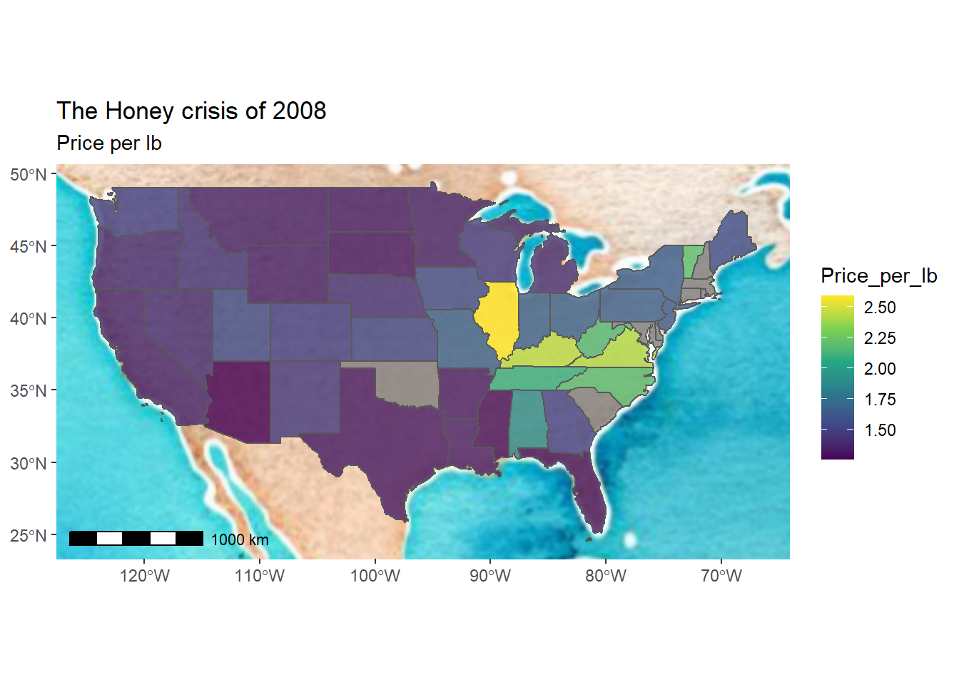
Figure 3.2: Adding a basemap and some elements
We can also use the packages vapoRwave and extrafonts, do some magic and then create some vibey maps.
ggplot(data = honey2008_multiline) +
  geom_sf(color = "#FF6B58", alpha = 0.1,  size = 4) +
  geom_sf(color = "#FF6B58", alpha = 0.1,  size = 3) +
  geom_sf(color = "#FF6B58", alpha = 0.2,  size = 2) +
  geom_sf(color = "#FF6B58", alpha = 0.2,  size = 1) +
  geom_sf(color = "#FF6B58", alpha = 1,  size = 0.5) +
  geom_sf(color = "#F8B660", alpha = 0.1, size = 6, data = state_capitals_sf) +
  geom_sf(color = "#F8B660", alpha = 0.1, size = 5, data = state_capitals_sf) +
  geom_sf(color = "#F8B660", alpha = 0.2, size = 4, data = state_capitals_sf) +
  geom_sf(color = "#F8B660", alpha = 0.2, size = 3, data = state_capitals_sf) +
  geom_sf(color = "#F8B660", alpha = 0.4, size = 2, data = state_capitals_sf) +
  geom_sf(color = "#F8B660", alpha = 1, size = 1, data = state_capitals_sf) +
  labs(subtitle="An aesthetic look",
       title="US States and their Captials",
       caption = "Excluding Alaska and Hawaii") +
  new_retro() +
  scale_colour_newRetro() +
  guides(size = guide_legend(override.aes = list(colour = "#FA5F70FF"))) +
  theme(
    panel.grid.major = element_blank()
  )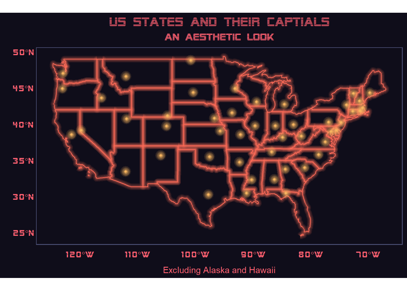
Figure 3.3: A E S T H E T I C
You can also go completely crazy, as Timo Grossenbacher did in his blog, and create maps like the one below.
ggplot() +
    # raster comes as the first layer, municipalities on top
    geom_raster(
      data = relief, aes(
        x = x,
        y = y,
        alpha = value
        )
      ) +
    # use the "alpha hack"
    scale_alpha(name = "", range = c(0.6, 0), guide = FALSE)  +
    # municipality polygons
    geom_polygon(
      data = map_data, aes(
        fill = brks,
        x = long,
        y = lat,
        group = group
        )
      ) +
    # municipality outline
    geom_path(
      data = map_data, aes(
        x = long,
        y = lat,
        group = group
        ),
      color = "white",
      size = 0.1
      ) +
    # apart from that, nothing changes
    coord_equal() +
    theme_map() +
    theme(
      legend.position = "bottom",
      plot.title = element_text(hjust = 0.5),
      plot.subtitle = element_text(hjust = 0.5)
      ) +
    labs(
      x = NULL,
      y = NULL,
      title = "Switzerland's regional demographics",
      subtitle = "Average age in Swiss municipalities, 2015",
      caption = "Geometries: ThemaKart, BFS; Data: BFS, 2016; Relief: swisstopo, 2016"
      ) +
    scale_fill_manual(
      values = rev(scico(8, palette = "davos")[2:7]),
      breaks = rev(brks_scale),
      name = "Average age",
      drop = FALSE,
      labels = labels_scale,
      guide = guide_legend(
        direction = "horizontal",
        keyheight = unit(2, units = "mm"),
        keywidth = unit(70/length(labels), units = "mm"),
        title.position = 'top',
        title.hjust = 0.5,
        label.hjust = 1,
        nrow = 1,
        byrow = TRUE,
        reverse = TRUE,
        label.position = "bottom"
      )
    )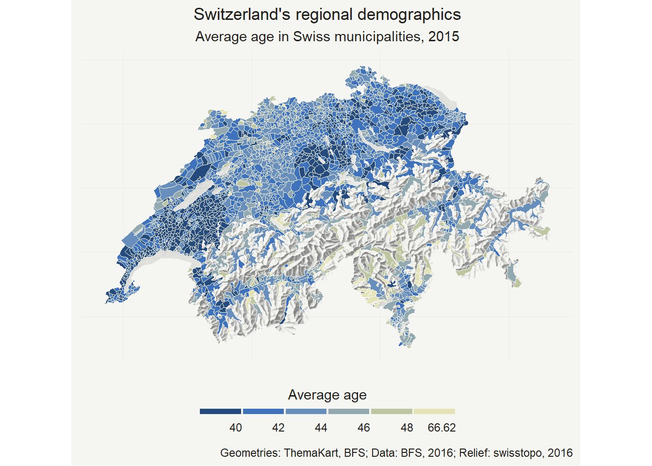
Figure 3.4: Map of Switzerland using ggplot2
Overall, ggplot2 is a great way to easily create geographic maps if you don’t want to learn a new plotting package.
(Grossenbacher 2016)