Chapter 3 Time Series Regression
A time series regression forecasts a time series as a linear relationship with the independent variables.
\[y_t = X_t \beta + \epsilon_t\]
The linear regression model assumes there is a linear relationship between the forecast variable and the predictor variables. This implies that the errors must have mean zero, otherwise the forecasts are biased: \(E(\epsilon | X_j) = 0\). The least squares method guarantees this condition is met. The residuals must not be autocorrelated, otherwise the forecasts are inefficient because there is more information in the data that can be exploited. To produce reliable inferences and prediction intervals, the residuals must be independent normal random variables with constant variance.
fable::TSLM() fits a linear regression model to time series data. TSLM() is similar to lm() with additional facilities for handling time series.
Data set fpp3::us_change contains quarterly US growth rates of personal \(\mathrm{Consumption}\), \(\mathrm{Income}\), and \(\mathrm{Production}\), and the quarterly \(\mathrm{Unemployment}\) rate and \(\mathrm{Savings}\) rate.
The scatterplot matrix shows positive relationships with income and industrial production, and negative relationships with savings and unemployment.
fpp3::us_change %>%
  as_tibble() %>%
  select(-Quarter) %>%
  cor() %>%
  ggcorrplot::ggcorrplot(type = "upper", lab = TRUE, lab_size = 3) +
  theme_light() +
  labs(title = "Consumption is correlated with predictors",
       subtitle = "Correlation plot of US economic indicators.",
       caption = "Source: fpp3::us_change.",
       x = NULL, y = NULL)
Let’s fit this model:
\[\mathrm{Consumption}_t = \beta_0 + \beta_1 \mathrm{Income}_t + \beta_2 \mathrm{Production}_t + \beta_3 \mathrm{Savings}_t + \beta_4 \mathrm{Unemployment}_t + \epsilon_t\]
us_change_lm <- fpp3::us_change %>%
  model(TSLM(Consumption ~ Income + Production + Savings + Unemployment))

report(us_change_lm)
## Series: Consumption
## Model: TSLM
##
## Residuals:
## Min 1Q Median 3Q Max
## -0.90555 -0.15821 -0.03608 0.13618 1.15471
##
## Coefficients:
## Estimate Std. Error t value Pr(>|t|)
## (Intercept) 0.253105 0.034470 7.343 5.71e-12 ***
## Income 0.740583 0.040115 18.461 < 2e-16 ***
## Production 0.047173 0.023142 2.038 0.0429 *
## Savings -0.052890 0.002924 -18.088 < 2e-16 ***
## Unemployment -0.174685 0.095511 -1.829 0.0689 .
## ---
## Signif. codes: 0 '***' 0.001 '**' 0.01 '*' 0.05 '.' 0.1 ' ' 1
##
## Residual standard error: 0.3102 on 193 degrees of freedom
## Multiple R-squared: 0.7683, Adjusted R-squared: 0.7635
## F-statistic: 160 on 4 and 193 DF, p-value: < 2.22e-16The fitted values follow the actual data fairly closely. The modeled \(R^2\) is 0.768, the adjusted \(R^2\) is 0.763, and the standard error of the regression, \(\hat{\sigma}_\epsilon\)$ is 0.310. The fitted to actual values plot has a strong linear relationship.
p1 <- augment(us_change_lm) %>%
  ggplot(aes(x = Quarter)) +
  geom_line(aes(y = Consumption), color = "dark gray", size = 1) +
  geom_line(aes(y = .fitted), color = "goldenrod", size = 1) +
  theme_light() +
  labs(subtitle = "Time series")
p2 <- augment(us_change_lm) %>%
  ggplot(aes(x = Consumption, y = .fitted)) +
  geom_point(color = "goldenrod", size = 1) +
  geom_abline(intercept = 0, slope = 1, linetype = 2, size = 1, color = "dark gray") +
  theme_light() +
  labs(subtitle = "Predicted vs actuals")

p1 + p2 +
  patchwork::plot_annotation(title = "Fitted values plots")
Evaluate the regression model with the following diagnostics.
The residuals vs time plot reveals some heteroscedasticity. Heteroscedasticity can make prediction intervals inaccurate.
The histogram shows that the residuals are slightly skewed. Non-normality of the residuals can also make the prediction intervals inaccurate.
The autocorrelation function plot (ACF) finds a significant spike at lag 7. If autocorrelation exists, forecasts are still unbiased, but the prediction intervals are larger than they need to be. Another test of autocorrelation in the residuals is the Breusch-Godfrey test for serial correlation up to a specified order. A small p-value indicates there is significant autocorrelation remaining in the residuals. The Breusch-Godfrey test is similar to the Ljung-Box test, but it is specifically designed for use with regression models. In this case, the spike at lag 7 is not enough for the Breusch-Godfrey to be significant (p = 0.062). In any case, the autocorrelation is not particularly large, and at lag 7 it is unlikely to have a noticeable impact on the forecasts or the prediction intervals.
gg_tsresiduals(us_change_lm)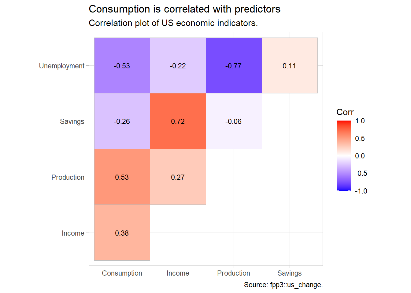
The residuals should be independent of each of the explanatory variables and independent of candidate variables not used in the model. In this case, the residuals show a random pattern in each of the plots.
us_change %>%
  left_join(residuals(us_change_lm), by = "Quarter") %>%
  pivot_longer(Income:Unemployment, names_to = "regressor", values_to = "x") %>%
  ggplot(aes(x = x, y = .resid, color = regressor)) +
  geom_point(show.legend = FALSE) +
  facet_wrap(vars(regressor), scales = "free_x") +
  labs(title = "There is no relationship between residuals and individual regressors.",
       subtitle = "otherwise the relationship may be nonlinear.",
       x = NULL) +
  theme_light() +
  ggthemes::scale_color_few()
A second check on the homoscedastity assumption is a plot of the residuals against the fitted values. Again, there should be no pattern.
augment(us_change_lm) %>%
  ggplot(aes(x = .fitted, y = .resid)) +
  geom_point() +
  labs(title = "There is no relationship between residuals and fitted values.",
       subtitle = "otherwise the response variable may require transformation.",
       y = "Residuals", x = "Fitted") +
  theme_light()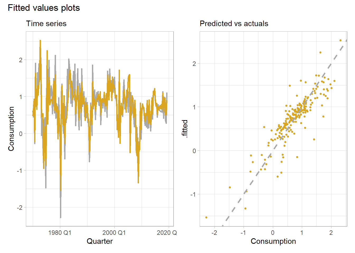
# cbind(Fitted = fitted(uschange.lm),
#       Residuals = residuals(uschange.lm)) %>%
#   as.data.frame() %>%
#   ggplot(aes(x=Fitted, y=Residuals)) + geom_point()
Check for outliers, leverage points, and influential points. For multiple linear regression models there is no straight-forward visual diagnostic like the simple linear regression scatter plot. Recall, an outlier is a point far from the others (in either the x or y direction); a leverage point is far from the others in the x direction, potentially affecting the measured slope; and influential point is a leverage point that does affect the slope.
The “hat matrix” \(H\) identifies leverage points. Recall that in the linear regression model \(\hat{y} = X \hat{\beta}\) the slope coefficients are estimated by \(\hat{\beta} = (X'X)^{-1}X'y\). Substituting, \(\hat{y} = X(X'X)^{-1}X'y\), or \(\hat{y} = Hy\), where
\[H = X(X'X)^{-1}X'.\]
\(H\) is called the hat matrix because \(H\) puts the hat on \(y\). \(H\) is an \(n \times n\) matrix. The diagonal elements \(H_{ii}\) are a measure of the distances between each observation \(i\)’s predictor variables \(X_i\) and the average of the entire data set predictor variables \(\bar{X}\). \(H_{ii}\) are the leverage that the observed responses \(y_i\) exert on the predicted responses \(\hat{y}_i\). Each \(H_{ii}\) is in the unit interval [0, 1] and the values sum to the number of regression parameters (including the intercept) \(\sum{H_{ii}} = k + 1\). A common rule is to research any observation whose leverage value is more than 3 times larger than the mean leverage value, which since the sum of the leverage values is \(k + 1\), equals
\[H_{ii} > 3 \frac{k + 1}{n}.\]
There are multiple methods to identify influential points. One is Cook’s distance. Cook’s distance for observation \(i\) is defined
\[D_i = \frac{(y_i - \hat{y}_i)^2}{p \times MSE} \frac{H_{ii}}{(1 - H_{ii})^2}.\]
\(D_i\) directly summarizes how much all of the fitted values change when the ith observation is deleted. A data point with \(D_i > 1\) is probably influential. \(D_i > 0.5\) is at least worth investigating.
# car::influenceIndexPlot(us_change_lm)
# cooks.distance(us_change_lm)
# autoplot(cooks.distance(uschange.lm)) +
#   geom_hline(yintercept = 0.5, linetype="dashed") +
#   labs(title = "Cook's Distance",
#        subtitle = "Investigate distances > 0.5.",
#        x = "Observation Number",
#        y = "Cook's")
There are several predictor variables that you may add to a time series regression model.
The trend is the slope of \(y_t = \beta_0 + \beta_1 t + \epsilon_t\). The season is a factor indicating the season (month, quarter, etc.) based on the frequency of the data. The time series trend and seasaon is calculated on the fly in the tslm() function as variables trend and season. Here is an example using the Autralian beer production dataset ausbeer. This model includes both a trend variable and a seasonal variable.
\[y_t = \beta_0 + \beta_1 t + \beta_2 S2 + \beta_3 S3 + \beta_4 S4\]
where \(S2\), \(S3\), and \(S4\) are seasonal (quarterly) dummiess, with season 1 as the reference. The model is concisely formulated in tslm(). There is a downward trend of 0.34 megalitres per quarter. On average, Q2 production is lower than Q1 by 34.7 megalitres, Q3 production is lower than Q1 by 17.8 megalitres, and Q4 production is higher than Q1 by 72.8 megalitres.
# y <- window(ausbeer, start = 1992)
# summary(ausbeer.lm <- tslm(y ~ trend + season))
# autoplot(y, series = "Data") +
#   autolayer(forecast(ausbeer.lm, h=20), series = "Forecast") +
#   autolayer(fitted(ausbeer.lm), series = "Fitted") +
#   labs( x = "Quarter",
#         y = "Megalitres",
#         title = "Quarterly Beer Production",
#         subtitle = "Linear time series regression with trend and seasonal dummies.")
You can also create dummy variables to flag holidays and outliers.
Predict future values with ex-ante forecasts or ex-post forecasts. An ex-ante forecasts are possible when the model is based only on calendar effects.
# y <- window(ausbeer, start = 1992)
# ausbeer.lm <- tslm(y ~ trend + season)
# ausbeer.fcst <- forecast(ausbeer.lm, h = 8)
# autoplot(ausbeer.fcst) +
#   ggtitle("Time Series Regression with Forecast")
Ex-post forecasts require assumptions (scenarios) about future values.
# uschange.lm <- tslm(Consumption ~ Income + Savings + Unemployment,
#                     data = uschange)
# newdata = data.frame(
#     Income = c(1, 1, 1, 1),
#     Savings = c(0.5, 0.5, 0.5, 0.5),
#     Unemployment = c(0, 0, 0, 0))
# uschange.fcst <- forecast(uschange.lm, newdata = newdata)
# autoplot(uschange.fcst) +
#   ggtitle("US Change in Consumption, ex-post Model")
3.0.1 Selecting Predictors
There are many strategies to choose regression model predictors when there are many to choose from. There are five common measures of predictive accuracy: \(\bar{R}^2\), CV, AIC, AICc, and BIC. They can be calculated using the CV() (cross-validation) function from the forecast package.
\(\bar{R}^2\) is common and well-established, but tends to select too many predictor variables, making it less suitable for forecasting. BIC has the feature that if there is a true underlying model, the BIC will select it given enough data. However, there is rarely a true underlying model, and even if there was one, that model would not necessarily produce the best forecasts because the parameter estimates may not be accurate. The AICc, AIC, and CV statistics are usually best because forecasting is their objective. If the value of time series size \(T\) is large enough, they all lead to the same model.
\(R^2\) is not a good measure of predictive ability because it does not measure bias: model that consistently predicts values that are 20% of observed will have \(R^2 = 1\).
\[\bar{R}^2 = 1 - (1 - R^2) \frac{T - 1}{T - k - 1}\] where \(T\) is the number of observations and \(k\) is the number of predictors. Maximizing \(\bar{R}^2\) is equivalent to minimized the regression standard error \(\hat{\sigma}\).
Classical leave-one-out cross-validation (CV) measures the predictive ability of a model. In concept CV is calculated by fitting a model without observation \(t\), then measuring the predictive error at observation \(t\). The process is repeated for all \(T\) observations. \(CV\) is the mean squared error. The model with the minimum CV is the best model for forecasting.
\[CV = \frac{1}{T} \sum_{t=1}^T [\frac{e_t}{1 - h_t}]^2\]
where \(h_t\) are the diagonal values of the hat-matrix \(H\) from \(\hat{y} = X\beta = X(X`X)^{-1}X'y = Hy\) and \(e_t\) is the residual obtained from fitting the model to all \(T\) observations.
Closely related to CV is Akaike’s Information Criterion (AIC), defined as
\[AIC = T \log(\frac{SSE}{T}) + 2(k + 2)\]
The measure penalises the models by the number of parameters that need to be estimated. The model with the minimum AIC is the best model for forecasting. For large values of \(T\), minimising the AIC is equivalent to minimising the CV.
For small values of \(T\), the AIC tends to select too many predictors, and so a bias-corrected version of the AIC has been developed, AICc.
\[AIC_c = AIC + \frac{2(k+2)(k + 3)}{T - k - 3}\]
BIC is similar to AIC, but penalises the number of parameters more heavily than the AIC. For large values of \(T\), minimising BIC is similar to leave-v-out cross-validation when \(v = T[1 − 1/\log(T) - 1]\).
\[BIC = T \log(\frac{SSE}{T}) + (k + 2)\log(T)\]
There are two common methods for using the measures: best subsets regression and stepwise regression. In best subsets regression, fit all possible models, then choose the one with the best metric value (e.g., lowest AIC). If there are simply too many candidate models (e.g., 40 predictors yield \(2^40\) models), the use stepwise regression. In backwards stepwise regression, include all candidate predictors initially, then check whether leaving any one predictor out improves the evaulation metric. If any leave-one-out model is better, then choose the best leave-one-out model. Repeat until no leave-one-out model is better.
Here is an example from dataset uschange in the fpp2 package. uschange contains quarterly growth rates of personal consumption, income, production, and savings, and the unemployment rate in the US from 1960 to 2016. The 4 predictors of consumption yield \(2^4 = 16\) possible models.
# inc <- c(1, 1, 1, 1, 1, 1, 1, 1, 0, 0, 0, 0, 0, 0, 0, 0)
# prd <- c(1, 1, 1, 1, 0, 0, 0, 0, 1, 1, 1, 1, 0, 0, 0, 0)
# sav <- c(1, 1, 0, 0, 1, 1, 0, 0, 1, 1, 0, 0, 1, 1, 0, 0)
# emp <- c(1, 0, 1, 0, 1, 0, 1, 0, 1, 0, 1, 0, 1, 0, 1, 0)
# df <- data.frame(inc, prd, sav, emp)
#
# mat <- matrix(NA, nrow = 16, ncol = 5)
# mat[1,] <- CV(tslm(Consumption ~ Income + Production + Savings + Unemployment, data = uschange))
# mat[2,] <- CV(tslm(Consumption ~ Income + Production + Savings, data = uschange))
# mat[3,] <- CV(tslm(Consumption ~ Income + Production + Unemployment, data = uschange))
# mat[4,] <- CV(tslm(Consumption ~ Income + Production, data = uschange))
# mat[5,] <- CV(tslm(Consumption ~ Income + Savings + Unemployment, data = uschange))
# mat[6,] <- CV(tslm(Consumption ~ Income + Savings, data = uschange))
# mat[7,] <- CV(tslm(Consumption ~ Income + Unemployment, data = uschange))
# mat[8,] <- CV(tslm(Consumption ~ Income, data = uschange))
# mat[9,] <- CV(tslm(Consumption ~ Production + Savings + Unemployment, data = uschange))
# mat[10,] <- CV(tslm(Consumption ~ Production + Savings, data = uschange))
# mat[11,] <- CV(tslm(Consumption ~ Production + Unemployment, data = uschange))
# mat[12,] <- CV(tslm(Consumption ~ Production, data = uschange))
# mat[13,] <- CV(tslm(Consumption ~ Savings + Unemployment, data = uschange))
# mat[14,] <- CV(tslm(Consumption ~ Savings, data = uschange))
# mat[15,] <- CV(tslm(Consumption ~ Unemployment, data = uschange))
# mat[16,] <- CV(tslm(Consumption ~ 1, data = uschange))
#
# #df2 <- as.data.frame(mat)
# df <- cbind(data.frame(inc, prd, sav, emp), as.data.frame(mat))
# colnames(df) <- c("Inc", "Prd", "Sav", "Emp", "CV", "AIC", "AICc", "BIC", "AdjR2")
# df$CV <- round(df$CV, 3)
# df$AIC <- round(df$AIC, 1)
# df$AICc <- round(df$AICc, 1)
# df$BIC <- round(df$BIC, 1)
# df$AdjR2 <- round(df$AdjR2, 3)
#
# df %>% arrange(AICc) %>%
# knitr::kable()
The best model contains all four predictors. However, there is clear separation between the models in the first four rows and the ones below, so Income and Savings are more important than Production and Unemployment. Also, the first two rows have almost identical values of CV, AIC and AICc. So you could possibly drop the Production variable and get similar forecasts.