Module 10 More on Regression
In this module, we return to regression to discuss some of the nuances of the linear regression model. We also talk about two hypothesis tests related to regression.
Module Learning Outcomes/Objectives
- Test the statistical significance of a predictor variable.
- Test overall model significance.
- Use plots to check regression model assumptions.
Recall that our regression model \[\hat{y} = b_0 + b_1x\] describes
10.2 A Hypothesis Test for a Regression Model
10.2.1 The F-Distribution
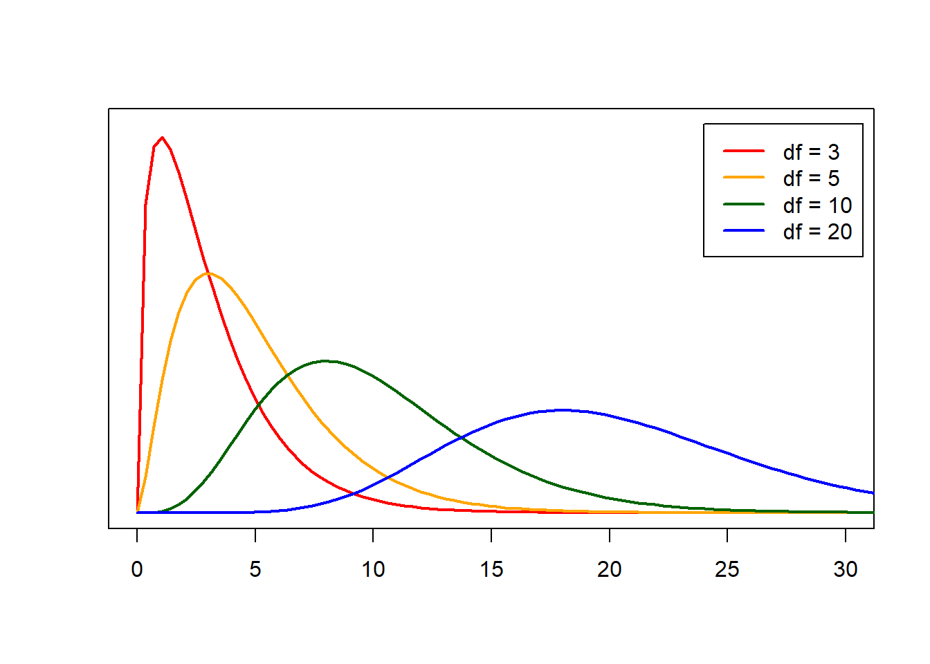
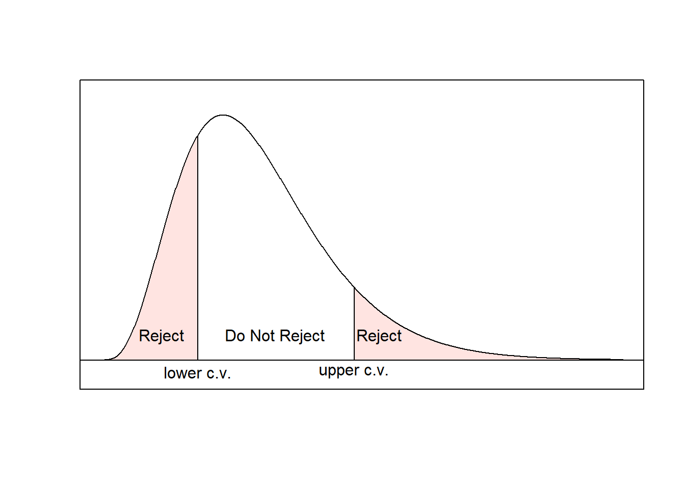
The \(\boldsymbol{F}\)-test relies on something called the \(F\) distribution. The \(F\) distribution has two parameters: \(df_1=df_G\) and \(df_1=df_E\). The \(F\) distribution always takes on positive values, so an extreme or unusual value for the \(F\) distribution will correspond to a large (positive) number.
When we run these types of tests, we almost always use the p-value approach. If you are using R for your distributions, the command is pf(F, df1, df2, lower.tail=FALSE) where F is the test statistic.
Example: Suppose I have a test with 100 observations and 5 groups. I find \(MSG = 0.041\) and \(MSE = 0.023\). Then \[df_G = k-1 = 5-1 = 4\] and \[df_E = n-k = 100-5 = 95\] The test statistic is \[f = \frac{0.041}{0.023} = 1.7826\] To find the p-value using
R, I would write the command
## [1] 0.1387132and find a p-value of 0.1387.
Here is a nice F-distribution applet. For this applet, \(\nu_1 = df_1\) and \(\nu_2 = df_2\). Plug in your \(F\) test statistic where it indicates “x =” and your p=value will appear in the red box next to “P(X>x)”. When you enter your degrees of freedom, a visualization will appear similar to those in the Rossman and Chance applets we used previously.
10.3 Model Assumptions
We have some assumptions we require in order for our hypothesis tests to be valid. These are
- A linear equation adequately describes the relationship between \(x\) and \(y\).
- The errors are approximately normally distributed.
- The errors have constant variance.
- The errors are not correlated.
In general, if a linear equation does not do a good job describing the relationship between \(x\) and \(y\), then we have no reason to run this type of model. Instead, we could develop a slightly more complex regression model or use another modeling technique, topics which are outside the scope of this class.
The rest of our assumptions have to do with the errors, which we approximate using our residuals \(r = y-\hat{y}\).
10.3.1 Normality of Errors
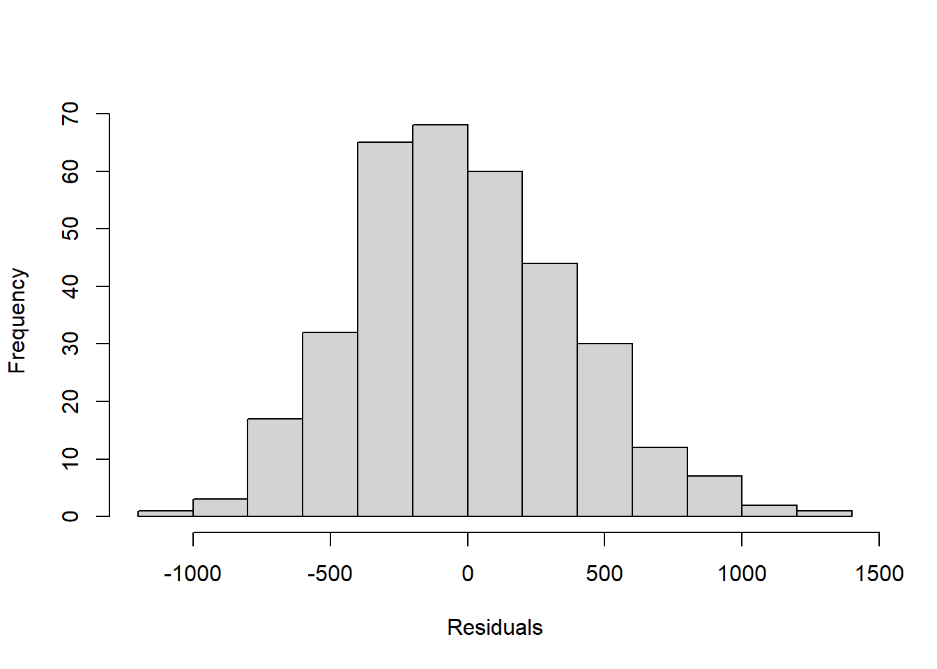
In Module 3, we generated a regression model that used a penguin’s flipper length (\(x\), in mm) to predict its weight (\(y\), in g):
\[\hat{y}=-5780.83 + 49.69x\] We could examine the distribution of this model’s residuals using a histogram
However, it can be kind of difficult to use a histogram to accurately determine normality.
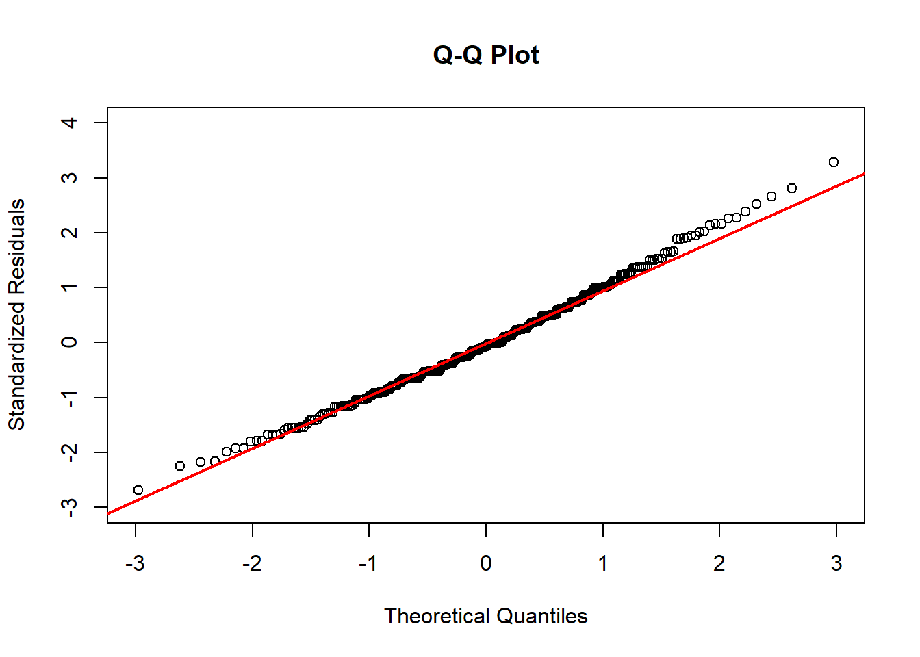
Instead, we typically use what we call a Q-Q Plot. A Q-Q Plot is a scatterplot that plots the model’s standardized residuals against the quantiles of a standard normal distribution. (Recall that standardized means we have z-scored everything.)
If the points fall along the line \(y = x\), then the standardized residuals match the quantiles of the standard normal distribution, which means they are normally distributed! Here, the line \(y=x\) has been added to the plot in red to make it easier to visually confirm normality.
If a lot of the points are far from this line, then we have violated our normality assumption.
In this example, our points are far from the \(y=x\) line in both tails. In fact, these residuals are heavily skewed!
In settings where our residuals deviate significantly from normality, we should not use our linear regression model as-is. Techniques to “fix” this issue include transformations on \(y\) and other modeling approaches, both of which are outside the scope of this class.