An Introduction to R Analytics
2023-10-26
Chapter 1 About
Welcome to the world of data analysis! “Introduction to R in Data Analytics” is your friendly guide to understanding how to use the R programming language for playing with data. If you’re new to this, don’t worry - we’ve got you covered.
This book takes you step by step, teaching you how to make sense of data using R. We’ll show you how to organize information, create cool charts and graphs, and even predict trends from data. You’ll learn all about the powerful tools that R offers for understanding numbers and patterns in data.
But we won’t just leave you with the theory. You’ll get your hands dirty with lots of examples and practice exercises that mimic what happens in the real world. By the end, you’ll be able to impress your friends with your data skills!
1.1 And then R was born…
The story of R begins in the early 1990s at the University of Auckland, New Zealand. Professors Ross Ihaka and Robert Gentleman sought to create a programming language that would simplify statistical computing and graphics. Their vision was to develop an open-source platform that would be accessible to researchers and statisticians worldwide.
In 1995, the first version of R emerged as an offshoot of the S programming language. It was named after the first letters of its creators’ names. R quickly gained traction within the academic community due to its powerful statistical capabilities and its ability to handle complex data analysis tasks efficiently.
As its popularity grew, R evolved into a dynamic and versatile language, incorporating contributions from an enthusiastic community of statisticians, data analysts, and programmers. This collaborative effort led to the development of a vast repository of packages and libraries, further enhancing R’s capabilities for data analysis and visualization.
By the early 2000s, R had firmly established itself as a leading tool for statistical computing and data analysis. Its open-source nature and extensive support for various operating systems contributed to its widespread adoption across different domains, including academia, research, and industries such as finance, healthcare, and technology.
The formation of the R Foundation in 2008 further solidified R’s position as a reliable and comprehensive statistical tool. This organization provided governance and support for the growing R community, ensuring the continued development and maintenance of the R language and its associated packages.
Today, R continues to be a powerhouse in the world of data analytics and statistical computing, with a vibrant and dedicated user community driving its continuous growth and innovation. Its rich history and robust functionality have cemented R as an indispensable tool for anyone working with data, solidifying its place as a cornerstone in the realm of statistical programming and analysis.
1.2 Why R?
R has become the go-to tool for statisticians, and for a good reason. It’s like a Swiss Army knife for data analysis. With its user-friendly interface and powerful features, R makes it easy for statisticians to handle complex data sets and extract meaningful insights.
One of the main reasons statisticians love R is its extensive collection of packages. These packages are like toolboxes filled with specialized tools for different tasks. From basic data manipulation to advanced statistical modeling, R’s packages cover a wide range of analytical needs. This allows statisticians to apply complex statistical techniques with relative ease.
Moreover, R’s robust graphical capabilities enable statisticians to create stunning visualizations that help in conveying complex data patterns and relationships. Whether it’s simple bar graphs or intricate heatmaps, R can produce visually appealing representations of data that aid in understanding and interpretation.
R’s versatility also comes from its active and vibrant community. With a large community of users and developers constantly contributing to its growth, R is constantly evolving and adapting to meet the demands of modern statistical analysis. This ensures that statisticians always have access to the latest tools and techniques in data analysis.
Furthermore, R’s ability to handle large datasets and its compatibility with other programming languages make it a preferred choice for statisticians working with big data. Its seamless integration with tools like Hadoop and Spark enables statisticians to work efficiently with massive datasets without compromising on performance.
In a nutshell, statisticians choose R because it empowers them to dive deep into data, uncover hidden patterns, and generate valuable insights that drive critical decision-making. Its flexibility, extensive packages, and strong community support make it an indispensable tool in the arsenal of any data analyst or statistician.
1.2.1 R and financial risk assessment
R has become a critical tool in the realm of financial risk analysis and predictive modeling, enabling professionals to make informed decisions in the face of complex and volatile market conditions. In financial risk analysis, R’s robust statistical capabilities allow for the assessment of market risks, credit risks, and operational risks through the implementation of various risk models and simulations. Its comprehensive libraries facilitate the computation of Value at Risk (VaR), stress testing, and Monte Carlo simulations, providing a deeper understanding of potential financial losses under different scenarios. Moreover, R’s advanced predictive modeling techniques, including machine learning algorithms and time series analysis, enable the development of accurate models for forecasting market trends, asset prices, and investment performance. Its ability to handle large datasets and perform intricate statistical analyses makes R an indispensable asset for financial professionals seeking to mitigate risks and optimize investment strategies in an ever-evolving financial landscape.
1.3 RStudio
RStudio is a popular integrated development environment (IDE) designed specifically for R programming. It provides a user-friendly interface that facilitates writing code, managing projects, and visualizing data. Understanding its components is key to maximizing your efficiency and productivity in R.
Script Editor: This is where you write your R code. The script editor offers features like syntax highlighting, code completion, and smart indentation, making it easier to write and edit code.
Console: The console is where you can directly interact with R. It displays the results of your code and allows you to execute commands and see their outputs immediately.
Environment and History: The environment tab displays information about the objects in your current R session, such as data frames, vectors, and functions. The history tab shows your previous commands and their outputs, making it easy to track your work.
Files and Plots: RStudio provides a file browser for navigating your computer’s directories and files. You can also view plots and visualizations in the “Plots” tab, which allows you to interact with and export your graphical outputs.
Packages and Help: The packages tab displays the packages you have installed and allows you to manage them efficiently. The help tab provides access to R’s extensive documentation, making it easy to find information about functions and packages.
Viewer and Git: The viewer tab displays web content and allows you to view HTML files and visualizations directly within RStudio. The Git tab provides an interface for version control, enabling you to manage your projects and collaborate with others seamlessly.
Global Options and Toolbar: RStudio’s global options allow you to customize various settings, such as appearance, code, and environment. The toolbar provides quick access to common actions like saving, running code, and debugging.
Understanding the RStudio interface and its components is essential for efficiently navigating and utilizing the powerful features that RStudio offers for data analysis and programming in R.
With this introduction to R, let us dive into the world of data analysis.
Chapter 2 Data Explorers Guide
“If we have data, let’s look at the data. If all we have are opinions, let’s go with mine.”
Jim Barksdale - former CEO of Netscape
In the previous chapter, you had an introduction to R and why it is important to us! In this chapter you will learn how to explore your data using different R packages and functions.
The first part of this book is designed to help you quickly learn the basics of exploring data. Exploring data means looking at it carefully, making guesses about it, checking if those guesses are right, and then doing it all over again. The point of exploring data is to find lots of interesting things that you can look at more closely later on.
It is still soon to tackle the modelling problem, we will come back to it later. First we need to have a look at the ways we can understand our data.
2.1 Required Packages
Before we try different options for exploring the data in R, we need to install the relevant packages and load the required libraries. R packages and libraries are collections of pre-written code that extend the functionality of the R programming language. They contain a set of functions, data, and documentation that serve specific purposes, such as statistical analysis, data visualization, machine learning, or specialized tasks. These packages and libraries are created by R users and developers worldwide to provide efficient solutions to common programming challenges and to streamline complex data analysis tasks. By utilizing these packages and libraries, R users can access a wealth of additional tools and capabilities without having to write all the code from scratch, making their data analysis processes more efficient and effective.
#Required packages:
#install.packages("ggplot2")
#install.packages("cluster")
library(ggplot2)
library(cluster)
#install.packages("dplyr")
library(dplyr)
#install.packages("data.table")
library(data.table)
#install.packages("tibble")
library(tibble)
#install.packages("stargazer")
library(stargazer)
#install.packages("tidyr")
library(tidyr)
#install.packages("reshape2")
library(reshape2)
#install.packages("pROC")
library(pROC)
2.2 Essentials
2.2.1 Data
Data is the foundation of any analytical process, encompassing a wide array of information that can be collected, observed, or derived. It comes in various forms, including numerical, categorical, textual, and spatial, and can be further classified as primary, secondary, or derived data. Primary data is gathered firsthand for a specific research purpose, while secondary data is obtained from existing sources, such as databases, research papers, or reports. Derived data is generated through the analysis or transformation of primary or secondary data, often to derive new insights or metrics.
2.2.2 Types of Variables
Variables play a pivotal role in data analysis, representing measurable quantities or attributes that can change. They are broadly classified into categorical and numerical variables. Categorical variables can further be divided into nominal, ordinal, and binary types.
Nominal variables represent categories without any inherent order, like colors or types of cars.
Ordinal variables maintain an inherent order, such as rankings or ratings.
Binary variables consist of only two categories, like yes/no or true/false.
Numerical variables can be discrete or continuous. Discrete variables represent distinct, separate values that usually correspond to counts, like the number of children in a family.
Continuous variables can take any value within a certain range and are often measured on a scale, such as temperature, time, or weight.
2.2.3 Understanding Observations
Observations, also known as data points or cases, represent individual units within a dataset. Each observation provides specific information related to the entities being studied. In the context of data analysis, an observation could refer to a person, an event, a transaction, or any unit under investigation.
Observations are composed of a combination of different variables, each contributing to the overall understanding of the entity or case. The quality and diversity of observations within a dataset significantly influence the depth and accuracy of any subsequent analysis or interpretation.
2.2.3.1 Clusters
In data analysis, clustering refers to the process of grouping similar data points or observations together based on certain features or characteristics. Clusters are formed by identifying patterns and similarities within the data that allow for the categorization of data points into distinct groups. This technique is often used in unsupervised machine learning to uncover underlying structures within datasets. An example of clusters can be seen in customer segmentation, where customers with similar buying behavior or preferences are grouped together for targeted marketing strategies.
#There are some built in datasets in R.
#You can find them by typing ?data in the console!
# Load the iris dataset
data(iris)

# Perform k-means clustering on the iris dataset
set.seed(123)
k <- 3
iris_cluster <- kmeans(iris[, 1:4], centers = k, nstart = 25)

# Visualize the clusters
iris$cluster <- as.factor(iris_cluster$cluster)
ggplot(iris, aes(Petal.Length, Petal.Width, color = cluster)) + geom_point()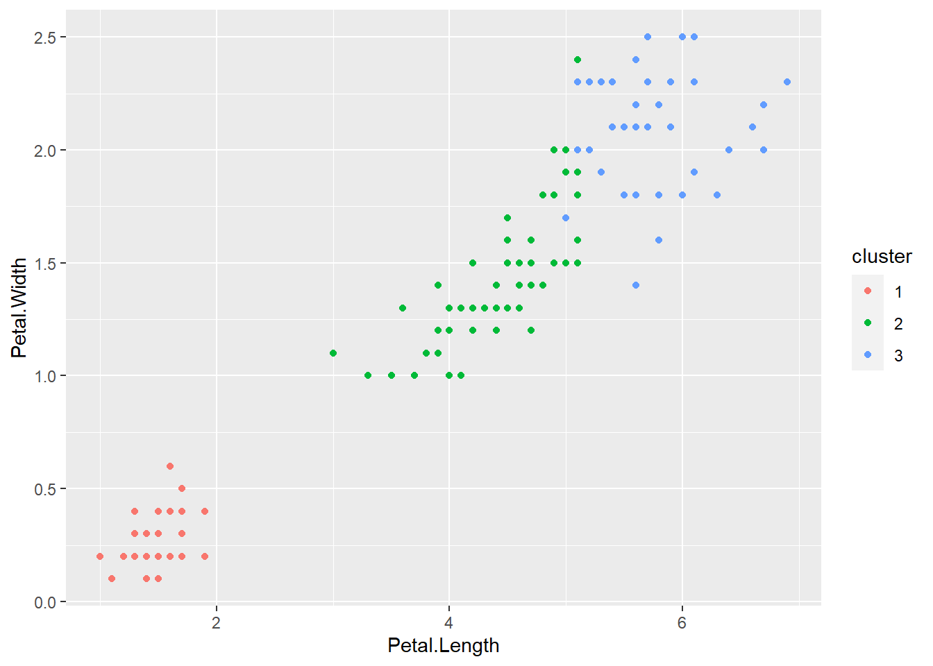
2.2.3.2 Segments
Segments are specific subsets or divisions within a larger dataset that share common characteristics or behaviors. They are often created through segmentation analysis, which involves the process of dividing a heterogeneous market into smaller, more homogenous groups. Segmentation allows businesses to tailor their products, services, and marketing efforts to specific customer segments, thus improving overall customer satisfaction and engagement. For instance, in market research, segments may be created based on demographic factors, purchasing habits, or geographic locations to better understand and target specific consumer groups.
# Segmentation example using the iris dataset
# Assuming we want to segment the dataset based on species
# Load required libraries
# Using the iris dataset
segments <- iris %>%
  group_by(Species) %>%
  summarise(
    Avg_Sepal_Length = mean(Sepal.Length),
    Avg_Sepal_Width = mean(Sepal.Width),
    Avg_Petal_Length = mean(Petal.Length),
    Avg_Petal_Width = mean(Petal.Width)
  )

# View the resulting segments
print(segments)
## # A tibble: 3 × 5
## Species Avg_Sepal_Length Avg_Sepal_Width Avg_Petal_Length Avg_Petal_Width
## <fct> <dbl> <dbl> <dbl> <dbl>
## 1 setosa 5.01 3.43 1.46 0.246
## 2 versicolor 5.94 2.77 4.26 1.33
## 3 virginica 6.59 2.97 5.55 2.032.2.3.3 Typical Values
Typical values refer to data points or observations that fall within the expected or average range for a given dataset. These values are representative of the general trend or behavior exhibited by the majority of the dataset. For example, in a dataset representing the ages of a group of individuals, the typical values may include the most frequently occurring age range, providing a standard representation of the age distribution within the group.
2.2.3.4 Unusual Values
Unusual values, also known as outliers, are data points that significantly deviate from the general pattern or distribution of the dataset. These values lie far from the typical values and can distort statistical analyses and data interpretations. Detecting and handling unusual values is crucial in ensuring the accuracy and reliability of data analysis results. For instance, in a dataset representing income levels, an unusually high or low income that does not align with the majority of the dataset may be considered an outlier and should be carefully examined to determine its validity and impact on the analysis.
By understanding clusters, segments, typical values, and unusual values, analysts can effectively categorize, interpret, and draw meaningful insights from complex datasets in various fields such as marketing, finance, and social sciences.
2.2.4 Exploring Datasets
A dataset is a structured collection of data points or observations, systematically organized to facilitate analysis and interpretation. Datasets can be classified into various types based on their structure and source, including cross-sectional, time series, panel, and longitudinal datasets. Cross-sectional datasets capture information at a single point in time, whereas time series datasets track data over a specific period.
Panel datasets combine aspects of both cross-sectional and time series data, focusing on multiple entities observed over multiple time periods. Longitudinal datasets follow the same entities or subjects over an extended period, allowing for the analysis of trends and changes over time. Through the exploration of datasets, analysts can unveil hidden patterns, relationships, and trends, leading to valuable insights and informed decision-making processes across diverse fields and industries.
2.2.4.1 Data Frames
A data frame is a two-dimensional data structure in R that stores data in a tabular format, where rows represent observations and columns represent variables. It is a fundamental data structure used for data manipulation and analysis in R. Data frames can consist of different types of data, including numerical, categorical, and textual data. Here is an example of a simple data frame:
2.2.4.2 Data Tables
Data tables are an enhanced version of data frames, commonly used in the data.table package in R. They provide a more efficient and speedy way to handle large datasets, making complex operations like subsetting, filtering, and summarizing data faster. Data tables share similarities with data frames but come with additional features optimized for performance. Here is an example of a data table:
2.2.4.3 Tibbles
Tibbles are a modernized and more user-friendly version of data frames, available in the tibble package in R. They provide a cleaner and more consistent output compared to data frames, making them easier to work with, especially when dealing with large datasets. Tibbles retain the same functionalities as data frames while offering improvements in printing, subsetting, and handling missing values. Here is an example of a tibble:
2.2.5 Visualization
Visualization is the graphical representation of data and information to facilitate understanding, analysis, and communication of complex concepts and relationships. It allows for the intuitive interpretation of data patterns, trends, and insights that may not be apparent from raw data alone. Visualization plays a crucial role in data analysis, enabling analysts to identify correlations, outliers, and patterns, and to communicate their findings effectively to a diverse audience.
2.2.5.1 Scatter Plot
A scatter plot displays the relationship between two numerical variables, showing how one variable may be affected by the other.
# Scatter plot example
plot(iris$Petal.Length, iris$Petal.Width,
     main = "Scatter Plot of Petal Length vs. Width",
     xlab = "Petal Length", ylab = "Petal Width", col = iris$Species)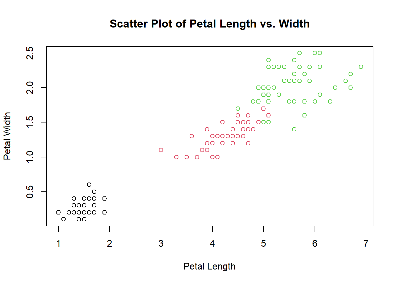
2.2.5.2 Bar Plot
A bar plot represents categorical data with rectangular bars, where the length of each bar corresponds to the value of the category it represents.
# Bar plot example
barplot(table(iris$Sepal.Length), main = "Bar Chart of Sepal Length",
        xlab = "Sepal Length", ylab = "Frequency", col = "lightgreen")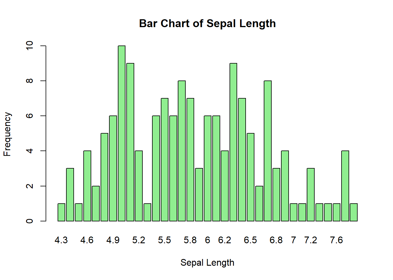
2.2.5.3 Histogram
A histogram is used to visualize the distribution of numerical data by grouping it into bins or intervals and displaying the frequencies of each bin.
# Histogram example
hist(iris$Petal.Width, main = "Histogram of Petal Width with Density Line",
     xlab = "Petal Width", ylab = "Frequency",
     col = "lightcoral", probability = TRUE)
lines(density(iris$Petal.Width), col = "darkred", lwd = 2)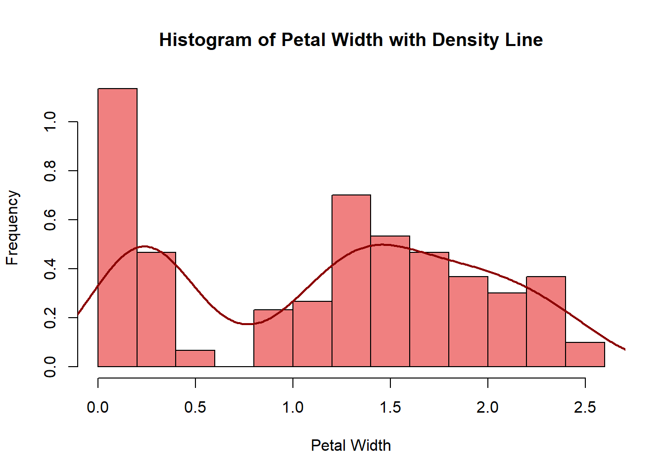
2.2.5.4 Visualization of Covariation
Visualization of covariation helps understand the relationship between two or more variables and how they change concerning each other. A common way to visualize covariation is through a heatmap, which represents the magnitude of the relationship between variables using colors. In R, the par() function is used to set or query graphical parameters. Here, mfrow and mar are two specific arguments of the par() function:
mfrow: This argument is used to specify the layout of the plots in a matrix format. The mfrow argument takes a vector of length 2, where the first value represents the number of rows, and the second value represents the number of columns in the layout. In this case, mfrow = c(1, 1) sets the layout to a single plot.mar: This argument is used to set the margins (in lines of text) on the four sides of the plot. The four values in the vector correspond to the bottom, left, top, and right margins, respectively. By adding + 0.1 to the existing margins, we are adjusting all margins slightly to provide some additional space around the plot.
# Heatmap example
correlation_matrix <- cor(iris[, 1:4])

# Adjust figure size and margins
par(mfrow = c(1, 1), mar = c(5, 6, 4, 4) + 0.1)

# Create the heatmap with a color key
heatmap(correlation_matrix,
        col = colorRampPalette(c("blue", "white", "red"))(100),
        cexRow = 1.0, cexCol = 1.0)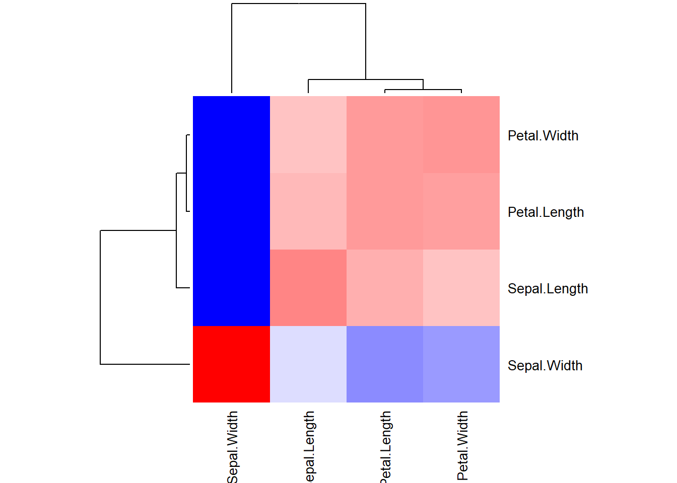
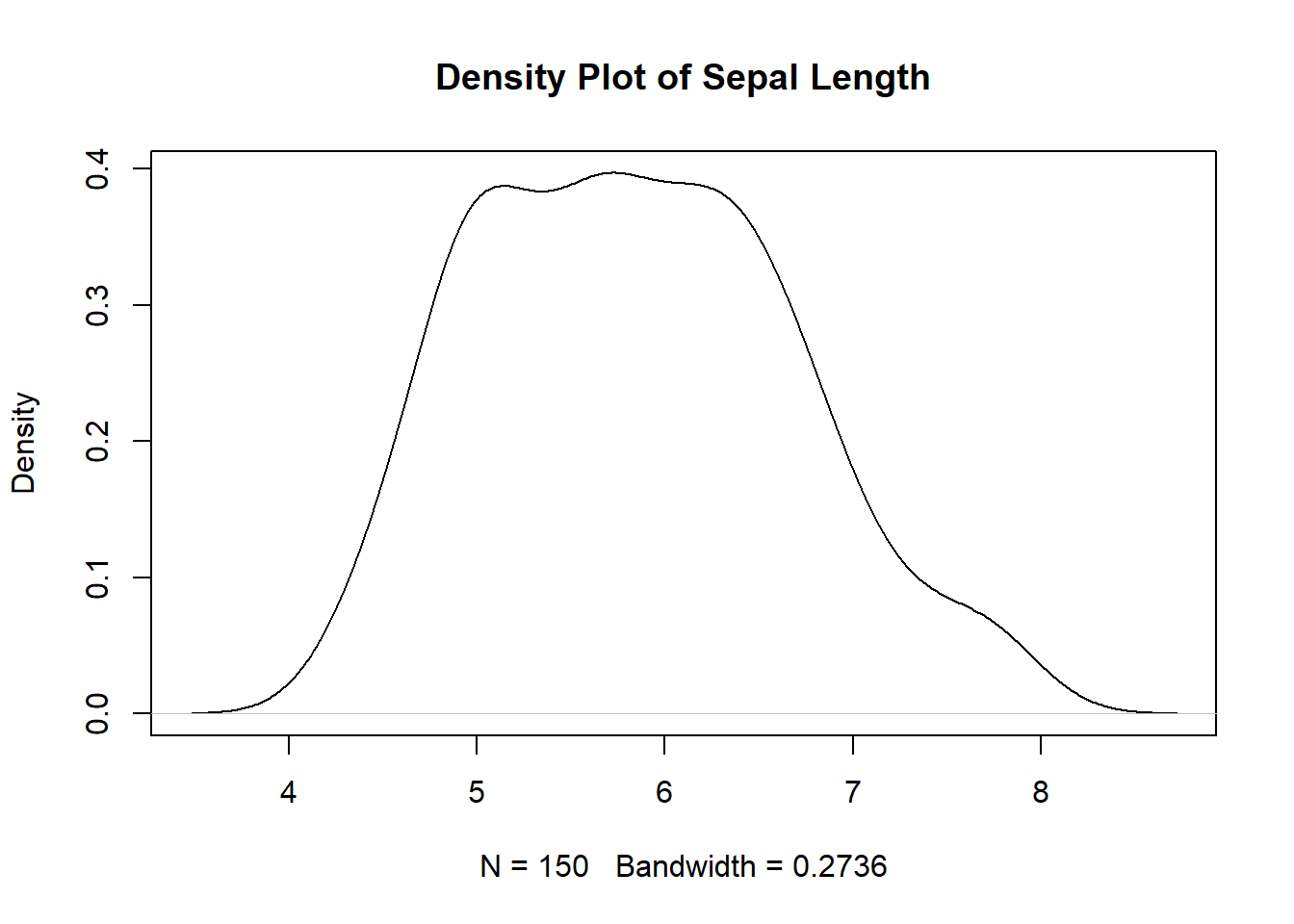
2.2.5.5 Distribution Plots
Distribution plots help visualize the distribution of data, allowing analysts to observe patterns, central tendencies, and variations within the dataset. Box plots and density plots are commonly used for visualizing data distribution.
# Box plot example
boxplot(iris$Petal.Length, main = "Box Plot of Petal Length",
        ylab = "Petal Length", col='lightpink')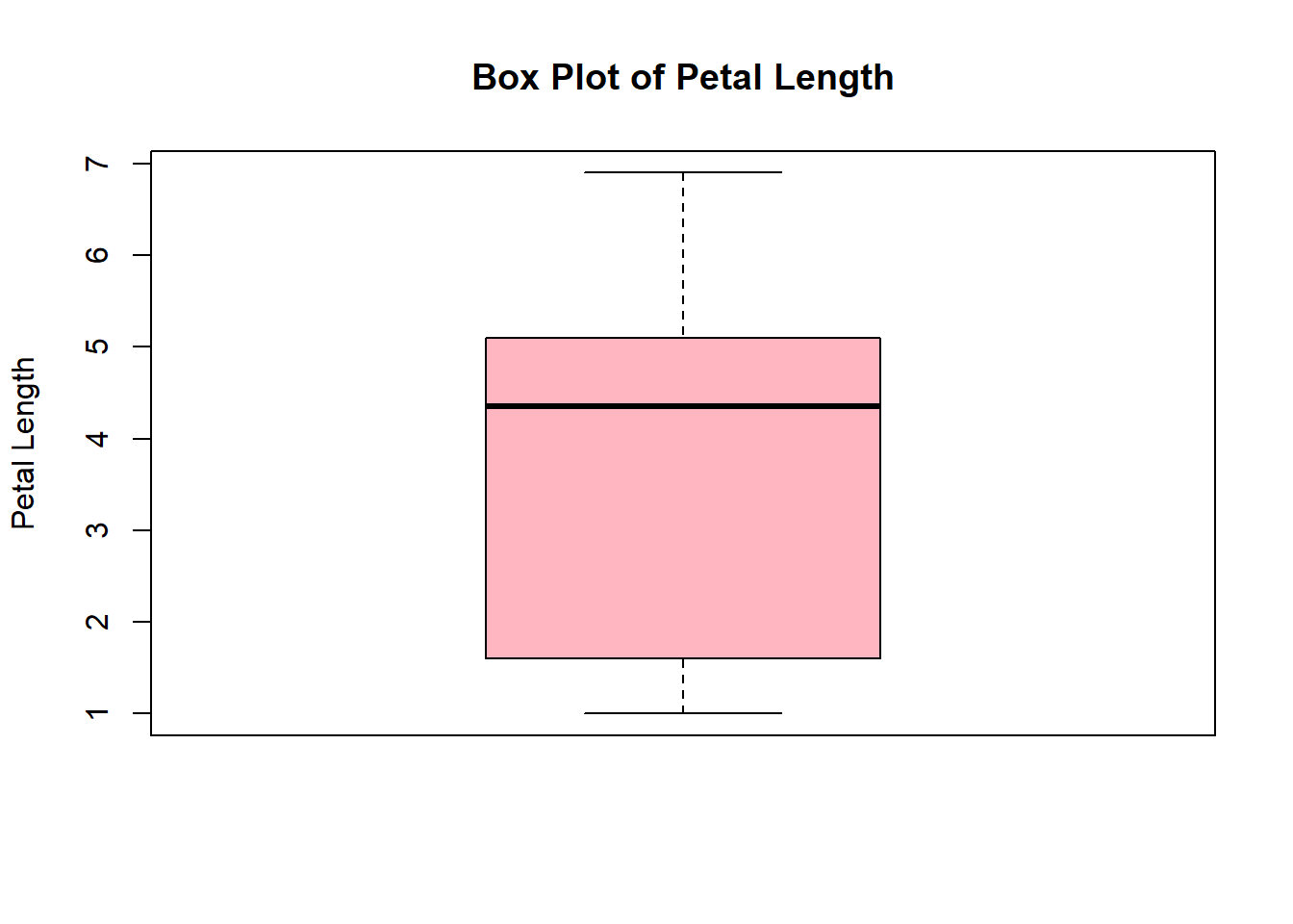
Through effective visualization, analysts can gain valuable insights, detect trends, and communicate complex data in a simple and understandable manner.
2.2.5.6 Geometric Objects
A geom, short for geometrical object, is the visual representation of data that a plot uses. Plots are often characterized by the type of geom they employ. For instance, bar charts utilize bar geoms, line charts are based on line geoms, boxplots are built using boxplot geoms, and so forth. However, scatterplots deviate from this trend as they utilize the point geom. As shown below, you have the option to use different geoms to visualize the same dataset. In the plot on the left, the point geom is used, whereas in the plot on the right, the smooth geom is employed, generating a smooth line fitted to the data.
To modify the geom in your plot, simply adjust the geom function in the ggplot(). For example, to create similar plots with the ‘iris’ dataset, you can use the following code:
# Create the left plot
library(patchwork)

# Create the left plot
left_plot <- ggplot(data = iris) +
  geom_point(mapping = aes(x = Sepal.Length, y = Sepal.Width))

# Create the right plot
right_plot <- ggplot(data = iris) +
  geom_smooth(mapping = aes(x = Sepal.Length, y = Sepal.Width))

# Display plots next to each other
(left_plot / right_plot) + plot_layout(ncol = 2)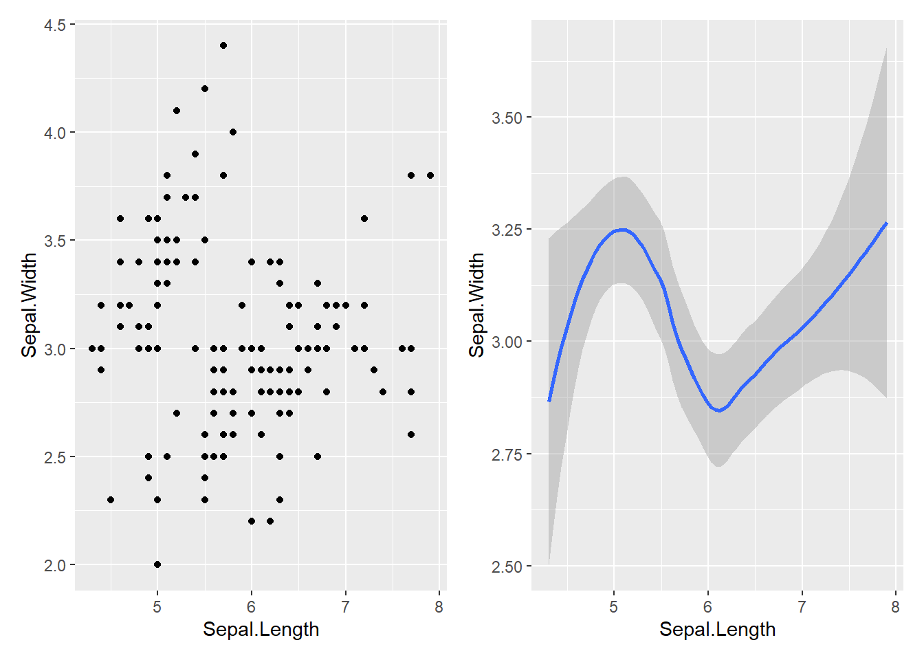
2.2.6 Printing
Well, as long as you do not print your results, you will not be able to see the results! In R, the print() function is used to display outputs such as data frames, matrices, lists, or any R object on the console. When you execute the print() function, R will show the content of the specified object. If the print() function is not explicitly used, R will automatically print the results for certain operations.
2.2.6.1 Printing a Data Frame
# Create a simple data frame
df <- data.frame(
  Name = c("John", "Jane", "Michael"),
  Age = c(25, 30, 22)
)

# Print the data frame
print(df)
## Name Age
## 1 John 25
## 2 Jane 30
## 3 Michael 222.2.6.4 Formating Print()
In R, the print() function provides several options for formatting the output, including specifying the number of digits, alignment, and other relevant formatting options. You can use the sprintf() function to control the formatting of numeric values. Here are some examples of how you can use formatting options:
# Example of using formatting options
x <- 3.14159265

# Formatting with 2 digits after the decimal point
print(sprintf("%.2f", x))
## [1] "3.14"## [1] "3.1416"## [1] "Hello "## [1] " Hello"In these examples, the %f specifier is used to represent a floating-point number, and the number after the dot specifies the number of decimal places to display. The %s specifier is used for character strings, and you can use the minus sign - for left alignment and a number for field width to adjust the alignment.
In R, the {} can be used to concatenate or format strings within the print() function. It is often used to combine text or values with other characters or variables. Here are some examples to illustrate the usage of {} in printing:
# Example of using {} in printing
name <- "John"
age <- 30

# Print with concatenated strings
print(paste("My name is", name, "and I am", age, "years old."))
## [1] "My name is John and I am 30 years old."## [1] "My name isJohnand I am30years old."# Printing with formatting using {}
print(paste("My name is", name, "and I am", age, "years old.", sep = " "))## [1] "My name is John and I am 30 years old."In these examples, the {} is used to concatenate the strings and the variables. It helps in formatting the output by allowing the combination of text and variable values in a flexible and readable way.
These formatting options can be useful when you need to control the appearance of your output for better readability and presentation.
2.2.6.5 Aesthetic Modifications
To modify the color and font in R output, you can use specific formatting functions depending on the output type. Here are some examples:
2.2.6.5.1 For Console Output
You can use ANSI escape sequences to modify the text color in the console. Here’s an example:
The escape sequence \033[31m sets the text color to red, and \033[0m resets it to the default color.
2.2.6.5.2 For Plots
When working with plots, you can modify various attributes such as color, font size, and style. Here’s an example:
# Create a plot with modified attributes
plot(1:10, col = "lightblue", pch = 16, cex = 1.5, main = "Modified Plot")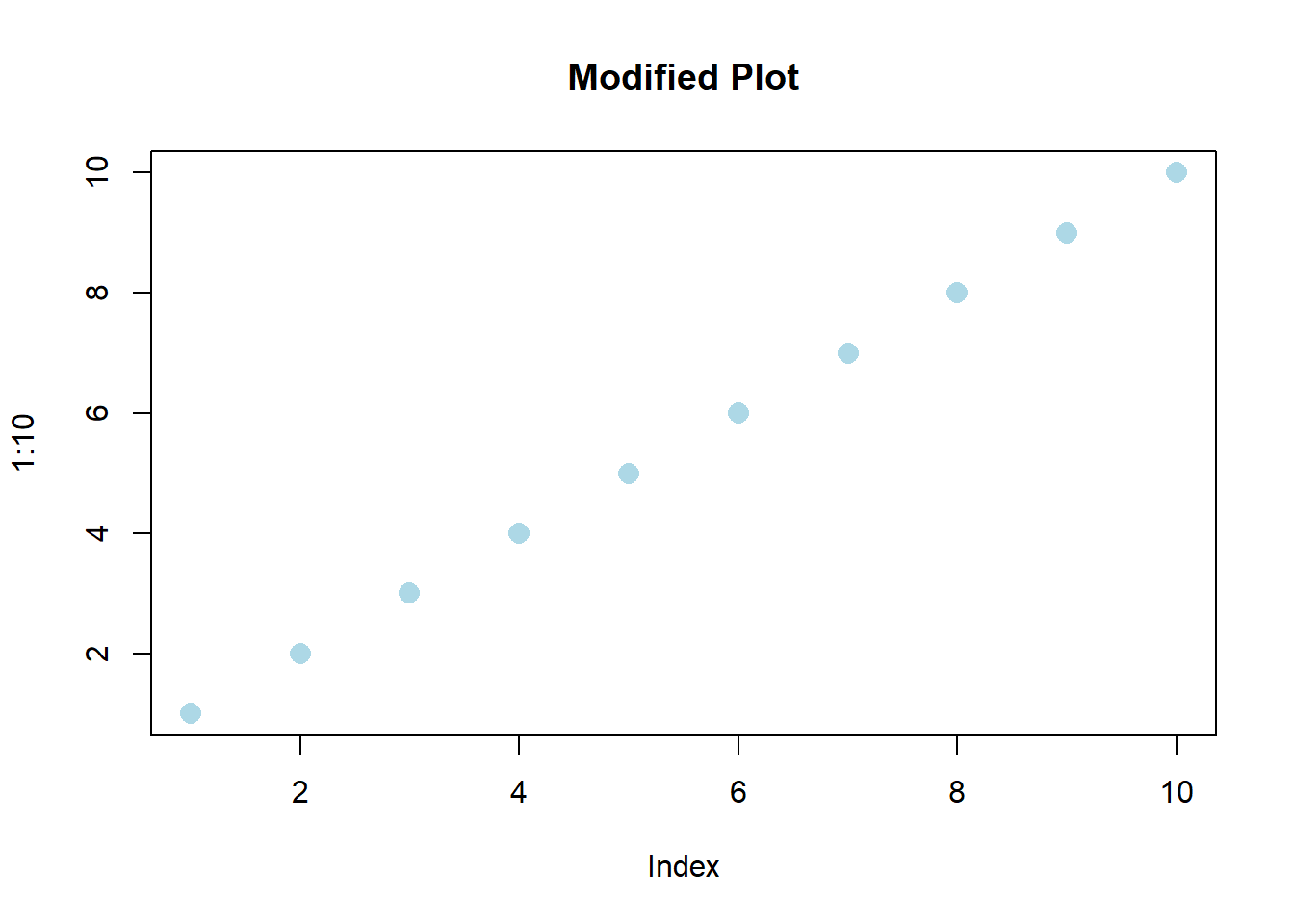
In this example, the col argument sets the point color to light blue, pch changes the point type, and cex scales the point size.
2.2.6.5.3 For Formatted Text:
If you’re working with formatted text, you can use HTML or LaTeX tags to modify the appearance. Here’s an example:
## <p style='color:red; font-size:16px;'>Red Text</p>In this case, the HTML tag <p> is used to specify a paragraph with red text color and a font size of 16 pixels.
You can apply these techniques to modify the appearance of text and plots in R, whether it’s for console output, plots, or formatted text in HTML or LaTeX.
2.2.6.6 Stargazer Package
The stargazer package in R is a useful tool for creating well-formatted regression and summary statistics tables. It provides a convenient way to produce high-quality, publication-ready output in various formats, including LaTeX, HTML, and ASCII text. Researchers often use the stargazer package to present the results of statistical analyses and regression models in a clear and organized manner.
# Install and load the stargazer package
# Fit a linear regression model
model <- lm(Sepal.Width ~ Sepal.Length + Petal.Length, data = iris)

# Print the regression results using stargazer
stargazer(model, type = "text")
##
## ===============================================
## Dependent variable:
## ---------------------------
## Sepal.Width
## -----------------------------------------------
## Sepal.Length 0.561***
## (0.065)
##
## Petal.Length -0.335***
## (0.031)
##
## Constant 1.038***
## (0.288)
##
## -----------------------------------------------
## Observations 150
## R2 0.456
## Adjusted R2 0.449
## Residual Std. Error 0.324 (df = 147)
## F Statistic 61.713*** (df = 2; 147)
## ===============================================
## Note: *p<0.1; **p<0.05; ***p<0.012.3 Tools
We mentioned the essentials for the Exploratory Data Analysis in the previous part. In this part we will dig a bit deeper in our toolbox to get to know our tools more. For the examples in this section we will use the mpg data set available in r.
##  manufacturer          model               displ            year
##  Length:234         Length:234         Min.   :1.600   Min.   :1999
##  Class :character   Class :character   1st Qu.:2.400   1st Qu.:1999
##  Mode  :character   Mode  :character   Median :3.300   Median :2004
##                                        Mean   :3.472   Mean   :2004
##                                        3rd Qu.:4.600   3rd Qu.:2008
##                                        Max.   :7.000   Max.   :2008
##       cyl           trans               drv                 cty
##  Min.   :4.000   Length:234         Length:234         Min.   : 9.00
##  1st Qu.:4.000   Class :character   Class :character   1st Qu.:14.00
##  Median :6.000   Mode  :character   Mode  :character   Median :17.00
##  Mean   :5.889                                         Mean   :16.86
##  3rd Qu.:8.000                                         3rd Qu.:19.00
##  Max.   :8.000                                         Max.   :35.00
##       hwy             fl               class
##  Min.   :12.00   Length:234         Length:234
##  1st Qu.:18.00   Class :character   Class :character
##  Median :24.00   Mode  :character   Mode  :character
##  Mean   :23.44
##  3rd Qu.:27.00
##  Max.   :44.00
2.3.1 Functions
Functions in R are reusable blocks of code designed to perform specific tasks. They can accept inputs, process data, and return outputs. R provides various built-in functions for common operations such as mathematical calculations, statistical analysis, and data manipulation.
You can also create your own functions to encapsulate a series of operations into a single unit, promoting code reusability and modularity.
# User-defined function example
custom_mean <- function(x) {
  return(sum(x) / length(x))
}
result <- custom_mean(mpg$hwy)
result
## [1] 23.440172.3.2 Conditions
Conditions in R allow you to control the flow of your program based on specific criteria. They enable you to execute different sets of instructions depending on whether certain conditions are met or not. R supports various conditional statements, including if, if-else, if-else if-else, and switch statements, which help in making decisions and directing the program’s flow based on the evaluation of logical expressions.
# If-else statement example
if (mean(mpg$hwy) > 30) {
  print("Highway mileage is above average.")
} else {
  print("Highway mileage is below average.")
}
## [1] "Highway mileage is below average."2.3.3 Loops
Loops in R are used to execute a block of code repeatedly until a specified condition is met. They facilitate the automation of repetitive tasks and the iteration over data structures such as vectors, lists, and data frames. R supports different types of loops, including for loops, while loops, and repeat loops, each serving specific purposes depending on the context and the structure of the data. Here is an example for a for loop:
## [1] "Value of i: 1"
## [1] "Value of i: 2"
## [1] "Value of i: 3"
## [1] "Value of i: 4"
## [1] "Value of i: 5"
And an example for a while loop:
## [1] "Value of i: 1"
## [1] "Value of i: 2"
## [1] "Value of i: 3"
## [1] "Value of i: 4"
## [1] "Value of i: 5"
2.3.4 Data Manipulation
Data manipulation in R involves various operations that transform, clean, and restructure data for analysis and visualization purposes. The dplyr and tidyr packages provide a rich set of functions that enable efficient data wrangling and transformation. These operations include:
- Pipes (%>%): The pipe operator
%>%allows you to chain multiple data manipulation operations together, facilitating the transformation of data step by step, and enhancing the readability and reproducibility of the code.
## # A tibble: 117 × 3
##    manufacturer model               year
##    <chr>        <chr>              <int>
##  1 audi         a4                  1999
##  2 audi         a4                  1999
##  3 audi         a4                  1999
##  4 audi         a4                  1999
##  5 audi         a4 quattro          1999
##  6 audi         a4 quattro          1999
##  7 audi         a4 quattro          1999
##  8 audi         a4 quattro          1999
##  9 audi         a6 quattro          1999
## 10 chevrolet    c1500 suburban 2wd  1999
## # ℹ 107 more rows- Subsetting: Subsetting allows you to extract specific subsets of data based on certain conditions or criteria, helping in isolating relevant portions of data for further analysis or visualization.
# Subsetting example
subset(mpg, manufacturer == "audi" &
         class == "compact", select = c("manufacturer", "model"))
## # A tibble: 15 × 2
## manufacturer model
## <chr> <chr>
## 1 audi a4
## 2 audi a4
## 3 audi a4
## 4 audi a4
## 5 audi a4
## 6 audi a4
## 7 audi a4
## 8 audi a4 quattro
## 9 audi a4 quattro
## 10 audi a4 quattro
## 11 audi a4 quattro
## 12 audi a4 quattro
## 13 audi a4 quattro
## 14 audi a4 quattro
## 15 audi a4 quattro- Pivoting: Pivoting operations enable you to reshape data from a long to wide format or vice versa, making it easier to perform various analytical tasks such as comparisons, summaries, and visualizations.
## # A tibble: 224 × 24
##    model  displ  year   cyl trans drv     cty fl    class audi  chevrolet dodge
##    <chr>  <dbl> <int> <int> <chr> <chr> <int> <chr> <chr> <lis> <list>    <list>
##  1 a4       1.8  1999     4 auto… f        18 p     comp… <int> <NULL>    <NULL>
##  2 a4       1.8  1999     4 manu… f        21 p     comp… <int> <NULL>    <NULL>
##  3 a4       2    2008     4 manu… f        20 p     comp… <int> <NULL>    <NULL>
##  4 a4       2    2008     4 auto… f        21 p     comp… <int> <NULL>    <NULL>
##  5 a4       2.8  1999     6 auto… f        16 p     comp… <int> <NULL>    <NULL>
##  6 a4       2.8  1999     6 manu… f        18 p     comp… <int> <NULL>    <NULL>
##  7 a4       3.1  2008     6 auto… f        18 p     comp… <int> <NULL>    <NULL>
##  8 a4 qu…   1.8  1999     4 manu… 4        18 p     comp… <int> <NULL>    <NULL>
##  9 a4 qu…   1.8  1999     4 auto… 4        16 p     comp… <int> <NULL>    <NULL>
## 10 a4 qu…   2    2008     4 manu… 4        20 p     comp… <int> <NULL>    <NULL>
## # ℹ 214 more rows
## # ℹ 12 more variables: ford <list>, honda <list>, hyundai <list>, jeep <list>,
## #   `land rover` <list>, lincoln <list>, mercury <list>, nissan <list>,
## # pontiac <list>, subaru <list>, toyota <list>, volkswagen <list>- Joins: Join operations facilitate the merging of multiple datasets based on common keys, enabling you to combine information from different sources and perform comprehensive analyses involving data from multiple tables.
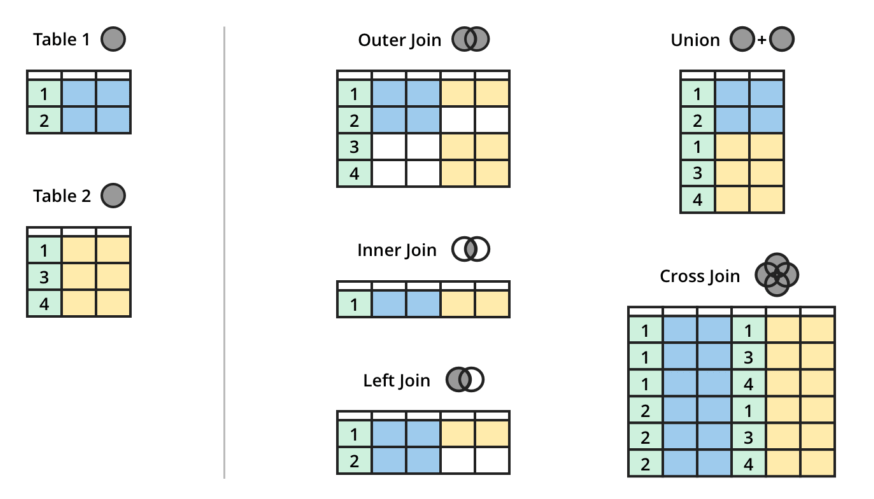
# Creating sample data frames with a common column
df1 <- data.frame(
  key = c("1", "2", "3", "4", "5"),
  value_df1 = c("A", "B", "C", "D", "E")
)

df2 <- data.frame(
  key = c("3", "4", "5", "6", "7"),
  value_df2 = c("X", "Y", "Z", "P", "Q")
)

# Convert data frames to data tables
dt1 <- as.data.table(df1)
dt2 <- as.data.table(df2)

# Setting keys for data tables
setkey(dt1, key)
setkey(dt2, key)

# Checking for common columns
common_columns <- intersect(names(dt1), names(dt2))

# Printing common columns
if (length(common_columns) > 0) {
  print(paste("Common columns:", paste(common_columns, collapse = ", ")))
} else {
  print("No common columns found.")
}
## [1] "Common columns: key"# Performing left join
left_join <- merge(dt1, dt2, by = "key", all.x = TRUE)
# Performing right join
right_join <- merge(dt1, dt2, by = "key", all.y = TRUE)
# View the results
print(left_join)## key value_df1 value_df2
## 1: 1 A <NA>
## 2: 2 B <NA>
## 3: 3 C X
## 4: 4 D Y
## 5: 5 E Z## key value_df1 value_df2
## 1: 3 C X
## 2: 4 D Y
## 3: 5 E Z
## 4: 6 <NA> P
## 5: 7 <NA> QIn the context of databases and data management, the terms “primary key,” “foreign key,” and “surrogate key” are important concepts that help maintain the integrity and relationships between different tables. Here is an explanation of each term:
A primary key is a unique identifier for each record in a database table. It ensures that each record can be uniquely identified and helps maintain data integrity. Typically, a primary key is used to establish relationships with other tables in a database. In a relational database, the primary key is a column or a set of columns that uniquely identifies each row in a table.
A foreign key is a field in a database table that is used to establish a link or relationship with the primary key of another table. It provides a means to cross-reference information between two tables. The foreign key constraints ensure referential integrity, meaning that values in the foreign key column must exist in the referenced table’s primary key column.
A surrogate key is a unique identifier that is added to a table to serve as the primary key. It is not derived from application data but is instead generated specifically for use as a primary key. Surrogate keys are often used when there is no natural primary key available, or when the existing primary key is not suitable or reliable. These keys do not carry any meaning or significance but are solely used to uniquely identify each record in a table.
- Separate and Mutate: Separating and mutating operations allow you to create new variables or modify existing ones, providing flexibility in handling and transforming data within a data frame or a tibble.
# Separate and Mutate example
separate(mpg, manufacturer, into = c("make", "company"), sep = " ") %>%
  mutate(new_column = 1:234)
## # A tibble: 234 × 13
## make company model displ year cyl trans drv cty hwy fl class
## <chr> <chr> <chr> <dbl> <int> <int> <chr> <chr> <int> <int> <chr> <chr>
## 1 audi <NA> a4 1.8 1999 4 auto… f 18 29 p comp…
## 2 audi <NA> a4 1.8 1999 4 manu… f 21 29 p comp…
## 3 audi <NA> a4 2 2008 4 manu… f 20 31 p comp…
## 4 audi <NA> a4 2 2008 4 auto… f 21 30 p comp…
## 5 audi <NA> a4 2.8 1999 6 auto… f 16 26 p comp…
## 6 audi <NA> a4 2.8 1999 6 manu… f 18 26 p comp…
## 7 audi <NA> a4 3.1 2008 6 auto… f 18 27 p comp…
## 8 audi <NA> a4 quatt… 1.8 1999 4 manu… 4 18 26 p comp…
## 9 audi <NA> a4 quatt… 1.8 1999 4 auto… 4 16 25 p comp…
## 10 audi <NA> a4 quatt… 2 2008 4 manu… 4 20 28 p comp…
## # ℹ 224 more rows
## # ℹ 1 more variable: new_column <int>- Filtering: Filtering operations enable you to extract specific rows or observations from a dataset that satisfy particular conditions, helping in identifying and focusing on relevant data points for in-depth analysis and interpretation.
## # A tibble: 71 × 11
##    manufacturer model      displ  year   cyl trans drv     cty   hwy fl    class
##    <chr>        <chr>      <dbl> <int> <int> <chr> <chr> <int> <int> <chr> <chr>
##  1 audi         a4           1.8  1999     4 manu… f        21    29 p     comp…
##  2 audi         a4           2    2008     4 manu… f        20    31 p     comp…
##  3 audi         a4           2    2008     4 auto… f        21    30 p     comp…
##  4 audi         a4 quattro   2    2008     4 manu… 4        20    28 p     comp…
##  5 audi         a4 quattro   2    2008     4 auto… 4        19    27 p     comp…
##  6 chevrolet    malibu       2.4  1999     4 auto… f        19    27 r     mids…
##  7 chevrolet    malibu       2.4  2008     4 auto… f        22    30 r     mids…
##  8 honda        civic        1.6  1999     4 manu… f        28    33 r     subc…
##  9 honda        civic        1.6  1999     4 auto… f        24    32 r     subc…
## 10 honda        civic        1.6  1999     4 manu… f        25    32 r     subc…
## # ℹ 61 more rows- Aggregation: Aggregation operations involve the computation of summary statistics or values for groups of data. Functions such as
summarise()andaggregate()help in calculating various summary metrics like mean, median, sum, and more for specific groups or subsets of data.
# Create a data.table
mpg_dt <- as.data.table(mpg)

# Aggregation example
mpg_dt[, .(avg_cty = mean(cty), avg_hwy = mean(hwy)), by = .(manufacturer, class)]
## manufacturer class avg_cty avg_hwy
## 1: audi compact 17.93333 26.93333
## 2: audi midsize 16.00000 24.00000
## 3: chevrolet suv 12.66667 17.11111
## 4: chevrolet 2seater 15.40000 24.80000
## 5: chevrolet midsize 18.80000 27.60000
## 6: dodge minivan 15.81818 22.36364
## 7: dodge pickup 12.05263 16.10526
## 8: dodge suv 11.85714 16.00000
## 9: ford suv 12.88889 17.77778
## 10: ford pickup 13.00000 16.42857
## 11: ford subcompact 15.88889 23.22222
## 12: honda subcompact 24.44444 32.55556
## 13: hyundai midsize 19.00000 27.71429
## 14: hyundai subcompact 18.28571 26.00000
## 15: jeep suv 13.50000 17.62500
## 16: land rover suv 11.50000 16.50000
## 17: lincoln suv 11.33333 17.00000
## 18: mercury suv 13.25000 18.00000
## 19: nissan compact 20.00000 28.00000
## 20: nissan midsize 20.00000 27.42857
## 21: nissan suv 13.75000 18.00000
## 22: pontiac midsize 17.00000 26.40000
## 23: subaru suv 18.83333 25.00000
## 24: subaru subcompact 19.50000 26.00000
## 25: subaru compact 19.75000 26.00000
## 26: toyota suv 14.37500 18.25000
## 27: toyota midsize 19.85714 28.28571
## 28: toyota compact 22.25000 30.58333
## 29: toyota pickup 15.57143 19.42857
## 30: volkswagen compact 20.78571 28.50000
## 31: volkswagen subcompact 24.00000 32.83333
## 32: volkswagen midsize 18.57143 27.57143
## manufacturer class avg_cty avg_hwy## manufacturer model displ year cyl trans drv cty hwy fl class
## 1: audi a4 1.8 1999 4 auto(l5) f 18 29 p compact
## 2: audi a4 1.8 1999 4 manual(m5) f 21 29 p compact
## 3: audi a4 2.0 2008 4 manual(m6) f 20 31 p compact
## 4: audi a4 2.0 2008 4 auto(av) f 21 30 p compact
## 5: audi a4 2.8 1999 6 auto(l5) f 16 26 p compact
## 6: audi a4 2.8 1999 6 manual(m5) f 18 26 p compact## manufacturer model displ year cyl trans
## 0 0 0 0 0 0
## drv cty hwy fl class
## 0 0 0 0 0- Reshaping: Reshaping operations allow you to transform data from wide to long format or vice versa, enabling you to restructure datasets to better suit specific analysis or visualization requirements. Functions like
melt()andcast()assist in reshaping data frames or matrices into the desired format.
mpg_melted <- melt(mpg_dt,id.vars = c("manufacturer","model","displ","year",
                                       "cyl","trans","drv","fl","class"))
mpg_cast <- dcast(mpg_melted, manufacturer + model + year + class ~ variable,
                  value.var = "value")
head(mpg_cast)
## manufacturer model year class cty hwy
## 1 audi a4 1999 compact 4 4
## 2 audi a4 2008 compact 3 3
## 3 audi a4 quattro 1999 compact 4 4
## 4 audi a4 quattro 2008 compact 4 4
## 5 audi a6 quattro 1999 midsize 1 1
## 6 audi a6 quattro 2008 midsize 2 2- Data Cleaning and Transformation: Data cleaning and transformation operations involve tasks such as handling missing values, converting data types, dealing with outliers, and scaling or standardizing variables. Functions like
na.omit(),as.numeric(), andscale()help in cleaning and transforming data for analysis.
# Data cleaning and transformation example
mpg_cleaned <- na.omit(mpg_dt)
mpg_cleaned[, cty := as.numeric(cty)]
mpg_cleaned[, hwy := as.numeric(hwy)]
mpg_scaled <-
  mpg_cleaned[, .(scaled_cty = scale(cty), scaled_hwy = scale(hwy))]
The terms NaN, NA, meaningful 0, and 0 as null represent different types of null or missing values in programming and data analysis. Here’s a brief explanation of each:
- NaN (Not a Number): NaN is a value used to represent undefined or unrepresentable results of a floating-point calculation. In R, NaN is commonly encountered when performing mathematical operations that yield undefined results, such as 0/0 or Inf/Inf.
- NA (Not Available): NA is used in R to denote missing or undefined values in vectors, arrays, or data frames. It is used to represent the absence of a value or the presence of missing information. NA is commonly used when a data point is not available or cannot be determined.
- Meaningful 0: Meaningful 0 refers to situations where the value 0 has a specific meaning or represents a valid data point. In some contexts, a value of 0 can have a distinct interpretation, such as indicating a measurement that is precisely zero or a count of occurrences.
- 0 as Null: In certain cases, a value of 0 might be used to represent a null or missing value, implying that the actual value is unknown or not applicable. This usage of 0 as a null value is context-specific and should be handled with caution, as it can lead to misinterpretation of data.
Having a thorough understanding of these concepts and operations is essential for proficient data analysis, programming, and manipulation in R, as they form the foundation for efficient and effective data handling and processing.
Chapter 3 Modelling
“One person’s data is another person’s noise.”
K.C. Cole
Modeling, in the context of data analysis and statistics, refers to the process of creating a simplified representation of a complex real-world system. It involves the development of mathematical, computational, or conceptual frameworks that aim to simulate, understand, or predict the behavior of a system or phenomenon.
In the field of data science and analytics, modeling entails the construction of a mathematical or computational structure that captures the essential features and relationships within a dataset. This structure, often referred to as a model, is developed based on patterns and trends observed in the data. The primary goal of modeling is to make predictions or draw inferences about the data, allowing for a deeper understanding of the underlying processes and facilitating decision-making.
Models can take various forms, including mathematical equations, statistical models, machine learning algorithms, or simulation models, depending on the complexity of the data and the specific objectives of the analysis. These models are then used to test hypotheses, simulate scenarios, forecast future outcomes, or classify data into different categories.
3.1 Traditional Modeling
Linear Regression
Linear regression is used to model the relationship between one or more independent variables and a dependent variable by fitting a linear equation to the observed data. It is often used for predictive analysis and determining the strength of the relationship between variables. For example, it can be used to predict housing prices based on factors such as square footage, number of bedrooms, and location.
Logistic Regression
Logistic regression is used to model the probability of a binary response based on one or more predictor variables. It is commonly used for classification problems, especially when the dependent variable is categorical. For instance, it can be used to predict whether a customer will purchase a product based on demographic and behavioral factors.
Decision Trees
Decision trees are hierarchical models that are used for both classification and regression. They partition the data into subsets based on various attributes and create a tree-like model of decisions. They can be used, for example, to predict whether a loan applicant is likely to default based on their credit history and financial information.
Time Series Analysis
Time series analysis is used to understand the past behavior of a time-dependent sequence of data points and to forecast future values. It is widely used in finance, economics, and other fields to predict trends over time. For example, it can be used to forecast future sales based on historical sales data and seasonal patterns.
3.2 Machine Learning Modeling
Random Forest
Random Forest is an ensemble learning method that constructs multiple decision trees during training and outputs the mean prediction of the individual trees. It is robust and effective for both regression and classification tasks, handling large datasets with high dimensionality. For instance, it can be used to predict customer churn based on customer interaction and transaction data in the telecommunications industry.
Support Vector Machines (SVM)
Support Vector Machines (SVM) is a supervised learning algorithm that analyzes data for classification and regression analysis. It works by finding the best possible line that separates data into different classes. It can be used, for example, to identify whether a particular email is spam or not based on various email features and attributes.
K-Nearest Neighbors (KNN)
K-Nearest Neighbors (KNN) is a simple and intuitive machine learning algorithm that classifies new data points based on the majority vote of its k-nearest neighbors. It is effective in classification problems and works well with small datasets. For example, it can be used to classify different species of flowers based on attributes such as petal length, petal width, sepal length, and sepal width in the iris dataset.
Neural Networks
Neural networks are a set of algorithms that mimic the human brain to recognize patterns. They are used for solving complex, nonlinear problems such as image and speech recognition. For example, they can be used to recognize handwritten digits from the MNIST dataset using a deep learning neural network.
XGBoost
XGBoost is an optimized distributed gradient boosting library designed to be highly efficient, flexible, and portable. It is used for classification, regression, and ranking problems, especially when dealing with large datasets. For example, it can be used to predict customer satisfaction levels in an e-commerce platform based on various customer interactions and transactional data.
3.3 Predictive Modelling for Financial Risk
Predictive modeling in financial risk is an indispensable tool used to assess and manage potential risks associated with financial investments or decisions. By harnessing the power of historical data, this approach employs sophisticated mathematical and statistical techniques to forecast future market trends, asset values, or potential financial downturns. Financial institutions, investment firms, and professionals use predictive modeling to anticipate potential risks and make well-informed decisions to protect their investments and maximize returns.
In the realm of financial risk analysis, predictive modeling serves as a proactive measure to identify, evaluate, and mitigate potential risks that may arise from market volatility, economic fluctuations, or unforeseen events. By leveraging historical market data, including asset prices, market indices, trading volumes, and other relevant financial indicators, predictive models can forecast potential market movements, identify emerging trends, and provide insights into potential investment opportunities or threats.
Furthermore, through the application of advanced algorithms and statistical techniques, predictive modeling can assist in the identification of key risk factors, such as credit default, market volatility, liquidity risks, and operational uncertainties. This enables financial institutions to develop robust risk management strategies, allocate resources efficiently, and optimize their portfolios to achieve a balanced risk-return profile.
In summary, predictive modeling in financial risk plays a pivotal role in empowering financial institutions and professionals to proactively manage and navigate the complexities of the financial landscape. By leveraging historical data and advanced analytical tools, predictive modeling provides invaluable insights and foresight, enabling stakeholders to make well-informed decisions and navigate potential risks in a dynamic and competitive financial environment.
3.4 Feature Selection Approach
Feature selection is a critical step in the data preprocessing phase that involves identifying and selecting the most relevant and informative features from a dataset. This process is essential for building robust and efficient predictive models, as it helps reduce dimensionality, improve model performance, and prevent overfitting. Feature selection methods can be broadly categorized into three types: filter methods, wrapper methods, and embedded methods.
Filter Methods: These methods assess the relevance of features based on their statistical properties, such as correlation, variance, or mutual information with the target variable. Features are selected or eliminated before the model is built. Examples include Pearson correlation coefficient and chi-square tests.
Wrapper Methods: These methods select features based on their impact on the predictive performance of the model. They involve building and evaluating multiple models using different feature subsets to identify the most relevant features. Recursive Feature Elimination (RFE) is a common wrapper method.
Embedded Methods: These methods perform feature selection during the model training process. They are incorporated directly into the model training algorithm, enabling the model to learn which features are most important. Regularization techniques, such as Lasso and Ridge regression, are examples of embedded methods.
Example of Recursive Feature Elimination (RFE):
In the context of predicting housing prices, the Recursive Feature Elimination (RFE) method can be employed to select the most influential features affecting house prices. For instance, the RFE algorithm can iteratively assess the importance of each feature, eliminating the least significant ones at each iteration until the optimal feature subset is determined. In this scenario, the RFE method might identify the number of bedrooms, the location of the house, and the age of the property as the most crucial factors influencing housing prices.
3.5 Methodologies
3.5.1 Supervised Learning
In the world of data, supervised learning acts as a guiding hand. Imagine you have a dataset where you know the outcomes in advance. The goal is to use this data to train the model to predict future outcomes accurately.
3.5.1.1 Regression
In regression, we deal with continuous data, like predicting house prices based on various features such as the size of the house, the number of rooms, and the location. The model tries to fit a line or curve that best represents the relationship between these features and the house price.
Linear regression is one of the simplest and most widely used regression techniques. It assumes a linear relationship between the dependent variable and one or more independent variables. For example, in the case of predicting house prices, linear regression tries to fit a line that best represents the relationship between house price (dependent variable) and features like house size, number of rooms, and location.
Polynomial regression is an extension of linear regression that allows for a nonlinear relationship between the dependent and independent variables. It fits a polynomial equation to the data, enabling more complex patterns to be captured. In the housing price prediction example, polynomial regression can account for more intricate relationships beyond a simple straight line, accommodating curves or bends in the data.
Ridge regression is a technique used when there is multicollinearity among the independent variables, which can lead to overfitting in linear regression. It adds a penalty term to the regression equation, constraining the coefficient estimates. This helps to reduce the model’s complexity and minimize the impact of irrelevant features. In the context of house price prediction, ridge regression can handle situations where some features are highly correlated, such as the relationship between house size and the number of rooms.
Lasso (Least Absolute Shrinkage and Selection Operator) regression is similar to ridge regression but with a different penalty term. It not only helps in reducing overfitting but also performs feature selection by forcing some of the coefficients to be exactly zero. In the housing price prediction scenario, lasso regression can automatically select the most relevant features, such as selecting either the size of the house or the number of rooms based on their predictive power.
Elastic net regression is a hybrid approach that combines the penalties of ridge and lasso regression. It addresses some of the limitations of both techniques, providing a balance between variable selection and regularization. It is especially useful when dealing with datasets with a large number of features. In the context of predicting house prices, elastic net regression can effectively handle situations where there are both correlated and uncorrelated features, ensuring accurate predictions while maintaining model simplicity.
3.5.1.2 Classification
Classification, on the other hand, deals with data that can be grouped into categories or classes. For instance, when you want to predict if a customer is likely to default on a loan, you’re essentially classifying them into either a “default” or “non-default” category. Common algorithms for classification include decision trees, logistic regression, and support vector machines.
Decision Trees are tree-like models where each node represents a feature, each branch symbolizes a decision rule, and each leaf node represents the outcome or the class label. These models are easy to interpret and visualize. In the context of predicting loan defaults, a decision tree might use features such as credit score, income, and existing debt to classify customers into default or non-default groups.
Logistic Regression is a statistical method used for predicting the probability of a binary outcome based on one or more predictor variables. It estimates the probability that a given input belongs to a particular category. In the case of loan default prediction, logistic regression could be employed to calculate the probability that a customer is likely to default based on factors such as credit history, income level, and existing debts.
Support Vector Machines (SVM) are supervised learning models that analyze data and recognize patterns, used for classification and regression analysis. SVMs map input data to a high-dimensional feature space and separate categories by a hyperplane. In the scenario of predicting loan defaults, an SVM might use features like loan amount, credit score, and employment status to classify customers into default or non-default categories.
Random Forest is an ensemble learning method that constructs a multitude of decision trees during training and outputs the class that is the mode of the classes. It provides an effective way to handle large datasets with higher dimensionality. In the context of loan default prediction, a random forest model could consider multiple features such as employment history, credit utilization, and payment history to classify customers into default or non-default groups.
Naive Bayes is a probabilistic classifier based on Bayes’ theorem with the assumption of independence between features. Despite its simplicity, it often performs well in various complex classification tasks. In the case of loan default prediction, a Naive Bayes model could calculate the probability of default based on features like loan amount, income, and credit history, assuming that these features are independent of each other.
3.5.2 Unsupervised Learning
In the absence of labeled data, unsupervised learning allows us to explore the hidden patterns or structures within the data without any predefined outcomes.
3.5.2.1 Clustering
Clustering is like finding hidden communities in your data. For instance, you might use clustering to group customers based on their purchasing behavior, allowing you to create more targeted marketing strategies for each group.
K-Means Clustering is a popular unsupervised machine learning algorithm that aims to partition data points into ‘K’ distinct, non-overlapping clusters. It works by iteratively assigning data points to one of K clusters based on the nearest mean. In the context of customer segmentation, K-means clustering can be used to group customers based on their purchasing behavior, helping businesses identify different customer segments for targeted marketing campaigns.
Hierarchical Clustering is a method of cluster analysis that builds a hierarchy of clusters. It begins with each data point as a separate cluster and then merges the closest clusters based on a specified distance metric. The result is a dendrogram that shows the arrangement of the clusters. This technique is beneficial when trying to understand the relationships between different segments of customers in marketing analysis.
3.5.2.2 Association
Association analysis helps us discover relationships or associations between different variables in the data. For example, in a retail setting, association analysis might reveal that customers who buy diapers are also likely to buy baby wipes, prompting the store to place these items close to each other.
Apriori Algorithm is a classic algorithm used for association rule mining in large datasets. It identifies frequent individual items occurring together in the dataset and generates association rules. In the retail setting, the Apriori algorithm can be employed to discover that customers who purchase coffee are also likely to buy milk, prompting the store to place these items together for increased sales.
FP-Growth Algorithm (Frequent Pattern Growth) is another popular method for finding frequent patterns in datasets. It represents the dataset in a compact data structure called an FP-tree, which is then used to mine frequent patterns. In a retail context, the FP-Growth algorithm can reveal that customers who purchase bread are also likely to buy butter, leading the store to strategically position these items together for customer convenience and increased sales.
3.5.3 Different Kinds of Target Variables and Models
Understanding the type of target variable is crucial in choosing the right model for your analysis.
Categorical Target Variables: When dealing with categorical targets, where the outcomes are in the form of categories or labels, you might employ decision tree models, random forests, or even gradient boosting machines. These models work well for tasks like predicting customer churn, sentiment analysis, or identifying potential credit card fraud.
Continuous Target Variables: For tasks where the target variable is continuous and can take any numerical value, models like linear regression, polynomial regression, and support vector machines are commonly used. These models prove helpful in predicting stock prices, housing prices, or estimating the sales of a product based on various factors like advertising expenditure and seasonality.
3.5.4 Discussing and Comparison of Models
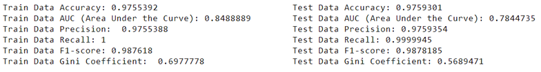
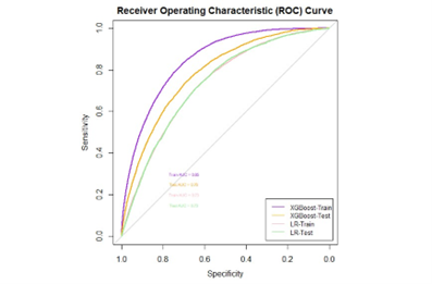
It’s crucial to compare different models to find the one that best fits your data and gives the most accurate predictions. For instance, when predicting loan defaults, you might compare the performance of various models such as logistic regression, random forest, or support vector machines. By evaluating metrics like accuracy, precision, recall, F1 score, and area under the curve (AUC), you can determine which model performs better for your specific task.
3.5.4.1 Evaluation Metrics
- Precision measures the proportion of correctly identified positive cases from all the predicted positive cases. In the context of loan defaults, precision tells you how many of the predicted defaults are actually true defaults.
- Recall (Sensitivity) measures the proportion of correctly identified positive cases from all the actual positive cases. In the case of loan defaults, recall tells you how many of the true defaults were correctly identified by the model.
- Accuracy measures the proportion of correctly identified cases (both true positives and true negatives) out of the total cases. It provides an overall measure of how often the model is correct.
- Gini Coefficient is a metric commonly used to evaluate the performance of classification models. It represents the area between the ROC curve and the diagonal line (random guess). A higher Gini coefficient indicates better discriminatory power of the model.
- F1 Score is the harmonic mean of precision and recall. It provides a balance between precision and recall and is useful when the classes are imbalanced. A high F1 score indicates both high precision and high recall.
- Area Under the Curve (AUC) is the area under the Receiver Operating Characteristic (ROC) curve. It provides an aggregate measure of performance across all possible classification thresholds. A higher AUC value indicates better discriminative ability of the model.
3.5.5 Sampling and Splitting
In the context of data analysis, Sampling refers to the process of selecting a subset of data from a larger dataset to perform analysis or build models. It helps to work with manageable data sizes for analysis and model building.
On the other hand, Splitting refers to dividing the dataset into different subsets for various purposes, such as model training, validation, and testing. It is commonly done to assess the performance of the model on unseen data.
3.5.5.1 Stratified Splittting
Stratified splitting is a method that ensures the distribution of classes in the dataset is maintained proportionally in both the training and testing datasets. This is crucial when dealing with imbalanced datasets where the classes are not evenly distributed.
- 70-30 Split: The 70-30 split indicates that the dataset is divided into 70% for training and 30% for testing. The larger portion is used for training the model, while the smaller portion is used for evaluating the model’s performance on unseen data.
3.5.5.2 Setting Seed
In R, various functions use randomness, such as data splitting and initialization of models. Setting a seed is like setting a starting point for the random number generator. This ensures that every time you run the code, you get the same sequence of random numbers. It helps in reproducing the same results, making the analysis more consistent and reproducible.
By setting a seed, you can replicate your analysis or model building, which is essential for sharing and verifying results. It also ensures that any changes or modifications in the analysis can be traced back to the same starting point, maintaining the consistency of the analysis over time.
Chapter 4 Let’s Build a Model
In the previous chapter, you have been familiarized with the basic concepts of modelling and tools, essentials and packages you will need in your data exploration path! It is time to dive deeper in this world and learn more details by going step by step towards building a model.
4.1 Data Preprocessing and Data Preparation
Data preprocessing and preparation are essential steps in the data analysis process. They involve transforming raw data into a format that is suitable for analysis and modeling. This process ensures that the data is clean, consistent, and ready for further exploration and analysis. The key steps involved in data preprocessing and preparation are as follows:
4.1.1 Importing the dataset
The very first step for data preparation is to import your data into R. Using different packages in R, you can import different file types. Table below includes the packages and file types supported by R:
| File Type | Functions |
|---|---|
| CSV (Comma Separated Values) | read.csv() |
| Excel Spreadsheets | read_excel() |
| RDBMS (Relational Database Management System) Tables | RMySQL or RSQLite packages |
| JSON (JavaScript Object Notation) | fromJSON() |
| XML (Extensible Markup Language) | xmlTreeParse() |
| SAS | read_sas() |
| Stata | read_dta() |
| SPSS | read_sav() |
| SQL | RMySQL package |
| Parquet | read_parquet() |
| Pickle | readdf() |
4.1.2 Data Cleaning
Data cleaning involves handling missing values, correcting data errors, and dealing with outliers in the dataset. It ensures that the data is accurate and reliable for analysis.
4.1.2.1 Missing Values
Data may contain missing values, denoted as NA or NaN, which can affect the analysis. These missing values can be handled by either removing the corresponding rows or columns, or by imputing them with appropriate values such as the mean, median, or mode of the dataset.
# Example: Imputing missing values with the mean
data <- c(2, 3, NA, 5, 6, NA, 8)
mean_value <- mean(data, na.rm = TRUE)
cleaned_data <- ifelse(is.na(data), mean_value, data)
print(cleaned_data)
## [1] 2.0 3.0 4.8 5.0 6.0 4.8 8.04.1.2.2 Data Errors
Data errors, such as inconsistencies in formatting, typographical errors, or erroneous entries, can distort the analysis results. Correcting these errors involves identifying and rectifying inconsistencies in the data, ensuring uniformity and accuracy throughout the dataset.
# Example: Standardizing text case to lowercase
text_data <- c("Apple", "orange", "Banana", "grape", "APPLE")
cleaned_text_data <- tolower(text_data)
print(cleaned_text_data)
## [1] "apple" "orange" "banana" "grape" "apple"4.1.2.3 Outliers
Outliers are data points that significantly deviate from the overall pattern of the dataset. They can skew statistical analyses and model predictions. Dealing with outliers involves identifying and handling them appropriately, either by removing them if they are data entry errors or by applying suitable techniques such as capping, flooring, or transforming the data.
# Example: Capping outliers in a numerical vector
numeric_data <- c(22, 18, 25, 30, 500, 28, 21)
upper_limit <- quantile(numeric_data, 0.75) + 1.5 * IQR(numeric_data)
cleaned_numeric_data <- pmin(numeric_data, upper_limit)
print(cleaned_numeric_data)
## [1] 22.00 18.00 25.00 30.00 40.25 28.00 21.004.1.2.4 Standard Formats
Standardizing data formats involves ensuring uniformity in the representation of data across different features. This process may include converting data to a consistent format, such as converting dates to a standard date format, ensuring uniform units of measurement, and resolving inconsistencies in categorical data representations.
# Standardizing Data Formats
# Example: Converting date to standard date format
date_data <- c("2022/01/01", "2022/02/01", "2022/03/01", "20220401")
cleaned_date_data <- as.Date(date_data, format = "%Y/%m/%d")
print(cleaned_date_data)
## [1] "2022-01-01" "2022-02-01" "2022-03-01" NA4.1.3 Data Integration
Data integration is the process of combining data from multiple sources into a single, unified dataset. It helps in creating a comprehensive view of the data for analysis.
library(dplyr)
# Creating example datasets
# Define the datasets
dataset1 <- data.frame(ID = c(1, 2, 3, 4),
                       Name = c("John", "Amy", "Tom", "Kate"),
                       Age = c(25, 30, 28, 35))
dataset2 <- data.frame(ID = c(3, 4, 5, 6),
                       Gender = c("M", "F", "M", "F"),
                       Salary = c(50000, 60000, 48000, 70000))

# Merge the datasets based on the common key 'ID'
merged_data <- merge(dataset1, dataset2, by = "ID", all = TRUE)
print(merged_data)
## ID Name Age Gender Salary
## 1 1 John 25 <NA> NA
## 2 2 Amy 30 <NA> NA
## 3 3 Tom 28 M 50000
## 4 4 Kate 35 F 60000
## 5 5 <NA> NA M 48000
## 6 6 <NA> NA F 700004.1.4 Data Transformation
Data transformation involves converting data into a suitable format for analysis. It may include scaling, normalization, and encoding categorical variables to ensure uniformity and comparability across different features.
4.1.4.1 Scaling
Scaling is a data transformation technique that standardizes the range of values in a dataset. It ensures that different features are comparable by bringing them to a common scale. In the given example, the scale() function is applied to the dataset, which centers the data by subtracting the mean and scales it by dividing by the standard deviation.
# Creating a sample dataset
data <- data.frame(Feature1 = c(10, 20, 30, 40, 50),
                   Feature2 = c(5, 15, 25, 35, 45))

# Applying scaling to the dataset
scaled_data <- scale(data)
print(scaled_data)
## Feature1 Feature2
## [1,] -1.2649111 -1.2649111
## [2,] -0.6324555 -0.6324555
## [3,] 0.0000000 0.0000000
## [4,] 0.6324555 0.6324555
## [5,] 1.2649111 1.2649111
## attr(,"scaled:center")
## Feature1 Feature2
## 30 25
## attr(,"scaled:scale")
## Feature1 Feature2
## 15.81139 15.811394.1.4.2 Normalization
Normalization is a data transformation technique that rescales the values of numerical features to a common scale, often between 0 and 1. It is particularly useful when the magnitude of different features varies widely. In the provided example, the data is normalized using the minimum and maximum values of each feature, ensuring that the entire range of each feature is utilized. In R, the normalize() function from the DMwR package is often used for normalization. Additionally, the preProcess() function from the caret package offers various normalization techniques.
# Normalization example
# Creating a sample dataset
data <- data.frame(Feature1 = c(100, 200, 300, 400, 500),
                   Feature2 = c(50, 150, 250, 350, 450))

# Applying normalization to the dataset
normalized_data <- as.data.frame(lapply(data, function(x)
  (x - min(x)) / (max(x) - min(x))))
print(normalized_data)
## Feature1 Feature2
## 1 0.00 0.00
## 2 0.25 0.25
## 3 0.50 0.50
## 4 0.75 0.75
## 5 1.00 1.004.1.4.3 Categorical Variable Encoding
Categorical variable encoding is the process of converting categorical variables into a format that can be used for analysis. One-hot encoding is a commonly used technique that converts categorical variables into a binary matrix, where each category is represented by a binary column. In the example, the model.matrix() function is used to apply one-hot encoding to the categorical variable “Gender,” representing each category as a binary column.
# Categorical variable encoding example
# Creating a sample dataset with a categorical variable
data <- data.frame(Gender = c("Male", "Female", "Male", "Female", "Male"))

# Encoding categorical variable using one-hot encoding
encoded_data <- model.matrix(~ Gender - 1, data = data)
print(encoded_data)
## GenderFemale GenderMale
## 1 0 1
## 2 1 0
## 3 0 1
## 4 1 0
## 5 0 1
## attr(,"assign")
## [1] 1 1
## attr(,"contrasts")
## attr(,"contrasts")$Gender
## [1] "contr.treatment"4.1.5 Feature Engineering
Feature engineering is the process of creating new features or modifying existing features to improve the performance of the machine learning models. It helps in capturing important patterns and relationships within the data.
data("mtcars")
# Creating a new feature: car performance score
mtcars <- mtcars %>%
  mutate(performance_score = hp / wt)
# Previewing the modified dataset
head(mtcars)
## mpg cyl disp hp drat wt qsec vs am gear carb
## Mazda RX4 21.0 6 160 110 3.90 2.620 16.46 0 1 4 4
## Mazda RX4 Wag 21.0 6 160 110 3.90 2.875 17.02 0 1 4 4
## Datsun 710 22.8 4 108 93 3.85 2.320 18.61 1 1 4 1
## Hornet 4 Drive 21.4 6 258 110 3.08 3.215 19.44 1 0 3 1
## Hornet Sportabout 18.7 8 360 175 3.15 3.440 17.02 0 0 3 2
## Valiant 18.1 6 225 105 2.76 3.460 20.22 1 0 3 1
## performance_score
## Mazda RX4 41.98473
## Mazda RX4 Wag 38.26087
## Datsun 710 40.08621
## Hornet 4 Drive 34.21462
## Hornet Sportabout 50.87209
## Valiant 30.346824.1.6 Data Reduction
Data reduction techniques such as feature selection and dimensionality reduction help in reducing the complexity of the dataset without losing critical information. This step is crucial for improving the efficiency and performance of the models.
## Loading required package: lattice#Load the dataset
data(iris)
# Perform feature selection using the "cor" method
reduced_data <- nearZeroVar(iris)
# View the reduced dataset
head(reduced_data)## integer(0)4.1.7 Data Formatting
Data formatting involves organizing the data in a structured and standardized format. It ensures consistency in the data representation, making it easier to analyze and interpret the results.
# Creating a simple dataset
employee_data <- data.frame(
  employee_id = c(1, 2, 3, 4, 5),
  employee_name = c("John", "Sara", "Mike", "Emily", "David"),
  employee_department = c("HR", "Marketing", "Finance", "IT", "Operations"),
  employee_salary = c(50000, 60000, 55000, 65000, 70000)
)

# Displaying the original dataset
print("Original Employee Data:")
## [1] "Original Employee Data:"## employee_id employee_name employee_department employee_salary
## 1 1 John HR 50000
## 2 2 Sara Marketing 60000
## 3 3 Mike Finance 55000
## 4 4 Emily IT 65000
## 5 5 David Operations 70000# Formatting the data with proper column names and alignment
colnames(employee_data) <- c("ID", "Name", "Department", "Salary")
rownames(employee_data) <- NULL
# Displaying the formatted dataset
print("Formatted Employee Data:")## [1] "Formatted Employee Data:"## ID Name Department Salary
## 1 1 John HR 50000
## 2 2 Sara Marketing 60000
## 3 3 Mike Finance 55000
## 4 4 Emily IT 65000
## 5 5 David Operations 700004.1.8 Data Splitting
Data splitting is the process of dividing the dataset into training and testing sets. It helps in evaluating the performance of the model on unseen data and prevents overfitting.
# Load necessary library
library(caret)
# Load the dataset (in this example, using the built-in iris dataset)
data(iris)

# Set a seed for reproducibility
set.seed(123)

# Split the data into 70% training and 30% testing sets
trainIndex <- createDataPartition(iris$Species, p = 0.7, list = FALSE)
trainData <- iris[trainIndex, ]
testData <- iris[-trainIndex, ]

# View the dimensions of the training and testing datasets
cat("Training data dimensions:", dim(trainData), "\n")
## Training data dimensions: 105 5## Testing data dimensions: 45 54.2 Building a Simple Model
Let’s try and build model step by step, including feature selection, missing value handling, scaling, model fitting, and visualization, using the built-in mtcars dataset.
4.2.1 Data Preprocessing
Handling Missing Values: Any 0 values in the dataset are replaced with NA to ensure accurate analysis and modeling.
Feature Selection: We select specific features (
mpg,cyl,disp,hp,wt,qsec) from the dataset for modeling purposes.Data Scaling: The selected features are standardized using the scale function to ensure that each feature has a mean of 0 and a standard deviation of 1.
# Load necessary libraries
library(ggplot2)
library(dplyr)
library(tidyr)
library(caret)

# Data preprocessing
# Handling missing values
# Handling missing values with mean imputation
mtcars[mtcars == 0] <- NA  # Replacing 0 values with NA
imputed_mtcars <- mtcars %>% mutate_all(~ ifelse(is.na(.),
                                                 mean(., na.rm = TRUE), .))

# Stratified 70-30 data splitting
set.seed(123)
split_data <- createDataPartition(imputed_mtcars$mpg, p = 0.7, list = FALSE)
train_data <- imputed_mtcars[split_data, ]
test_data <- imputed_mtcars[-split_data, ]

# Feature selection
selected_train_data <- train_data %>% select(mpg, cyl, disp, hp, wt, qsec)
selected_test_data <- test_data %>% select(mpg, cyl, disp, hp, wt, qsec)

# Data scaling
scaled_train_data <- as.data.frame(selected_train_data %>% scale())
scaled_test_data <- as.data.frame(selected_test_data %>% scale())
4.2.2 Model Fitting
- Linear Regression: We fit a linear regression model to the scaled data using the
lmfunction, withmpgas the dependent variable and the remaining selected features as independent variables. In this example we want to use all the selected features therefore we use~but once we have the p-value and the significance of other features in order to have a less complex model with only strongest regressors, we will be able to manually feed the regressors to the model.
4.2.3 Visualization
- We create a scatter plot of the
mpgvalues against thewt(weight) values from the original dataset. We also overlay the regression line from the fitted model on the scatter plot to visualize the relationship between the features and the target variable.
# Visualize the model with the regression line using ggplot2
ggplot(selected_train_data, aes(x = wt, y = mpg)) +
  geom_point(color = "lightblue") +
  geom_smooth(method = "lm", color = "lightcoral", se = FALSE) +
  labs(title = "Scatter Plot of Weight vs. MPG with Regression Line")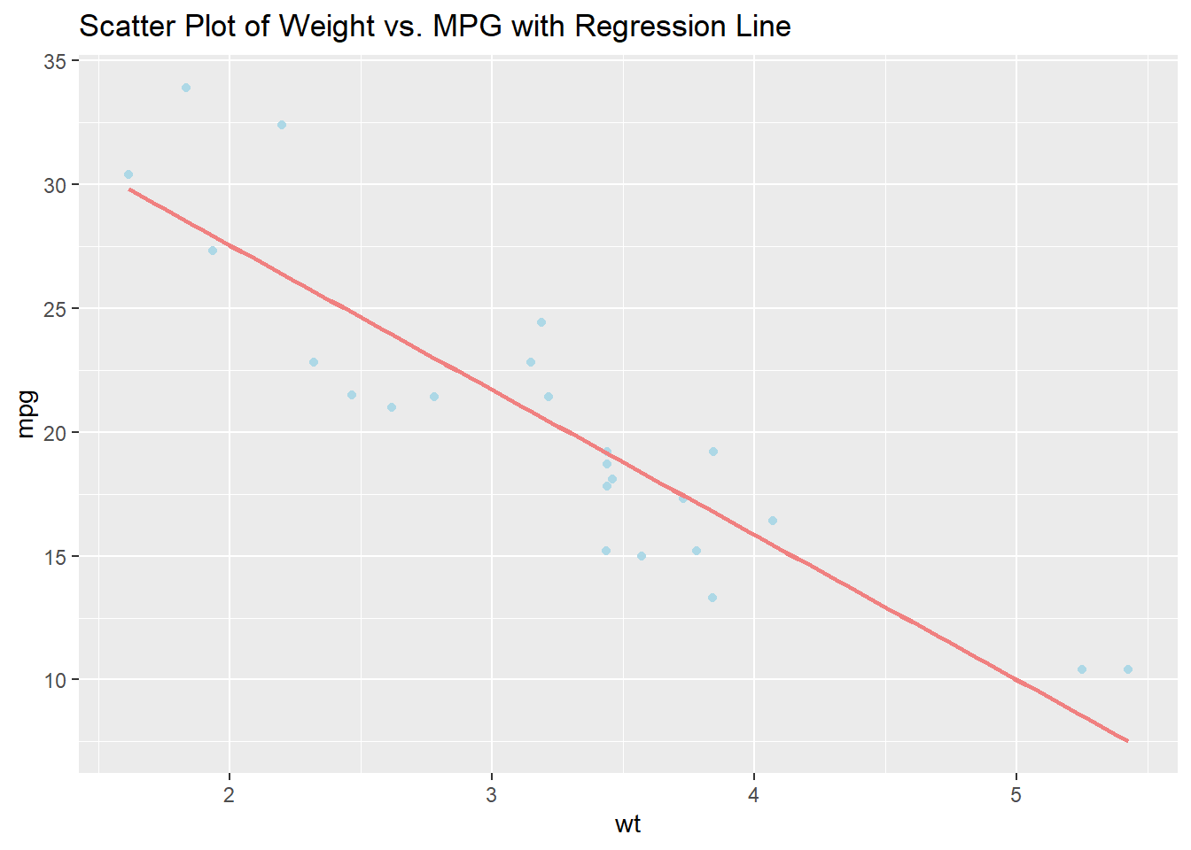
4.2.4 Model Summary
- We provide a summary of the linear regression model to understand the significance and impact of the selected features on the predicted
mpg.
##
## ===============================================
##                         Dependent variable:
##                     ---------------------------
##                                 mpg
## -----------------------------------------------
## cyl                           -0.166
##                               (0.259)
##
## disp                           0.256
##                               (0.289)
##
## hp                            -0.180
##                               (0.201)
##
## wt                           -0.828***
##                               (0.248)
##
## qsec                           0.109
##                               (0.177)
##
## Constant                       0.000
##                               (0.088)
##
## -----------------------------------------------
## Observations                    24
## R2                             0.856
## Adjusted R2                    0.816
## Residual Std. Error       0.429 (df = 18)
## F Statistic           21.364*** (df = 5; 18)
## ===============================================
## Note: *p<0.1; **p<0.05; ***p<0.014.2.5 Prediction
- We create a new data point with specific values for the features
cyl,disp,hp,wt, andqsec. Wescale()the new data using the mean and standard deviation from the original scaled data to ensure consistency. We use thepredict()function to predict thempgfor the new data point based on the fitted linear regression model. The predictedmpgvalue for the new data point is displayed.
# Run predictions
new_data <- data.frame(cyl = 6, disp = 225, hp = 100, wt = 2.6, qsec = 17)
scaled_new_data <- as.data.frame((as.matrix(new_data) -
                                    colMeans(selected_train_data[, -1])) / apply(selected_train_data[, -1], 2, sd))
predicted_mpg <- predict(model, scaled_new_data)

cat("Predicted MPG for the new data:", predicted_mpg, "\n")
## Predicted MPG for the new data: 0.5943394.2.6 Performance Testing
Performance testing after building a model is essential for evaluating the model’s effectiveness and determining its predictive capabilities. This step is crucial because:
Model Validation: Performance testing allows us to validate the model against unseen data. It helps in understanding how well the model can generalize to new, unseen instances. This validation is vital to ensure that the model is not overfitting or underfitting the training data.
Assessment of Model Accuracy: By evaluating the model’s performance, we can assess its accuracy in predicting the target variable. Performance metrics such as precision, recall, F1 score, Gini, AUC, and accuracy provide quantitative measures of the model’s predictive power, allowing us to gauge its reliability in real-world scenarios.
Comparison with Baseline: Performance testing helps in comparing the model’s performance with a baseline or benchmark. This comparison aids in understanding whether the model provides significant improvements over simpler or naive approaches, thereby justifying the effort put into building a more complex model.
Identification of Model Limitations: Evaluating the model’s performance can reveal its limitations and areas for improvement. It can help in identifying potential biases, data issues, or shortcomings in the modeling approach, which can then be addressed to enhance the model’s predictive capabilities.
Optimization and Iterative Improvement: Through performance testing, we can iteratively optimize the model by fine-tuning its parameters, adjusting the feature selection, or exploring different modeling techniques. This iterative process allows for continuous refinement of the model, leading to better predictive accuracy and generalization to new data.
# Calculate evaluation metrics
model_predictions <- predict(model, scaled_test_data)

# Create factors with appropriate levels
factor_model_predictions <-
  as.factor(ifelse(model_predictions > median(scaled_test_data$mpg), "1", "0"))
binary_mpg <-
  as.factor(ifelse(scaled_test_data$mpg>median(scaled_test_data$mpg),"1", "0"))

# Ensure the levels of the factors match
levels(factor_model_predictions) <- levels(binary_mpg)

# Calculate confusion matrix
confusion_matrix <-
  confusionMatrix(factor_model_predictions, reference = binary_mpg)

# Calculate evaluation metrics
precision <- confusion_matrix$byClass["Precision"]
recall <- confusion_matrix$byClass["Recall"]
f1_score <- confusion_matrix$byClass["F1"]
gini <- 2 * auc(roc(as.numeric(binary_mpg),
                    as.numeric(factor_model_predictions))) - 1
auc_value <- auc(roc(as.numeric(binary_mpg),
                     as.numeric(factor_model_predictions)))
accuracy <- confusion_matrix$overall["Accuracy"]

metrics_table <- data.frame(
  Metric = c("Precision", "Recall", "F1 Score", "Gini", "AUC", "Accuracy"),
  Value = c(precision, recall, f1_score, gini, auc_value, accuracy)
)

# Display the table
knitr::kable(metrics_table, align = "c", col.names = c("Metric", "Value"))| Metric | Value |
|---|---|
| Precision | 1.0000000 |
| Recall | 0.7500000 |
| F1 Score | 0.8571429 |
| Gini | 0.7500000 |
| AUC | 0.8750000 |
| Accuracy | 0.8750000 |
Chapter 5 Real World Implementation
We have seen a simple example for modelling with R, but in the real world, the challenges and the modelling process is much more complex. A real world implementation of what we learnt in the previous chapters is presented to you in this chapter.
5.1 Feature Engineering
Now let’s have a look into our real world project and how we can actually use the functions and options that we have learnt in a bigger and more complex way.
The first step in our project is to construct our variables and update our original table that has been import from an excel file.
# simple variable construction
data_orig_features$ToB =  data_orig_features$time-data_orig_features$orig_time
# Time on Book
data_orig_features$TtM=data_orig_features$mat_time-data_orig_features$time
# Remaining time to maturity
data_orig_features$IR_change=
  data_orig_features$interest_rate_time-data_orig_features$Interest_Rate_orig_time
# Absolute Change in interest rate since origination
data_orig_features$HPI_pct_change =
  data_orig_features$hpi_time/data_orig_features$hpi_orig_time-1
# Percentage Change in House Price Index since origination
data_orig_features$RemBal_pct =
  data_orig_features$balance_time/data_orig_features$balance_orig_time
# Remaining Balance as a parcentage of Original Balance

# Macro-economic features - Create lagged vriables

normalit<-function(m){
  (m - mean(m))/sqrt(var(m))
}# Function to normalize columns

macro_ts = data_orig_features %>% group_by(time) %>%
  summarise(GDP_change_t = min(gdp_time), UER_t = min(uer_time)) %>%
  mutate(GDP_change_t_norm=normalit(GDP_change_t), # Normalized GDP change
         UER_t_norm=normalit(UER_t), # Normalized Unemployment Rate
         GDP_change_t_norm_3=lag(GDP_change_t_norm, n=3, order_by=time),
         # Lagged Normalized GDP Change
         GDP_change_t_norm_6=lag(GDP_change_t_norm, n=6,order_by=time),
         GDP_change_t_norm_9=lag(GDP_change_t_norm, n=9,order_by=time),
         GDP_change_t_norm_12=lag(GDP_change_t_norm, n=12,order_by=time),
         # Lagged Normalized Unemployment Rate
         UER_t_norm_3=lag(UER_t_norm, n=3, order_by=time),
         UER_t_norm_6=lag(UER_t_norm, n=6, order_by=time),
         UER_t_norm_9=lag(UER_t_norm, n=9, order_by=time),
         UER_t_norm_12=lag(UER_t_norm, n=12, order_by=time))

data_orig_features = left_join(data_orig_features,macro_ts,by=c("time"))
# Join time dependent macro variables to existing data based on "time"

# Save csv file with new features
write.csv(data_orig_features,"mortgage_upd.csv",row.names = FALSE)

View(data_orig_features)
summary(data_orig_features)
5.2 Missing Value Treatments
Before handleing the missing values in this example, due to the requirement and the concept of the project, aggregated features need to be created and added to the data set. Always have in my to #comment on your code for feature use and keep the original data in your environment in case you will need it.
#  the ! means that we want to select other rows that does not have missing values
data_orig_ftrs <- data_orig_ftrs[!is.na(LTV_time)]

# impute missing values that could not be removed from the data set
mean_pct_change_gdp <- mean(data_orig_features$gdp_time, na.rm = TRUE)
mean_pct_change_uer <- mean(data_orig_features$uer_time, na.rm = TRUE)

lagged_gdp_columns <-
  names(data_orig_ftrs)[grepl("GDP_change_t_norm", names(data_orig_ftrs))]

for (col_name in lagged_gdp_columns) {
  data_orig_ftrs[, (col_name) := ifelse(is.na(get(col_name)),
                                        mean_pct_change_gdp, get(col_name))]
}

lagged_uer_columns <-
  names(data_orig_ftrs)[grepl("UER_t_norm_", names(data_orig_ftrs))]

for (col_name in lagged_uer_columns) {
  data_orig_ftrs[, (col_name) := ifelse(is.na(get(col_name)),
                                        mean_pct_change_uer, get(col_name))]
}

# always check the missing values after the imputation techniques you used
missing_values <- colSums(is.na(data_orig_ftrs))
print(missing_values)
5.3 Distribution Analysis
Always remember to check the imbalance data. In many cases when it comes to financial risk, you have imbalanced data which can cause some abnormalities and you will need to decide your next steps in modelling based on that.
# you can check the distribution of your dataset using visualization techniques
p <-
  ggplot(data_orig_ftrs, aes(x = factor(default_time),
                             fill = factor(default_time))) +geom_bar() +
  labs(title = "Data Imbalance Check", x = "Default Status", y = "Count") +
  scale_fill_manual(values = c("0" = "lightblue", "1" = "lightpink"),
                    name = "Default Status")

counts <- table(data_orig_ftrs$default_time)

p + annotate("text", x = c(1, 2), y = c(counts[1], counts[2]), label = counts)
# it is good to understand your data better by visualizing them
for (var_name in names(data_orig_ftrs)) {
if (is.numeric(data_orig_ftrs[[var_name]])) {
p <- ggplot(data_orig_ftrs, aes(x = data_orig_ftrs[[var_name]])) +
geom_histogram(binwidth = 0.1, fill = "blue", color = "black") +
labs(title = paste("Histogram of", var_name),
x = var_name, y = "Frequency")
print(p)
}
}5.4 Univariate Analysis
Univariate analysis serves the purpose of understanding and summarizing individual variables in a dataset. It is a fundamental step in data analysis that helps to describe and comprehend the characteristics of a single variable in isolation. The primary objectives of univariate analysis include:
Descriptive Statistics: Univariate analysis aids in exploring the distribution, central tendency, and spread of a single variable, providing insights into its mean, median, mode, variance, and other measures of dispersion.
Identifying Patterns and Anomalies: By examining one variable at a time, analysts can identify patterns, trends, and outliers within the dataset. This process helps in uncovering hidden insights and anomalies that might otherwise be overlooked.
Data Cleaning and Preprocessing: Univariate analysis often forms the initial stage of data cleaning and preprocessing, allowing analysts to detect and handle missing values, outliers, or erroneous data points in the dataset.
Hypothesis Testing: Univariate analysis plays a crucial role in hypothesis testing by examining the characteristics of a single variable to draw inferences and make conclusions about the population under investigation.
univariate_results2 <- lapply(names(data_orig_ftrs), function(var_name) {
  if (var_name != "default_time") {
    if (is.factor(data_orig_ftrs[[var_name]])) {
      if (any(is.na(data_orig_ftrs[[var_name]]))) {
        variable_status <- "Missing Data"
      } else {
        chi_square_test <- chisq.test(table(data_orig_ftrs[[var_name]], data_orig_ftrs$default_time))
        if (chi_square_test$p.value < 0.05) {
          variable_status <- "Selected"
        } else {
          variable_status <- "Not Selected"
        }
      }
      return(list(
        Variable = var_name,
        ChiSquare_P_Value =
          ifelse(exists("chi_square_test"), chi_square_test$p.value, NA),
        Variable_Status = variable_status
      ))
    } else {
      if (any(is.na(data_orig_ftrs[[var_name]]))) {
        variable_status <- "Missing Data"
      } else {
        t_test <-
          t.test(data_orig_ftrs[[var_name]] ~ data_orig_ftrs$default_time)
        wilcox_test <-
          wilcox.test(data_orig_ftrs[[var_name]] ~ data_orig_ftrs$default_time)
        if (t_test$p.value < 0.05 || wilcox_test$p.value < 0.05) {
          variable_status <- "Selected"
        } else {
          variable_status <- "Not Selected"
        }
      }
      return(list(
        Variable = var_name,
        T_Test_P_Value = ifelse(exists("t_test"), t_test$p.value, NA),
        Wilcox_Test_P_Value =
          ifelse(exists("wilcox_test"), wilcox_test$p.value, NA),
        Variable_Status = variable_status
      ))
    }
  }
})

univariate_df2 <- do.call(rbind.data.frame, univariate_results2)
print(univariate_df2)
5.5 Stepwise Regression
Forward stepwise logistic regression is a method for building a logistic regression model by adding one predictor variable at a time based on statistical criteria like p-values or the AIC. It starts with an empty model and iteratively includes variables to improve model fit. We used this model to be able to choose our final features for the model.
5.6 Selected Regression Model
set.seed(123)

# Create a train-test split using createDataPartition
train_index <-
  createDataPartition(data_orig_ftrs$default_time, p = 0.7, list = FALSE)
train_data <- data_orig_ftrs[train_index, ]
test_data <- data_orig_ftrs[-train_index, ]
featurelist <- c('balance_time', 'interest_rate_time', 'hpi_time', 'gdp_time',
              'uer_time', 'investor_orig_time', 'FICO_orig_time',
              'LTV_time', 'Interest_Rate_orig_time', 'hpi_orig_time', 'ToB',
              'HPI_pct_change', 'RemBal_pct')

# Train the logistic regression model on the train_data
formula <-
  as.formula(paste("default_time ~", paste(featurelist, collapse = "+")))

# Fit the logistic regression model
model2 <- glm(formula, data = train_data, family = "binomial")

# Predict probabilities on both train_data and test_data
predicted_probs_train<-predict(model2, newdata = train_data, type = "response")
predicted_classes_train <- ifelse(predicted_probs_train > 0.5, 1, 0)

predicted_probs_test <- predict(model2, newdata = test_data, type = "response")
predicted_classes_test <- ifelse(predicted_probs_test > 0.5, 1, 0)

train_data$predicted_prob <- predicted_probs_train
train_data$predicted_class <- predicted_classes_train

test_data$predicted_prob <- predicted_probs_test
test_data$predicted_class <- predicted_classes_test

# Calculate and print accuracy for train_data and test_data
accuracy_train <- sum(predicted_classes_train == train_data$default_time) / length(train_data$default_time)
accuracy_test <- sum(predicted_classes_test == test_data$default_time) / length(test_data$default_time)


# Calculate ROC and AUC for train_data and test_data
roc_obj_train <- roc(train_data$default_time, predicted_probs_train)
roc_obj_test <- roc(test_data$default_time, predicted_probs_test)

auc_train <- auc(roc_obj_train)
auc_test <- auc(roc_obj_test)


# Convert predicted_classes for train and test to factors for confusionMatrix
predicted_classes_train <- factor(predicted_classes_train, levels = c(0, 1))
predicted_classes_test <- factor(predicted_classes_test, levels = c(0, 1))

train_data$default_time <- factor(train_data$default_time, levels = c(0, 1))
test_data$default_time <- factor(test_data$default_time, levels = c(0, 1))

# Calculate confusion matrix for train_data and test_data
conf_matrix_train <-
  confusionMatrix(predicted_classes_train, train_data$default_time)
conf_matrix_test <-
  confusionMatrix(predicted_classes_test, test_data$default_time)

# Precision, recall, and F1-score for train_data and test_data
precision_train <- conf_matrix_train$byClass['Pos Pred Value']
recall_train <- conf_matrix_train$byClass['Sensitivity']
f1_score_train <-
  2 * (precision_train * recall_train) / (precision_train + recall_train)

precision_test <- conf_matrix_test$byClass['Pos Pred Value']
recall_test <- conf_matrix_test$byClass['Sensitivity']
f1_score_test<-2*(precision_test * recall_test)/(precision_test + recall_test)

# Plot ROC curves for train_data and test_data
plot(roc_obj_train, main = "Train Data ROC Curve", print.auc = TRUE)
plot(roc_obj_test, main = "Test Data ROC Curve", print.auc = TRUE)

# Calculate Gini coefficient for train_data and test_data
gini_coefficient_train <- (2 * auc_train) - 1
gini_coefficient_test <- (2 * auc_test) - 1

cat("Train Data Accuracy:", accuracy_train, "\n")
cat("Train Data AUC (Area Under the Curve):", auc_train, "\n")
cat("Train Data Precision:", precision_train, "\n")
cat("Train Data Recall:", recall_train, "\n")
cat("Train Data F1-score:", f1_score_train, "\n")
cat("Train Data Gini Coefficient:", gini_coefficient_train, "\n")

cat("Test Data Accuracy:", accuracy_test, "\n")
cat("Test Data AUC (Area Under the Curve):", auc_test, "\n")
cat("Test Data Precision:", precision_test, "\n")
cat("Test Data Recall:", recall_test, "\n")
cat("Test Data F1-score:", f1_score_test, "\n")
cat("Test Data Gini Coefficient:", gini_coefficient_test, "\n")

# Summary of the logistic regression model
summary(model2)

par(pty = "s")

plot(roc_obj_train, main = "Receiver Operating Characteristic (ROC) Curve",
     col = "purple", asp = 1)
plot(roc_obj_test, col = "orange", add = TRUE)

text(0.7, 0.3, paste("Train AUC =",round(auc(roc_obj_train), 2)),col = "purple")
text(0.7, 0.2, paste("Test AUC =", round(auc(roc_obj_test), 2)), col = "orange")

legend("bottomright", legend = c("Train", "Test"), col = c("purple", "orange"),
       lty = 1, inset = 0.02)

par(pty = "m")
Performance Test Results for our model is as follows:
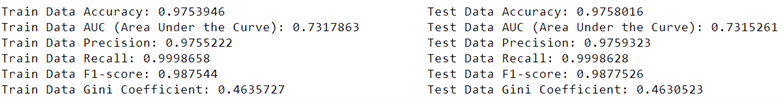
And the AUC Curve:
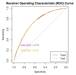
5.7 XGBoost
We mentioned earlier different methods of machine learning modelling and for our dataset and the problem that we want to solve, XGBoost is the most reliable one.
XGBoost, short for Extreme Gradient Boosting, is a highly popular and powerful machine learning algorithm known for its effectiveness in a wide range of tasks, particularly in structured and tabular data scenarios. It belongs to the ensemble learning category and is based on the gradient boosting framework. XGBoost builds an ensemble of decision trees, where each tree corrects the errors made by the previous ones. What sets XGBoost apart is its efficiency and performance optimizations, including techniques like parallel processing, tree pruning, and regularization, which make it exceptionally fast and capable of handling large datasets. It’s well-regarded for its ability to handle imbalanced data, feature selection, and automatic handling of missing values. Additionally, XGBoost provides strong predictive accuracy and flexibility, making it a top choice in machine learning competitions and real-world applications, especially when it comes to tasks like regression, classification, and ranking problems.
In addition to logistic regression, XGBoost model was trained to predict mortgage defaults. The model was trained using a subset of the features. The model’s performance was examined by using accuracy, ROC curves, AUC, precision, recall, and F1-score on both training and test data. For this XGBoost model no specific and extreme hyper parameter optimization has been considered and the model was built based on the default values for Learning rate, maximum depth of trees and boosting rounds. Notably the features used in the XGBoost model are the same features used in the logistic regression (3.2) to have comparable results. The boosting was done by decision tree booster for binary classification.
data_orig_ftrs <-
  data_orig_ftrs[, c('balance_time', 'interest_rate_time', 'hpi_time', 'gdp_time',
                     'uer_time', 'investor_orig_time',
                     'FICO_orig_time','LTV_time',
                     'Interest_Rate_orig_time', 'hpi_orig_time', 'ToB',
                     'HPI_pct_change', 'RemBal_pct', 'default_time')]
set.seed(123)
train_index <- createDataPartition(data_orig_ftrs$default_time,
                                   p = 0.7, list = FALSE)
train_data <- data_orig_ftrs[train_index, ]
test_data <- data_orig_ftrs[-train_index, ]

# Train the XGBoost model
xgb_model <- xgboost(
  data = as.matrix(train_data[, -c("default_time")]),  # Remove target variable
  label = train_data$default_time,  # Target variable
  booster = "gbtree",  # Gradient boosting with decision trees
  objective = "binary:logistic",  # Binary classification
  nrounds = 350,  # Number of boosting rounds (adjust as needed)
  eta = 0.05,  # Learning rate (adjust as needed)
  max_depth = 6  # Maximum depth of trees (adjust as needed)
)

# Make predictions on both train and test data
train_preds <- predict(xgb_model, as.matrix(train_data[, -c("default_time")]))
train_preds_classes <- factor(ifelse(train_preds > 0.5, 1, 0), levels = c(0, 1))

test_preds <- predict(xgb_model, as.matrix(test_data[, -c("default_time")]))
test_preds_classes <- factor(ifelse(test_preds > 0.5, 1, 0), levels = c(0, 1))

# Evaluate on both train and test data
train_data$default_time <- factor(train_data$default_time, levels = c(0, 1))
test_data$default_time <- factor(test_data$default_time, levels = c(0, 1))

train_conf_matrix<-confusionMatrix(train_preds_classes, train_data$default_time)
test_conf_matrix <- confusionMatrix(test_preds_classes, test_data$default_time)

# Calculate metrics for both train and test data
train_precision <- train_conf_matrix$byClass["Pos Pred Value"]
train_recall <- train_conf_matrix$byClass["Sensitivity"]
train_f1_score <- train_conf_matrix$byClass["F1"]

test_precision <- test_conf_matrix$byClass["Pos Pred Value"]
test_recall <- test_conf_matrix$byClass["Sensitivity"]
test_f1_score <- test_conf_matrix$byClass["F1"]

# Calculate AUC and Gini for both train and test data
train_roc_obj <- roc(train_data$default_time, as.numeric(train_preds))
test_roc_obj <- roc(test_data$default_time, as.numeric(test_preds))

train_auc <- auc(train_roc_obj)
train_gini_coefficient <- (2 * train_auc) - 1

test_auc <- auc(test_roc_obj)
test_gini_coefficient <- (2 * test_auc) - 1

# Calculate accuracy for both train and test data
train_accuracy <- train_conf_matrix$overall["Accuracy"]
test_accuracy <- test_conf_matrix$overall["Accuracy"]

# Print the results
cat("Train Metrics:\n")
cat("Precision:", train_precision, "\n")
cat("Recall:", train_recall, "\n")
cat("F1-Score:", train_f1_score, "\n")
cat("AUC:", train_auc, "\n")
cat("Gini Coefficient:", train_gini_coefficient, "\n")
cat("Accuracy:", train_accuracy, "\n")

cat("\nTest Metrics:\n")
cat("Precision:", test_precision, "\n")
cat("Recall:", test_recall, "\n")
cat("F1-Score:", test_f1_score, "\n")
cat("AUC:", test_auc, "\n")
cat("Gini Coefficient:", test_gini_coefficient, "\n")
cat("Accuracy:", test_accuracy, "\n")

par(pty = "s")

plot(train_roc_obj, main =
       "Receiver Operating Characteristic (ROC) Curve", col = "purple", asp = 1)
plot(test_roc_obj, col = "orange", add = TRUE)

text(0.7, 0.3, paste("Train AUC =",round(auc(train_roc_obj), 2)),col = "purple")
text(0.7, 0.2, paste("Test AUC =", round(auc(test_roc_obj), 2)), col = "orange")

legend("bottomright", legend = c("Train", "Test"),
       col = c("purple", "orange"), lty = 1, inset = 0.02)

par(pty = "m")
Results for our XGBoost model is As follows: