LASI 2019 - Visualization meets Learning Analytics
1 researcher
Базовая картинка - показывает как связаны количество кликов в вле на форуме и средний балл за assignments
dfp = df %>%
  filter(vle_click_forumng > 0)

p_old = ggplot(data = dfp, aes(x = vle_click_forumng, y = mean_assign_score)) +
  geom_point()
p_old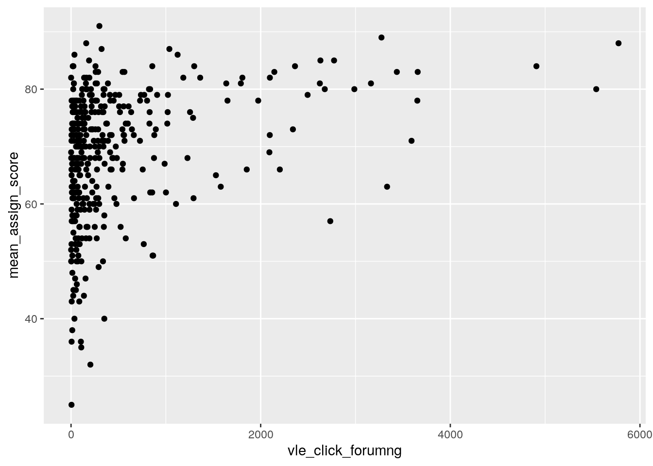
гештальт принципы - близость - группируем мы можем помочь зрителю увидеть связь - провести линию
ggplot(data = dfp, aes(x = vle_click_forumng, y = mean_assign_score)) +
  geom_point() +
  geom_smooth(method = "lm", se = FALSE)
точки группируются по тому как они выглдят similarity простой способ визуальной группировки - цвет, с помощью него можно показать дополнительную информацию
ggplot(data = dfp, aes(x = vle_click_forumng, y = mean_assign_score, color = gender)) +
  geom_point() +
  geom_smooth(method = "lm", se = FALSE)
любая информация не доносящая никакой полезной информации - лишьняя - удаляем! потому что зритель тратит ресурсы на восприятие
ggplot(data = dfp, aes(x = vle_click_forumng, y = mean_assign_score, color = gender)) +
  geom_point() +
  geom_smooth(method = "lm", se = FALSE) +
theme_bw() 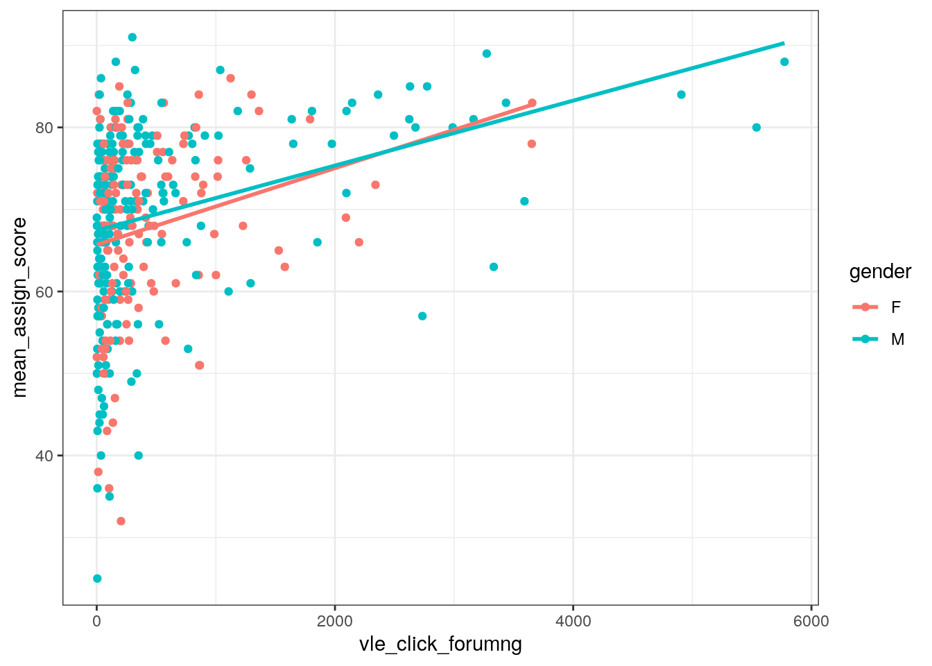
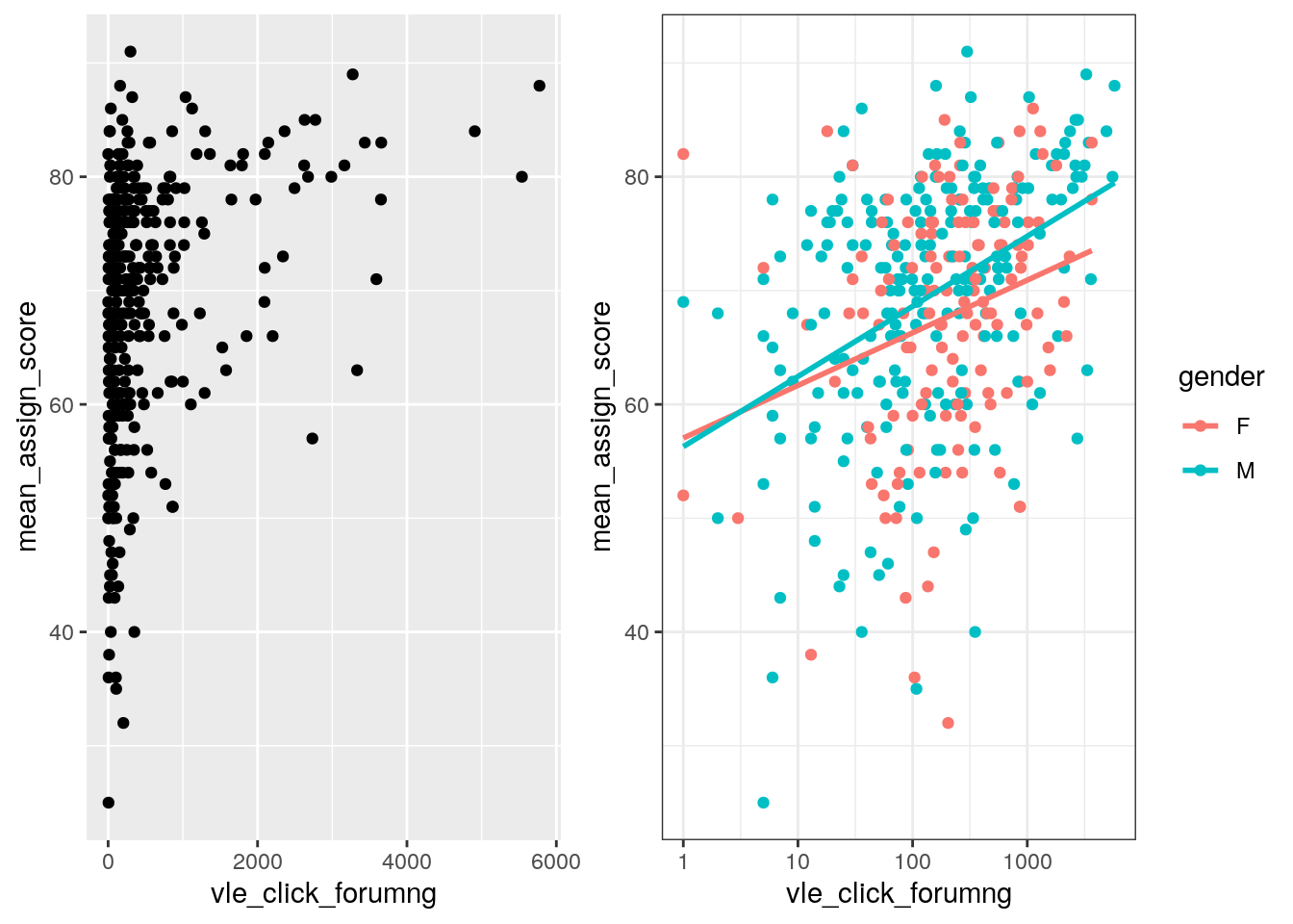
логарифмируем шкалу - в ней много “выбросов” (?)
p_new = ggplot(data = dfp, aes(x = vle_click_forumng, y = mean_assign_score, color = gender)) +
  geom_point() +
  geom_smooth(method = "lm", se = FALSE) +
  theme_bw() +
  scale_x_log10()

p_new
попробуйте проинтерпретировать картинку №1 и №последняя есть разница
показываем 2 картинки рядом 1 и последняя может тут вводочка про patchwork мб и комбинирование график
##
## Call:
## lm(formula = mean_assign_score ~ vle_click_forumng, data = dfp)
##
## Residuals:
##     Min      1Q  Median      3Q     Max
## -41.830  -6.904   2.143   7.879  22.956
##
## Coefficients:
##                    Estimate Std. Error t value Pr(>|t|)
## (Intercept)       6.681e+01  6.461e-01 103.405  < 2e-16 ***
## vle_click_forumng 4.128e-03  6.747e-04   6.119 2.47e-09 ***
## ---
## Signif. codes:  0 '***' 0.001 '**' 0.01 '*' 0.05 '.' 0.1 ' ' 1
##
## Residual standard error: 10.61 on 359 degrees of freedom
##   (13 observations deleted due to missingness)
## Multiple R-squared:  0.09444,    Adjusted R-squared:  0.09192
## F-statistic: 37.44 on 1 and 359 DF,  p-value: 2.466e-09
df_assignments = df_assignments %>%
mutate(diff_submit = date_submitted - date)
# в зависимости от того что из чего вычитаем (какой знак остается)
# меняется восприятие
# дни после сдачи - интуитивно (справа то что позднее)
ggplot(data = df_assignments, aes(x = diff_submit, y = score)) +
geom_point() +
geom_smooth(method = "lm") +
theme_bw()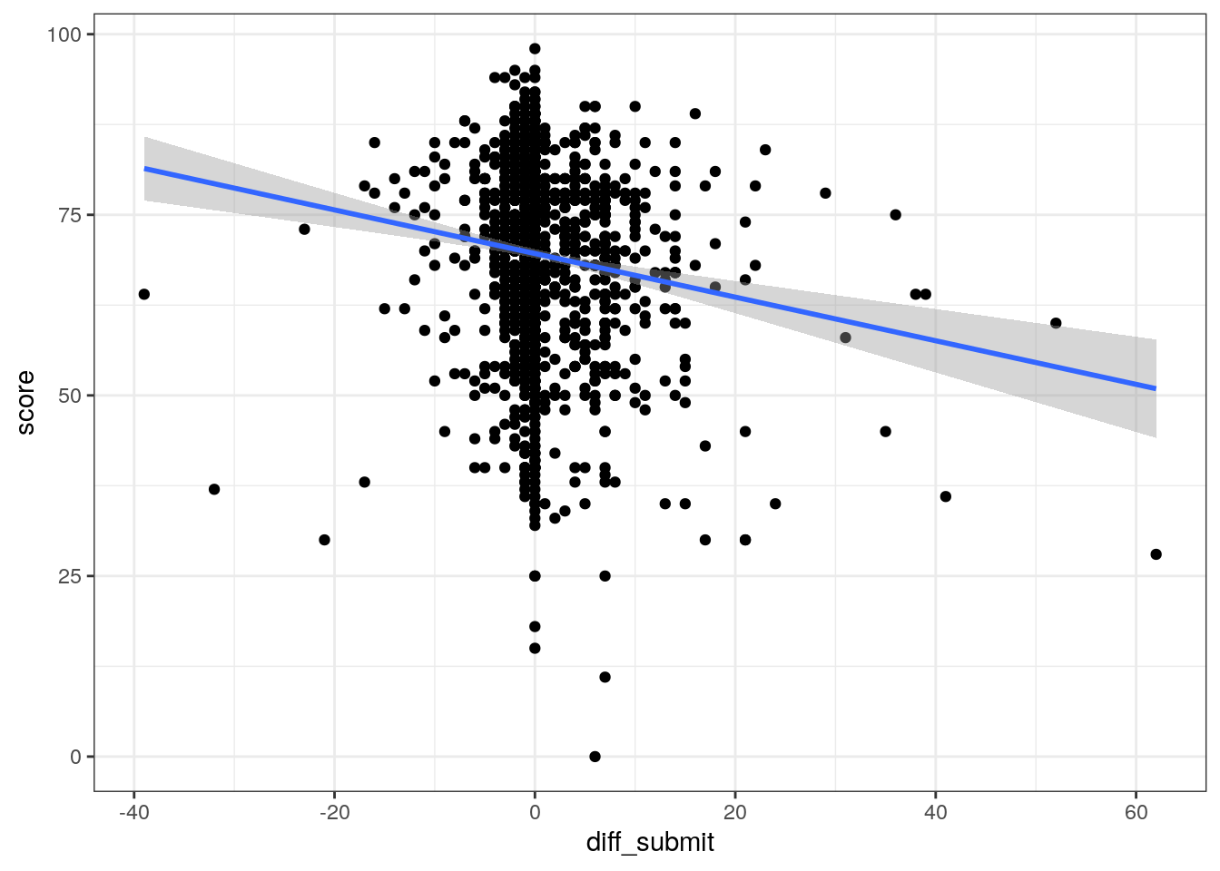
##
##  Pearson's product-moment correlation
##
## data:  df_assignments$score and df_assignments$diff_submit
## t = -5.3492, df = 1629, p-value = 1.009e-07
## alternative hypothesis: true correlation is not equal to 0
## 95 percent confidence interval:
##  -0.17878294 -0.08337932
## sample estimates:
##        cor
## -0.1313853
1.1 положение курсов по количеству студентов и pass rate
ggplot() +
  geom_point(data = df_courses, aes(x = count_students, y = share_passed)) +
  ggrepel::geom_text_repel(data = df_courses, aes(x = count_students, y = share_passed, label = str_c(code_module, "_", code_presentation))) +
  geom_smooth(data = df_courses, aes(x = count_students, y = share_passed), method = "lm", se = FALSE) +
  theme_bw()