Chapter 4 Analysing onemap population data
https://www.onemap.sg/main/v2/ is the authoritative national map of Singapore, developed by the Singapore Land Authority.
It consist of datasets such as: * Land Query (land ownership and landlot number) * School query (finds nearby schools) * Traffic query (traffic cconditions, incidents/alerts/ live camera action/ERP/parking lots availability) * Property query (resale and subletting transaction information) * Population query (population size per planning area by details such as income, age, gender, household size) * Business query (location of registered businesses)
In this exercise, we draw data from the population query from onemap using its API, and attempt to analyse correlaltions between the variables (eg. income, age etc) and perform some basic chloropleths of the population numbers per planning area.
The onemap API documentation can be found here: https://docs.onemap.sg/#introduction The list of population datasets from Department of Statistics, that we can query from onemap, can be found at: https://docs.onemap.sg/#population-query
4.1 Getting the token
After creating your account at https://docs.onemap.sg, using your account email and password and the token_url, we can get the token tied to your account.
base_url <- "https://developers.onemap.sg"
token_url <- paste0(base_url, "/privateapi/auth/post/getToken")
body <- list(email = "jolene_quek@mymail.sutd.edu.sg",
             password = "Jojoquek1") # get an account at https://docs.onemap.sg
token <- POST(token_url, body = body) %>%
  content() %>%
  pluck("access_token") # pluck comes from tidyverse
4.2 Dataset 1: Economic status data
url <- paste0(base_url, "/privateapi/popapi/getEconomicStatus") #list of available options at https://docs.onemap.sg/#population-query
query = list(
  token = token,
  planningArea = "MARINE PARADE",
  year = 2015
)
data <- GET(url, query = query, verbose()) %>% content()
4.2.1 Getting the data
url <- paste0(base_url, "/publicapi/popapi/getAllEconomicStatus")
query = list(
  token = token
)
data <- GET(url, query = query, verbose()) %>% content()
View(data)
4.2.2 Unnesting the data
This step is needed as the datais currently in the form of a nested list. We need it in a datable for analysis.
data <- data %>%
  purrr::transpose() %>% #inverts the nest
  as_tibble() %>%
  unnest()
4.2.3 Summing up men and women
The data shows 2 rows per planning area and year: one for female and one for male. We want to sum these two rows up for every planning area and year, so that we get a total number per planning area and year.
data <- data %>%
  select(-id, -gender) %>%
  group_by(planning_area, year) %>%
  summarise_all(sum) %>% #sum all the columns, not just one column
  ungroup()
4.2.4 Percentages of employment status per planning area per year
data <- data %>%
  mutate(total = employed + unemployed + inactive) %>%
  mutate(employed_perc = employed / total,
  unemployed_perc = unemployed / (employed + unemployed),
  inactive_perc = inactive / total)
4.2.5 Distribution of unemployment percentage
data %>%
  filter(year == 2015) %>%
  ggplot(aes(unemployed_perc)) +
  geom_histogram(bins = 10)+
  theme_fivethirtyeight() +
  labs(title="Distribution of unemployment percentage")+
  theme(plot.title = element_text(size=14, hjust=0.5))
## Warning: Removed 27 rows containing non-finite values (stat_bin).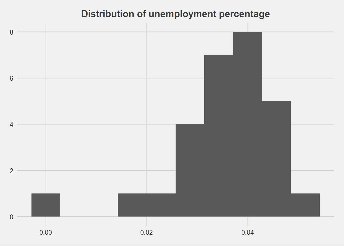
data %>%
  arrange(desc(unemployed_perc)) %>%
  slice(1:10)
## # A tibble: 10 x 9
## planning_area year employed unemployed inactive total employed_perc
## <chr> <int> <int> <int> <int> <int> <dbl>
## 1 Yishun 2000 80706 6390 48710 135806 0.594
## 2 Geylang 2000 52315 4137 37402 93854 0.557
## 3 Kallang 2000 42506 3274 29764 75544 0.563
## 4 Ang Mo Kio 2000 85740 6487 56298 148525 0.577
## 5 Toa Payoh 2000 54082 3940 38013 96035 0.563
## 6 Outram 2000 10617 754 8009 19380 0.548
## 7 Queenstown 2000 44585 3151 31361 79097 0.564
## 8 Downtown Core 2000 2154 148 1542 3844 0.560
## 9 Bedok 2000 119417 8086 81307 208810 0.572
## 10 Bukit Merah 2000 70307 4743 48120 123170 0.571
## # ... with 2 more variables: unemployed_perc <dbl>, inactive_perc <dbl>data_employment <- data4.3 Dataset 2: Population by Age Group
4.3.1 Getting the data
url <- paste0(base_url, "/publicapi/popapi/getAllPopulationAgeGroup")
query = list(
token = token
)
data <- GET(url, query = query, verbose()) %>% content()
View(data)
4.3.2 Unnesting the data
data <- data %>%
purrr::transpose() %>%
as_tibble() %>%
unnest()
4.3.3 Summing up men and women
data <- data %>%
  select(-id) %>%
  filter(gender == "Total") %>%
  select(-gender)
4.3.4 Plotting population growth per planning area
data %>%
  ggplot(aes(year, total, color = planning_area)) +
  geom_line()+
  theme_fivethirtyeight() +
  labs(title="Population growth per planning area")+
  theme(plot.title = element_text(size=14, hjust=0.5))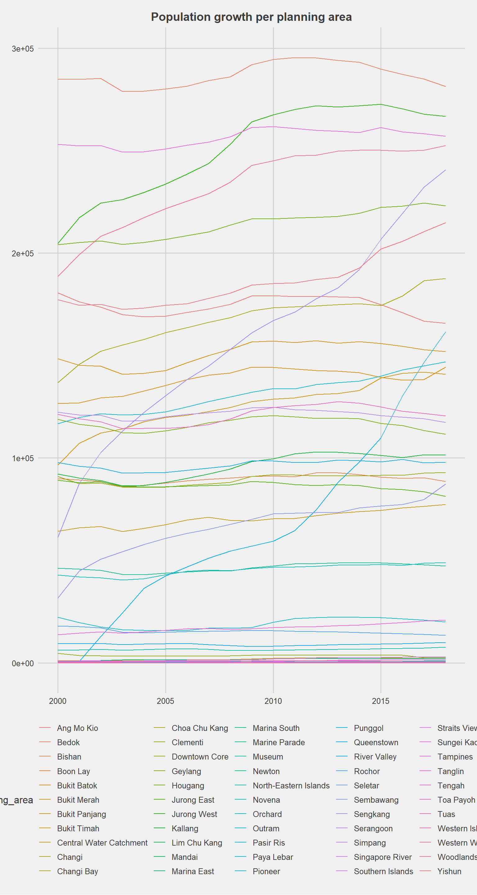
4.3.5 Percentages of age groups per planning area
data_age <- data
data_age <- data_age %>% mutate_at(vars(age_0_4:age_85_over), funs(perc=. / total * 100))
4.4 Dataset 3: Ethnic groups
4.4.1 Getting the data
url <- paste0(base_url, "/publicapi/popapi/getAllEthnicGroup")
query = list(
token = token
)
data <- GET(url, query = query, verbose()) %>% content()
4.4.2 Unnesting the data
data <- data %>%
  purrr::transpose() %>%
  as_tibble() %>%
  unnest()
4.4.3 Summing up men and women
data <- data %>% # similar to the economic data, we need to sum across genders
select(-id, -gender) %>%
group_by(planning_area, year) %>%
summarise_all(sum) %>%
ungroup()
4.4.4 Percentages of ethnic groups per planning area per year
data_ethnicity <- data %>% # normalized percentages are more insightful than absolute totals
mutate(chinese_perc = chinese / total,
malays_perc = malays / total,
indian_perc = indian / total,
others_perc = others / total)
4.5 Dataset 4: Income from work
4.5.1 Getting the data
url <- paste0(base_url, "/publicapi/popapi/getAllIncomeFromWork")
query = list(
token = token
)
data <- GET(url, query = query, verbose()) %>% content()
#View(data)
4.5.2 Unnesting the data
data <- data %>%
purrr::transpose() %>%
as_tibble() %>%
select(-id)

data[data == "NULL"] <- 0
data_income <- data %>%
   unnest()
4.5.3 Percentages of income groups per planning area per year
data_income <- data_income %>%
  mutate_at(vars(below_sgd_1000:sgd_9000_to_9999), funs(perc=. / total * 100)) %>%
  select(-sgd_8000_over_perc) %>%
  select(-sgd_6000_over_perc)
4.6 Dataset 5: Education Status
4.6.1 Getting the data
url <- paste0(base_url, "/publicapi/popapi/getAllEducationAttending")
query = list(
token = token
)
data <- GET(url, query = query, verbose()) %>% content()
View(data)
4.6.2 Unnesting the data
data <- data %>%
purrr::transpose() %>%
as_tibble() %>%
unnest() %>%
select(-id)

data_education <- data
4.6.3 Percentages of education status per planning area per year
data_education <- data_education %>%
  group_by(planning_area,year) %>%
  mutate(total=sum(pre_primary, primary, secondary, post_secondary, polytechnic, prof_qualification_diploma,university))
data_education <- data_education %>% mutate_at(vars(pre_primary:university), funs(perc=. / total * 100))
4.7 Joining the datasets
To join all 5 datasets:
data <- left_join(data_ethnicity, data_employment, by = c("planning_area", "year")) %>%
left_join(data_age, by = c("planning_area", "year")) %>%
  left_join(data_income, by = c("planning_area", "year")) %>%
left_join(data_education, by = c("planning_area", "year"))cor(data$malays_perc, data$inactive_perc, use = "pairwise.complete.obs")## [1] -0.4926429data %>% # visually
ggplot(aes(malays_perc, inactive_perc)) +
geom_point()## Warning: Removed 27 rows containing missing values (geom_point).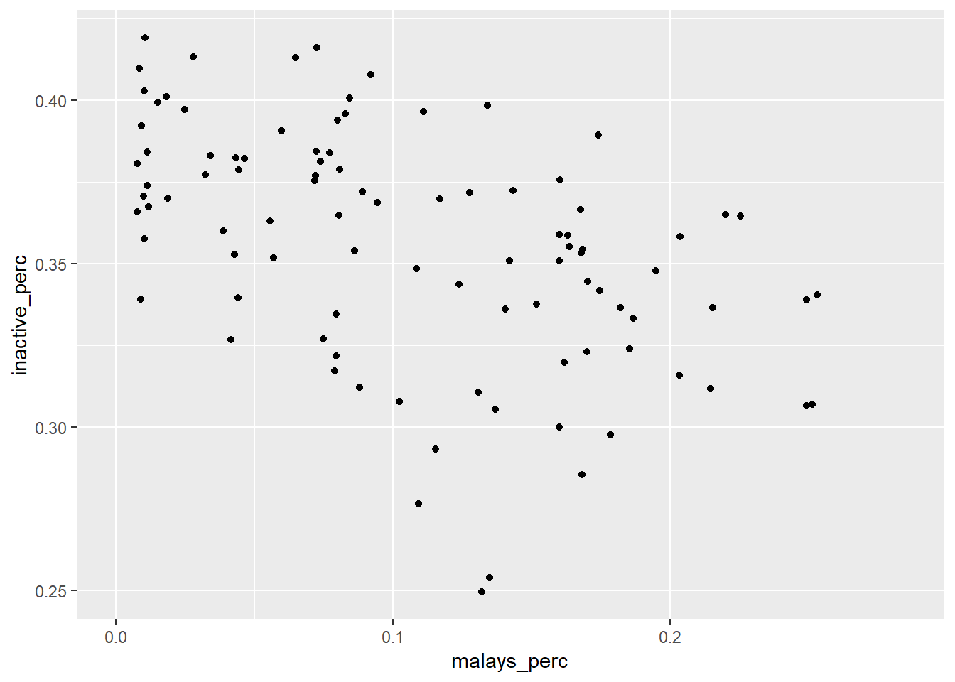
4.8 Finding all possible correlations
4.8.1 Correlations across all planning areas
#install.packages("corrr")
library(corrr)
cor <- data %>% # look at the correlation matrix
select(ends_with("_perc")) %>%
correlate()
##
## Correlation method: 'pearson'
## Missing treated using: 'pairwise.complete.obs'cor[is.na(cor)] <- 0
cor_long <- data %>% # look at the correlation matrix
select(ends_with("_perc")) %>%
correlate() ##
## Correlation method: 'pearson'
## Missing treated using: 'pairwise.complete.obs'cor_long[is.na(cor_long)]<- 0
#install.packages("knitr")
library(knitr)
kable(cor_long %>%
rearrange() %>%
shave() %>%
stretch() %>%
filter(abs(r)>0.65) %>%
filter(substr(x,1,3)!=substr(y,1,3)) %>%
arrange(desc(r)))| x | y | r |
|---|---|---|
| university_perc | age_55_59_perc | 0.8466404 |
| sgd_1500_to_1999_perc | unemployed_perc | 0.8065964 |
| age_35_39_perc | pre_primary_perc | 0.7996807 |
| university_perc | age_60_64_perc | 0.7677187 |
| sgd_2000_to_2499_perc | unemployed_perc | 0.7650020 |
| age_25_29_perc | sgd_2000_to_2499_perc | 0.7356289 |
| age_5_9_perc | primary_perc | 0.7311009 |
| age_25_29_perc | sgd_1500_to_1999_perc | 0.7197881 |
| age_25_29_perc | sgd_2500_to_2999_perc | 0.7177043 |
| sgd_1000_to_1499_perc | unemployed_perc | 0.7086490 |
| age_0_4_perc | pre_primary_perc | 0.7064846 |
| age_35_39_perc | primary_perc | 0.6993927 |
| age_50_54_perc | university_perc | 0.6944299 |
| sgd_2500_to_2999_perc | unemployed_perc | 0.6887245 |
| age_55_59_perc | sgd_6000_to_6999_perc | 0.6780642 |
| age_30_34_perc | pre_primary_perc | 0.6776413 |
| age_25_29_perc | unemployed_perc | 0.6747752 |
| age_0_4_perc | primary_perc | 0.6672446 |
| university_perc | age_65_69_perc | 0.6662950 |
| age_40_44_perc | primary_perc | 0.6608485 |
| age_40_44_perc | polytechnic_perc | -0.6562966 |
| sgd_7000_to_7999_perc | unemployed_perc | -0.6597550 |
| age_0_4_perc | post_secondary_perc | -0.6623422 |
| university_perc | sgd_2000_to_2499_perc | -0.6624473 |
| university_perc | sgd_2500_to_2999_perc | -0.6637440 |
| primary_perc | prof_qualification_diploma_perc | -0.6673969 |
| sgd_6000_to_6999_perc | unemployed_perc | -0.6819359 |
| others_perc | sgd_2000_to_2499_perc | -0.6876880 |
| age_50_54_perc | primary_perc | -0.7011344 |
| pre_primary_perc | age_50_54_perc | -0.7022355 |
| age_5_9_perc | university_perc | -0.7030247 |
| age_0_4_perc | university_perc | -0.7041291 |
| others_perc | sgd_1500_to_1999_perc | -0.7091899 |
| others_perc | sgd_2500_to_2999_perc | -0.7206527 |
| others_perc | sgd_1000_to_1499_perc | -0.7388730 |
| primary_perc | age_55_59_perc | -0.7726750 |
| inactive_perc | employed_perc | -0.9769730 |
So, it seems there is a strong correlation between: * income and others_perc * education and age * income and employment status * age and income * race and income
4.8.2 Correlations within each planning area
It might be interesting to see the difference in the correlation of factors between planning areas. To do this, we have to find the correlations between the factors in each planning area.
cor_area <- data %>%
  select((ends_with("_perc")),planning_area) %>%
  group_by(planning_area) %>%
  nest() %>%
  mutate(cor_area = map(data, correlate)) %>%
  unnest(cor_area)

cor_area[is.na(cor_area)]<- 0
#install.packages("tidyr")
library(tidyr)
cor_area_long <- gather(cor_area, factor, cor_value, chinese_perc:university_perc, factor_key=TRUE)
colnames(cor_area_long)=c("planning_area","x","y","cor_value")
cor_area_long <- cor_area_long %>%
  filter(cor_value!="0") %>%
  filter(abs(cor_value)>0.65) %>%
  filter(abs(cor_value)<1) %>%
  filter(substr(x,1,3)!=substr(y,1,3)) %>%
  arrange(desc(cor_value))

toDelete <- seq(1, nrow(cor_area_long), 2)
cor_area_long <- cor_area_long[-toDelete ,]

cor_area_long <- cor_area_long %>%
  mutate(pln_area_n = toupper(planning_area))
4.9 Visualising through maps
4.9.1 Getting the base map
url <- paste0(base_url, "/publicapi/popapi/getMp14PlanningAreaGeojson")
query = list(
token = token
)
planning_areas <- GET(url, query = query, verbose()) %>%
content(as = "text") %>%
geojson_sf()plot(planning_areas)## Warning: plotting the first 9 out of 10 attributes; use max.plot = 10 to
## plot all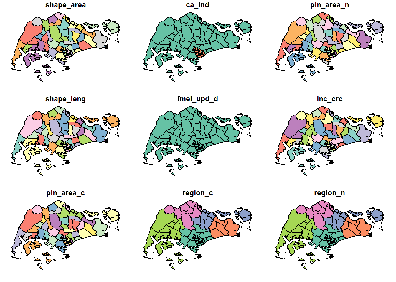
4.9.2 Joining datasets to spatial data
data <- data %>%
mutate(pln_area_n = toupper(planning_area))

planning_areas <- left_join(planning_areas, data)
## Joining, by = "pln_area_n"planning_areas <- left_join(planning_areas, cor_area_long)## Joining, by = c("pln_area_n", "planning_area")planning_areas <- planning_areas %>%
mutate(cor_between=paste0(x,", ",y))4.9.3 Spatial distribution of ethnic groups in 2015
#tmap_mode("view") #just this line makes your subsequent plot interactive
tmap_mode("plot") #use this to revert to static mode
## tmap mode set to plottingindian <- planning_areas %>%
filter(year == 2015) %>%
tm_shape() +
tm_fill("indian_perc")+
tm_facets(by = "year", nrow = 2, ncol=2)
malays <- planning_areas %>%
filter(year == 2015) %>%
tm_shape() +
tm_fill("malays_perc")
chinese <- planning_areas %>%
filter(year == 2015) %>%
tm_shape() +
tm_fill("chinese_perc")
others <- planning_areas %>%
filter(year == 2015) %>%
tm_shape() +
tm_fill("others_perc")
tmap_arrange(indian, malays, chinese, others, ncol = NA, nrow = NA, sync = FALSE, asp = 0,
outer.margins = 0.02)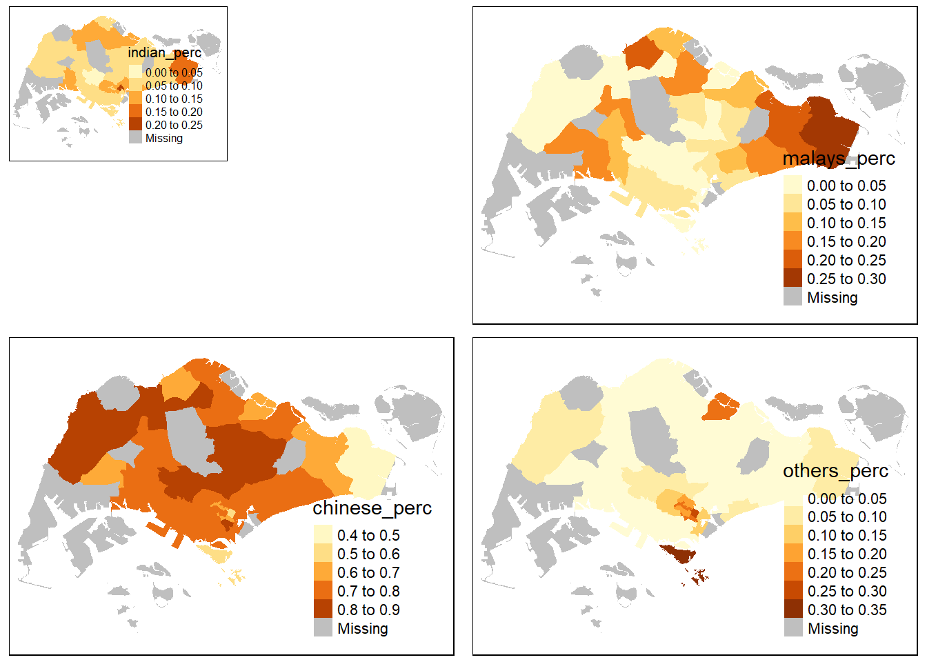
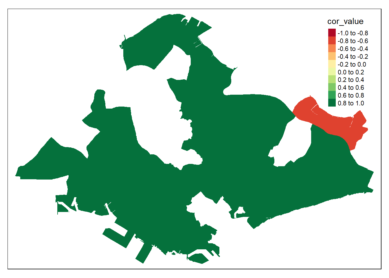
4.9.4 Map of correlation between highest earning group and others in planning areas
“sg_12000_over_perc” and “others_perc” has the highest correlation (0.937), when taking rows of all the planning areas. We are interested in how thae correlation between these two variables vary spatially, ie. in each planning area.
The resulting plot seems strange, with only pasir ris showing a negative correlation and the rest of the areas at an extremely high correlation of 0.8 to 1.0. This could be due to how there are only 3 years of data. Thus by doing correlation within each planning area, the limited data easily leads to a high correlation factor. Such an analysis could be more insightful given more years of data.
tmap_mode("plot")## tmap mode set to plottingplanning_areas %>%
filter(cor_between == "unemployed_perc, sgd_1500_to_1999_perc") %>%
tm_shape() +
tm_fill("cor_value", breaks = c(-1, -0.8, -0.6, -0.4, -0.2, 0, 0.2, 0.4, 0.6, 0.8, 1))## Variable "cor_value" contains positive and negative values, so midpoint is set to 0. Set midpoint = NA to show the full spectrum of the color palette.