Ratings and Reviews
Google Form for Reviews
Click here to rate the recipes that you have made and tried. You should only answer the question that corresponds to the recipe you tried.
Click here to rate for taste: Click here
Click here to rate for easiness to make: Click here
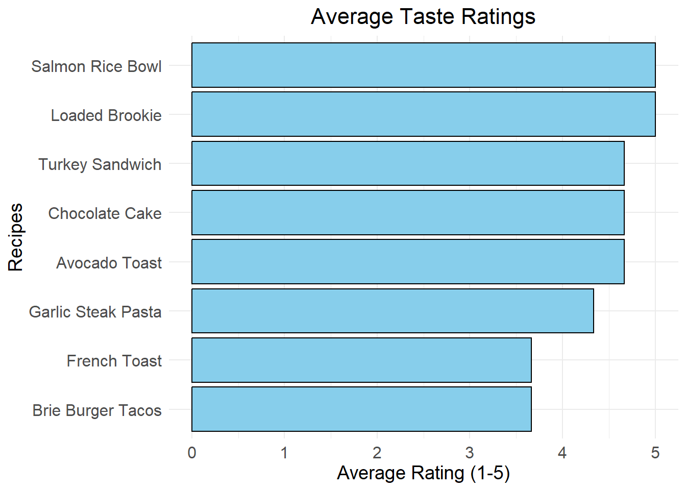
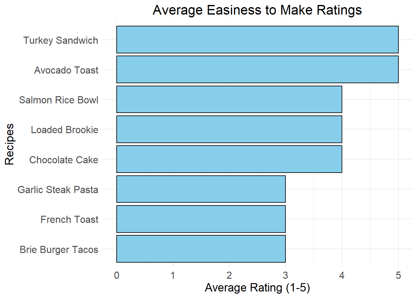
Interactive Average Ratings Barplot
This plot dynamically visualizes the average ratings for each recipe based on responses submitted via the Google Form. Once you submit your ratings in the form above, your data will automatically be collected and stored in a Google Sheet. When the book is re-rendered, it fetches the latest data from the Google Sheet and displays the updated results for the average taste and easiness to make ratings for each recipe. This lets you see the most liked recipes and dishes based on users’ feedback.
Average Taste Ratings
# Load necessary libraries
library(ggplot2)
library(dplyr)
library(readxl)
library(googlesheets4)

gs4_deauth()

# Replace with your public Google Sheet URL
sheet_url <- "https://docs.google.com/spreadsheets/d/1LNykmlRDgLpGf85isQpq5OFtFj8Jo0kOfkR0LBC_1C4/edit"

data <- read_sheet(sheet_url)

# Clean the column names (strip leading/trailing spaces)
colnames(data) <- trimws(colnames(data))

# Rename columns for simplicity
data <- data %>%
  rename(
    `Avocado Toast` = `How would you rate Avocado Toast w/ Egg?`,
    `French Toast` = `How would you rate French Toast?`,
    `Salmon Rice Bowl` = `How would you rate Salmon Rice Bowl?`,
    `Turkey Sandwich` = `How would you rate Turkey Sandwich?`,
    `Garlic Steak Pasta` = `How would you rate Garlic Parmesan Steak Pasta?`,
    `Brie Burger Tacos` = `How would you rate Brie & Bacon Smash Burger Tacos?`,
    `Loaded Brookie` = `How would you rate Loaded Brookie?`,
    `Chocolate Cake` = `How would you rate Mini Chocolate Cake?`
  )

# Select only the rating columns
ratings <- data %>%
  select(`Avocado Toast`, `French Toast`, `Salmon Rice Bowl`,
         `Turkey Sandwich`, `Garlic Steak Pasta`,
         `Brie Burger Tacos`, `Loaded Brookie`, `Chocolate Cake`)

# Calculate the average ratings for each recipe
average_ratings <- colMeans(ratings, na.rm = TRUE)

# Convert to a data frame for plotting
average_ratings_df <- data.frame(
  Recipe = names(average_ratings),
  Average_Rating = average_ratings
)

# Create the bar plot
ggplot(average_ratings_df, aes(x = reorder(Recipe, Average_Rating), y = Average_Rating)) +
  geom_bar(stat = "identity", fill = "skyblue", color = "black") +
  coord_flip() +
  labs(
    title = "Average Taste Ratings",
    x = "Recipes",
    y = "Average Rating (1-5)"
  ) +
  theme_minimal() +
  theme(
    plot.title = element_text(hjust = 0.5, size = 16),
    axis.text = element_text(size = 12),
    axis.title = element_text(size = 14)
  )
Average Easiness Ratings
# Load necessary libraries
library(ggplot2)
library(dplyr)
library(readxl)
library(googlesheets4)

gs4_deauth()

# Replace with your public Google Sheet URL
sheet_url <- "https://docs.google.com/spreadsheets/d/1vo5sTo0qq-fAK2r9F_t_IRNjNnp13T_kqASFgd5cJhc/edit"

data <- read_sheet(sheet_url)

# Clean the column names (strip leading/trailing spaces)
colnames(data) <- trimws(colnames(data))

# Rename easiness rating columns
data <- data %>%
  rename(
    `Avocado Toast` = `How easy was it to make Avocado Toast w/ Egg?`,
    `French Toast` = `How easy was it to make French Toast?`,
    `Salmon Rice Bowl` = `How easy was it to make Salmon Rice Bowl?`,
    `Turkey Sandwich` = `How easy was it to make Turkey Sandwich?`,
    `Garlic Steak Pasta` = `How easy was it to make Garlic Parmesan Steak Pasta?`,
    `Brie Burger Tacos` = `How easy was it to make Brie & Bacon Smash Burger Tacos?`,
    `Loaded Brookie` = `How easy was it to make Loaded Brookie?`,
    `Chocolate Cake` = `How easy was it to make Mini Chocolate Cake?`
  )

# Select only the rating columns
ratings <- data %>%
  select(`Avocado Toast`, `French Toast`, `Salmon Rice Bowl`,
         `Turkey Sandwich`, `Garlic Steak Pasta`,
         `Brie Burger Tacos`, `Loaded Brookie`, `Chocolate Cake`)

# Calculate the average ratings for each recipe
average_ratings <- colMeans(ratings, na.rm = TRUE)

# Convert to a data frame for plotting
average_ratings_df <- data.frame(
  Recipe = names(average_ratings),
  Average_Rating = average_ratings
)

# Create the bar plot
ggplot(average_ratings_df, aes(x = reorder(Recipe, Average_Rating), y = Average_Rating)) +
  geom_bar(stat = "identity", fill = "skyblue", color = "black") +
  coord_flip() +
  labs(
    title = "Average Easiness to Make Ratings",
    x = "Recipes",
    y = "Average Rating (1-5)"
  ) +
  theme_minimal() +
  theme(
    plot.title = element_text(hjust = 0.5, size = 16),
    axis.text = element_text(size = 12),
    axis.title = element_text(size = 14)
  )