library(hmsidwR)      # sample data: affected countries & health metrics
library(sf)           # spatial operations
library(tidyverse)    # data wrangling & plotting
library(rnaturalearth) # world map
library(ggforce)      # for curved/Bezier lines
library(geosphere)    # great-circle calculations
library(patchwork)    # combining multiple plots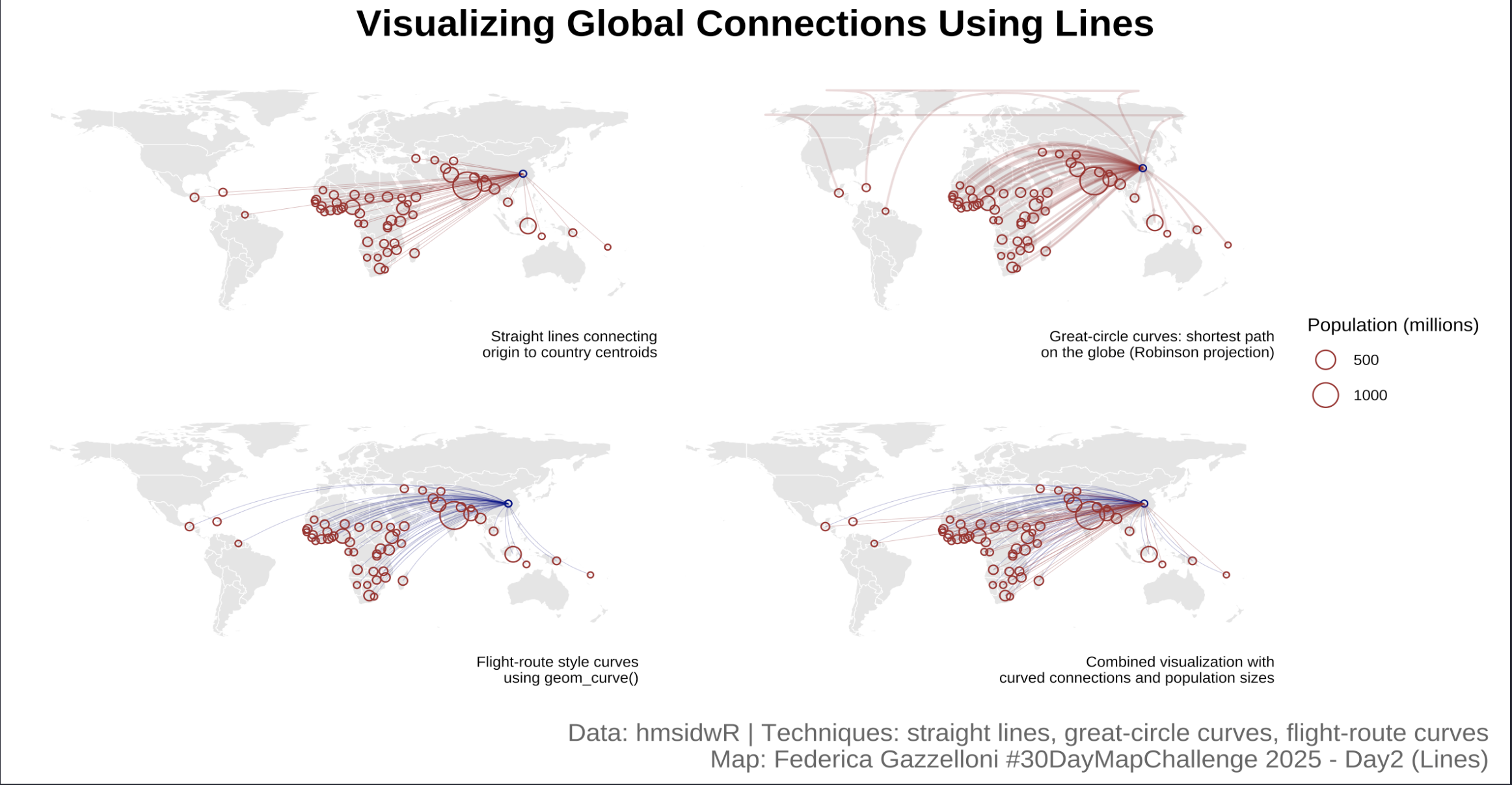
Overview
This workflow demonstrates how to visualize connections from an origin point (e.g., Wuhan) to affected countries using different line techniques: straight lines, great-circle (curved) lines, and flight-route style curves. The goal is to illustrate line-based spatial visualization techniques in R.
# Load world map and clean
world <- ne_countries(returnclass = "sf") %>%
  filter(name != "Antarctica") %>%
st_make_valid()Join Data to World Map and Compute Centroids
# Join country metrics with world map
affected_sf <- world %>%
  inner_join(id_avg, by = c("name" = "location_name"))

# Disable s2 to avoid geometry issues
sf_use_s2(FALSE)

# Compute centroids for plotting connections
centroids <- st_centroid(affected_sf)
Define Origin Point
Straight Line Connections
# Create simple straight lines from origin to centroids
lines_list <- lapply(st_geometry(centroids), function(pt) {
  st_linestring(rbind(st_coordinates(origin), st_coordinates(pt)))
})

lines_sf <- st_sf(
  data.frame(location = centroids$name, pop_est = centroids$pop_est),
  geometry = st_sfc(lines_list, crs = 4326)
)
Make the Map
Simple straight lines show direct connections from origin to each centroid. Good for basic visualization but may look unrealistic at a global scale due to map distortions.
# Plot
p1 <- ggplot() +
  geom_sf(data = world, fill = "grey90", color = "white") +
  geom_sf(data = lines_sf, color = "brown", size = 0.05) +
  geom_sf(data = origin, color = "darkblue", shape = 21) +
  geom_sf(data = centroids, aes(size = pop_est), color = "brown", shape = 21) +
  scale_size_continuous(labels = ~ .x / 1e6, name = "Population (millions)") +
  ggthemes::theme_map()

p1
Great-circle Lines
Great-circle lines follow the shortest path on the globe, giving a more realistic representation of long-distance connections. The Robinson projection (+proj=robin) enhances the visual global perspective.
# Great-circle interpolation (curved on globe)
lines_list_gc <- lapply(st_geometry(centroids), function(pt) {
  inter <- geosphere::gcIntermediate(
    st_coordinates(origin),
    st_coordinates(pt),
    n = 50,             # points along the curve
    addStartEnd = TRUE,
    sp = TRUE
  )
  st_as_sf(inter)
})

lines_sf_gc <- do.call(rbind, lines_list_gc)
p2 <- ggplot() +
geom_sf(data = world, fill = "grey90", color = "white") +
geom_sf(data = lines_sf_gc, color = alpha("brown", 0.2), linewidth = 0.5) +
geom_sf(data = origin, color = "darkblue", shape = 21) +
geom_sf(data = centroids, aes(size = pop_est), show.legend = FALSE, color = "brown", shape = 21) +
coord_sf(crs = "+proj=robin") +
ggthemes::theme_map()
p2Flight-Route Curves with geom_curve()
Curved lines using geom_curve() resemble flight paths. They are visually appealing and can emphasize flow/direction. The curvature parameter controls the bending.
# Prepare data for curves
centroids_df <- st_coordinates(centroids) %>%
  as.data.frame() %>%
  mutate(name = centroids$name)

origin_df <- data.frame(X = st_coordinates(origin)[1], Y = st_coordinates(origin)[2])

curve_data <- centroids_df %>%
  rowwise() %>%
  mutate(
    x = origin_df$X, y = origin_df$Y,
    xend = X, yend = Y,
    curvature = 0.2
  )
# Plot flight-route style
p3 <- ggplot() +
geom_sf(data = world, fill = "grey90", color = "white") +
geom_curve(data = curve_data, aes(x = x, y = y,
xend = xend, yend = yend),
curvature = 0.2, color = alpha("darkblue", 0.9),
linewidth = 0.05) +
geom_sf(data = origin, color = "darkblue", shape = 21) +
geom_point(aes(x = X, y = Y), data = origin_df, color = "darkblue", shape = 21) +
geom_sf(data = centroids, aes(size = pop_est),
show.legend = FALSE, color = "brown", shape = 21) +
ggthemes::theme_map()
p3 p4 <- ggplot() +
geom_sf(data = world, fill = "grey90", color = "white") +
geom_curve(data = curve_data,
aes(x = x, y = y, xend = xend, yend = yend),
curvature = 0.2, color = alpha("darkblue", 0.9),
linewidth = 0.05) +
geom_sf(data = origin, color = "darkblue", shape=21) +
geom_sf(data = lines_sf, linewidth = 0.05,color = "brown") +
geom_sf(data = centroids, aes(size=pop_est),show.legend = F,
color = "brown",
shape = 21) +
scale_linewidth(range = c(0, 0.3))+
ggthemes::theme_map()
p4Combined 2x2 Plot with Patchwork
- Straight lines (p1): simple, fast, but less realistic globally
- Great-circle curves (p2): realistic paths along globe curvature
- Flight-route curves (p3/p4): aesthetically curved, suggest movement or flow
- Combined plot: shows how different line techniques can convey connections, distances, and relative magnitudes (using circle size for population).
# 1 Straight lines
p1 <- p1 + labs(caption = "Straight lines connecting\norigin to country centroids")

# 2 Great-circle lines
p2 <- p2 + labs(caption = "Great-circle curves: shortest path\non the globe (Robinson projection)")

# 3 Flight-route curves (geom_curve)
p3 <- p3 + labs(caption = "Flight-route style curves\nusing geom_curve()")

# 4 Combined curved lines and points
p4 <- p4 + labs(caption = "Combined visualization with\ncurved connections and population sizes")
combined <- (p1 + p2) / (p3 + p4) +
plot_layout(guides = "collect") +
plot_annotation(
title = "Visualizing Global Connections Using Lines",
caption = "Data: hmsidwR | Techniques: straight lines, great-circle curves, flight-route curves\nMap: Federica Gazzelloni #30DayMapChallenge 2025 - Day2 (Lines)",
theme = theme(plot.title = element_text(size = 18,
face = "bold",
hjust = 0.5),
plot.caption = element_text(size = 12,
color = "grey40")))
combined