Overview
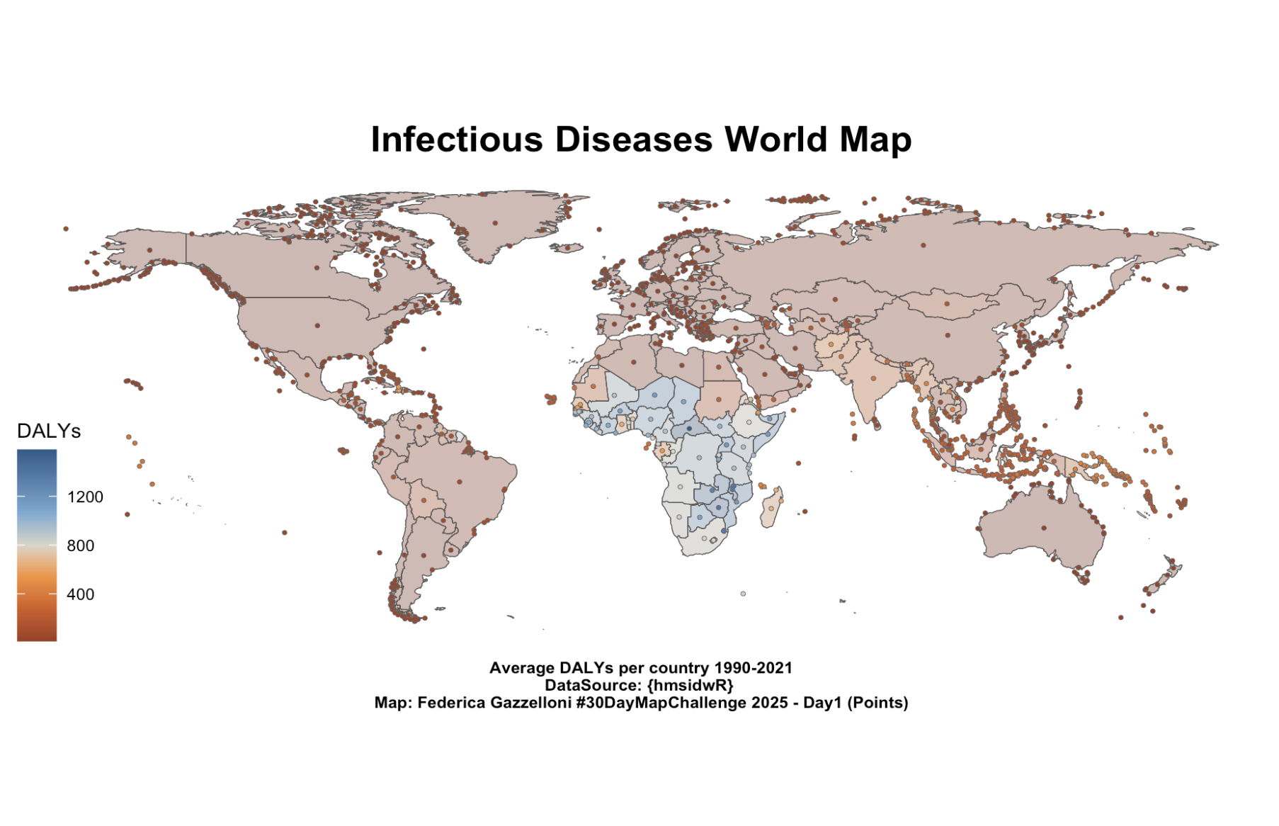
Infectious Diseases World Map
This map visualizes the global distribution of Disability-Adjusted Life Years (DALYs) due to infectious diseases, averaged across the period 1990–2021.
Each point represents the geometric centroid of a country, coloured according to the average DALY value.
The use of points instead of polygons aligns with the Day 1 theme of the #30DayMapChallenge, focusing on the placement and density of data rather than boundaries.
This approach allows a quick visual comparison of health burdens across countries while maintaining a clean, minimalist design.
# Load Data
data(idDALY_map_data)# Compute centroids from polygon geometries (one per country)
idDALY_points <- idDALY_map_data %>%
st_centroid()world_map %>%
ggplot() +
geom_sf() +
geom_sf(data = idDALY_map_data,
aes(fill = DALYs), alpha = 0.3) +
geom_sf(data = idDALY_points,
aes(fill = DALYs),
size = 0.8, color = "grey40",
shape = 21, stroke = 0.2) +
labs(title = "Infectious Diseases World Map",
caption = "Average DALYs per country 1990-2021\nDataSource: {hmsidwR} \nMap: Federica Gazzelloni #30DayMapChallenge 2025 - Day1 (Points)") +
ggthemes::scale_fill_gradient2_tableau() +
ggthemes::theme_map() +
theme(plot.title = element_text(hjust = 0.5,
size = 16,
face = "bold"),
plot.caption = element_text(hjust = 0.5, face = "bold"))Code Functions Explanation
-
st_point_on_surface()creates one representative point inside each country polygon, avoiding centroid placement outside islands or irregular shapes. -
geom_sf(data = world_map)draws the background map. -
geom_sf(data = idDALY_points)overlays the DALY points. - The viridis colour scale improves accessibility and visual clarity.
- Labels and captions provide clear context for interpretation.
-
ggthemes::theme_map()keeps the focus on the data.
Interpretation
The visualization reveals marked geographic disparities in the burden of infectious diseases.
Higher DALY values cluster in Sub-Saharan Africa and South Asia, where infectious diseases remain leading causes of morbidity and mortality.
In contrast, most high-income countries in Europe, North America, and Oceania show comparatively low DALY values, reflecting the success of public health interventions, improved healthcare access, and disease prevention strategies.
This spatial pattern underscores persistent global inequalities in health outcomes and the need for targeted policy efforts to reduce the impact of infectious diseases in the most affected regions.