library(tidyverse)
library(sf)Overview
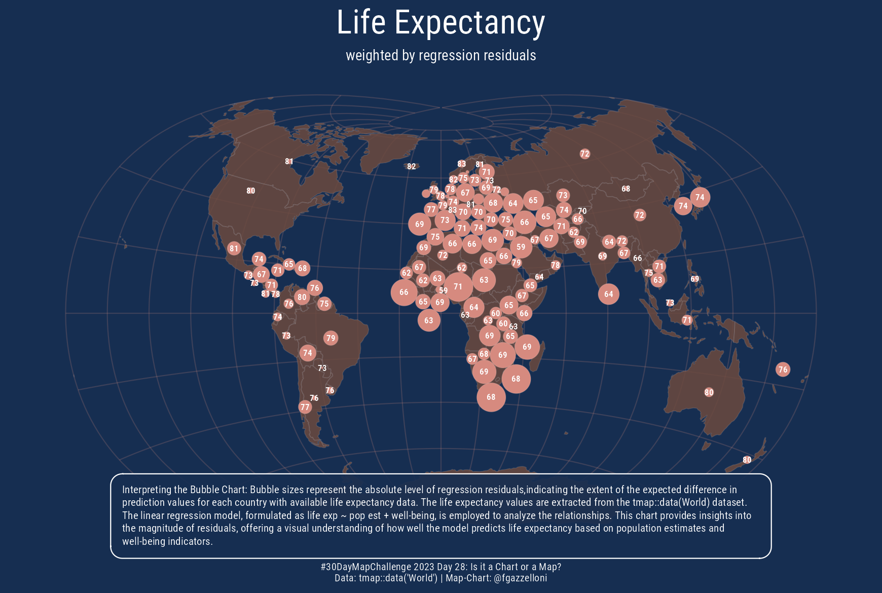
This is a bubble chart on a Map. Data is from tmap::data("World").
Load libraries
library(tmap)
data("World")
# World$geometrylife_exp<-World%>%
select(life_exp)
grat <- st_graticule(lat = c(-89.9, seq(-80, 80, 20), 89.9))ggplot()+
geom_sf(
life_exp,
mapping=aes(fill=life_exp,geometry=geometry),
color=alpha("white",0.1)
)+
geom_sf(
grat, mapping=aes(geometry=geometry),
col=alpha("white",0.2),lwd=0.25
)+
guides(
fill=guide_bins(
title.position = 'top',
title.hjust = 0.5,
keywidth = unit(1,'cm'),
keyheight = unit(0.25,'cm')
)
)+
scale_fill_viridis_b(
option='cividis',
#breaks=seq(3,12,3),
na.value = "grey10",
labels=function(x){paste(x, '')}
#nbreaks=5
)+
labs(fill="Life Expectancy")+
coord_sf(crs='+proj=lask')carto<-cartogram::cartogram_ncont(
life_exp%>%drop_na(life_exp)%>%
st_transform(crs='+proj=lask'),
weight='life_exp'
)
ggplot(carto)+
geom_sf(
carto,
mapping=aes(geometry=geometry),
fill="#EF6F6C",color=alpha("white",0.1)
)+
geom_sf(data=life_exp%>%
st_transform(crs='+proj=lask'),fill=NA)+
geom_sf(
grat, mapping=aes(geometry=geometry),
col=alpha("red",0.2),lwd=0.25
)+
labs(title="Life Expectancy",
subtitle="Inside-Out of the Country's Borders",
caption = "raw carto - map | tmap::data(World) | @fgazzelloni")
ggsave("raw.png",bg="#dedede",width=5.8,height = 3.9)life_exp_lm=lm(life_exp~ pop_est + well_being,data=World)
pred_life_exp <- predict(life_exp_lm)life_exp_pred <- World%>%
select(name,pop_est,life_exp,well_being)%>%
filter(!is.na(life_exp))%>%
cbind(pred=pred_life_exp)
life_exp_pred2 <- life_exp_pred%>%mutate(diff=abs(life_exp-pred))text <- tibble(text=c("Interpreting the Bubble Chart: Bubble sizes represent the absolute level of regression residuals,indicating the extent of the expected difference in prediction values for each country with available life expectancy data. The life expectancy values are extracted from the tmap::data(World) dataset. The linear regression model, formulated as life exp ~ pop est + well-being, is employed to analyze the relationships. This chart provides insights into the magnitude of residuals, offering a visual understanding of how well the model predicts life expectancy based on population estimates and well-being indicators."))dorl<-cartogram::cartogram_dorling(
life_exp_pred2%>%
st_transform(crs='+proj=lask'),
weight='diff',
k = 0.4,
m_weight = 1,
itermax = 1000
)
ggplot()+
geom_sf(
grat%>%st_transform(crs='+proj=lask'),
mapping=aes(geometry=geometry),
col=alpha("#d68a7f",0.2),
lwd=0.25
)+
geom_sf(
life_exp%>%st_transform(crs='+proj=lask'),
mapping=aes(geometry=geometry),
fill=alpha("#6b493e",0.85),
color=alpha("white",0.1)
)+
geom_sf(
dorl,
mapping=aes(geometry=geometry),
fill="#d68a7f",color=alpha("white",0.1)
)+
geom_sf_text(data=dorl,mapping=aes(label=round(pred)),
color="white",
fontface="bold",
family="Roboto Condensed",
size=1.5,
check_overlap = T)+
ggtext::geom_textbox(data=text,
mapping=aes(label=text,x=0,y=0),
vjust = 2.9,
inherit.aes = F,
width=0.8,
size=1.8,
fill=alpha("#162e51",0.9),
color="white",family="Roboto Condensed")+
coord_sf(clip = "off")+
labs(title="Life Expectancy",
subtitle="weighted by regression residuals",
caption="#30DayMapChallenge 2023 Day 28: Is it a Chart or a Map?\nData: tmap::data('World') | Map-Chart: @fgazzelloni")+
ggthemes::theme_map()+
theme(text=element_text(color="white",family="Roboto Condensed"),
plot.title = element_text(hjust=0.5,size=16),
plot.subtitle = element_text(hjust=0.5,size=7),
plot.caption = element_text(hjust=0.5,size=5),
plot.background = element_rect(color="#162e51",fill="#162e51"),
panel.background = element_rect(color="#162e51",fill="#162e51"))
ggsave("day28_is-this-a-chart-or-a-map.png",bg="#162e51",width=5.8,height = 3.9)