# libraries --------------------------------------
library(tidyverse)
library(ggforce)
library(extrafont)Overview
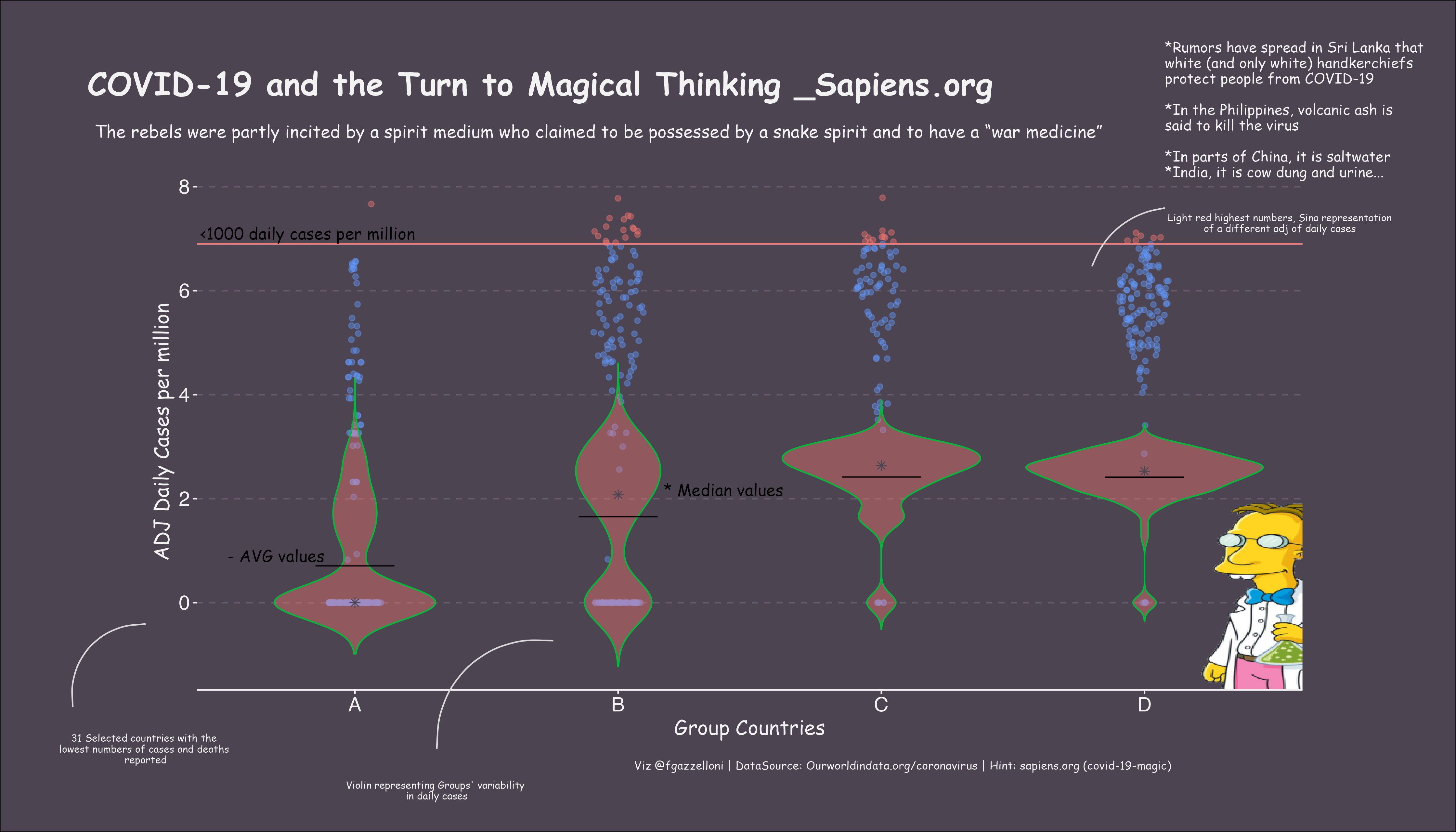
For this #30DayChartChallenge 2021 day 4 ‘Magical’ I decided to explore the relationship between groups of countries with low covid19 deaths and their reported daily cases, using magical elements to highlight the theme of magical thinking during the pandemic.
INSPIRED BY:
- https://github.com/avrodrigues/Tidy_tuesday/blob/main/2021/week14/makeup_shades.R
- https://github.com/AndyABaker/TidyTuesday/blob/main/2021_week14_makeupshades.R
# load and wrangling ---------------------------------------------------

# read the data from OurWorldData
ow_df<- read.csv("owid-covid-data.csv")

ow_df[is.na(ow_df)]=0 # transform na into 0 values

# location sliced by total_deaths: A<=10; 10<B>=138; 138<C>=1819; D>1819
A <- ow_df %>% group_by(location) %>% filter(total_deaths <= 10) %>% mutate(gr="A")
B <- ow_df %>% group_by(location) %>% filter(total_deaths > 10 & total_deaths <= 138) %>% mutate(gr="B")
C <- ow_df %>% group_by(location) %>% filter(total_deaths > 138 & total_deaths <= 1819) %>% mutate(gr="C")
D <- ow_df %>% group_by(location) %>% filter(total_deaths > 1819) %>% mutate(gr="D")

# build a new data set
df<-rbind(A,B,C,D)
# manipulate and select daily cases and deaths by group
df <- df %>%
mutate(date=as.Date(date)) %>%
arrange(- new_deaths_per_million) %>%
distinct(date,
location,
reproduction_rate,
new_cases_per_million,
new_deaths_per_million,
gr)
man_cols <- df$location
names(man_cols) <- man_cols# Grouping -------------------------------------------------------------
# selection of the first TEN countries per group with the latest number of tot deaths
a<-df%>%
filter(gr=="A")%>%
arrange(-new_deaths_per_million)%>%
group_by(location)%>%
summarize(av_new_deaths_per_million=mean(new_deaths_per_million))%>%
ungroup()%>%
arrange(-av_new_deaths_per_million)
A_countries<-a[1:10,]$location # first 10 in group A
b<-df%>%
filter(gr=="B")%>%
arrange(-new_deaths_per_million)%>%
group_by(location)%>%
summarize(av_new_deaths_per_million=mean(new_deaths_per_million))%>%ungroup()%>%arrange(-av_new_deaths_per_million)
B_countries<-b[1:10,]$location # first 10 in group B
c<-df%>%
filter(gr=="C")%>%
arrange(-new_deaths_per_million)%>%
group_by(location)%>%
summarize(av_new_deaths_per_million=mean(new_deaths_per_million))%>%ungroup()%>%arrange(-av_new_deaths_per_million)
C_countries<-c[1:10,]$location # first 10 in group C
d<-df%>%
filter(gr=="D")%>%
arrange(-new_deaths_per_million)%>%
group_by(location)%>%
summarize(av_new_deaths_per_million=mean(new_deaths_per_million))%>%ungroup()%>%arrange(-av_new_deaths_per_million)
D_countries<-d[1:10,]$location # first 10 in group D
# extrapolation of the first 10 countries with the latest number of total deaths by group
A_df<-df%>%filter(location==A_countries,gr=="A")
B_df<-df%>%filter(location==B_countries,gr=="B")
C_df<-df%>%filter(location==C_countries,gr=="C")
D_df<-df%>%filter(location==D_countries,gr=="D")
# build selection df for plotting
selection<- rbind(A_df,B_df,C_df,D_df)
# set a max limit for daily cases per million to use a colour warning in the plot
cols<-selection$new_cases_per_million < 1000
# count the unique countries used in the viz
selected_countries<-plyr::count(selection$location) #31
# adding two column for adj of daily cases
selection$log_new_cases_per_million<-log(selection$new_cases_per_million)
selection$log10_new_cases_per_million<-log10(selection$new_cases_per_million)
# confirming 0 values
selection$log_new_cases_per_million[is.infinite(selection$log_new_cases_per_million)]=0
selection$log10_new_cases_per_million[is.infinite(selection$log10_new_cases_per_million)]=0# plot --------------------------------------------
#axis.font <- "Source Sans Pro"
my.col <- "#4c4551"
fonts()
library(ggforce)
cases_plot<-
ggplot(data=selection) + # set the data to be used in the plot
geom_sina( # Sina plot for adj1 daily cases representation (log)
aes(x=gr, y=log_new_cases_per_million, color=cols),
alpha=0.4, scale=F, show.legend = F,
method="density",
maxwidth = .2,
position=position_jitter(0)) +
geom_hline(aes(yintercept = 6.9, colour = cols),show.legend = F) +
annotate("text", x = 0.82, y = 7.1, label = "<1000 daily cases per million", family="Comic Sans MS",size = 4) +
geom_violin( # Violin plot for adj2 daily cases representation (log10)
aes(x=gr, y=log10_new_cases_per_million,fill="#4c4551",col="red"), # higher prob is at median value
alpha=0.4, show.legend = F,trim=FALSE) +
geom_crossbar( # bar crossing on the mean values
aes(x=gr, y=log10_new_cases_per_million),
stat="summary", fun=mean, fatten=0.8, width=.3) +
stat_summary( # star shape on the median values
aes(x=gr, y=log10_new_cases_per_million),
fun=median, geom="point", shape=8, size=2, color="#4c4551") +
annotate("text", x = 0.7, y = 0.9, label = "- AVG values", family="Comic Sans MS",size = 4) +
annotate("text", x = 2.4, y = 2.17, label = "* Median values", family="Comic Sans MS",size = 4) +
# setting the elements of the plot
theme_transparent() +
xlab("Group Countries") + ylab("ADJ Daily Cases per million") +
# personalizing the theme
theme(
axis.title.y = element_text(family="Comic Sans MS", size = 14,
color = "grey95"),
axis.title.x = element_text(family="Comic Sans MS", size = 14,
color = "grey95"),
axis.text.y = element_text(size = 14,
color = "grey95"),
axis.text.x = element_text(size = 14,
color = "grey95"),
panel.grid.major.y = element_line(linetype = 2,color="#665c6d"),
panel.grid = element_blank(),
axis.line.x = element_line(color = "grey95"),
axis.ticks.x = element_line(color= "grey95"),
axis.ticks.y = element_line(color= "grey95"))# add a magick raster------------------------
library(magick)
frink <- image_read("https://jeroen.github.io/images/frink.png")
raster<-as.raster(frink)
final <- cases_plot + annotation_raster(raster,5, 4, -3, 2)# final plot --------------------------------------------------------------
# adding title, annotations and caption
library(cowplot)
final.plot <- ggdraw() +
draw_plot(
final,
x = 0.5,
y = 0.1,
width = 0.8,
height = 0.7,
hjust = 0.5,
vjust = 0) +
draw_label(
"COVID-19 and the Turn to Magical Thinking _Sapiens.org",
x = 0.06,
y = 0.9,
fontfamily = "Comic Sans MS",
fontface = "bold",
size = 22,
color = "grey95",
hjust = 0) +
draw_label(
"The rebels were partly incited by a spirit medium who claimed to be possessed by a snake spirit and to have a “war medicine”",
x = 0.065,
y = 0.85,
fontfamily = "Comic Sans MS",
fontface = "plain",
size = 12,
color = "grey95",
hjust = 0,
vjust = 1) +
draw_label("*Rumors have spread in Sri Lanka that \nwhite (and only white) handkerchiefs \nprotect people from COVID-19
\n*In the Philippines, volcanic ash is \nsaid to kill the virus
\n*In parts of China, it is saltwater \n*India, it is cow dung and urine...",
x = 0.8,
y = 0.95,
fontfamily = "Comic Sans MS",
fontface = "plain",
size = 10,
color = "grey95",
hjust = 0,
vjust = 1) +
# adding explanation 1
annotate("curve", x = 0.05, xend = 0.1, y = 0.15, yend = 0.25,
color = "grey85", curvature = -0.5) +
draw_label(
"31 Selected countries with the \nlowest numbers of cases and deaths \nreported",
x = 0.10,
y = 0.1,
fontfamily = "Comic Sans MS",
size = 7,
color = "grey95",
hjust = 0.5,
vjust = 0.5) +
# adding explanation 2
annotate("curve", x = 0.3, xend = 0.38, y = 0.1, yend = 0.23,
color = "grey85", curvature = -0.5) +
draw_label(
"Violin representing Groups' variability \nin daily cases",
x = 0.3,
y = 0.05,
fontfamily = "Comic Sans MS",
size = 7,
color = "grey95",
hjust = 0.5,
vjust = 0.5) +
# adding explanation 3
annotate("curve", x = 0.8, xend = 0.75, y = 0.75, yend = 0.68,
color = "grey85", curvature = 0.3) +
draw_label(
"Light red highest numbers, Sina representation \nof a different adj of daily cases ",
x = 0.88,
y = 0.732,
fontfamily = "Comic Sans MS",
size = 7,
color = "grey95",
hjust = 0.5,
vjust = 0.5) +
###########
draw_label(
"Viz @fgazzelloni | DataSource: Ourworldindata.org/coronavirus | Hint: sapiens.org (covid-19-magic)",
x = 0.62,
y = 0.08,
fontfamily = "Comic Sans MS",
size = 8,
color = "grey95",
hjust = 0.5,
vjust = 0.5
) +
theme(
plot.background = element_rect(fill = my.col))# save final plot ---------------------------------------------------------
ragg::agg_png(here::here("day4", "magick.png"),
res = 320, width = 14, height = 8, units = "in")
final.plot
dev.off()