library(tidyverse)
library(streamgraph)
library(lubridate)


# load data and manipulation ------------------------------------
excess_of_mortality<-read.csv("https://raw.githubusercontent.com/owid/covid-19-data/master/public/data/excess_mortality/excess_mortality.csv")
head(excess_of_mortality)
names(head(excess_of_mortality))

excess_of_mortality[is.na(excess_of_mortality)] <- 0

avg_std_excess <- excess_of_mortality%>%group_by(location)%>%summarize(avg = mean(average_deaths_2015_2019_all_ages))

mean(avg_std_excess$avg) # 8247.341

plyr::count(excess_of_mortality$location)


df_plot <-excess_of_mortality%>%
  group_by(date, location) %>%
  tally(wt=p_scores_all_ages)


# function "sg_add_marker()" found here: https://github.com/hrbrmstr/streamgraph/blob/master/R/marker.r
sg_add_marker <- function(sg, x, label="", stroke_width=0.5, stroke="#7f7f7f", space=5,
                          y=0, color="#7f7f7f", size=12, anchor="start") {

  if (inherits(x, "Date")) { x <- format(x, "%Y-%m-%d") }

  mark <- data.frame(x=x, y=y, label=label, color=color, stroke_width=stroke_width, stroke=stroke,
                     space=space, size=size, anchor=anchor, stringsAsFactors=FALSE)

  if (is.null(sg$x$markers)) {
    sg$x$markers <- mark
  } else {
    sg$x$markers <- bind_rows(mark, sg$x$markers)
  }

  sg

}


top_10<-df_plot%>%arrange(-n)%>%group_by(location)%>%summarize(sum=sum(n))%>%ungroup()%>%arrange(-sum)
plyr::count(df_plot$location)


# plotting -----------------------------------------------
streamgraph(data= df_plot, "location", "n", "date", offset="zero",
                    interpolate="cardinal",interactive=FALSE) %>%
  sg_axis_y(10) %>%
  # vertical line and label
  sg_add_marker(x=as.Date("2020-01-05"),  y = 408, label= "",
                stroke_width = 0.8,
                stroke = "#7f7f7f", space = 5, color = "#7f7f7f",
                size = 12, anchor = "start") %>%
  sg_add_marker(x=as.Date("2020-04-08"), label= "",
                stroke_width = 0.8,
                stroke = "#7f7f7f", space = 5, y = 0, color = "#7f7f7f",
                size = 12, anchor = "end") %>%
  sg_add_marker(x=as.Date("2020-11-01"), label= "",
                stroke_width = 0.8,
                stroke = "#7f7f7f", space = 5, y = 0, color = "#7f7f7f",
                size = 12, anchor = "start") %>%
  sg_add_marker(x=as.Date("2021-01-01"), label= "",
                stroke_width = 0.8,
                stroke = "#7f7f7f", space = 5, y = 0, color = "#7f7f7f",
                size = 12, anchor = "start") %>%
  sg_add_marker(x=as.Date("2021-03-01"), label= "",
                stroke_width = 0.8,
                stroke = "#7f7f7f", space = 5, y = 0, color = "#7f7f7f",
                size = 12, anchor = "start") %>%
  # annotate the top ten countries
  sg_annotate(label="Top Ten countries with the highest P-score",size=10,x=as.Date("2020-01-7"), y=1.30*10^3, color="black") %>%
  sg_annotate(label="1 - Equador",size=10,x=as.Date("2020-01-7"), y=1.25*10^3, color="black") %>%
  sg_annotate(label="2 - Mexico",size=10,x=as.Date("2020-01-7"), y=1.20*10^3, color="black") %>%
  sg_annotate(label="3 - Colombia",size=10,x=as.Date("2020-01-7"), y=1.15*10^3, color="black") %>%
  sg_annotate(label="4 - Poland",size=10,x=as.Date("2020-01-7"), y=1.10*10^3, color="black") %>%
  sg_annotate(label="5 - Chile",size=10,x=as.Date("2020-01-7"), y=1.05*10^3, color="black") %>%
  sg_annotate(label="6 - Czechia",size=10,x=as.Date("2020-01-7"), y=1.0*10^3, color="black") %>%
  sg_annotate(label="7 - United States",size=10,x=as.Date("2020-01-7"), y=0.95*10^3, color="black") %>%
  sg_annotate(label="8 - Slovakia",size=10,x=as.Date("2020-01-7"), y=0.90*10^3, color="black") %>%
  sg_annotate(label="9 - Slovenia",size=10,x=as.Date("2020-01-7"), y=0.85*10^3, color="black") %>%
  sg_annotate(label="10 - Spain",size=10,x=as.Date("2020-01-7"), y=0.80*10^3, color="black") %>%
  # set a title and a subtile
  sg_annotate(label="How have excess mortality changed Globally due to Covid19?",
              size=30,x=as.Date("2020-01-23"), y=1.57*10^3, color="blue") %>%
  sg_annotate(label ="The P-score is the percentage of number of deaths in a given period obtained as proportion of the deaths difference with a reference period",
              size=10, x=as.Date("2020-01-07"), y=1.45*10^3, color="black") %>%
  # annotate formulation for calculating the P-score
  sg_annotate(label = "Excess of Deaths_w2020 = Deaths_w2020 - Avg_Deaths_w2015-2019",
              size=10, x=as.Date("2020-05-13"), y=1.10*10^3, color="black") %>%
  sg_annotate(label = "P-score = (Deaths_2020-2021 - Avg_Deaths_2015-2019)/ Avg_Deaths_2015-2019",
              size=10, x=as.Date("2020-05-13"), y=1.05*10^3, color="black") %>%
  # set a caption
  sg_annotate(label = "Viz Federica Gazzelloni | Data: OurWorldinData | Global Change Day19",
              size=10, x=as.Date("2020-06-23"), y=-0.1*10^3, color="blue") %>%
  # full color
  sg_fill_tableau()


# saving ######################################
library(webshot)

# Make a webshot in png : Low quality - but you can choose shape
webshot(here::here("day19_global_change", "global_change_day19.png"),
delay = 0.2 , cliprect = c(440, 0, 1000, 10))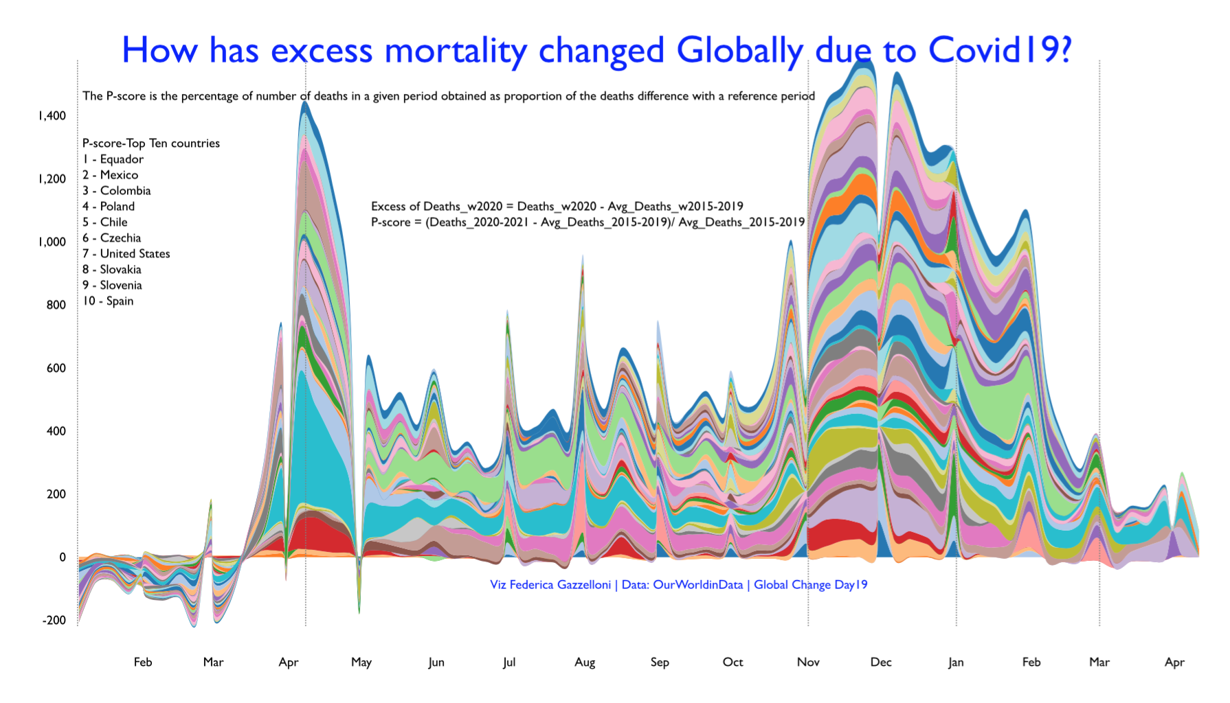 ## Global Change Day 19 - Excess of Mortality