Visualization
This section contains the diagrams, charts, and applications that I have previously learned or created, which are highly beneficial for producing comparable visualizations.

Multiple 95% Confidence Intervals

Iowa state unemployment rate animation plot

Student performance and registration status

Shiny Template for Navigation bar

Shiny App of the mTPI design
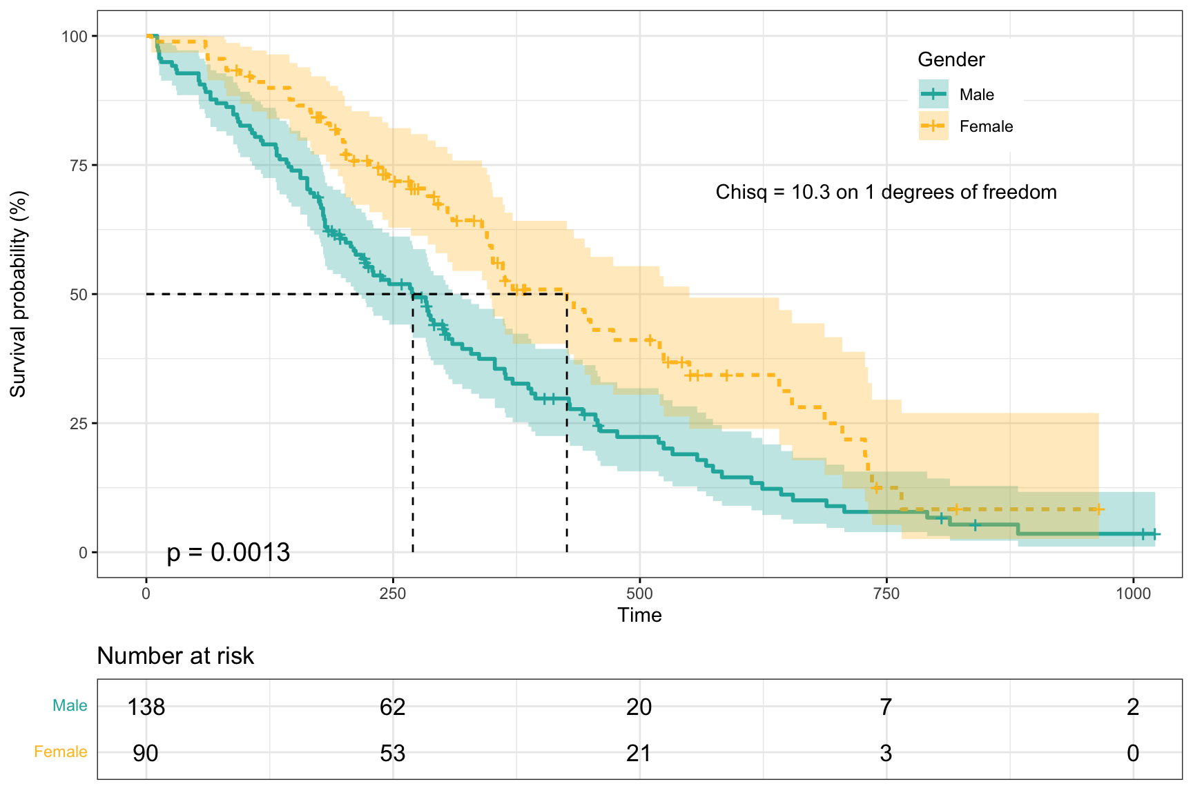
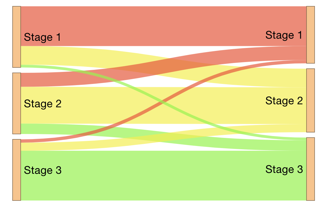
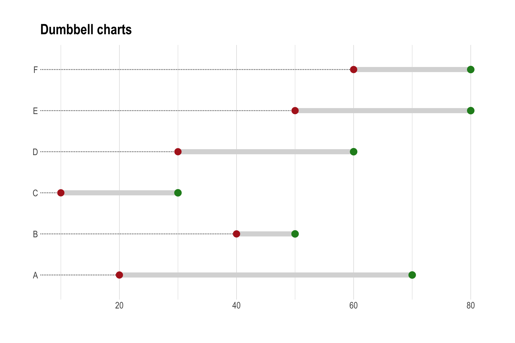
R plot gallery
A collection of figures produced using R


R table gallery
A collection of tables produced using R

R shiny gallery
R Shiny examples.


No matching items