Chapter 3 Communicating Data
Just as there is a range of public literacy, there is a range for which individuals can understand and interpret numbers, termed numeracy. Numeracy varies extensively as some individuals, even those highly educated, have difficulty comprehending numbers when making decisions (Peters 2012). Numeracy can be divided into three levels: primary, applied, and interpretive (Schapira et al. 2008). Primary numeracy is the ability to understand foundational math concepts and graphs, applied numeracy is the ability to understand how numbers relate to everyday tasks, and interpretive numeracy is the ability to use numbers in complex decision making (Schapira et al. 2008). Discomfort exists at every level (Schapira et al. 2008). As such, communicators must present data in a way that individuals with low numeracy can engage in and retain the communication content. Guidelines 7–9 provide suggestions for accessibly communicating data in public health contexts.
Guideline 7: Present Simple Numbers
To accommodate all levels of numeracy when communicating data, communicators should format numbers simply. Numbers should always appear as symbols (e.g., 2) rather than as words (e.g., two) (National Cancer Institute 2011; Bierer and Baedorf Kassis 2023). Formatting numbers as whole integers rather than decimals also improves audience comprehension (Bierer and Baedorf Kassis 2023). In comparisons between numbers, ensure units and denominators are consistent (Bierer and Baedorf Kassis 2023). Audiences also better understand risk when presented as absolute risk formatted as a frequency (e.g., 1 out of 100) as opposed to relative risk expressed as probabilities or percents (e.g., 50% reduction of disease incidence in the treatment group) (Bierer and Baedorf Kassis 2023; Siegrist and Hartmann 2017; Peters 2017). Formatting numbers as simply as possible reduces the audience’s cognitive burden and improves comprehension.
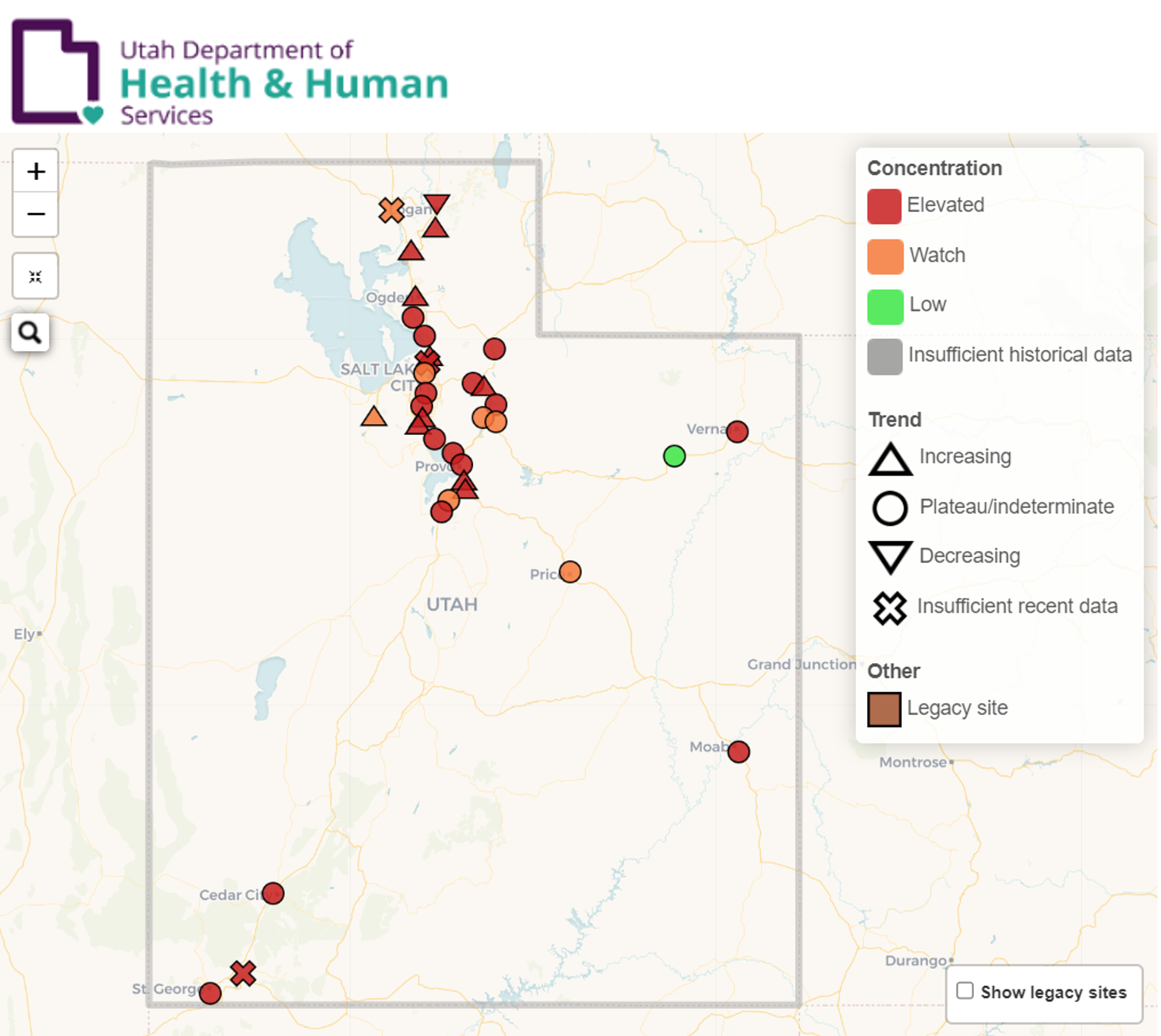
In addition to formatting, presenting data along with other information and cues helps audiences interpret data. Because numbers are inherently abstract, audiences need context to apply and interpret data (Peters 2012). This context can be added using qualifiers (National Cancer Institute 2011; Peters 2012; Bierer and Baedorf Kassis 2023). For example, label probabilities as very likely, likely, possible, unlikely (rare), or very unlikely (very rare) and accompany concentrations with labels for high, normal, or low (Bierer and Baedorf Kassis 2023). Not only do qualifiers add context to numbers, but they also present the same information in words, increasing accessibility for less numerate individuals. The Utah Department of Health and Human Services’ wastewater surveillance dashboard demonstrates using qualifiers to communicate data (U. D. of Health and Human Services 2024).
In addition to formatting, presenting data along with other information and cues helps audiences interpret data. Because numbers are inherently abstract, audiences need context to apply and interpret data (Peters 2012). This context can be added using qualifiers (National Cancer Institute 2011; Peters 2012; Bierer and Baedorf Kassis 2023). For example, label probabilities as very likely, likely, possible, unlikely (rare), or very unlikely (very rare) and accompany concentrations with labels for high, normal, or low (Bierer and Baedorf Kassis 2023). Not only do qualifiers add context to numbers, but they also present the same information in words, increasing accessibility for less numerate individuals. The Utah Department of Health and Human Services’ wastewater surveillance dashboard demonstrates using qualifiers to communicate data (U. D. of Health and Human Services 2024).
\(~\)
Guideline 8: Display Accessible Visualizations
To further accommodate varying degrees of numeracy, present numbers alongside text or visualizations (Bierer and Baedorf Kassis 2023). Visualizations more familiar to audiences (e.g., bar charts, line graphs, and pie charts) require less effort and time to understand (National Cancer Institute 2011). Regardless of the visualization format, adding text labels and qualifiers near graphical components and avoiding red-green color scales facilitate audience comprehension (National Cancer Institute 2011; Bierer and Baedorf Kassis 2023) . When using colors, ensure a 3:1 contrast between elements and the background (Harvard Digital Accessibility Services 2024).4 Similarly, avoiding abstract shapes with poor contrast ensures useability (Bierer and Baedorf Kassis 2023). The NCI’s Making Data Talk Workbook provides further recommendations for accessible visualizations provided in table 4.1. For more guidance on designing accessible webpages see the Additional Resources section.
\(~\)
|
||||||||||||||||||||||||||||||||||||||||||||||||||||||||||||||||
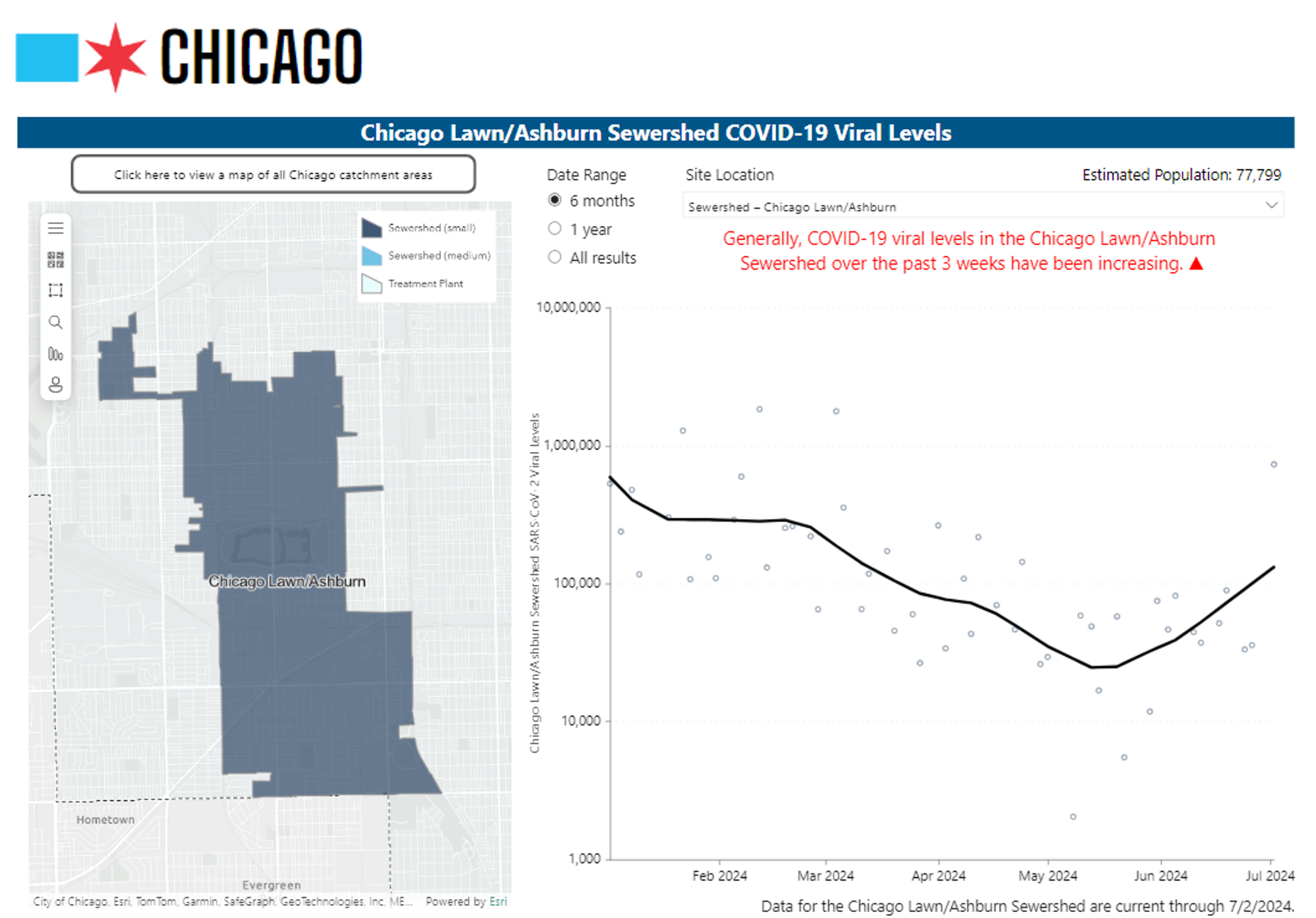
The City of Chicago’s wastewater monitoring dashboard demonstrates good use of simple visualizations with qualifiers (Chicago Department of Public Health 2024). The trendline description at the top of the scatterplot emphasizes the main takeaway from the data.
\(~\)
Guideline 9: Prioritize and Explain Data
Like communicating public health concepts, data communications are most effective when they present a few key pieces of information accompanied with detailed explanations. As such, communicators should prioritize two to three numbers or figures when presenting public health data (National Cancer Institute 2011; Peters 2012). To ensure audience comprehension, accompany data with analogies and meaningful examples (National Cancer Institute 2011; Bierer and Baedorf Kassis 2023). For instance, compare the number of people affected by a disease to the capacity of a local football stadium. It is also helpful for audiences to describe both the positive and negative outcomes (Bierer and Baedorf Kassis 2023). For example, “3 out of 10 restaurant patrons fell ill while 7 out of 10 did not.” These strategies will ensure both audience comprehension and retention.
References
Bierer, Barbara E., and Sylvia Baedorf Kassis. 2023. “Communicating Complex Numeric Information in Clinical Research.” Frontiers in Communication 8 (June). https://doi.org/10.3389/fcomm.2023.1096271.
Chicago Department of Public Health. 2024. “COVID-19 Wastewater Monitoring. COVID-19 Resources.” July 8, 2024. https://www.chicago.gov/content/city/en/sites/covid-19/home/covid-19-wastewater-surveillance.html.
Harvard Digital Accessibility Services. 2024. “Data Visualizations, Charts, and Graphs. Digital Accessibility.” 2024. https://accessibility.huit.harvard.edu/data-viz-charts-graphs.
Health, Utah Department of, and Human Services. 2024. “Utah Wastewater Surveillance System.” July 9, 2024. https://avrpublic.dhhs.utah.gov/uwss/.
National Cancer Institute. 2011. “Making Data Talk: A Workbook.” National Cancer Institute.
Peters, Ellen. 2012. “Beyond Comprehension: The Role of Numeracy in Judgments and Decisions.” Current Directions in Psychological Science 21 (1): 31–35.
———. 2017. “Overcoming Innumeracy and the Use of Heuristics When Communicating Science.” In The Oxford Handbook of the Science of Science Communication, 1st ed., 389–98. New York, NY: Oxford University Press.
Schapira, Marilyn M., Kathlyn E. Fletcher, Mary Ann Gilligan, Toni K. King, Purushottam W. Laud, B. Alexendra Matthews, Joan M. Neuner, and Elisabeth Hayes. 2008. “A Framework for Health Numeracy: How Patients Use Quantitative Skills in Health Care.” Journal of Health Communication 13 (5): 501–17. https://doi.org/10.1080/10810730802202169.
Siegrist, Michael, and Christina Hartmann. 2017. “Overcoming the Challenges of Communicating Uncertainties Across National Contexts.” In The Oxford Handbook of the Science of Science Communication, 1st ed., 445–54. New York, NY: Oxford University Press.
Black text on a white background has a color contrast ratio of 21:1.↩︎