3 Data Visualization
After laboring yourselves to collect, clean, and analyze the data, you want to share the findings and engage the audience with insights about the significance of the study. But most people are not good at extracting insights from rows and columns of numbers. It is the job of the researchers to get important messages across to the audience so they can understand them with as little effort as possible.
Learning Objectives:
This chapter discusses the properties of various graphs, what they are good at and not so good at, and how to plot them in R using two different graphical systems. After finishing this chapter, you should be able to:
Choose the most appropriate graph based on the number of variables and their types.
Convey the message you want to convey to the audience embedded in the data through graphs.
Decorate graphs with labels, a main title, color, and other graphical attributes using the base R graphical system.
Create publication-quality graphs using the
ggplot2package.
3.1 Types of Graphs
The best way to choose the most appropriate graph depends on the data. Specially, the types of variables (numeric or categorical) and how many of them. You will plot graph for:
One numeric variable.
One categorical variable.
One categorical and one numeric variables.
Two or more numeric variables.
A summary table.
3.2 Base R Graphics
This graphical system is built into the base R; no additional package is required. It is simple, ideal for creating graphs promptly for prototyping purposes and get the job done. The flip side is that the graphs may appear a bit primitive. Some features are hard to be implemented. Anyway, if plotting graphs using R is new to you, base R is a great starting point. You will understand the basic characteristics of different graphs without requiring too much technical details.
3.2.1 One Numeric Variable
You can plot a histogram of the numeric variable to see its distribution, such as the spread, the peak, symmetry, and flatness. If your concern is robust statistics, a boxplot will do the job.
3.2.1.1 Histogram
Let’s examine the distribution of iris’s Sepal.Width.
par(mfrow=c(2,2))

# Top left
hist(iris$Sepal.Width)

# Top right
hist(iris$Sepal.Width,
     xlab="Sepal Width",
     ylab = "Count",
     main = "Histogram of Sepal Width")

# Bottom left
hist(iris$Sepal.Width,
     col = 'skyblue',
     border = 'white',
     xlab="Sepal Width",
     ylab = "Count",
     main = "Color options")

# Bottom right
hist(iris$Sepal.Width,
     breaks = seq(2,4.5,by=0.1),
     col = 'skyblue',
     border = 'white',
     xlab="Sepal Width",
     ylab = "Count",
     main = "breaks option")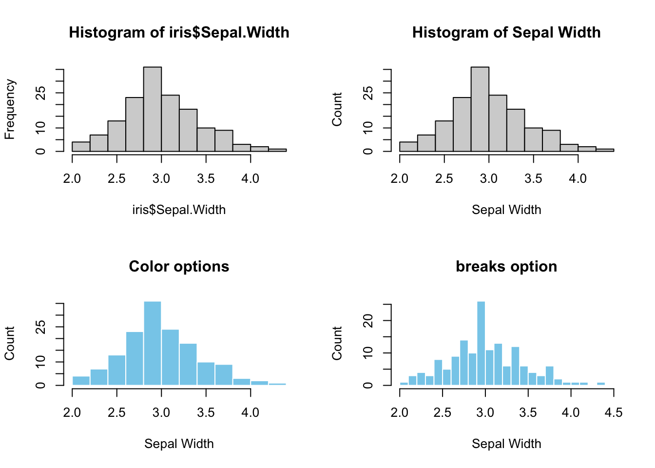
Figure 3.1: Base R Histogram. Top left: default. Top right: Customized X-Y labels and the main title. Bottom left: change color of bars and border. Bottom right: change the bin width (breaks=)
For the bottom-right graph, the seq() function (1.3.1) is used to generate a list of numbers for the breaks parameter that represents x-ticks.
Note: par(mfrow=c(2,2)) splits the plotting area into a 2x2 grid such that multiple graphs can be grouped
3.2.1.2 Boxplot
If the message is robust statistics, such as median and quantiles, or the presence of outliers, the best graph is a boxplot. The y-axis represents the numeric variable, and the x-axis has no meaning.
par(mfrow=c(2,2))

# Top left
boxplot(iris$Sepal.Width)

# Top right
boxplot(iris$Sepal.Width,
        ylab="Sepal Width",
        main="Boxplot of Sepal Width")

# Bottom left
boxplot(iris$Sepal.Width,
            col = "skyblue",
            ylab="Sepal Width",
            outcol = 'red',
            outpch = 19,
            main="Color options")

# Bottom right
boxplot(iris$Sepal.Width,
        horizontal = TRUE,
        xlab="Sepal Width",
        main="Horizontal Boxplot")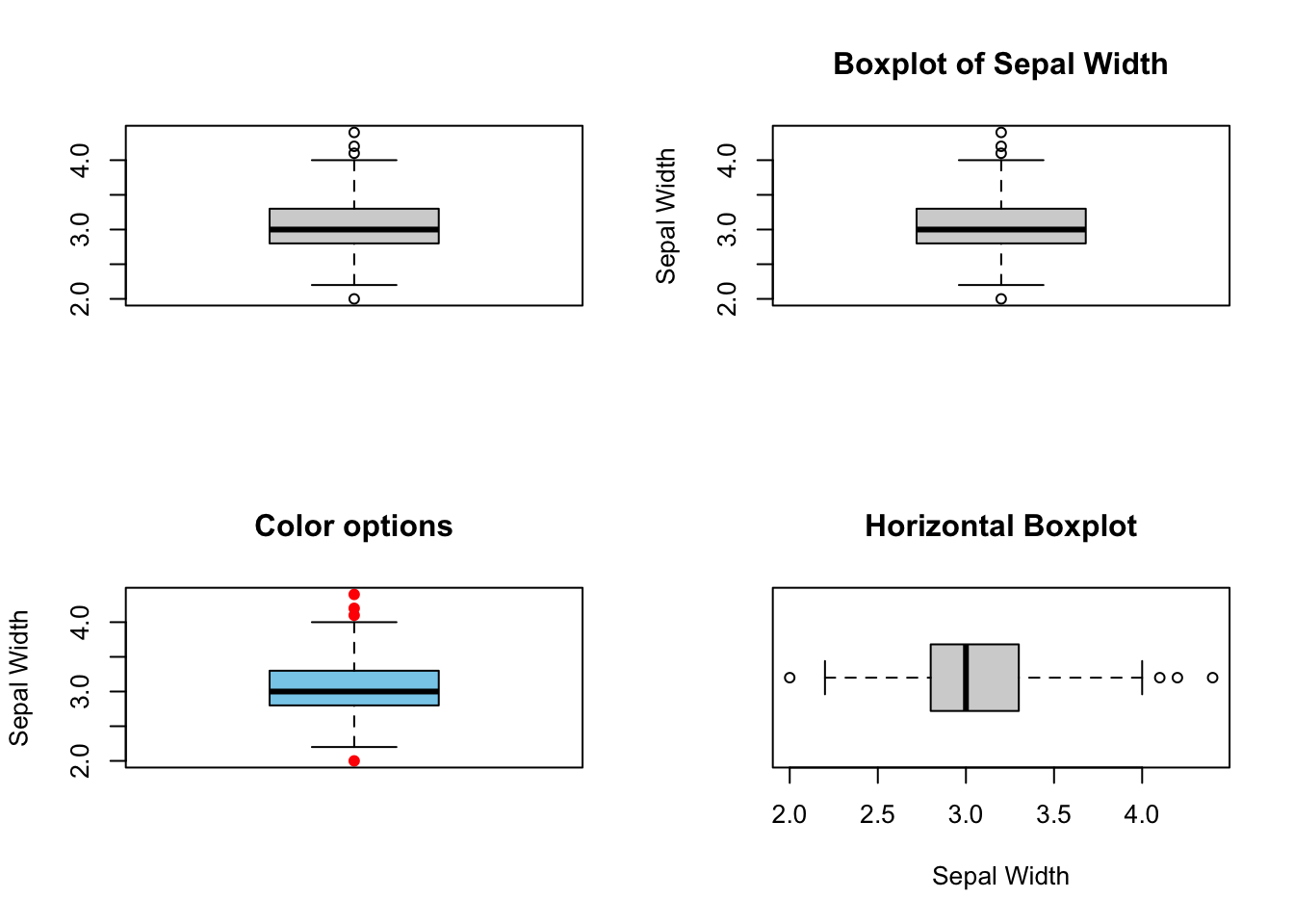
Figure 3.2: Boxplot. Top left: Default, Top right: labels and main title. Bottom left: color options. Bottom right: horizontal = TRUE
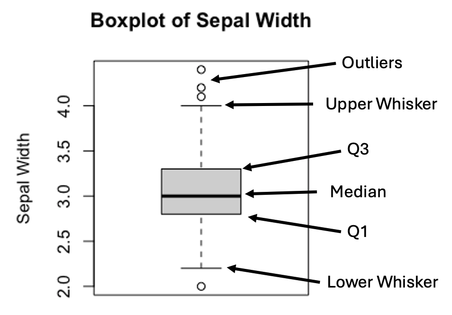
Figure 3.3: Anatomy of a Boxplot
The upper and lower whiskers are defined as:
\[Upper\ Whisker = Q3 + 1.5 \times IQR\] \[Lower\ Whisker = Q1 - 1.5 \times IQR\] , where \(IQR=(Q3-Q1)\).
In practice, values that are greater or less than the upper or lower whiskers are treated as outliers.
Histogram offers a glimpse of how the data is distributed, displaying the peak(s), and long tail, if any, that is less obvious in a boxplot. However, pinpointing the median and outliers on a histogram is non-trivial. Therefore, it makes sense to combine the strengths of both plots in a single graph. To be sure the two plots are comparable, make sure to set the axes in the same range by the xlim and/or ylim= parameters. Here’s an example below:
par(mfrow=c(2,1))

hist(iris$Sepal.Width,
     breaks = seq(2,4.5,by=0.1),
     col = 'skyblue',
     border = 'white',
     xlim = c(2,4.5),
     xlab = "",
     ylab = "Count",
     main = "Stacking Up Graphs")

boxplot(iris$Sepal.Width,
        horizontal = TRUE,
        ylim = c(2,4.5),
        xlab="Sepal Width",
        main="")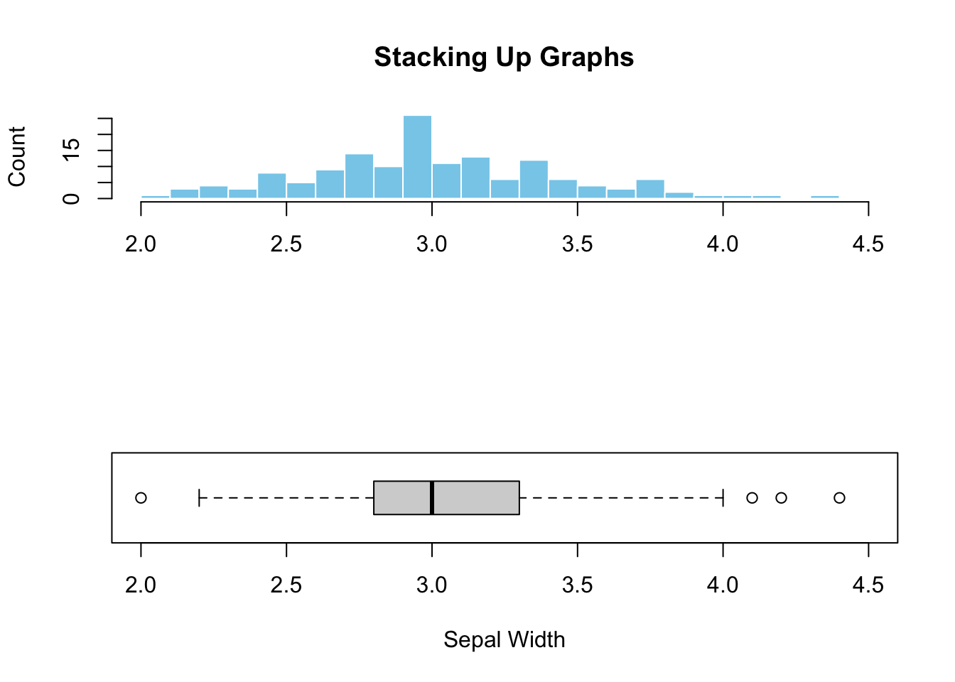
Figure 3.4: Stacking up two graphs.
Figure (3.4)) illustrated the added advantage of combining graphs. It is clear that the peak in the histogram is almost perfectly aligned with the median shown in the boxplot, indicating symmetric data distribution. Additionally, the outliers hardly visible from the histogram can easily be spotted in the boxplot. This example illustrates the synergy and additional perspectives created by combining different graphs.
3.2.2 One Categorical Variable
When it comes to categorical variables, we are usually interested in the number of samples fall in each category of a categorical variable. As discussed in Chapter 2, the tallying can be done using the table() function (2.1.8) or group_by() followed by summarize(n=n()) (2.2.10).
3.2.2.1 Barplot
Barplot is the standard choice for visualizing tallied data. The only input to the R’s barplot() graph function is a tabulated count of the categorical variable. Here’s an example:
par(mfrow=c(2,2))

# Top left
barplot(with(iris, table(Species)))

# Top right
barplot(with(iris, table(Species)),
        xlab="Species",
        ylab="Count",
        main="A Barplot of Species")

# Bottom left
barplot(with(iris, table(Species)),
        col='skyblue',
        border='blue',
        xlab="Species",
        ylab="Count",
        main="Color Options")

# Bottom right
barplot(with(iris, table(Species)),
        horiz = TRUE,
        col='skyblue',
        border='blue',
        xlab="Count",
        ylab="Species",
        main="A Horizontal Barplot")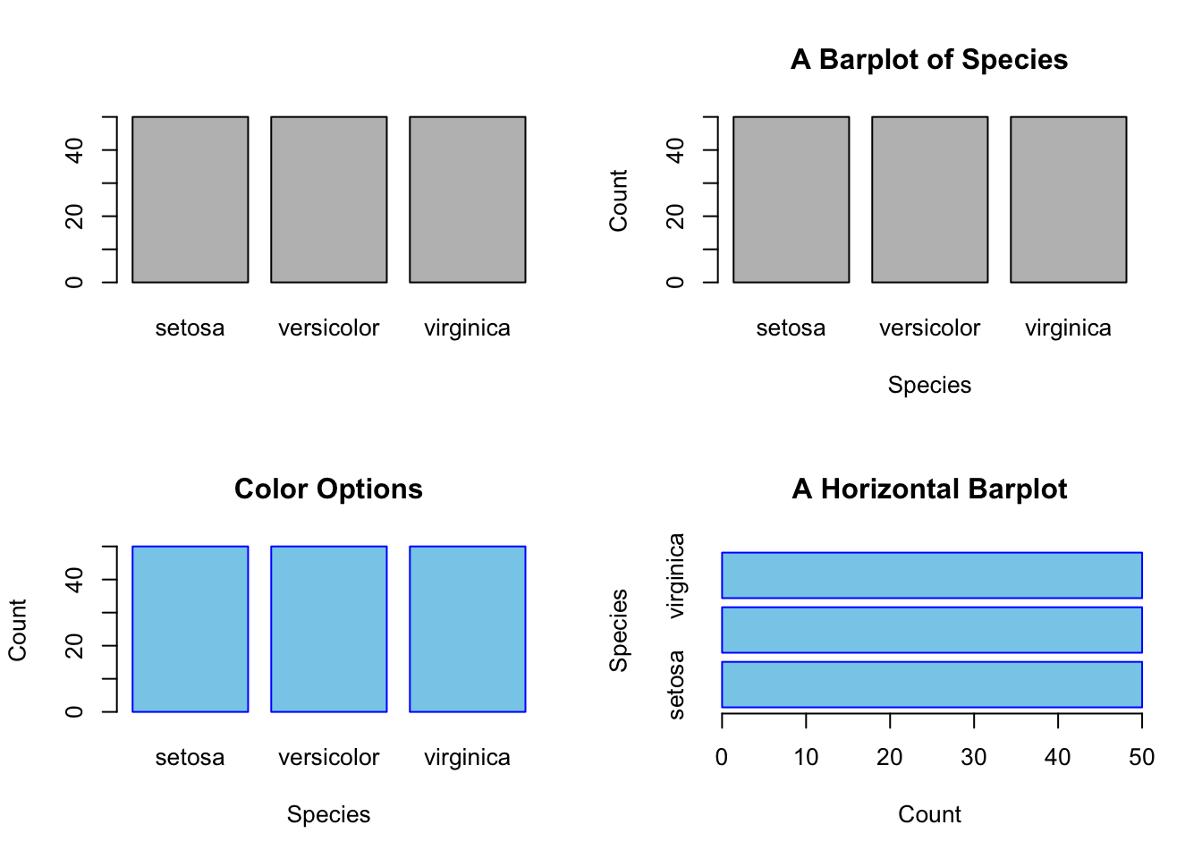
Figure 3.5: A simple bar plot. Top left: Default. Top right: with tables
Sometime you might want to reorder the categories along the x- or y-axis. By default, barplot() places the bars from left to right according to the current order of the levels. E.g., the levels of iris$Species is:
levels(iris$Species)
#> [1] "setosa"     "versicolor" "virginica"
You can change the current order by updating the factor variable by the factor() function (1.2.5). Suppose, the desired order is virginica, setosa, and veriscolor.
iris$Species <- factor(iris$Species,
                       levels = c("virginica", "setosa", "versicolor"),
                       ordered = TRUE)
levels(iris$Species)
#> [1] "virginica"  "setosa"     "versicolor"
barplot(with(iris, table(Species)),
        col='skyblue',
        border='blue',
        xlab="Species",
        ylab="Count",
        main="Reordered Species")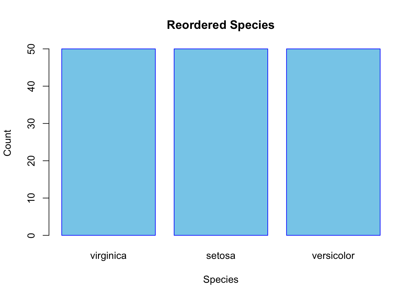
Figure 3.6: Reorder the Bars of a Barplot
3.2.2.2 Pie Chart
Besides a barplot, a pie chart is also a good fit for displaying tallied data.
par(mfrow=c(2,2))

# Top left
pie(with(iris, table(Species)))

# Top left
pie(with(iris, table(Species)),
    col = c('skyblue', 'orange', 'white'),
    main="Species")

# Bottom right
counts <- with(iris, table(Species))
my_labs <- paste0(names(counts),"(",counts,")")
pie(counts,
    labels = my_labs,
    col = c('skyblue', 'orange', 'white'),
    main = "Species Counts")


# Bottom right
counts <- with(iris, table(Species))
fractions <- round(counts/sum(counts),2)
my_labs <- paste0(names(counts),"(",fractions,")")
pie(counts,
    labels = my_labs,
    col = c('skyblue', 'orange', 'white'),
    main = "Species Fractions")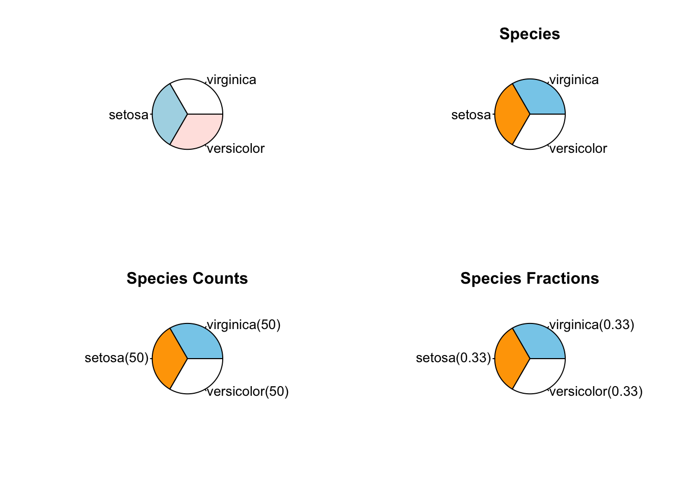
Figure 3.7: A simple pie chart. Top left: Default. Top right: with tables
3.2.3 One Categorical and One Numeric Variables
The categorical is usually served as a group identifier that splits the data into groups so the numerical variable can be compared between groups. This kind of graph is generally named side-by-side plot. You can choose a side-by-side boxplot or a side-by-side barplot. For example, visually compare the robust statistics between different species of iris.
3.2.3.1 Side-by-side Boxplot
par(mfrow=c(2,1))

boxplot(Sepal.Length ~ Species,
        data=iris,
        main="A Side-by-Side Boxplot")

boxplot(Sepal.Length ~ Species,
        data=iris,
        horizontal = TRUE,
        main="A Horizontal Side-by-Side Boxplot")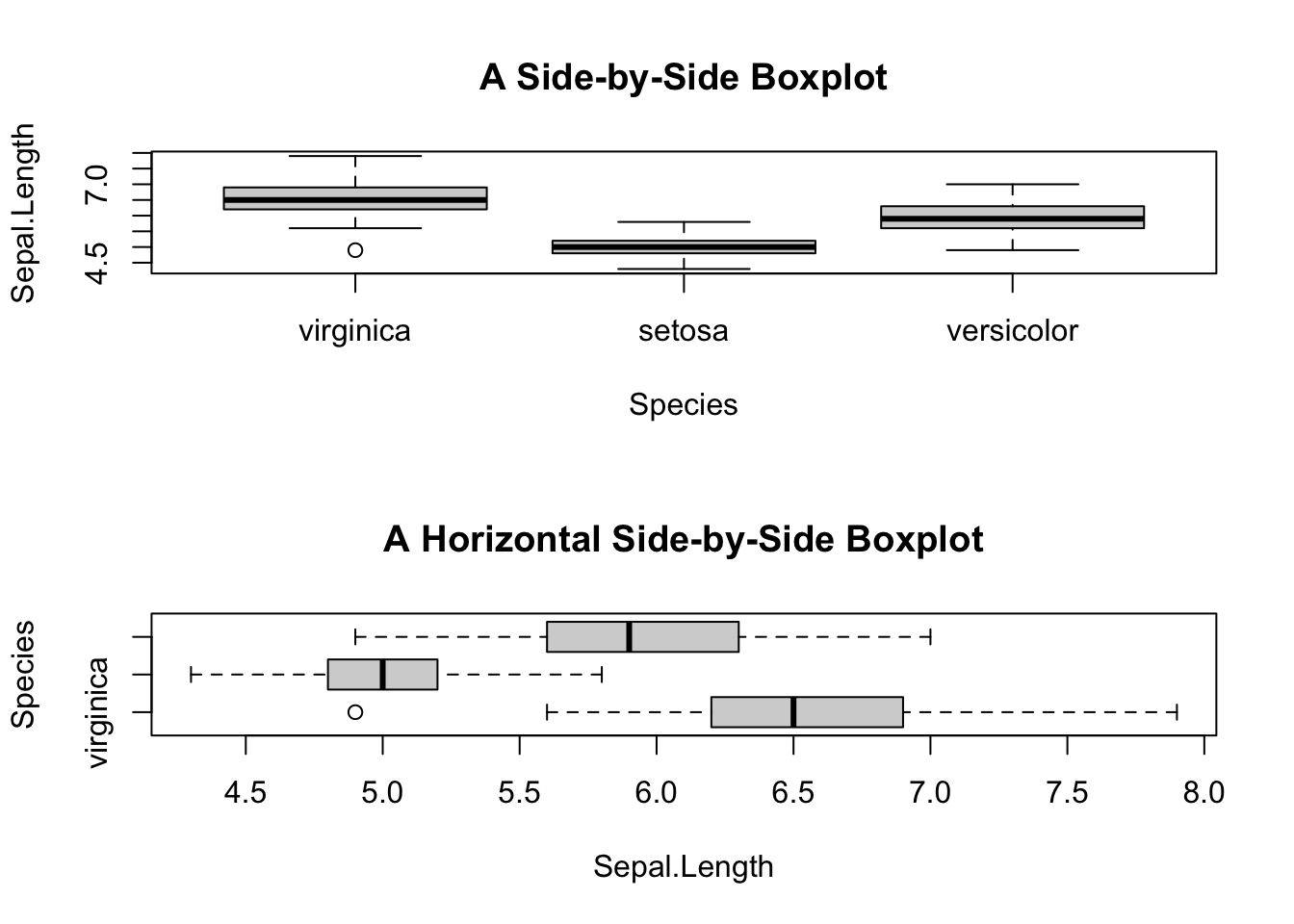
Figure 3.8: Side-by-side plot
Sepal.Length ~ Species is read as “Sepal length by species”, the tilde symbol “~” means “by”.
However, there is glitch in the horizontal boxplot. The tick y-labels collided. It can be fixed by adding las=2 parameter to the boxplot() function.
boxplot(Sepal.Length ~ Species,
        data=iris,
        horizontal = TRUE,
        las = 2,
        main="Y-tick Labels Reorientated")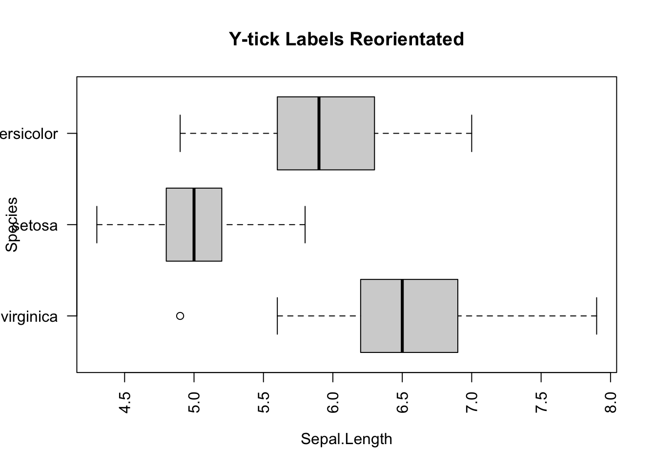
Figure 3.9: Side-by-side plot
3.2.3.2 Side-by-side Barplot
Suppose you want to visually compare the average sepal length among different iris species. You will begin to feel the cumbersome of base R, and appreciate the power of tidyverse. Anyway, you will see how to make such a graph with a new function, tapply(), in two steps.
First, make a table of average sepal length by species. Apparently, the table() function may help. But it does not work for this case, as it only tallies the number of samples by species. Hence, you need to use a new function tapply(). Here’s an example:
mean_data <- tapply(iris$Sepal.Length, iris$Species, FUN = mean)
mean_data
#>  virginica     setosa versicolor
#>      6.588      5.006      5.936
How does tapply() work? The “t” represents table. The function applies the mean function to the input data iris$Sepal.Length grouped by iris$Species. In other words, the mean() is applied to the sepal lengths for each species separately.
And then, pass the mean_data object to barplot().
barplot(mean_data,
        xlab="Species",
        ylab="Average Sepal.Length",
        main="Side-by-side Barplot")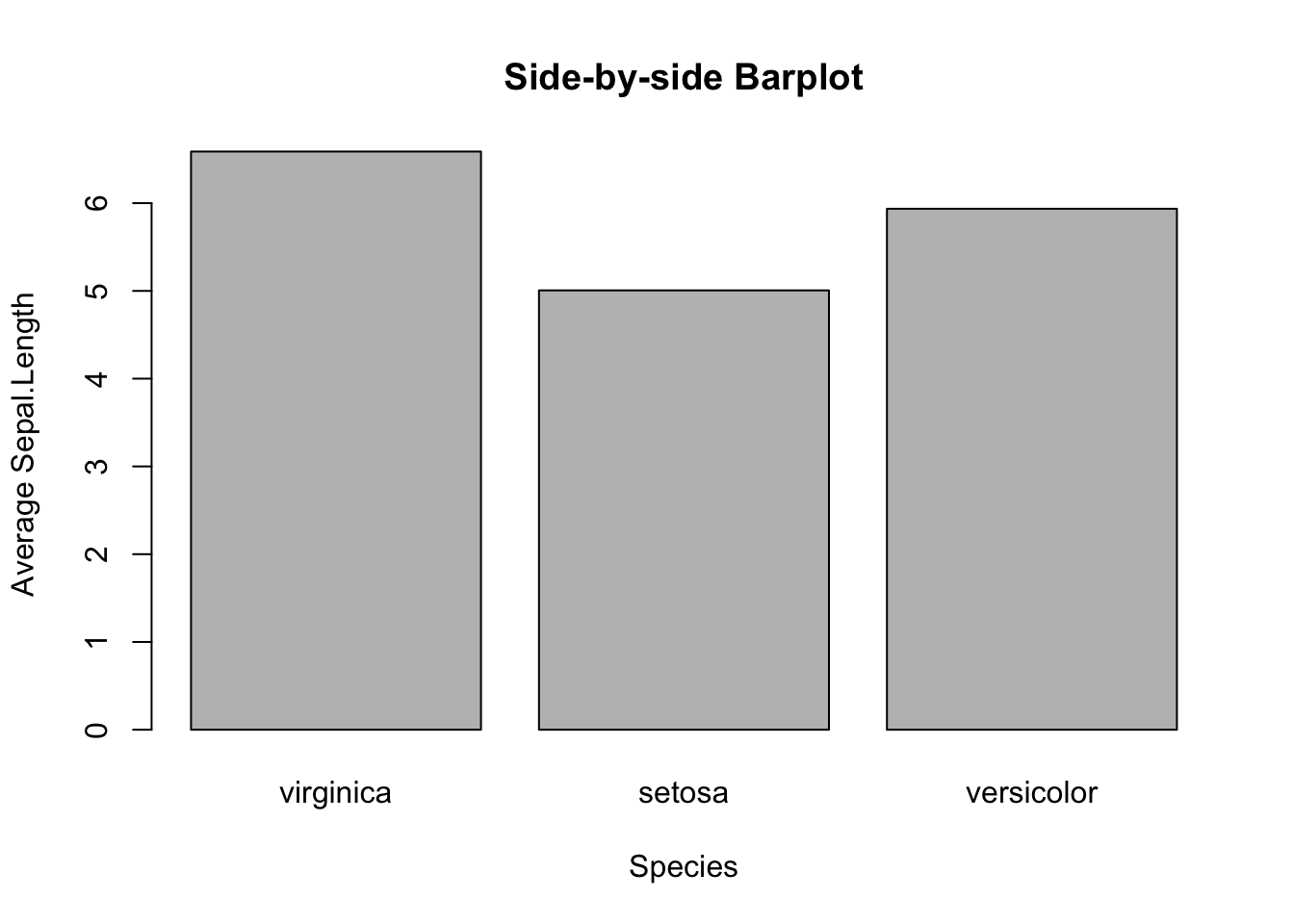
Figure 3.10: Side-by-side Barplot
3.2.3.3 Side-by-side Barplot with Error Bar^*
*This topic is slightly advanced. It is much easier to use ggplot2. So, feel free to skip this and jump to 3.3.4.3.
The error bar represents the standard error of the mean (SEM). Here is the formula:
\[\huge{\bar{x}\pm\frac{s}{\sqrt{n}}}\] , where \(s\) and \(n\) are the standard deviation and sample size, respectively. In the bar plot you are going to plot, the height of the bar is \(\bar{x}\), and the error bars span above and below the bar’s top by \(\frac{s}{\sqrt{n}}\) units.
First, calculate the mean and standard of errors using the tapply() function.
mean_data <- tapply(iris$Sepal.Length, iris$Species, FUN = mean)
mean_data
#>  virginica     setosa versicolor
#>      6.588      5.006      5.936
sem <- function(x) {sd(x)/sqrt(length(x))}
sem_data <- tapply(iris$Sepal.Length, iris$Species, FUN = sem)
sem_data
#>  virginica     setosa versicolor
#> 0.08992695 0.04984957 0.07299762
First, create the bar plot and store the height of bars in the object bar_midpoints. Use the arrows() function create the error bars, where each error bar consists of the upper whisker \((x_{1}, y_{1})\) and lower whisker \((x_{0}, y_{0})\).
bar_midpoints <- barplot(mean_data,
                  xlab="Species",
                  ylab="Average Sepal.Length",
                  main="Side-by-side Barplot")

arrows(x0 = bar_midpoints,
       y0 = mean_data - sem_data, # Start of the bar
       x1 = bar_midpoints,
       y1 = mean_data + sem_data, # End of the bar
       angle = 90,                # Makes the ends of the bars flat
       code = 3,                  # Draws ticks at both ends
       length = 0.5, col='red')   # Sets the length of the ticks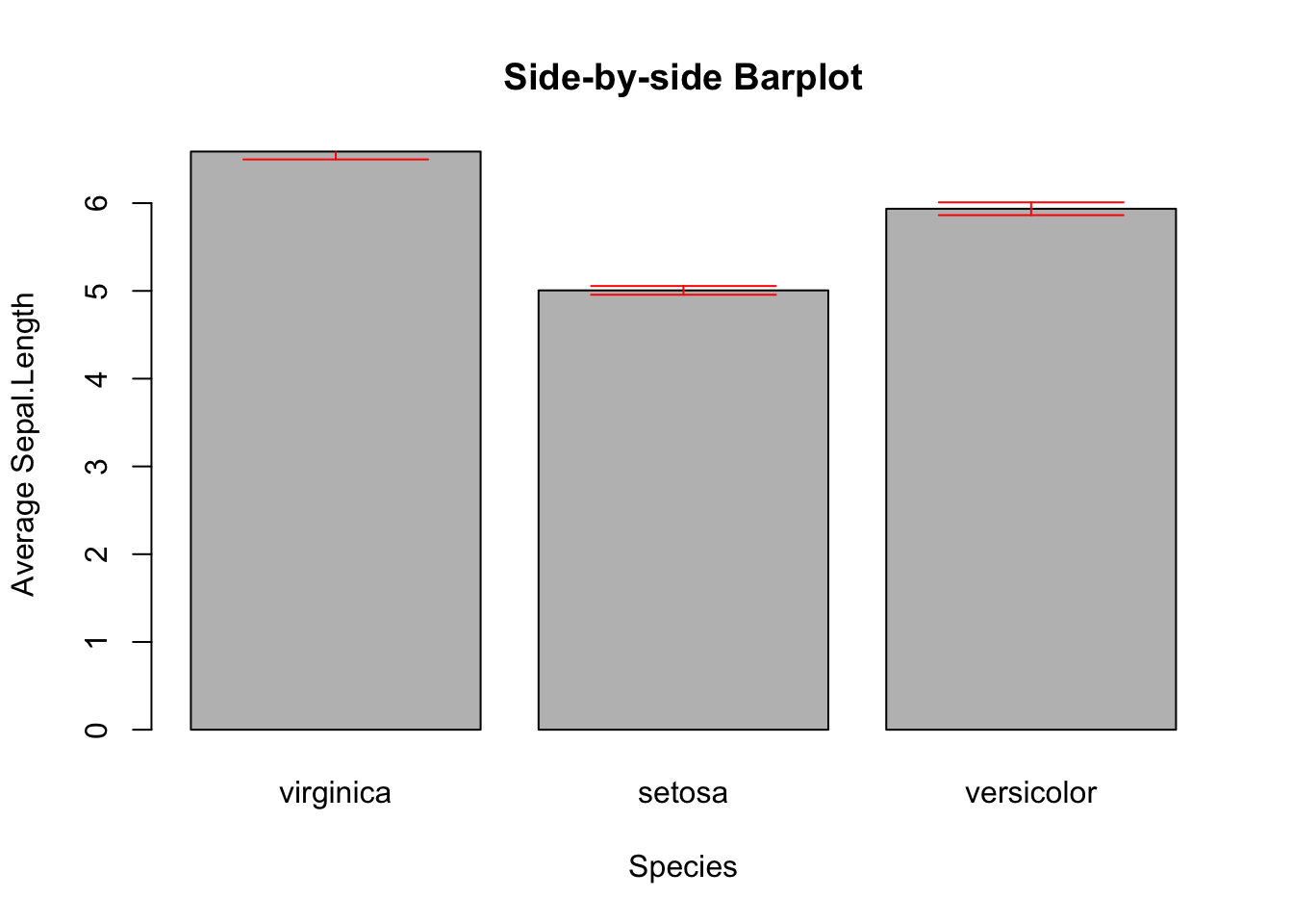
Figure 3.11: Side-by-side Barplot with Error Bars
Once again, if you found this confusing, see the ggplot version of error bars (Section 3.3.4.3).
3.2.3.4 Line Graph with Error Bar
A line graph is an alternative to a bar plot that is good at showing a trend. Here you see how to create a line graph overlaid with solid dots.
# Default line plot
plot(mean_data,
      type='b',
      pch=19,
      xlab="Species",
      ylab="Average Sepal.Length",
      main="Line Plot")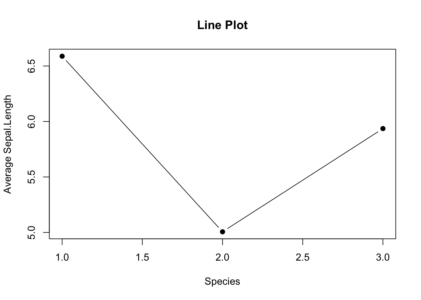
Figure 3.12: Line plot
Use
pch=19to specify the shape of the data points.pchstands for plotting character. The value19denotes a solid dot (\(\bullet\)).To join the dots together in a line plot, specify
type='b', thebmeans to plot both dots and line. More options oftypecan be found in thehelp(plot)documentation.
But, there is a glitch in the x-tick.The x-tick should show the actual species names instead of number. It can be fixed in two steps: 1. Suppress the default x-tick labeling feature of the plot() function by setting the parameter xaxt="n". And then, paste the customized x-tick back by the axis() function. The species names can be obtained by names(mean_data).
# Fix x-tick labels
plot(mean_data,
      type='b',
      pch=19,
      xlab="Species",
      ylab="Average Sepal.Length",
      main="Change x-tick Labels",
      xaxt="n")
axis(side=1, at=1:length(mean_data), labels=names(mean_data))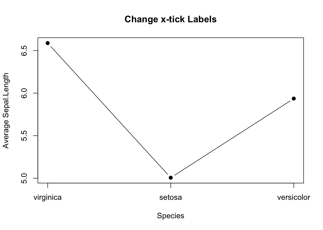
Figure 3.13: Line plot with proper x-tick labels
Here’s how to add error bars to the line plot. It is similar to the barplot above, except that x0 and x1 should take the values 1,2,3.
# Add Error Bar
plot(mean_data,
      type='b',
      pch=19,
      xlab="Species",
      ylab="Average Sepal.Length",
      main="Change x-tick Labels",
      xaxt="n")
axis(side=1, at=1:length(mean_data), labels=names(mean_data))

arrows(x0 = seq(length(mean_data)),
       y0 = mean_data - sem_data, # Start of the bar
       x1 = seq(length(mean_data)),
       y1 = mean_data + sem_data, # End of the bar
       angle = 90,                # Makes the ends of the bars flat
       code = 3,                  # Draws ticks at both ends
       length = 0.05, col='red')   # Sets the length of the ticks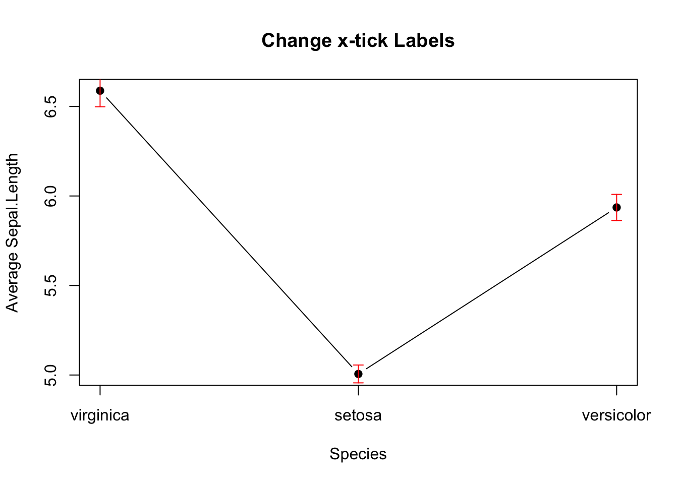
Figure 3.14: Line plot with error bars
3.2.3.5 Overlapping Histogram^*
/* The code for creating this plot is a bit convoluted. It is easier to make it using ggplot2. Feel free to skip to 3.3.4.5.
Suppose you are interested in comparing the distribution of sepal lengths among the three iris species. Here are the steps:
Split the data by individual species.
Calculate the range for the x- and y-axis so as to ensure the histograms are in the same scale.
Create a histogram for a data subset from step 1, which becomes the template of the final graph. Additionally, color is used to distinguish one species from the other.
Overlay the histograms for other data subsets on top of the template.
Let’s do it step by step below:
# Step 1
setosa <- subset(iris, Species == "setosa")
versicolor <- subset(iris, Species == "versicolor")
virginica <- subset(iris, Species == "virginica")Below is the code for plotting the template histogram, and how additional histograms are added to it. To distinguish species, different color is attributed to different species. It is done by col = rgb(...). The rgb() function stands for red, green, and blue. It takes four parameters: the intensity of red, green, blue, and transparency. All are in the range of 0 and 1. E.g., rgb(1, 0, 0, 0.5) means 100% red, no green and blue at all, and transparency is 50%.
# Step 3
hist(setosa$Sepal.Length,
     main = "Overlapping Histogram of Sepal Length",
     xlab = "Sepal Length",
     col = rgb(1, 0, 0, 0.5), # Red with 50% transparency
     breaks = seq(4,9,by=0.25),
     xlim = x_range,
     ylim = y_range)

# Step 4
hist(versicolor$Sepal.Length, col=rgb(0, 1, 0, 0.5), add = TRUE) # green with 50% transparency
hist(virginica$Sepal.Length, col=rgb(0, 0, 1, 0.5), add = TRUE)  # blue with 50% transparency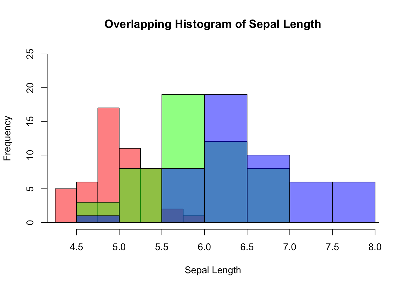
Figure 3.15: Overlapping histogram
3.2.4 Contingency Table
If a dataset comprises two categorical variables. A two-dimensional contingency table, or a 2D table, depicts the number of samples present in different combinations of categories of the two categorical variables. The distribution of the counts can reveal the dependency of the two categorical variables. Let’s use another built-in dataset penguins for illustration. It contains two categorical variables: species and island. Suppose you are interested to explore how geographical location affects the distribution of penguins.
Create a 2D table as below:
mytab <- with(penguins, table(species, island))
mytab
#>            island
#> species     Biscoe Dream Torgersen
#>   Adelie        44    56        52
#>   Chinstrap      0    68         0
#>   Gentoo       124     0         0
Obviously, species and island are not independent, as you can see not all three species can be found in each island. If species and island are independent, the counts in the contingency table should be below:
indep_tab
#>            island
#> species     Biscoe Dream Torgersen
#>   Adelie        74    55        23
#>   Chinstrap     33    25        10
#>   Gentoo        61    45        19
Two popular graphs are used to visualize counts from a contingency table: a side-by-side barplot, and mosaic plot.
barplot(mytab,
        beside=T,
        xlab = "Island",
        ylab = "Count",
        main = "A 2D Table",
        col = c("skyblue", "lightgreen", "lightcoral"),
        legend.text = rownames(mytab))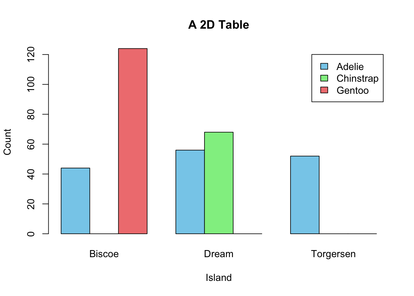
Figure 3.16: Visualization of a 2D Contingency Table. A. A side-by-side barplot. B. Mosaic plot.
mosaicplot(mytab, main = "Mosaic Plot of Two Dependent Variables")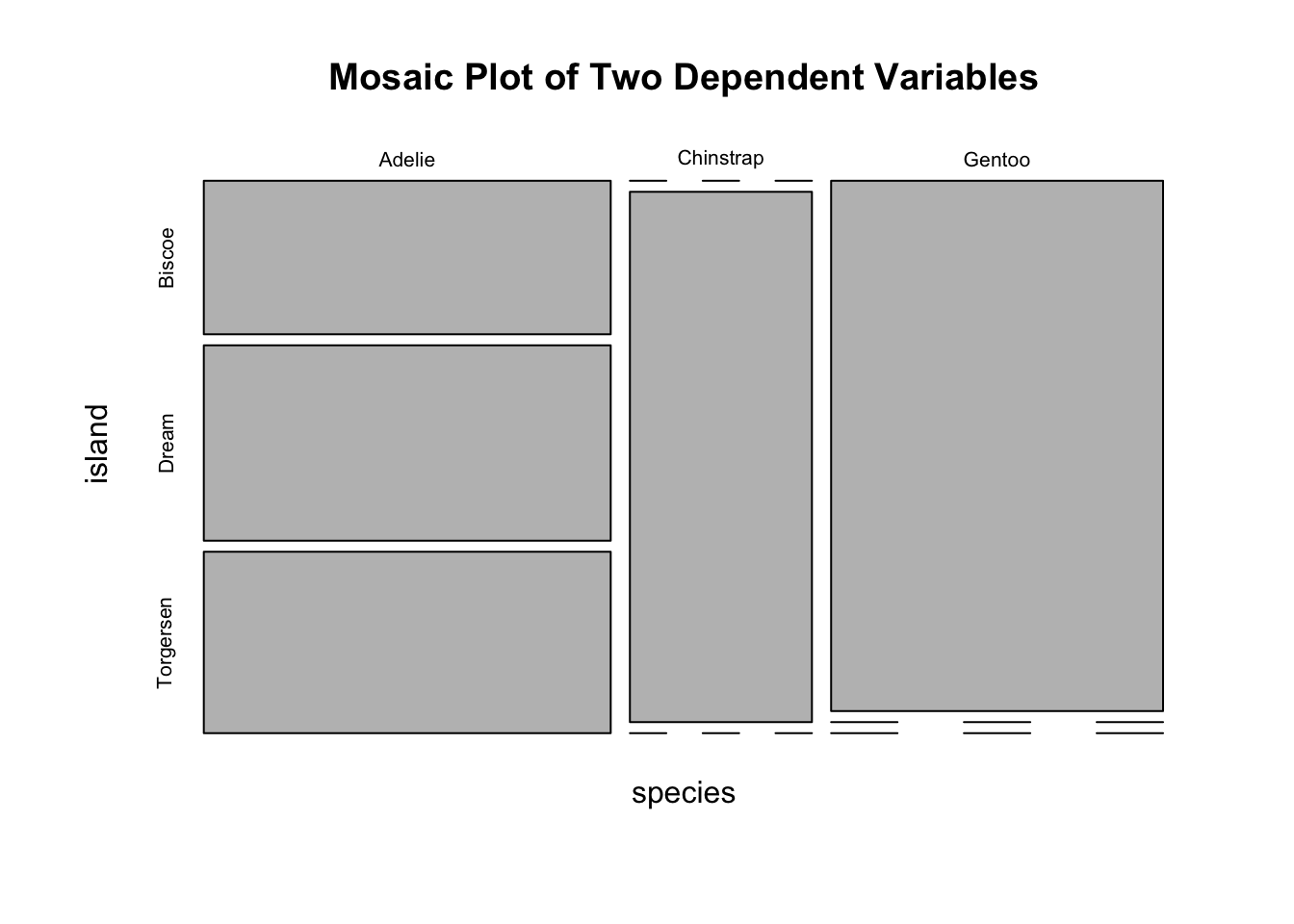
Figure 3.17: Visualization of a 2D Contingency Table. A. A side-by-side barplot. B. Mosaic plot.
mosaicplot(indep_tab, main = "Mosaic Plot of Two Independent Variables")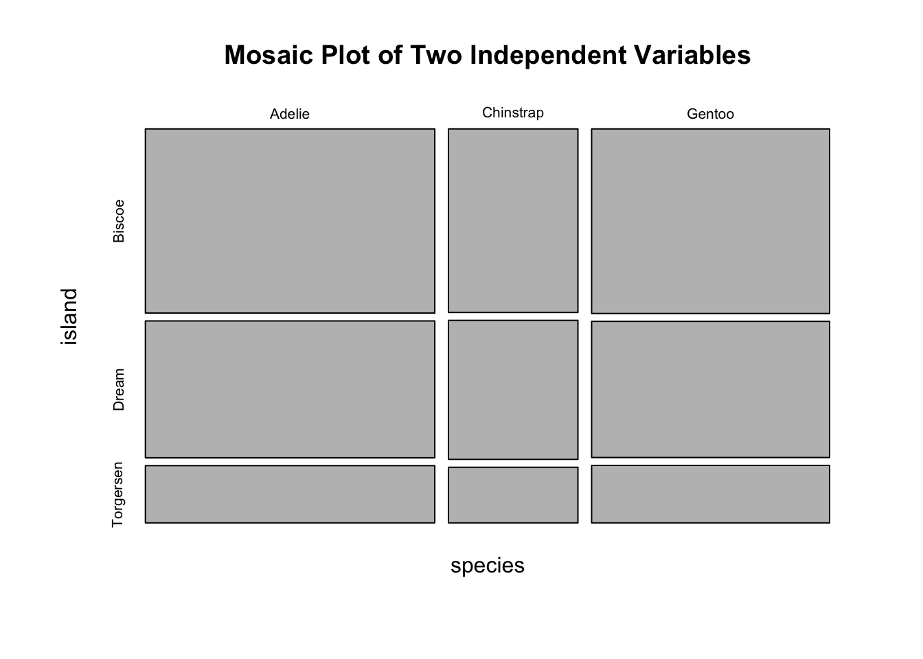
Figure 3.18: Visualization of a 2D Contingency Table. A. A side-by-side barplot. B. Mosaic plot.
3.2.5 Two Numeric Variables
If you want to gain a gut feeling about the relationship between two numeric variables, a scatter plot is the best choice. Note that the relationship can be manifold, ranging from linear to cyclical. So, visualizing how the data points are distributed in a 2D plan is a quick and easy way in gaining intuition of the two variables. Importantly, it should be done before performing any statistical analysis, e.g., linear regression. Here is how to create a scatter plot that shows the relationship between sepal width and sepal length. Note that each point \((x_{i},y_{i})\) is a pair of values from one sample.
par(mfrow=c(1,2))

# Top left
plot(x=iris$Sepal.Width,
     y=iris$Sepal.Length,
     xlab = "Sepal Width",
     ylab = "Sepal Length",
     main = "Default")

# Top right
plot(x=iris$Sepal.Width,
     y=iris$Sepal.Length,
     pch=3,
     xlab = "Sepal Width",
     ylab = "Sepal Length",
     main = "Change the Point Style")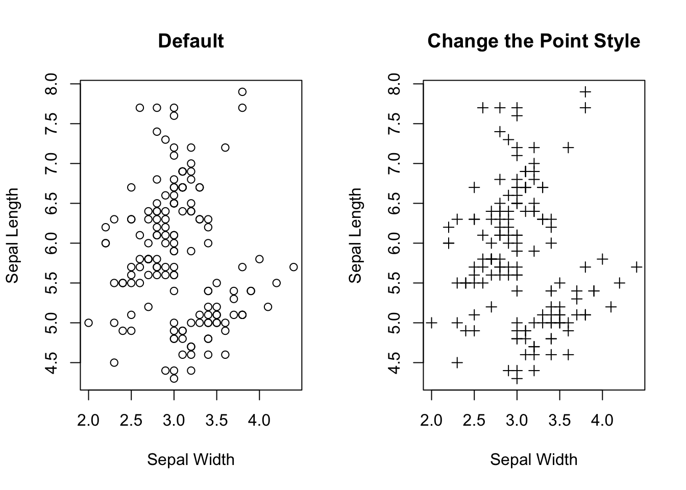
Figure 3.19: Visualizing the relationship between two numeric variables.
plot(x=iris$Sepal.Width,
     y=iris$Sepal.Length,
     pch=3,
     xlab = "Sepal Width",
     ylab = "Sepal Length",
     main = "Segregate Data Points by Color (Species)",
     col = c("skyblue", "lightgreen", "lightcoral")[as.numeric(iris$Species)])

legend("topright",
       legend = levels(iris$Species),
       col = c("skyblue", "lightgreen", "lightcoral"),
       pch = 3,
       title = "Species")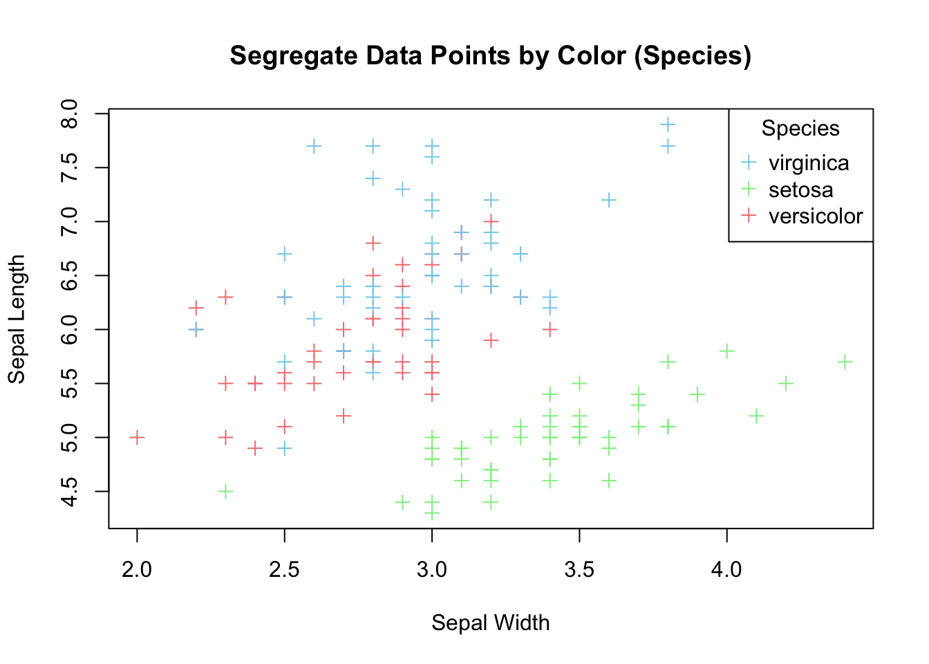
Figure 3.20: Color data points by species.
If your aim is to explore linear relationship between the two variables, it can be emphasized by plotting a regression line for the two variables on top of the data points.
lm_model <- lm(Sepal.Length ~ Sepal.Width, data=iris)

# intercept
intercept <- lm_model$coefficients[1]

# slope
slope = lm_model$coefficients[2]

print(paste("Slope =", slope, "Intercept =", intercept))
#> [1] "Slope = -0.2233610611299 Intercept = 6.52622255089448"
plot(x=iris$Sepal.Width,
     y=iris$Sepal.Length,
     pch=3,
     xlab = "Sepal Width",
     ylab = "Sepal Length",
     main = "Add a Regression Line",
     col = c("skyblue", "lightgreen", "lightcoral")[as.numeric(iris$Species)])

legend("topright",
       legend = levels(iris$Species),
       col = c("skyblue", "lightgreen", "lightcoral"),
       pch = 3,
       title = "Species")

# Add a line
abline(a=intercept, b=slope, col='red')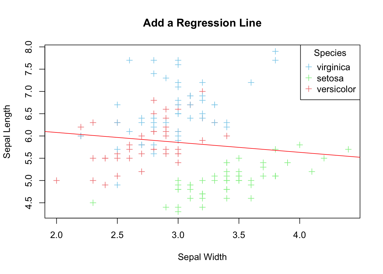
Figure 3.21: Add a regression line
3.2.6 Multi-panel Scatter Plot
A multi-panel scatter plot offers a glimpse of the relationship between all possible pairs of numeric variables. Suppose, you are interested in the pairwise relationship between all numeric variables in iris. It can easily be done using the pairs() plot function.
pairs(iris[,1:4], main="A Multi-Panel Scatter Plot")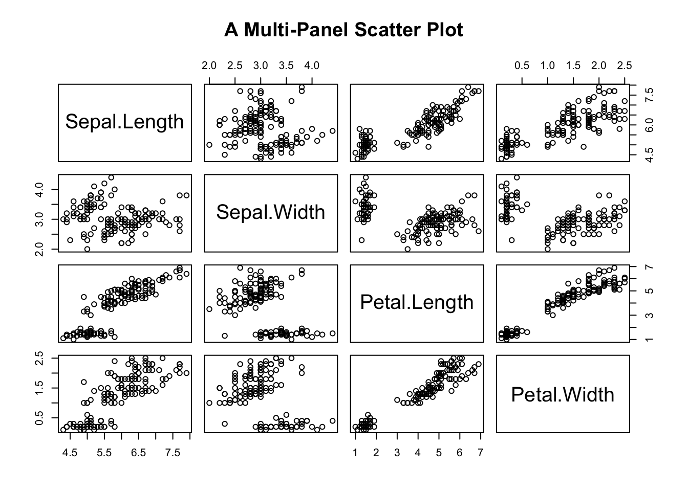
Figure 3.22: A Multi-panel Scatter Plot
Here, it concludes our journey of data visualization using base R functions. As you can see, some plots can be made easily using base R (e.g., multi-panel scatter plot), while others are complicated (e.g., barplot with error bars). To compare the pros and cons of the two graphical systems, let’s continue our journey to ggplot.
3.3 ggplot2
ggplot2 is bundled in tidyverse. So, you have to activate tidyverse before using ggplot2. Here, the focus is on using ggplot2to plot the graphs that were created using base R above. We will not repeat the discussion of strengths and weaknesses of each graph in this section. Readers should refer to the corresponding section above for the characteristics and functions of the graphs.
To use ggplot2, load it into R.
library(tidyverse)
#> ── Attaching core tidyverse packages ──── tidyverse 2.0.0 ──
#> ✔ dplyr     1.1.4     ✔ readr     2.1.5
#> ✔ forcats   1.0.0     ✔ stringr   1.5.1
#> ✔ ggplot2   3.5.2     ✔ tibble    3.3.0
#> ✔ lubridate 1.9.4     ✔ tidyr     1.3.1
#> ✔ purrr     1.1.0
#> ── Conflicts ────────────────────── tidyverse_conflicts() ──
#> ✖ dplyr::filter() masks stats::filter()
#> ✖ dplyr::lag()    masks stats::lag()
#> ℹ Use the conflicted package (<http://conflicted.r-lib.org/>) to force all conflicts to become errors
3.3.1 Grammer of ggplot2
The two ’g’s of ggplot2 stand for Grammar of Graphics. The graphical widgets are arranged in layers that provides the flexibility for decorating a graph by adding layers to it. The data layer forms the foundation of a graph. The Aesthetics defines the association between data variable(s) and the axes. Geometries are the types of graphs, e.g., line plot, histogram, etc. Facets split a graph into multi-panels. Statistics defines how to aggregate data, e.g., in proportion or take the face value in a barplot. Coordinates supports an X-Y Cartesian coordinate system, and a polar coordinate system. (See the Pie Chart section below) Themes offers different color schemes, font type, font size, etc.
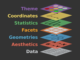
Figure 3.23: Anatomy of ggplot2
3.3.2 One Numeric Variable
You can plot a histogram of the numeric variable to see its distribution, such as the spread, the peak, symmetry, and flatness. If your concern is robust statistics, a boxplot will do the job.
3.3.2.1 Histogram
Let’s redraw the histogram in Figure (3.1)) using ggplot2. The first line is the data layer that specifies the data source, and it must be a data frame (or tibble), e.g., iris. The aesthetic option designates the x-axis for Sepal.Width. The second line is the geometry of the graph. For a histogram, the function name is geom_histogram(). Here is the bare minimum of a ggplot2 histogram:
# Default
ggplot(data=iris, aes(x=Sepal.Width)) +
  geom_histogram()
#> `stat_bin()` using `bins = 30`. Pick better value with
#> `binwidth`.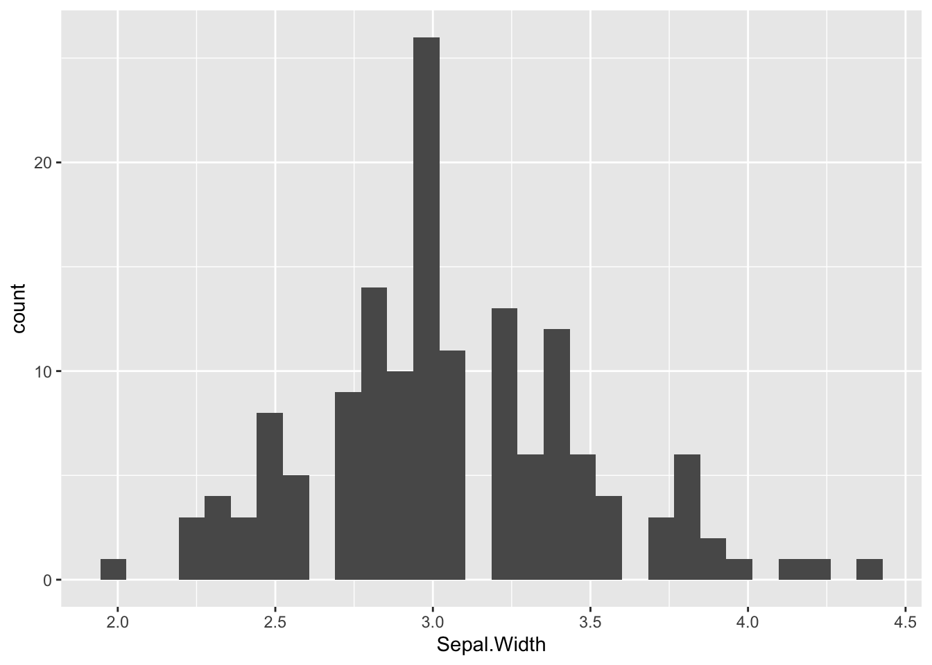
Figure 3.24: ggplot2 Histogram.
It is always a good idea to give the graph a title at the top so people what the key message is. Equally important is the x- and y-labels. This task can be done by the labs() function. By default, the title is left-justified. To center it, see the last line and the comment above it.
# Overwrite default x-/y-label and title
ggplot(data=iris, aes(x=Sepal.Width)) +
  geom_histogram() +
  labs(x="Sepal Width", y="Count", title="Histogram of Sepal Width") +
  # hjust = 0.5 means the horizontal adjustment is the midpoint.
  theme(plot.title = element_text(hjust = 0.5))
#> `stat_bin()` using `bins = 30`. Pick better value with
#> `binwidth`.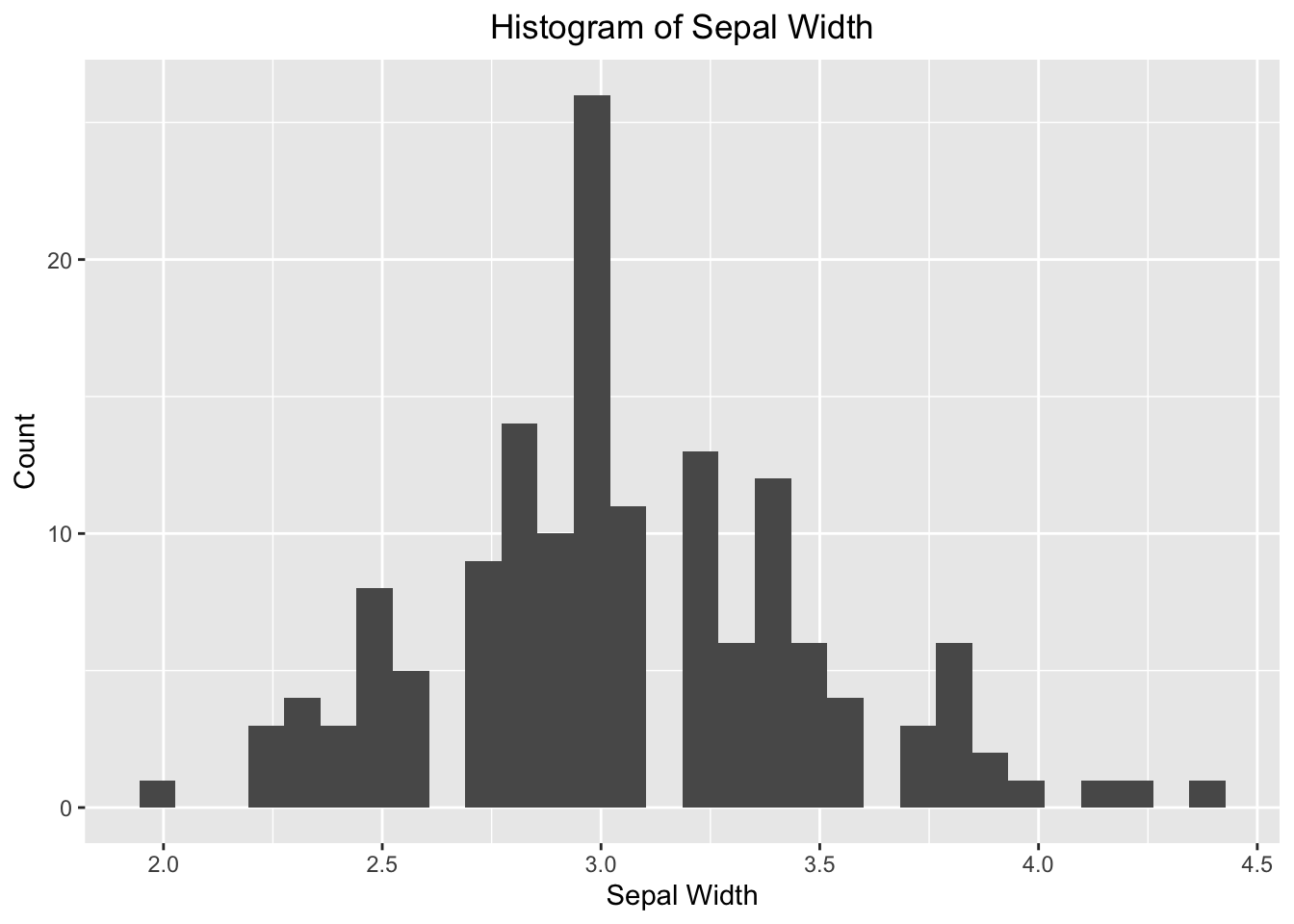
Figure 3.25: ggplot2 Histogram - specify your own labels and title.
Change the fill color and border color. It can be done by providing additional parameters to the geom_histogram().
# fill = filled color
# color = border color
ggplot(data=iris, aes(x=Sepal.Width)) +
  geom_histogram(fill="skyblue", color = "white") +
  labs(x="Sepal Width", y="Count", title="Color Options") +
  # hjust = 0.5 means the horizontal adjustment is the midpoint.
  theme(plot.title = element_text(hjust = 0.5))
#> `stat_bin()` using `bins = 30`. Pick better value with
#> `binwidth`.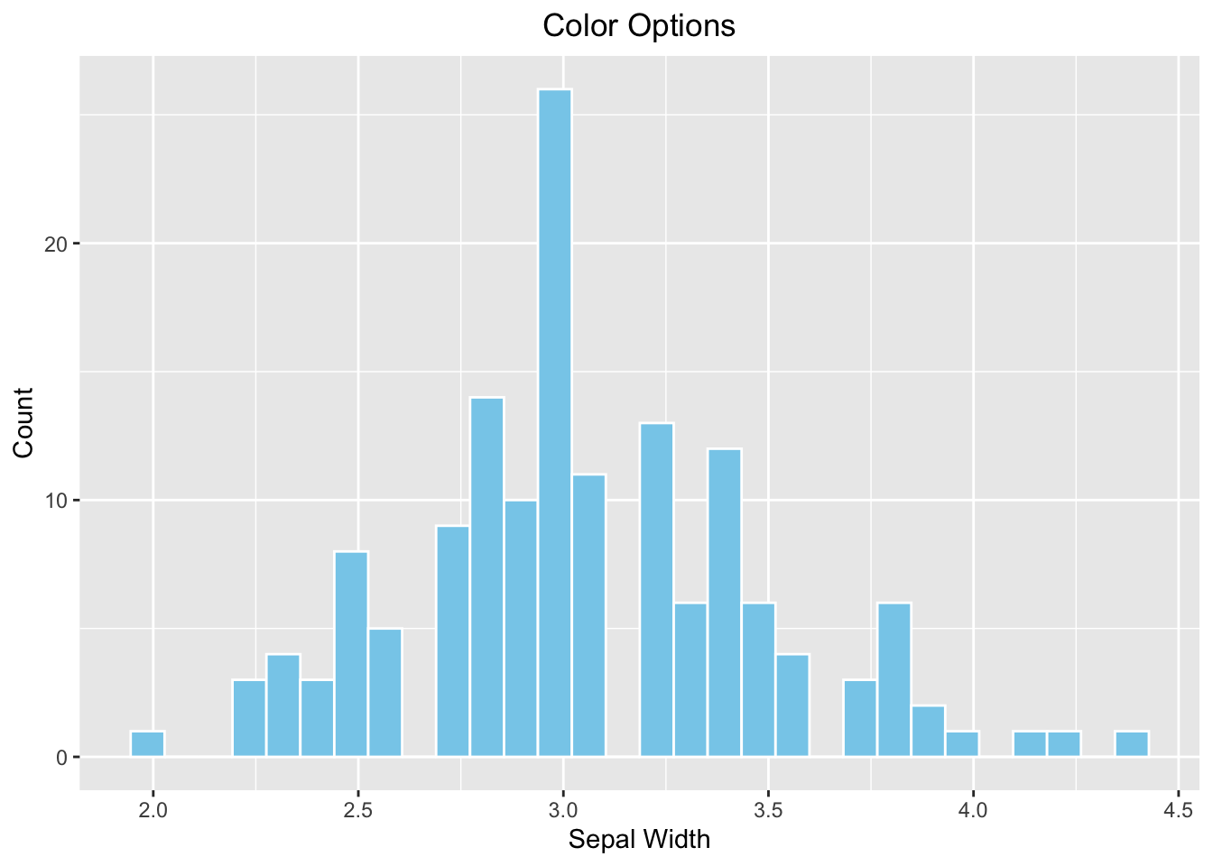
Figure 3.26: ggplot2 Histogram - choose your own color
The bin width of the histogram is calculated automatically by ggplot2 according to the range of x. To overwrite it by the breaks parameter.
# breaks
ggplot(data=iris, aes(x=Sepal.Width)) +
  geom_histogram(fill="skyblue", color = "white", breaks=seq(2,4.5,by=0.1)) +
  labs(x="Sepal Width", y="Count", title="`breaks` option") +
  # hjust = 0.5 means the horizontal adjustment is the midpoint.
  theme(plot.title = element_text(hjust = 0.5))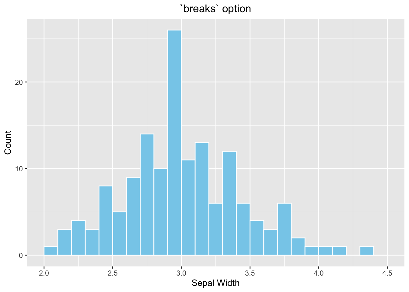
Figure 3.27: ggplot2 Histogram - choose your own color
Optional topic
As you might notice that each of the four histograms occupies the entire plotting area instead of displaying in a 2x2 grid as Figure (3.1)). It is because ggolot2 does not work with par(mfrow(2,2)). To divide the plotting area into a grid that is compatible with ggplot2, use the patchwork package. Use the menu option Tools \(\rightarrow\) Install Packages to install it the very first time.
Another new concept is that a graph can be stored in a variable so it can be displayed later in the grid. In the example below, the four histograms above are initially stored in variables p1, p2, p3, and p4. See the example below:
library(patchwork)

# Default
p1 <- ggplot(data=iris, aes(x=Sepal.Width)) +
        geom_histogram()

# With labels and title
p2 <- ggplot(data=iris, aes(x=Sepal.Width)) +
        geom_histogram() +
        labs(x="Sepal Width", y="Count", title="Histogram of Sepal Width") +
        # hjust = 0.5 means the horizontal adjustment is the midpoint.
        theme(plot.title = element_text(hjust = 0.5))

# fill = filled color
# colour = border color
p3 <- ggplot(data=iris, aes(x=Sepal.Width)) +
        geom_histogram(fill="skyblue", color = "white") +
        labs(x="Sepal Width", y="Count", title="Color Options") +
        # hjust = 0.5 means the horizontal adjustment is the midpoint.
        theme(plot.title = element_text(hjust = 0.5))

# Change the number of bins
p4 <- ggplot(data=iris, aes(x=Sepal.Width)) +
        geom_histogram(fill="skyblue", color = "white", breaks=seq(2,4.5,by=0.1)) +
        labs(x="Sepal Width", y="Count", title="`breaks` option") +
        # hjust = 0.5 means the horizontal adjustment is the midpoint.
        theme(plot.title = element_text(hjust = 0.5))

# Arrange them in a 2x2 grid
# '+' places plots next to each other, '/' stacks them
(p1 + p2) / (p3 + p4)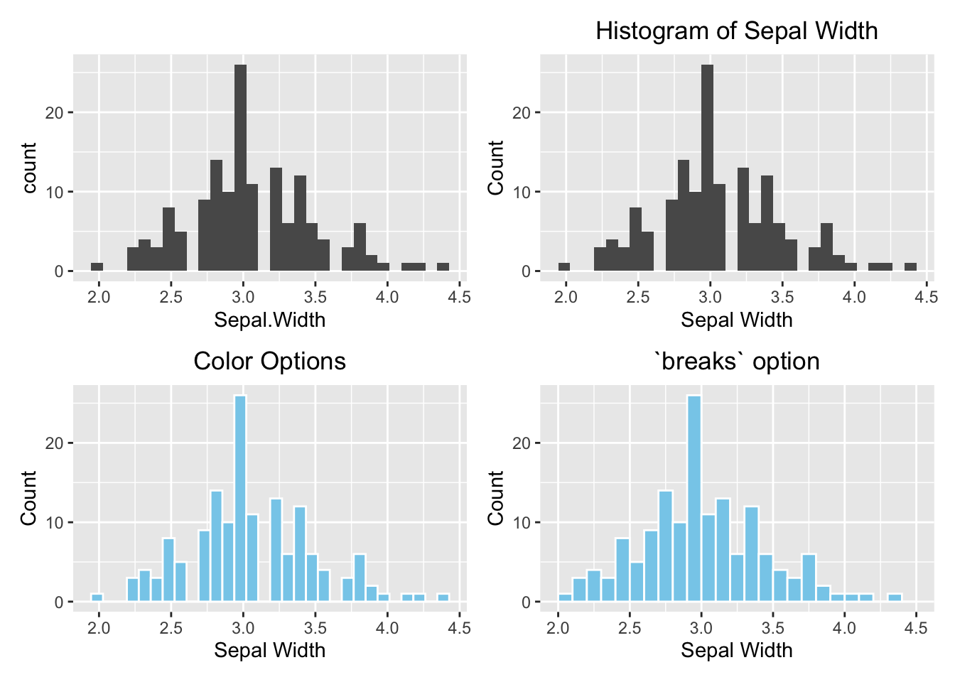
Figure 3.28: ggplot2 Grid System by patchwork. Top left: Default (bare minimum). Top right: with labels and title. Bottom left: change the color. Bottom right: change the number of bins.
3.3.2.2 Boxplot
For an anatomy of a boxplot, reference the Figure (3.3)). The geometry function of a boxplot is geom_boxplot(). Unlike a histogram, the numeric variable is mapped to the y-axis for a vertical boxplot. If you want a horizontal boxplot, map the numeric variable to the x-axis, and don’t forget to specify the label for the x-axis.
library(patchwork)

# Default
p1 <- ggplot(data=iris, aes(y=Sepal.Width)) +
        geom_boxplot()

# Add y-label and title
p2 <- ggplot(data=iris, aes(y=Sepal.Width)) +
        geom_boxplot() +
        labs(y="Sepal Width", title = "Boxplot of Sepal Width") +
        theme(plot.title = element_text(hjust = 0.5))

# Change color
p3 <- ggplot(data=iris, aes(y=Sepal.Width)) +
        geom_boxplot(fill="skyblue", outlier.color = "red") +
        labs(y="Sepal Width", title = "Color options") +
        theme(plot.title = element_text(hjust = 0.5))

# Horizontal boxplot
p4 <- ggplot(data=iris, aes(x=Sepal.Width)) +
        geom_boxplot() +
        labs(x="Sepal Width", title = "Horizontal Boxplot") +
        theme(plot.title = element_text(hjust = 0.5))

(p1 + p2)/(p3 + p4)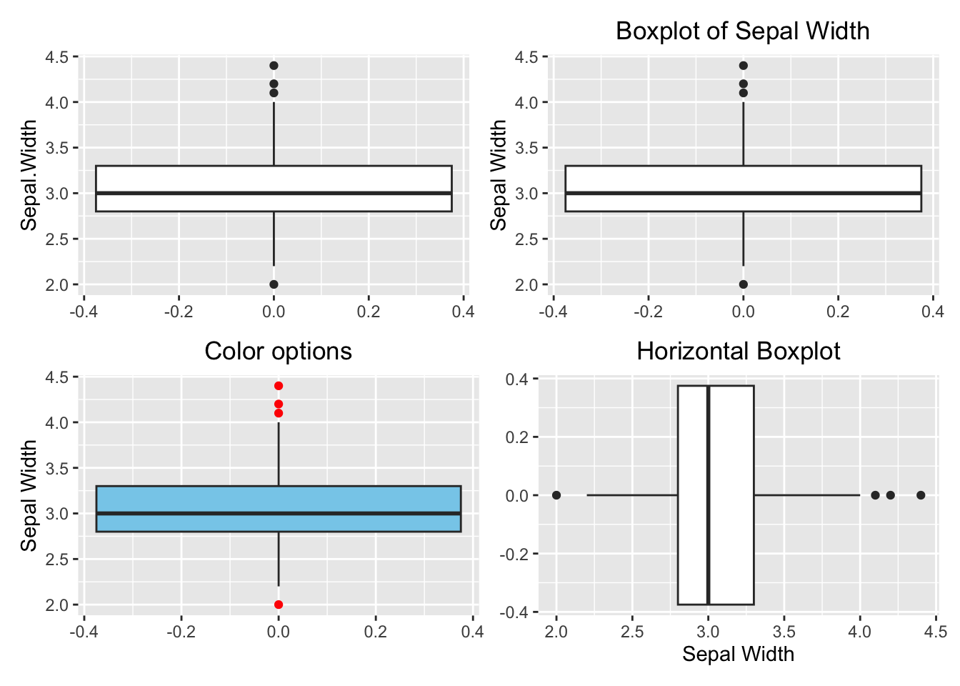
Figure 3.29: Boxplot using ggplot2. Top left: default (bare minimum). Top right: with y-label and title. Bottom left: change color. Bottom right: horizontal boxplot.
3.3.3 One Categorical Variable
3.3.3.1 Barplot
Here we will show how to make a barplot and a piechart using ggplot2.
library(patchwork)

# Default
p1 <- ggplot(data=iris, aes(x=Species)) +
        geom_bar()

# With labels and title
p2 <- ggplot(data=iris, aes(x=Species)) +
        geom_bar() +
        labs(x="Species", y="Count", title = "A Barplot of Species") +
        theme(plot.title = element_text(hjust = 0.5))

# Color option
p3 <- ggplot(data=iris, aes(x=Species)) +
        geom_bar(fill="skyblue", color="blue") +
        labs(x="Species", y="Count", title = "A Barplot of Species") +
        theme(plot.title = element_text(hjust = 0.5))

# Horizontal barplot
p4 <- ggplot(data=iris, aes(y=Species)) +
        geom_bar(fill="skyblue", color="blue") +
        labs(y="Species", x="Count", title = "A Horizontal Barplot of Species") +
        theme(plot.title = element_text(hjust = 0.5))

(p1 + p2)/(p3 + p4)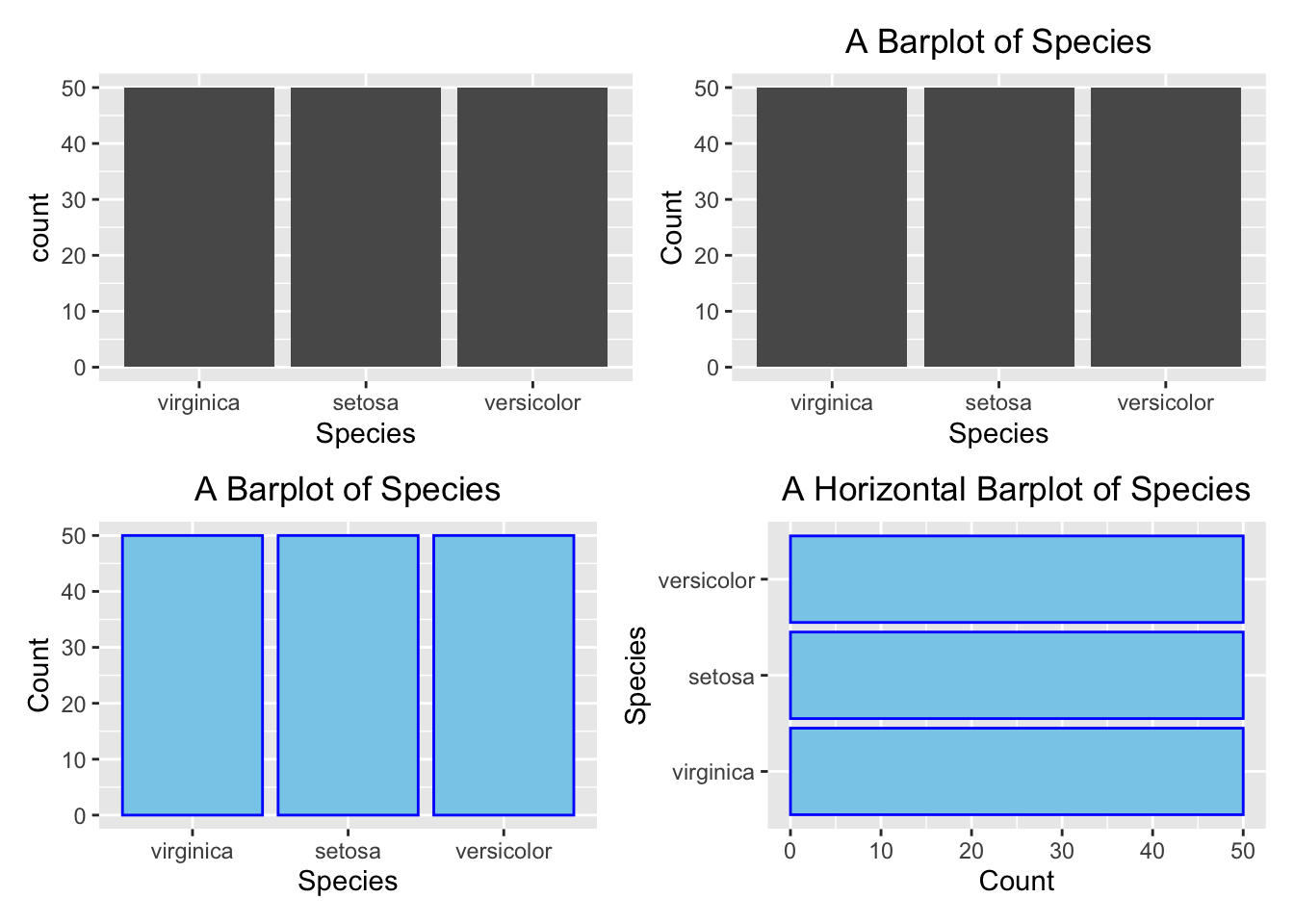
Figure 3.30: Barplot using ggplot2. Top left: default (bare minimum).
3.3.3.2 Pie Chart
Although ggplots is portrayed as an improved method to compose graphs based upon its grammatical architecture, it does not always make plotting as simple as you might think, like the histograms and barplots illustrated above. A pie chart is one of those graphs in which geom_pie() does not exist! Plotting it is not as straightforward as the base R pie() function, as shown in Figure (3.7)). Despite that, it is worth to see how a pie chart can be plotted using foundational building-block functions. To give you a heads-up, ggplot2 views a pie chart as a twisted barplot. There is an internal logic to justify such a view but we will not discuss it in detail.
Suppose we want to create a pie chart like the one below:
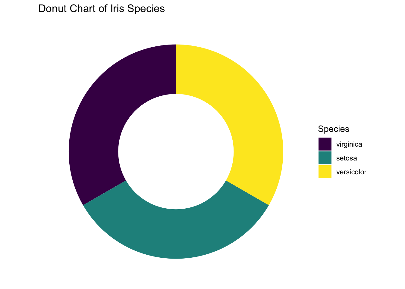
Figure 3.31: Pie chart or a donut chart
Here we will walk through each of the intermediate steps until getting the final pie chart.
Let’s begin with a stacked barplot, where the bars are stacked up into a single column, and the fill-color is an attribute to distinguish different iris species (fill=Species). The stacked bar is placed at the position 2 units on the right from the origin (aes(x=2)), but the exact position does not matter.
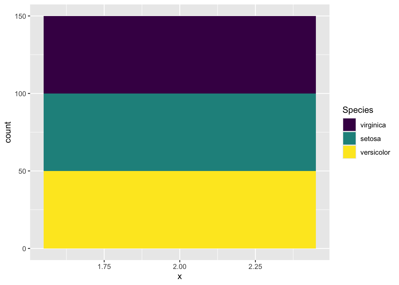
Figure 3.32: A stacked barplot
Now, use your imagination to picture that the stacked bar is bent into a ring. Does it look like the pie chart in Figure (3.32))? To way to “bend” it in ggplot2 is to change the x-y Cartesian coordinate system to the polar (circular) coordinate system in which a point is characterized by two parameters: the distance from the origin (\(r\)), and the angle (\(\theta\)) from the horizontal polar axis in an counter-clockwise direction.
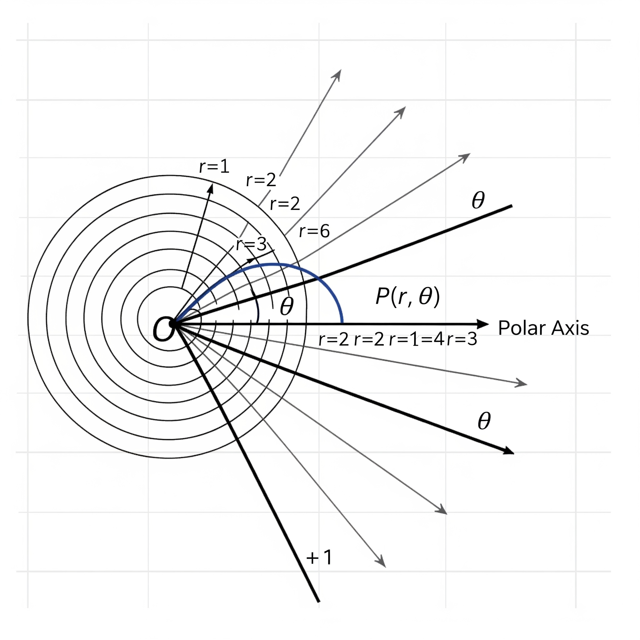
Figure 3.33: Polar Coordinate. (generated by Gemini)
By adding this line coord_polar(theta="y", start = 0) in the code below, it transforms the height of the bar for each species into an angle (\(\theta\)) in the polar coordinate, where the zero position is the 12 o’clock (start = 0). In this example, one third of the samples is setosa. As such, the angle \(\theta\) is \(360^{\circ}\times\frac{1}{3}=120^{\circ}\). If the proportion is a quarter, the angle \(\theta=360^{\circ}\times\frac{1}{4}=90^{\circ}\).
ggplot(data=iris, aes(x="", fill=Species)) +
  geom_bar() +
  coord_polar(theta="y", start = 0)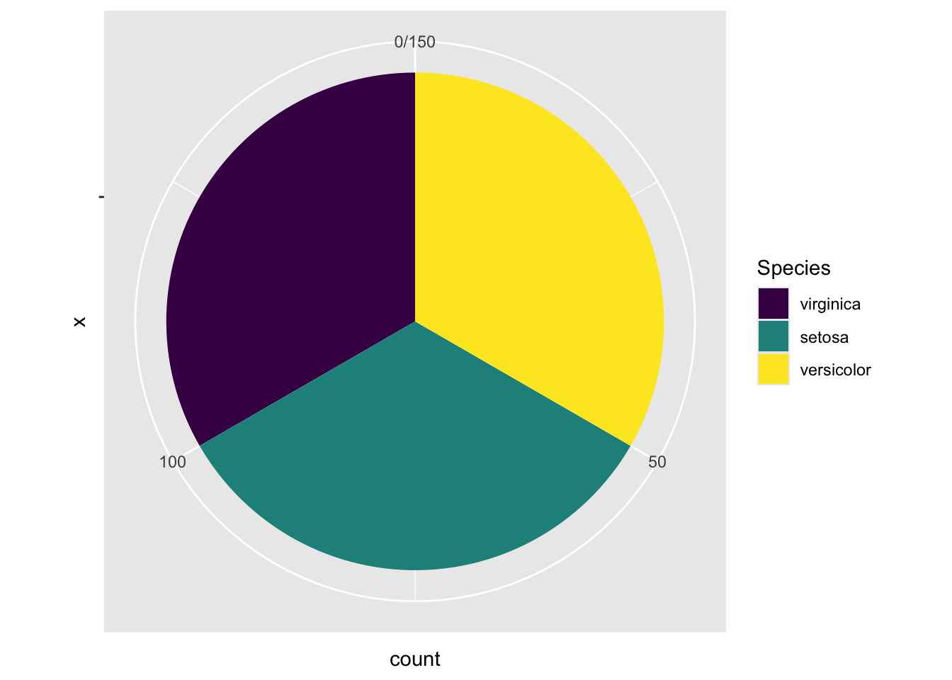
Figure 3.34: A Piechart by changing to the polar coordinate system.
The final step is to open a hole in the pie chart if you like, for aesthetic reasons. But this modification is optional.
ggplot(iris, aes(x = 2, fill = Species)) +
  geom_bar(width = 1, stat = "count") +
  coord_polar(theta = "y", start = 0) +
  # This is the key part that creates the hole
  xlim(0.5, 2.5) +
  labs(title = "Donut Chart of Iris Species")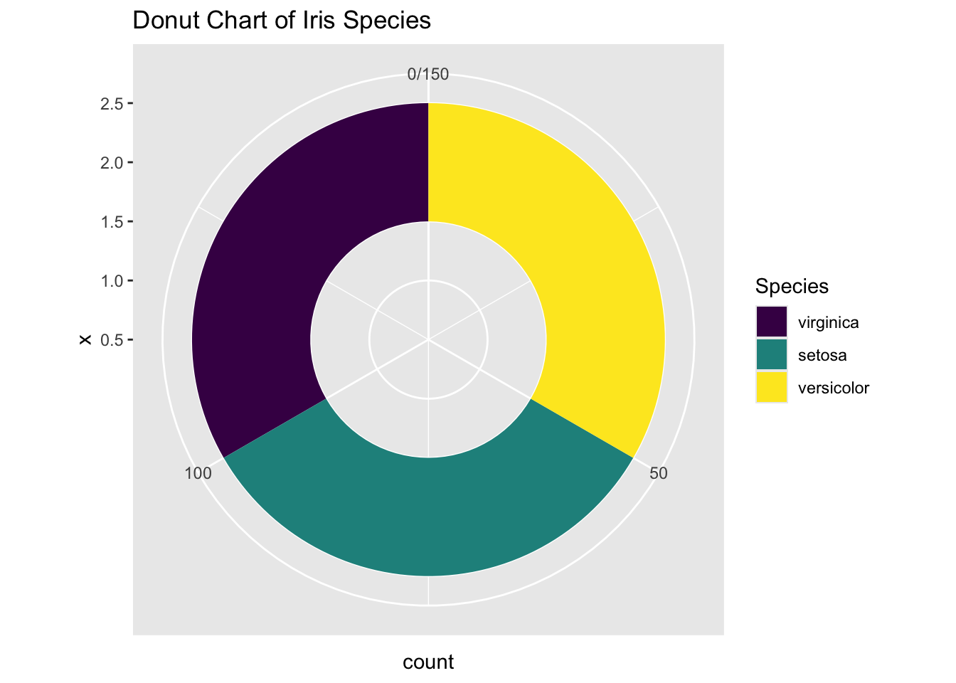
Figure 3.35: Piechart using ggplot2
If you prefer to have a clean background, add the line theme_void(). Finally, here’s the desired pie chart. What a journey!
ggplot(iris, aes(x = 2, fill = Species)) +
  geom_bar(width = 1, stat = "count") +
  coord_polar(theta = "y", start = 0) +
  # This is the key part that creates the hole
  xlim(0.5, 2.5) +
  theme_void() +
  labs(title = "Donut Chart of Iris Species")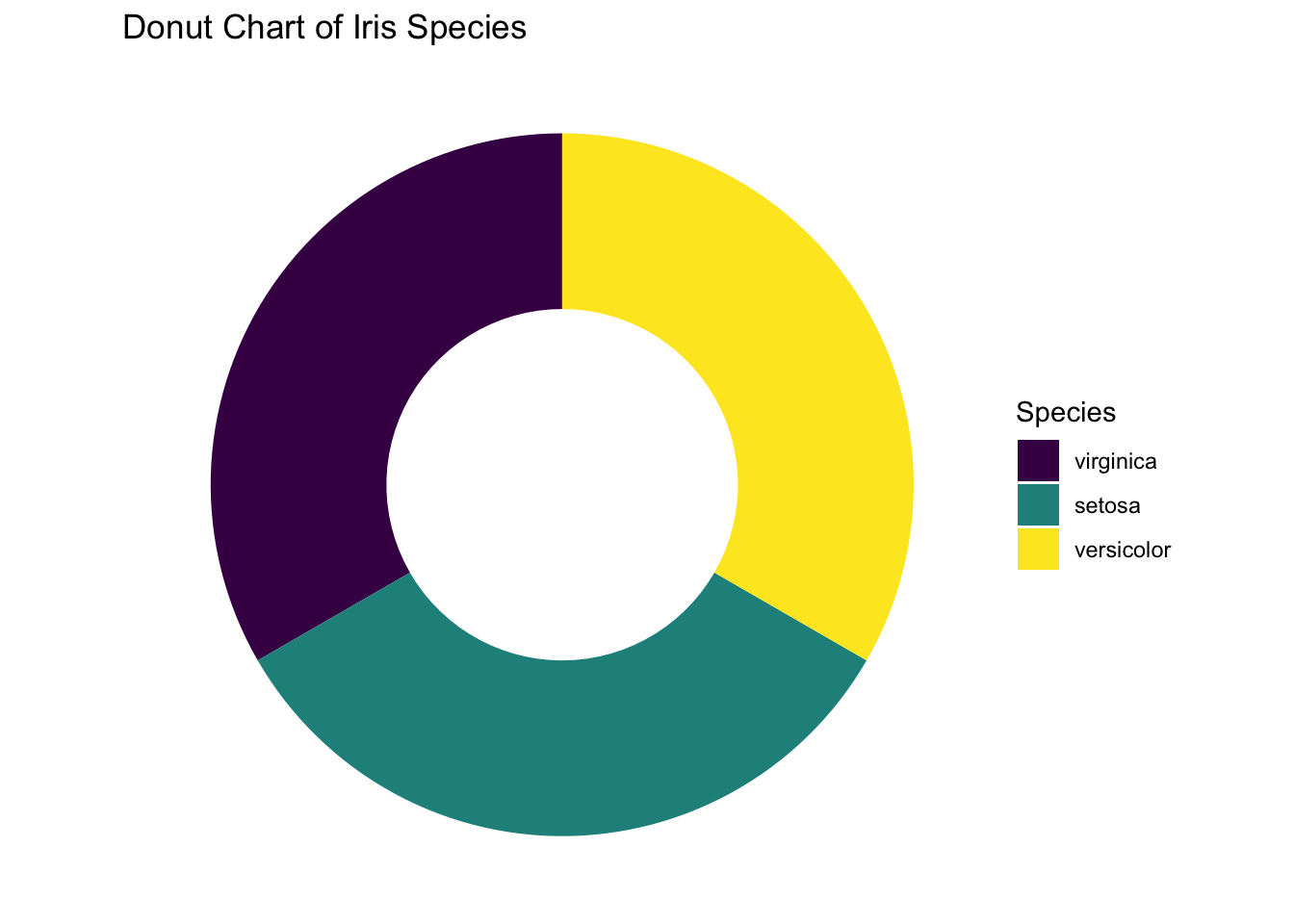
Figure 3.36: Piechart using ggplot2 without no background.
3.3.4 One Categorical and One Numeric Variables
3.3.4.1 Side-by-side Boxplot
Here you want to compare the robust statistics among different species.
library(patchwork)

p1 <- ggplot(data=iris, aes(x=Species, y=Sepal.Length)) +
        geom_boxplot() +
        labs(title = "A Side-by-Side Boxplot") +
        theme(plot.title = element_text(hjust = 0.5))

p2 <- ggplot(data=iris, aes(x=Sepal.Length, y=Species)) +
        geom_boxplot() +
        labs(title = "A Horizontal Side-by-Side Boxplot") +
        theme(plot.title = element_text(hjust = 0.5))

p1/p2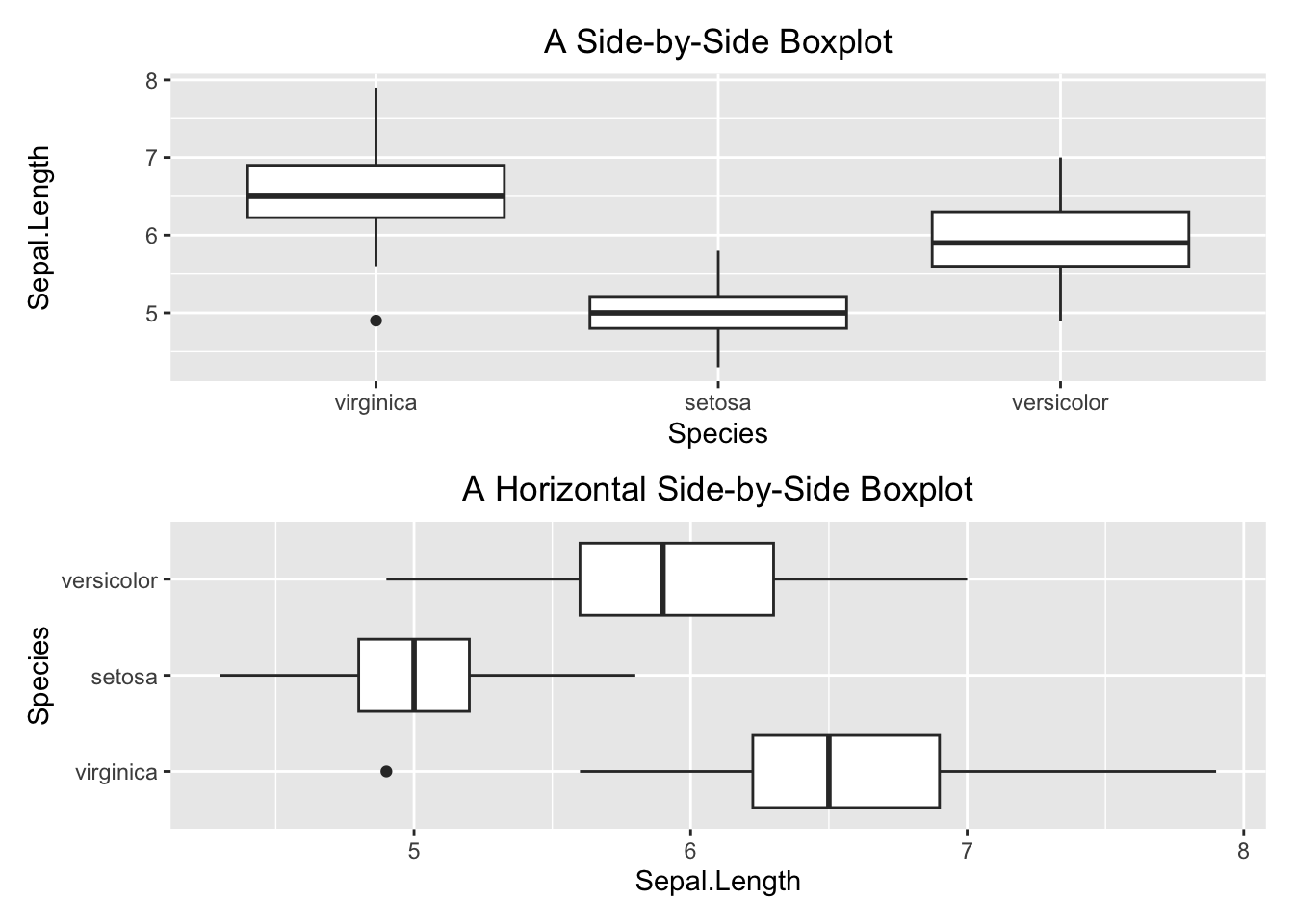
Figure 3.37: Side-by-side boxplot
3.3.4.2 Side-by-side Barplot
Here, you want to compare the average Sepal.Length among iris species. As discussed above, you calculate the averages and store them in a separate table.
iris_summary1 <- iris %>%
                  group_by(Species) %>%
                  summarize(mean_sepal_length = mean(Sepal.Length))
iris_summary1
#> # A tibble: 3 × 2
#>   Species    mean_sepal_length
#>   <ord>                  <dbl>
#> 1 virginica               6.59
#> 2 setosa                  5.01
#> 3 versicolor              5.94
And then, you can plot the summary table. The geometry function is geom_bar(stat = "identity"). The stat = "identity" parameter tells the geom_bar() function to set up the height of the bars according to the face value of mean_sepal_length.
ggplot(data=iris_summary1, aes(x=Species, y=mean_sepal_length)) +
  geom_bar(stat = "identity") +
  labs(x="Species", y="Average Sepal Length", title = "Side-by-side Barplot") +
  theme(plot.title = element_text(hjust = 0.5))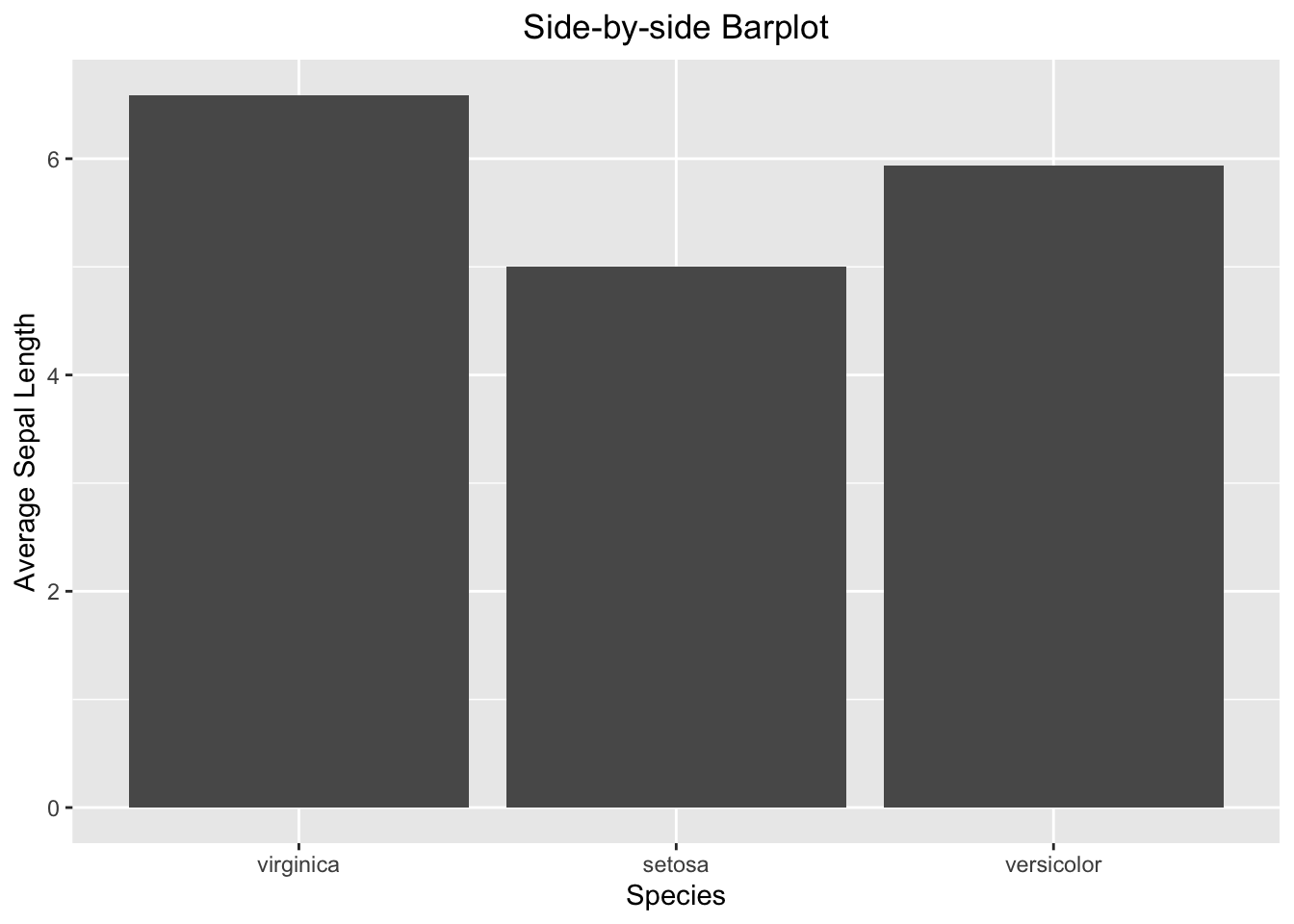
Figure 3.38: Side-by-side barplot
3.3.4.3 Side-by-side Barplot with Error Bar
The calculation of the error bar (i.e., the standard error se) requires standard deviation and sample size. Once se is calculated, it can be used to calculate the minimum (lower) and maximum (upper) of the error bar.
iris_summary2 <- iris %>%
                  group_by(Species) %>%
                  summarize(mean_sepal_length = mean(Sepal.Length),
                            N=n(),
                            se=sd(Sepal.Length)/sqrt(N)) %>%
                  # add the y minimum and y maximum columns
                  mutate(ymin = mean_sepal_length - se,
                         ymax = mean_sepal_length + se)
iris_summary2
#> # A tibble: 3 × 6
#>   Species    mean_sepal_length     N     se  ymin  ymax
#>   <ord>                  <dbl> <int>  <dbl> <dbl> <dbl>
#> 1 virginica               6.59    50 0.0899  6.50  6.68
#> 2 setosa                  5.01    50 0.0498  4.96  5.06
#> 3 versicolor              5.94    50 0.0730  5.86  6.01
ggplot(data=iris_summary2, aes(x=Species, y=mean_sepal_length)) +
  geom_bar(stat = "identity") +
  geom_errorbar(aes(ymin = ymin, ymax = ymax), width = 0.2, color='red') +
  labs(x="Species", y="Average Sepal Length", title = "Side-by-side Barplot") +
  theme(plot.title = element_text(hjust = 0.5))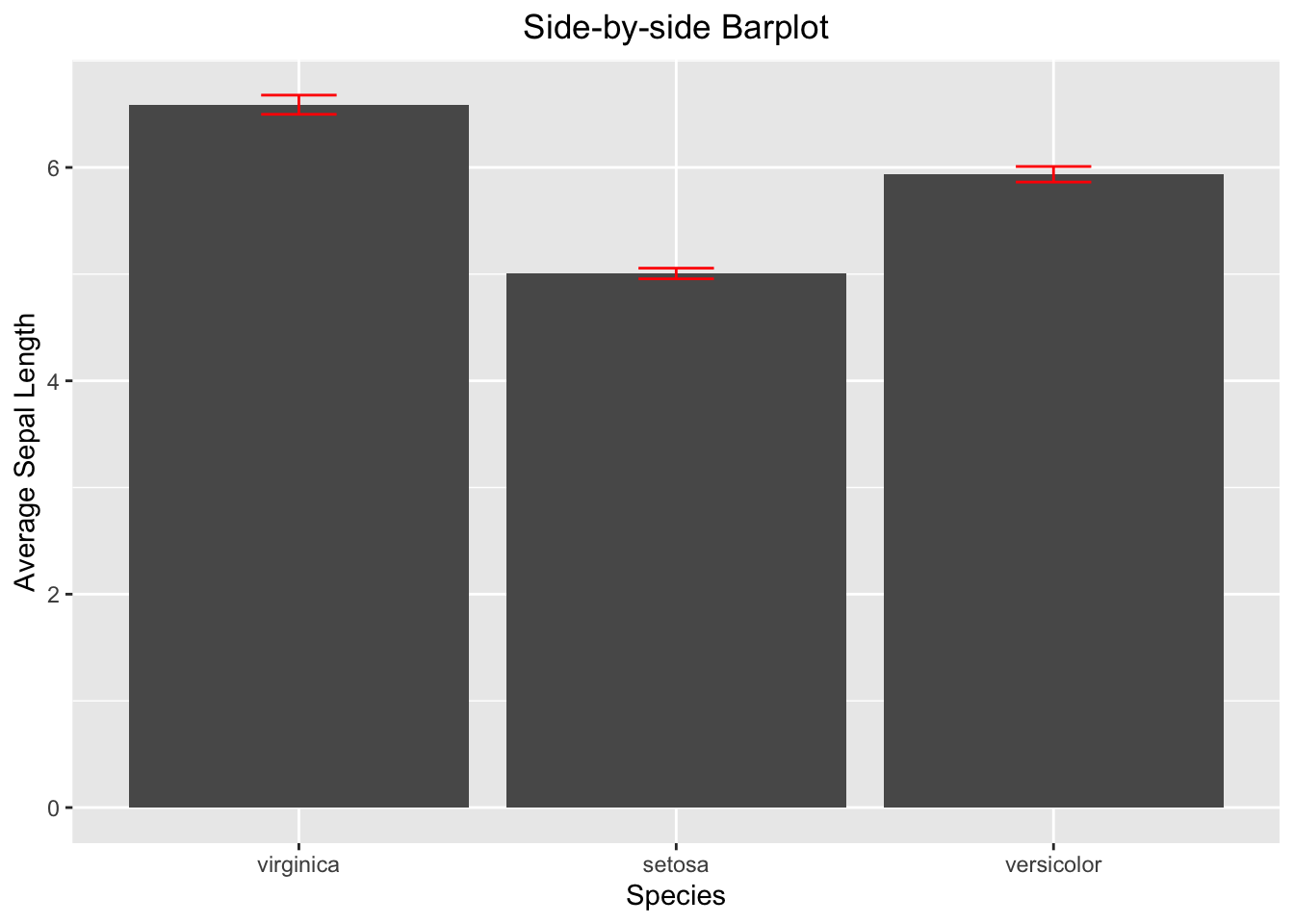
Figure 3.39: Side-by-side barplot with error bar
3.3.4.4 Line Graph with Error Bar
iris_summary3 <- iris %>%
                  group_by(Species) %>%
                  summarize(mean_sepal_length = mean(Sepal.Length),
                            N=n(),
                            se=sd(Sepal.Length)/sqrt(N)) %>%
                  mutate(ymin=mean_sepal_length-se,
                         ymax=mean_sepal_length+se)
iris_summary3
#> # A tibble: 3 × 6
#>   Species    mean_sepal_length     N     se  ymin  ymax
#>   <ord>                  <dbl> <int>  <dbl> <dbl> <dbl>
#> 1 virginica               6.59    50 0.0899  6.50  6.68
#> 2 setosa                  5.01    50 0.0498  4.96  5.06
#> 3 versicolor              5.94    50 0.0730  5.86  6.01
ggplot(iris_summary3, aes(x=Species, y=mean_sepal_length, group = 1)) +
  geom_line(color = 'skyblue') +
  geom_point(size = 3, color = 'skyblue') +
  geom_errorbar(aes(ymin = ymin, ymax = ymax), width = 0.1, linewidth = 1) +
  labs(x="Species", y="Sepal Length", title = "Line Plot with Erorr Bar") +
  theme(plot.title = element_text(hjust = 0.5))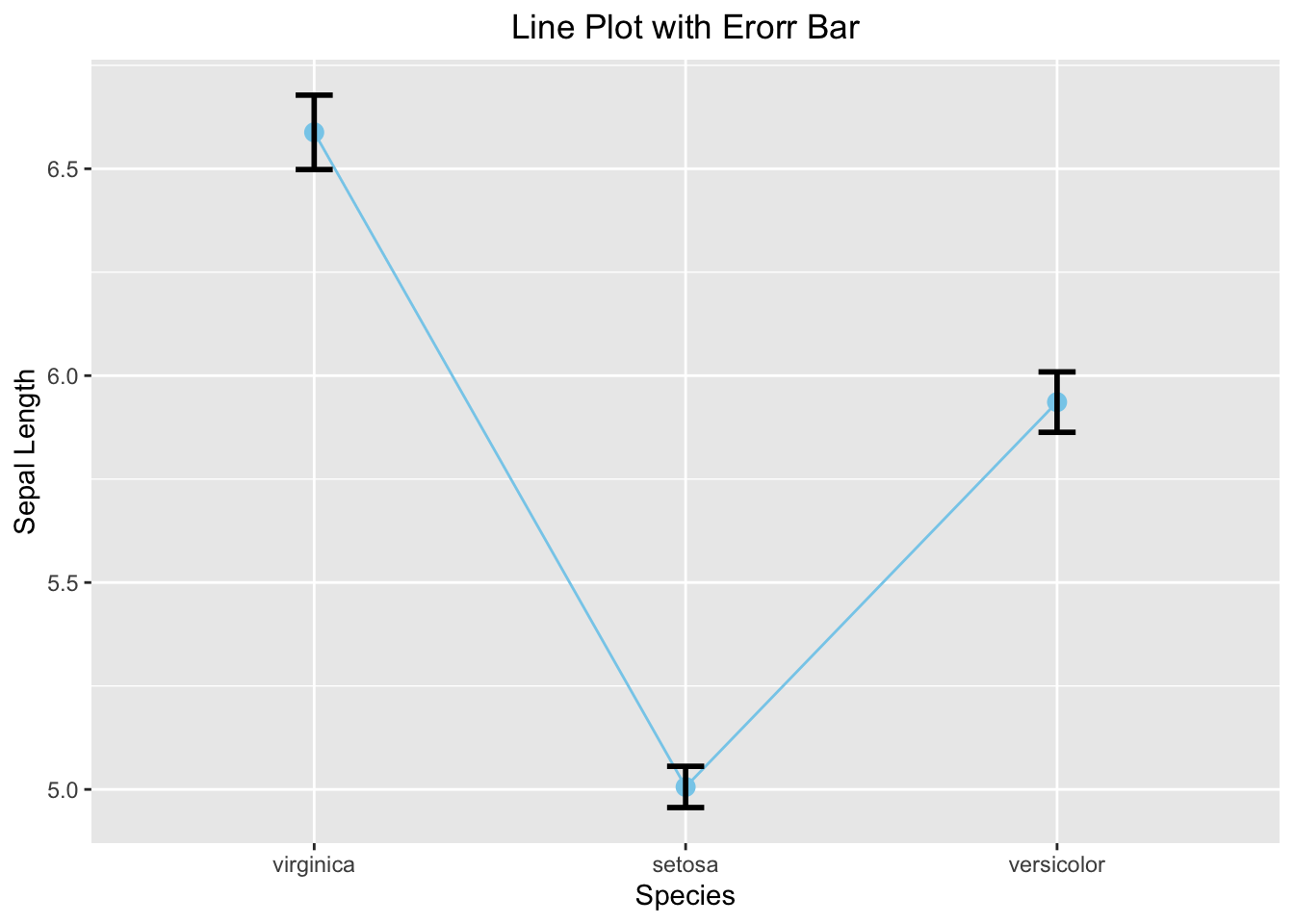
Figure 3.40: Line plot with error bar
3.3.4.5 Overlapping Histogram
Like the base R side-by-side histogram, you will set the transparency to 0.5 and bin width to 0.25. Note that there is no need to care about the x- and y-limit in ggplot2.
ggplot(data=iris, aes(x=Sepal.Length, fill=Species)) +
  geom_histogram(alpha=0.5, binwidth = 0.25) +
  labs(x="Sepal Length", title = "Overlapping Histogram") +
  theme(plot.title = element_text(hjust = 0.5))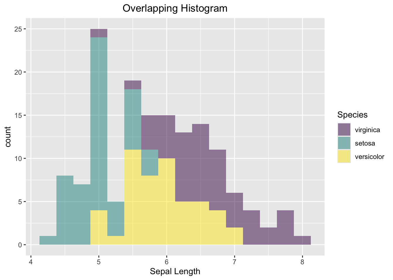
Figure 3.41: Side-by-side Histogram
3.3.5 Contingency Table
We will use the penguins data set to demonstrate how to create a side-by-side bar plot of the counts, and a mosaic plot.
First, let’s create a contingency table as below:
mytab <- with(penguins, table(species, island))
mytab
#>            island
#> species     Biscoe Dream Torgersen
#>   Adelie        44    56        52
#>   Chinstrap      0    68         0
#>   Gentoo       124     0         0
As said above, ggplot2 only works with data frames. Therefore, you need to convert the contingency table into a data frame with column names. During the conversion process, the R function will pair up each species with an island and create a new column that stores the count. It means that the resultant data frame will consists of RxC rows, where R and C are the number of rows and columns, respectively. A 3x3 contingency table like yours, will be converted to a data frame consisting of 9 rows as shown below:
mydf <- as.data.frame(mytab)
colnames(mydf) <- c("species","island","Count")
mydf
#>     species    island Count
#> 1    Adelie    Biscoe    44
#> 2 Chinstrap    Biscoe     0
#> 3    Gentoo    Biscoe   124
#> 4    Adelie     Dream    56
#> 5 Chinstrap     Dream    68
#> 6    Gentoo     Dream     0
#> 7    Adelie Torgersen    52
#> 8 Chinstrap Torgersen     0
#> 9    Gentoo Torgersen     0
ggplot(data=mydf, aes(x=island, y=Count, fill=species)) +
  geom_col(position = "dodge") +
  labs(title = "Side-by-side Barplot", x = "Island", y = "Count")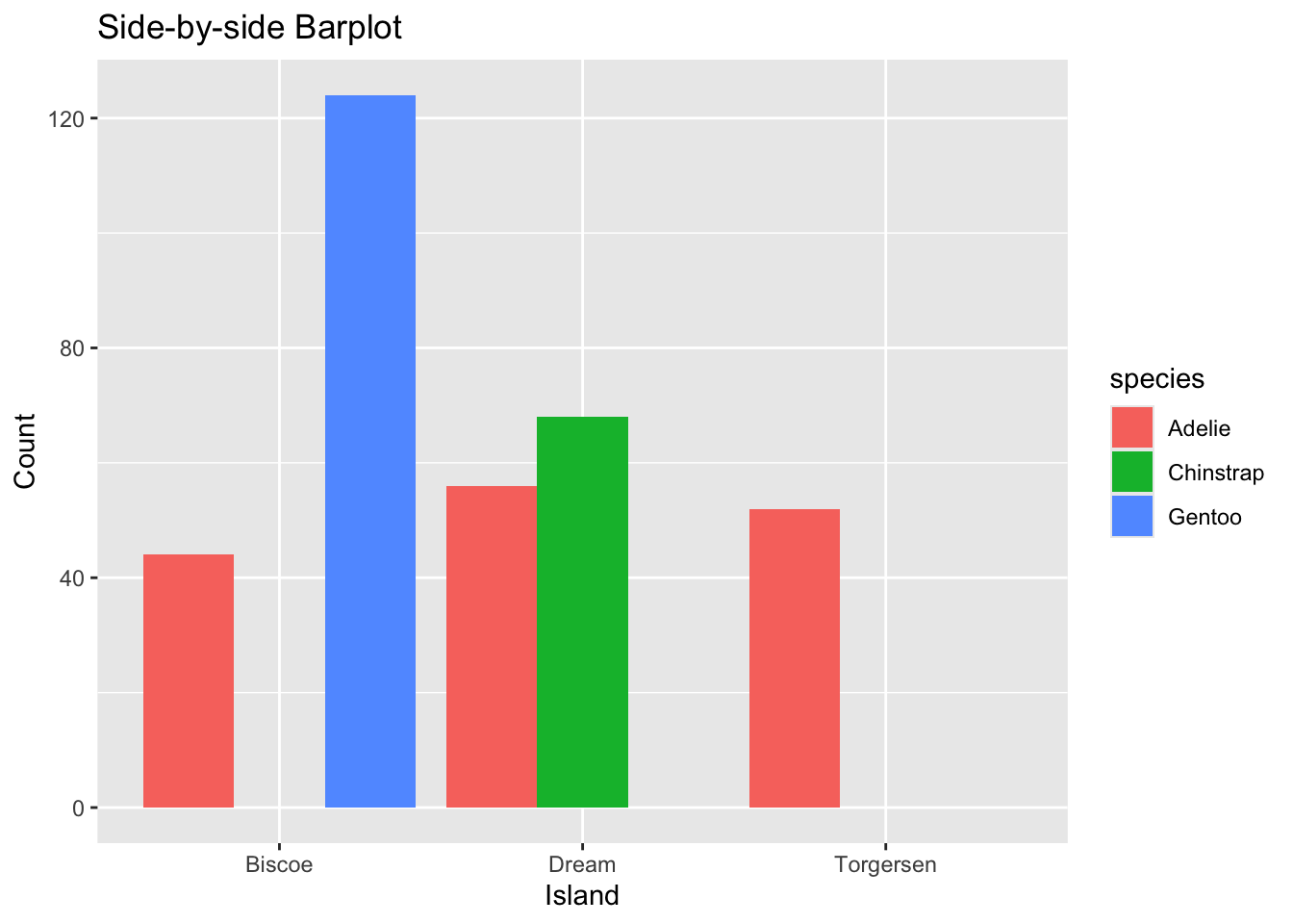
Figure 3.42: Side-by-side Barplot
ggplot2 does not have a geometry function for mosaic plot. To create a mosaic within the ggplot2 framework, you need to install the package ggmosaic in which the installation is straightforward.
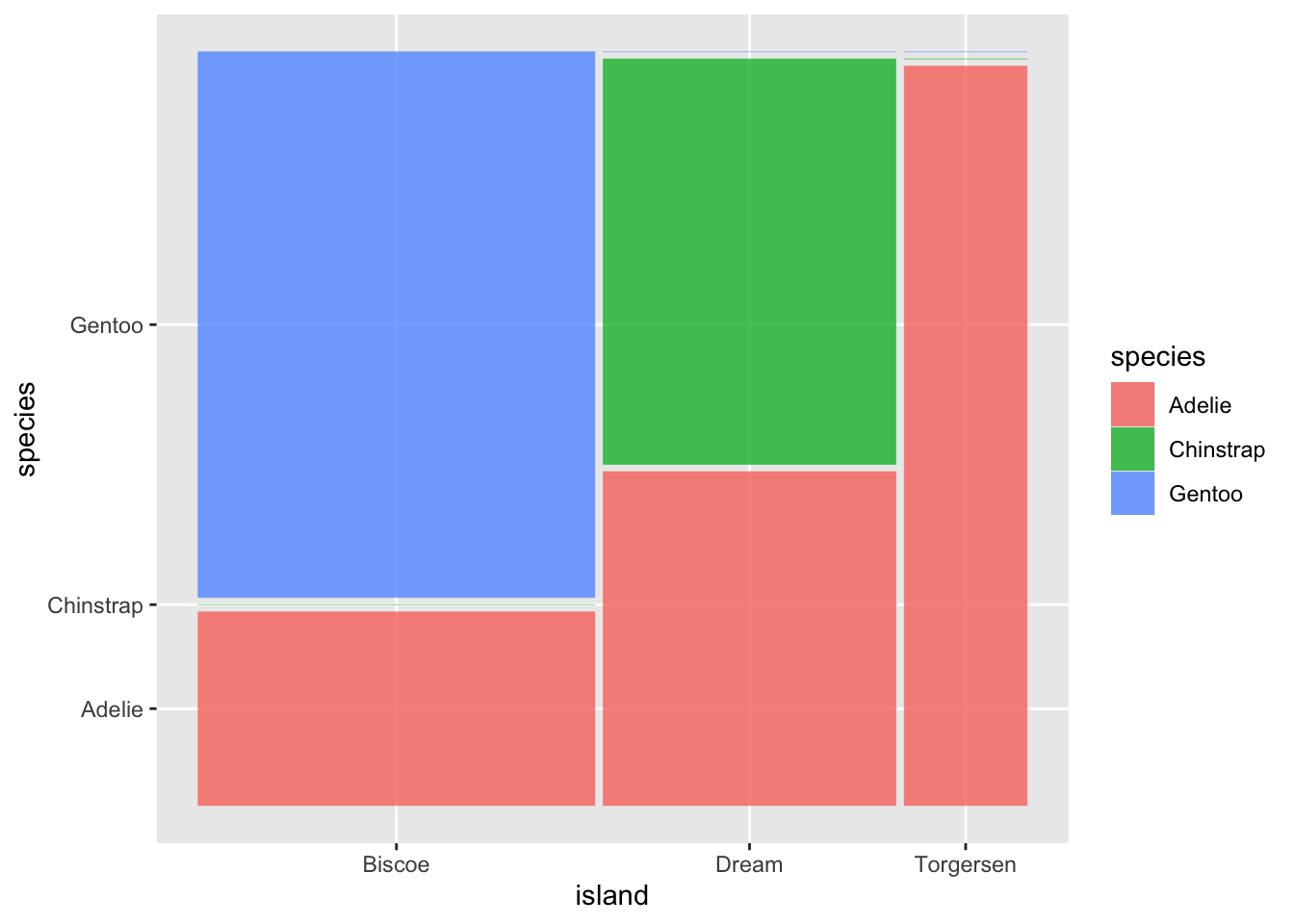
Figure 3.43: Mosaic Barplot
3.3.6 Two Numeric Variables
Here, you are going to visualize the relationship between two numeric variables using a scatter plot. As said above, the revealed relationship can be linear and non-linear. Visualizing how data points are distributed on a scatter plot is the most intuitive way to understand their true relationship.
ggplot(iris, aes(x=Sepal.Width, y=Sepal.Length)) +
  geom_point() +
  labs(x="Sepal Width", y="Sepal Length", title = "Scatter Plot") +
  theme(plot.title = element_text(hjust = 0.5))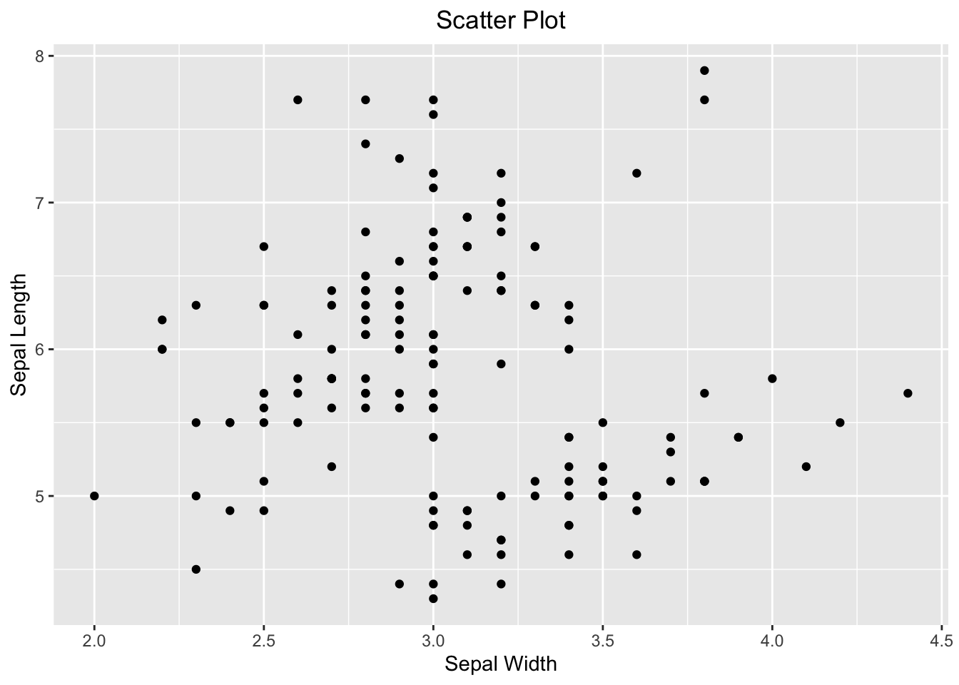
Figure 3.44: Visualizing the relationship between two numeric variables using a scatter plot.
If you wanted to emphasize their linear relationship, it can be done convincingly by adding a regression line on top of the scatter plot. ggplot2 spares you the effort to create a linear model like above to determine what the slope and intercept are. Instead, it can be done by adding the geom_smooth(). You tell geom_smooth(method = "lm", se = FALSE, color = "red") to use a linear method (lm) for smoothing the data points. See the code below:
ggplot(iris, aes(x=Sepal.Width, y=Sepal.Length)) +
  geom_point() +
  geom_smooth(method = "lm", se = FALSE, color = "red") +
  labs(x="Sepal Width", y="Sepal Length", title = "Scatter Plot with the Regression Line") +
  theme(plot.title = element_text(hjust = 0.5))
#> `geom_smooth()` using formula = 'y ~ x'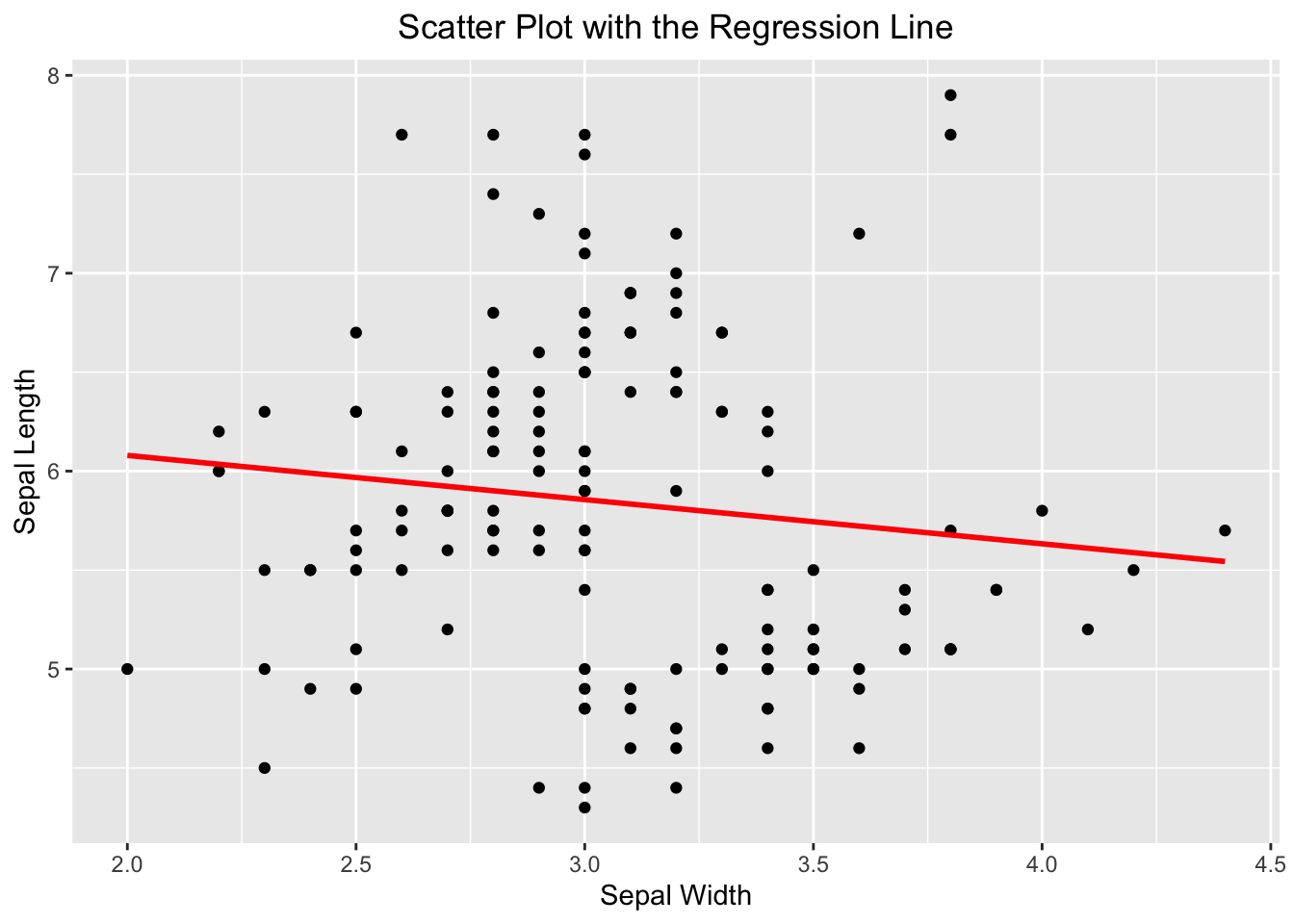
Figure 3.45: A scatter plot overlaid with a regression line.
If you see this message “geom_smooth() using formula = ‘y ~ x’”, it is harmless, and informational. ggplot2 is just to let you know what the response and predictor are used by geom_smooth() in creating the regression line.
3.3.7 Multi-panel Scatter Plot
Often times before multiple linear regression, it is a good idea to visualize the linear relationship between the response variable and the independent variables pairwisely. Or, the linear relationship between independent variables, as it may cause the collinearity issue in which independent variables are linearly correlated. A multi-panel scatter plot can do this. However, ggplot2 does not have a geometry function for it. The simplest way is to use the ggpairs() function provided by the GGally package, which requires installation, if you have not done so.
Suppose, you are interested in the pairwise relationship between all numeric variables in iris. It can easily be done using the ggpairs() plot function. Color is the attribute used to distinguish species. progress = FALSE is to suppress the printing of the progress bar.
library(GGally)
ggpairs(iris, aes(color = Species), title = "A Multi-panel Scatter Plot", progress = FALSE)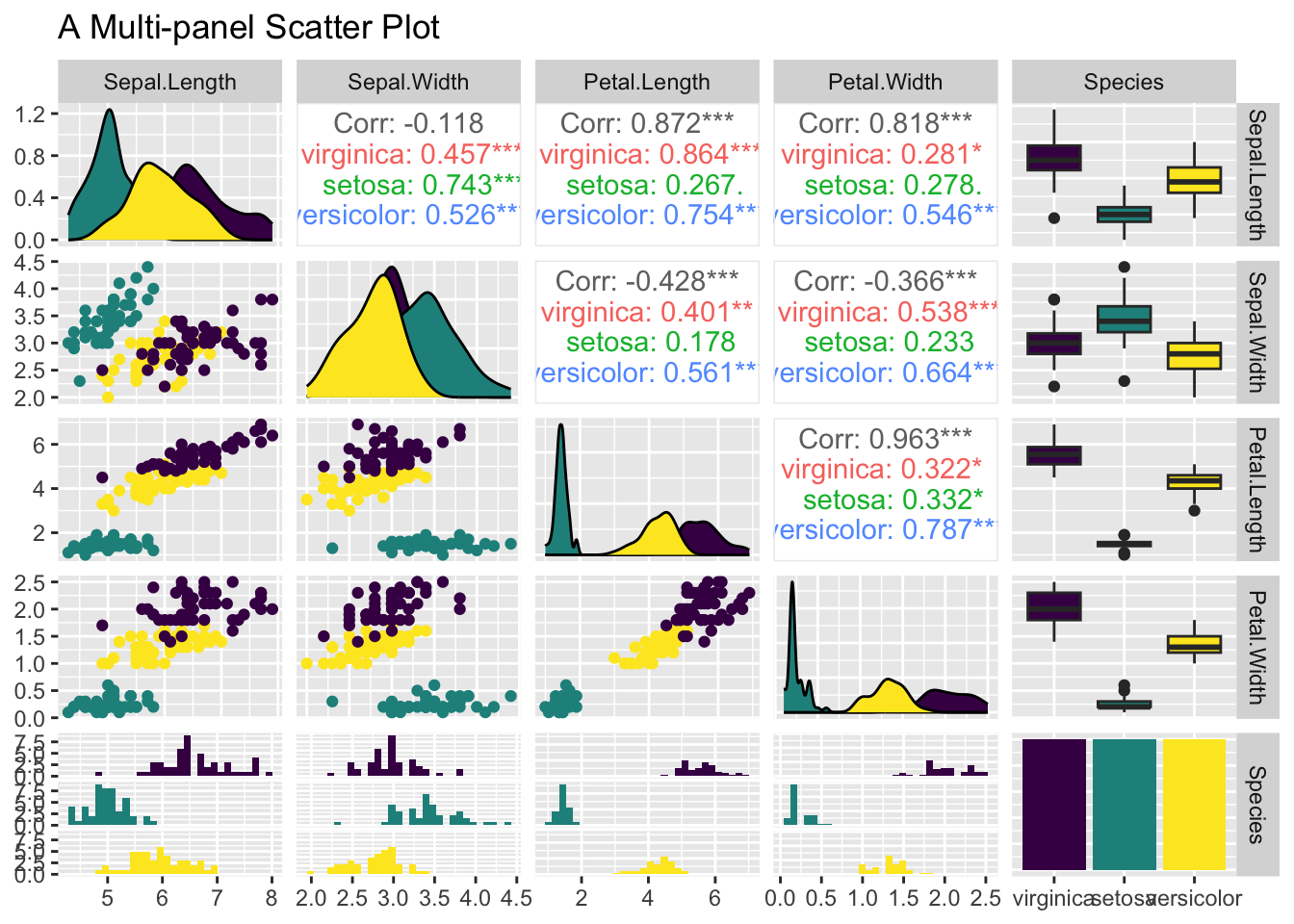
Figure 3.46: A Multi-panel Scatter Plot
3.4 Summary
This is big chapter that has discussed an array of plot functions both from base R and ggplot2. It is more like a cookbook of various visualization recipes. So, instead of listing all the functions here, it is helpful to list several useful resources that you can fine-tune the graphs yourselves.
pch
If you type help(pch) at the console, R shows the pch section of the help page for points. Below is a snapshot of pch values and the corresponding plotting characters:

Figure 3.47: pch values
Color
R supports a large number of colors and palettes. Here is a great resource to see what are available and their names: https://r-graph-gallery.com/colors.html.