2 Survey Research
In this chapter, we illustrate how R can be used to analyze survey data. The data used in the examples was collected in a risk and protective factors needs assessment in an Ohio high school, the goal of which was to identify non-academic barriers to learning that could be impacted by school-wide programs with the assistance of community partners. The data set is composed of 550 student responses to items designed to measure school connectedness, academic efficacy, academic press, social support, stress, and depression.
In following examples, we use a structured data analysis strategy composed of the following stages:
- Univariate analyses
- Bivariate analyses
- Multivariate analyses
In each of these stages, we illustrate how both graphic (visual) techniques and statistical methods and tests can be used to understand our data and address important research questions of interest. The selection of methods and tests in each stage is guided by levels of measurement and the statistical task at hand.
##Load Libraries
library(car)         ## Companion for applied regression
library(questionr)   ## Helpful functions for survey research
library(effectsize)  ## Indexes of effect Sizes and standardized parameters
library(lattice)     ## Graphics system
library(ggplot2)     ## Graphics system
library(dplyr)       ## Comprehensive package for data science
library(knitr)       ## An engine for dynamic report generation with R
library(psych)       ## A general purpose toolbox for research
library(psychTools)  ## Tools to accompany the 'psych' Package
library(gplots)      ## Various R Programming tools for plotting data
library(vcd)         ## Tools for visualizing categorical data
library(aplpack)     ## Data plotting package
library(gridExtra)   ## Miscellaneous functions for "Grid" graphics
2.1 A Structured Approach to Data Analysis
In the following sections, we link the univariate, bivariate, and multivariate stages listed above with the R code necessary to produce results within those stages. One thing you will discover is that using R gets you in touch with your data – some of the procedures you use in SPSS or Stata do not require these steps in the detail R requires. We see this as a positive – it honestly makes you give some thought to aspects of your data that you might not have considered using other packages. Knowing your data and how it is structured is a critical component of sound analysis and reporting.
In this first step, we load our data set into R. It is in the form of a comma separated values (.csv) file. R can import a range of data file formats including SPSS. Text (.dat) and comma separated values (.csv) file formats are flexible and are non-proprietary.
Please note we make clarifying comments for many R commands so you can get a sense of what is going with that command. They are preceded by the ## comment symbols in the R commands.
survey <- read.csv("survey.csv", header=TRUE)  ## load a .csv file
head(survey, 3) ## list a first few records to check your data set
## sc.1 sc.2 sc.3 sc.4 connect efficacy support press stress depression dep_risk
## 1 2 2 3 2 9 43 13 20 2 0 Low
## 2 3 3 3 2 11 50 17 36 0 0 Low
## 3 3 2 3 1 9 36 8 14 20 0 Low
## gender race grade family
## 1 Male White 9 Both
## 2 Female White 10 Both
## 3 Female White 12 OneThe various measures used for the analysis are as follows:
- Gender, race, grade, and family are all self-explanatory and are measured at the nominal level of measurement.
- The sc.1 to sc.4 items are individual measures of school connectedness using a strongly disagree - strongly agree response scale. These items are measured at the ordered categorical or ordinal level of measurement.
- Connect, efficacy, support, press, stress, and depression are all scale scores measuring school connectedness, academic efficacy, social support, academic press (expectations), stress, and depression, respectively. These scales are measured at the continuous or interval level of measurement. Note that each scale is measured by a set of items not included in this example analysis in an effort to keep it compact.
It is helpful to collect subsets of items into a separate data frame. We do that in the following for the continuous measures.
## Subset continuous scales into a data frame
scores <- as.data.frame(cbind(connect, efficacy, support, press, stress, depression))
colnames(scores) <- c("connect", "efficacy", "support", "press", "stress", "depression")
head(scores, 3)  ## This function lists the first couple of records to make sure it worked
## connect efficacy support press stress depression
## 1 9 43 13 20 2 0
## 2 11 50 17 36 0 0
## 3 9 36 8 14 20 02.2 Univariate Analysis
2.2.1 Examining nominal categorical
We start our univariate analysis example with the tabulation of the ‘family’ categorical variable:
options(digits = 4)  ## Set output length
fam.tab <- table(family) ## Collects category frequencies
fam.tab  ## Displays frequencies
## family
## Both One Other
## 248 268 34## family
## Both One Other
## 45.091 48.727 6.182We see that 45% of our students live in a family with both parents, 49% live in a one family or shared parenting family, and 6% live in an alternative family arrangement(e.g., foster care). We display the percentages in a bar plots as follows:
ggplot(survey, aes(x = family)) +
  geom_bar(aes(y = (..count..)/sum(..count..)*100), fill="steelblue") +
  ylab("Percent") +
  xlab("Parenting Arrangement")
2.2.2 Examining ordinal categorical data
The school connectedness items (sc.1 – sc.4) are measured at the ordinal levels of measurement. To tabulate and plot these items we do the following;
## Collect category frequencies for each variable
sc1.counts <- table(sc.1)
sc2.counts <- table(sc.2)
sc3.counts <- table(sc.3)
sc4.counts <- table(sc.4)
## Create a data frame of counts adding row and column names
sc.counts <- as.data.frame(cbind(sc1.counts, sc2.counts, sc3.counts, sc4.counts))
colnames(sc.counts) <- c("sc.1", "sc.2", "sc.3", "sc.4")
row.names(sc.counts) <- c("SD", "D", "A", "SA")
## Produce a frequency table
sc.counts
## sc.1 sc.2 sc.3 sc.4
## SD 48 76 68 94
## D 132 145 177 157
## A 299 279 247 259
## SA 71 50 58 40We graph these distributions as follows:
sc1.bar <- ggplot(survey, aes(x = factor(sc.1))) +
  geom_bar(fill = "steelblue") +
  xlab("I feel close to people at my school")
sc2.bar <- ggplot(survey, aes(x = factor(sc.2))) +
  geom_bar(fill = "steelblue") +
  xlab("I am happy to be at my school")
sc3.bar <- ggplot(survey, aes(x = factor(sc.3))) +
  geom_bar(fill = "steelblue") +
  xlab("I feel like I am part of my school")
sc4.bar <- ggplot(survey, aes(x = factor(sc.4))) +
  geom_bar(fill = "steelblue") +
  xlab("I feel safe at my school")
grid.arrange(sc1.bar, sc2.bar, sc3.bar, sc4.bar, nrow = 2, ncol = 2)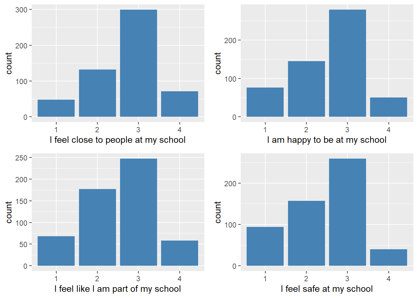
We see from the table and graphs that students tended to consistently select the Agree(3) category most frequently.
2.2.3 Examining continuous data
The first step in analyzing a continuous variable is to compute summary descriptive statistics. The following code and table illustrates how this can be done. Note here that we refer to the ‘scores’ data frame we created earlier. We use this reference in the command as a short-cut to specifying the individual scales.
##            vars   n  mean    sd median trimmed   mad min max range  skew
## connect       1 550 10.25  2.67   11.0   10.36  2.97   4  16    12 -0.33
## efficacy      2 550 36.72  7.35   38.0   37.20  7.41  10  50    40 -0.72
## support       3 550 11.32  4.50   11.5   11.40  3.71   0  22    22 -0.16
## press         4 550 24.79  6.53   25.0   25.07  5.93   8  40    32 -0.39
## stress        5 550 26.25 12.75   26.0   26.06 13.34   0  60    60  0.14
## depression    6 550 20.58 12.67   18.0   19.50 11.86   0  57    57  0.69
##            kurtosis   se
## connect       -0.08 0.11
## efficacy       0.62 0.31
## support       -0.31 0.19
## press          0.01 0.28
## stress        -0.28 0.54
## depression    -0.24 0.54
Summary information about each scale is presented in this table. Say we are interested in looking at a social support index for these 550 students. The variable is a summed score over a number of sources of support a student might have in his/her life. We start by examining measures of central tendency – the mean and median. We see that the mean (= 11.32) and median (= 11.5) are close in value suggesting that the distribution is symmetrical. For measures of variability we find the following. The minimum score is 0 and the maximum score is 22 for a score range of 22. The variance of the distribution is 20.2 and the standard deviation 4.5. These values suggest that there is variability in our scores. For the shape of the distribution we compute an index of skewness and an index of kurtosis. Recall that skewness has to do with the symmetry or balance of the distribution. Kurtosis looks at how tall or how flat the distribution is. Values close to 0 (zero) on these indexes indicate that the distribution is balanced and appropriate in height. Our scores would be considered as a normal distribution of scores.
Next we turn our attention to the graphic display of a continuous of a variable. The visual examination of a distribution of scores adds substance to descriptive analysis. For example, the extent to which a variable is skewed is readily apparent in a plot. As an aside, we urge students to learn about exploratory data analysis methods in their approach to data analysis. These methods focus on analyzing data through graphic displays.
For example, the stem-and-leaf display is a popular member of exploratory data analysis. While it may be confusing at first, once you know the conventions, the stem-and-leaf is an effective way to examine the details of a distribution. A stem-and-leaf plot for the support scale is shown below. The stem part of the plot is represented by the scale score values ranked from 0 to 22 on the left. The leaf part of the plot is represented by the 0 values on the right. Each 0 is one case so there are 550 values – these values are computed from the frequencies for each score value. The distribution of support scores appears to be symmetrical (not skewed) and does not appear to be excessively tall or short (normal kurtosis) which also was suggested by the summary statistics.
##
##   The decimal point is at the |
##
##    0 | 00000000
##    1 | 000
##    2 | 00000
##    3 | 000000000
##    4 | 0000000000000
##    5 | 000000000000000000000
##    6 | 000000000000000000000000
##    7 | 000000000000000000000000000000000
##    8 | 0000000000000000000000000
##    9 | 000000000000000000000000000000000000000000
##   10 | 0000000000000000000000000000000000000000000
##   11 | 0000000000000000000000000000000000000000000000000
##   12 | 0000000000000000000000000000000000000000000000
##   13 | 000000000000000000000000000000000000000000000000000000000
##   14 | 000000000000000000000000000000000000000
##   15 | 00000000000000000000000000000000000
##   16 | 00000000000000000000000
##   17 | 000000000000000000000000000
##   18 | 000000000000000000
##   19 | 000000000000000
##   20 | 0000000000
##   21 | 0
##   22 | 0000
The boxplot also is popular in exploratory data analysis. It uses the five number summary in the following way. Boxplots use quartile statistics to define components. The box itself is bounded by Q1 (1st. Qu.) and Q3 (3rd. Qu.) so it represents 50 percent of the scores. The perpendicular line in the box is the Q2 (median). The lines on extending from either side of the box are called whiskers (the boxplot is sometimes called the box-and-whisker plot). Whiskers represent 25 percent of the lowest cases and 25 percent of the highest cases. Boxplots are helpful in visualizing the skewness of a distribution – this plot further suggests that the support score distribution is not excessively skewed.
##    Min. 1st Qu.  Median    Mean 3rd Qu.    Max.
##     0.0     8.0    11.5    11.3    14.0    22.0
## Boxplot
ggplot(survey) +
geom_boxplot(mapping = aes(y = support ), fill="steelblue") +
theme(axis.ticks.y = element_blank(), axis.text.y = element_blank()) +
labs(y = "Support Score") +
coord_flip()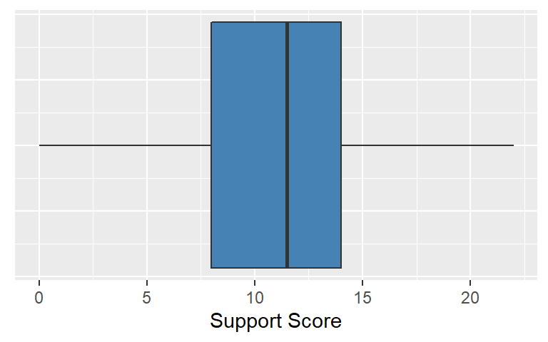
Finally, we use another common plot for continuous data called the histogram. The histogram is a classic way of looking at a continuous distribution. Bins are created from the data, so the histogram is actually a form of bar chart. In the following example, we use an histogram to examine depression scale scores.
ggplot(survey) +
  geom_histogram(mapping = aes(x = depression), fill = "steelblue", binwidth = 2) +
  labs(x = "CES-D Score")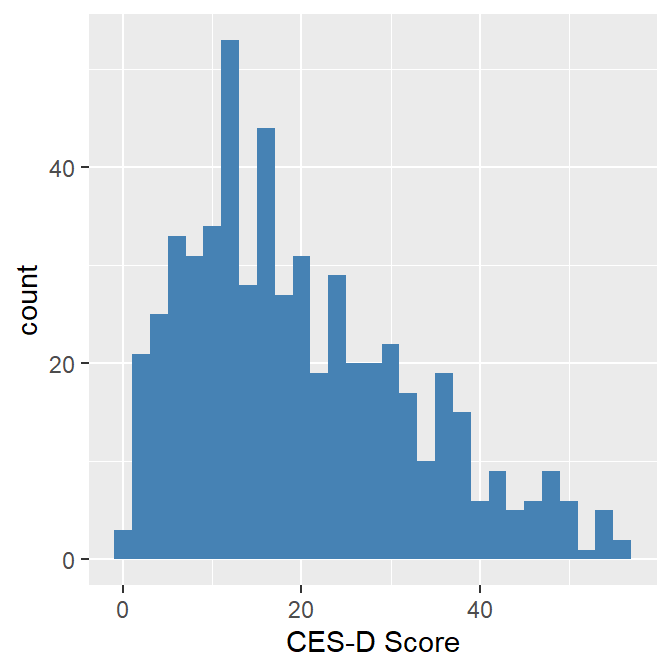
We see that the depression score distribution is positively skewed with higher scores (higher depression) tailing off the right. We would expect that type of distribution with a depression scale based on the assumption that the higher scores are less likely to occur than lower scores. Although the histogram suggests that depression sores are not symmetrical, the summary skewness coefficient ( = .69) and kurtosis coefficient (= -.24) do not exceed thresholds values of + 1.0 or - 1.0 (which are generally used to determine if the distribution is non-normal).
2.3 Bivariate Analysis
Once we have assessed each of our individual items, we move to the exploration of relationships between measures. Various bivariate analyses should be driven by research questions or hypotheses, which also provide building blocks for more extensive model testing involving three or more variables. Note that we use the general convention of using a p-value of <= .05 as a cut-off to determine statistical significance.
2.3.1 Examining two categorical variables
Say you are interested in looking at the relationship between gender and depression risk. The literature on gender and depression suggests that females are likely to experience depression than males. Gender is a two-level categorical variable and we decided to recode the continuous depression scale into a two-level variable represented by no to low risk and moderate to high risk using a recommended cut-off score of 16.
We start with a grouped bar chart to visually examine this relationship:
ggplot(survey) +
  geom_bar(mapping = aes(x=dep_risk, fill = gender), position = "dodge") +
  xlab("Depression Risk") +
  ylab("Frequency") +
  scale_fill_manual(values = c("steelblue","lightgreen"))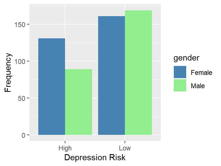
We see in this plot that male and female frequencies are close in the low risk category but that more females are represented in the high risk category.
We examine this relationship in a crosstabulation of the variables (a 2x2 table). The result of this table is shown below:
##         dep_risk
## gender   High Low
##   Female  131 161
##   Male     89 169
We compute row proportions of the frequencies to make comparisons more straightforward. In the following table, we see that the proportion of females in the high risk category is about 10 points higher than the proportion of males in the high risk category. We are interested in both the statistical significance and practical significance of this difference.
##         dep_risk
## gender     High    Low
##   Female 0.4486 0.5514
##   Male   0.3450 0.6550
We compute various measures of association for 2x2 tables:
##                     X^2 df P(> X^2)
## Likelihood Ratio 6.1584  1 0.013079
## Pearson          6.1337  1 0.013263
##
## Phi-Coefficient   : 0.106
## Contingency Coeff.: 0.105
## Cramer's V        : 0.106
For the traditional chi-square test of association, the obtained p-value = .013 indicates that we should reject the null hypothesis of no difference between gender and depression and conclude that there is a statistically significant relationship. We use the Phi-coefficient to assess the practical significance of the relationship. Phi is a correlation effect size for 2x2 tables which can be interpreted using the Cohen effect size framework where an r = .1 is a small effect size, r = .3 is a medium effect size, and r = .5 is a large effect size. Based on these rules-of-thumb, we conclude there is a small effect size between gender and depression and that the practical significance of the relationship is minimal.
2.3.2 Examining a two-level categorical variable and a continous variable
In this example, we are interested in the research question: Is there a relationship between gender and stress? Along with susceptibility to depression, the literature suggests that females also tend to be more susceptible to stress (which would make sense given the relationship between stress and depression). The following two-level boxplot provides insights into the relationship:
ggplot(survey) +
  geom_boxplot(mapping = aes(x = gender, y = stress), fill="steelblue") +
  coord_flip() +
  labs(x = "Gender", y = "Stress Score")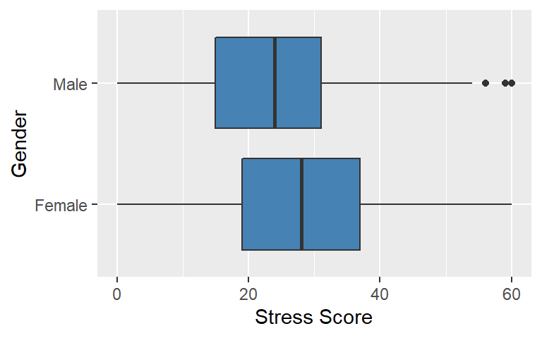
The boxplots suggest that the female distribution of stress scores tend to locate higher on the stress scale than the male distribution of scores. We examine this difference in distributions using an independent samples t-test and a Cohen’s d effect size to assess both the statistical and practical significance of this relationship.
##
##  Welch Two Sample t-test
##
## data:  stress by gender
## t = 3.6, df = 530, p-value = 3e-04
## alternative hypothesis: true difference in means is not equal to 0
## 95 percent confidence interval:
##  1.776 6.025
## sample estimates:
## mean in group Female   mean in group Male
## 28.08 24.18## Cohen's d | 95% CI
## ------------------------
## 0.31 | [0.14, 0.48]
##
## - Estimated using pooled SD.## [1] "small"
## (Rules: cohen1988)Our obtained p-value = .003 indicates that we reject the null hypothesis of no difference between male and female stress scores and conclude there is a statistically significant relationship between the two with females having higher stress scores, on the average, than males. Further, following the Cohen effect size framework where a d = .3 is a small effect size, d = .5 is a medium effect size, and d = .8 is a large effect size, we conclude there is a small effect size – Cohens d = .31 – thus the practical significance of the relationship between gender and stress is minimal.
It is interesting to see that both the gender – depression and gender – stress relationships are in the direction suggested by the literature (females are higher in both cases). Also, both relationships are statistically significant but are not necessarily practically significant. These results highlight why it is important to look at both statistical and practical significance – conclusions based strictly on statistical significance may lead to wrong characterizations of relationships.
2.3.3 Examining three-level (or more) categorical variable and a continous variable
In this example, we are interested in the research question: Is there a relationship between parenting arrangement and support? The literature suggests that family composition and perceived levels of support are related with families with both parents tending to be more supportive that an alternative parenting arrangement (we should note that family composition is admittedly more complicated than just parenting arrangements). The following three-level boxplot provides insights into the relationship:
ggplot(survey) +
  geom_boxplot(mapping = aes(x = family, y = support ), fill="steelblue") +
  coord_flip() +
  labs(x = "Family", y = "Support Score")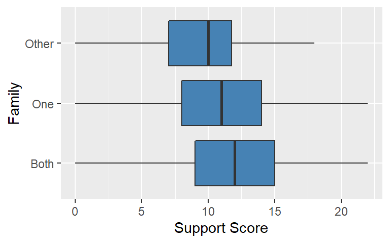
The boxplots suggest that the students in families with both parents tend to have higher support scores than students in alternative family situations. Students in other family situations tend to have the lowest set of support scores. We examine this difference in distributions using an one-way analysis of variance (ANOVA) and an eta-squared effect size to assess both the statistical and practical significance of these differences.
First, we compute an one-way ANOVA:
##Anova of Family Situation and Depression
anova <- aov(support ~ family, data=survey)
summary(anova)
## Df Sum Sq Mean Sq F value Pr(>F)
## family 2 237 118.7 5.97 0.0027 **
## Residuals 547 10879 19.9
## ---
## Signif. codes: 0 '***' 0.001 '**' 0.01 '*' 0.05 '.' 0.1 ' ' 1The above table is called an ANOVA sumary table. The most important value in the table is the Pr(>F) value = .002. This value is indicates that we should reject the null hypothesis that the group means are equal and assume that there is a statistically significant relationship between family parenting arrangement and perceived social support. We conduct a follow-up test called a post hoc test which indicates what pair-wise mean differences are accounting for the overall significant result. We use a Tukey HSD test in this example:
##   Tukey multiple comparisons of means
##     95% family-wise confidence level
##
## Fit: aov(formula = support ~ family, data = survey)
##
## $family
##               diff    lwr      upr  p adj
## One-Both   -0.8274 -1.751  0.09607 0.0896
## Other-Both -2.5930 -4.510 -0.67631 0.0044
## Other-One  -1.7656 -3.674  0.14244 0.0765
There are three group pair comparisons listed in the table. The ‘diff’ value is the mean difference between the pair; e.g., the Other-Both mean difference is -2.6 points on the support scale. The ‘p adj value’ is interpreted as a standard p-value so the Other-Both mean difference is considered statistically significant. The other two comparisons would not be considered statistically significant.
Finally, in this analysis we compute an eta-squared value effect size:
## For one-way between subjects designs, partial eta squared is equvilant to eta squared.
## Returning eta squared.
## Parameter | Eta2 | 90% CI
## -------------------------------
## family | 0.02 | [0.00, 0.04]The obtained Eta2 = .02 would be considered a small effect size using the using the Cohen effect size framework where an eta-squared = .01 is a small effect size, eta-squared = .09 is a medium effect size, eta-squared = .25 is a large effect size. We conclude that while the overall model is statistically significant, the small eta-squared effect size suggests that the practical significance between parenting arrangements and support is minimal.
2.3.4 Examining two continuous variables
For this example, we are interested in the research question: Is there a relationship between how much stress a student is experiencing and and the level of their depression. Our assumption here is a higher perception of stress would lead to a higher level of depression. Since the scale scores for these constructs are continuous, the standard statistic for assessing this relationship is a correlation coefficient.
First, we do a scatterplot to visualize the relationship:
## Scatterplot of stress and depression
ggplot(survey, mapping = aes(x = stress, y = depression)) +
  geom_point() +
  geom_smooth(color = "blue", method = 'lm', se=FALSE) +
  geom_smooth(color = "red", method = 'loess', se=FALSE) +
  labs(x = "Stress", y = "Depression")
## `geom_smooth()` using formula 'y ~ x'
## `geom_smooth()` using formula 'y ~ x'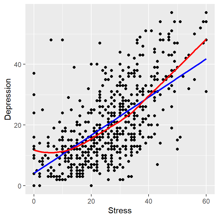
The data pattern indicates that low scores and high scores on scales seem to go go together (co-vary). We use two lines to assess the data pattern. The straight line (blue) is a best fitting line based on the linear regression model. The curved line (red) is a non-parametric smoother that follows the the co-varying data pattern. Both lines have positive slopes indicating there is a positive relationship between stress and depression. The regression line will always be a straight line so it is not as nuanced as the smoother in detecting non-linear relationships. The curve in the smoother is not pronounced so we conclude there is a linear relationship between these variables.
We compute a correlation coefficient which is a summary measure of the strength and direction of the relationship:
##
##  Pearson's product-moment correlation
##
## data:  stress and depression
## t = 19, df = 548, p-value <2e-16
## alternative hypothesis: true correlation is not equal to 0
## 95 percent confidence interval:
##  0.5787 0.6794
## sample estimates:
##    cor
## 0.6317
We see that the correlation between stress and depression is .63. This correlation is an effect size that can be interpreted using the Cohen effect size framework where an r = .1 is a small effect size, r = .3 is a medium effect size, and r = .5 is a large effect size. Our obtained r is considered a large effect size meaning stress and depression are substantively related (probably no surprise). In addition, it is statistically significant and has a fairly narrow confidence interval meaning it is a good estimate of a population correlation.
2.4 Multivariate Analysis
Once you have thoroughly examined your individual variables and explored bivariate associations you can start to consider more extensive analyses your data. This moves you into multivariate modeling or model building. Tools and methods for multivariate analysis are extensive – e.g., structural equation modeling, factor analysis, multilevel analysis, and multiple regression.
Linear regression is a versatile method you should add to your data analytic toolbox. It is actually a family of models and methods based on the more general framework of general linear models. In this example, we explore the relationship between a set of independent variables (or predictor variables) and a single dependent variable. Specifically, we want to understand how school connectedness, academic efficacy, academic press, and stress predict a student’s level of depression. The mental health literature suggests that there is a link between mental health status and each of the predictor constructs.
We start this analysis using an exploratory data analysis method called a scatterplot matrix (SPLOM). An SPLOM presents a set of bivariate relationship based on item pair correlations;
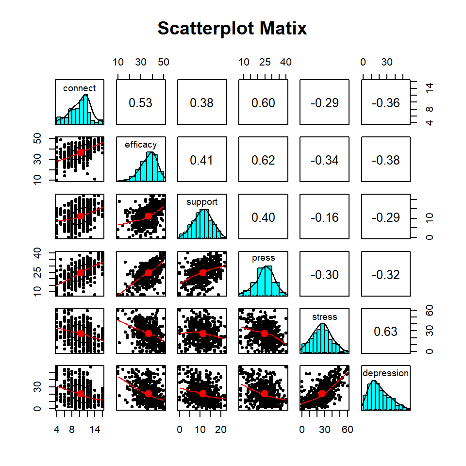
This variant of an SPLOM displays helpful information. For example, item pair scatterplots are shown in the lower left part of the SPLOM (they are not well defined because of the page size constraints but the line characterization the direction of the relationship is fairly clear). Individual item distributions are shown in the histograms on the diagonal. Finally, item pair correlations are displayed in the right part of the plot. In our analysis, we are particularly interested in the last column of the plot which shows the correlation of each item and depression. Stress has the highest correlation (r = .63) and support has the lowest (r = -.29). These correlations are medium to large in the Cohen correlation effect size framework.
Next, we specify a regression model:
## Multiple linear regression
fit <- lm(depression ~ connect + efficacy + press + support + stress, data = survey)
summary(fit)
##
## Call:
## lm(formula = depression ~ connect + efficacy + press + support +
## stress, data = survey)
##
## Residuals:
## Min 1Q Median 3Q Max
## -26.17 -6.75 -0.69 5.16 33.92
##
## Coefficients:
## Estimate Std. Error t value Pr(>|t|)
## (Intercept) 20.4831 2.7375 7.48 3e-13 ***
## connect -0.5323 0.1973 -2.70 0.00720 **
## efficacy -0.1593 0.0741 -2.15 0.03198 *
## press 0.0438 0.0866 0.51 0.61329
## support -0.3652 0.1006 -3.63 0.00031 ***
## stress 0.5506 0.0339 16.23 < 2e-16 ***
## ---
## Signif. codes: 0 '***' 0.001 '**' 0.01 '*' 0.05 '.' 0.1 ' ' 1
##
## Residual standard error: 9.4 on 544 degrees of freedom
## Multiple R-squared: 0.455, Adjusted R-squared: 0.45
## F-statistic: 90.8 on 5 and 544 DF, p-value: <2e-16The output provides a great deal of information about the overall model. First, the p-value assessing the statistical significance of the model (p-value: <2.2e-16 in scientific notation) is very small indicating statistical significance. The squared multiple correlation value of .46 is interpreted as the amount of variance in depression that is accounted for (or explained) by the linear combination of the independent variables (stated differently, the model accounts for 46% of the variance in depression). Using the Cohen effect size framework where an R-squared = .02 is a small effect size, R-squared = .15 is a medium effect size, and R-squared = .35 is a large effect size we conclude that the model effect size is large. The adjusted R-squared value is used we use our analysis to make population estimates. It is sometimes referred to shrunken R-squared referring to the fact that the model R-squared tends to be inflated as a population estimate.
For the coefficients part of the table:
- The (intercept) is the value (= 20.48) of the dependent variable when all of the other variables are set to zero.
- Each value in the Estimate column is a weight given to that variable in the regression equation. It is called the raw score regression coefficient. The interpretation of a raw score regression coefficient is that it indicates how much change will happen in the dependent variable for a unit change in the independent variable. For example, if there is an increase of one unit on the support scale, that change would result in a .36 decrease on the depression scale.
- The Std. Error is a measure of the precision of the estimated regression coefficients. Smaller standard errors are desirable indicating more precision in the estimate. The stress estimate of .55 has a small standard error of .03.
- The t value is a t-test value. The p-Value (Pr(>|t|)) tests the significance of a regression coefficient. All the independent variables except academic press are statistically significant.
Raw score regression coefficients cannot be directly compared because the scale metrics are different for each predictor. To facilitate scale comparisons, we compute standardized regression coefficients:
## # Standardization method: refit
##
## Parameter   | Coefficient (std.) |         95% CI
## -------------------------------------------------
## (Intercept) |          -2.60e-16 | [-0.06,  0.06]
## connect     |              -0.11 | [-0.19, -0.03]
## efficacy    |              -0.09 | [-0.18, -0.01]
## press       |               0.02 | [-0.07,  0.11]
## support     |              -0.13 | [-0.20, -0.06]
## stress      |               0.55 | [ 0.49,  0.62]
The interpretation of a standardized regression coefficient is that it indicates what how much change will happen in the dependent variable for a unit change in the independent variable, but these changes are measured in comparable standard deviation units. For example, if there is an increase of one standard deviation change on the support scale, that change would result in a .13 standard deviation decrease on the depression scale. The stress scale (Estimate = .55) is clearly the most influential predictor of depression. The academic press scale (Estimate = .04) is least helpful in predicting depression.
2.5 Concluding thoughts
The examples presented here represent a limited picture of all the possible analysis strategies required in survey data analysis. That notwithstanding, there is an R package for virtually any data analysis need you might have.