Chapter 4 Categorical Analysis
4.1 Introduction
In some situations, we do not have numerical data, and only categorical data. What do we do then? here are no meaningful measures of central tendency like the mean, median, or mode. We can’t make a scatterplot, or run a correlation matrix, or other techniques we have covered in this textbook so far.
In situations like these, when we only have categorical values, we undergo a Categorical Analysis. Today, we will be looking at three different treatment options aimed at inhibiting infections. The question we are trying to answer is: > Does the type of treatment people get affect whether they get an infection?
We’ll use a dataset called Infection Treatments.xlsx. Each row is a unique participant, indicating what treatment method they utilized, and if they became infected or not.
4.2 Loading Our Data
library(readxl)
library(tidyverse)

infection <- read_excel("Infection Treatments.xlsx")

summary(infection)
## Infection Treatment
## Length:150 Length:150
## Class :character Class :character
## Mode :character Mode :character## tibble [150 × 2] (S3: tbl_df/tbl/data.frame)
## $ Infection: chr [1:150] "Yes" "Yes" "Yes" "Yes" ...
## $ Treatment: chr [1:150] "Control" "Control" "Control" "Control" ...| Name | infection |
| Number of rows | 150 |
| Number of columns | 2 |
| _______________________ | |
| Column type frequency: | |
| character | 2 |
| ________________________ | |
| Group variables | None |
Variable type: character
| skim_variable | n_missing | complete_rate | min | max | empty | n_unique | whitespace |
|---|---|---|---|---|---|---|---|
| Infection | 0 | 1 | 2 | 3 | 0 | 2 | 0 |
| Treatment | 0 | 1 | 7 | 13 | 0 | 3 | 0 |
We can see our data nice and loaded. There are two columns, Infection and Treatment which are both categorical, and there are 150 rows. Thankfully, we do not have any missing data. Let’s dig a little deeper into our data.
4.3 Contingency Tables
When there are only categorical variables, we need to create what are called Contingency table (otherwise known as frequency tables). In order to do this, we can utilize the table command from base r, or the xtabs command from the stats package.
##
##       Control     Cranberry Lactobacillus
##            50            50            50
# This is not an even split like Treatment. There are more people that were not infected vs infected.
table(infection$Infection)##
## No Yes
## 104 46##
## No Yes
## Control 32 18
## Cranberry 42 8
## Lactobacillus 30 20# We can also create this using the xtabs commmand from the stats package
contingency_table <- xtabs(~Treatment+Infection, data=infection)
contingency_table## Infection
## Treatment No Yes
## Control 32 18
## Cranberry 42 8
## Lactobacillus 30 20# Let us see what it looks like if we reverse it.
reverse_table <-xtabs(~Infection+Treatment, data=infection)
reverse_table## Treatment
## Infection Control Cranberry Lactobacillus
## No 32 42 30
## Yes 18 8 20Now through any of the ways (table or xtabs), we are able to see that Cranberry has the lowest number infected out of the three treatments. What if we want to understand this from a percentage standpoint?
Let’s find out.
library(janitor)

c_table<- infection %>%
  tabyl(Treatment, Infection) %>%         # Makes a contingency table
  adorn_totals("row") %>%                 # Adds totals for each treatment
  adorn_percentages("row") %>%            # Adds row percentages
  adorn_pct_formatting(digits = 1) %>%    # Makes it readable (adds % signs)
  adorn_ns()                              # Combines counts + percentages

c_table
## Treatment No Yes
## Control 64.0% (32) 36.0% (18)
## Cranberry 84.0% (42) 16.0% (8)
## Lactobacillus 60.0% (30) 40.0% (20)
## Total 69.3% (104) 30.7% (46)From a percentage standpoint, we see that 84% of people who were given cranberries were not infected! That is much higher than either other treatment options, and the total percentage of people who were not infected as well.
It seems that cranberry is taking an early lead in terms of which treatment is the most impactful. We have some preliminary numbers, so now we can visualize.
4.4 Visualizations
With purely categorical data, the visualization most commonly recommended would be a bar chart. With a barchart, a viewer can interpret differences between the variables. There are two main options, a stacked or grouped bar chart. The main differnce from a coding perspective is what we enter inside the geom_bar command.
# We can use the library ggthemes to add some flavor to our plots
library(ggthemes)

# Creating a stacked bar chart
stacked<- ggplot(infection, aes(x = Treatment, fill = Infection)) +
  geom_bar(position = "fill") +   # "fill" stacks to 100% height
  labs(
    title = "Proportion of Infections by Treatment Type",
    y = "Proportion of Participants",
    x = "Treatment"
  ) +
  theme_solarized()

# Creating a grouped bar chart
grouped<- ggplot(infection, aes(x = Treatment, fill = Infection)) +
  geom_bar(position = "dodge") +
  geom_text(
    stat = "count",                          # use counts from geom_bar
    aes(label = after_stat(count)),          # label each bar with its count
    position = position_dodge(width = 0.9),  # place correctly over side-by-side bars
    vjust = -0.3,                            # move labels slightly above bars
    size = 4
  ) +
  labs(
    title = "Number of Infections by Treatment Type",
    x = "Treatment",
    y = "Count of Participants",
    fill = "Infection Outcome"
  ) +
  theme_classic()

# We can put them side by side to compare what they look like
library(patchwork)
grouped + stacked + plot_annotation(title = "Visualizing Infection Outcomes by Treatment (Stacked Vs. Grouped")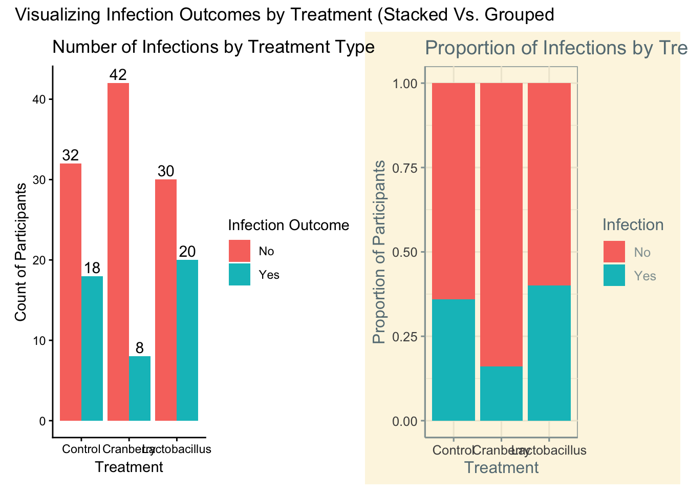
4.5 Chi-Square Test
Now, we have done some investigation on our data through contingency tables and visualizations. It is time to run what is called a chi-square test. This allows us to see if two categorical variables are related to each other.
##
##  Pearson's Chi-squared test
##
## data:  contingency_table
## X-squared = 7.7759, df = 2, p-value = 0.02049
Whether we performed it on our contingency table, we get:
- X^2- This is the test statistic. This is telling us how much different our observed is vs our expected.
- df - Degrees of freedom = (rows - 1)(columns - 1). For 3 treatments and 2 outcomes, df = (3-1)(2-1) = 2.
- p-value- This tells us if it is statistically significant or not.
We see that our X^2 value is 7.78, our df is 2, and out p-value is 0.0204871. Since our p-value is less than .05, we can rightly say that there is a significant relationship between treatment plans and outcomes.
Now that we know it is significant, we need to dive a little deeper. We are understanding that cranberry is looking like the leader, but we can become more solidified on that stance.
chi_square_test<- chisq.test(contingency_table)

# All the parts of the chi square can be called.
chi_square_test$statistic
## X-squared
## 7.77592## df
## 2## [1] 0.0204871## [1] "Pearson's Chi-squared test"## [1] "contingency_table"## Infection
## Treatment No Yes
## Control 32 18
## Cranberry 42 8
## Lactobacillus 30 20## Infection
## Treatment No Yes
## Control 34.66667 15.33333
## Cranberry 34.66667 15.33333
## Lactobacillus 34.66667 15.33333# Difference between observed and expected
# Positive is more than expected
# Negative is less than expected
# Bigger number = bigger difference
# Represent how many standard deviations
chi_square_test$residuals## Infection
## Treatment No Yes
## Control -0.4529108 0.6810052
## Cranberry 1.2455047 -1.8727644
## Lactobacillus -0.7925939 1.1917591## Infection
## Treatment No Yes
## Control -1.001671 1.001671
## Cranberry 2.754595 -2.754595
## Lactobacillus -1.752924 1.752924Our deep dive uncovered some very important things about our experiment
- Expected: all of the values were different from what we the actual observations were. If there was no relationship between the two variables, it was expected that each treatment would have about 35 people not infected, and 15 people infected
- Residuals/stdres: this is where we really start to tie everything together. With the residuals, we are looking for if it is positive/negative, and then strength in relation to the other. Cranberry if the only one of the three where there are less people infected than anticipated, almost 2 standard deviations less than expected. Both other treatments have more people infected than expected.
- Note: Standardized residuals behave like z-scores — values beyond ±2 suggest cells contributing most strongly to the overall χ² statistic.
We tie this information together to get a very strong case for cranberry. There is just one piece of the puzzle left to bring this home.
4.6 Cross tables
In the gmodels package we are able to utilize the CrossTable command. Beware, this can at first be overwhelming, as a lot of information is thrown at you.
library(gmodels)

# This allows us to see the contributions each category has on chi-square.
# Note, you (infection$Treatment, infection$Infection) if you want to stick to defaults
CrossTable(infection$Treatment, infection$Infection,
           prop.chisq = TRUE,    # Shows the chi-square contribution
           chisq = TRUE,         # shows chi-square test
           expected = TRUE,      # shows expected counts
           prop.r = TRUE,        # shows row proportions
           prop.c = TRUE)        # shows column proportions
##
##
## Cell Contents
## |-------------------------|
## | N |
## | Expected N |
## | Chi-square contribution |
## | N / Row Total |
## | N / Col Total |
## | N / Table Total |
## |-------------------------|
##
##
## Total Observations in Table: 150
##
##
## | infection$Infection
## infection$Treatment | No | Yes | Row Total |
## --------------------|-----------|-----------|-----------|
## Control | 32 | 18 | 50 |
## | 34.667 | 15.333 | |
## | 0.205 | 0.464 | |
## | 0.640 | 0.360 | 0.333 |
## | 0.308 | 0.391 | |
## | 0.213 | 0.120 | |
## --------------------|-----------|-----------|-----------|
## Cranberry | 42 | 8 | 50 |
## | 34.667 | 15.333 | |
## | 1.551 | 3.507 | |
## | 0.840 | 0.160 | 0.333 |
## | 0.404 | 0.174 | |
## | 0.280 | 0.053 | |
## --------------------|-----------|-----------|-----------|
## Lactobacillus | 30 | 20 | 50 |
## | 34.667 | 15.333 | |
## | 0.628 | 1.420 | |
## | 0.600 | 0.400 | 0.333 |
## | 0.288 | 0.435 | |
## | 0.200 | 0.133 | |
## --------------------|-----------|-----------|-----------|
## Column Total | 104 | 46 | 150 |
## | 0.693 | 0.307 | |
## --------------------|-----------|-----------|-----------|
##
##
## Statistics for All Table Factors
##
##
## Pearson's Chi-squared test
## ------------------------------------------------------------
## Chi^2 = 7.77592 d.f. = 2 p = 0.0204871
##
##
## Crosstable gave us a lot of information (nothing we can not handle). Thankfully, there is an legend in the beginning of the results that identifies what each number is. Some of these we already discovered, such as expected values and the chi-square X^2 value, but also some new information. Specifically, we are able to see the chi-square contribution. To break this down:
- When we run the chi-square test, we get the X^2 value. Importantly, each combination of the variables contributes individually to this number. We are looking for the biggest contributors to not only understand the chi-square value better, but to also understand what is the most impactful.
- For this result, our third number’s in each cell are the chi-square contribution. It is evident that cranberry has the highest contribution to the chi-square test statistic.
4.7 Contribution
If we want to hone in on this more, we can take the contributions and turn them into percentages, answering the question > What percentage of the X^2 value is each responsible for?
# Calculate contribution to chi-square statistic
# X^2= ((observed-expected)^2)/expected
contributions<-((chi_square_test$observed-chi_square_test$expected)^2)/chi_square_test$expected
contributions
## Infection
## Treatment No Yes
## Control 0.2051282 0.4637681
## Cranberry 1.5512821 3.5072464
## Lactobacillus 0.6282051 1.4202899## Infection
## Treatment No Yes
## Control 2.637993 5.964158
## Cranberry 19.949821 45.103943
## Lactobacillus 8.078853 18.265233Through this, we discovered that about 65% of the X^2 value is due to the cranberry treatment.
You already know that visualizations really help paint the picture, and chi-square contributions are not exempt. For this, the pheatmap package comes in handy.
library(pheatmap)

# Create heatmap for percentage contributions
pheatmap(percent_contributions,
         display_numbers = TRUE,
         cluster_rows = FALSE,
         cluster_cols = FALSE,
         main = "% Contribution to Chi-Square Statistic")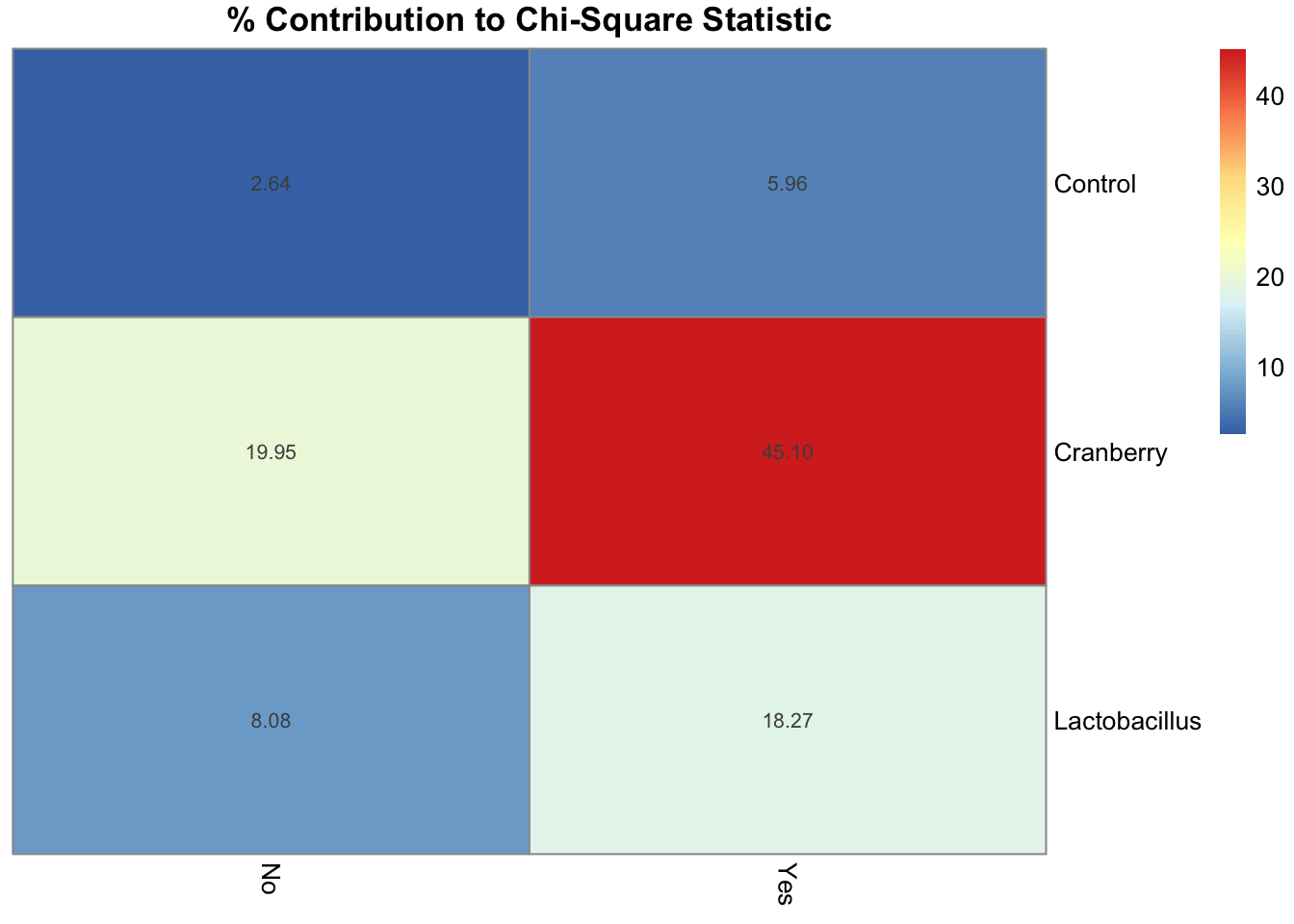
That glaring, deep red box? That is the cranberry yes cell!
Tying all of this together, we have discovered:
- Cranberry has the most people that were not infected (least amount infected).
- The chi-square test shows a significant relationship between treatment and outcome.
- When looking at residuals, cranberry was the only treatment with less people infected than expected.
- When looking at chi-square contributions, cranberry had the largest contribution, with about 65% of the test statistic being accounted for by cranberry.
Now, how impactful is this overall? What is the effect of treatment overall on outcome?
4.8 CramerV
Cramer’s V tells you the strength of the relationship between two categorical variables, similar to correlation coefficient
It is important to note that this measures effect size. This is not a statistic. We can utilize the cramerV command from the rcompanion package.
## Cramer V
## 0.2277| Cramer V Value | Strength of Relationship |
|---|---|
| 0.00–0.10 | Very Weak |
| 0.10–0.30 | Weak |
| 0.30–0.50 | Moderate |
| >0.50 | Strong |
Treatment, overall, had a weak-moderate effect on outcome overall. This suggests that while treatment type and infection outcome are related, the relationship isn’t strong — meaning that other factors likely play a larger role.
4.9 Interpretation
- The chi-square test shows X^2 = 7.78, df = 2, p = 0.02
- This means there is a statistically significant relationship between Treatment and Infection.
- The Cranberry group had fewer infections than expected and contributes most to the chi-square statistic.
- Cramer’s V shows the relationship is weak-to-moderate in strength.
- Drink your cranberry juice!
4.10 Key Takeaways
- The Chi-Square test helps us determine whether two categorical variables are related.
- It compares the observed frequencies (what we saw) to the expected frequencies (what we’d expect by chance).
- A large Chi-Square statistic and a p-value < .05 suggest that the relationship is statistically significant.
- Degrees of freedom (df) are based on the number of categories: (rows - 1) * (columns - 1).
- Cramer’s V measures the strength of the relationship, similar to a correlation coefficient:
- 0.00–0.10 = very weak | 0.10–0.30 = weak | 0.30–0.50 = moderate | >0.50 = strong
- Residuals show which specific groups contribute most to the Chi-Square result.
- Visualizations (like bar charts or heatmaps) make it easier to interpret where the differences lie.
- Statistical significance ≠ practical significance — even weak relationships can be significant with large samples.
- Example takeaway: Cranberry treatment showed fewer infections than expected — a weak but meaningful effect!
4.12 Example APA-style write-up
“A Chi-Square test of independence indicated a significant relationship between treatment and infection, χ²(2, N = 150) = 7.78, p = .02, Cramer’s V = .23, indicating a weak-to-moderate association. Participants in the Cranberry condition showed fewer infections than expected.”