Chapter 2 Week 2: Data Visualisation Introduction
2.1 Overview
So you have installed R, R Studio, and the tidyverse package. You’ve also dabbled with the odd command into the R console. In this week’s session you are going to create some data visualisations using the ggplot2 package (which is installed already because it comes bundled with the tidyverse package). We will come back to data visualisation later in the module, so this just serves as an introduction.
It might seem odd that we are covering data visualisation before you’ve even learned how to write any code in R. Indeed, “Visualise” comes rather late in he typical flow of a data analysis project (see Figure 2.1 below).
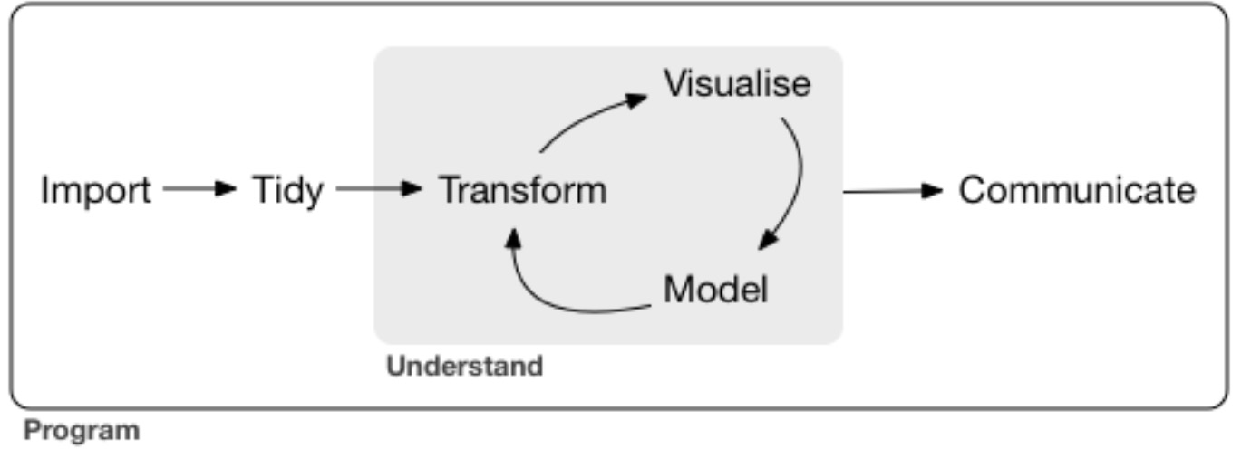
Figure 2.1: The flow of a significant data analysis project.
However, I think it is incredibly valuable for you to try some data visualisation before anything else because you get to experience first hand some of the power of R early in your learning. You will quickly see that the plots you can produce with R are beautiful and require (relatively) little coding. By seeing the power of R’s visualisation—and how relatively little code is required—early in your learning, I hope that you will become more motivated to learn the coding that makes it possible.
For example, consider the following plot (Figure 2.2). Don’t worry that you don’t know what it represents, just marvel at how cool it is!
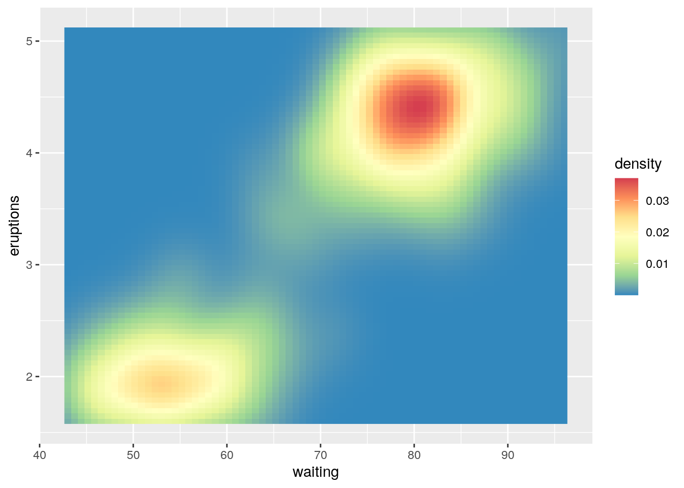
Figure 2.2: Awesome plot using R.
THINK. How long might such a plot take you to create in Excel, or your other software of choice?
Here is all that is required to create Figure 2.2:
library(tidyverse)

ggplot(data = faithfuld, aes(x = waiting, y = eruptions)) +
  geom_raster(aes(fill = density)) +
  scale_fill_distiller(palette = "Spectral")
Pretty neat, huh? OK, let’s dive in:
2.2 Reading
- Sections 3.1 to 3.4 (inclusive) from Chapter 3 of R for Data Science.
- You will see the basics of ggplot2 in action
- Don’t worry about understanding everything. Practice typing the code into the R console even though you won’t understand everything you are doing.
- We will come back to the other sections in this Chapter later in the module.
FURTHER READING. It is beyond the scope of this module to dive into the theory behind what makes the ggplot2 package so powerful. However, if you want to nerd-out I strongly recommend the following (incredibly clear and readable) paper from Hadley Wickham:
- Wickham, H. (2007). A layered grammar of graphics. Journal of Computational and Graphical Statistics, 19, 3–28. https://doi.org/10.1198/jcgs.2009.07098