Chapter 4 Data Visualisation
4.1 Objectives
In this chapter, readers will:
- be introduced to the concept of data visualisation
- be able to understand the ingredients for good graphics
- be able to generate plots using ggplot packages
- be able to save plots in different formats and graphical settings
In our physical book, the plots will be published in black and white text. Because of that, some of the R codes that come with ggplot2 will have an additional line of codes such as scale_colour_grey() + and scale_line_grey() to make sure the plots suits the black and white text inside our physical book. The online version of our book on the bookdown website shows the plots in colour.
4.2 Introduction
Many disciplines view data visualisation as a modern equivalent of visual communication. It involves the creation and study of the visual representation of data. Data visualisation requires “information that has been abstracted in some schematic form, including attributes or variables for the units of information”. You can read more about data visualization on this wikipedia page and another wikipedia page.
4.3 History and objectives of data visualisation
In his 1983 book, which carried the title The Visual Display of Quantitative Information, the author Edward Tufte defines graphical displays and principles for effective graphical display. The book mentioned, “Excellence in statistical graphics consists of complex ideas communicated with clarity, precision and efficiency.”
Visualisation is the process of representing data graphically and interacting with these representations. The objective is to gain insight into the data. Some of the processes are outlined on Watson IBM webpage
4.4 Ingredients for good graphics
Good graphics are essential to convey the message from your data visually. They will complement the text for your books, reports or manuscripts. However, you need to make sure that while writing codes for graphics, you need to consider these ingredients:
- You have good data
- Priorities on substance rather than methodology, graphic design, the technology of graphic production or something else
- Do not distort what the data has to say
- Show the presence of many numbers in a small space
- Coherence for large data sets
- Encourage the eye to compare different pieces of data
- Graphics reveal data at several levels of detail, from a broad overview to the fine structure
- Graphics serve a reasonably clear purpose: description, exploration, tabulation or decoration
- Be closely integrated with a data set’s statistical and verbal descriptions.
4.5 Graphics packages in R
There are several packages to create graphics in R. They include packages that perform general data visualisation or graphical tasks. The others provide specific graphics for certain statistical or data analyses.
The popular general-purpose graphics packages in R include:
- graphics : a base R package, which means it is loaded every time we open R
- ggplot2 : a user-contributed package by RStudio, so you must install it the first time you use it. It is a standalone package but also comes together with tidyverse package
- lattice : This is a user-contributed package. It provides the ability to display multivariate relationships, and it improves on the base-R graphics. This package supports the creation of trellis graphs: graphs that display a variable or.
A few examples of more specific graphical packages include:
- survminer : The survminer R package provides functions for facilitating survival analysis and visualization. It contains the function
ggsurvplot()for drawing easily beautiful and ready-to-publish survival curves with the number at risk table and censoring count plot. - sjPlot : Collection of plotting and table output functions for data visualization. Using sjPlot, you can make plots for various statistical analyses including simple and cross tabulated frequencies, histograms, box plots, (generalised) linear models, mixed effects models, principal component analysis and correlation matrices, cluster analyses, scatter plots, stacked scales, effects plots of regression models (including interaction terms).
Except for graphics package (a base R package), other packages such as ggplot2 and lattice need to be installed into your R library if you want to use them for the first time.
4.6 The ggplot2 Package
We will focus on using the ggplot2 package for this book. The ggplot2 package is an elegant, easy and versatile general graphics package in R. It implements the grammar of graphics concept. This concept’s advantage is that it fastens the process of learning graphics. It also facilitates the process of creating complex graphics
To work with ggplot2, remember that at least your R codes must
- start with
ggplot() - identify which data to plot
data = Your Data - state variables to plot for example
aes(x = Variable on x-axis, y = Variable on y-axis )for bivariate - choose type of graph, for example
geom_histogram()for histogram, andgeom_points()for scatterplots
The official website for ggplot2 is here https://ggplot2.tidyverse.org/ which is an excellent resource. The website states that ggplot2 is a plotting system for R, based on the grammar of graphics, which tries to take the good parts of base and lattice graphics and none of the bad parts. It takes care of many fiddly details that make plotting a hassle (like drawing legends) and provides a powerful model of graphics that makes it easy to produce complex multi-layered graphics.
4.7 Preparation
4.7.1 Create a New RStudio Project
We always recommend that whenever users want to start working on a new data analysis project in RStudio, they should create a new R project.
- Go to
File, - Click
New Project.
If you want to create a new R project using an existing folder, then choose this folder directory when requested in the existing Directory in the New Project Wizard window. An R project directory is useful because RStudio will store and save your codes and outputs in that directory (folder).
If you do not want to create a new project, then ensure you are inside the correct directory (R call this a working directory). The working directory is a folder where you store your codes and outputs. If you want to locate your working directory, type getwd() in your Console.
Inside your working directory,
- we recommend you keep your dataset and your codes (R scripts
.R, R markdown files.Rmd) - RStudio will store your outputs
4.7.2 Important questions before plotting graphs
It would be best if you asked yourselves these:
- Which variable or variables do you want to plot?
- What is (or are) the type of that variable?
- Are they factor (categorical) variables or numerical variables?
- Am I going to plot
- a single variable?
- two variables together?
- three variables together?
4.8 Read Data
R can read almost all (if not all) types of data. The common data formats in data and statistical analysis include
- comma-separated files (
.csv) - MS Excel file (
.xlsx) - SPSS file (
.sav) - Stata file (
.dta) - SAS file (
.sas)
However, it would help if you had user-contributed packages to read data from statistical software. For example. haven and rio packages.
Below we show are the functions to read SAS, SPSS and Stata file using the haven package.
- SAS:
read_sas()reads .sas7bdat + .sas7bcat files and read_xpt() reads SAS transport files (version 5 and version 8). write_sas() writes .sas7bdat files. - SPSS:
read_sav()reads .sav files and read_por() reads the older .por files. write_sav() writes .sav files. - Stata:
read_dta()reads .dta files (up to version 15). write_dta() writes .dta files (versions 8-15).
Sometimes, users may want to analyse data stored in databases. Some examples of common databases format are:
- MySQL
- SQLite
- Postgresql
- MariaDB
To read data from databases, you must connect your RStudio IDE with the database. There is an excellent resource to do this on the Databases Using R webpage
4.9 Load the packages
The ggplot2 package is one of the core member of tidyverse metapackage (https://www.tidyverse.org/). So, whenever we load the tidyverse package, we automatically load other packages inside the tidyverse metapackage. These packages include dplyr, readr, and of course ggplot2.
Loading a package will give you access to
- help pages of the package
- functions available in the package
- sample datasets (not all packages contain this feature)
We also load the here package in the example below. This package is helpful to point R codes to the specific folder of an R project directory. We will see this in action later.
## ── Attaching core tidyverse packages ──────────────────────── tidyverse 2.0.0 ──
## ✔ dplyr     1.1.4     ✔ readr     2.1.5
## ✔ forcats   1.0.0     ✔ stringr   1.5.1
## ✔ ggplot2   3.5.1     ✔ tibble    3.2.1
## ✔ lubridate 1.9.3     ✔ tidyr     1.3.1
## ✔ purrr     1.0.2
## ── Conflicts ────────────────────────────────────────── tidyverse_conflicts() ──
## ✖ dplyr::filter() masks stats::filter()
## ✖ dplyr::lag()    masks stats::lag()
## ℹ Use the conflicted package (<http://conflicted.r-lib.org/>) to force all conflicts to become errors## here() starts at D:/Data_Analysis_CRC_multivar_data_analysis_codesIf you run the library() code and then get this message there is no package called tidyverse, it means the package is still unavailable in your R library. So, you need to install the missing package. Similarly, if you receive the error message while loading the tidyverse package, you must install it.
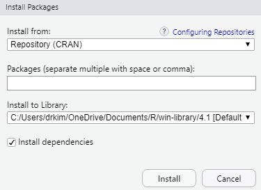
To install an R package for example tidyverse, type install.package("tidyverse") in the Console. Once the installation is complete, type library(tidyverse) again to load the package. Alternatively, you can use the GUI to install the package.
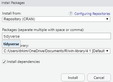
Now, type the package you want to install. For example, if you want to install the tidyverse package, then type the name in the box.
4.10 Read the dataset
In this chapter, we will use two datasets, the gapminder dataset and a peptic ulcer dataset. The gapminder dataset is a built-in dataset in the gapminder package. You can read more about gapminder from https://www.gapminder.org/ webpage. The gapminder website contains many useful datasets and shows excellent graphics, made popular by the late Dr Hans Rosling.
To load the gapminder package, type:
Next, we will call the data gapminder into R. Then , we will browse the first six observations of the data. The codes below:
- assigns gapminder as a dataset
- contains a pipe
%>%that connects two codes (gapminderandslice) - contains a function called
slice()that selects rows of the dataset
## # A tibble: 4 × 6
##   country     continent  year lifeExp      pop gdpPercap
##   <fct>       <fct>     <int>   <dbl>    <int>     <dbl>
## 1 Afghanistan Asia       1952    28.8  8425333      779.
## 2 Afghanistan Asia       1957    30.3  9240934      821.
## 3 Afghanistan Asia       1962    32.0 10267083      853.
## 4 Afghanistan Asia       1967    34.0 11537966      836.
It is a good idea to quickly list the variables of the dataset and look at the type of each of the variables:
## Rows: 1,704
## Columns: 6
## $ country   <fct> "Afghanistan", "Afghanistan", "Afghanistan", "Afghanistan", …
## $ continent <fct> Asia, Asia, Asia, Asia, Asia, Asia, Asia, Asia, Asia, Asia, …
## $ year      <int> 1952, 1957, 1962, 1967, 1972, 1977, 1982, 1987, 1992, 1997, …
## $ lifeExp   <dbl> 28.801, 30.332, 31.997, 34.020, 36.088, 38.438, 39.854, 40.8…
## $ pop       <int> 8425333, 9240934, 10267083, 11537966, 13079460, 14880372, 12…
## $ gdpPercap <dbl> 779.4453, 820.8530, 853.1007, 836.1971, 739.9811, 786.1134, …
We can see that the gapminder dataset has:
- six (6) variables
- a total of 1704 observations
- two factor variables, two integer variables and two numeric (
dbl) variables
We can generate some basic statistics of the gapminder datasets by using summary(). This function will list
- the frequencies
- central tendencies and dispersion such as min, first quartile, median, mean, third quartile and max
##         country        continent        year         lifeExp
##  Afghanistan:  12   Africa  :624   Min.   :1952   Min.   :23.60
##  Albania    :  12   Americas:300   1st Qu.:1966   1st Qu.:48.20
##  Algeria    :  12   Asia    :396   Median :1980   Median :60.71
##  Angola     :  12   Europe  :360   Mean   :1980   Mean   :59.47
##  Argentina  :  12   Oceania : 24   3rd Qu.:1993   3rd Qu.:70.85
##  Australia  :  12                  Max.   :2007   Max.   :82.60
##  (Other)    :1632
##       pop              gdpPercap
##  Min.   :6.001e+04   Min.   :   241.2
##  1st Qu.:2.794e+06   1st Qu.:  1202.1
##  Median :7.024e+06   Median :  3531.8
##  Mean   :2.960e+07   Mean   :  7215.3
##  3rd Qu.:1.959e+07   3rd Qu.:  9325.5
##  Max.   :1.319e+09   Max.   :113523.1
##
4.11 Basic plots
Let us start by creating a simple plot using these arguments:
- data :
data = gapminder - variables :
x = year,y = lifeExp - graph scatterplot :
geom_point()
ggplot2 uses the \(+\) sign to connect between functions, including ggplot2 functions that span multiple lines.
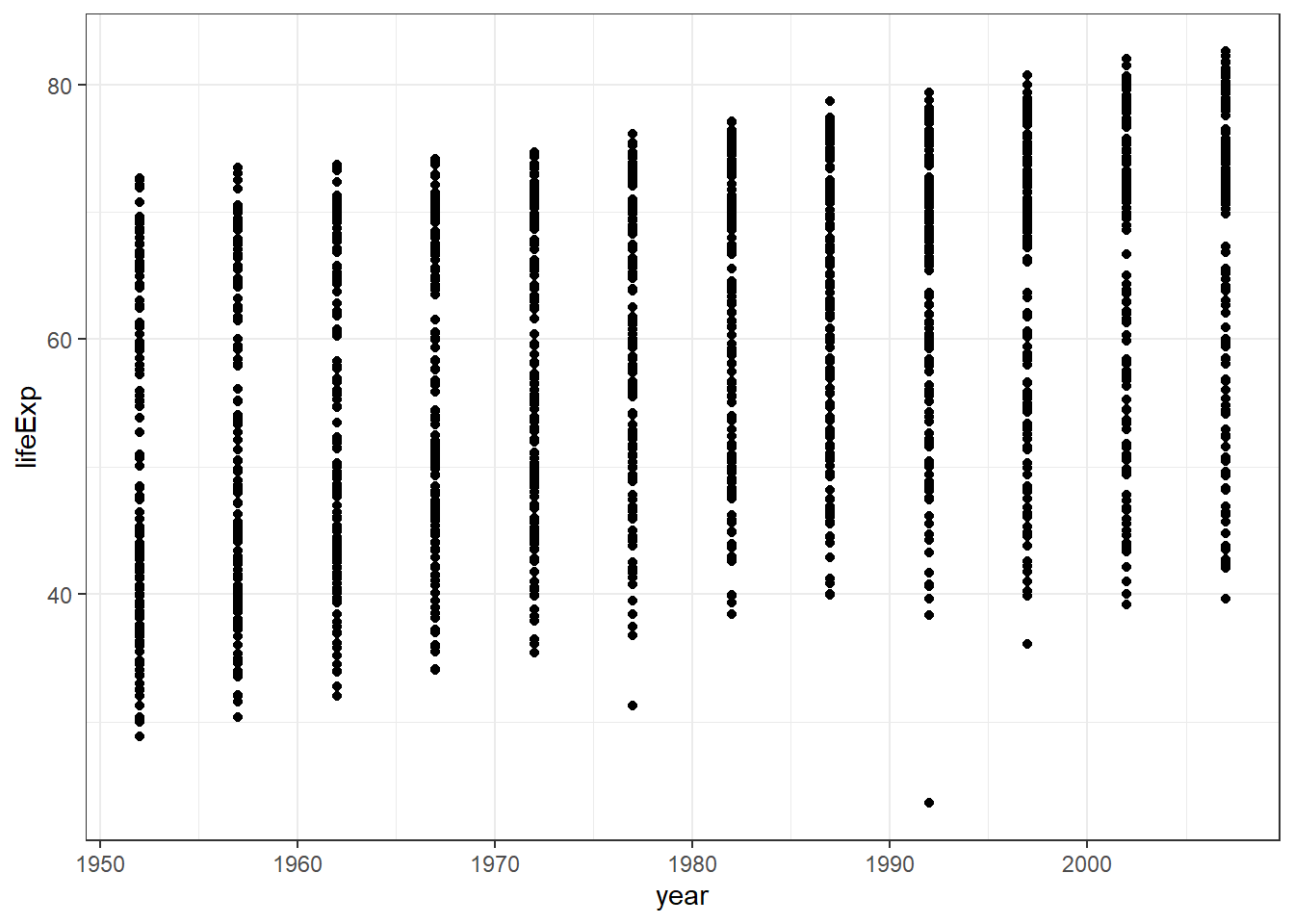
From the plot, we can see
- a scatterplot
- the scatterplot shows the relationship between
yearandlife expectancy. - as variable year advances, the life expectancy increases.
If you look closely, you will notice that
ggplot()function tells R to be ready to make plot from a specified data.geom_point()function tells R to make a scatter plot.
Users may find more resources about ggplot2 package on the ggplot2 webpage (Wickham et al. 2020). Other excellent resources include the online R Graphics Cookbook and its physical book (Chang 2013) .
4.12 More complex plots
4.12.1 Adding another variable
We can see that the variables we want to plot are specified by aes(). We can add a third variable to make a more complex plot. For example:
- data :
data = gapminder - variables :
x = year,y = lifeExp,colour = continent
The objective of creating plot using multiple (more than two variables) is to enable users to visualize a more complex relationship between more than two variables. Let us take a visualization for variable year, variable life expectancy, and variable continent.
This book uses black and white text so we add the scale_colour_grey() + codes. If readers want to see the colour of the plot, just delete this line scale_colour_grey() +.
ggplot(data = gapminder) +
  geom_point(mapping = aes(x = year,
                           y = lifeExp,
                           colour = continent)) +
  scale_colour_grey() +
  theme_bw()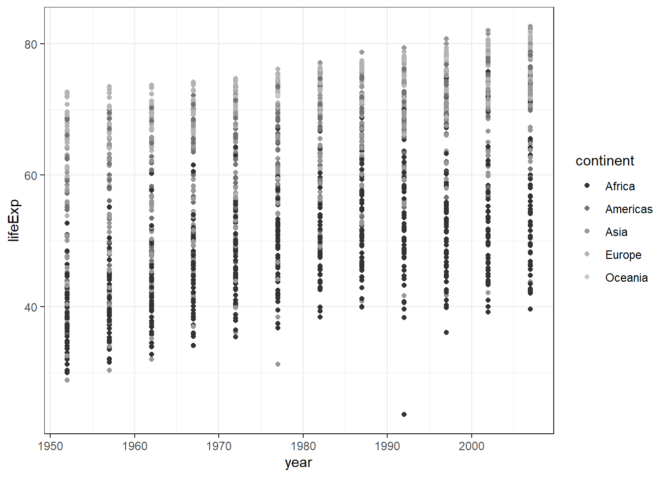
From the scatterplot of these three variables, you may notice that.
- European countries have a high life expectancy
- African countries have a lower life expectancy
- One country is Asia looks like an outlier (very low life expectancy)
- One country in Africa looks like an outlier too (very low life expectancy)
Now, we will replace the third variable with Gross Domestic Product gdpPercap and correlates it with the size of gdpPerCap.
ggplot(data = gapminder) +
  geom_point(mapping = aes(x = year,
                           y = lifeExp,
                           size = gdpPercap)) +
  theme_bw()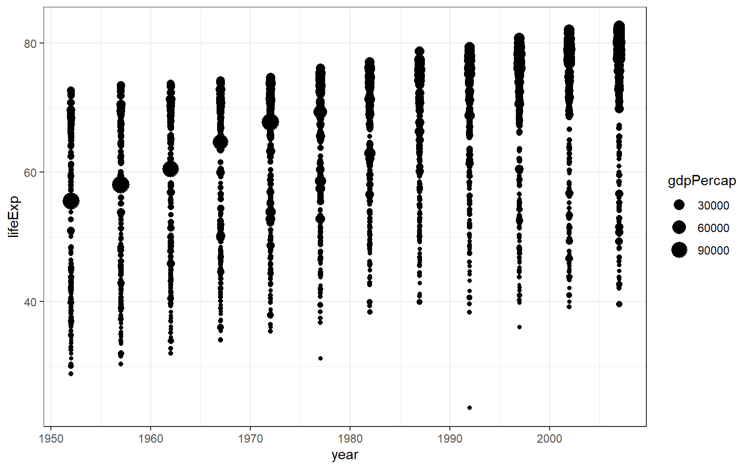
You will notice that ggplot2 automatically assigns a unique level of the aesthetic (here, a unique colour) to each value of the variable, a process known as scaling. ggplot2 also adds a legend that explains which levels correspond to which values. For example, the plot suggests that with higher gdpPerCap, there is also a longer lifeExp.
Instead of using colour, we can also use different shapes. Different shapes are helpful, especially when there is no facility to print out colourful plots. And we use geom_jitter() to disperse the points away from one another. The argument alpha= will set the opacity of the points. However, readers still have difficulty to notice the difference between continents.
ggplot(data = gapminder) +
  geom_jitter(mapping = aes(x = year,
                           y = lifeExp,
                           shape = continent),
              width = 0.75, alpha = 0.5) +
  theme_bw()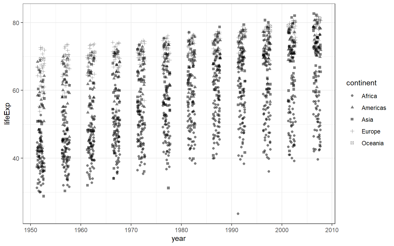
To change the parameter shape, for example, to the plus symbol, you can set the argument for shape to equal 3.

You may be interested to know what number corresponds to what type of shape. To do so, you can type ?pch to access the help document. You will see in the Viewer pane, there will be a document that explains various shapes available in R. It also shows what number that represents each shape.
4.12.2 Making subplots
You can split our plots based on a factor variable and make subplots using the facet(). For example, if we want to make subplots based on continents, then we need to set these parameters:
- data = gapminder
- variable
yearon the x-axis andlifeExpon the y-axis - split the plot based on continent
- set the number of rows for the plot at 3
ggplot(data = gapminder) +
  geom_point(mapping = aes(x = year, y = lifeExp)) +
  facet_wrap(~ continent, nrow = 3) +
  theme_bw()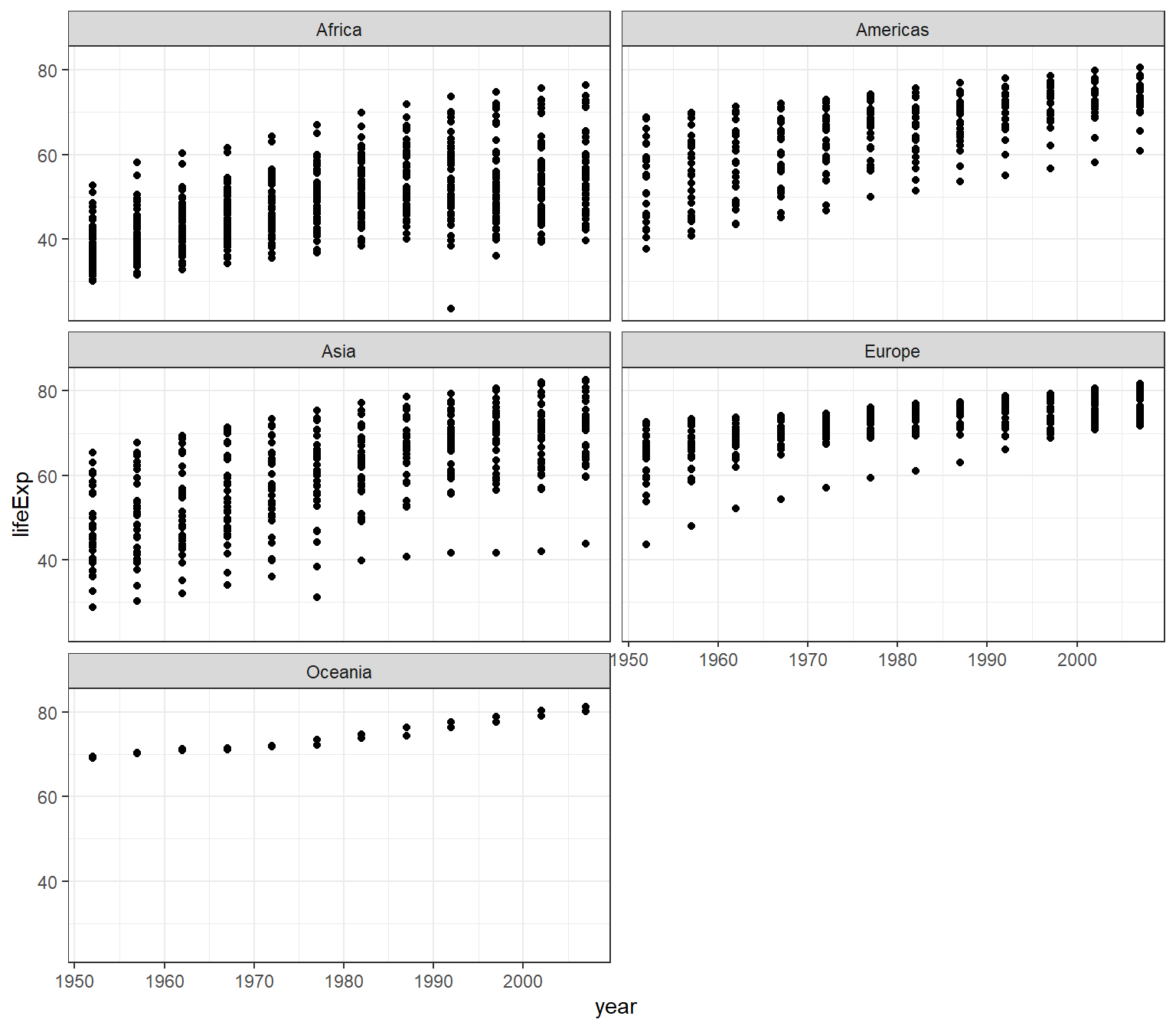
However, you will get a different arrangement of plot if you change the value for the nrow
ggplot(data = gapminder) +
  geom_point(mapping = aes(x = year, y = lifeExp)) +
  facet_wrap(~ continent, nrow = 2) +
  theme_bw()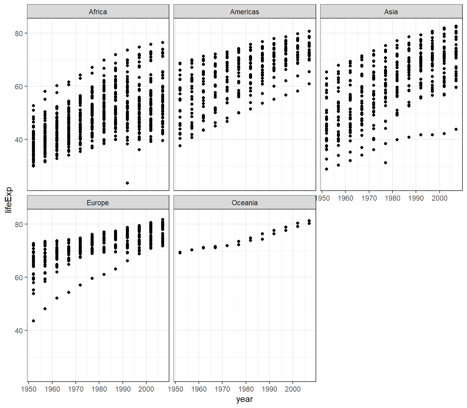
4.12.3 Overlaying plots
Each geom_X() in ggplot2 indicates different visual objects. This is a scatterplot and we set in R code chuck the fig.width= equals 6 and fig.height= equals 5 (fig.width=6, fig.height=5)

This is a smooth line plot:
## `geom_smooth()` using method = 'gam' and formula = 'y ~ s(x, bs = "cs")'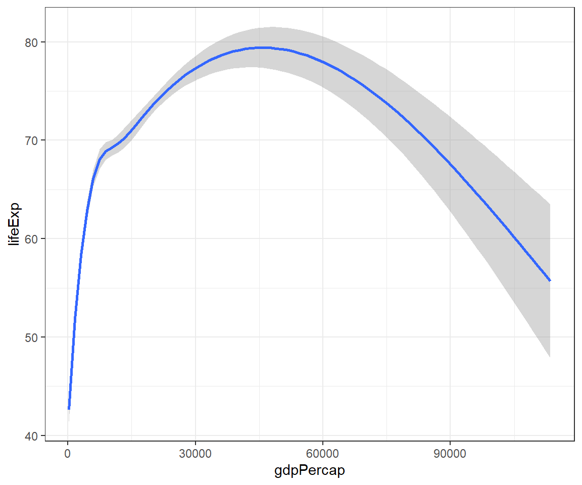
Let’s generate a smooth plot based on continent using the linetype() and use log(gdpPercap) to reduce the skewness of the data. Use these codes:
ggplot(data = gapminder) +
  geom_smooth(mapping = aes(x = log(gdpPercap),
                            y = lifeExp,
                            linetype = continent)) +
  theme_bw()
## `geom_smooth()` using method = 'loess' and formula = 'y ~ x'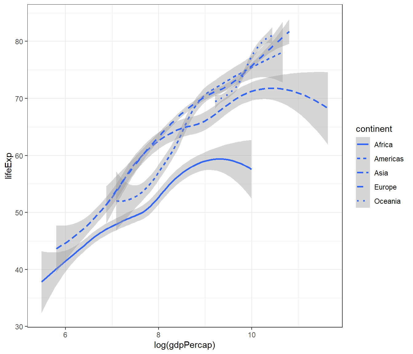
Another smooth plot but setting the parameter for colour but in greyscale. Again, if you print on black and white text, you will not be able to see the colour. To see the colour clearly, just remove the scale_colour_grey() + codes.
ggplot(data = gapminder) +
  geom_smooth(mapping = aes(x = log(gdpPercap),
                            y = lifeExp,
                            colour = continent)) +
  scale_colour_grey() +
  theme_bw()
## `geom_smooth()` using method = 'loess' and formula = 'y ~ x'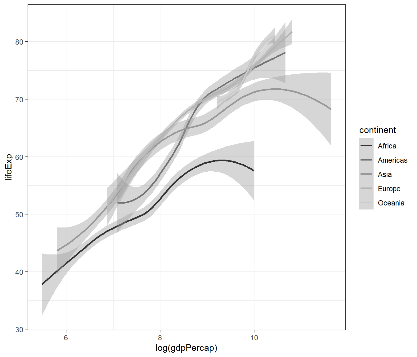
4.12.4 Combining different plots
We can combine more than one geoms (type of plots) to overlay plots. The trick is to use multiple geoms in a single line of R code:
ggplot(data = gapminder) +
  geom_point(mapping = aes(x = log(gdpPercap), y = lifeExp)) +
  geom_smooth(mapping = aes(x = log(gdpPercap), y = lifeExp)) +
  theme_bw()
## `geom_smooth()` using method = 'gam' and formula = 'y ~ s(x, bs = "cs")'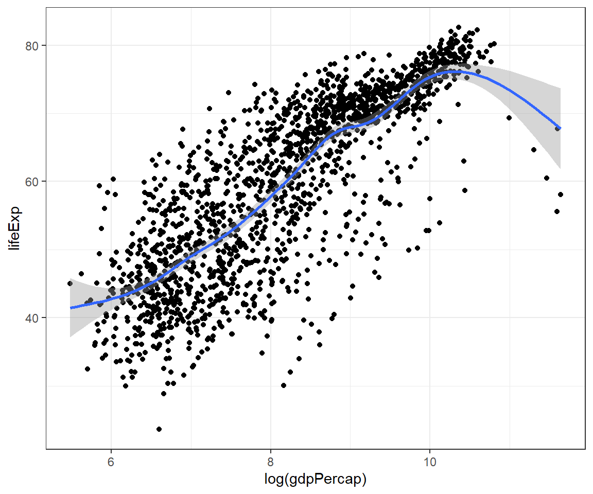
The codes above show duplication or repetition. To avoid this, we can pass the mapping to ggplot():
ggplot(data = gapminder,
       mapping = aes(x = log(gdpPercap), y = lifeExp)) +
  geom_point() +
  geom_smooth() +
  theme_bw()
## `geom_smooth()` using method = 'gam' and formula = 'y ~ s(x, bs = "cs")'
And we can expand this to make scatterplot shows different shape for continent:
ggplot(data = gapminder,
       mapping = aes(x = log(gdpPercap), y = lifeExp)) +
  geom_point(mapping = aes(shape = continent)) +
  geom_smooth() +
  theme_bw()
## `geom_smooth()` using method = 'gam' and formula = 'y ~ s(x, bs = "cs")'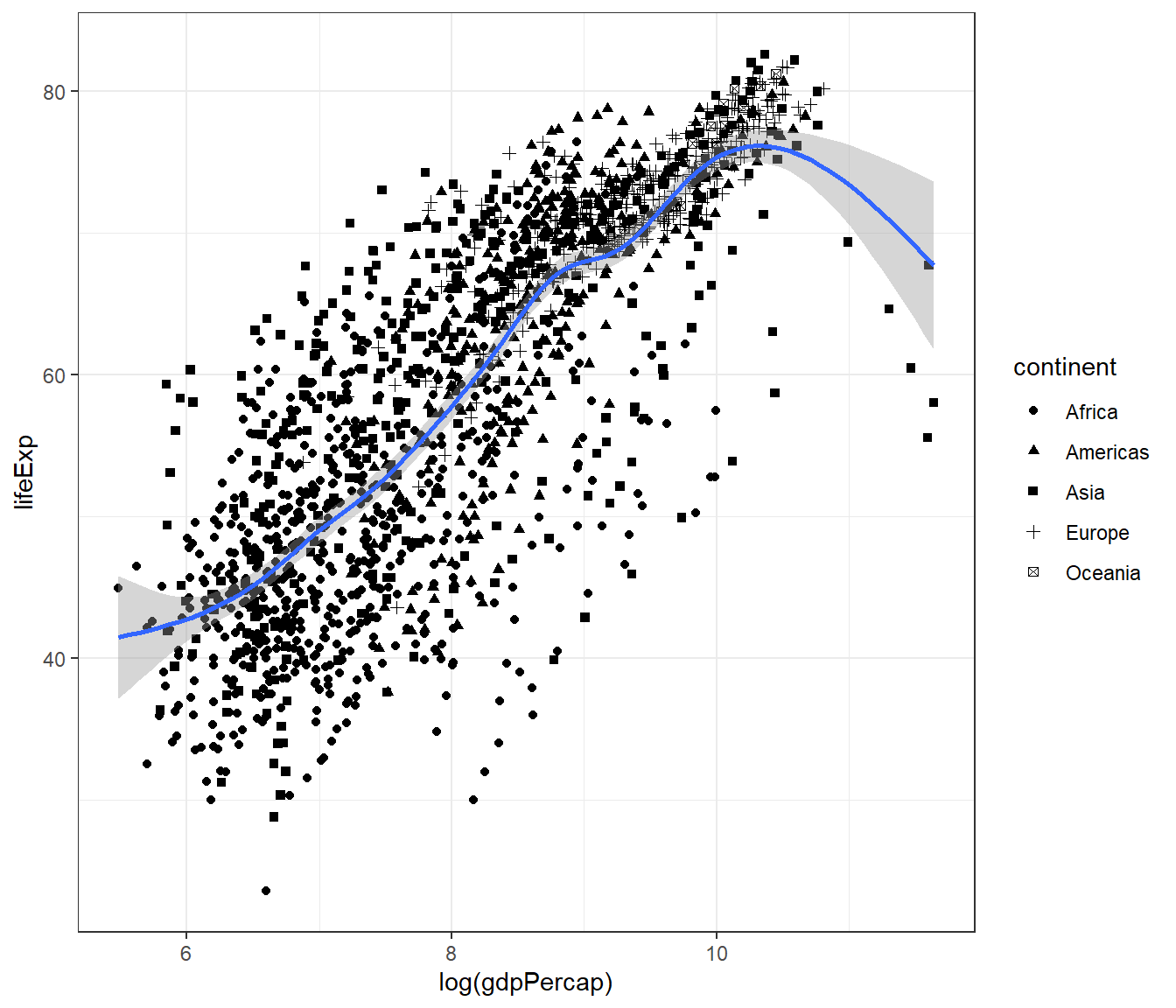
Or expand this to make the smooth plot shows different linetypes for continent:
ggplot(data = gapminder,
       mapping = aes(x = log(gdpPercap), y = lifeExp)) +
  geom_point() +
  geom_smooth(mapping = aes(linetype = continent)) +
  theme_bw()
## `geom_smooth()` using method = 'loess' and formula = 'y ~ x'
Or both the scatterplot and the smoothplot:
ggplot(data = gapminder,
       mapping = aes(x = log(gdpPercap), y = lifeExp)) +
  geom_point(mapping = aes(shape = continent)) +
  geom_smooth(mapping = aes(colour = continent)) +
  scale_colour_grey() +
  theme_bw()
## `geom_smooth()` using method = 'loess' and formula = 'y ~ x'
4.12.5 Statistical transformation
Let us create a Bar chart, with y-axis as the frequency.
ggplot(data = gapminder) +
  geom_bar(mapping = aes(x = continent)) +
  scale_colour_grey() +
  theme_bw()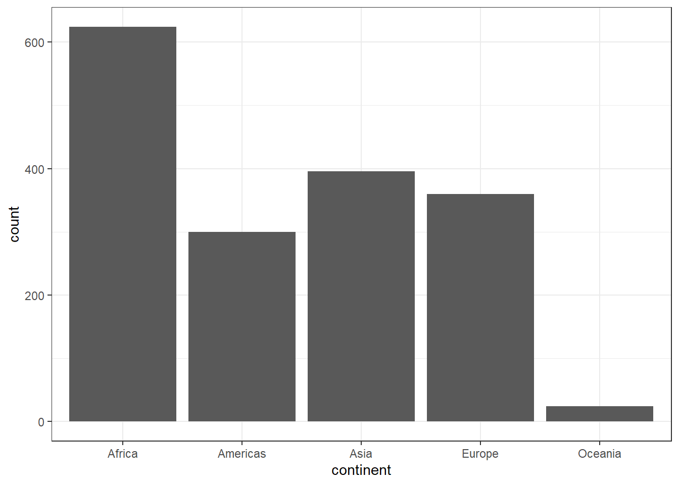
If we want the y-axis to show proportion, we can use these codes.
ggplot(data = gapminder) +
  geom_bar(mapping = aes(x = continent, y = after_stat(count/sum(count)),
                         group = 1))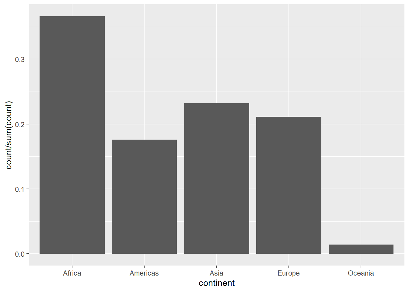
Or you can be more elaborate like below:
gapminder2 <-
  gapminder %>%
  count(continent) %>%
  mutate(perc = n/sum(n) * 100)

pl <- gapminder2 %>%
  ggplot(aes(x = continent, y = n, fill = continent))
pl <- pl + geom_col() + scale_fill_grey(start = 0, end = .9)
pl <- pl + geom_text(aes(x = continent, y = n,
                         label = paste0(n, " (", round(perc,1),"%)"),
                         vjust = -0.5))
pl <- pl + theme_classic()
pl <- pl + labs(title ="Bar chart showing counts and percentages")
pl
4.12.6 Customizing title
We can customize many aspects of the plot using ggplot2 package. For example, from gapminder dataset, we choose gdpPerCap and log it (to reduce skewness) and lifeExp, and make a scatterplot.
Let’s name the plot as mypop
mypop <- ggplot(data = gapminder,
                mapping = aes(x = log(gdpPercap),
                              y = lifeExp,
                              shape = continent)) +
  geom_point(alpha = 0.4) +
  geom_smooth(mapping = aes(colour =  continent), se = FALSE) +
  scale_colour_grey()
mypop
## `geom_smooth()` using method = 'loess' and formula = 'y ~ x'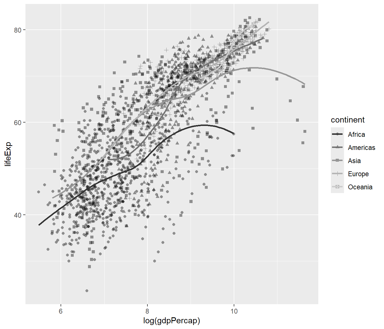
You will notice that there is no title in the plot which is not great. To to add the title, you can add a function ggtitle():
## `geom_smooth()` using method = 'loess' and formula = 'y ~ x'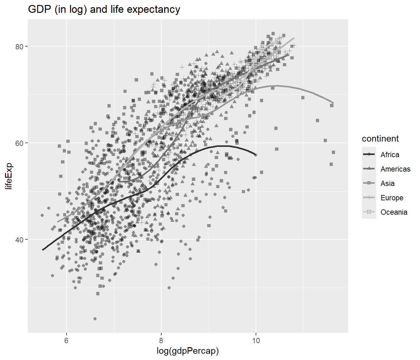
To make the title appears in multiple lines, we can add \n:
## `geom_smooth()` using method = 'loess' and formula = 'y ~ x'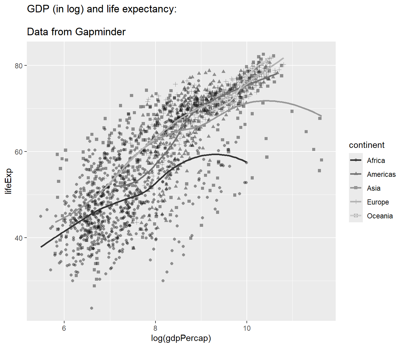
4.12.7 Choosing themes
The default is gray theme or theme_gray(). But there are many other themes. One of the popular themes is the black and white theme and the classic theme:
## `geom_smooth()` using method = 'loess' and formula = 'y ~ x'
4.12.8 Adjusting axes
We can specify the tick marks, for example:
- min = 0
- max = 12
- interval = 1
mypop <- mypop +
  scale_x_continuous(breaks = seq(0,12,1)) +
  scale_y_continuous(breaks = seq(0,90,10))
mypop
## `geom_smooth()` using method = 'loess' and formula = 'y ~ x'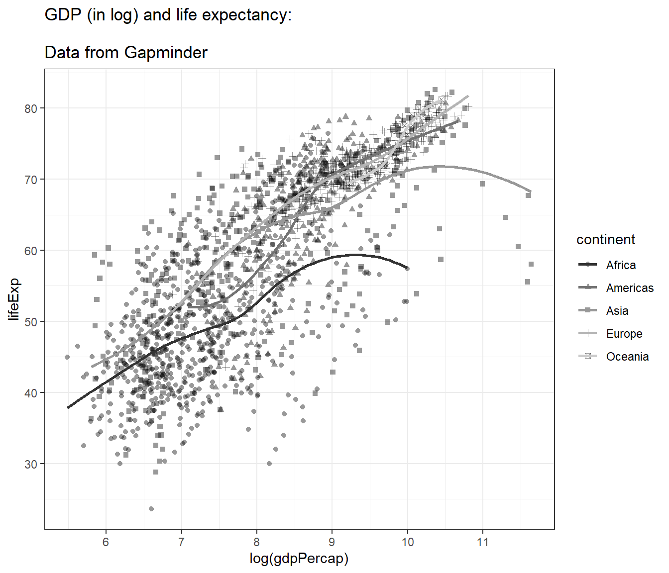
And we can label the x-axis and y-axis:
## `geom_smooth()` using method = 'loess' and formula = 'y ~ x'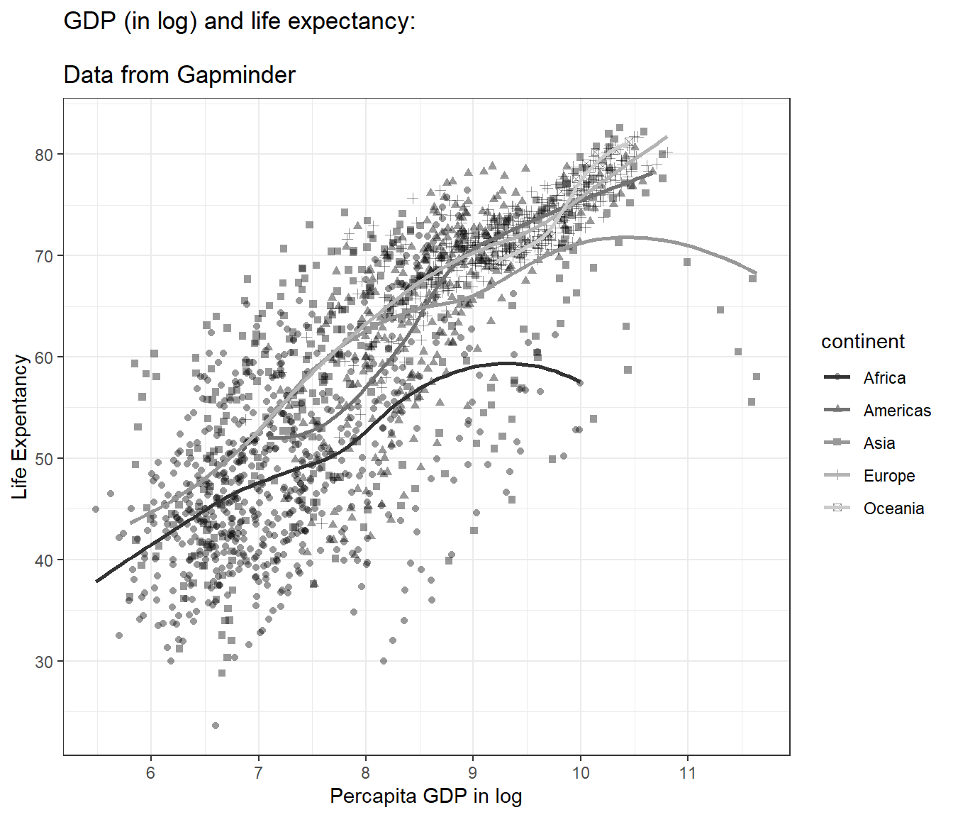
Perhaps, you may want to use facet_wrap() to split the plots based on variable continent to show better differences between the plots.
ggplot(data = gapminder,
       mapping = aes(x = log(gdpPercap), y = lifeExp)) +
  geom_point(alpha = 0.4) +
  geom_smooth(mapping = aes(line =  continent), se = FALSE) +
  facet_wrap(~ continent) +
  ylab("Life Expentancy") +
  xlab("Percapita GDP in log") +
  theme(legend.position="none") +
  theme_bw()
## Warning in geom_smooth(mapping = aes(line = continent), se = FALSE): Ignoring
## unknown aesthetics: line## `geom_smooth()` using method = 'loess' and formula = 'y ~ x'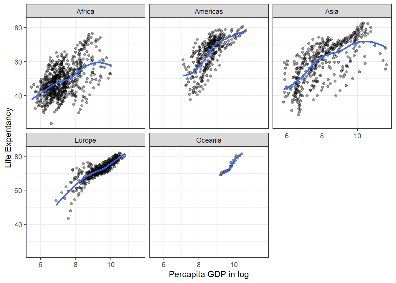
4.13 Saving plots
In R, you can save the plot in different graphical formats. You can also set other parameters such as the dpi and the size of the plot (height and width). One of the preferred formats for saving a plot is PDF format.
Here, we will show how to save plots in a different format in R. In this example, let us use the object we created before (mypop). We will add
- title
- x label
- y label
- black and white theme
And then create a new graphical object, myplot
myplot <-
  mypop +
  ggtitle("GDP (in log) and life expectancy:
                \nData from Gapminder") +
  ylab("Life Expentancy") +
  xlab("Percapita GDP in log") +
  scale_x_continuous(breaks = seq(0,12,1)) +
  theme_bw()
## Scale for x is already present.
## Adding another scale for x, which will replace the existing scale.## `geom_smooth()` using method = 'loess' and formula = 'y ~ x'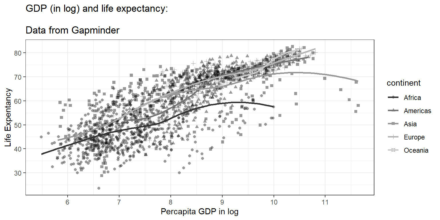
We now can see a nice plot. And next, we want to save the plot (currently on the screen) to these formats:
pdfformatpngformatjpgformat
If we want to save the plots in a folder named as plots, then
- go to working directory
- click New Folder
- name it as plot


This is when the here() function is handy. You can easily point to the correct folder so R knows where to locate the file.
here() is a function under a small packages called simply as here. This function helps you retrieve or save file or files or r objects from and to the correct path (including folder). This works even when we are using different machines.
Many of us recall the uncomfortable experiences when the drive name changes automatically (especially when using a thumb drive) on different computers. By using here() from the here package, we will always get to the correct path or folder.
To save the plots in the directory named plots in different image formats, we can do these:
## Saving 7 x 5 in image
## `geom_smooth()` using method = 'loess' and formula = 'y ~ x'## Saving 7 x 5 in image
## `geom_smooth()` using method = 'loess' and formula = 'y ~ x'## Saving 7 x 5 in image
## `geom_smooth()` using method = 'loess' and formula = 'y ~ x'ggplot2 is flexible and contains many customizations. For example, we want to set these parameters to our plots:
- width = 10 cm (or you can use
infor inches) - height = 6 cm (or you can use
infor inches) - dpi = 150.
dpiis dots per inch
ggsave(plot = myplot,
       here('plots','my_pdf_plot2.pdf'),
       width = 10, height = 6, units = "in",
       dpi = 150, device = 'pdf')
## `geom_smooth()` using method = 'loess' and formula = 'y ~ x'ggsave(plot = myplot,
here('plots','my_png_plot2.png'),
width = 10, height = 6, units = "cm",
dpi = 150, device = 'png')## `geom_smooth()` using method = 'loess' and formula = 'y ~ x'ggsave(plot = myplot,
here("plots","my_jpg_plot2.jpg"),
width = 10, height = 6, units = "cm",
dpi = 150, device = 'jpg')## `geom_smooth()` using method = 'loess' and formula = 'y ~ x'4.14 Summary
In this chapter, we briefly describe important matters before making plots. Then we teach readers to make plots using the ggplot2 package. This package uses the principle of Grammar for Graphics to ensure the codes are more intuitive to users. Readers learn to generate a simple plot for one variable before plotting two and three variables simultaneously. ggplot2 is also flexible and contains many customization to help readers generate fantastic plots and how to save them.