Chapter 15 Simple Regression
15.1 Get Started
In this chapter, we build on the correlation and scatterplot techniques and begin a three-chapter overview of regression analysis. It is a good idea to follow along in R, not just to learn the relevant commands, but also because we will use R to perform some important calculations in a couple of different instances. You should load the states20 data set as well as the libraries for the DescTools and descr packages.
15.2 Linear Relationships
In Chapter 14, we began to explore techniques that can be used analyze relationships between numeric variables, focusing on scatterplots as a descriptive tool and the correlation coefficient as a measure of association. Both of these techniques are essential tools for social scientists and should be used when investigating numeric relationships, especially in the early stages of a research project. As useful as scatterplots and correlations are they still have some limitations. For instance, suppose we wanted to predict values of y based on values of x.42 Think about the example in the last chapter, where we looked at factors that influence life expectancy. The correlation between life expectancy and fertility rate was -.84, and there was a very strong negative pattern in the scatterplot. Based on these findings, we could “predict” that generally life expectancy tends to be lower when fertility rate is high and higher when the fertility is low. However, we can’t really use this information to make specific predictions of life expectancy outcomes based on specific values of fertility rate. Is life expectancy simply -.84 of the fertility rate, or -.84 time fertility? No, it doesn’t work that way. Instead, with scatterplots and correlations, we are limited to saying how strongly x is related to y, and in what direction. It is important and useful to be able to say this, but it would be nice to be able to say exactly how much y increases or decreases for a given change in x.
Even when r = 1.0 (when there is a perfect relationship between x and y) we can’t predict y based on x using the correlation coefficient itself. Is y equal to 1*x whne the correlation is 1.0? No, not unless x and y are the same variable.
Consider the following two hypothetical variables that are perfectly correlated:
#Create a data set named "perf" with two variables and five cases
x <- c(8,5,11,4,14)
y <- c(31,22,40,19,49)
perf<-data.frame(x,y)
#list the values of the data set
perf
x y
1 8 31
2 5 22
3 11 40
4 4 19
5 14 49It’s a little hard to tell just by looking at the values of these variables, but they are perfectly correlated (r=1.0). Check out the correlation coefficient in R:
    Pearson's product-moment correlation

data:  perf$x and perf$y
t = Inf, df = 3, p-value <2e-16
alternative hypothesis: true correlation is not equal to 0
95 percent confidence interval:
 1 1
sample estimates:
cor
  1
Still, despite the perfect correlation, notice that the values of x are different from those of y for all five observations, so it is unclear how to predict values of y from values of x even when r=1.0.
Figure 15.1 provides a hint to how we can use x to predict y. Notice that all the data points fall along a straight line, which means that y is a perfect linear function of x. To predict y based on values of x, we need to figure out what the linear pattern is.
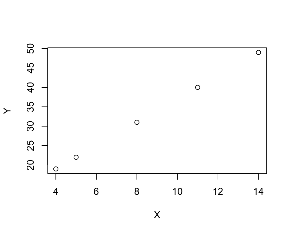
Figure 15.1: An Illustration of a Perfect Positive Relationship
Do you see a pattern in the data points listed above that allows you to predict y outcomes based on values of x? You might have noticed that each value of x divides into y at least three times, but that several of them do not divide into y four times. So, we might start out with y=3x for each data point and then see what’s left to explain. To do this, we create a new variable (predictedy) where we predict y=3x, and then use that to calculate another variable (leftover) that measures how much is left over:
#Multiply x times three
perf$predictedy<-3*perf$x
#subtract "predictedy" from "y"
perf$leftover<-perf$y-perf$predictedy
#List all data
perf
x y predictedy leftover
1 8 31 24 7
2 5 22 15 7
3 11 40 33 7
4 4 19 12 7
5 14 49 42 7Now we see that all the predictions based on y=3x under-predicted y by the same amount, 7. In fact, from this we can see that for each value of x, y is exactly equal to 3x + 7. Plug one of the values of x into this equation, so you can see that it perfectly predicts the value of y.
You probably learn from math classes you’ve had before that the equation for a straight line is
\[y=mx + b\]
Where \(m\) is the slope of the line (how much y changes for a unit change in x) and b is a constant. In the example above m=3 and b=7, and x and y are the independent and dependent variables, respectively.
\[y=3x+7\]
In the real-world of data analysis, perfect relationships between x and y do not usually exist, especially in the social sciences. As you know from the scatterplot examples used Chapter 14, even with very strong relationships, most data points do not come close to lining up on a single straight line
15.3 Ordinary Least Squares Regression
What we need is a methodology that estimates and fits the best possible “prediction” line to the relationship between two variables. We need a methodology that provides estimates of the slope and constant, based on the relationship between the two variables. That methodology is called Ordinary Least Squares (OLS) Regression. OLS regression provides a means of predicting y based on values of x that minimizes prediction error.
The population regression model is:
\[Y_i=\alpha+\beta_1X_i+\epsilon_i\] Where:
\(Y_i\) = the dependent variable
\(\alpha\) = the constant (aka the intercept)
\(\beta_1\) = the slope (expected change in y for a unit change in x)
\(X_i\) = the independent variable
\(\epsilon_i\) = random error component
But, of course, we usually cannot know the population values of these parameters, so we estimate an equation based on sample data:
\[{y}_i= a + b_1x_i+e_i\]
Where:
\(y_i\) = the dependent variable
\(a\) = the sample constant (aka the intercept)
\(b\) = the sample slope (change in y for a unit change in x)
\(x_i\) = the independent variable
\(e_i\) = error term; actual values of y minus predicted values of y (\(y_i-\hat{y}_i\)).
The sample regression model can also be written as:
\[\hat{y}_i= a + b_1x_i\] Where the caret above the y signals that it is the predicted value and implies \(e_i\).
To estimate the predicted value of the dependent variable (\(\hat{y}_i\)) for any given case we need know the values of \(a\), \(b_1\), and the outcome of the independent variable for that case (\(x_i\)). We can calculate the values of \(a\) and \(b_1\) with the following formulas:
\[b=\frac{\sum(x_i-\bar{x})(y_i-\bar{y})}{\sum(x_i-\bar{x})^2}\] Note that the numerator is the same as the numerator for Pearson’s r and, similarly, summarizes the direction of the relationship, while the denominator reflects the variation in x. This focus on the variation is \(x\) is necessary because we are interested in the expected (positive or negative) change in \(y\) for a unit change in \(x\). Unlike Pearson’s r, the magnitude of \(b\) is not bounded by -1 and +1. The size of \(b\) is a function of the scale of the independent and dependent variables and the strength of relationship.
Once we have obtained the value of \(b\), we can plug it into the following formula to obtain \(a\). \[a=\bar{y}-b\bar{x}\]
15.3.1 Calculation Example: Presidential Vote in 2016 and 2020
Let’s work through calculating these quantities for a small data set using data from seven states from the 2016 and 2020 presidential elections. Presumably there is a close relationship between how states voted in 2016 and how they voted in 2020. We can use regression analysis to analyze that relationship and to “predict” values in 2020 based on values in 2016 for the seven states listed below:
#Enter data for three different  columns
#State abbreviation
state <- c("AL","FL","ME","NH","RI","UT","WI")
#Democratic % of two-party vote, 2020
vote20 <-c(37.1,48.3,54.7,53.8,60.6,37.6,50.3)
#Democratic % of two-party vote, 2016
vote16<-c(35.6,49.4,51.5,50.2,58.3,39.3,49.6)
#Combine three columns into a single data frame
d<-data.frame(state,vote20,vote16) Democratic % in Presidential Elections
  state vote20 vote16
1    AL   37.1   35.6
2    FL   48.3   49.4
3    ME   54.7   51.5
4    NH   53.8   50.2
5    RI   60.6   58.3
6    UT   37.6   39.3
7    WI   50.3   49.6
This data set includes two very Republican states (AL and UT), one very Democratic state (RI), two states that lean Democratic (ME and NH), and two very competitive states (Fl and WI). First, let’s take a look at the relationship using a scatterplot and correlation coefficient to get a sense of how closely the 2020 outcomes mirrored those from 2016:
#Plot "vote20" by "vote16"
plot(d$vote16, d$vote20, xlab="Dem two-party % 2016",
     ylab="Dem two-party % 2020")
    Pearson's product-moment correlation

data:  d$vote16 and d$vote20
t = 10.5, df = 5, p-value = 0.00014
alternative hypothesis: true correlation is not equal to 0
95 percent confidence interval:
 0.85308 0.99686
sample estimates:
    cor
0.97791
Even though the scatterplot and correlation coefficient (.978) reveal an almost perfect correlation between these two variables, we still need a mechanism for predicting values of y based on values of x. For that, we need to turn to the calculations for the regression equation.
The code chunk listed below creates everything necessary to calculate the components of the regression equation, and these components are listed in Table 15.1. Make sure you take a close look at this so you really understand where the regression numbers are coming from.
#calculate deviations of y and x from their means
d$Ydev=d$vote20-mean(d$vote20)
d$Xdev=d$vote16-mean(d$vote16)

#(deviation for y)*(deviations for x)
d$YdevXdev<-d$Ydev*d$Xdev

#squared deviations for x from its mean
d$Xdevsq=d$Xdev^2| state | vote20 | vote16 | ydev | Xdev | Ydev | YdevXdev | Xdevsq |
|---|---|---|---|---|---|---|---|
| AL | 37.1 | 35.6 | -11.814 | -12.1 | -11.814 | 142.953 | 146.410 |
| FL | 48.3 | 49.4 | -0.614 | 1.7 | -0.614 | -1.044 | 2.890 |
| ME | 54.7 | 51.5 | 5.786 | 3.8 | 5.786 | 21.986 | 14.440 |
| NH | 53.8 | 50.2 | 4.886 | 2.5 | 4.886 | 12.214 | 6.250 |
| RI | 60.6 | 58.3 | 11.686 | 10.6 | 11.686 | 123.869 | 112.360 |
| UT | 37.6 | 39.3 | -11.314 | -8.4 | -11.314 | 95.040 | 70.560 |
| WI | 50.3 | 49.6 | 1.386 | 1.9 | 1.386 | 2.633 | 3.610 |
Now we have all of the components we need to estimate the regression equation. The sum of the column headed by YdevXdev is the numerator for \(b\), and the sum of the column headed by Xdevsq is the denominator:
#Create the numerator for slope formula
numerator=sum(d$YdevXdev)
#Display value of the numerator
numerator
[1] 397.65#Create the denominator for slope formula
denominator=sum(d$Xdevsq)
#Display value of the denominator
denominator[1] 356.52[1] 1.1154\[b=\frac{\sum(x_i-\bar{x})(y_i-\bar{y})}{\sum(x_i-\bar{x})^2}=\frac{397.65}{356.52} =1.115\] Now that we have a value of \(b\), we can plug that into the formula for the constant:
[1] -4.2886\[a=\bar{y}-b\bar{x}= -4.289\]
Which leaves us with the following linear equation:
\[\hat{y}=-4.289 + 1.115x\]
We can now predict values of y based on values of x. Predicted vote in 2020 is equal to -4.289 plus 1.115 times the value of the vote in 2016. We can also say that for every one-unit increase in the value of x (vote in 2016), the expected value of y (vote in 2020) increases by 1.115 percentage points.
We’ve used the term “predict” quite a bit in this and previous chapters. Let’s take a look at what it means in the context of regression analysis. To illustrate, let’s predict the value of the Democratic share of the two-party vote in 2020 for two states, Alabama and Wisconsin. The values of the independent variable (Democratic vote share in 2016) are 35.6 for Alabama and 49.6 for Wisconsin. To predict the 2020 outcomes, all we have to do it plug the values of the independent variable into the regression equation and calculate the outcomes:
| State | Predicted Outcome | Actual Outcome | Error (\(y-\hat{y}\)) |
|---|---|---|---|
| Alabama | \(\hat{y}= -4.289 + 1.115(35.6)= 35.41\) | 37.1 | 1.70 |
| Wisconsin | \(\hat{y}= -4.289 + 1.115(49.6)= 51.02\) | 50.3 | -.72 |
The regression equation under-estimated the outcome for Alabama by 1.7 percentage points and over-shot Wisconsin by .72 points. These are near-misses and suggest a close fit between predicted and actual outcomes. This ability to predict outcomes of numeric variables based on outcomes of independent variable is something we get from regression analysis that we do not get from other methods we have studied. The error reported in the last column (\(y-\hat{y}\)) can be calculated across all observations and used to evaluate how well the model explains variation in the dependent variable.
15.4 How Well Does the Model Fit the Data?
Figure 15.2 plots the regression line from the equation estimated above through the seven data points. To use this graph to find the predicted outcome of the dependent variable for a given value of the independent variable, imagine a vertical line going from the value on the x-axis to the regression line, and then a horizontal line from that intersection to the y-axis. The point where the horizontal line intersects the y-axis is the predicted value of y for the specified value of x. The closer the scatterplot markers are to the regression line, the less prediction error there is. As you can see, the predictions (regression line) are fairly close to the actual outcomes (markers), although closer for some states than for others. This is the nature of regression analysis. The linear predictions will predict some cases better than others. But the key thing to remember is the predictions generated by OLS regression will always be the best predictions you can get; that is, the estimates that give you the least overall error in prediction for these two variables.
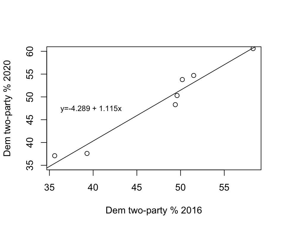
Figure 15.2: The Regession Line Superimposed in the Scatterplot
In Figure 15.3, the vertical lines between the markers and the regression line represent the error in the predictions (\(y-\hat{y}\)). These errors are referred to as residuals. As you can see, most data points are very close to the regression line, indicating that the model fits the data well. You can see this by “eyeballing” the regression plot, but it would be nice to have a more precise estimate of the overall strength of the model. An important criterion for judging the model is how well it predicts the dependent variable based on the independent variable. You can get a sense of this by using the overall error in the predictions; that is, the sum of \(y-\hat{y}\) across all observations. The problem with this calculation is that you will end up with a value of zero (except when rounding error gives us something very close to zero) because the positive errors perfectly offset the negative errors. We’ve encountered this type of issue before (Chapter 6) when trying to calculated the average deviation from the mean. As we did then, we can use squared prediction errors to evaluate the amount of error in the model.
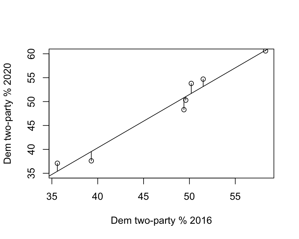
Figure 15.3: Prediction Errors (Residuals) in the Regression Model
The table below provides the actual and predicted values of y, the deviation of each predicted outcome from the actual value of y, and the squared deviations (fourth column). The sum of the squared prediction errors is 20.259. This, we refer to as total squared error (or variation) in the residuals (\(y-\hat{y}\)). The “Squares” part of Ordinary Least Squares regression refers the the total squared error from the model and the fact that it produces the lowest squared error possible, given the set of variables.
| State | \(y\) | \(\hat{y}\) | \(y-\hat{y}\) | \((y-\hat{y})^2\) |
|---|---|---|---|---|
| AL | 37.1 | 35.418 | 1.682 | 2.829 |
| FL | 48.3 | 50.810 | -2.510 | 6.300 |
| ME | 54.7 | 53.153 | 1.547 | 2.393 |
| NH | 53.8 | 51.703 | 2.097 | 4.397 |
| RI | 60.6 | 60.737 | -0.137 | 0.019 |
| UT | 37.6 | 39.545 | -1.945 | 3.783 |
| WI | 50.3 | 51.033 | -0.733 | 0.537 |
| Sum | 20.259 |
15.5 Proportional Reduction in Error
So, is 20.259 a lot of error? A little error? About average? It’s hard to tell without some objective standard for comparison. One way to get a grip on the “Compared to what?” type of question is to think of this issue in terms improvement in prediction over a model without the independent variable. In the absence of a regression equation or any information about an independent variable, the single best guess we can make for interval and ratio level data—the guess that gives us the least amount of error—is the mean of the dependent variable. One way to think about this is to visualize what the prediction error would look like if we predicted outcomes with a regression line that was perfectly horizontal at the mean value of the dependent variable. Figure 15.4 shows how well the mean of the dependent variable “predicts” the individual outcomes.
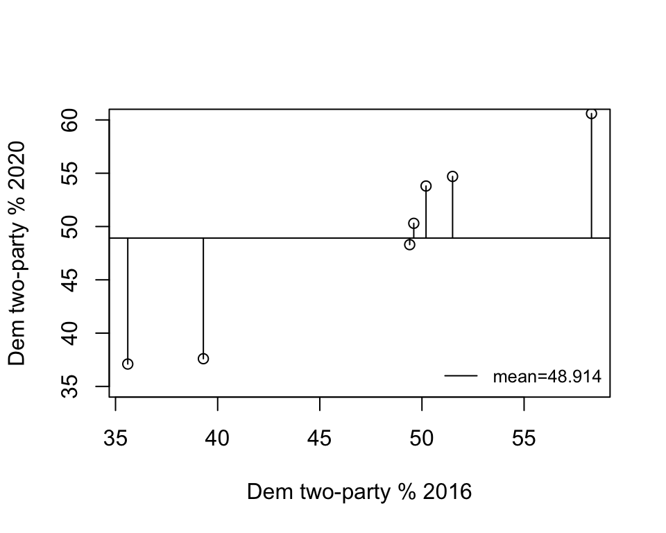
Figure 15.4: Prediction Error without a Regression Model
The horizontal line in this figure represents the mean of y (48.914) and the vertical lines between the mean and the data points represent the error in prediction if we used the mean of y as the prediction. As you can tell by comparing this to the previous figure, we get a lot more prediction error when using the mean to predict outcomes than when using the regression model. We can be a bit more precise and describe exactly how much less error, relative to the error with the prediction from the mean. Table 15.4 shows the error in prediction from the mean (\(y-\bar{y}\)) and its squared value. The total squared error when predicting with the mean is 463.789, compared to 20.259 with predictions from the regression model.
| State | \(y\) | \(y-\bar{y}\) | \((y-\bar{y})^2\) |
|---|---|---|---|
| AL | 37.1 | -11.814 | 139.577 |
| FL | 48.3 | -0.614 | 0.377 |
| ME | 54.7 | 5.786 | 33.474 |
| NH | 53.8 | 4.886 | 23.870 |
| RI | 60.6 | 11.686 | 136.556 |
| UT | 37.6 | -11.314 | 128.013 |
| WI | 50.3 | 1.386 | 1.920 |
| Mean | 48.914 | Sum | 463.789 |
We can now use this information to calculate the proportional reduction in error (PRE) that we get from the regression equation. In the discussion of measures of association in Chapter 13 we calculated another PRE statistic, Lambda, based on the difference between predicting with no independent variable (Error1) and predicting on the basis of an independent variable (Error2):
\[Lambda (\lambda)=\frac{E_1-E_2}{E_1}\]
The resulting statistic, lambda, expresses reduction in error as a proportion of the original error.
We can calculate the same type of statistic for regression analysis, except we will use \(\sum({y-\bar{y})^2}\) (total error from predicting with the mean of the dependent variable) and \(\sum{(y-\hat{y})^2}\) (total error from predicting with the regression model) in place of E1 and E2, respectively. This gives us a statistic known as the coefficient of determination, or \(r^2\) (sound familiar?).
\[r^2=\frac{\sum{(y_i-\bar{y})^2}-\sum{(y_i-\hat{y})^2}}{\sum{(y_i-\bar{y})^2}}=r^2=\frac{463.789-20.259}{463.789}=\frac{443.53}{463.789}=.9563\] Okay, so let’s break this down. The original sum of squared error in the model—the error from predicting with the mean—is 463.789, while the sum of squared residuals (prediction error) based on the model with an independent variable is 20.259. The difference between the two (443.53) is difficult to interpret on its own, but when we express it as a proportion of the original error, we get .9563. This means that we see about a 95.6% reduction in error predicting the outcome of the dependent variable with the independent variable, compared to using just the mean of the dependent variable. Another way to interpret this is to say that we have explained 95.6% of the error (or variation) in y using x as the predictor.
Earlier in this chapter we found that the correlation between 2016 and 2020 votes in the states was .9779. If you square this, you get .9563, the value of r2. This is why it was noted in Chapter 14 that one of the virtues of Pearson’s r is that it can be used as a measure of proportional reduction in error. In this case, both r and r2 tell us that this is a very strong relationship. In fact, this is very close to a perfect positive relationship.
15.6 Getting Regression Results in R
Let’s confirm our calculations using R. First, we use the linear model function to tell R which variables we want to use lm(dependent~independent), and store the results in a new object named “fit”.
Then we have R summarize the contents of the new object:
Call:
lm(formula = d$vote20 ~ d$vote16)

Residuals:
     1      2      3      4      5      6      7
 1.682 -2.510  1.547  2.097 -0.137 -1.945 -0.733

Coefficients:
            Estimate Std. Error t value Pr(>|t|)
(Intercept)   -4.289      5.142   -0.83  0.44229
d$vote16       1.115      0.107   10.46  0.00014 ***
---
Signif. codes:  0 '***' 0.001 '**' 0.01 '*' 0.05 '.' 0.1 ' ' 1

Residual standard error: 2.01 on 5 degrees of freedom
Multiple R-squared:  0.956, Adjusted R-squared:  0.948
F-statistic:  109 on 1 and 5 DF,  p-value: 0.000138
Wow. There is a lot of information here. The figure below provides an annotated guide:
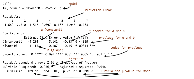
Figure 15.5: Annotated Regession Output from R
Here we see that our calculations for the constant (4.289), the slope (1.115), and the value of r2 (.9563) are the same as those produced in the regression output. You will also note here that the output includes values for t-scores and p-values that can be used for hypothesis testing. In the case of regression analysis, the null and alternative hypotheses are:
H0: \(\beta = 0\) (There is no relationship)
H1: \(\beta \ne0\) (There is a relationship)
Or, since we expect a positive relationship:
H1: \(\beta > 0\) (There is a positive relationship)
The t-score is equal to the slope divided by the standard error of the slope. In this case the t-score (10.46) and p-value (p=.00014), suggest that we are safe rejecting the null hypothesis. Note also that the t-score and p-values for the slope are identical to the t-score and p-values from the correlation coefficient shown earlier. That is because in simple (bi-variate) regression, the results are a strict function of the correlation coefficient.
15.6.1 All Fifty States
We’ve probably pushed the seven-observation data example about as far as we legitimately can. Before moving on, let’s look at the relationship between 2016 and 2020 votes in all fifty states, using a the states20 data set. First, the scatter plot:
#Plot 2020 results against 2016 results, all states
plot(states20$d2pty16, states20$d2pty20, xlab="Clinton % 2016",
     ylab="Biden % 2020",
     main="Democratic % Two-party Vote")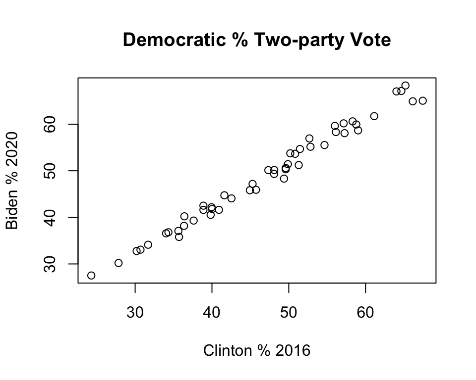
This pattern is similar to that found in the smaller sample of seven states: a strong, positive relationship. This impression is confirmed in the regression results:
#Get linear model and store results in new object 'fit50'
fit50<-lm(states20$d2pty20~states20$d2pty16)
#View regression results stored in 'fit50'
summary(fit50)
Call:
lm(formula = states20$d2pty20 ~ states20$d2pty16)

Residuals:
   Min     1Q Median     3Q    Max
-3.477 -0.703  0.009  0.982  2.665

Coefficients:
                 Estimate Std. Error t value Pr(>|t|)
(Intercept)        3.4684     0.8533    4.06  0.00018 ***
states20$d2pty16   0.9644     0.0177   54.52  < 2e-16 ***
---
Signif. codes:  0 '***' 0.001 '**' 0.01 '*' 0.05 '.' 0.1 ' ' 1

Residual standard error: 1.35 on 48 degrees of freedom
Multiple R-squared:  0.984, Adjusted R-squared:  0.984
F-statistic: 2.97e+03 on 1 and 48 DF,  p-value: <2e-16
Here we see that the model still fits the data very well (r2=.98) and that there is a significant, positive relationship between 2016 and 2020 vote. The linear equation is:
\[\hat{y}=3.468+ .964x\] The value for b (.964) means that for every one unit increase in the observed value of x (one percentage point in this case), the expected increase in y is .964 units. If it makes it easier to understand, we could express this as a linear equation with substantive labels instead if “y” and “x”:
\[\hat{\text{2020 Vote}}=3.468+ .964(\text{2016 Vote})\] To predict the 2020 outcome for any state, just plug in the value of the 2016 outcome for x, multiply that time the slope (.964), and add the value of the constant.
15.7 Understanding the Constant
Discussions of regression results typically focus on the estimate for the slope (b) because it describes how y changes in response to changes in the value of x. In most cases, the constant (a) isn’t of much substantive interest and we rarely spend much time talking about it. But the constant is very important for placing the regression line in a way that minimizes the amount of error obtained from the predictions.
Take a look at the scatterplot below, with a regression line equal to \(\hat{y}=3.468 + .964x\) plotted through the data points. To add the regression line to the plot, I used the abline function, which we’ve used before to add horizontal or vertical lines, and specified that the function should use information from the linear model to add the prediction line. Since the results of the regression model are stored in fit50, we could also write this as abline(lm(fit50)).
#Plot 2020 results against 2016 reults, all states
plot(states20$d2pty16, states20$d2pty20, xlab="Clinton % 2016",
     ylab="Biden % 2020")
#Add prediction line to the graph
abline(lm(states20$d2pty20~states20$d2pty16))
#Add a legend without a box (bty="n")
legend("right", legend="y=3.468 +.964x", bty="n", cex=.8)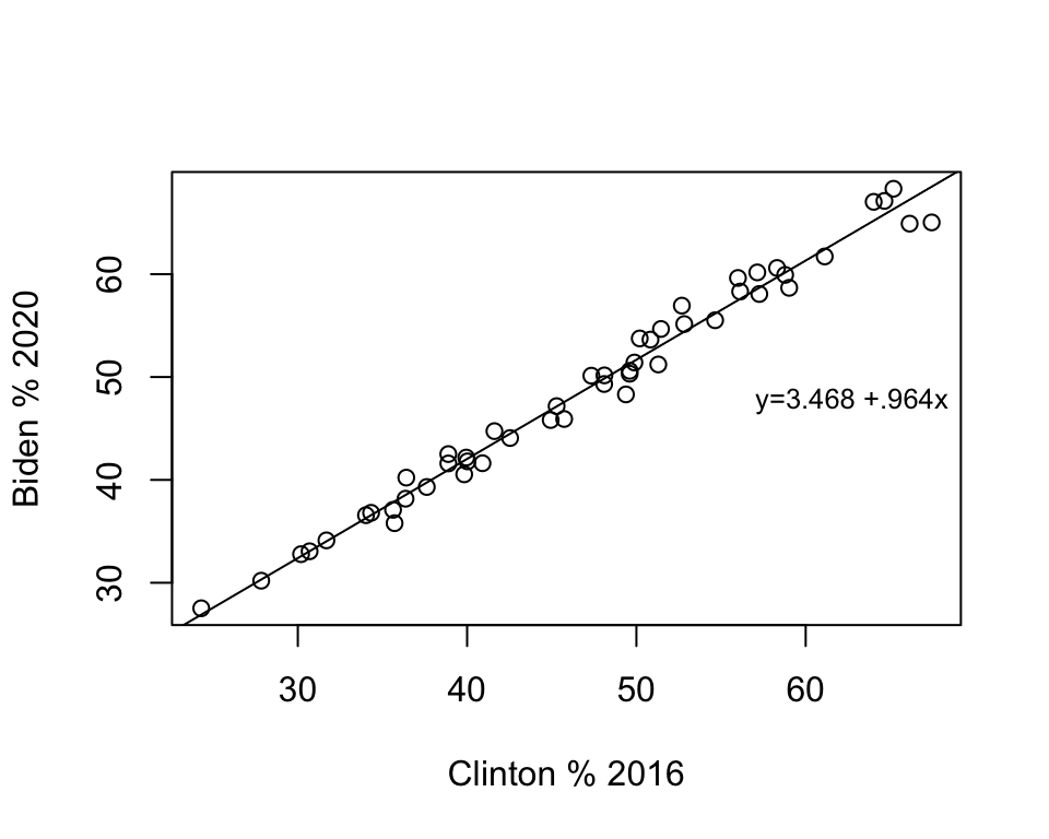
Just to reiterate, this line represents the best fitting line possible for this pair of variables. There is always some error in predicting outcomes in y, but no other linear equation will produce less error in prediction than those produced using OLS regression.
The slope (angle) of the line is equal to the value of b, and the vertical placement of the line is determined by the constant. Literally, the value of the constant is the predicted value of y when x equals zero. In many cases, such as this one, zero is not a plausible outcome for x, which is part of the reason the constant does not have a really straightforward interpretation. But that doesn’t mean it is not important. Look at the scatterplot below, in which I keep the value of b the same but use the abline function to change the constant to 1.468 instead of 3.468:
#Plot 2020 results against 2016 reults, all states
plot(states20$d2pty16, states20$d2pty20, xlab="Clinton % 2016",
     ylab="Biden % 2020")
#Add prediction line to the graph, using 1.468 as the constant
abline(a=1.468, b=.964)
legend("right", legend="y=1.468 + .964x", bty = "n", cex=.9)
Changing the constant had no impact on the angle of the slope, but the line doesn’t fit the data nearly as well. In fact, it looks like the regression predictions under-estimate the outcomes in almost every case. The point here is that although we are rarely interested in the substantive meaning of the constant, it plays a very important role in providing the best fitting regression line.
15.8 Non-numeric Independent Variables
Regression analysis is a very useful tool for analyzing the relationship between an interval-ratio dependent variable and one or more interval-ratio independent variables. But what about nominal and ordinal-level independent variables? Suppose for instance that you are interested in exploring regional influences on the 2020 presidential election. We could divide the country into several different regions (NE, South, MW, Mountain, West Coast, for instance), or we might be interested in a simple distinction and focus on the south/non-south differences in voting.
We can use compmeans to examine the differences in the mean outcome for southern states compared to other states. In this example, I focus on comparing thirteen southern states (deep south and border states) to the remaining 37 states.
#Create factor variable named "southern"
states20$southern=as.factor(states20$south)
#Assign levels
levels(states20$southern)<-c("Non-South", "South")
#Get group means
compmeans(states20$d2pty20,states20$southern, plot=F)
Mean value of "states20$d2pty20" according to "states20$southern"
Mean N Std. Dev.
Non-South 50.969 37 10.8849
South 42.643 13 7.0943
Total 48.804 50 10.6293The mean Democratic percent in southern states is 42.64%, compared to 50.97% in non-southern states, for a difference of 8.33 points. Of course, we can add a bit more to this analysis by using the t-test:
#Get t-test or region-based difference in "d2pty20"
t.test(states20$d2pty20~states20$southern,var.equal=T)
    Two Sample t-test

data:  states20$d2pty20 by states20$southern
t = 2.56, df = 48, p-value = 0.014
alternative hypothesis: true difference in means is not equal to 0
95 percent confidence interval:
  1.797 14.855
sample estimates:
mean in group Non-South     mean in group South
                 50.969                  42.643
The t-score for the difference is 2.56, and the p-value is .014 (< .05), so we conclude that there is a statistically significant difference between the two groups. Note, though, that the confidence interval is quite wide.
Can we do something like this with regression analysis? Does the dichotomous nature of the regional variable make it unsuitable as an independent variable in a regression model? In Chapter 4 (measures of central tendency) we discussed treating dichotomous variables as numeric variables that indicate the presence or absence of some characteristic; in this case, that characteristic is being a southern state.
So let’s look at how this works in a regression model, using the 2020 election results:
#Run regression model
south_demo<-lm(states20$d2pty20~states20$southern)
#View regression results
summary(south_demo)
Call:
lm(formula = states20$d2pty20 ~ states20$southern)

Residuals:
    Min      1Q  Median      3Q     Max
-23.449  -6.697   0.346   7.450  17.331

Coefficients:
                       Estimate Std. Error t value Pr(>|t|)
(Intercept)               50.97       1.66   30.78   <2e-16 ***
states20$southernSouth    -8.33       3.25   -2.56    0.014 *
---
Signif. codes:  0 '***' 0.001 '**' 0.01 '*' 0.05 '.' 0.1 ' ' 1

Residual standard error: 10.1 on 48 degrees of freedom
Multiple R-squared:  0.12,  Adjusted R-squared:  0.102
F-statistic: 6.57 on 1 and 48 DF,  p-value: 0.0135
Here, the constant is 50.97 and the “slope” is -8.33. Do you notice anything familiar about these numbers? Do they look similar to other findings you’ve seen recently?
The most important thing to get about dichotomous independent variables is that it does not make sense to interpret the value of b (-8.33) as a slope in the same way we might think of a slope for a numeric variable with multiple categories. There are just two values to the independent variable, 0 (non-south) and 1 (south), so statements like “for every unit increase in southern, Biden vote drops by 8.33 points” sound a bit odd. Instead, the slope is really saying that the expected level of support for Biden in the south is 8.33 points lower than his support in the rest of the country. Let’s plug in the values of the independent variable to illustrate this.
When South=0: \(\hat{y}=50.97-8.33(0)= 50.97\)
When South=1: \(\hat{y}=50.97-8.33(1)= 42.64\)
This is exactly what we saw in the compmeans results: the mean for southern states is 42.64, while the mean for other states is 50.97, and the difference between them (-8.33) is equal to the regression coefficient for south. Also, the t-score and p-value associated with the slope for the south variable in the regression model are exactly the same as in the t-test model.43 What this illustrates is that when using a dichotomous independent variable, the “slope” captures the mean difference in the value of the dependent variable between the two categories of the independent variable, and the results are equivalent to a difference of means test. In fact, the slope for a dichotomous variable like this is really just an addition to or subtraction from the intercept for cases scored 1, and for cases scored 0 on the independent variable, the predicted outcome is equal to the intercept.
Let’s take a look at this as a scatterplot, to illustrate how this works.
#Scatter plot of "d2pty20" by "South"
plot(states20$south,states20$d2pty20,
     xlab="0=Non-South, 1=South",
     ylab="Percent Vote for Biden")
#Add regesssion line
abline(lm(south_demo))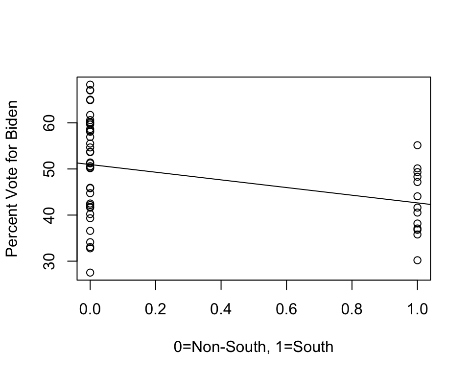
Here, the “slope” is just connecting the mean outcomes for the two groups. Again, it does not make sense to think about a predicted outcome for any values of the independent variable except 0 and 1, because there are no such values. So, the best way to think about coefficients for dichotomous variables is that they represent intercept shifts—we simply add (or subtract) the value of the coefficient to the intercept when the dichotomous variable equals 1.
All of this is just a way of pointing out to you that regression analysis is really an extension of things we’ve already been doing.
15.9 Adding More Information to Scatterplots
The assignments for this chapter, as well as some portions of the remaining chapters rely on integrating case-specific information from scatterplots with information from regression models to learn more about cases that do and don’t fit the model well. In this section, we follow the example of the R problems from the last few chapters and use infant mortality in the states (states20$infant_mort) as the dependent variable and state per capita income (states20$PCincome2020) as the independent variable. First, let’s run a regression model and add the regression line to the scatterplot using the abline function, as shown earlier in the chapter.
#Regression model of "infant_mort" by "PCincome2020"
inf_mort<-lm(states20$infant_mort ~states20$PCincome2020)
#View results
summary(inf_mort)
Call:
lm(formula = states20$infant_mort ~ states20$PCincome2020)

Residuals:
    Min      1Q  Median      3Q     Max
-1.4453 -0.7376  0.0331  0.6455  1.9051

Coefficients:
                        Estimate Std. Error t value   Pr(>|t|)
(Intercept)           10.5344672  0.7852998   13.41    < 2e-16 ***
states20$PCincome2020 -0.0000796  0.0000135   -5.92 0.00000033 ***
---
Signif. codes:  0 '***' 0.001 '**' 0.01 '*' 0.05 '.' 0.1 ' ' 1

Residual standard error: 0.88 on 48 degrees of freedom
Multiple R-squared:  0.422, Adjusted R-squared:  0.41
F-statistic:   35 on 1 and 48 DF,  p-value: 0.000000335
Here, we see a statistically significant and negative relationship between per capita income and infant mortality and the relationship is fairly strong (r2=.422).44 The scatterplot reinforces both of these conclusions: there is a clear negative pattern to the data, infant mortality rates tend to be higher in states with low per capita income than in states with high per capita income. The addition of the regression line is useful in many ways, including that we can see that while most outcomes are close to the predicted outcome, infant mortality is appreciably higher or lower in some states than we would expect based on their per capita income in those states.
#Regression model
plot(states20$PCincome2020, states20$infant_mort,
     xlab="Per Capita Income",
     ylab="# Infant Deaths per 1000 live Births")
#Add regression line
abline(lm(inf_mort))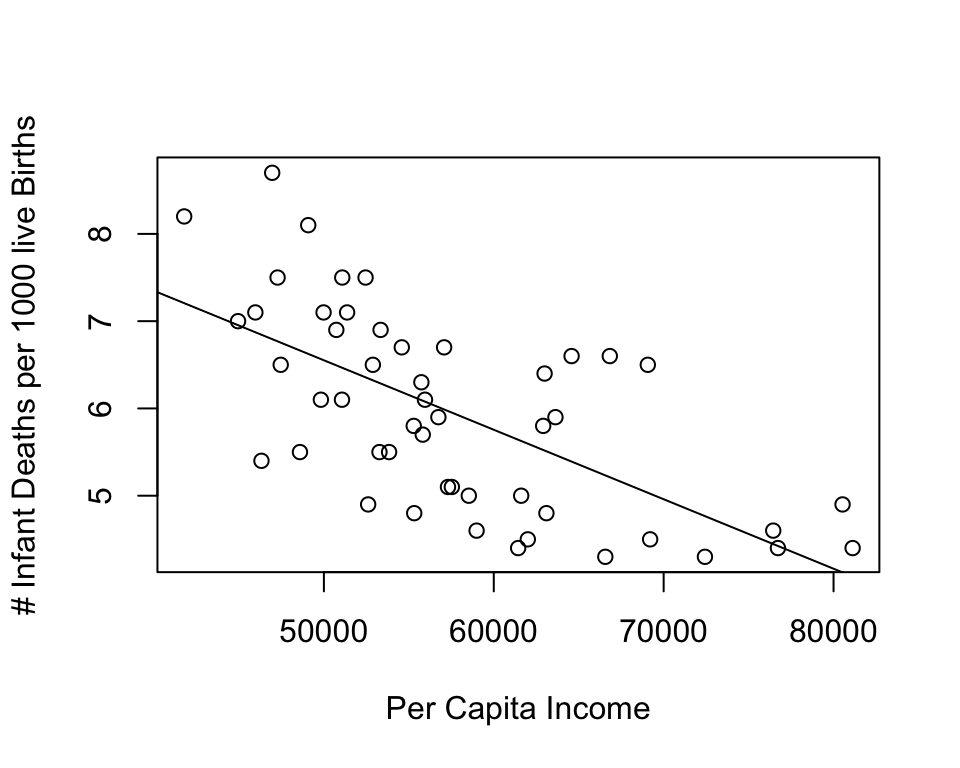
One thing we can do to add information in this scatterplot and make the pattern more meaningful is replace the data points with state abbreviations. Doing this enables us to see which states are high and low on the two variables, as well as which states are relatively close to or far from the regression line. To do this, you need to reduce the size of the original markers (cex=.01 below) and instruct R to add the state abbreviations using the text function. The format for this is text(independent_variable,dependent_variable, ID_variable)
#Scatterplot for per capita income and infant mortality
plot(states20$PCincome2020, states20$infant_mort,
     xlab="Per Capita Income",
     ylab="# Infant Deaths per 1000 live Births", cex=.01)
#Add regression line
abline(lm(inf_mort))
#Add State abbreviations
text(states20$PCincome2020,states20$infant_mort, states20$stateab, cex=.7)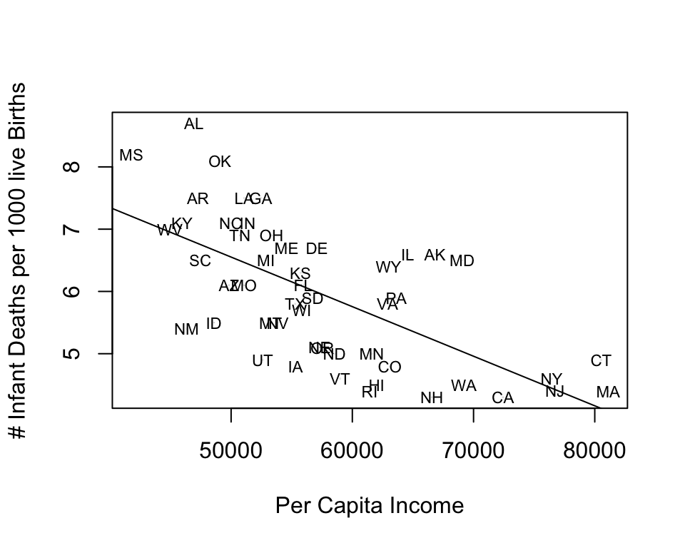
This scatterplot provides much of the same information as the previous one, but now we also get information about the outcomes for individual states. The added value is that now we can see which states are well explained by the regression model and which states are not. States that stand out as having higher than expected infant mortality (farthest above the regression line), given their income level are Alabama, Oklahoma, Alaska, and Maryland. States with lower than expected infant mortality (farthest below the regression line) are New Mexico, Utah, Iowa, Vermont, and Rhode island. It is not clear if there is a pattern to these outcomes, but there might be a slight tendency for southern states to have a higher than expected level of infant mortality, once you control for income.
15.10 Next Steps
This first chapter on regression provides you with all the tools you need to move on to the next topic: using multiple regression to control for the influence of several independent variables in a single model. The jump from simple regression (covered in this chapter) to multiple regression will not be very difficult, especially because we addressed the idea of multiple influences in Chapter 14, in the discussion of partial correlations. Having said that, make sure you have a firm grasp in the material from this chapter to ensure smooth sailing as we move on to multiple regression. Check in with your professor if there are parts of this chapter that you find challenging.
15.11 Assignments
15.11.1 Concepts and Calculations
Identify the parts of this regression equation: \(\hat{y}= a + b_{1}x\)
- The independent variable is:
- The slope is:
- The constant is:
- The dependent variable is:
The regression output below is from the 2020 ANES and shows the impact of respondent sex (0=male, 1=female) on the Feminist feeling thermometer rating.
- Interpret the coefficient for
anes20$female - What is the average Feminist feeling thermometer rating among female respondents?
- What is the average Feminist feeling thermometer rating among male respondents?
- Is the relationship between respondent sex and feelings toward feminists strong, weak, or something in between? Explain your answer.
- Interpret the coefficient for
Call:
lm(formula = anes20$feministFT ~ anes20$female)

Residuals:
   Min     1Q Median     3Q    Max
-62.55 -12.55  -2.55  22.45  45.46

Coefficients:
              Estimate Std. Error t value Pr(>|t|)
(Intercept)     54.536      0.459   118.8   <2e-16 ***
anes20$female    8.012      0.623    12.9   <2e-16 ***
---
Signif. codes:  0 '***' 0.001 '**' 0.01 '*' 0.05 '.' 0.1 ' ' 1

Residual standard error: 26.5 on 7271 degrees of freedom
  (1007 observations deleted due to missingness)
Multiple R-squared:  0.0222,    Adjusted R-squared:  0.0221
F-statistic:  165 on 1 and 7271 DF,  p-value: <2e-16
The regression model below summarizes the relationship between the poverty rate and the percent of households with access to the internet in a sample of 500 U.S. counties.
- Write out the results as a linear model (see question #1 for a generic version of the linear model)
- Interpret the coefficient for the poverty rate.
- Interpret the R2 statistic
- What is the predicted level of internet access for a county with a 5% poverty rate?
- What is the predicted level of internet access for a county with a 15% poverty rate?
- Is the relationship between poverty rate and internet access strong, weak, or something in between? Explain your answer.
Call:
lm(formula = county500$internet ~ county500$povtyAug21)

Residuals:
    Min      1Q  Median      3Q     Max
-25.764  -3.745   0.266   4.470  19.562

Coefficients:
                     Estimate Std. Error t value Pr(>|t|)
(Intercept)           89.0349     0.7600   117.1   <2e-16 ***
county500$povtyAug21  -0.8656     0.0432   -20.1   <2e-16 ***
---
Signif. codes:  0 '***' 0.001 '**' 0.01 '*' 0.05 '.' 0.1 ' ' 1

Residual standard error: 6.71 on 498 degrees of freedom
Multiple R-squared:  0.447, Adjusted R-squared:  0.446
F-statistic:  402 on 1 and 498 DF,  p-value: <2e-16
15.11.2 R Problems
This assignment builds off the work you did in Chapter 14 as well as the scatterplot discussion in the last section of this chapter.
Following the example used at the end of this chapter, produce a scatterplot showing the relationship between the percent of births to teen mothers (
states20$teenbirth) and infant mortalitystates20$infant_mortin the states (infant mortality is the dependent variable). Make sure you include the regression line and the state abbreviations. Identify any states that you see as outliers, i.e, that don’t follow the general trend. Is there any pattern to these states? Then, run a regression model using the same two variables. Discuss the results, focusing on the general direction and statistical significance of the relationship, as well as the expected change in infant mortality for a unit change in the teen birth rate, and interpret the R2 statistic.Repeat the same analysis from (1), except now use
states20$lowbirthwt(% of births that are technically low birth weight) as the independent variable.
As always, use words. The statistics don’t speak for themselves!
We have used the term “predict” before and will use it a lot in the next few chapters. This term is used rather loosely here and does not mean we are forecasting future outcomes. Instead, it is used here and throughout the book to refer to guessing or estimating outcomes based on information provided by different types of statistics.↩︎
An astute observer will notice that I included the
var.equal=Tsubcommand in thet.test. This is because the regression model does not apply the Welch’s correction to account for unequal variances across groups, which thet.testfunction does by default.↩︎Why do I call this a fairly strong relationship? After all r2=.422 is pretty small compared to those shown earlier in chapter. One useful way to think about the r2 statistic is to convert it to a correlation coefficient (\(\sqrt{r^2}\)), which in this case, gives us r=.65, a fairly strong correlation.↩︎