Chapter 5 Measures of Central Tendency
5.1 Get Ready
In this chapter, we move on to examining measures of central tendency. You will find that the techniques learned here complement and expand upon the material from Chapter 2, providing a few more options for describing how variables are distributed. In order to follow along in this chapter, you should load the anes20 and states20 data sets and attach libraries for the following packages: DescTools, descr, and Hmisc.
5.2 Central Tendency
While frequencies tell us a lot about the distribution of variables, we are also interested in more precise measures of the general tendency of the data. Do the data tend toward a specific outcome? Is there a “typical” value? What is the “expected” value? Measures of central tendency provide this information. There are a number of different measures of central tendency, and their role in data analysis depends in part on the level measurement for the variables you are studying.
5.2.1 Mode
The mode is the category or value that occurs most often, and it is most appropriate for nominal data because it does not require that the underlying variable be quantitative in nature. That said, the mode can sometimes provide useful information for ordinal and numeric data, especially if those variables have a limited number of categories.
Let’s look at an example of the mode by using Religious affiliation, a nominal-level variable that is often tied to important social and political outcomes. The frequency below shows the outcomes from anes20$denom, an eight-category recoded version of the original twelve-category variable measuring religious affiliation (anes20$V201435).
#Create new variable for religious denomination
anes20$denom<-anes20$V201435
#Reduce number of categories by combine some of them
levels(anes20$denom)<-c("Protestant", "Catholic", "OtherChristian",
                        "OtherChristian", "Jewish", "OtherRel","OtherRel",
                        "OtherRel","Ath/Agn", "Ath/Agn",
"SomethingElse", "Nothing")PRE: What is present religion of R
Frequency Percent Valid Percent
Protestant 2113 25.519 25.778
Catholic 1640 19.807 20.007
OtherChristian 267 3.225 3.257
Jewish 188 2.271 2.294
OtherRel 163 1.969 1.989
Ath/Agn 796 9.614 9.711
SomethingElse 1555 18.780 18.970
Nothing 1475 17.814 17.994
NA's 83 1.002
Total 8280 100.000 100.000From this table, we can see in both the raw frequency and percent columns that “Protestant” is the modal category (recognizing that this category includes a number of different religions). Let’s think about how this represents the central tendency or expected outcome of this variable. With nominal variables such as this, the concept of a “center” doesn’t hold much meaning, strictly speaking. However, if we are a bit less literal and take “central tendency” to mean something more like the typical or expected outcome, it makes more sense.
Think about this in terms of guessing the outcome, and you need information that will minimize your error in guessing (this idea will also be important later in the book). Suppose you have all 8197 valid responses on separate strips of paper in a great big hat, and you need to guess the religious affiliation of each respondent using the coding scheme from this variable. What’s your best guess as pull each piece of paper out of the hat? It turns out that your best strategy is to guess the modal category, “Protestant,” for all 8197 valid respondents. You will be correct 2113 times and wrong 6084 times. That’s a lot of error, but no other guess will give you less error because “Protestant” is the most likely outcome. In this sense, the mode is a good measure of the “typical” outcome for nominal data.
Besides using the frequency table, you can also get the mode for this variable using the Mode command in R:
[1] NA
attr(,"freq")
[1] NA
Oops, this result doesn’t look quite right. That’s because many R functions don’t know what to do with missing data and will report [1] NA instead of the information of interest. Since there are 83 missing cases for this variable (see the frequency), we get the error message. This is fixed in most cases by adding na.rm=T, which tells R to remove the NAs from the analysis, to the command line.
[1] Protestant
attr(,"freq")
[1] 2113
8 Levels: Protestant Catholic OtherChristian Jewish OtherRel ... Nothing
This confirms that “Protestant” is the modal category, with 2113 respondents, and also lists all of the levels. In many cases, such as this, I prefer looking at the frequency table for the mode because it provides a more complete picture of the variable, showing, for instance, that while Protestant is the modal category, “Catholic” is a very close second.
While the mode is the most suitable measure of central tendency for nominal-level data, it can be used with ordinal and and interval-level data. Let’s look at two variables we’ve used in earlier chapters, spending preferences on programs for the poor (anes20$V201320x), and state abortion restrictions (states20$abortion_laws):
[1] 3. Kept the same
attr(,"freq")
[1] 3213
5 Levels: 1. Increased a lot 2. Increased a little ... 5. Decreasaed a lot[1] 10
attr(,"freq")
[1] 12Here, we see that the modal outcome for spending preferences is “Kept the same”, with 3213 respondents, and the mode for abortion regulations is 10, which occurred twelve times. While the mode does provide another piece of information for these variables, there are better measures of central tendency when working with ordinal or interval/ratio data. However, the mode is the preferred measure of central tendency for nominal data.
5.3 Median
The median cuts the sample in half: it is the value of the outcome associated with the observation at the middle of the distribution when cases are listed in order of magnitude. Because the median is found by ordering observations from the lowest to the highest value, the median is not an appropriate measure of central tendency for nominal variables. If the cases for an ordinal or numeric variable are listed in order of magnitude, we can look for the point that cuts the sample exactly in half. The value associated with that observation is the median. For instance, if we had 5 observations ranked from lowest to highest, the middle observation would be the third one (two above it and two below it), and the median would be the value of the outcome associated with that observation. Just to be clear, the median in this example would not be 3, but the value of the outcome associated with the third observation. The median is well-suited for ordinal variables but can also provide useful information regarding numeric variables.
Here is a useful formula for finding the middle observation:
\[\text{Middle Observation}={\frac{n+1}{2}}\]
where n=number of cases
If n is an odd number, then the middle is a single data point. If n is an even number, then the middle is between two data points and we use the mid-point between those two values as the median. Figure 5.1 illustrates how to find the median, using hypothetical data for a small sample of cases:
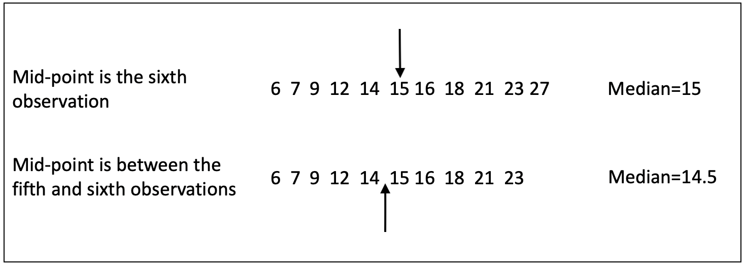
Figure 5.1: Finding the Median with Odd and Even Numbers of Cases
In the first row of data, the sixth observation perfectly splits the sample, five observations above it and five below. The value of the sixth observation, 15, is the median. In the second row of data, there are an even number of cases (10), so the middle of the distribution is between the fifth and sixth observations, with values of 14 and 15, respectively. The median is the mid-point between these values, 14.5.
Now, let’s look at this with some real-world data, using the abortion laws variable from the states20 data set. There are 50 observations, so the mid-point is between the 25th and 26th observations ((50+1)/2). Obviously, we can get R to just show us the median, but it is instructive at this point to find it by “eyeballing” the data. All fifty observations for states20$abortion_laws are listed below in order of magnitude. The value associated with the 25th observation is 9, as is the value associated with the 26th observation. Since these are both the same, the median outcome is 9.
 [1]  1  2  3  3  4  4  4  5  5  5  5  5  6  6  6  6  6  6  7  7  7  8  8  8  9
[26]  9  9  9  9  9  9 10 10 10 10 10 10 10 10 10 10 10 10 11 11 12 12 12 13 13
We could also get this information more easily:
[1] 9To illustrate the importance of listing the outcomes in order of magnitude, check the list of outcomes for states20$abortion_law when the data are listed alphabetically:
 [1]  8  8 11 10  5  2  4  6 10  9  5 11  5 12  9 13 10 10  4  6  5 10  9  9 12
[26]  7 10  7  3  7  6  4  9  9 10 13  3  9  6 10 10 10 12 10  1  8  5  6 10  6
If you took the mid-point between the 25th (12) and 26th (7) observations, you would report a median of 9.5. While this is close to 9, by coincidence, it is incorrect.
Let’s turn now to finding the median value for spending preferences on programs for the poor (anes20$V201320x). Since there are over 8000 observations for this variable, it is not practical to list them all in order, but we can do the same sort of thing using a frequency table. Here, I use the Freq command to get a frequency table because I am particularly interested in the cumulative percentages.
                   level   freq   perc  cumfreq  cumperc
1     1. Increased a lot  2'560  31.1%    2'560    31.1%
2  2. Increased a little  1'617  19.7%    4'177    50.8%
3       3. Kept the same  3'213  39.1%    7'390    89.8%
4  4. Decreased a little    446   5.4%    7'836    95.3%
5    5. Decreasaed a lot    389   4.7%    8'225   100.0%
What we want to do now is use the cumulative frequency to identify the category associated with the 50th percentile. In this case, you can see that the cumulative frequency for the category “Increased a little” is 50.8%, meaning the the middle observation (50th percentile) is in this category, so this is the median outcome.
We can check this with the median command in R. One little quirk here is that R requires numeric data to calculate the median. That’s fine. All we have to do is tell R to treat the values as if they were numeric, replacing the five levels with values 1,2,3,4 and 5.
[1] 2We get confirmation here that the median outcome is the second category, “Increased a little”.
5.4 The Mean
The Mean is usually represented as \(\bar{x}\) and is also referred to as the arithmetic average, or the expected value of the variable, and is a good measure of the typical outcome for numeric data. The term “typical” outcome is interesting in this context because the mean value of a variable may not exist as an actual outcome. The best way to think about the mean as a measure of typicality is somewhat similar to the discussion of the mode as your best guess if you want to minimize error in predicting the outcomes in a nominal variable. The difference here is that since the mean is used with numeric data, we don’t judge accuracy in a dichotomous right/wrong fashion; instead, we can judge accuracy in terms of how close the mean is to each outcome. For numeric data, the mean is closer overall to the actual values than any other guess you could make. In this sense, the mean represents the typical outcome better than any other statistic.
The formula for the mean is
\[\bar{x}=\frac{\sum_{i=1}^n x_i}{n}\]
This reads: the sum of the values of all observations (the numerical outcomes) of x, divided by the total number of valid observations (observations with real values). This formula illustrates an important way in which the mean is different from both the median and the mode: it is based on information from all of the values of x, not just the middle value (the median) or the value that occurs most often (the mode). This makes the mean a more encompassing statistic than either the median or the mode.
Using this formula, in the case of the # abortion restrictions, we could calculate the mean something like this:
\[\frac{1+2+3+3+4+4+\cdot\cdot\cdot\cdot+11+12+12+12+13+13}{50}\]
We don’t actually have to add up all fifty outcomes manually to get the numerator. Instead, we can tell R to sum up all of the values of x:
[1] 394So the numerator is 394. We divide through by the number of cases (50) to get the mean:
[1] 7.88\[\bar{x}=\frac{394}{50} = 7.88\]
Of course, it is simpler, though not quite as instructive, to just have R tell us the mean:
[1] 7.88A very important characteristic of the mean is that it is the point at which the weight of the values is perfectly balanced on each side. It is helpful to think of the outcomes numeric variables distributed according to their weight (value) on a plank resting on a fulcrum, and that fulcrum is placed at the mean of the distribution, the point at which both sides are perfectly balanced. If the fulcrum is placed at the mean, the plank will not tip to either side, but if it is placed at some other point, then the weight will not be evenly distributed and the plank will tip to one side or the other.
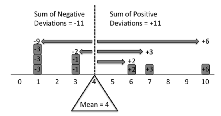
Figure 5.2: The Mean Perfectly Balances a Distribution
*Source: https://stats.stackexchange.com/questions/200282/explaining-mean-median-mode-in-laymans-terms
A really important concept here is the deviation of observations of x from the mean of x. Mathematically, this is represented as \(x_i-\bar{x}\). So, for instance, the deviation from the mean number of abortion restrictions (7.88) for a state like Alabama, with 8 abortion restrictions on the books is .12 units (8-7.88), and for a state like Colorado, with 2 restrictions on the books, the deviation is -5.88 (2-7.88). For any numeric variable, the distance between the mean and all values greater than the mean is perfectly offset by the distances between the mean and all values lower than the mean. The distribution is perfectly balanced around the mean.
This means that summing up all of the deviations from the mean (\(\sum_{i=1}^n{x_i-\bar{x}}\)) is always equal to zero. This point is important for understanding what the mean represents, but it is also important for many other statistics that are based on the mean.
We can check this balance property in R. First, we express each observation as a deviation from the means.
##Subtract the mean of x from each value of x
dev_mean=(states20$abortion_laws- mean(states20$abortion_laws))
#Print the mean deviations
dev_mean
[1] 0.12 0.12 3.12 2.12 -2.88 -5.88 -3.88 -1.88 2.12 1.12 -2.88 3.12
[13] -2.88 4.12 1.12 5.12 2.12 2.12 -3.88 -1.88 -2.88 2.12 1.12 1.12
[25] 4.12 -0.88 2.12 -0.88 -4.88 -0.88 -1.88 -3.88 1.12 1.12 2.12 5.12
[37] -4.88 1.12 -1.88 2.12 2.12 2.12 4.12 2.12 -6.88 0.12 -2.88 -1.88
[49] 2.12 -1.88As expected, some deviations from the mean are positive, and some are negative. Now, if we take the sum of all deviations, we get:
[1] 5.329071e-15That’s a funny looking number. Because of the length of the resulting number, the sum of the deviations from the mean is reported using scientific notation. In this case, the scientific notation is telling us we need to move the decimal point 15 places to the left, resulting in .00000000000000532907. Not quite exactly 0, due to rounding, but essentially 0.12
Note, that the median does not share this “balance” property;if we placed a fulcrum at the median, the distribution would tip over because the positive deviations do not balance perfectly by the negative deviations, as shown here:
#Sum the deviations of x from the median of x
sum(states20$abortion_laws- median(states20$abortion_laws))
[1] -56The negative deviations outweigh the positive by a value of 56.
5.4.1 Dichotomous Variables
Here’s an interesting bit of information that will be useful in the future: for dichotomous variables with all values are either 0 or 1, the mean of the variable is the proportion of cases in category 1. Let’s take an example from the anes20 survey. Suppose you are interested in the political behavior of people who have served in the military compared to those who have not. The 2020 ANES survey asks a question about military service, and the responses are in anes20$V201516. Below, I shorten the label of the second category so the frequency contents can be printed together.
# Change levels to fit better
levels(anes20$V201516)<-c("1. Now serving on active duty",
                           "2. Previously served,not now on active duty",
"3. Have never served on active duty")PRE: Armed forces active duty
Frequency Percent Valid Percent
1. Now serving on active duty 74 0.8937 0.8966
2. Previously served,not now on active duty 868 10.4831 10.5174
3. Have never served on active duty 7311 88.2971 88.5860
NA's 27 0.3261
Total 8280 100.0000 100.0000Here we see that just less than 1% are currently on active duty, about 10.5% have previously served, and the overwhelming majority (88.6%) have never served. If we are interested in a comparison between those who have and have not served, we need to combine the first two categories into a single category. You already know how to do this from the material covered in Chapter 4, but let’s have another go at it here.
#Create new variable
anes20$service<-anes20$V201516
#Change category labels to reflect military service
levels(anes20$service)<-c("Yes, Served","Yes, Served", "No Service")
#Check the changes
freq(anes20$service, plot=F)
PRE: Armed forces active duty
Frequency Percent Valid Percent
Yes, Served 942 11.3768 11.41
No Service 7311 88.2971 88.59
NA's 27 0.3261
Total 8280 100.0000 100.00If we try to get the mean of this variable, we would get an error because anes20$service is a factor variable (try it if you want to). So, we need to convert this into a numeric variable, scored 0 for those with no military service and 1 for those who have served in the military. Recall that we did the same thing when creating dichotomous variables for the LGBTQ index in Chapter 4. Typically, when creating numeric dichotomous variables like this, you should use 0 to signal that the corresponding observations do not have the characteristic identified in the variable name and 1 to signal that they have that characteristic.
#Creating a numeric (0,1) version of a categorical variable.
anes20$service.n<-as.numeric(anes20$service=='Yes, Served')
Here, we are telling R to create a new object, anes20$service.n, as a numeric variable using the original factor variable anes20$service and assigning a 1 for all “Yes, Served” outcomes and (by default) a 0 for all other valid outcomes (“No Service” answers, in this case). We are also telling R to treat this new variable as a numeric variable, which is why we use the “.n” extension. This is not required, but these types of extensions are helpful when trying to remember which similarly named variable is which. Now, let’s get a frequency for the new variable:
anes20$service.n
      Frequency  Percent Valid Percent
0          7311  88.2971         88.59
1           942  11.3768         11.41
NA's         27   0.3261
Total      8280 100.0000        100.00
Now we have a dichotomous numeric variable that distinguishes between those who have (11.4%) and have not (88.6%) served in the military. We can use the formula presented earlier to calculate the mean of this variable. Since the value 0 occurred 7311 times, and the value 1 occurred 942 times, the mean is equal to
\[\bar{x}=\frac{(0*7311)+(1*942)}{8253}=\frac{942}{8253}=.1141\] We can verify this with R:
[1] 0.1141403The mean of this dichotomous variable, scored 0 and 1, is the proportion in category 1. This should always be the case with similar dichotomous variables. This may not seem very intuitive to you at this point, but it will be very useful to understand it later on.
One thing you might be questioning at this point is how we can treat what seems like a nominal variable—whether people have or have not served in the military–as a numeric variable. The way I like to think about this is that the variable measures the presence (1) or absence (0) of a characteristic. In cases like this, you can think of the 0 value as a genuine zero point, an important characteristic of most numeric variables. In other words, 0 means none of the characteristic being measured. Since the value 1 indicates having a unit of the characteristic, we can treat this variable as numeric. However, it is important to always bear in mind what the variable represents and that there are only two outcomes, 0 and 1. This becomes especially important in later chapters when we discuss using these types of variables in regression analysis.
5.5 Mean, Median, and the Distribution of Variables
As a general rule, the mean is most appropriate for interval/ratio level variables, and the median is most appropriate for ordinal variables. However, there are instances when the median might be a better measure of central tendency for numeric data, almost always because of skewness in the data. Skewness occurs in part as a consequence of one of the virtues of the mean. Because the mean takes into account the values of all observations, whereas the median does not actually emphasize “values” but uses the ranking of observations, the mean can be influenced by extreme values that “pull” it away from the middle of the distribution. Consider the following simple data example, using five observations from a hypothetical variable:
In this case, the mean and the median are the same. Now, watch what happens is we change the value 5 to 18, a value that is substantially higher than the rest of the values :
The median is completely unaffected by the extreme values but the mean is. The median and some other statistics are what we call robust statistics because their value is not affected by the weight of extreme outcomes. In some cases, the impact of extreme values is so great that it is better to use the median as a measure of central tendency when discussing numeric variables. The data are still balanced around the mean, and the mean is still your “best guess” (smallest error in prediction), but in terms of looking for an outcome that represents the general tendency of the data, it may not be the best option in some situations.
Having said this, it has been my experience that once students hear that the median might be preferred over the mean when there is a significant difference between them, they tend to default to the median whenever it is at all different from the mean. There will almost always be some difference between the mean and the median and, hence, some skewness to the data, so you should not automatically default to the median. There are no official cutoff points, so it is a judgment call. My best advice is the mean should be your first choice. If, however, there is evidence that the mean is heavily influenced by extreme observations (see below), then you should also use the median. Of course, it doesn’t hurt to present both statistics, as more information is usually good information.
In general, when the mean is significantly higher than the median, this is a sign that the distribution of values is right (or positively) skewed, due to the influence of extreme values at the high end of the scale. This means that the extreme values are pulling the mean away from the middle of the observations. When the mean is significantly lower than the median, this indicates a left (or negatively) skewed distribution, due to some extreme values at the low end of the scale. When the mean and median are the same, or nearly the same, this could indicate a bell-shaped distribution, but there are other possibilities as well. When the mean and median are the same, there is no skew.
Figure 3 provides caricatures of what these patterns might look like. The first graph shows that most data are concentrated at the low (left) end of the x-axis, with a few very extreme observations at the high (right) end of the axis pulling the mean out from the middle of the distribution. This is a positive skew. The second graph shows just the opposite pattern: most data at the high end of the x-axis, with a few extreme values at the low (left) end dragging the mean to the left. This is a negatively skewed distribution.
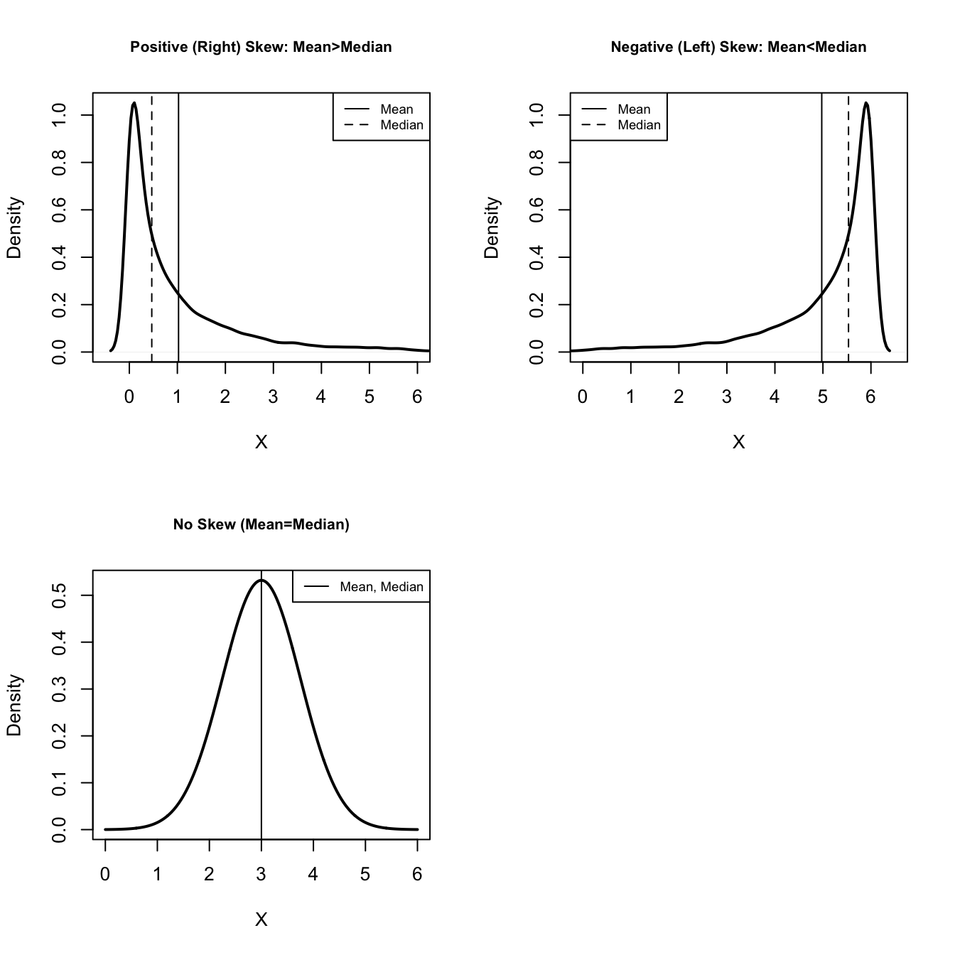
Figure 5.3: Illustrations of Different Levels of Skewness
Finally, the third graph shows a perfectly balanced, bell-shaped distribution, with the mean and the median equal to each other and situated right in the middle of the distribution. There is no skewness in this graph. This bell-shaped distribution is not the only way type of distribution with no skewness13, but it is an important type of distribution that we will take up later.
Let’s see what this looks like when using real-world data, starting with abortion laws in the states. First, we take another look at the mean and median, which we produced in an earlier section of this chapter, and then we can see a density plot for the number of restrictive abortion laws in the states.
[1] 7.88[1] 9The mean is a bit less than the median, so we might expect to see signs of negative (left) skewness in the density plot.
plot(density(states20$abortion_laws),
     xlab="# Abortion Restrictions in State Law",
     main="")
#Insert vertical lines for mean and median
abline(v=mean(states20$abortion_laws))
abline(v=median(states20$abortion_laws), lty=2) #use dashed line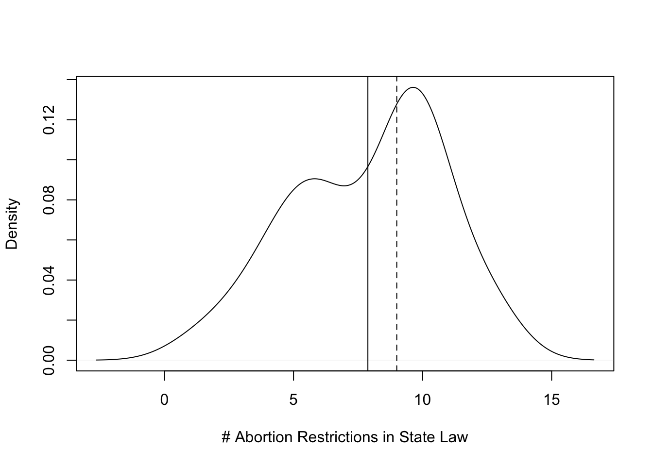
Here we the difference between the mean (solid line) and the median (dashed line) in the context of the full distribution of the variable, and the graph shows a distribution with a bit of negative skew. The skewness is not severe, but it is visible to the naked eye.
An R code digression. The density plot above includes the addition of two vertical lines, one for the mean and one for the median. To add these lines, I used the abline command. This command allows you to add lines to existing graphs. In this case, I want to add two vertical lines, so I use v= to designate where to put the lines. I could have put in the numeric values of the mean and median (v=7.88 and v=9), but I chose to use have R calculate the mean and median and insert the results in the graph (v=mean(states20$abortion_laws) and v=median(states20$abortion_laws)). Either way would get the same result. Also, note that for the median, I added lty=2 to get R to use “line type 2”, which is a dashed line. The default line type is a solid line, which is used for the mean.
Now, let’s take a look at another distribution, this time for a variable we have not looked at before, the percent of the state population who are foreign born (states20$fb). This is an increasingly important population characteristic, with implications for a number of political and social outcomes.
[1] 7.042[1] 4.95Here, we see a bit more evidence of a skewed distribution. In absolute terms, the difference between the mean and the median (2.09) is not much greater than in the first example (1.22), but the density plot (below) looks somewhat more like a skewed distribution than in the first example. In this case, the distribution is positively skewed, with a few relatively high values pulling the mean out from the middle of the distribution.
#Density plot for % foreign born
plot(density(states20$fb),
     xlab="Percent Foreign Born",
     main="")
#Add lines for mean and median
abline(v=mean(states20$fb))
abline(v=median(states20$fb), lty=2) #Use dashed line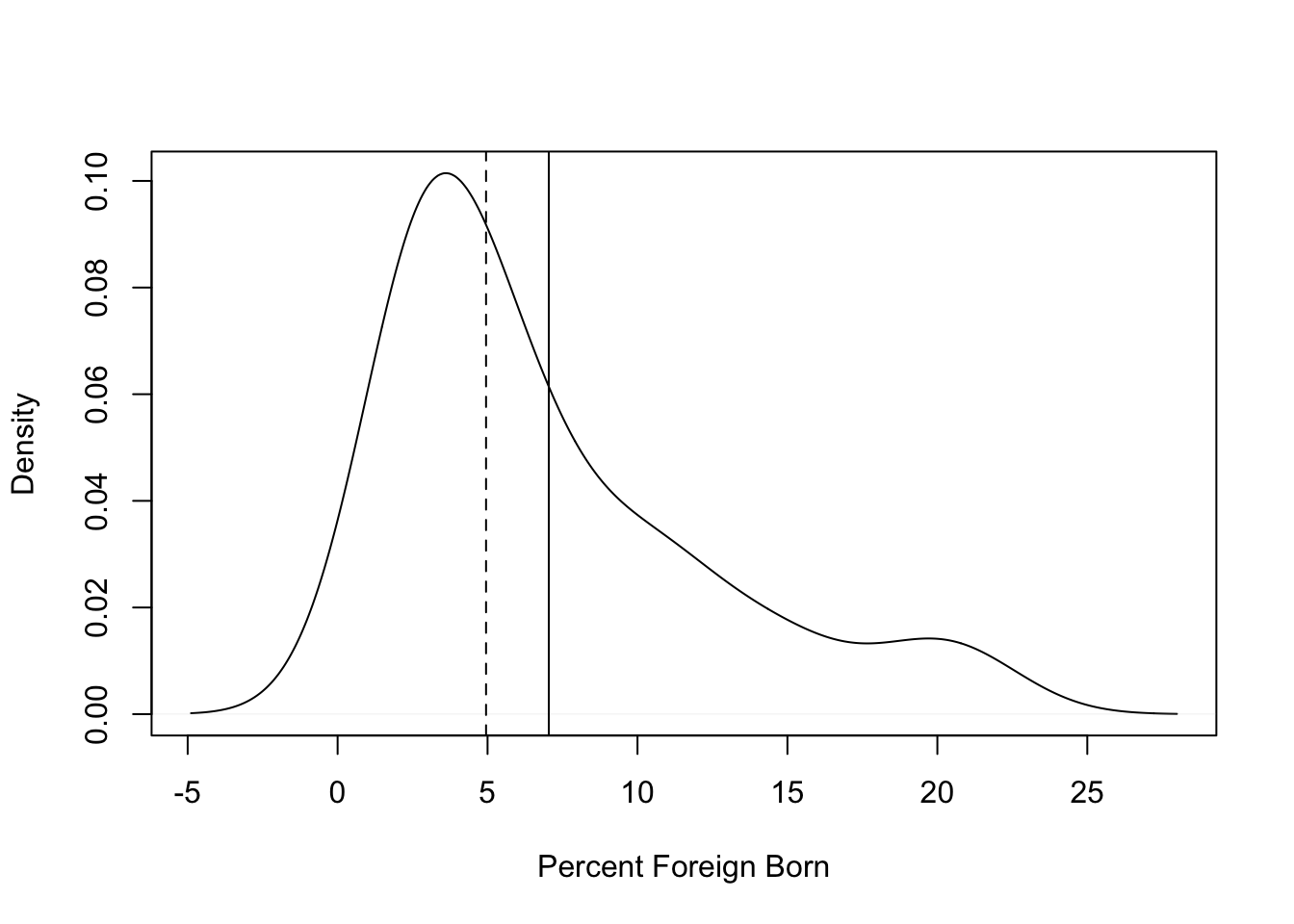
Finally, as a counterpoint to these skewed distributions, let’s take a look at the distribution of percent of the two-party vote for Joe Biden in the 2020 election:
[1] 48.8044[1] 49.725Here, there is very little difference between the mean and the median, and there appears to be almost no skewness in the shape of the density plot (below).
plot(density(states20$d2pty20),
     xlab="% of Two-Party Vote for Biden",
     main="")
abline(v=mean(states20$d2pty20))
abline(v=median(states20$d2pty20), lty=2)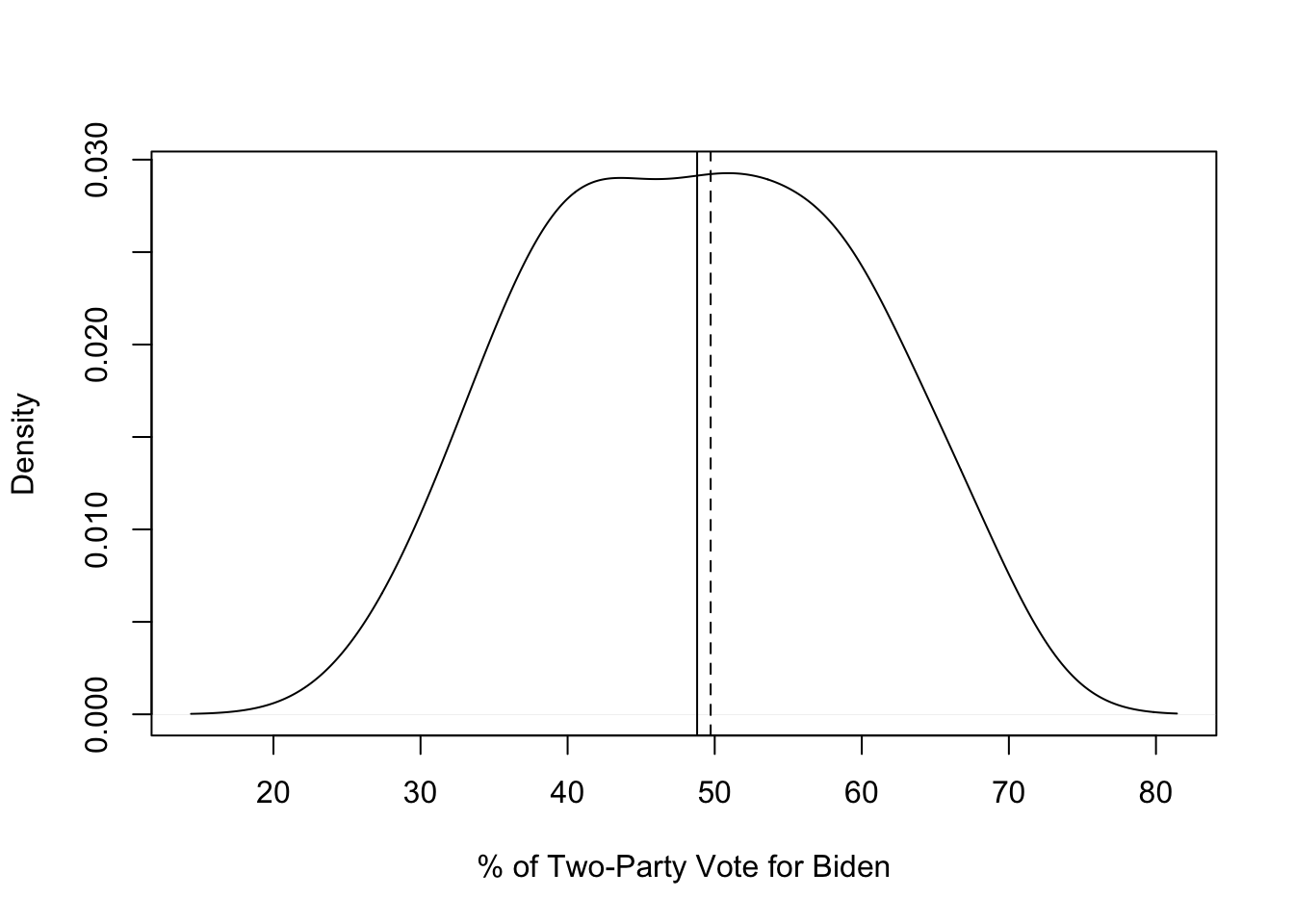
What’s interesting here is that the distance between the mean and median for Biden’s vote share (.92) is not terribly different than the distance between the mean and the median for the number of abortion laws (1.12). Yet there is not a hint of skewness in the distribution of votes, while there is clearly some negative skew to abortion laws. This, of course, is due to the difference in scale of the two variables. Abortion laws range from 1 to 13, while Biden’s vote share ranges from 27.5 to 68.3, so relative to the scale of the variable, the distance between the mean and median is much greater for abortion laws in the states than it for Biden’s share of the two-party vote in the states. This illustrates the real value of examining a numeric variable’s distribution with a histogram or density plot along side statistics like the mean and median. Graphs like these provide context for those statistics
5.6 Skewness Statistic
Fortunately, there is a skewness statistic that summarizes the extent of positive or negative skew in the data. There are several different methods for calculating skewness. The one used in R is based on the direction and magnitude of deviations from the mean, relative to the amount of variation in the data.14 The nice thing about the skewness statistic is that there are some general guidelines for evaluating the direction and seriousness of skewness:
- A value of 0 indicates no skew to the data.
- Any negative value of skewness indicates a negative skew, and positive values indicate positive skew.
- Values lower than -2 and higher than 2 indicate extreme skewness that could pose problems for operations that assume a relatively normal distribution.
Let’s look at the skewness statistics for the three variables discussed above.
[1] -0.3401058[1] 1.202639[1] 0.006792623These skewness statistics make a lot of sense, given the earlier discussion of these three variables. There is a little bit of negative skew (-.34) to the distribution of abortion restrictions in the states, a more pronounced level of (positive) skewness to the distribution of the foreign born population, and no real skewness in the distribution of Biden support in the states (.007). None of these results are anywhere near the -2,+2 cut-off points discussed earlier, so these distributions should not pose any problems for any analysis that uses these variables.
Quite often, you will be using variables whose distributions look a lot like the three shown above, maybe a bit skewed, but nothing too outrageous. Occasionally, though, you come across variables with severe skewness. One such “problem” variable from the 2020 ANES is anes20$V201628, which measures how many guns respondents reported owning. We get the mean and median for this variable below, and we can see that the mean (1.47) is greater than the median (0). We can glean a couple of things from this. First, since the median is 0, we know that at least half the respondents own no guns (if you look at a frequency table for this variable, you’ll see that 64.5% do not own guns). Second, because the mean is greater than the median, we can tell that the mean is being pulled from the middle of the distribution by some extreme observations at the high end of the x-axis.
[1] 1.469723[1] 0We can get a better sense of the distribution by looking at a density plot for this variable.
#Density plot for gun ownership variable
plot(density(anes20$V201628, na.rm=T),
     xlab="#Number of Guns Onwed by Respondent",
     main="")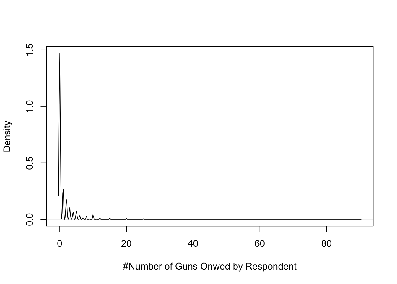
This plot shows an extreme level of positive skewness. In fact, this plot is a good illustration of how extreme skewness can get. The skewness statistic reported below (8.33) confirms what is apparent from the density plot, an extremely high level of skewness. In fact, this variable is so skewed that it would not make sense to use it in its current state. Instead, you might want to recode it into an ordinal variable (0 guns, 1 gun, 2-5, guns, more than five guns), or perhaps take the truncate the distribution at 20+ guns. Either way, a variable with a skewness problem like this is going to cause problems with a number of statistics.
[1] 8.338574In reality, most of the variables you look at will not be this severely skewed. However, had you only looked at the mean and median of the gun ownership, you might not have had any idea how skewed this variable was because the difference between the mean and median does not seem that great. This brings home a very important point: use as much information as you can to learn about the data. Even if you do not end up using the information when you present results, you should use it to make sure you understand what’s going on with the data.
5.7 Adding Legends to Graphs
Note that in the examples provided above, I used a solid vertical line for the mean and a dashed vertical line for the median. This was explained in the text, but there was no identifying information provided in the graphs themselves. When presenting information like this in a more formal setting (e.g., on the job, for an assignment, or for a term paper), it is usually expected that you provide a legend with your graphs that identifies what the lines represent (see figure 5.3 as an example). This can be a bit complex, especially if there are multiple lines in your graph. For our current purposes, however, it is not terribly difficult to add a legend.
We’re going to add the following line of code to the commands used to generate the plot for states20$fb to add a legend to the plot:
#Create a legend to be put in the top-right corner, identifying
#mean and median outcomes with solid and dashed lines, respectively
legend("topright", legend=c("Mean", "Median"), lty=1:2)
The first bit ("topright") is telling R where to place the legend in the graph. In this case, I specified topright because I know that is where there is empty space in the graph. You can specify top, bottom, left, right, topright, topleft, bottomright, or bottomleft, depending on where the legend fits the best. The second piece of information, legend=c("Mean", "Median"), provides names for the two objects we are identifying, and the last part, lty=1:2, tells R which line types to use in the legend (the same as in the graph). Let’s add this to the command lines for the density plot for states20$fb and see what we get.
plot(density(states20$fb),
     xlab="Percent Foreign Born",
     main="")
abline(v=mean(states20$fb))
abline(v=median(states20$fb), lty=2)
#Add the legend
legend("topright", legend=c("Mean", "Median"),  lty=1:2)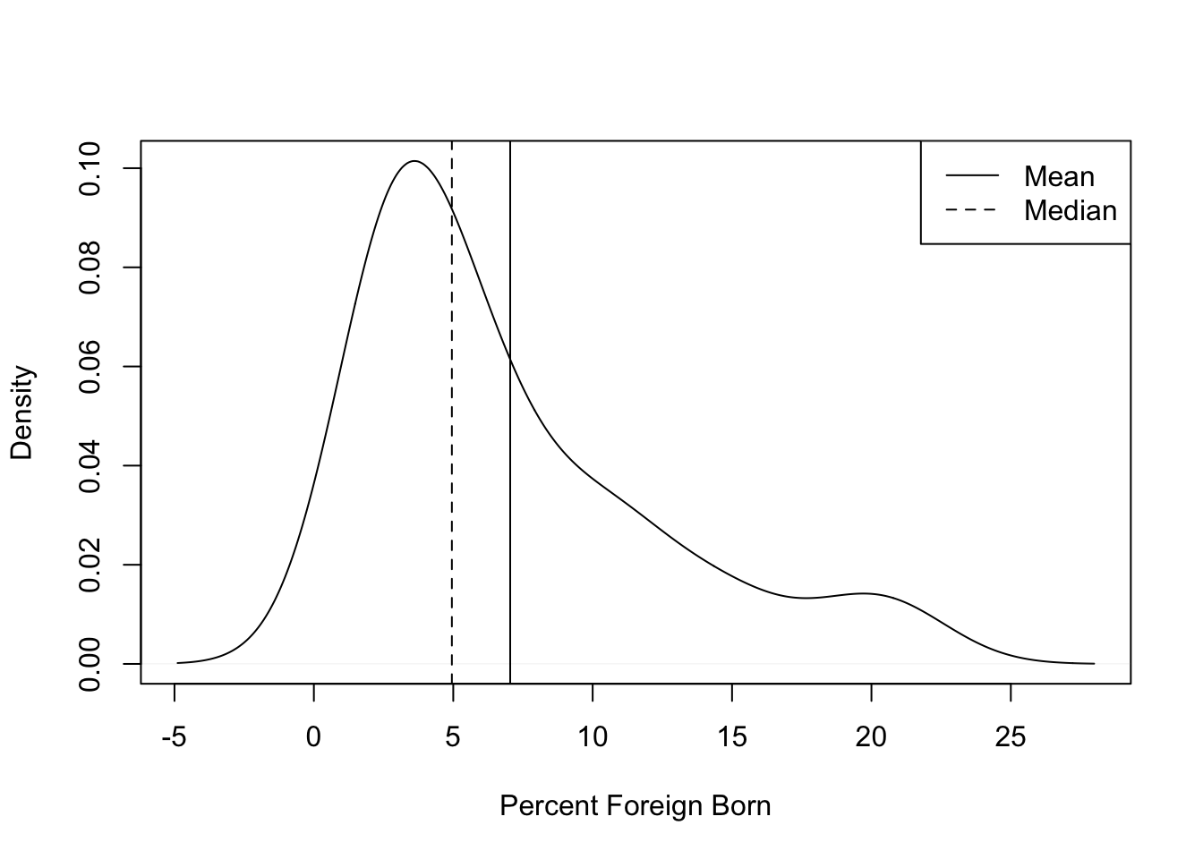
This extra bit of information fits nicely in the graph and aids in interpreting the pattern in the data.
Sometimes, it is hard to get the legend to fit well in a graph space. When this happens, you need to tinker a bit to get the legend to fit. There are a some fairly complicated ways to achieve this, but I favor trying a couple of simple things first: try different locations for the legend, reduce the number of words you use to name the lines, or add the cex command to reduce the overall size of the legend. When using cex, you might start with cex=.8, which will reduce the legend to 80% of its original size, and then change the value as needed to make the legend fit.
5.8 Next Steps
The next chapter builds on the discussion by focusing on something we’ve dealt with tangentially in this chapter: measuring variability in the data. Measures of central tendency are important descriptive tools, but they also form the building blocks for many other statistics, including measures of dispersion, which we take up in Chapter 6. Following that, we spend a bit of time on the more abstract topics of probability and statistical inference. These things might sound a bit intimidating to you, but you will be ready for them when we get there.
5.9 Assignments
5.9.1 Concepts and Calculations
As usual, when making calculations, show the process you used.
You might recognize this list of variables from the exercises at the end of Chapter 1. Identify what you think is the most appropriate measure of central tendency for each of these variables. Choose just one measure for each variable
- Course letter grade
- Voter turnout rate (votes cast/eligible voters)
- Marital status (Married, divorced, single, etc)
- Occupation (Professor, cook, mechanic, etc.)
- Body weight
- Total number of votes cast in an election
- #Years of education
- Subjective social class (Poor, working class, middle class, etc.)
- Poverty rate
- Racial or ethnic group identification
Below is a list of voter turnout rates in twelve Wisconsin Counties during the 2020 presidential election. Calculate the mean, median, and mode for the level of voter turnout in these counties. Which of these is the most appropriate measure of central tendency for this variable? Why? Based on the information you have here, is this variable skewed in either direction?
| Wisconsin County | % Turnout |
|---|---|
| Clark | 63 |
| Dane | 87 |
| Forrest | 71 |
| Grant | 63 |
| Iowa | 78 |
| Iron | 82 |
| Jackson | 65 |
| Kenosha | 71 |
| Marinette | 71 |
| Milwaukee | 68 |
| Portage | 74 |
| Taylor | 70 |
5.9.2 R Problems
As usual, show the R commands and output you used to answer these questions.
Use R to report all measures of central tendency that are appropriate for each of the following variables: The feeling thermometer rating for the National Rifle Association (
anes20$V202178), Latinos as a percent of state populations (states20$latino), party identification (anes20$V201231x), and region of the country where ANES survey respondents live (anes20$V203003). Where appropriate, also discuss skewness.Using one of numeric variables listed in question #3, create a density plot that includes vertical lines showing the mean and median outcomes, and add a legend. Describe what you see in the plot.
If you are interested in how the mean came to be used as a measure of “representativeness”, here is a short bit of intellectual history: https://priceonomics.com/how-the-average-triumphed-over-the-median/ ↩︎
For instance, a U-shaped distribution, or any number of multi-modal distributions could have no skewness.↩︎
\(Skewness=\frac{(x_{i}-\bar{x})^3}{n*{S^3}}\), where n= number of cases, and S=standard deviation↩︎