Injuries at Amazon Warehouses - A Bayesian Approach
Injuries and Low Base Counts
My friend, Andy Wheeler, just recently posted on his blog about reported injuries at Amazon warehouses. As he rightly points out, the apparent high number of injuries at these warehouses is primarily a function of the size of the locations. In criminology we often deal with similar issues (namely, why we use crime rates rather than raw counts when comparing geographies of different populations). While I don’t have much to add to Andy’s post, one thing did stand out to me - the issue of low base counts.
But note that I don’t think Bonded Logistics is a terribly dangerous place. One thing you need to watch out for when evaluating rate data is that places with smaller denominators (here lower total hours worked) tend to be more volatile.(“Injury Rates at Amazon Warehouses” 2022)
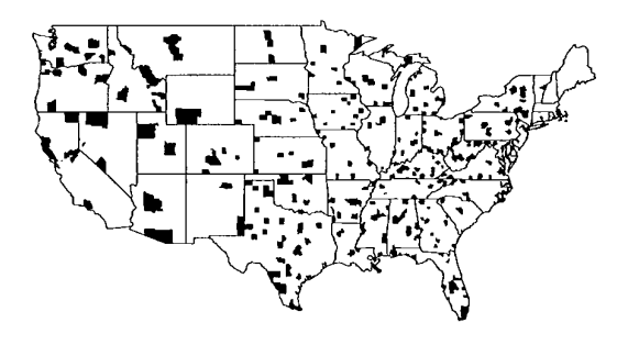
This is also a very common problem across many different disciplines. Andrew Gelman discusses the problem in this paper about issues arising from mapping county-level cancer rates. Similarly, he points out that very variable rates arise from very low sample sizes. For example: imagine a single murder occurs in the city of Union, CT. With a population of 854, that gives us a murder rate per 1,000 of \(\frac{1}{854} * 1,000 = 1.17\). This would potentially make it one of the highest-rate small towns in the state! Logically this doesn’t make sense, because rare events can happen - but it doesn’t imply a single region is especially unusual.
Hierarchical Models
All of this discussion made me think about some issues I had addressed when studying crime - namely rare events (homicides or shootings) that are aggregated to small areas (census blocks or street segments). In these previous examples I had applied hierarchical models to help adjust for these issues we commonly observe with rare events. Let’s work with the same data that Andy used in his example. First, we’ll load the OSHA data for 2021 and isolate just the warehouses in North Carolina.
library(tidyverse)
library(brms)
library(knitr)

# load osha data
osha <- read_csv(unzip("C:/Users/gioc4/Dropbox/blogs/hlm_osha/ITA-data-cy2021.zip"))

# isolate NC injuries at warehouses
inj_wh <- osha %>%
  filter(naics_code == '493110',
         state == 'NC') %>%
  mutate(inj_rate = (total_injuries/total_hours_worked)*2080)
If we plot the distribution of injury rates per-person work hour year we see that the majority of warehouses are quite low, and very few exceed 0.2. However on the far right we see a single extreme example - the outlier that is the Bonded Logistics warehouse.
Show code
ggplot(inj_wh) +
  geom_histogram(aes(x = inj_rate),
                 fill = "#004488",
                 color = "white",
                 bins = 20,
                 linewidth =1.5) +
  labs(x = "(total_injuries/total_hours_worked)*2080", y = "Count") +
  theme_minimal() +
  theme(axis.text = element_text(size = 12),
        axis.title = element_text(face = "bold"))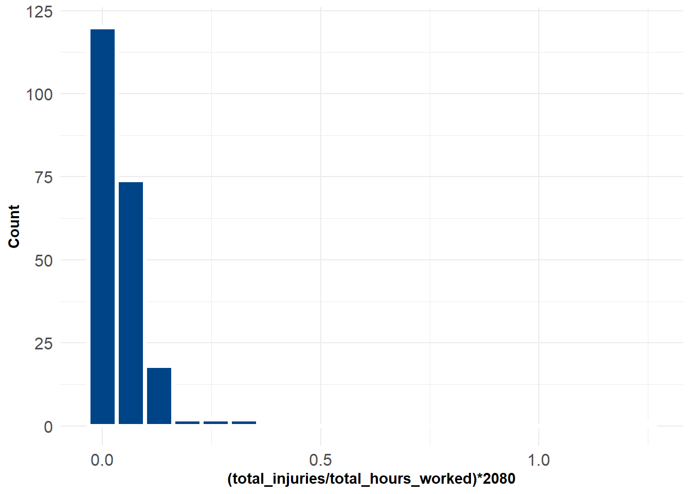
Sorting by the top 10 we see that Bonded Logistics has an injury rate nearly 4 times the next highest warehouse. But they also have only a single employee who worked 1,686 hours that year! Is this really a fair comparison? Following what we already know, almost certainly not.
Show code
inj_wh %>%
  select(company_name, inj_rate, annual_average_employees, total_hours_worked) %>%
  arrange(desc(inj_rate)) %>%
  slice(1:10) %>%
  kable(caption = "Top 10 Warehouses, by Injury Rate",
        digits = 2,
col.names = c("Company","Injury Rate","Employees","Total Hours Worked"))| Company | Injury Rate | Employees | Total Hours Worked |
|---|---|---|---|
| Bonded Logistics | 1.23 | 1 | 1686 |
| Technimark | 0.34 | 4 | 6154 |
| Bonded Logistics | 0.30 | 4 | 6913 |
| CAPSTONE LOGISTICS, LLC | 0.29 | 36 | 43137 |
| RH US LLC | 0.27 | 7 | 7703 |
| Aldi (N.C.) L.L.C. | 0.22 | 385 | 569274 |
| Brame Specialty Company Inc | 0.17 | 6 | 12513 |
| Conn Appliances Inc | 0.16 | 15 | 26634 |
| Blue Line Distribution | 0.16 | 31 | 53287 |
| Tosca Services, LLC | 0.16 | 41 | 66891 |
To address this issue, we’ll fit a (very) simple Bayesian hierarchical linear model where we give each warehouse its own intercept. We then partially pool estimates from the model toward the group-level means. In short, we’ll model this as the number of injuries \(y\) at each warehouse \(j\) as a Poisson process, where each warehouse is modeled with its own (varying) intercept. In a minute we will see the advantage of this.
\[y_{j} \sim Poisson(\lambda_{j})\]
\[ln(\lambda{j}) = \beta_{0j}\]
Using brms we’ll fit a Poisson regression estimating the total number of injuries at any warehouse weighted by the logged number of hours worked. Because the model is extremely simple, we’ll just keep the default priors with this model which are student_t(3,0,3).
# fit the hierarchical model w/ default priors

fit <- brm(total_injuries ~ 1 + (1|id) +
             offset(log(total_hours_worked)),
           family = poisson(),
           data = inj_wh,
           file = "C:/Users/gioc4/Dropbox/blogs/hlm_osha/brmfit",
           chains = 4, cores = 4, iter = 2000)
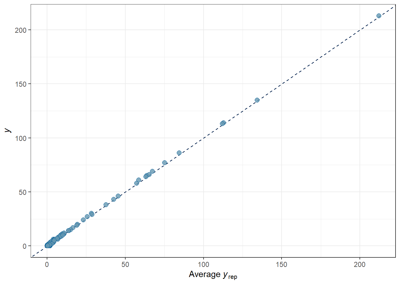
After the model fits, it’s generally a good idea to make sure the predictions from the model correspond with the observed distribution of the data. Our posterior predictive checks show that we have fairly well captured the observed process, with our posterior simulations \(\hat{y}\) largely in line with the observed \(y\).
Show code
pp_check(fit, "hist") + theme_bw()

pp_check(fit, "scatter_avg") + theme_bw()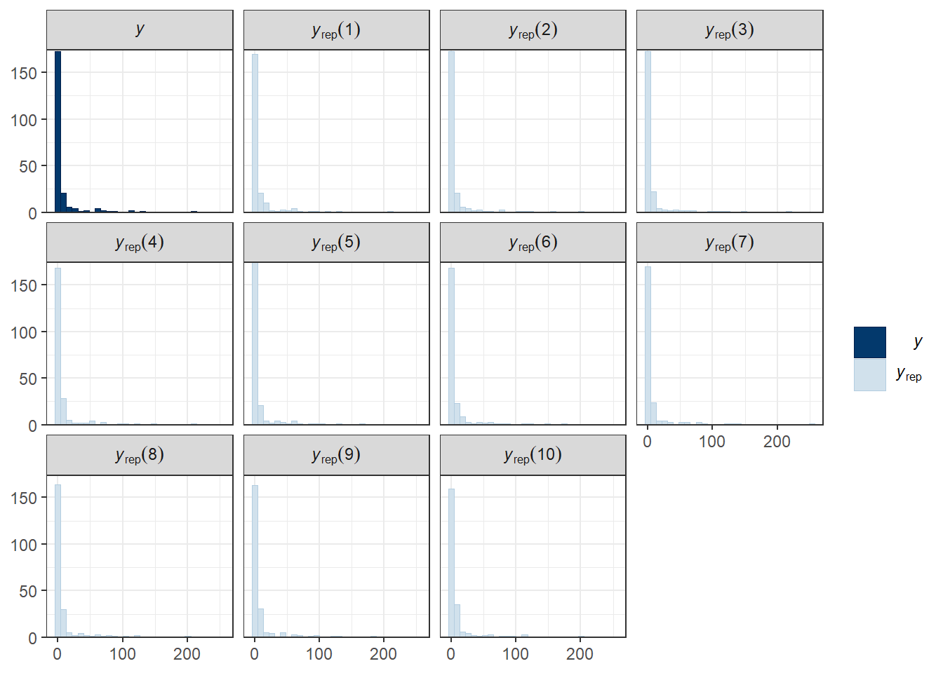
Shrinkage!
Here’s where things get interesting. One of the benefits of a hierarchical model is that estimates from the model are partially pooled (shrunk) toward the group-level means. In a typical no-pooling model, estimates from very sparse clusters can be extreme or even undefined. In our hierarchical example we are applying regularization to the estimates by trading higher bias for lower variance(Gelman et al. 1995). In a Bayesian framework our application of a prior distribution helps set a reasonable boundary for our model estimates.
To illustrate this, we can see the difference between the predicted (blue circles) and observed (empty circles) below. For warehouses with very few worked hours we see that the estimates are pulled strongly toward the global mean. For warehouses with more hours, however, there is considerably less shrinkage.
Show code
# predicted vs actual
inj_wh_pred <- inj_wh %>%
  select(id, company_name, inj_rate, annual_average_employees, total_hours_worked) %>%
  mutate(yhat = predict(fit, type = 'response')[,1],
         inj_rate_pred = (yhat/total_hours_worked) * 2080)

# Plot all values
ggplot(inj_wh_pred, aes(x = total_hours_worked)) +
  geom_hline(yintercept = mean(inj_wh_pred$inj_rate), linewidth = 1, color = "#004488", alpha = .7)+
  geom_point(aes(y = inj_rate), shape = 21, size = 2)+
  geom_point(aes(y = inj_rate_pred), shape = 21, fill = "#004488", size = 2, alpha = .5) +
  labs(x = "Total Hours Worked", y = "Total Injuries/Hours Worked") +
  theme_minimal() +
  theme(axis.text = element_text(size = 12),
        axis.title = element_text(face = "bold"))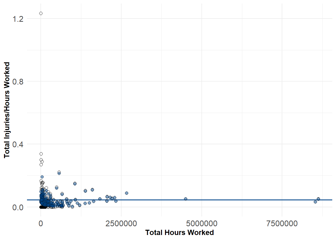
If we constrain ourselves to the left-hand side of the plot we can view this even more clearly. The estimated value for the unusual Bonded Warehouse is 0.1 compared to the observed value of 1.23. While this estimate is farther off from the observed value, it is probably much more reasonable based on the observed values of other warehouses.
Show code
inj_wh_pred %>%
  filter(total_hours_worked < 1e5) %>%
  ggplot(aes(x = total_hours_worked)) +
  geom_hline(yintercept = mean(inj_wh_pred$inj_rate), linewidth = 1, color = "#004488", alpha = .7)+
  geom_point(aes(y = inj_rate), shape = 21, size = 2)+
  geom_point(aes(y = inj_rate_pred), shape = 21, fill = "#004488", size = 2, alpha = .5) +
  labs(x = "Total Hours Worked", y = "Total Injuries/Hours Worked") +
  theme_minimal() +
  theme(axis.text = element_text(size = 12),
        axis.title = element_text(face = "bold"))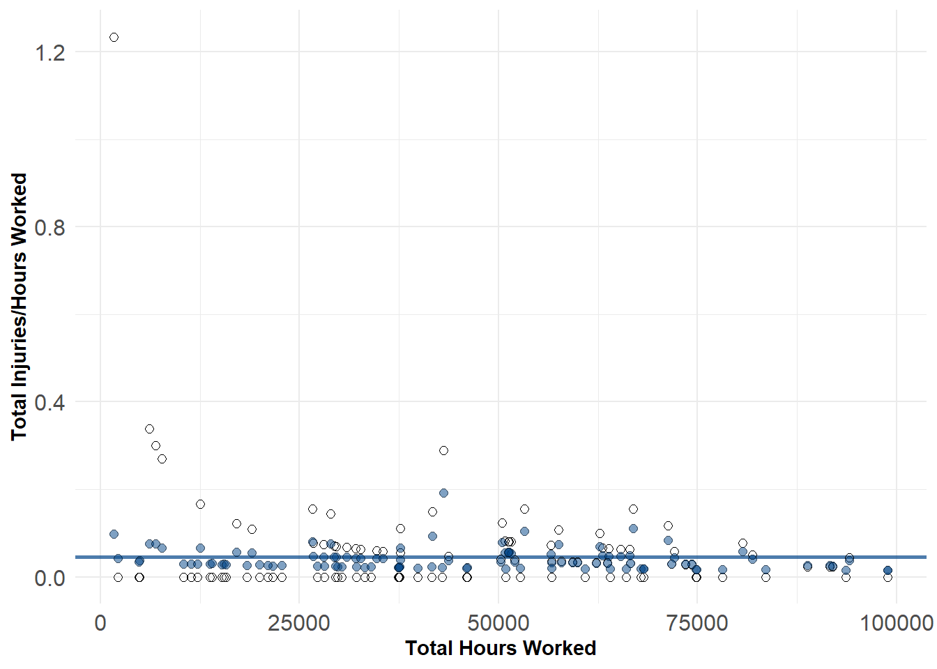
If we compare the predicted injury rates to the observed ones, we can see the differences in shrinkage as well. Larger warehouses have estimates quite close to the observed counts (like The Aldi warehouse which has a relatively high rate of injuries for its size).
inj_wh_pred %>%
  select(company_name, inj_rate, inj_rate_pred, annual_average_employees, total_hours_worked) %>%
  arrange(desc(inj_rate)) %>%
  slice(1:10) %>%
  kable(caption = "Top 10 Warehouses, by Injury Rate",
        digits = 2,
col.names = c("Company","Injury Rate","(Pred) Injury Rate", "Employees","Total Hours Worked"))| Company | Injury Rate | (Pred) Injury Rate | Employees | Total Hours Worked |
|---|---|---|---|---|
| Bonded Logistics | 1.23 | 0.10 | 1 | 1686 |
| Technimark | 0.34 | 0.08 | 4 | 6154 |
| Bonded Logistics | 0.30 | 0.08 | 4 | 6913 |
| CAPSTONE LOGISTICS, LLC | 0.29 | 0.19 | 36 | 43137 |
| RH US LLC | 0.27 | 0.07 | 7 | 7703 |
| Aldi (N.C.) L.L.C. | 0.22 | 0.21 | 385 | 569274 |
| Brame Specialty Company Inc | 0.17 | 0.07 | 6 | 12513 |
| Conn Appliances Inc | 0.16 | 0.08 | 15 | 26634 |
| Blue Line Distribution | 0.16 | 0.10 | 31 | 53287 |
| Tosca Services, LLC | 0.16 | 0.11 | 41 | 66891 |