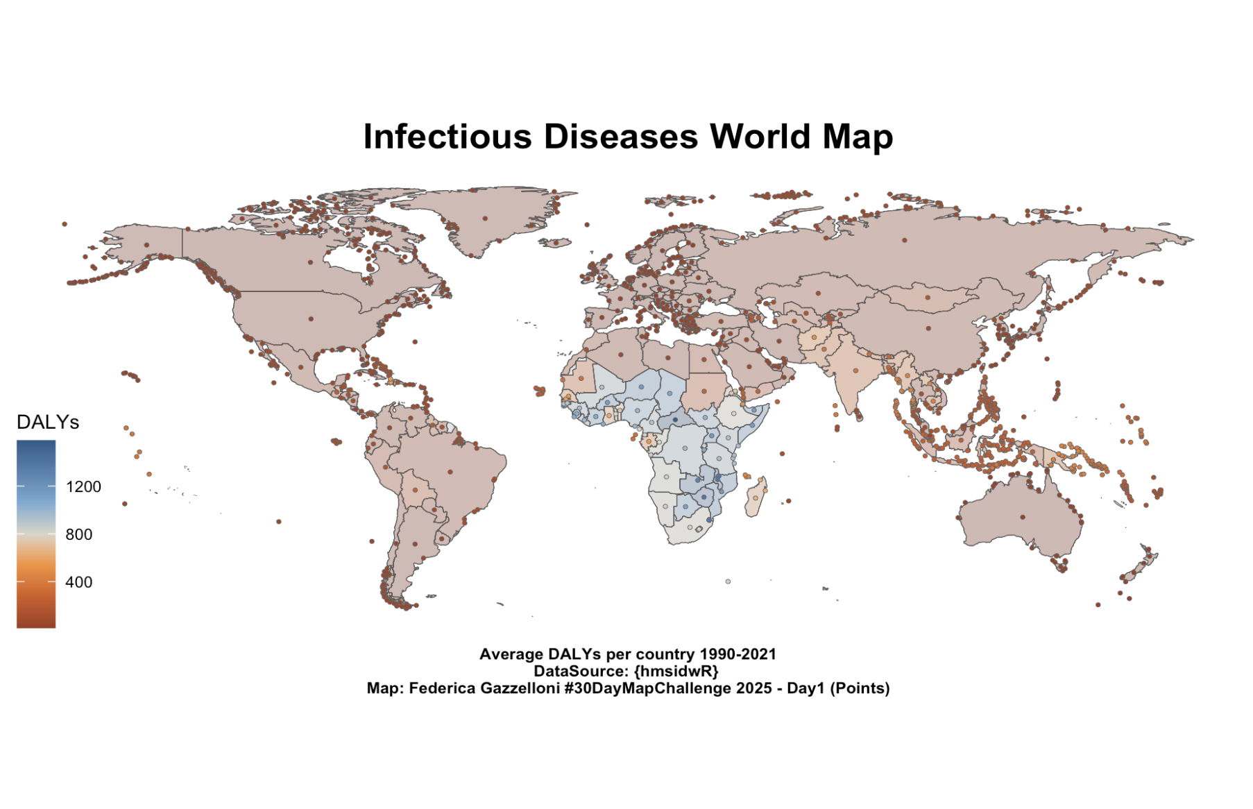
Infectious Diseases World Map - Average DALYs per country 1990-2021
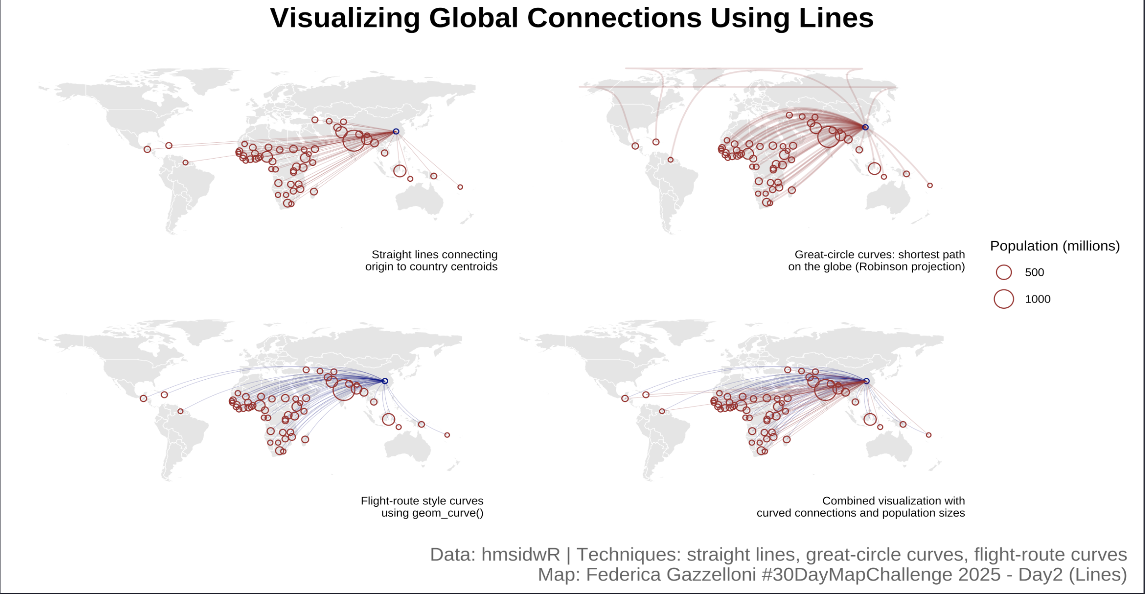
Visualizing Global Connections Using Lines
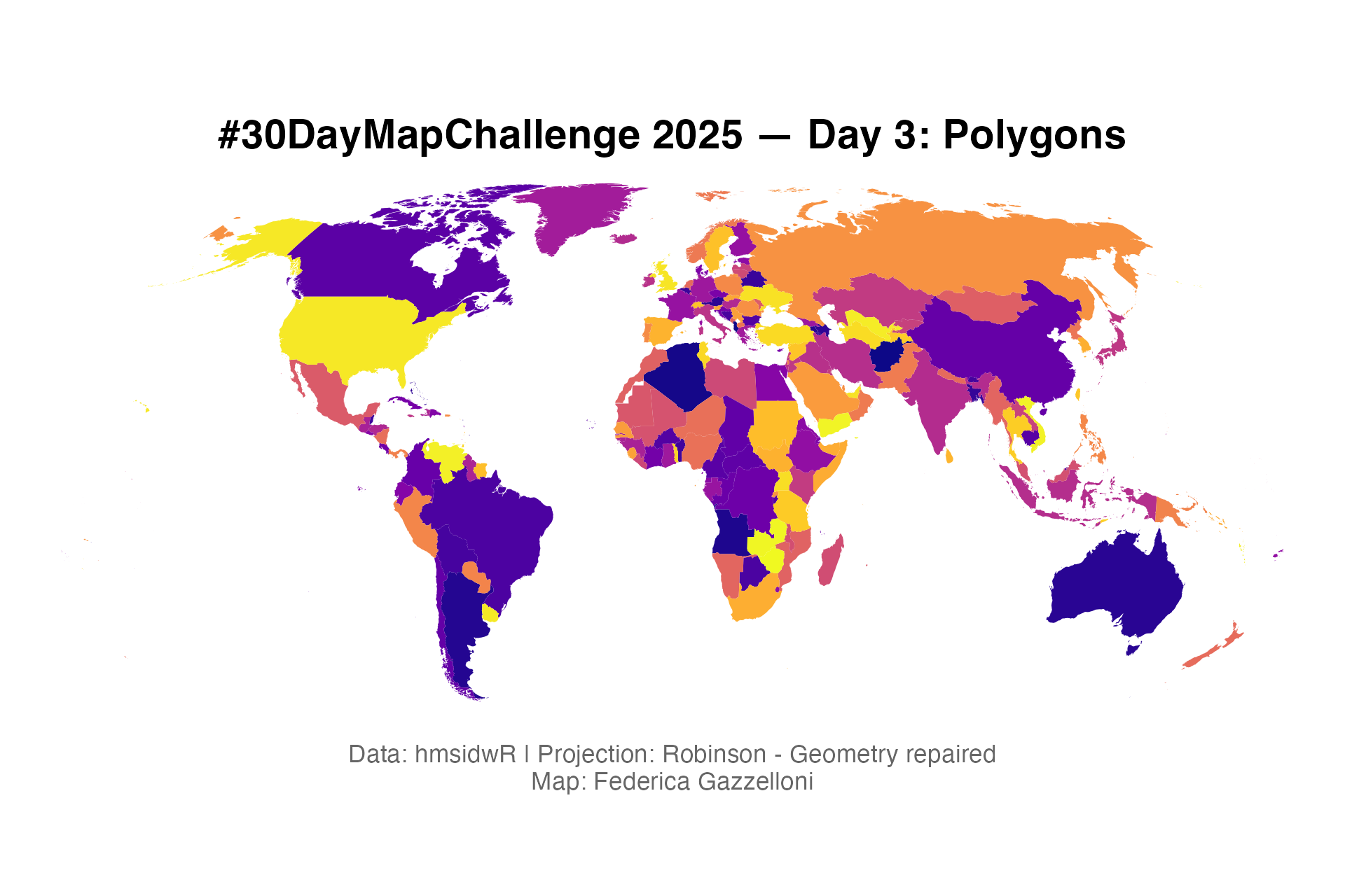
Working with polygons and global projections
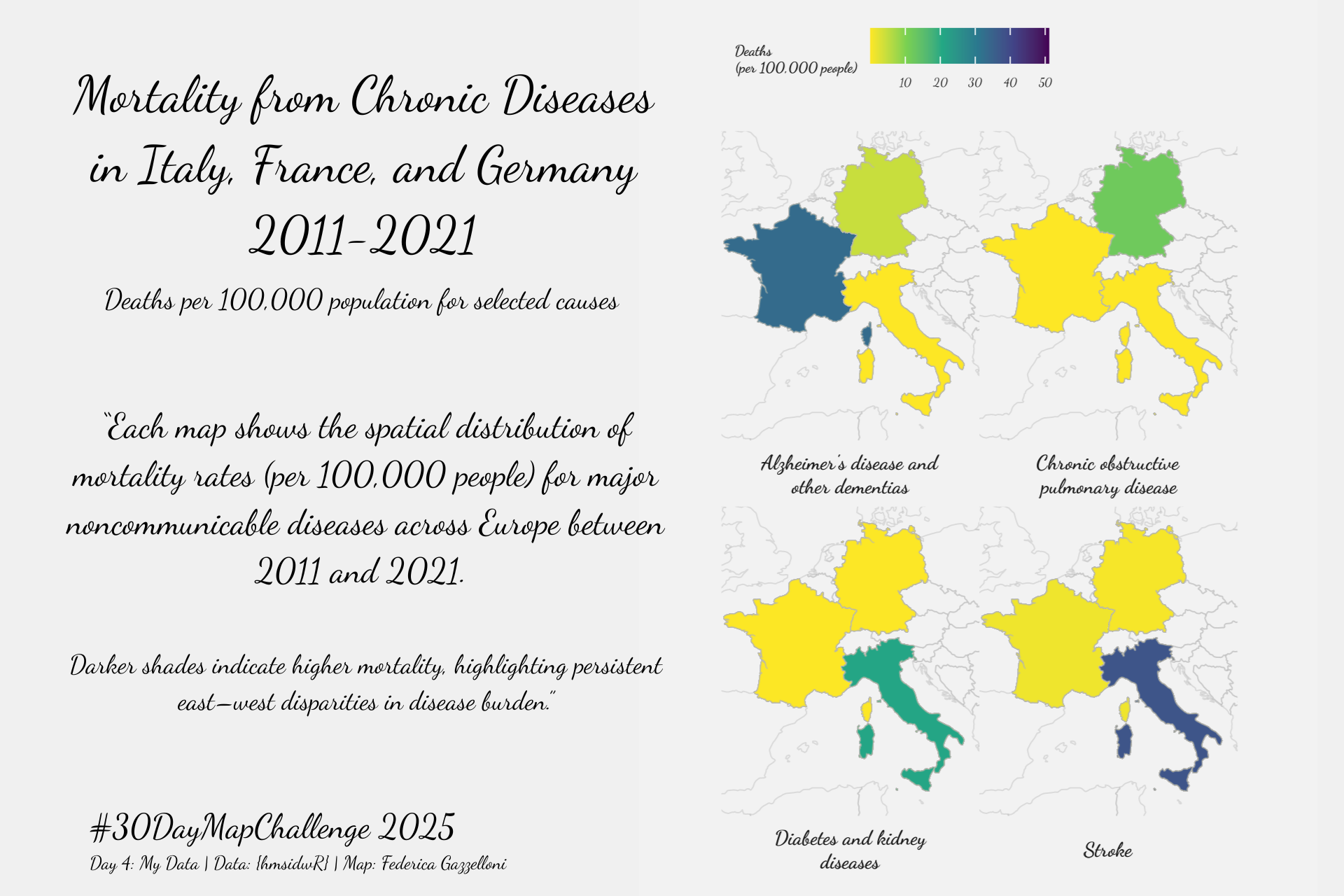
This map compares mortality rates across Italy, France, and Spain for four leading causes of death — Alzheimer’s disease and other dementias, chronic obstructive pulmonary…
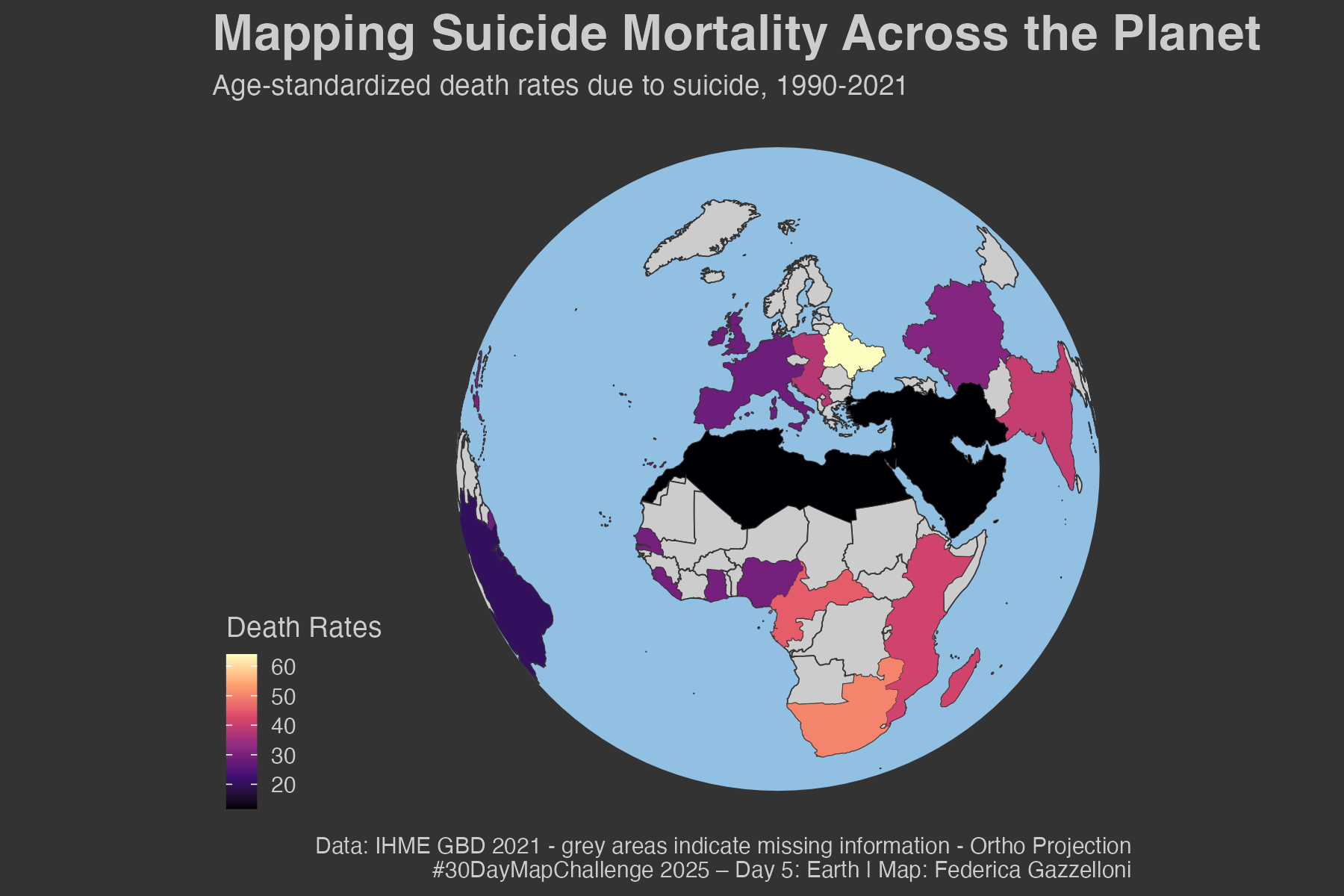
Mapping Suicide Mortality Across the Planet, Age-standardized death rates due to suicide, 1990-2021
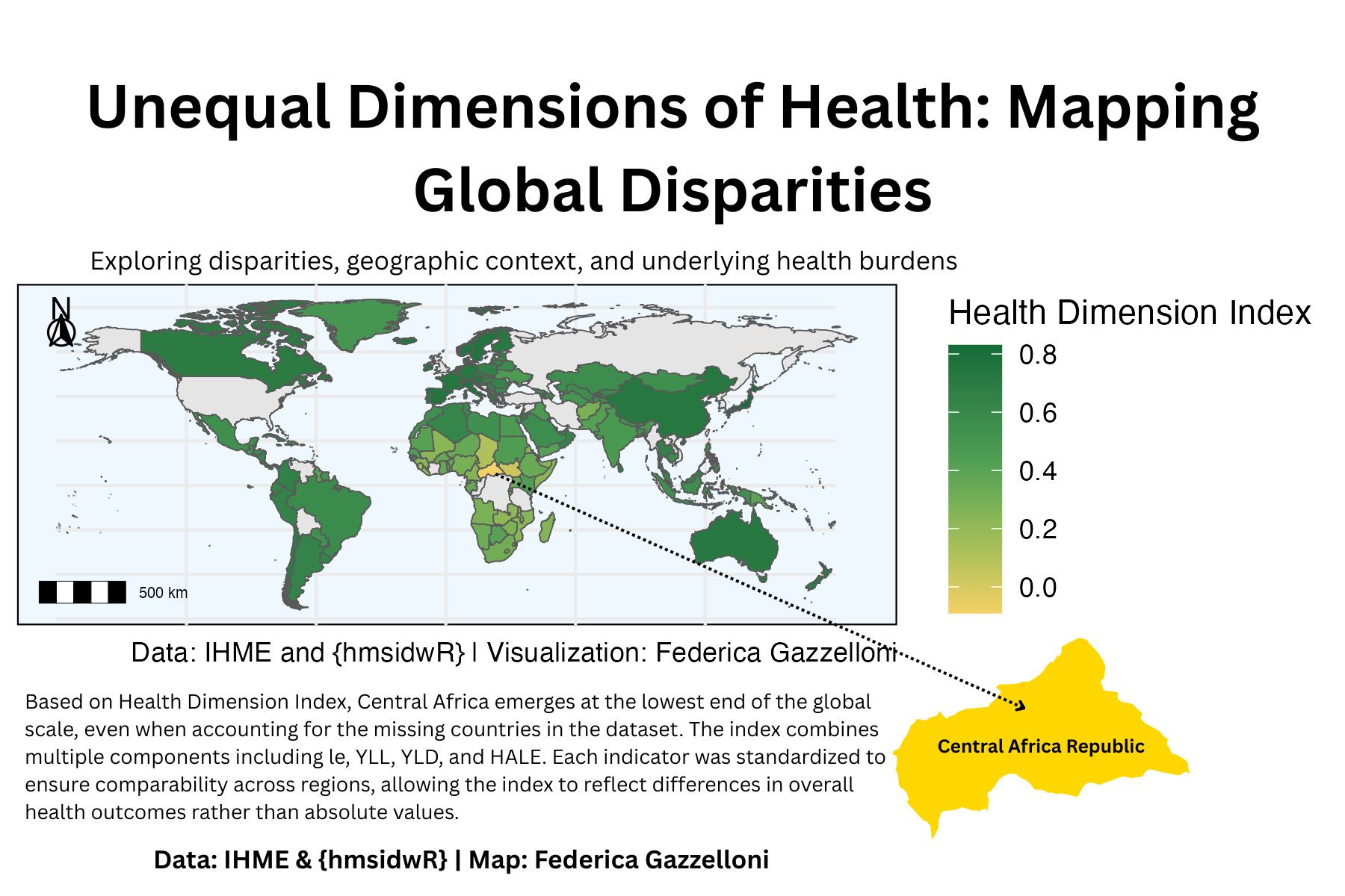
Exploring multidimensional health data through a composite index combining life expectancy, HALE, YLL, and YLD.
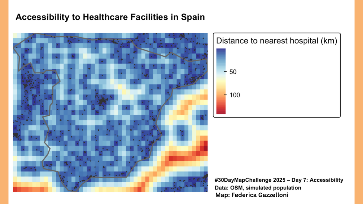
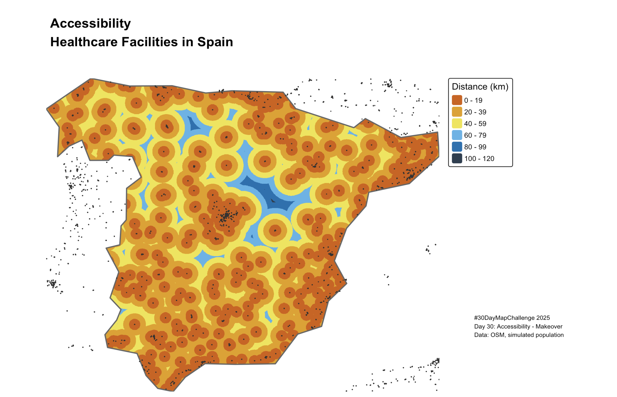
Exploring accessibility to healthcare facilities across Spain, highlighting spatial inequalities in travel time.
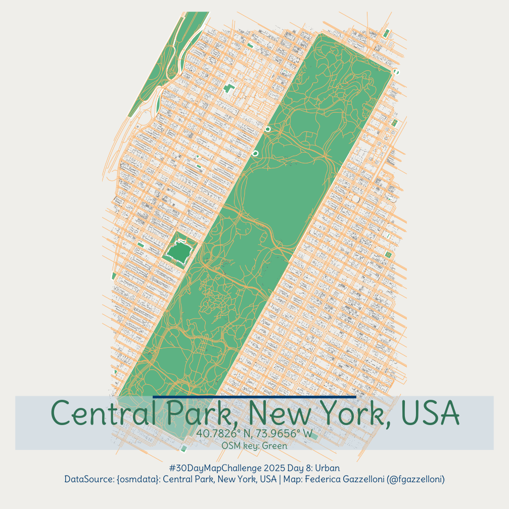
This map explores the heart of New York City — a view of buildings, roads, and parks around Central Park, blending the city’s structure and green spaces.
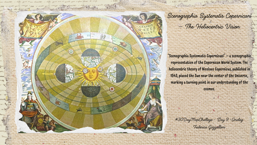
“Scenographia Systematis Copernicani” — a scenographic representation of the Copernican World System. The heliocentric theory of Nicolaus Copernicus, published in 1543…
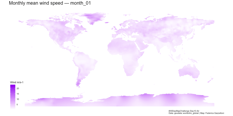
Exploring global wind speed patterns using WorldClim data and R
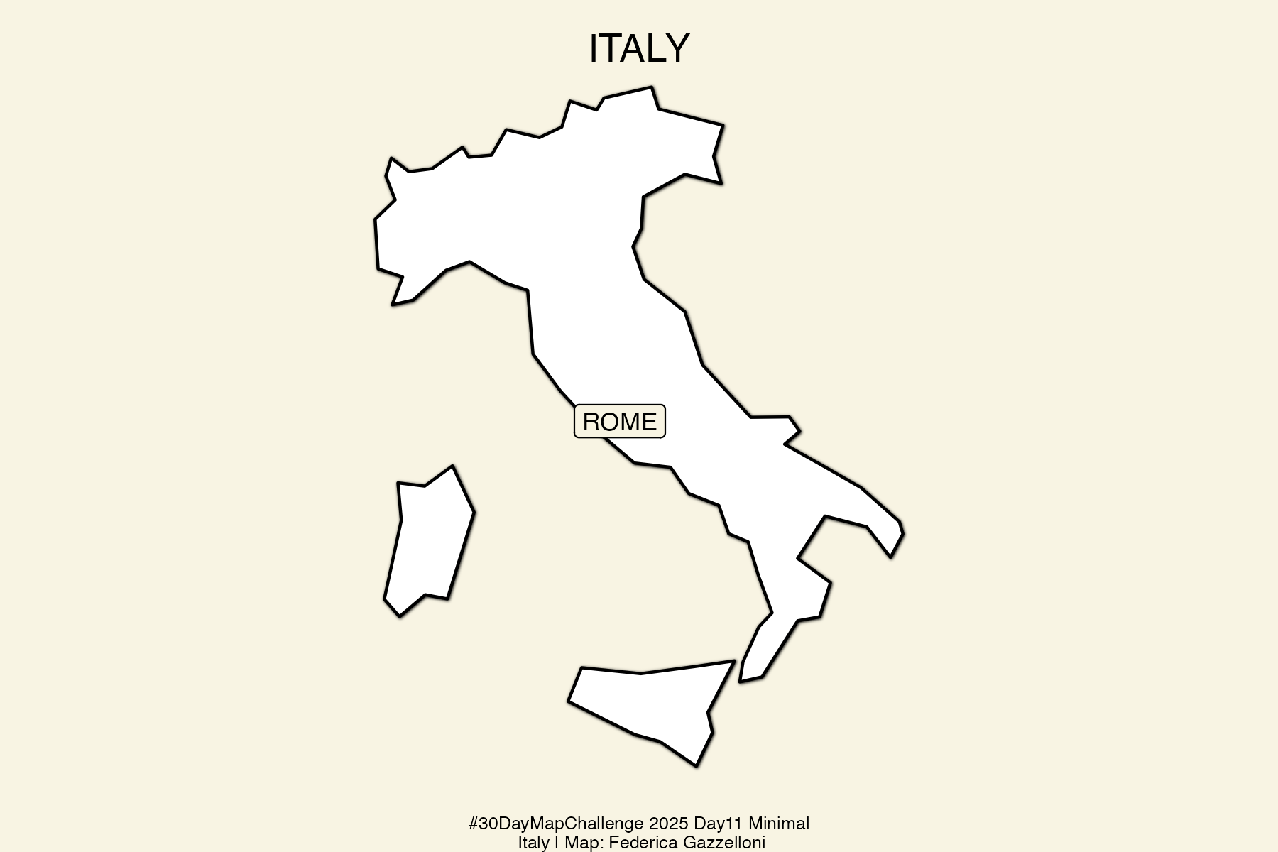
A minimalist map of Italy created using sf and ggplot2 with soft tones and a single city highlighted.
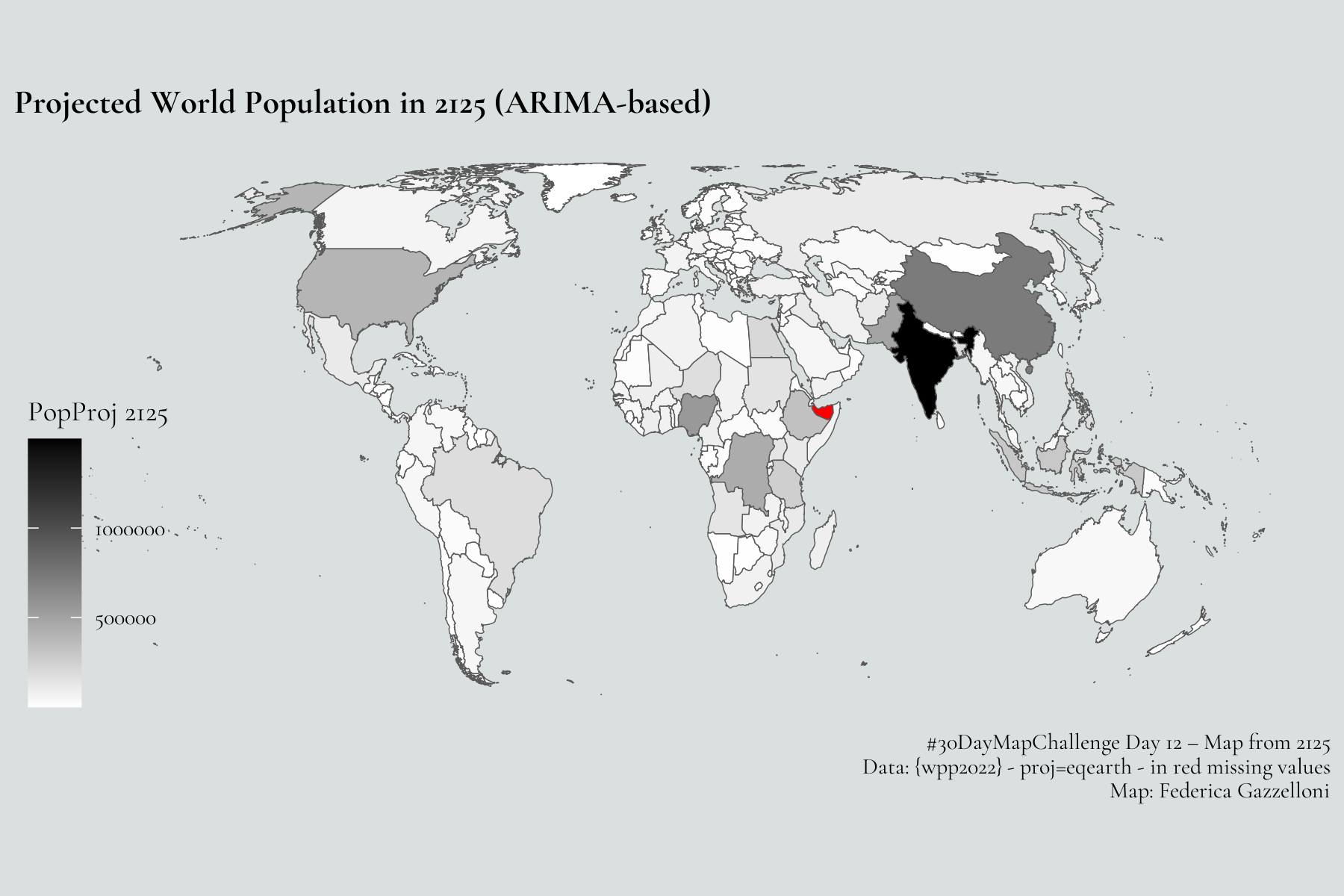
World’s population a century from now
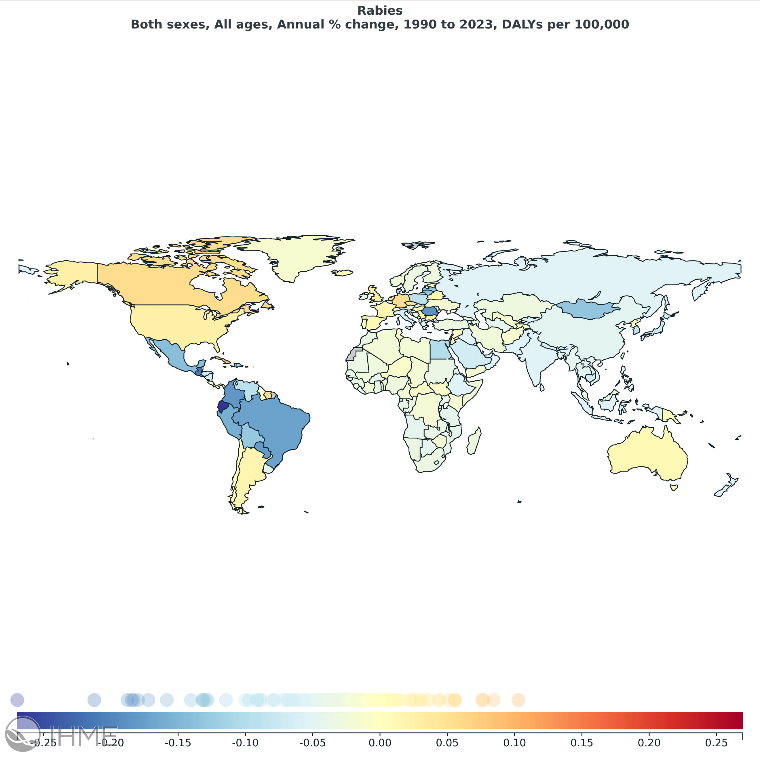
Changes in Disability-Adjusted Life Years (DALYs) attributable to rabies between 1990 and 2023
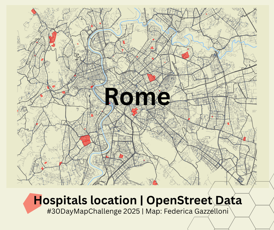
Rome Hospitals location
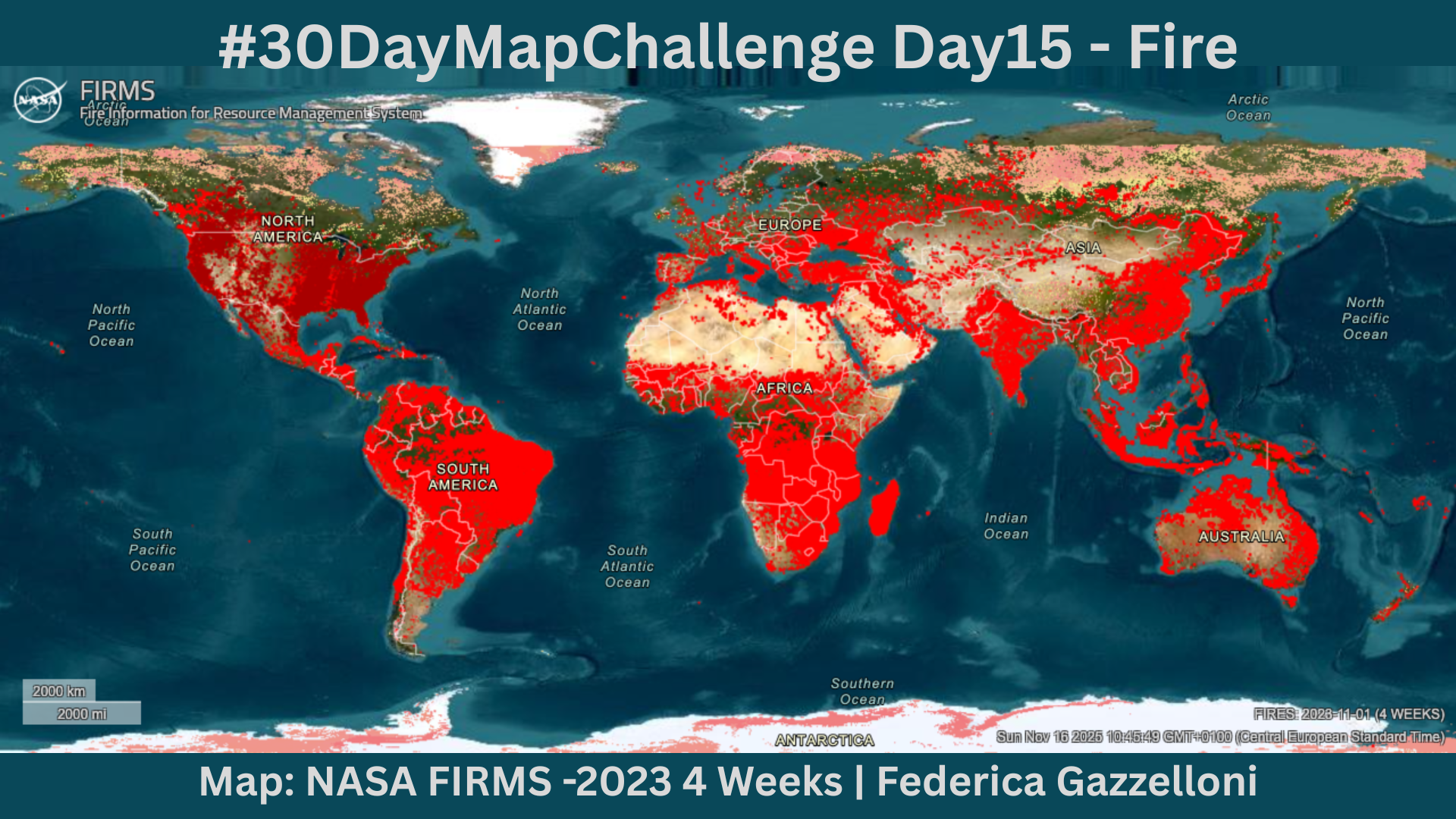
FIRMS hotspots
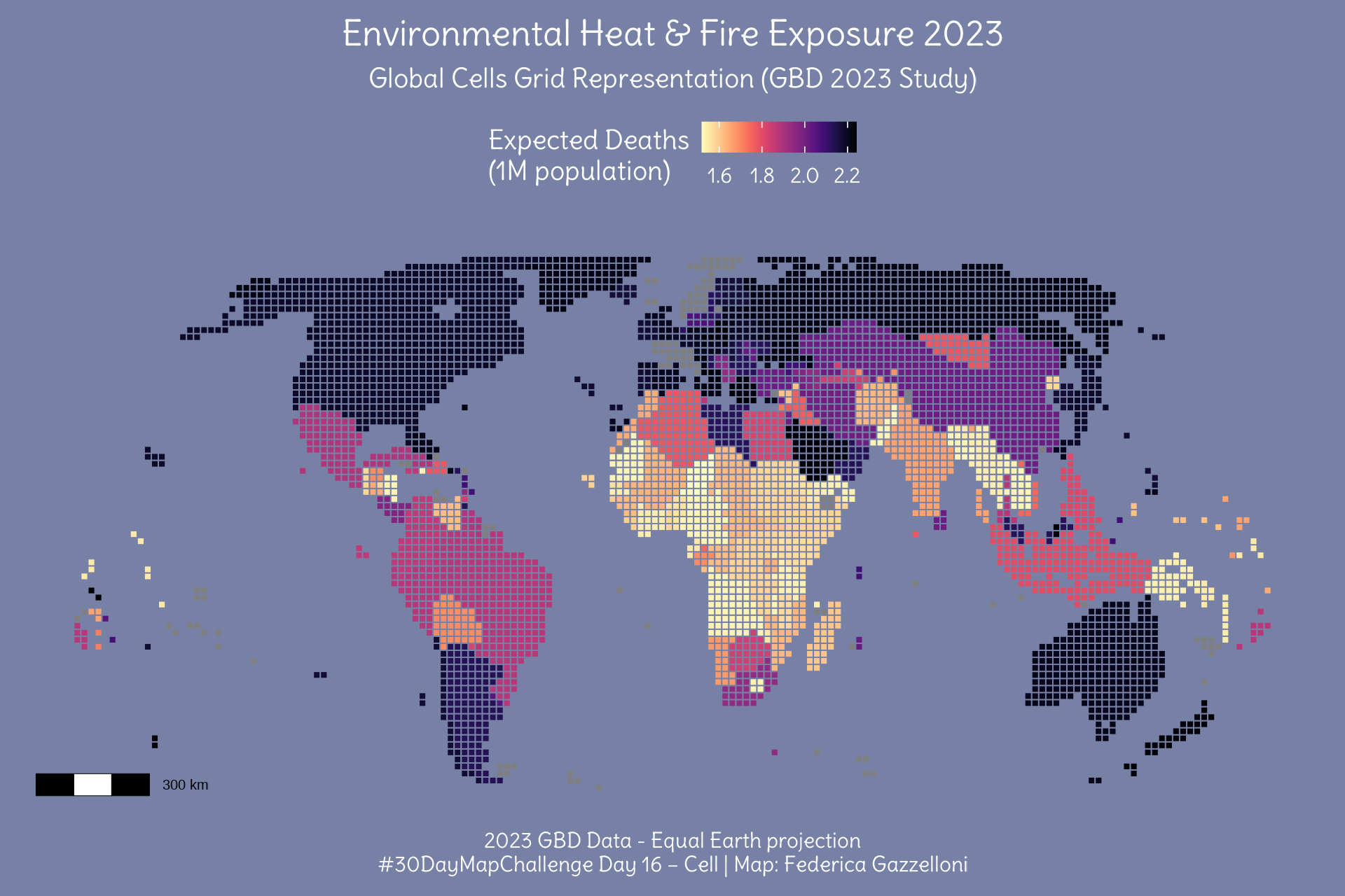
Global map of expected deaths per 1M population due to Environmental Heat & Fire, using GBD 2023 data
Change Data - Yearly AVG Temp at Weather Stations.
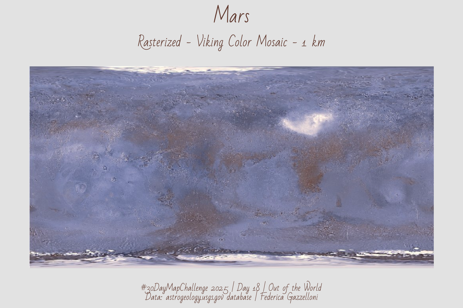
Mapped Mars today using the Viking global mosaic from NASA/USGS. Rebuilt the extent in R and plotted the planet in a clean equirectangular view.
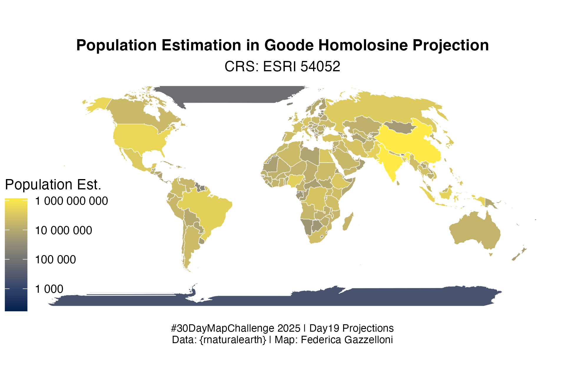
Population Estimation in Goode Homolosine Projection
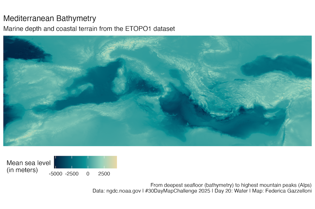
ETOPO1 Ice Surface Global Relief Model (specifically the “Ice Surface” version, grid-registered GeoTIFF)
Earthquakes Yearly Average Magnitude 6+ (1900–2013)
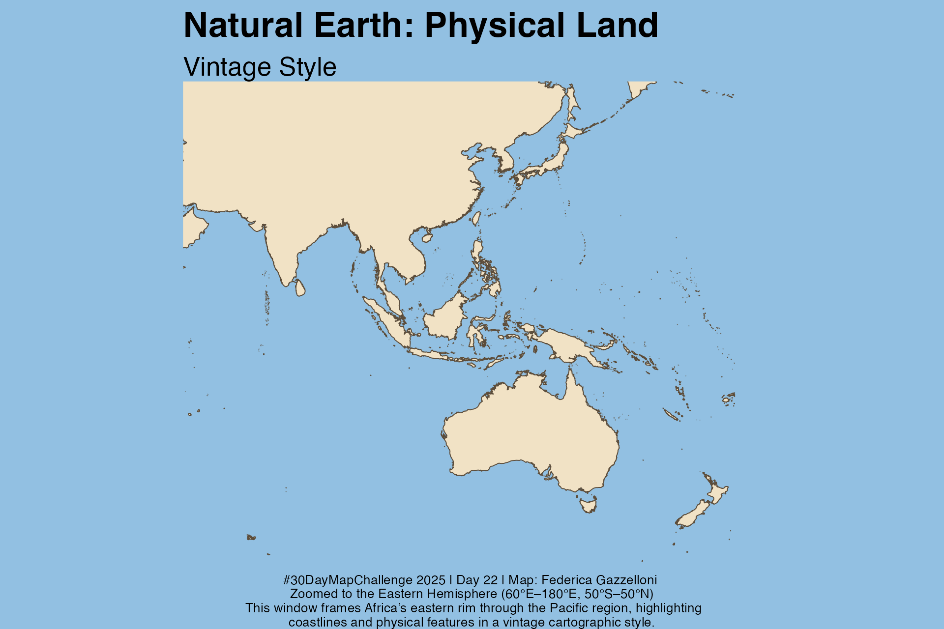
Eastern Hemisphere: This window frames Africa’s eastern rim through the Pacific region, highlighting coastlines and physical features in a vintage cartographic style.
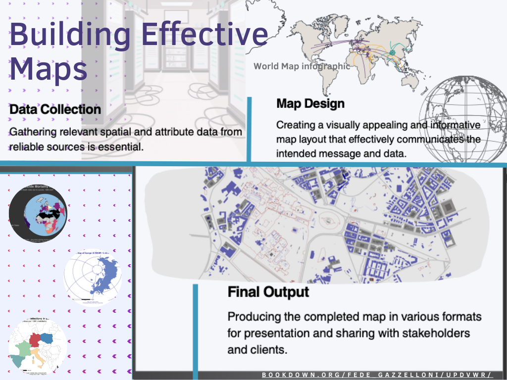
Mapping Process: from data collection to visualization
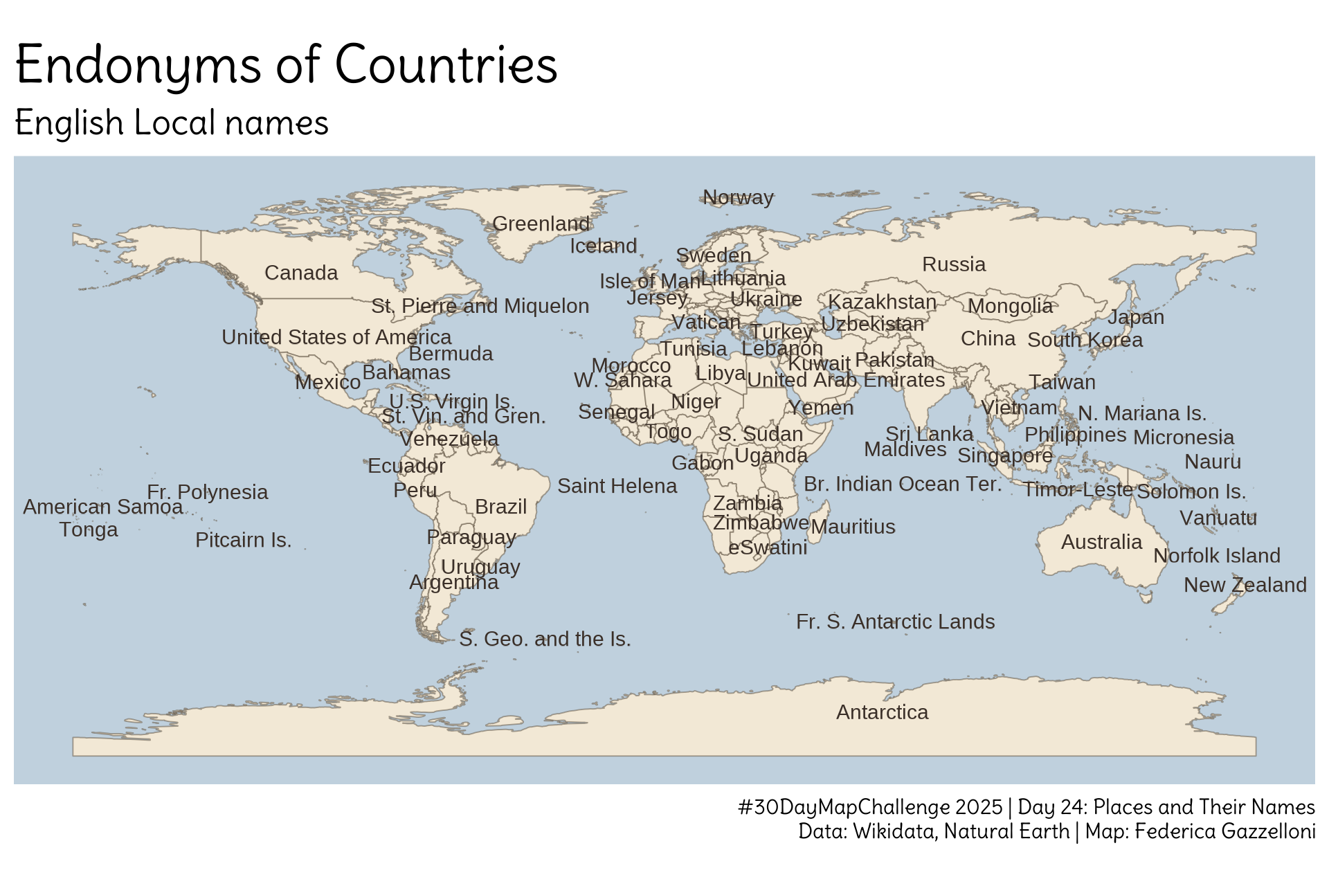
Places and their Names: A map showcasing various locations and their names around the world.
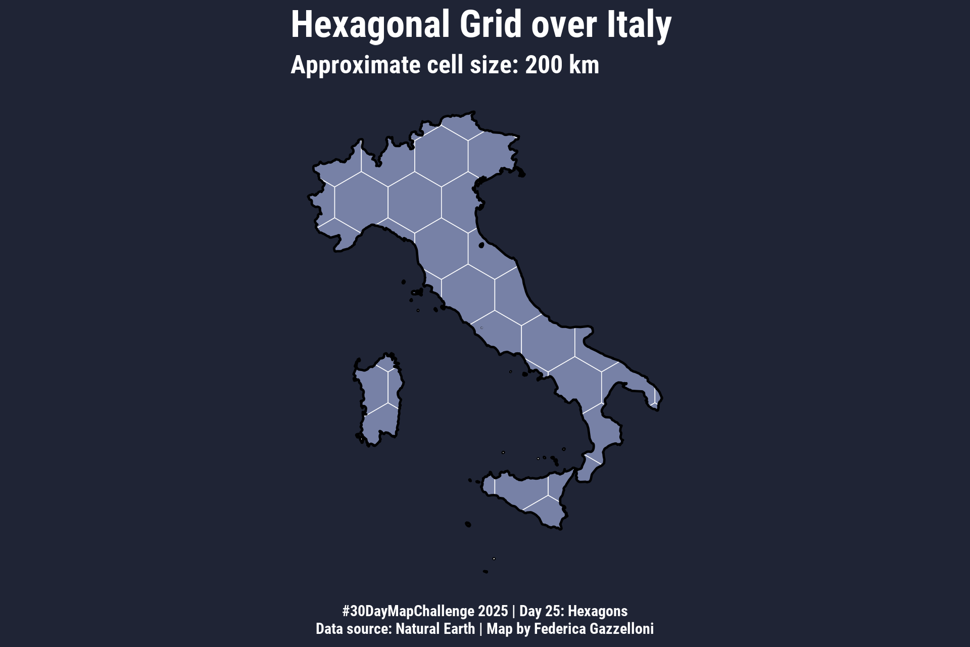
Italy in hexagons: a different perspective on the map
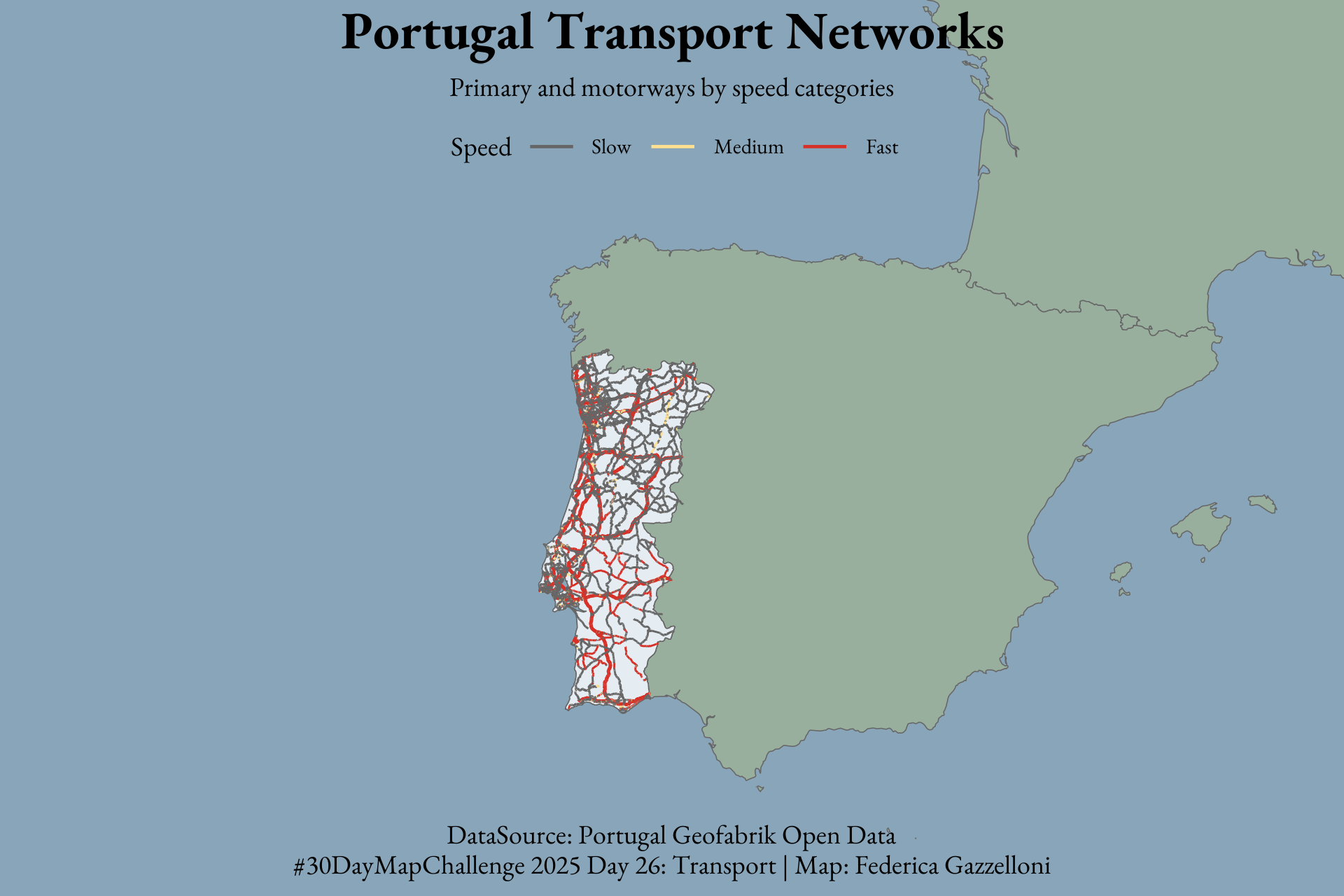
Portugal Transport Networks: Primary and motorways by speed categories
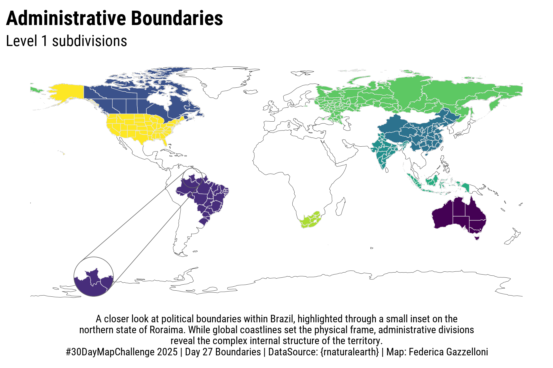
Administrative boundaries map focusing on Brazil with an inset on Roraima state.
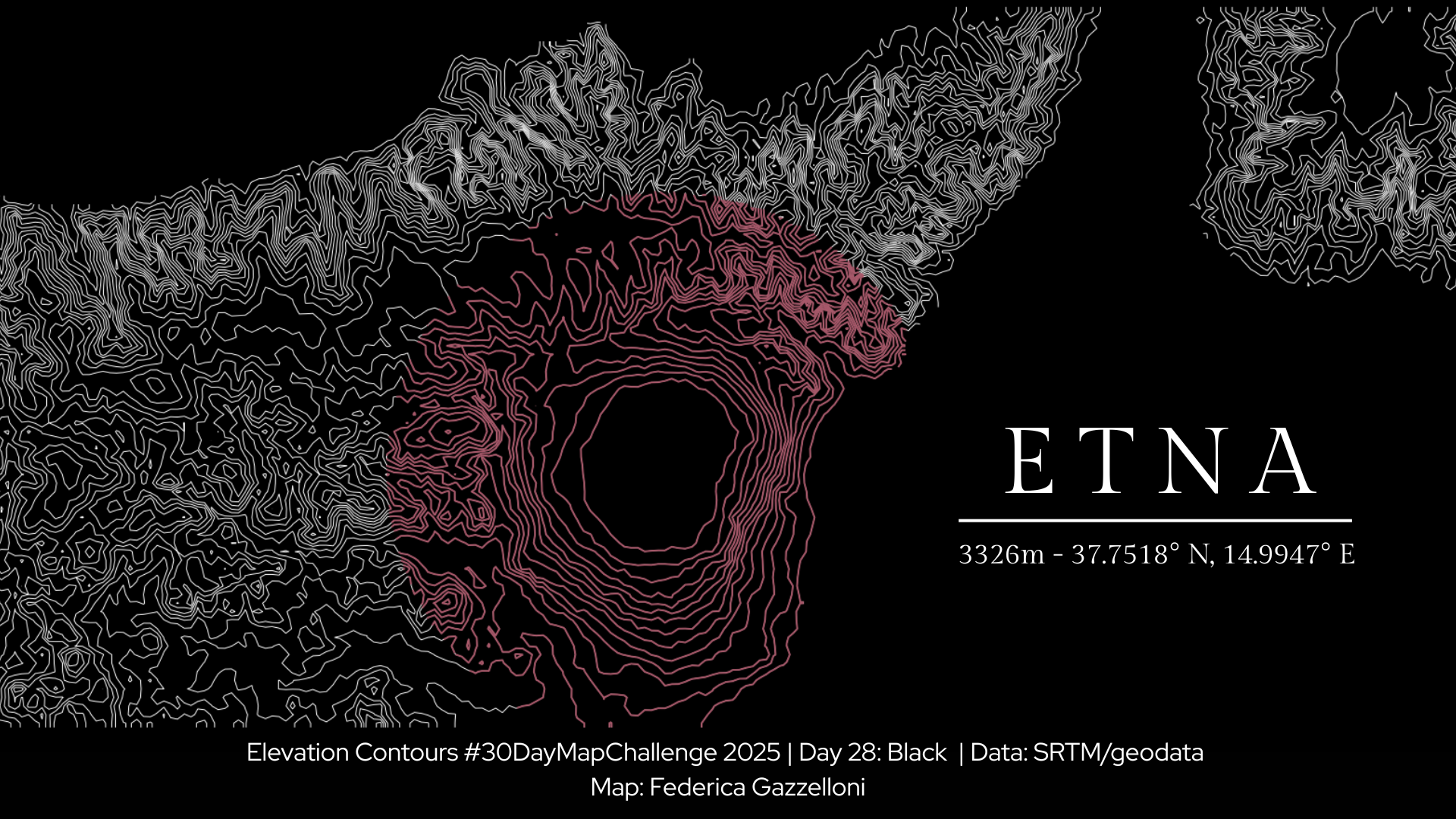
Black Themed Map of Etna Volcano Elevation Contours
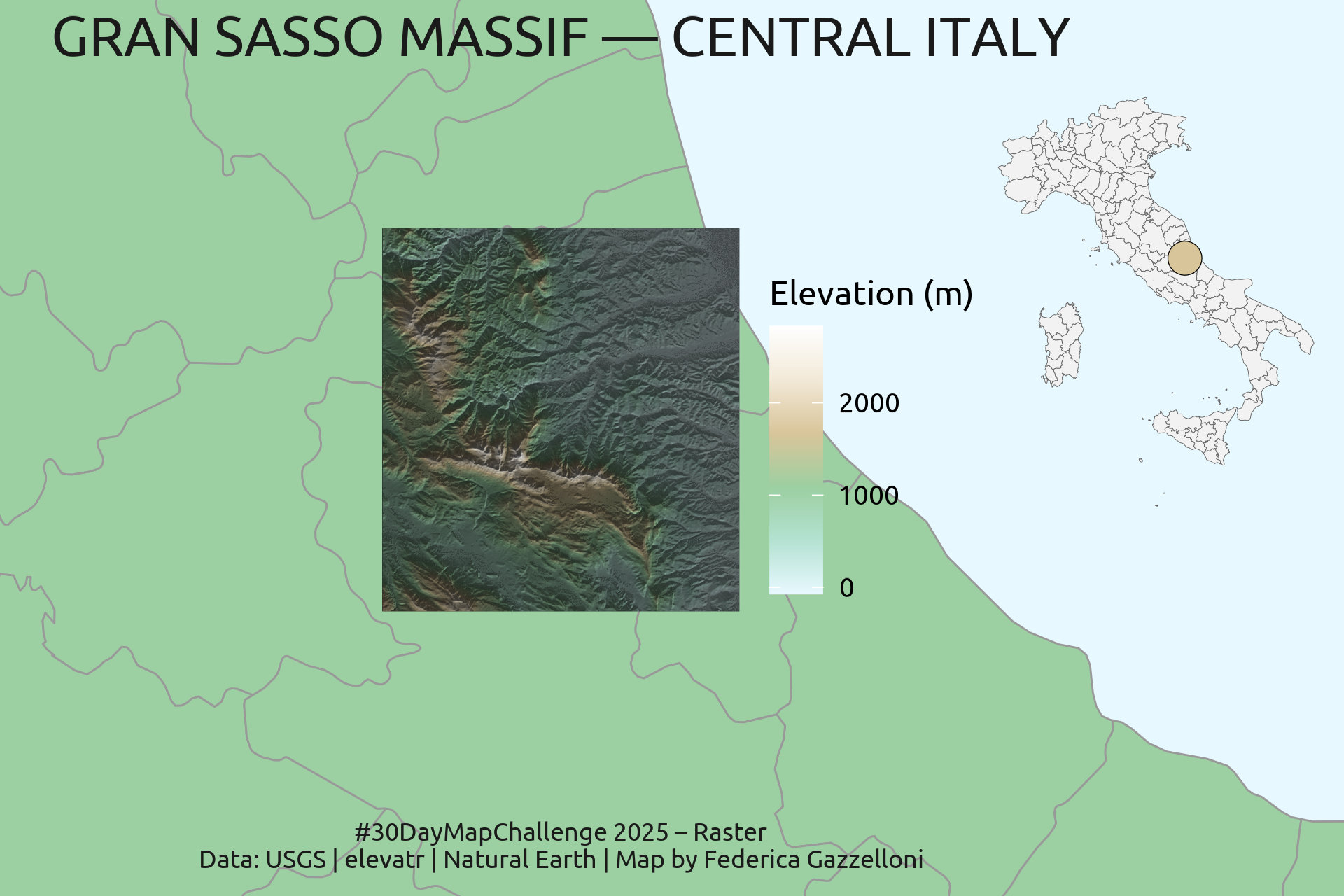
Raster Map of Gran Sasso Massif, Central Italy. This raster map visualizes the elevation of the Gran Sasso Massif and its surrounding areas using high-resolution elevation…
This map visualizes healthcare accessibility across Spain using OpenStreetMap data and a simplified travel time model - improved version of day 7 of the challenge.