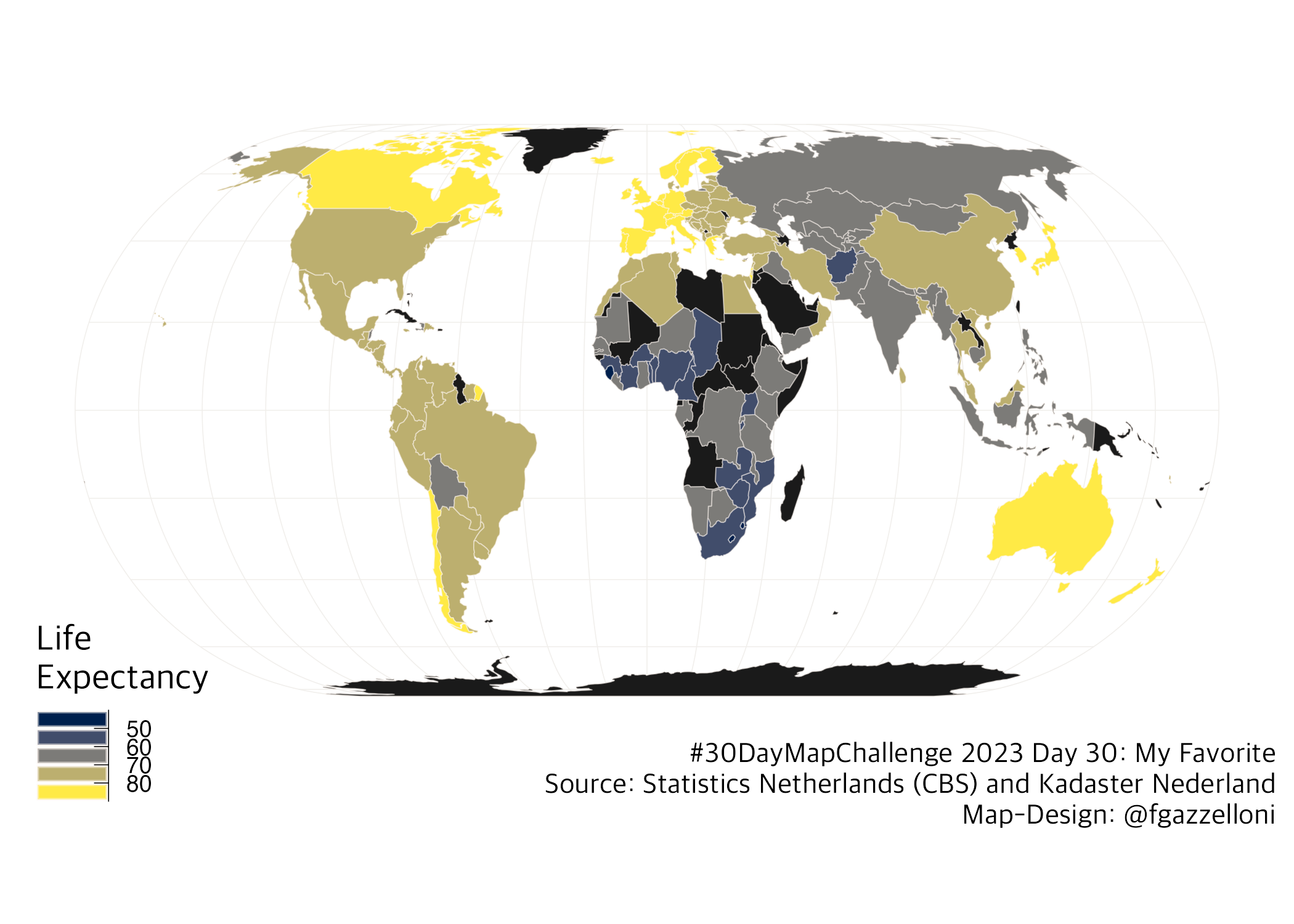
Life Expectancy Map: this map shows the life expectancy across the world using an Eckert IV projection.
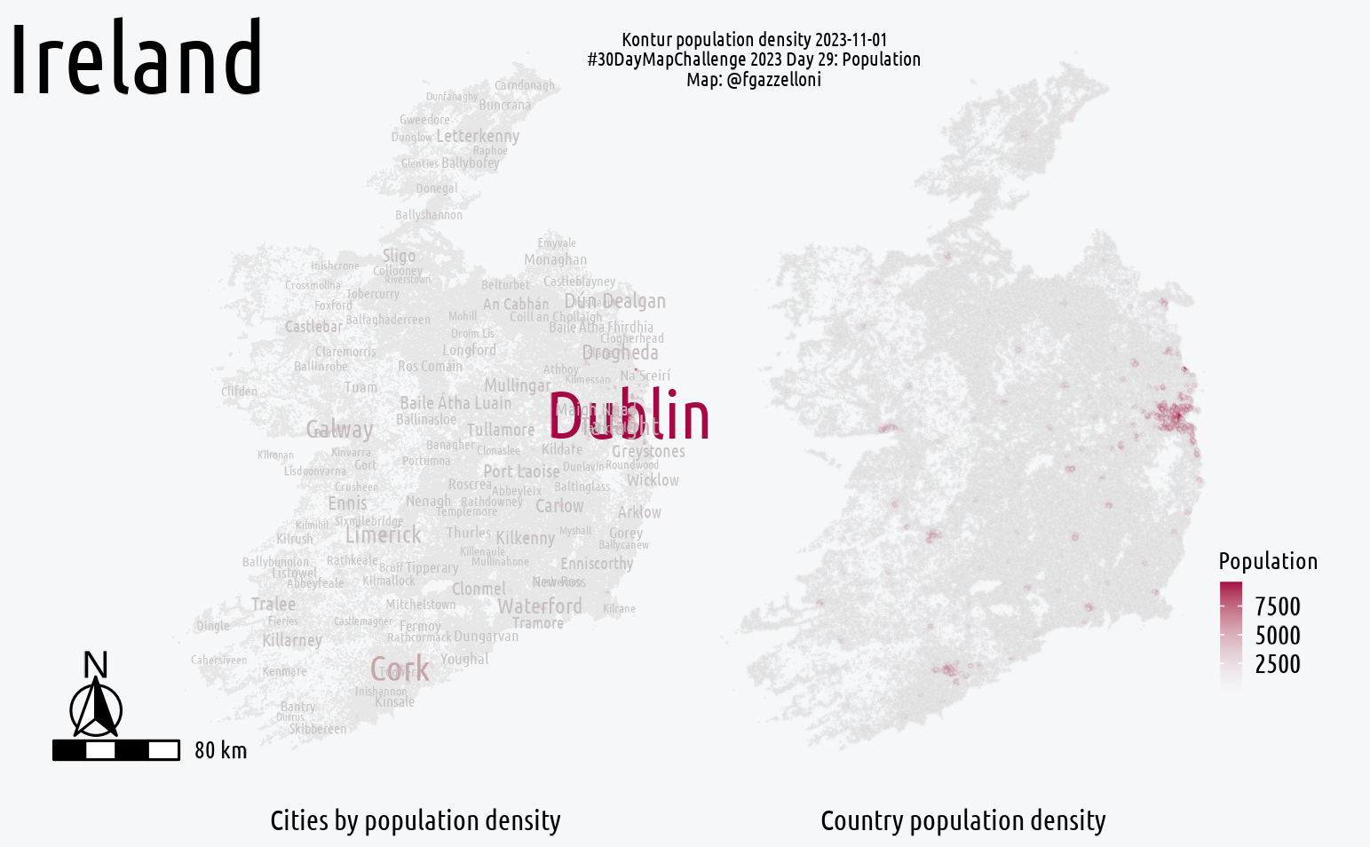
Population Map Ireland: This Ireland Map explore the population density in the area. Data is from the latest version of Kontur Population available at `United Nations…
Ireland Map
Kontur Population
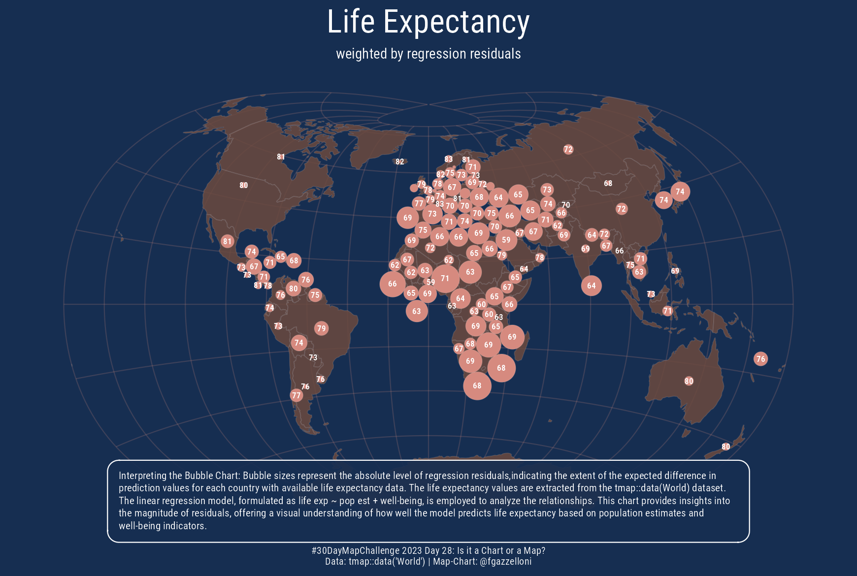
This is a bubble chart on a Map. Data is from tmap::data(“World”). Here the size of the bubbles is weighted by the absolute level of regression residuals from a linear model…
Dot Map of the EPSG Geodetic Parameter Dataset: this mapping resource provides a comprehensive overview of geodetic datums, spatial reference systems, Earth ellipsoids…
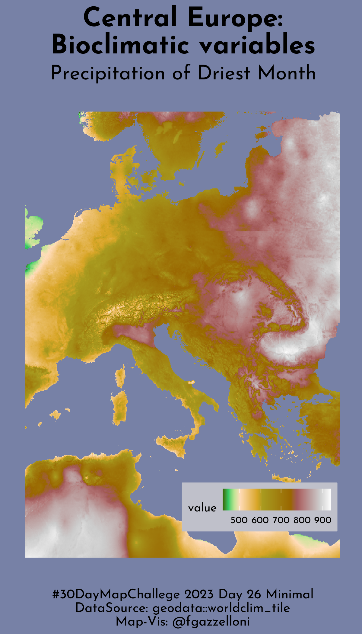
Minimal Climate Raster Map: this is a minimal Climate Raster Map for worldclim data and species distribution.
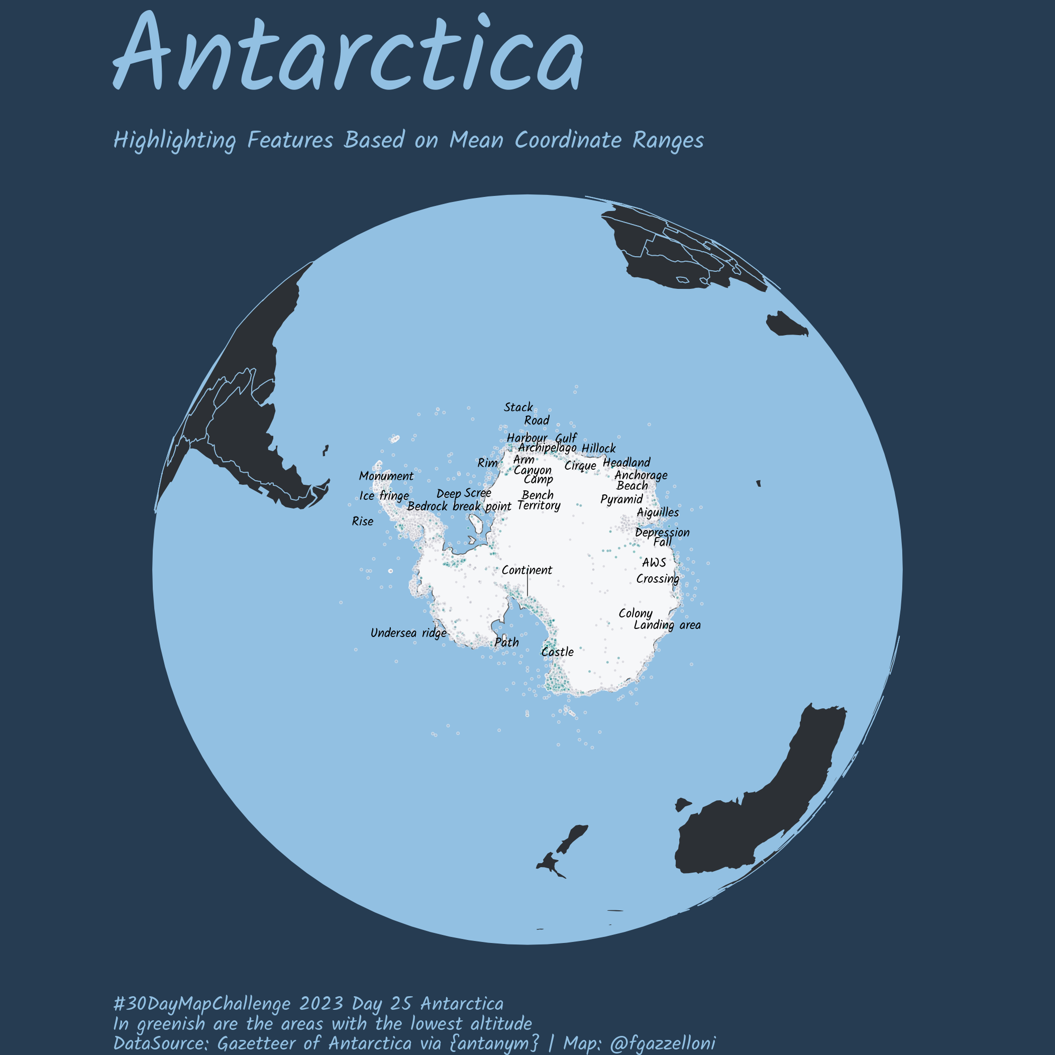
Antarctica Map: Composite Gazetteer of Antarctica via {antanym}
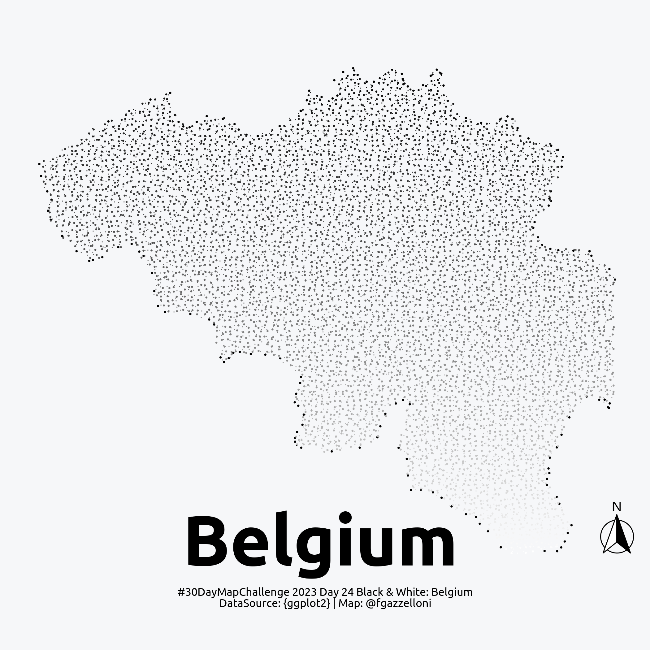
Black and White Belgium Map
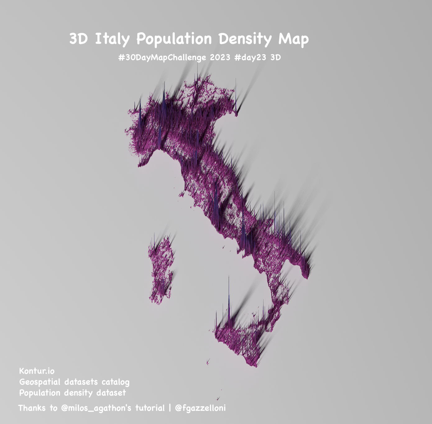
3d Italy Population Density Map: this map shows the population density of Italy in 3D spikes.
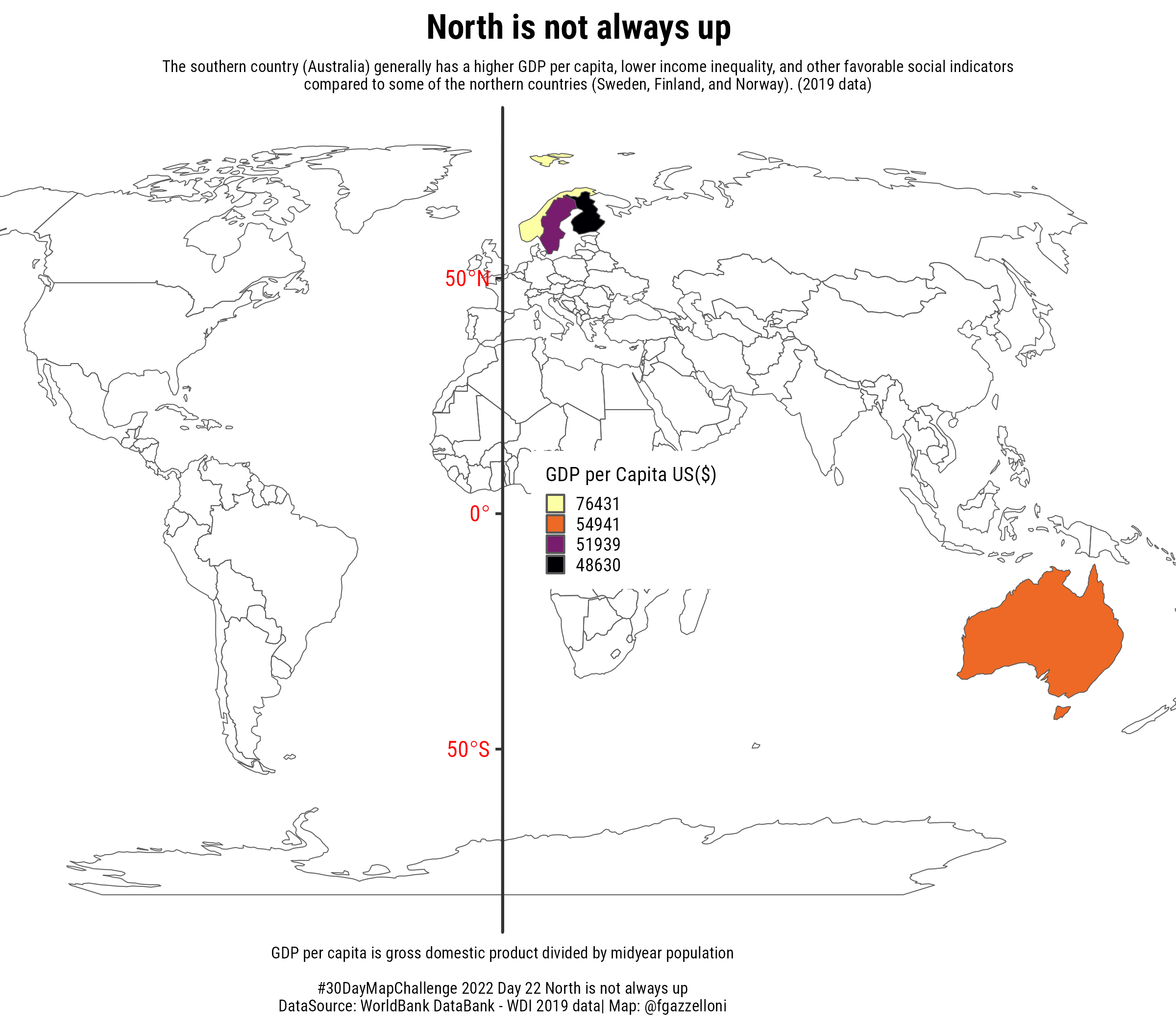
North Is Not Always Up: this map represent four countries with diverse GDP. One in the south side of the earth, Australia has a higher GDP value compared to northern side…
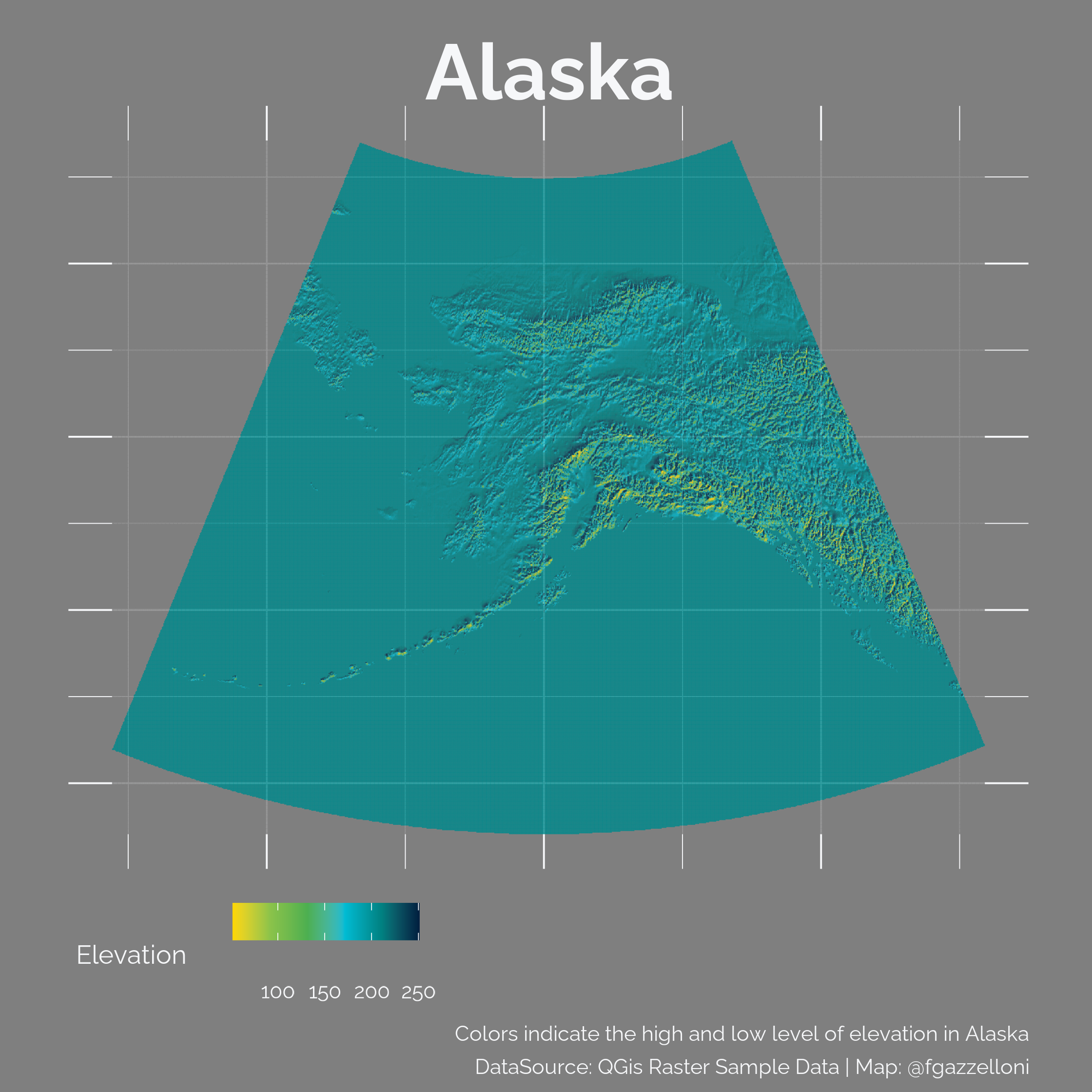
Raster Map: this map of Alaska uses a raster file to represent elevation data, with colors indicating different elevation levels.
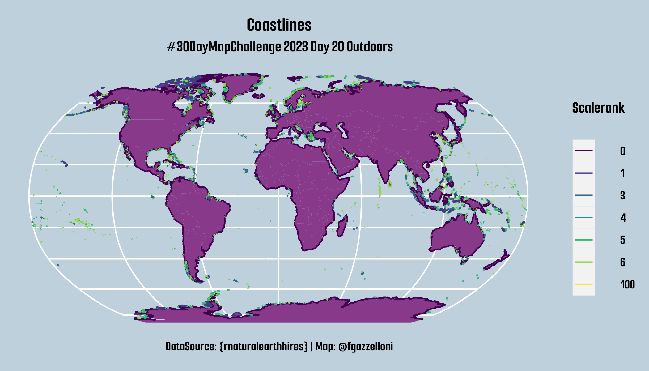
Coastlines Scalerank Map: This map visualizes the coastlines of the world, categorized by their scalerank, using data from the {rnaturalearthhires} package.
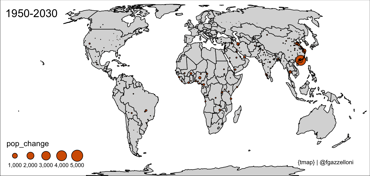
A 5-minute map made with {tmap} package to visualize the Estimate Population change 1950-2030.
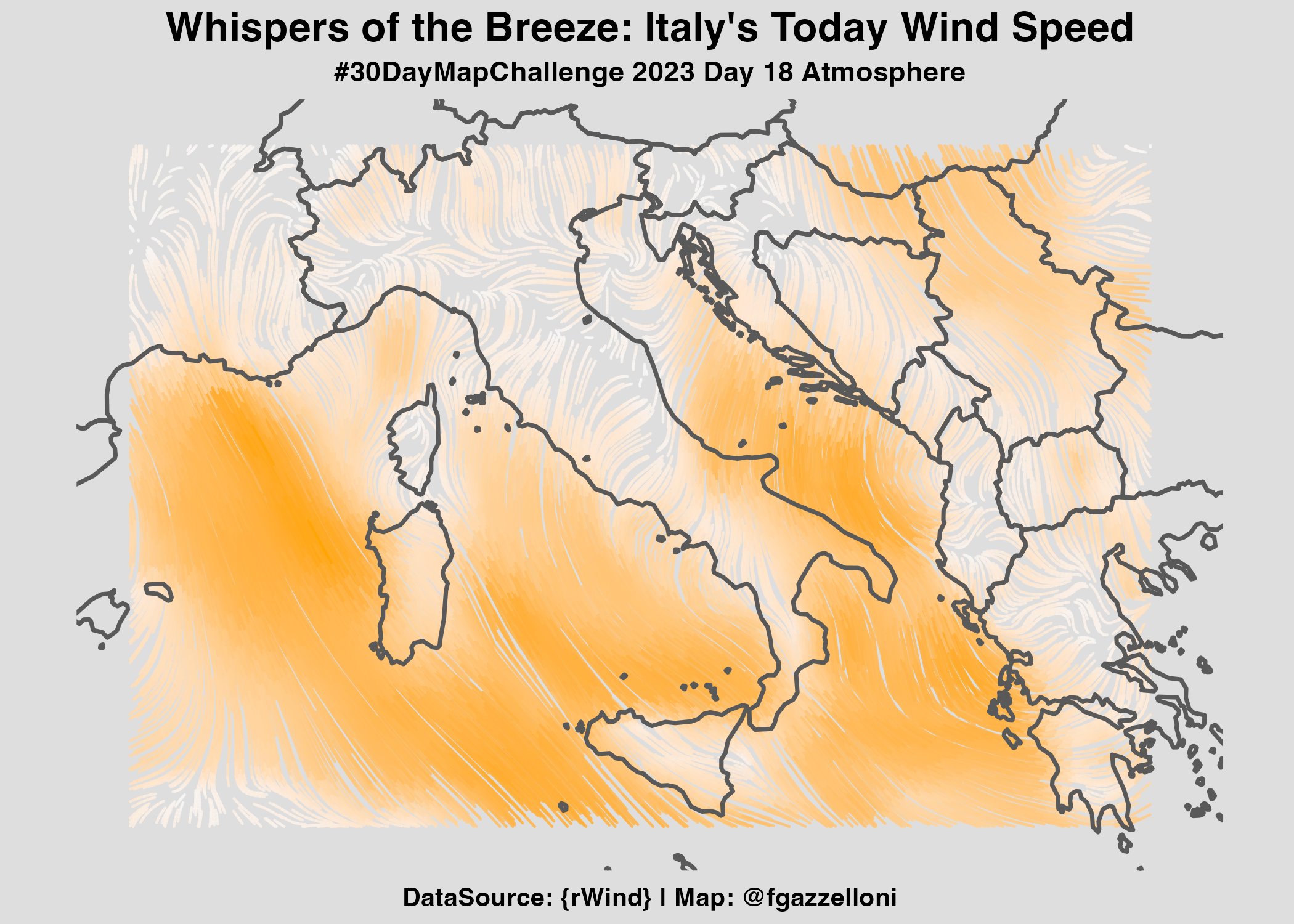
Atmosphere Map: This map visualizes wind speed and direction over Italy using streamlines to represent wind flow patterns.
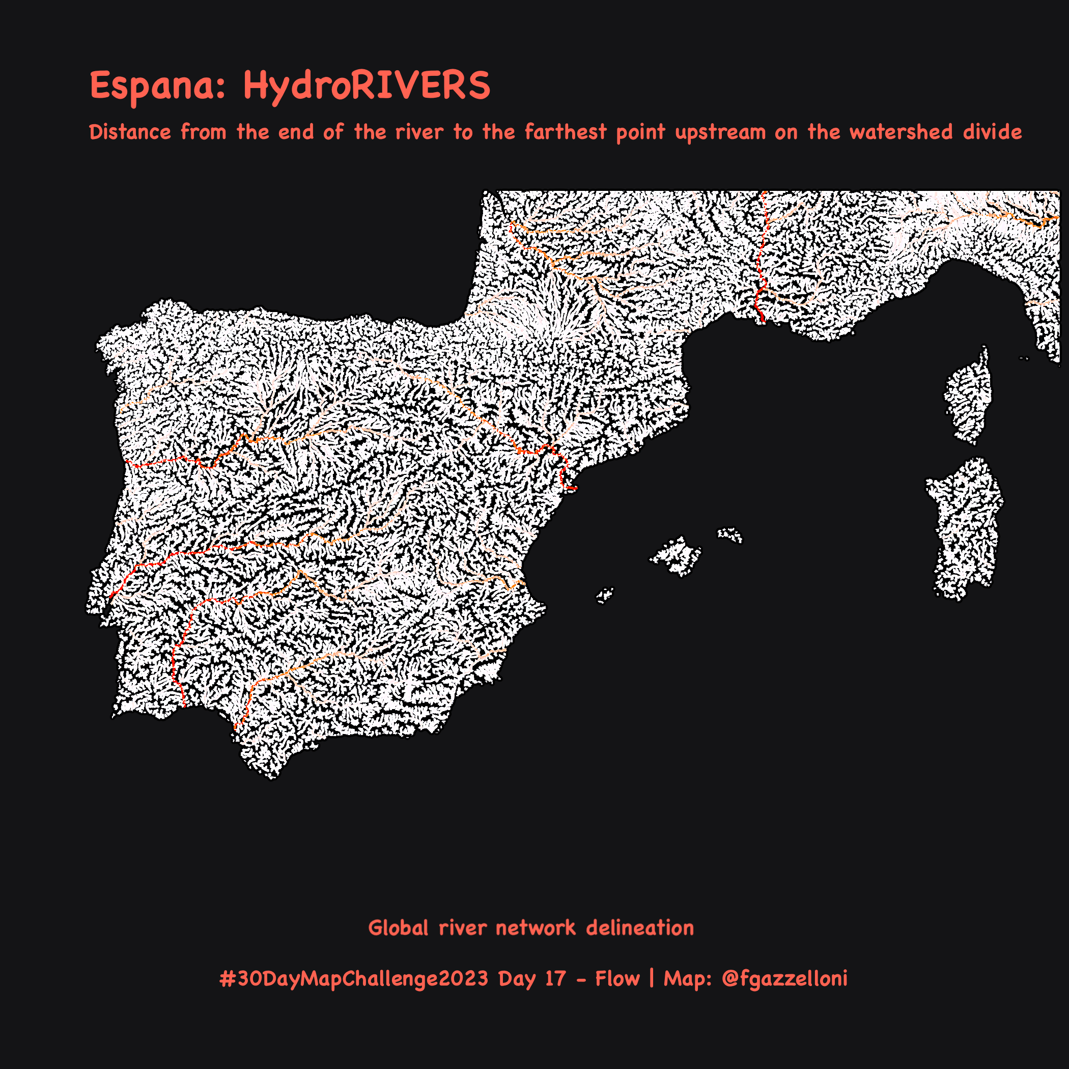
Flow Map: this map of the HydroRIVERS for the Iberia peninsula and surrounding areas is made coloring by the DIST_UP_KM.
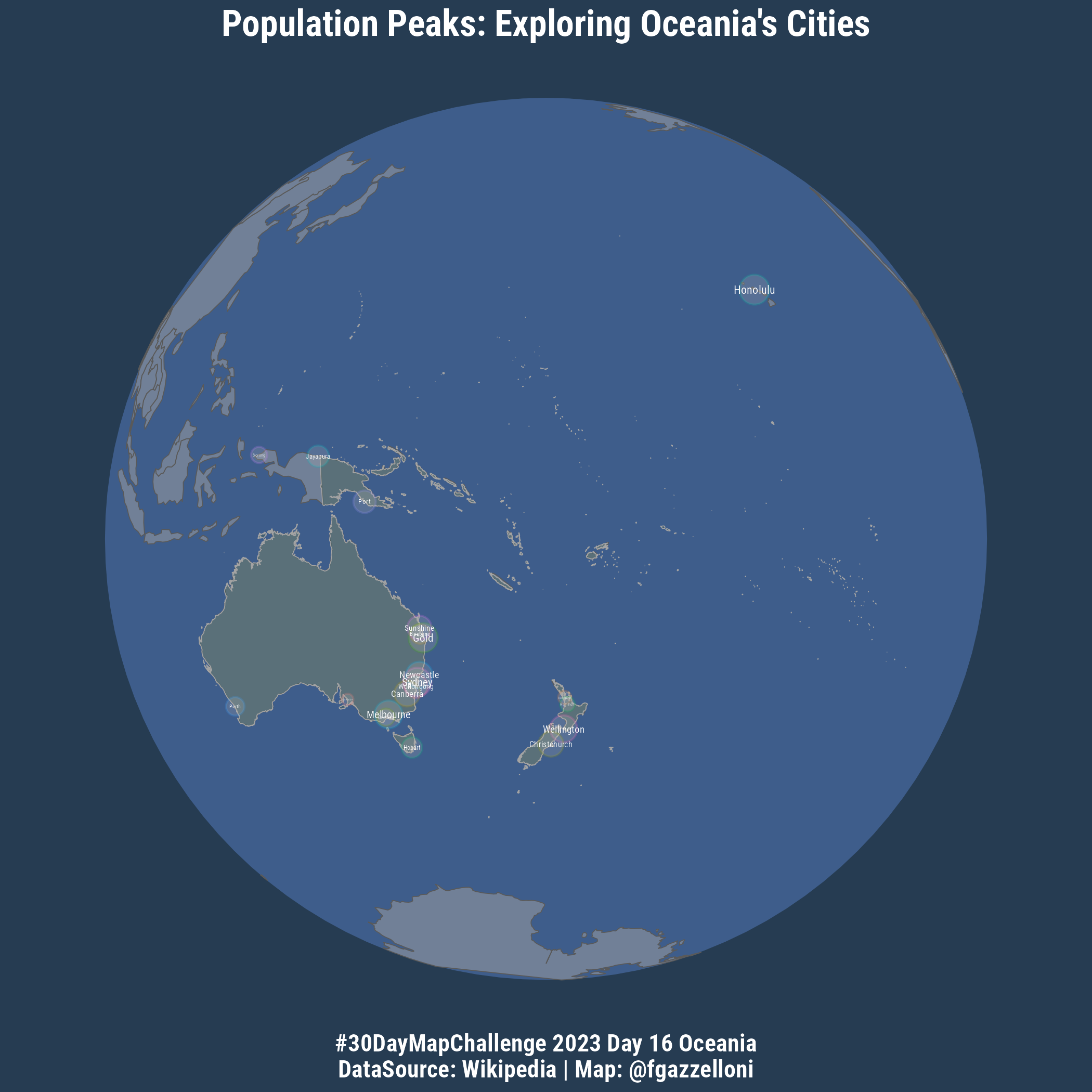
Oceania Map: This map of Oceania shows Population Peaks of Oceania’s Cities.
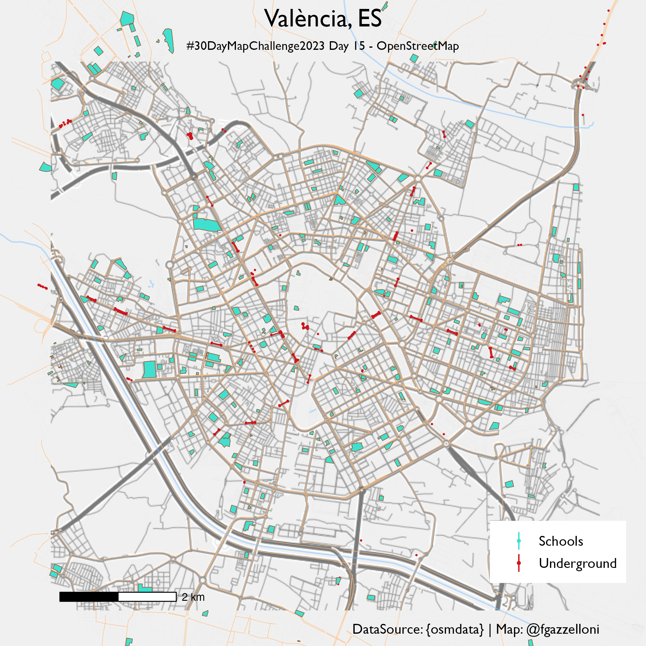
OpenStreetMap data map for Valencia schools and underground stations: this map visualizes the locations of schools and underground stations in Valencia using OpenStreetMap…
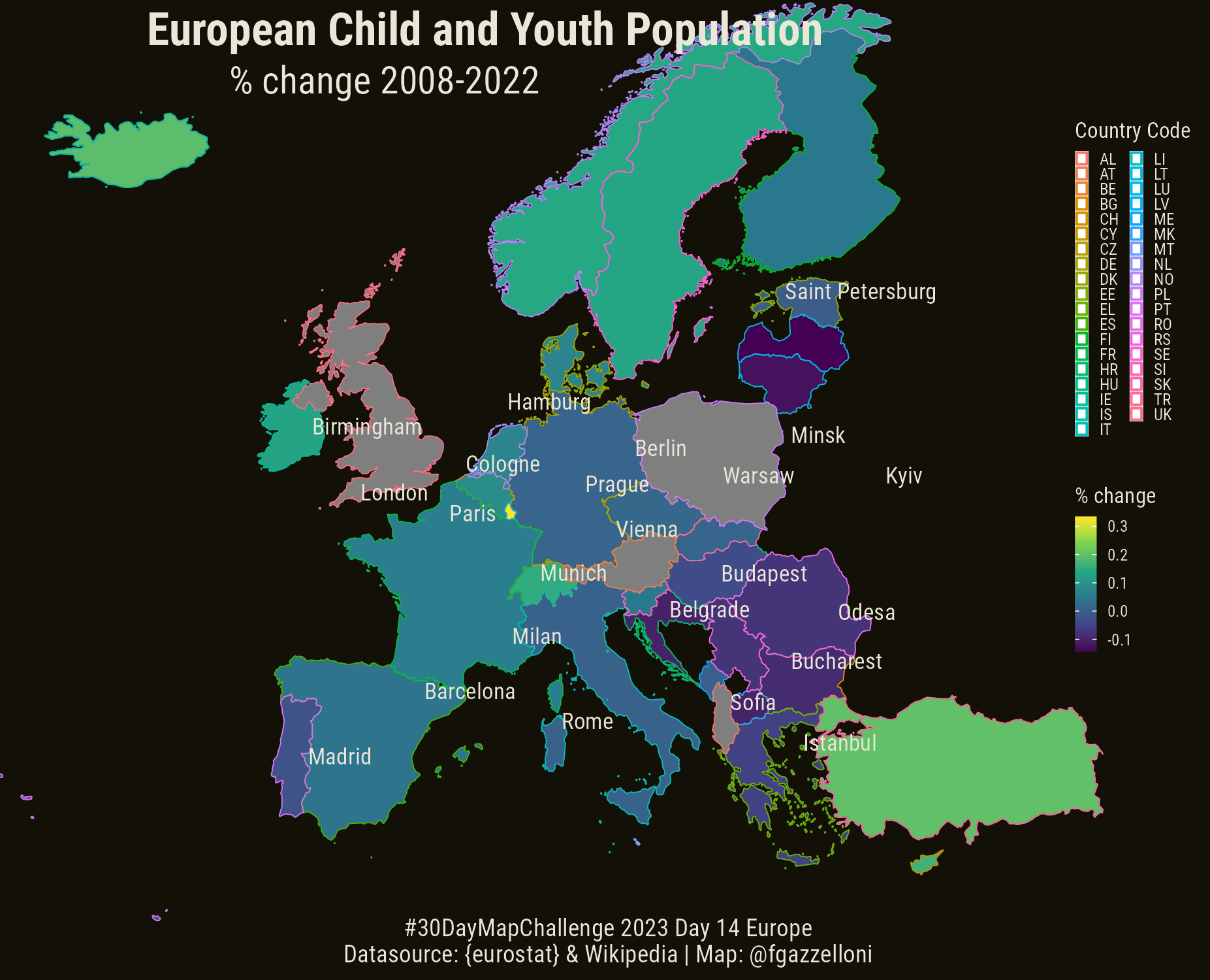
Eurostat data with R. I used the {eurostat} package to shows European Child and Youth Population.
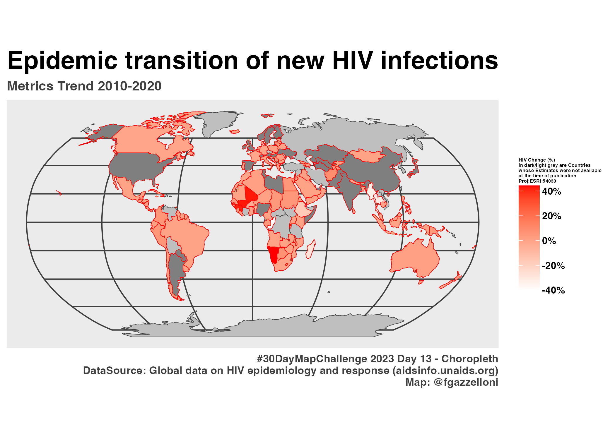
Choropleth Map: This map illustrates the epidemic transition of new HIV infections from 2010 to 2020, showing the percentage contribution of each country`s change to the…
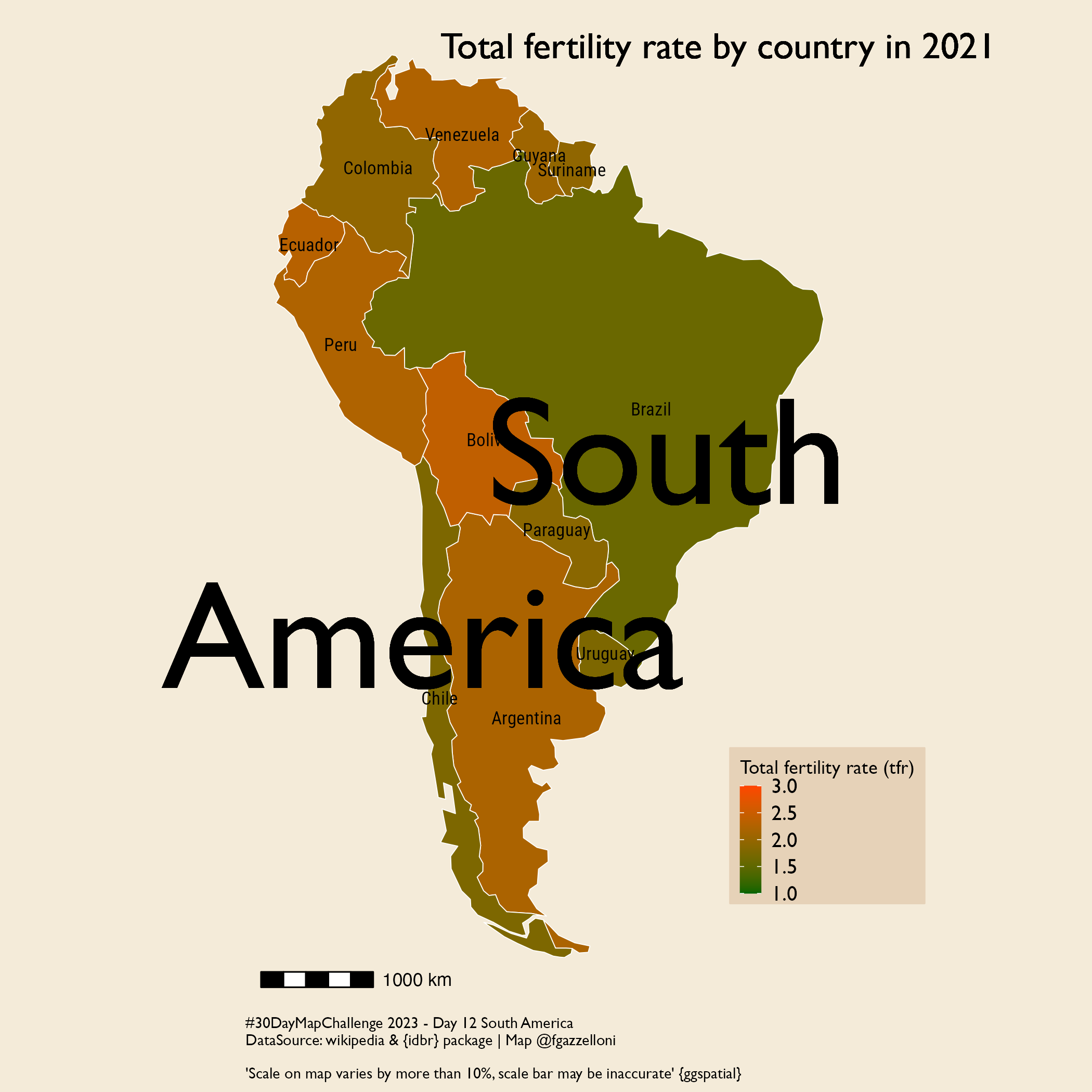
South America Map: this map visualizes the total fertility rate by country in South America for the year 2021 using data from the US Census Bureau International Data Base…
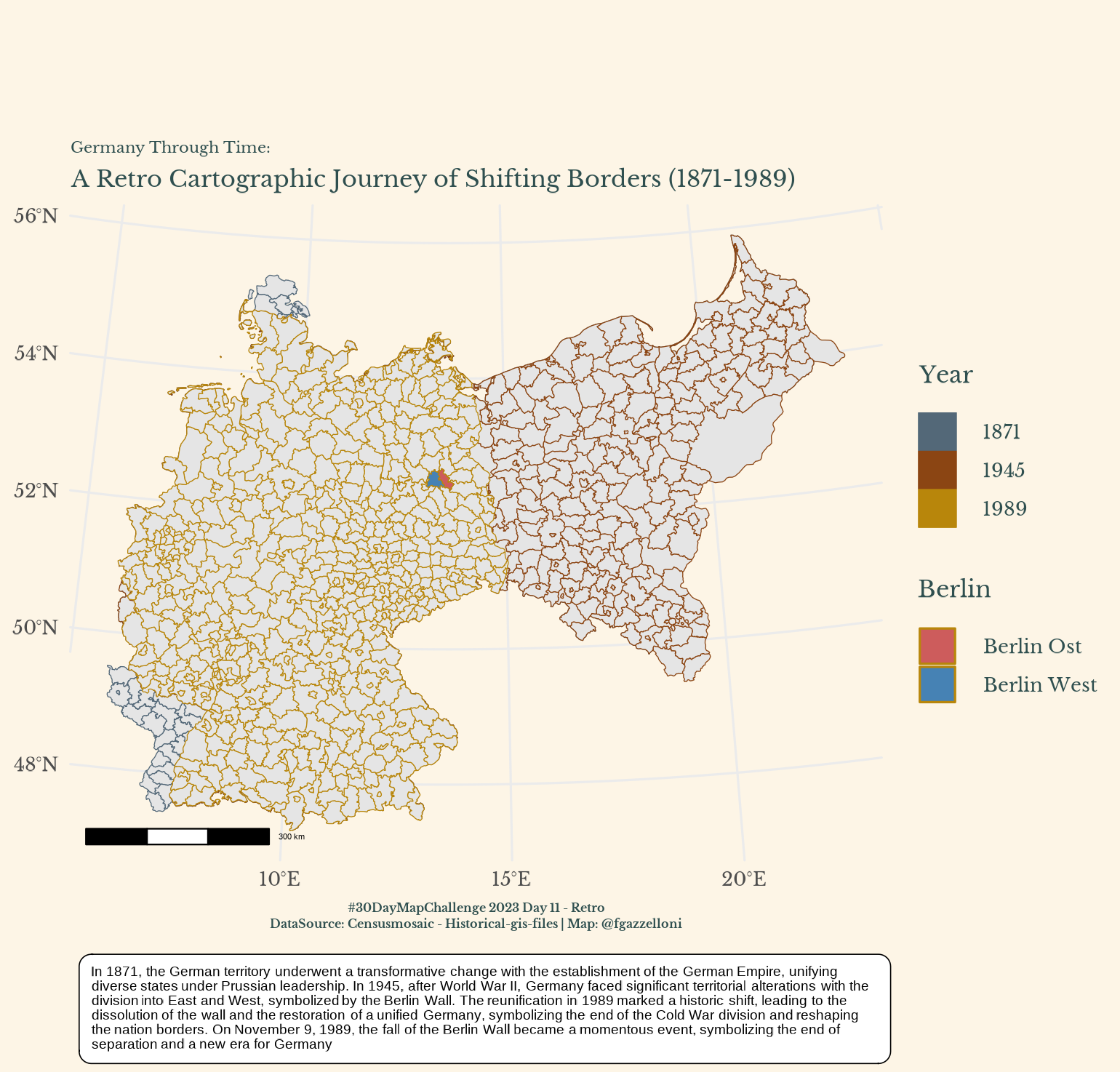
Retro Map: This retro-style map illustrates the historical changes in Germany`s borders from 1871 to 1989, highlighting key periods such as the German Empire, World War II…
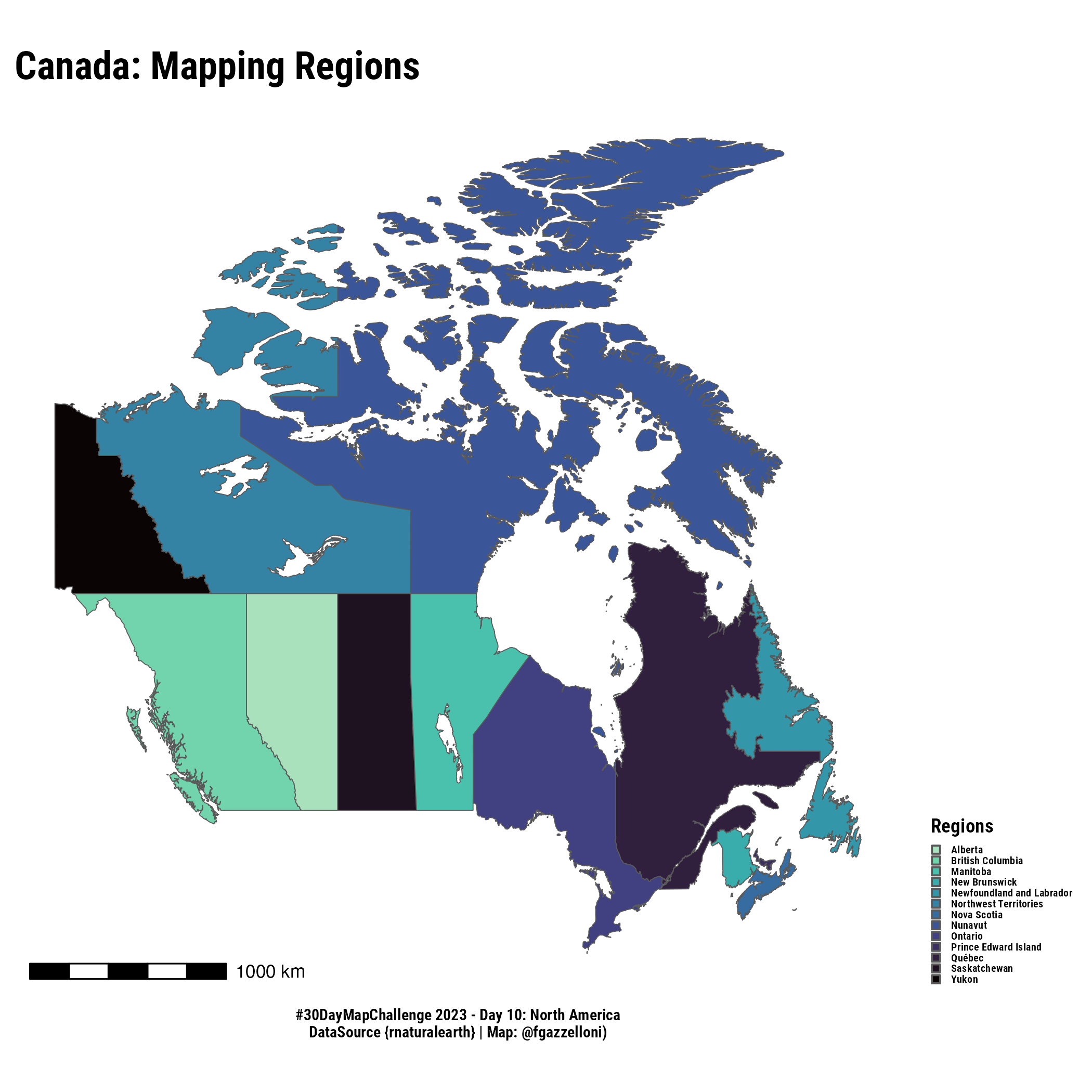
Map of Canada Regions using {rnaturalearth}: this map visualizes the different regions within Canada, each represented by distinct colors.
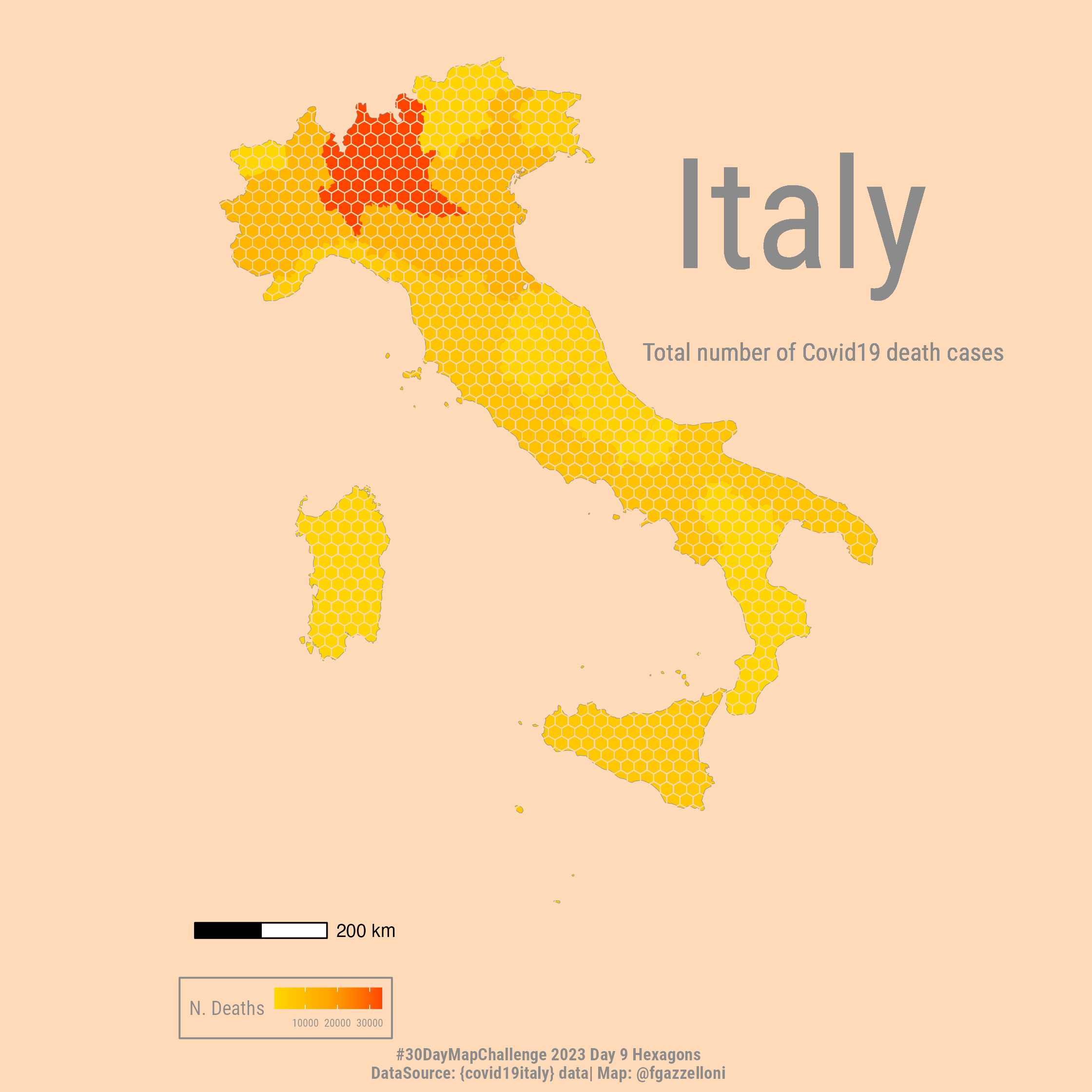
Hexagons map of Covid19 data in Italy using {covid19italy} package: this map visualizes Covid19 cases across different regions of Italy using hexagonal grid cells to…
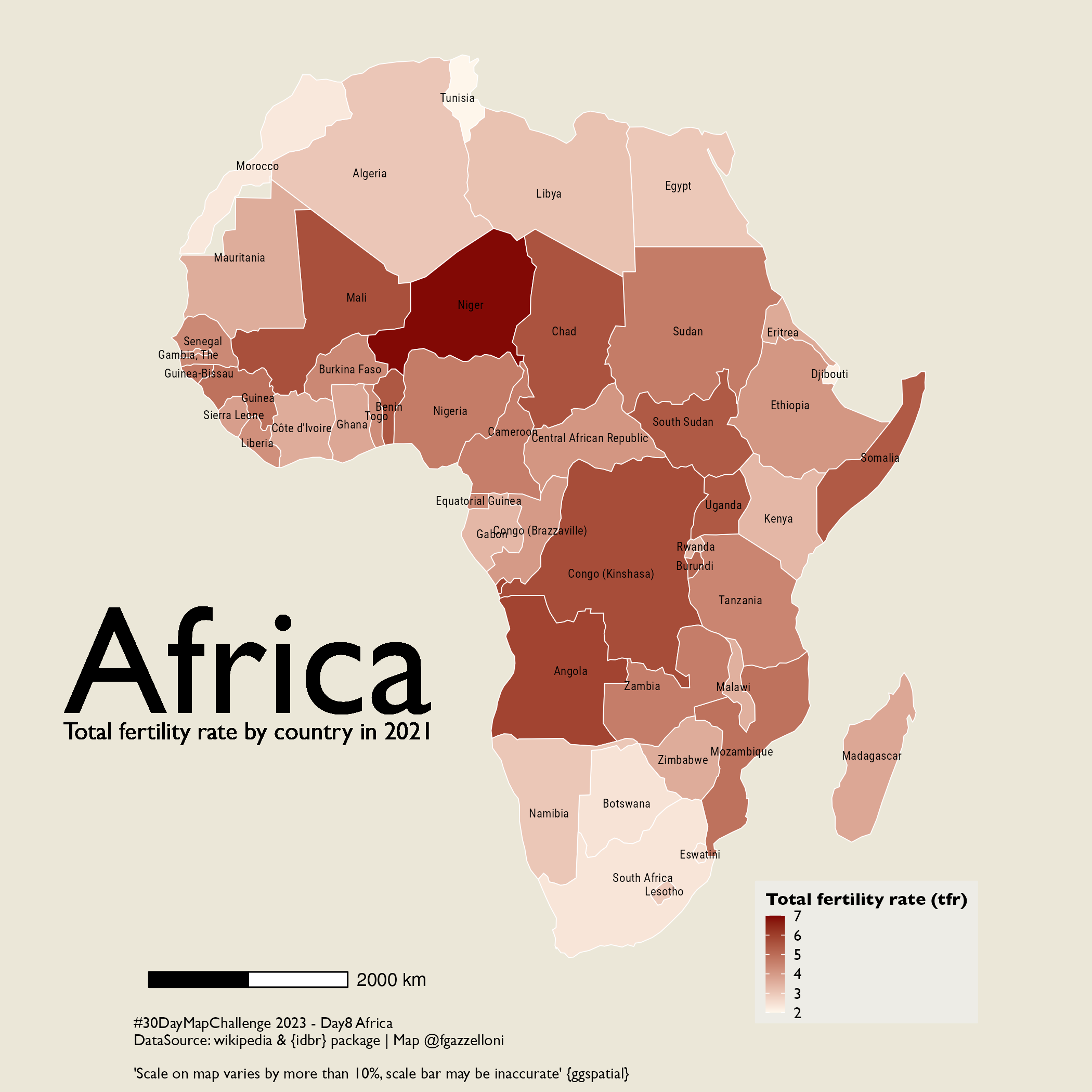
Africa Map: this map shows the total fertility rate by country in Africa for the year 2021, using data from the US Census Bureau International Data Base API and visualized…
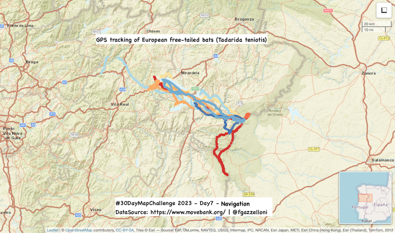
Leaflet map of 3D flights of European free-tailed bat spotted from 2017-08-08 to 2017-08-15.
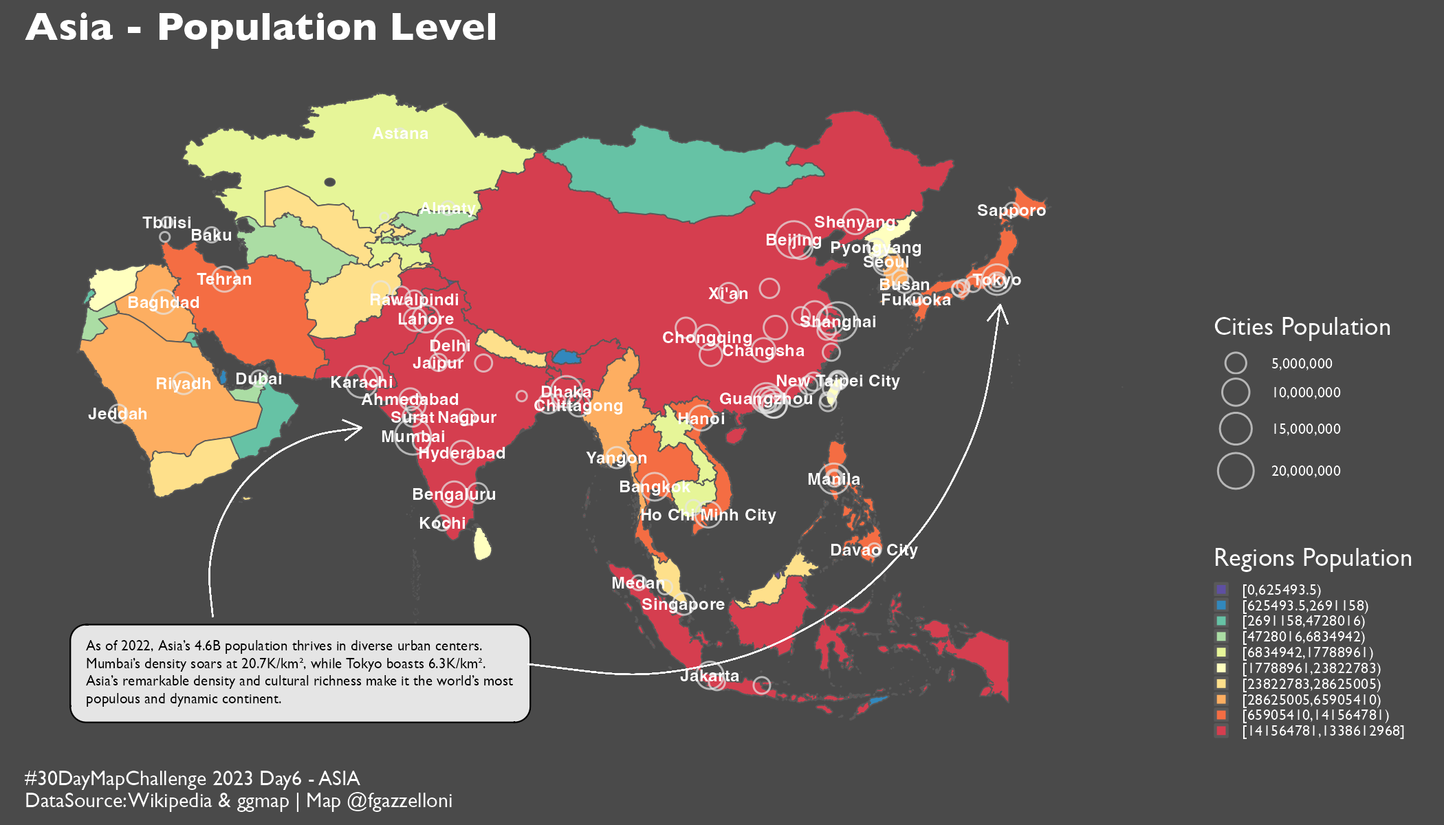
Asia Map: This map visualizes population estimates for regions and major cities in Asia, using data from Wikipedia and geocodes obtained via the ggmap package.
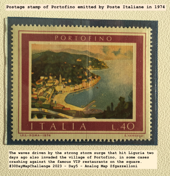
Analog Map: this is a postage stamp map of Portofino, Italy emitted by Poste Italiane in 1974.
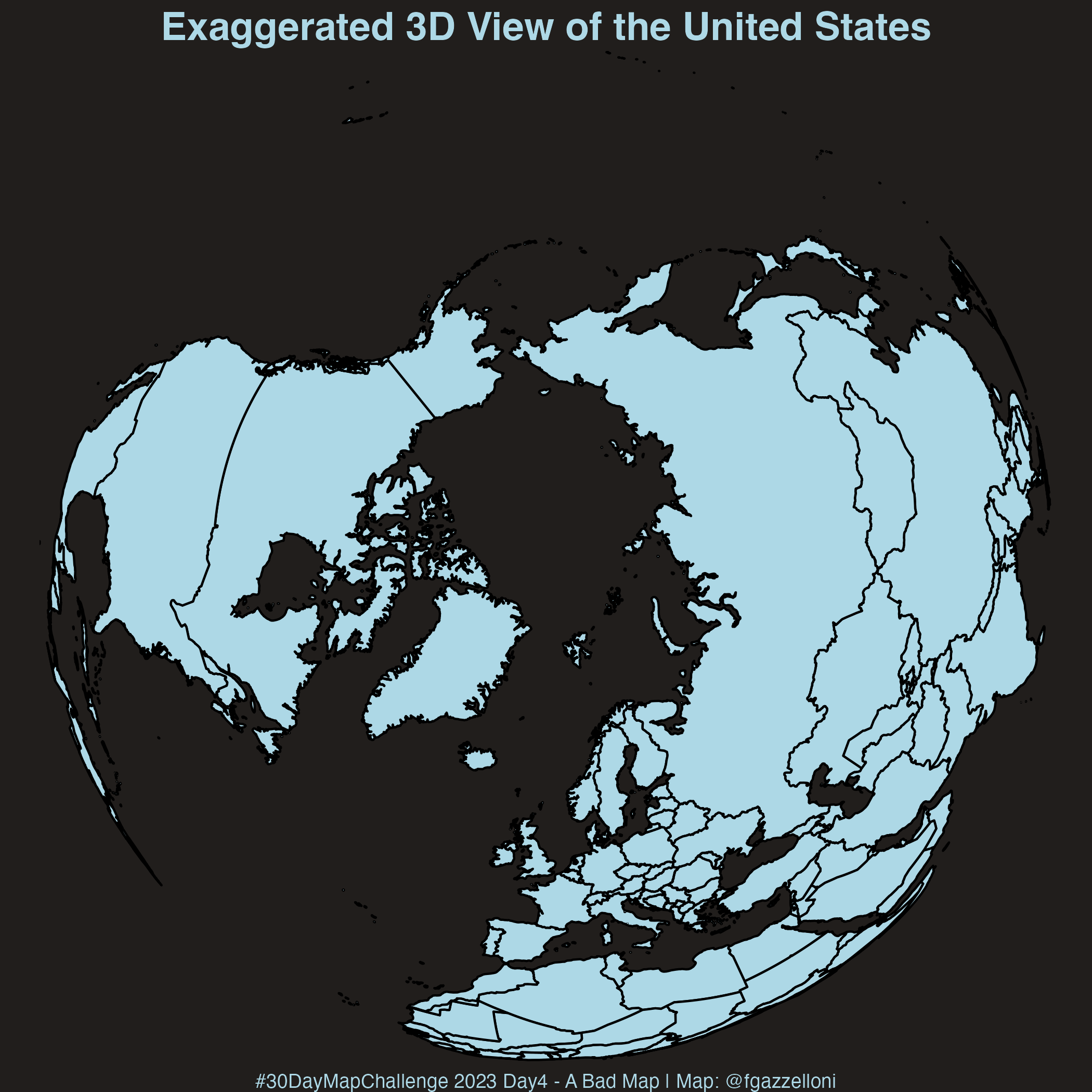
A Bad Map: This map of the United States uses an exaggerated 3D perspective, distorting the geography for visual effect rather than accuracy.
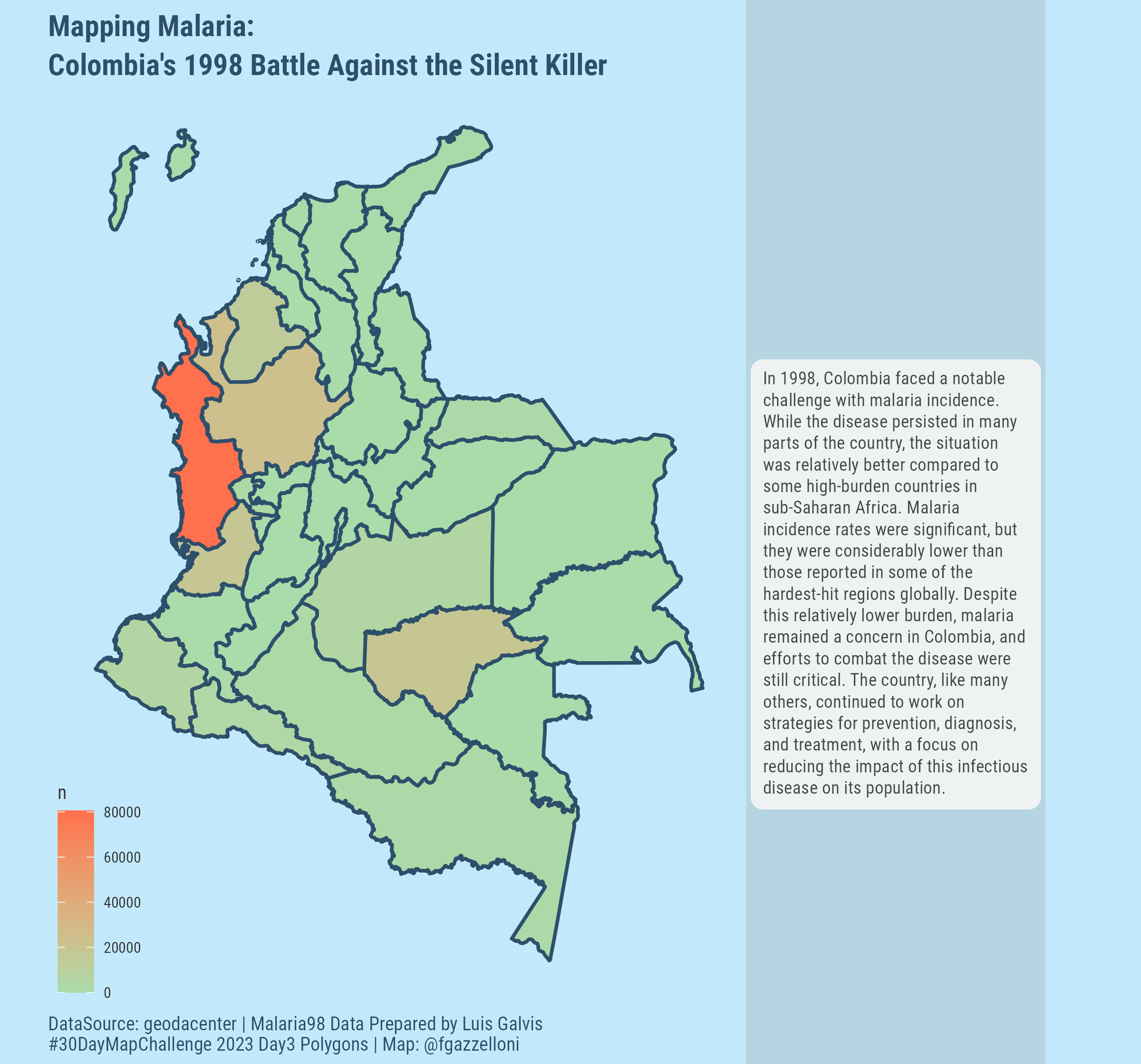
Polygons Map: This map visualizes malaria incidence across different departments in Colombia for the year 1998, using polygon shapes to represent the geographical boundaries…
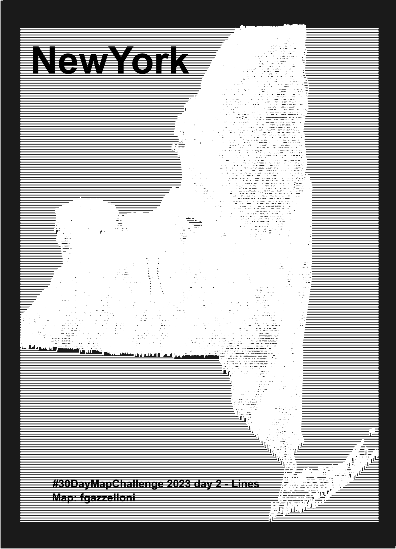
Lines Map: this map of New York uses topographic ridge lines to represent elevation data, creating a visually striking representation of the terrain.
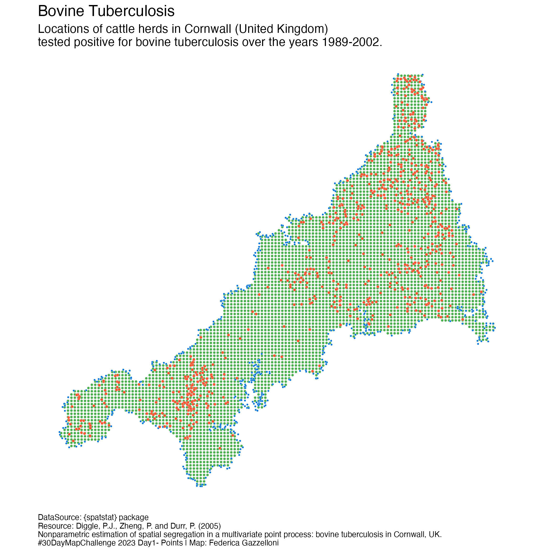
Points Map: A points map of the Bovine Tubercoulosis Farm Locations in Cornwall, UK (South West England). Data is from the {spatstat} package.