There have been over 16,860 games of professional American Football. There have been some rule changes to the points scoring system over that time, but clearly some scores are going to be more likely than others. As a touchdown plus extra point is worth 7, we’d expect a higher amount of games with multiples of 7 in the scoreline. Similarly, we’d expect more scorelines with multiples of 3 (the number of extra points).
Given the large number of games already played, we would expect that it would be rare for unique, never happened before, scorelines to occur. In fact, there is a fun website called Scorigami that tracks the likelihood of this happening for each ongoing NFL game.
There is also a nice neat list of the number of times each pro scoreline has occurred at the Pro Football Reference website. One important thing to note is that this list does not distinguish between home/road teams. So, for example a 17-20 road win is considered to be the same as a 20-17 home win.
In this post, I thought it would be fun to visualize these scorelines and how often they occurred.
Getting the Data
The first step is to scrape the data. We will do that using the rvest package:
library(rvest)
library(tidyverse)

url <- "https://www.pro-football-reference.com/boxscores/game-scores.htm"

tab <- url %>%
  read_html(url) %>%
 html_node("table") %>%
 html_table()

head(tab)
# A tibble: 6 x 9
     Rk Score  PtsW  PtsL PtTot    PD Count ``        `Last Game`
  <int> <chr> <int> <int> <int> <int> <int> <chr>     <chr>
1     1 20-17    20    17    37     3   271 all games Chicago Bears v~
2     2 27-24    27    24    51     3   219 all games Los Angeles Ram~
3     3 17-14    17    14    31     3   197 all games Atlanta Falcons~
4     4 23-20    23    20    43     3   189 all games New York Jets v~
5     5 24-17    24    17    41     7   169 all games Tennessee Titan~
6 6 13-10 13 10 23 3 163 all games Detroit Lions v~tail(tab)
# A tibble: 6 x 9
     Rk Score  PtsW  PtsL PtTot    PD Count ``        `Last Game`
  <int> <chr> <int> <int> <int> <int> <int> <chr>     <chr>
1  1061 70-27    70    27    97    43     1 all games Los Angeles Ram~
2  1062 42-38    42    38    80     4     1 all games Los Angeles Ram~
3  1063 11-6     11     6    17     5     1 all games St. Louis Rams ~
4  1064 46-9     46     9    55    37     1 all games Los Angeles Ram~
5  1065 66-0     66     0    66    66     1 all games Rochester Jeffe~
6  1066 50-28    50    28    78    22     1 all games San Diego Charg~
We could tidy these data up, but they already contain the three columns that we need. The PtsW and PtsL columns contain the scores for each team. The Count column contains the number of times each scoreline occurred.
What we can do is plot these data as a matrix using geom_tile() and filling the color of each tile based on the count variable.
We also need to know the range of possible scores to limit the axes. These are:
This is the plot - you may need to zoom in to check each score, but they should be visible:
ggplot(tab, aes(x=PtsW, y=PtsL, fill=sqrt(Count))) +
  geom_tile(color='black') +
  geom_text(aes(label=Count), size=1.8, color='black')+
  scale_fill_continuous(low="#FFF973", high="#F92A0D") +
  scale_y_reverse(breaks=seq(0,52,2)) +
  scale_x_continuous(breaks=seq(0,74,2),position = "top")+
  xlab("Winning Team Points") +
  ylab("Losing Team Points") +
  theme(
    plot.background = element_rect(fill="white"),
    panel.background = element_rect(fill="white"),
    panel.border = element_rect(fill=NA, color="white", size=0.15, linetype="solid"),
    axis.text = element_text(color="black", size=rel(0.7)),
    axis.text.y  = element_text(hjust=1),
    legend.position = "none"
     )
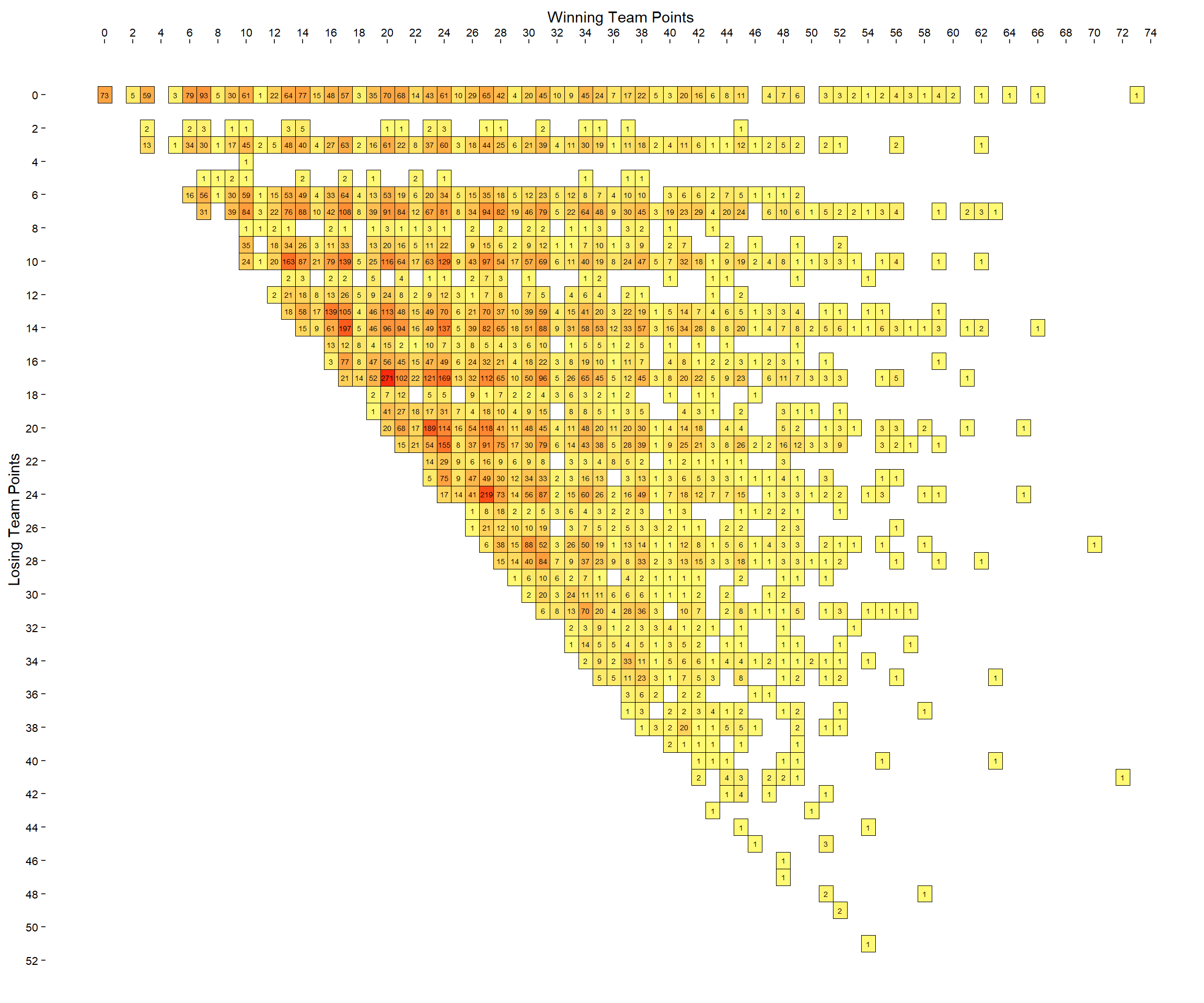
I chose to make the tick marks on the x and y axes separated by 2. I think this still makes the chart readable while not making it too clustered. Perhaps one issue with the above graph is that it isn’t that easy to follow rows and columns as not the tiles with missing values do not have borders.
If we had borders it might be easier to see which scores have yet to occur. To make a plot with borders around each tile, we need to include every combination of values in the data.frame. I did this by joining the tab data.frame with one that contained each winning and losing possible score, and a 0 in the Count column, then summing across each win/loss score, and then making the zeros into NA so that they would appear white in the final plot.
eg <- expand.grid(0:74,0:52)

df <-
  data.frame(
  PtsW = eg[,1],
  PtsL = eg[,2],
  Count=0
)

df <-
  full_join(df, tab %>% select(PtsW, PtsL, Count)) %>%
  group_by(PtsW,PtsL) %>%
  summarise(Count=sum(Count))

head(df)
# A tibble: 6 x 3
# Groups:   PtsW [1]
   PtsW  PtsL Count
  <int> <int> <dbl>
1     0     0    73
2     0     1     0
3     0     2     0
4     0     3     0
5     0     4     0
6 0 5 0# A tibble: 6 x 3
# Groups: PtsW [1]
PtsW PtsL Count
<int> <int> <dbl>
1 0 0 73
2 0 1 NA
3 0 2 NA
4 0 3 NA
5 0 4 NA
6 0 5 NAThis is what the plot now looks like:
ggplot(df, aes(x=PtsW, y=PtsL, fill=sqrt(Count))) +
  geom_tile(color='black') +
  geom_text(aes(label=Count), size=1.8, color='black')+
  scale_fill_continuous(low="#FFF973", high="#F92A0D", na.value="white") +
  scale_y_reverse(breaks=seq(0,56,2)) +
  scale_x_continuous(breaks=seq(0,76,2),position = "top")+
  xlab("Winning Team Points") +
  ylab("Losing Team Points") +
  theme(
    plot.background = element_rect(fill="white"),
    panel.background = element_rect(fill="white"),
    panel.border = element_rect(fill=NA, color="white", size=0.15, linetype="solid"),
    axis.text = element_text(color="black", size=rel(0.7)),
    axis.text.y  = element_text(hjust=1),
    legend.position = "none"
     )
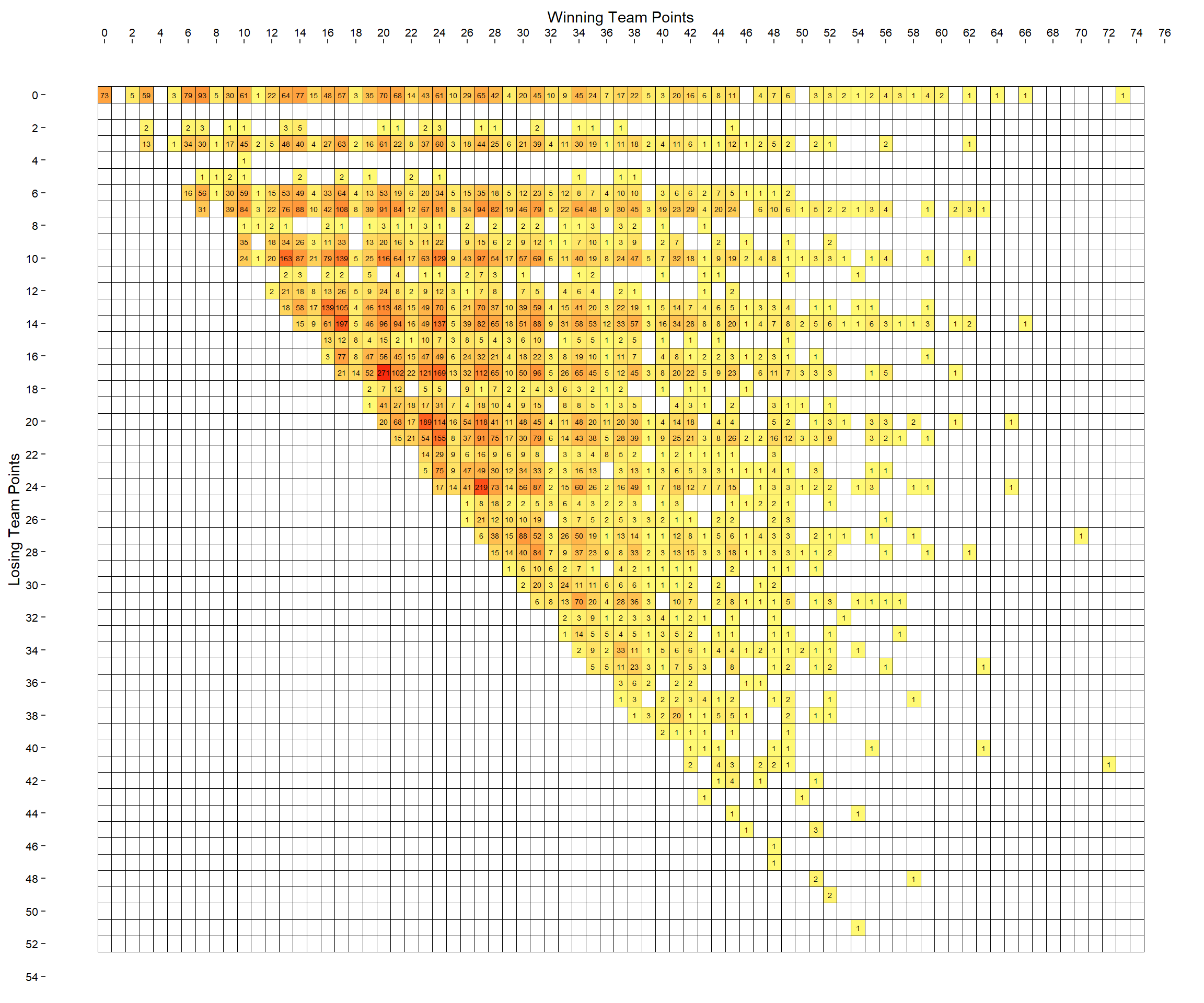
This is pretty interesting. There aren’t many scores along the 1,2,4,5 and 11 points rows/columns.
One final thing I wondered was what if we looked at total points for games. How many times has each combined point score been achieved.
df$Count <- ifelse(is.na(df$Count), 0, df$Count)
df$Total <- df$PtsW + df$PtsL

df.total <-
  df %>%
  group_by(Total) %>%
  summarise(Count = sum(Count))


head(df.total)
# A tibble: 6 x 2
  Total Count
  <int> <dbl>
1     0    73
2     1     0
3     2     5
4     3    59
5     4     0
6 5 5ggplot(df.total, aes(x=Total, y=Count)) +
geom_col(color='black',fill='salmon') +
ylab("Frequency") +
xlab("Total Score") +
ggtitle("Frequency of Pro Football Point Totals") +
theme_classic()
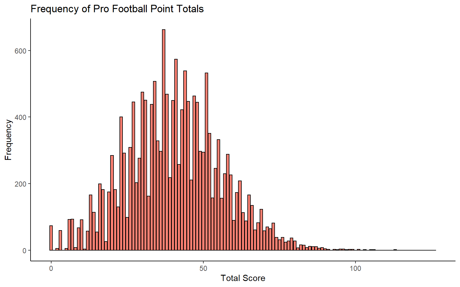
We can also identify those scores that have never occurred.
df.total %>%
  filter(Count==0)
# A tibble: 25 x 2
   Total Count
   <int> <dbl>
 1     1     0
 2     4     0
 3    92     0
 4   100     0
 5   102     0
 6   104     0
 7   107     0
 8   108     0
 9   109     0
10   110     0
# ... with 15 more rows
What’s interesting here is that after total scores of 1 and 4, the next highest total score that has never occurred is 92!
There are other things we could look at with these data such as what scores have never occurred based on who is home/on the road. Also we could look at the rate of unique scores - how often have they occured over time.