3 Simple Static Maps
R can be used for spatial visualization and analysis, with features that rival commercial GIS software. There are many R packages to perform spatial analysis, and advanced spatial analysis is its own subject, beyond the scope of this class. Here, I will focus on relatively simple static maps. We will use several spatial packages in conjunction with the venerable ggplot2, a general purpose package for plotting.
3.1 Setup
We must load several packages to get started. We will also set ggplot2 to display in theme_bw which will make our plots clear and simple by default.
library(sf) #'simple features' package
library(leaflet) # web-embeddable interactive maps
library(ggplot2) # general purpose plotting
library(rnaturalearth) # map data
library(rnaturalearthdata)# map data
library(ggspatial) # scale bars and north arrows

#the package below was installed from source through github:
# devtools::install_github("ropensci/rnaturalearthhires"))
library(rnaturalearthhires)# map data

theme_set(theme_bw())
3.2 Data
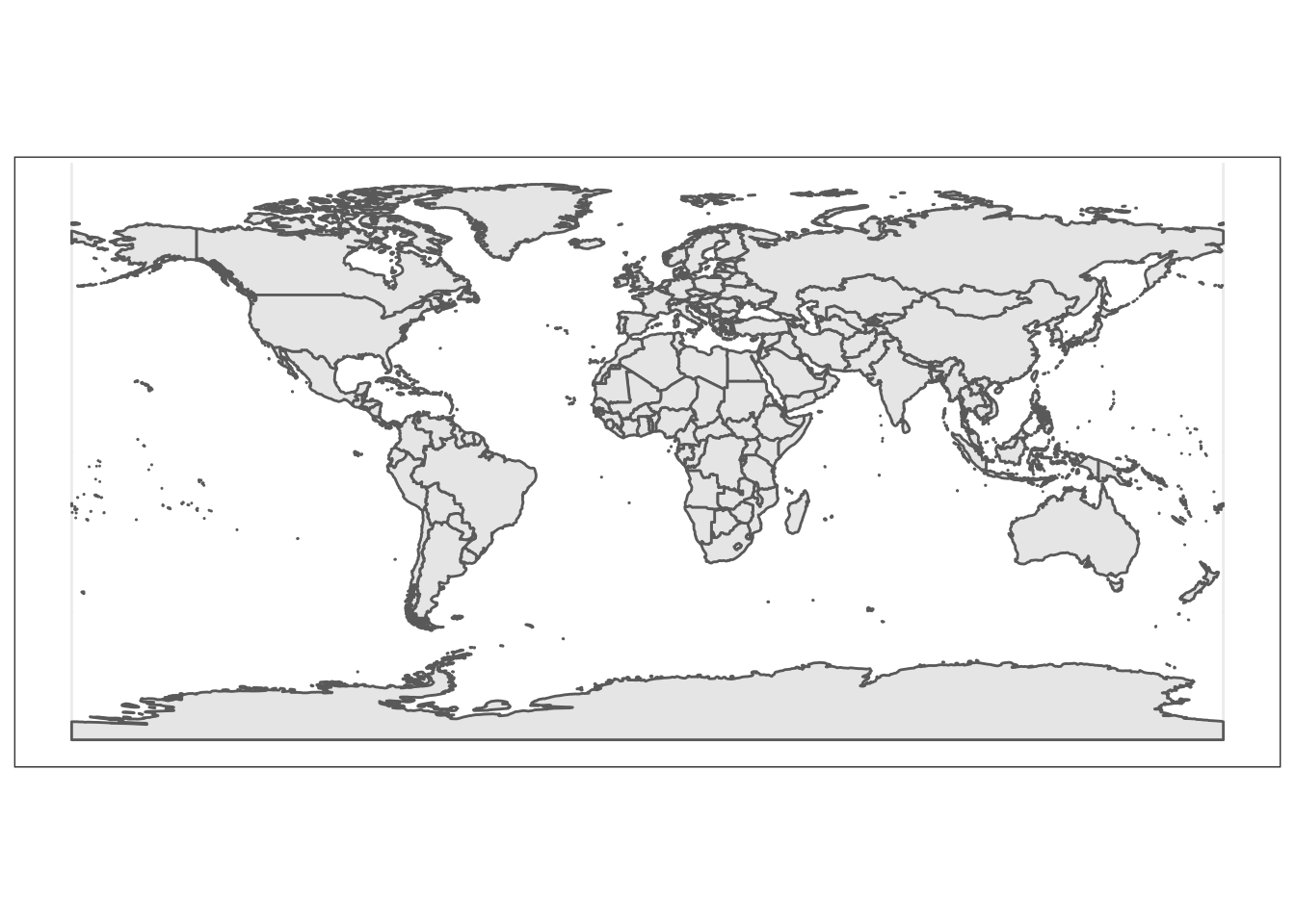
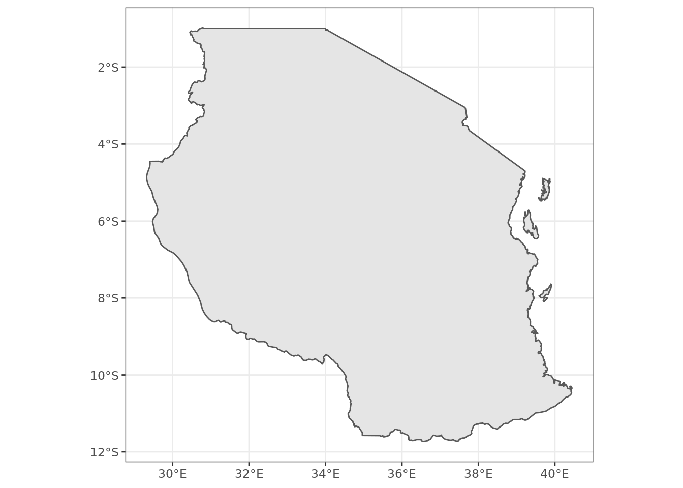
Spatial data come in many forms. Here, we are going to make use of spatial data that comes pre-loaded in the package rnaturalearth. Below we select medium-resolution map data for the entire world and higher resolution data for Tanzania in particular.
world <- ne_countries(scale="medium", returnclass = "sf")
tanzania <- ne_countries(country="united republic of tanzania", type="countries", scale='large', returnclass = "sf")
3.3 A map of the world
Here we create a basic map of the world. This call to ggplot() should look similar to previous plotting code that you have seen and used with this package. The spatial plotting occurs via geom_sf() which is made available through the sf package. Also please note that layers are added one at a time in a ggplot call, so the order of each layer is important.
3.5 Adding titles and axis labels
A title and a subtitle can be added to the map using the function ggtitle. Axis names can be added using xlab and ylab
ggplot(data = tanzania) +
geom_sf() +
xlab("Longitude") + ylab("Latitude") +
ggtitle("The United Republic of Tanzania")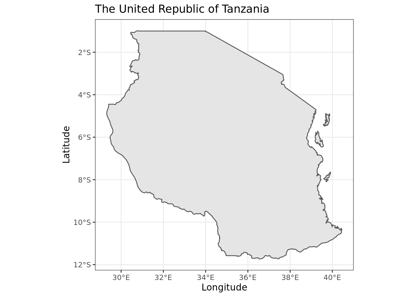
3.6 Adding scale bars and a north arrow
We use here the package ggspatial, which provides an easy function for creating scale bars / north arrows.
ggplot(data = tanzania) +
    geom_sf() +
    xlab("Longitude") + ylab("Latitude") +
ggtitle("The United Republic of Tanzania") +
annotation_scale(location = "bl", width_hint = 0.4) +
annotation_north_arrow(location = "bl", which_north = "true",
pad_x = unit(0.0, "in"), pad_y = unit(0.2, "in"),
style = north_arrow_fancy_orienteering)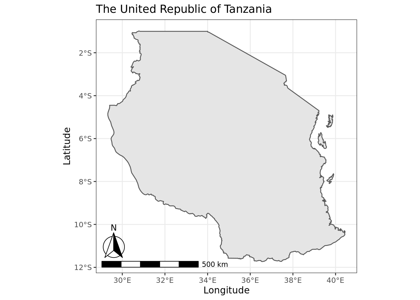
In the example above, we used functions in ggspatial to add a north symbol and a scale bar into the map. Explanations of the arguments that we have set manually include:
-
location = "bl": where to put the scale bar (“tl” for top left, etc.).
-
width_hint = 0.4: The (suggested) proportion of the plot area which the scalebar should occupy.
-
which_north = "true": “true” always points to the north pole from whichever corner of the map the north arrow is in. One can also specify “grid” which results in a north arrow always pointing up; -
pad_x = unit(0.0, "in"): Distance between scale bar and x-axis (longitude) edge of panel, in inches -
pad_y = unit(0.2, "in"): Distance between scale bar and y-axis (latitude) edge of panel, in inches -
style = north_arrow_fancy_orienteeringwhat style of arrow to show. Other options includenorth_arrow_orienteering,north_arrow_minimal.
3.7 Further tweaking of the scale bars and north arrow
It is possible to change the font size for the legend of the scale bar (argument legend_size, which defaults to 3). The North arrow behind the “N” north symbol can also be adjusted for its length (arrow_length), its distance to the scale (arrow_distance), or the size the N north symbol itself (arrow_north_size, which defaults to 6).
3.8 Adding points to the map
The top five most populous cities in Tanzania happen to be: Dar es salaam, Mwanza, Arusha, Dodoma, and Mbeya. I’d like to add points and text labels to our map to represent those cities. We do this by creating a new dataframe, city_data and then adding those data to the map using the functions geom_point and geom_text.
city_data <- data.frame(city_name=c("Dar es Salaam", "Mwanza", "Arusha", "Dodoma", "Mbeya"))
city_data$lat <- c(-6.7924,-2.5164,-3.3869,-6.1630,-8.9094)
city_data$lon <- c(39.2083,32.9175,36.6830,35.7516,33.4608)

ggplot(data = tanzania) +
    geom_sf() +
    xlab("Longitude") + ylab("Latitude") +
    ggtitle("Major Cities in the United Republic of Tanzania") +
    annotation_scale(location = "bl", width_hint = 0.4) +
    annotation_north_arrow(location = "bl", which_north = "true",
        pad_x = unit(0.0, "in"), pad_y = unit(0.2, "in"),
        style = north_arrow_fancy_orienteering) +
  geom_point(data = city_data, mapping = aes(x = lon, y = lat), colour = "red") +
  geom_text(data = city_data, mapping=aes(x=lon, y=lat, label=city_name), nudge_y = 0.5, color="darkblue")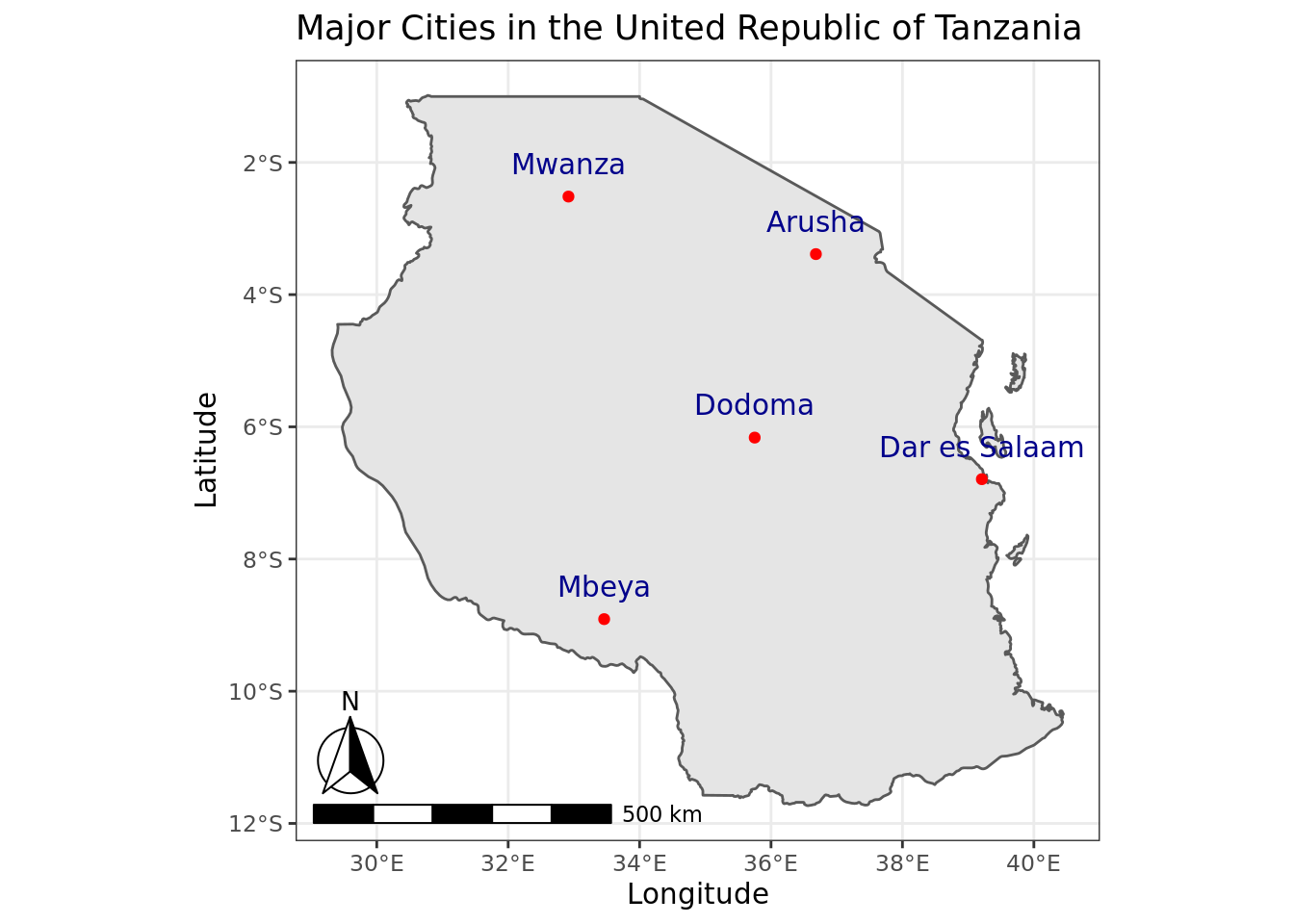
Explanations of the function arguments include:
-
data = city_datathis provides the new data to be used in the new point and textlabel layers to the map. -
mapping = aes(x = lon, y = lat)this specifies exactly how the data incity_datacorrespond to the necessary aesthetic (oraes) elements of anygeom_point, which include the x coordinates ( corresponding to our columnlon) and the y coordinates (corresponding tolat).
-
colour = "red"the color to use for the points. A reference to different color names that can be used in ggplot2 is available here. -
label=city_namegeom_text elements require a specification for thelabelaesthetic – this is the text to be displayed. -
nudge_y = 0.5this sets how the label should be displayed, relative to its x and y coordinates. In this case, we are just pushing the label a bit higher in the y-axis, (moving it north) so that it does not display directly on top of the point displayed for each city.
3.9 Zoom and Pan your map
The frame of view of your map can be set using coord_sf function.
ggplot(data = tanzania) +
    geom_sf() +
    coord_sf(xlim = c(35.5, 38), ylim = c(-4,-2), expand = FALSE) +
    xlab("Longitude") + ylab("Latitude") +
    ggtitle("Arusha") +
    annotation_scale(location = "bl", width_hint = 0.4) +
    annotation_north_arrow(location = "bl", which_north = "true",
        pad_x = unit(0.0, "in"), pad_y = unit(0.2, "in"),
        style = north_arrow_fancy_orienteering) +
  geom_point(data = city_data, mapping = aes(x = lon, y = lat), colour = "red") +
  geom_text(data = city_data, mapping=aes(x=lon, y=lat, label=city_name), nudge_y = 0.1, color="darkblue")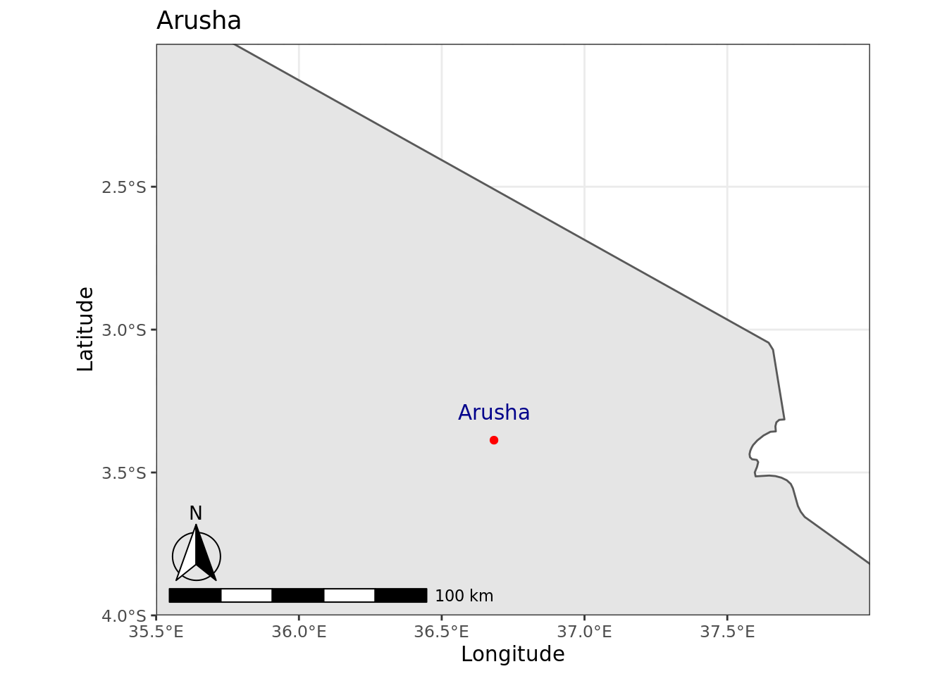
3.10 Static maps using the tmap package
The tmap package is designed to make building thematic maps easy. It is also integrated nicely with ggplot2. After installing tmap, it takes just a few lines of code to make a global map of the distribution of the Human Poverty Index (HPI) as shown below.
library(tmap)
data("World")
tm_shape(World) +
tm_polygons("HPI")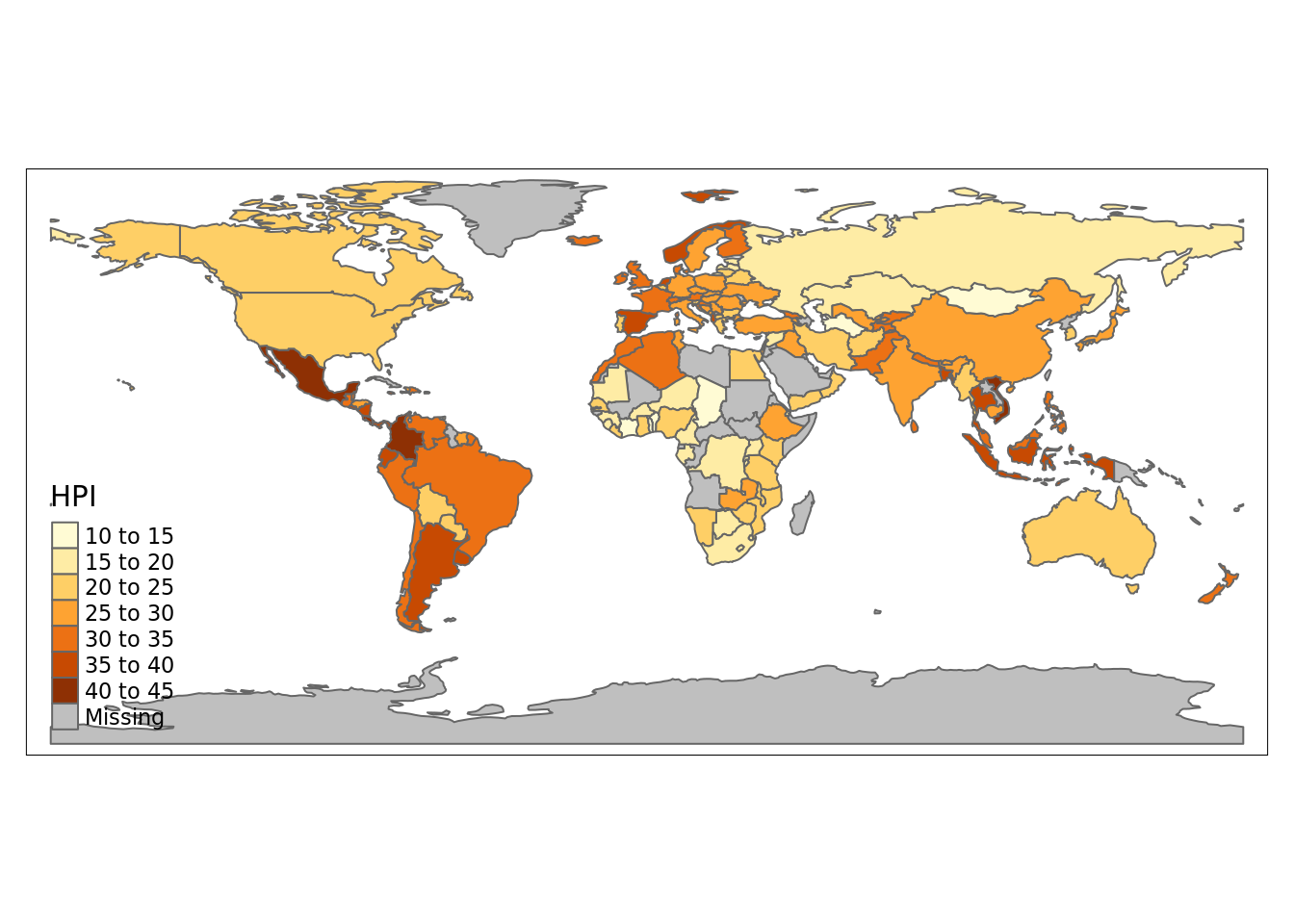 The object
 World is a spatial object of class sf from the sf package; it is a data.frame with a special column that contains a geometry for each row, in this case polygons representing each nation. In order to plot it in tmap, you first need to specify it with tm_shape. Layers can be added with the + operator, in this case tm_polygons. There are many layer functions in tmap, which can easily be found in the documentation by their tm_ prefix. See also ?'tmap-element'.
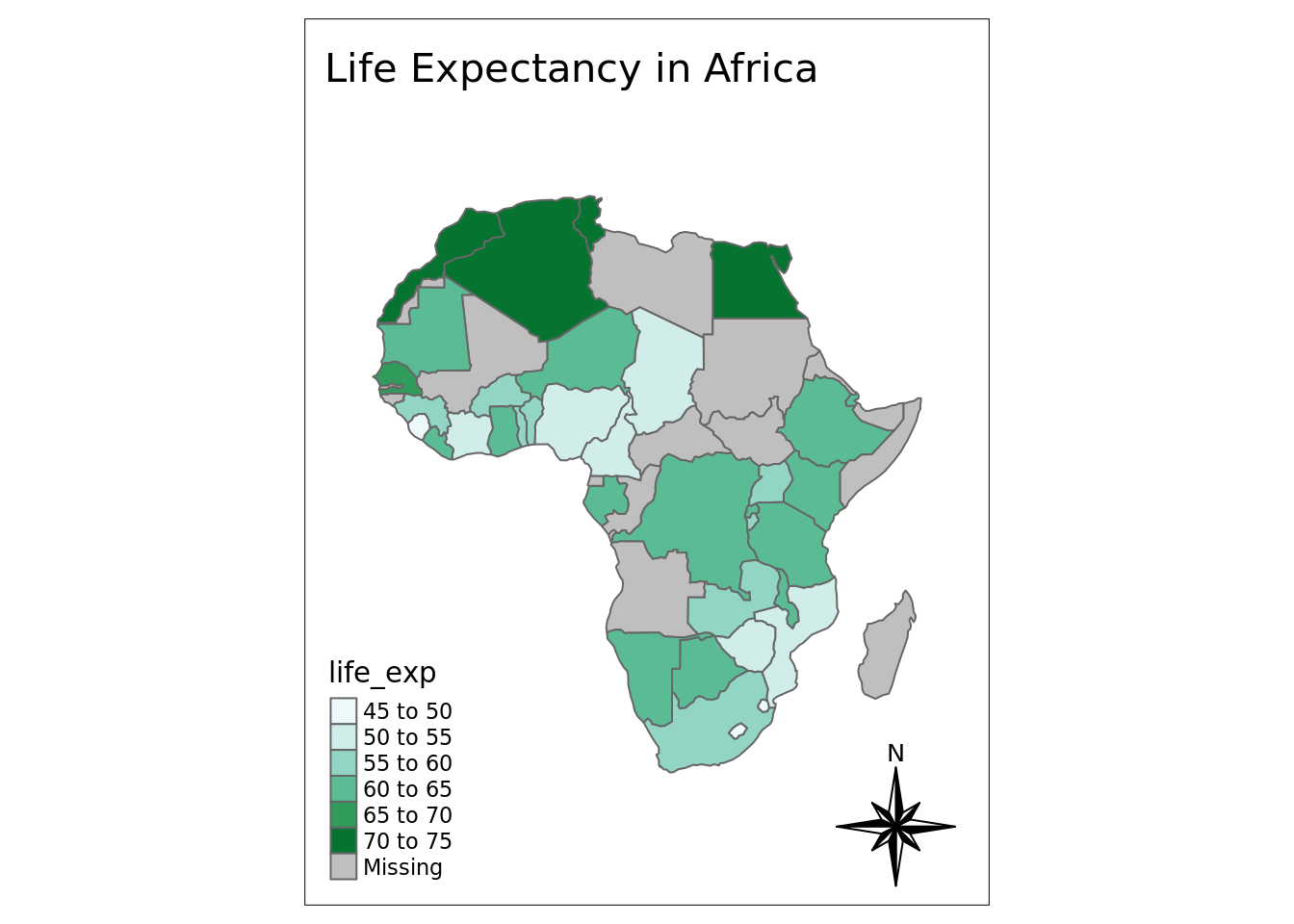
3.10.1 Thematic Map of Life Expectancy among African Nations
tmap is great for generating thematic maps, and there are many ways that you can customize the layout and appearances of your maps, using the function tm_layout. Below, we plot life expectancy at birth across different African nations. We also add a title and a compass.
africa =  World[World$continent == "Africa",]
tm_shape(africa) +
  tm_layout(title = "Life Expectancy in Africa",
            inner.margins=c(.15,.1,.2,.1)) +
  tm_polygons(col = "life_exp", palette = "BuGn") +
  tm_compass(type = "8star", position = c("right", "bottom"))